

Sienna color is a warm, earthy brown with a subtle red-orange undertone—close to baked clay or sun-dried soil. Its classic digital reference is #A0522D, a balanced shade that feels grounded without looking dull.
Often linked with warmth, reliability, and a handcrafted vibe, sienna comes from historic earth pigments associated with Siena. Below, you'll find its color codes, conversions, best pairings, shade ideas, and practical design uses.
Sienna Color: Codes & Values
If you want sienna color to look consistent across screens and assets, start with the standard codes below and reuse them across your UI, brand files, and templates.
| Parameters | VALUE |
| HEX Code | #A0522D |
| RGB DECIMAL | 160, 82, 45 |
| RGB PERCENTAGE | 63%, 32%, 18% |
| CMYK | 0%,49%,72%,37% |
| HSL | 19°, 56%, 40% |
| HSV (HSB) | 19°, 72%, 63% |
| Web Safe | #996633 |
Key Color Space Explanations:
- HEX - HEX is the simplest way to use sienna in digital design; #a0522d is the standard value you can paste into CSS and design tools.
- RGB - RGB defines how much red, green, and blue light make up the shade on screens, helping you match it across UI components and images.
- CMYK - CMYK is used for print production and packaging; these values help approximate sienna on paper, though results vary by ink and stock.
- HSL - HSL describes hue, saturation, and lightness, which is useful when building lighter or darker variants while keeping the same overall character.
- Web Safe - Web Safe is the nearest legacy-safe alternative; it can help keep a similar look on older systems or constrained palettes.
For most design work, use the HEX value as your source of truth, then pull RGB/HSL when you need consistent UI states, gradients, or lighter/darker variants.
Sienna Color Conversions
These conversions help you apply sienna accurately in different tools—whether you're styling a webpage, building a brand guide, or preparing assets for print.
| Parameters | VALUE | CSS |
| HEX | #a0522d | #a0522d |
| RGB DECIMAL | 160, 82, 45 | rgb(160,82,45) |
| RGB PERCENTAGE | 63%, 32%, 18% | rgb(63%,32%,18%) |
| CMYK | 0%,49%,72%,37% | cmyk(0%,49%,72%,37%) |
| HSL | 19°, 56%, 40% | hsl(19°,56%,40%) |
| HSV (or HSB) | 19°, 72%, 63% | -- |
| Web Safe | 996633 | #996633 |
| CIE-LAB | L* 45.6, a* 24.5, b* 33.6 | -- |
| XYZ | X 23.5, Y 17.6, Z 6.1 | -- |
| xyY | x 0.496, y 0.372, Y 17.6 | -- |
| CIE-LCH | L* 45.6, C* 41.5, h° 54.0 | -- |
| CIE-LUV | L* 45.6, u* 44.0, v* 35.0 | -- |
| Hunter-Lab | L 41.9, a 18.2, b 28.9 | -- |
| Binary | 10100000 01010010 00101101 | -- |
Want to generate Sienna Color photos or posters? Try Media.io's AI Image Generator now!
Sienna Color Meaning & Symbolism
Sienna is strongly tied to the natural world, so it often reads as grounded, warm, and dependable. Because it sits between brown and muted orange, it can feel both practical and inviting in everyday life.
Psychological Effects
In design and decor, sienna tends to shift the mood toward comfort and approachability.
- Warmth - Sienna tends to make spaces and visuals feel warmer and more lived-in.
- Approachability - It can reduce the clinical feel of bright whites and cool grays, making layouts feel more welcoming.
- Stability - As an earth tone, it often supports a sense of stability and comfort.
- Calm Attention - It can draw attention in a softer way, which helps for highlights and accents without loud saturation.
- Visual Weight - If overused, it can feel dusty, dated, or heavy, especially in low light or dense layouts.
Positive Associations
Because it echoes familiar materials, sienna often feels honest, human, and easy to trust.
- Craft - Sienna commonly signals a handcrafted, maker-led tone.
- Reliability - Its grounded character often reads as steady and dependable.
- Comfort - The warm undertone helps visuals feel cozy rather than stark.
- Material Honesty - It's associated with clay, leather, wood, and stone, which can suggest authenticity.
- Inviting Practicality - Sitting between brown and muted orange gives it a practical feel that still looks friendly.
Cultural Significance Across the World
Sienna's strongest symbolism tends to come from art history and its connection to natural pigments and materials.
- Earth Pigments - It's historically connected to pigments used in drawing and painting, which can suggest tradition.
- Tradition - Its heritage feel often supports brand stories rooted in longevity and craft.
- Natural Materials - Associations with clay, leather, wood, and stone make it widely recognizable and neutral.
- Handcrafted Character - In homes, brands, and products, it commonly points to warmth and a human touch.
Design Applications
Sienna works best as a warm anchor—strong enough for key accents, but comfortable as a background when you use a lighter tint and plenty of breathing room.
Graphic Design Tips
- Use it for high-value accents - Apply sienna to buttons, badges, icons, and active states to add warmth without overpowering the layout.
- Balance with light neutrals - Pair it with airy off-whites to keep the overall look modern and clean.
- Add a cool counterpoint - Introduce a blue or blue-gray accent to prevent the palette from feeling overly warm.
- Choose tints for large areas - For backgrounds and cards, use a lighter sienna tint instead of lowering opacity.
- Check contrast early - Because sienna sits mid-to-dark, test small text and UI states and adjust weight/size as needed.
Pro tip: If your layout starts to feel "too rustic,” keep sienna as a secondary color, increase whitespace, and let neutrals handle the heavy lifting.
Sienna Color in Photography & Video
- Lean into natural light - Warm, directional light makes sienna read like clay, leather, and wood—rich without looking muddy.
- Use it as a set accent - Small props (ceramics, textiles, signage) can bring in sienna tones without tinting the whole frame.
- Balance with cooler hues - Pair sienna scenes with soft blues or blue-grays in wardrobe or background elements for clean contrast.
- Protect skin tones - If you push warmth too far, faces can skew orange; keep an eye on overall color balance.
- Prefer controlled grading - Adjust hue/saturation in targeted areas rather than globally, so sienna stays intentional and readable.
Recommended Tool for Image Enhancement: When incorporating sienna color into your photography projects, Media.io's AI Image tools can help you achieve more refined results. With AI-powered color enhancement, photo colorization, image upscaling, and old photo restoration, you can easily enrich sienna color tones, improve overall image quality, and highlight the color's elegant and sophisticated aesthetic.
Color Combinations
Sienna pairs well with cool blues, gentle creams, and other earth tones. Use these palettes as ready-made starting points for branding, UI themes, and decor boards.
Complementary Colors
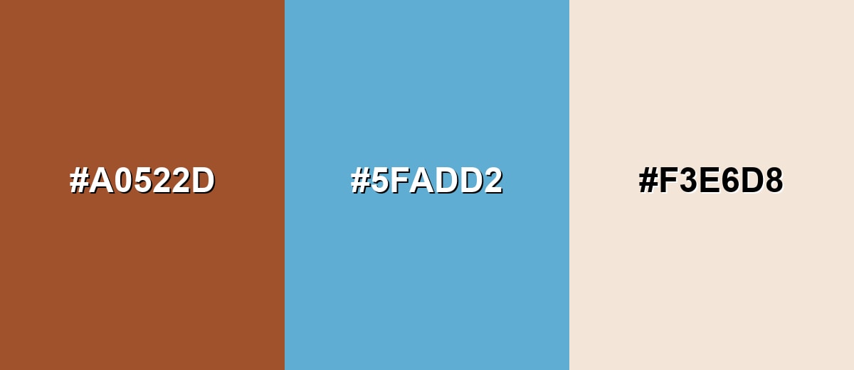
A cool blue complement makes sienna feel cleaner and more balanced, especially in digital layouts where warmth can dominate quickly.
Complementary Palette Example: Try sienna with a soft blue and an ivory neutral for a warm-cool contrast that still feels natural.
Analogous Color Schemes
Analogous colors sit adjacent to each other on the color wheel, creating harmonious, cohesive palettes with subtle variation.
Orange-leaning browns build a cozy, sunset-like gradient that works well for packaging and editorial headers.
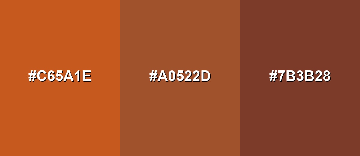
- Burnt Orange: #C65A1E
- Sienna: #A0522D
- Deep Chestnut: #7B3B28
Softer warm neighbors keep the palette calm and modern, ideal for backgrounds and subtle accents.
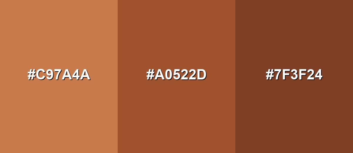
- Sandstone: #C97A4A
- Sienna: #A0522D
- Russet: #7F3F24
Triadic & Tetradic Combinations
A triadic set adds range while staying lively and readable when each shade has enough contrast.
Use sienna with a medium green and a deep indigo for a balanced, energetic palette that still feels grounded.
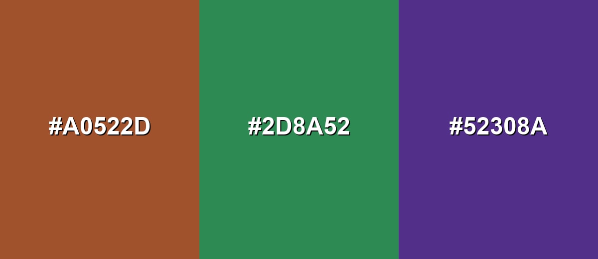
- Sienna: #A0522D
- Forest Green: #2D8A52
- Royal Indigo: #52308A
Colors to Avoid
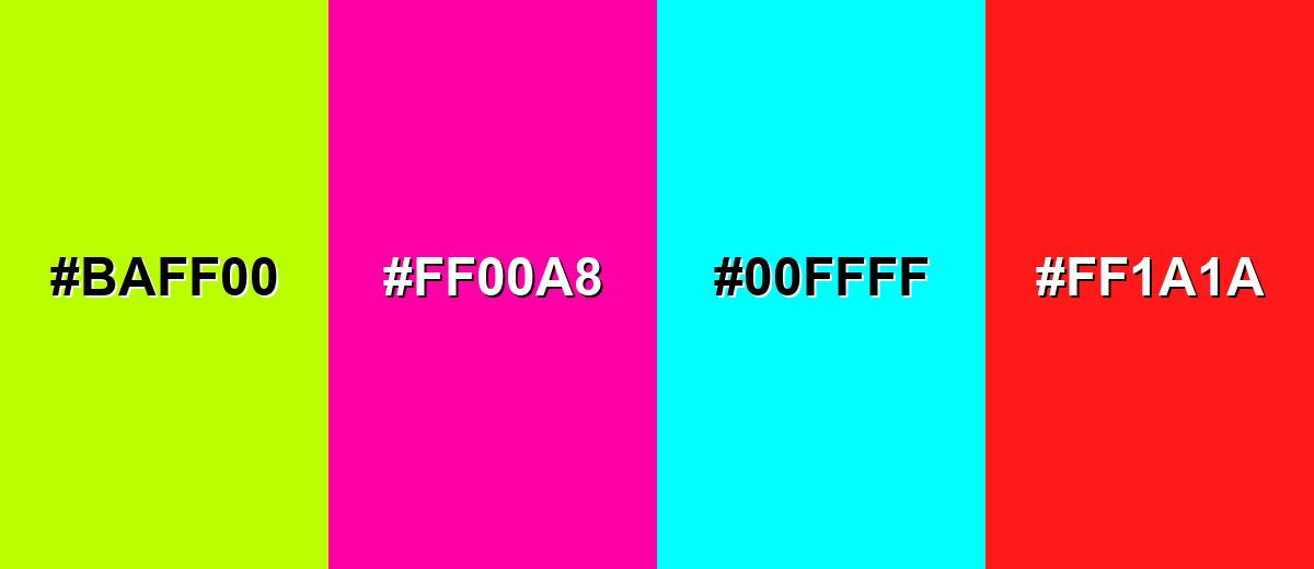
While sienna color is remarkably versatile, certain combinations can create problematic visual effects:
- Neon Lime (#BAFF00) - The extreme brightness can make sienna look muddy and can create harsh vibration on screens.
- Electric Magenta (#FF00A8) - High-saturation pink competes with sienna and can feel chaotic unless carefully toned down.
- Pure Cyan (#00FFFF) - The intensity is too sharp against an earthy base, often reading as mismatched rather than complementary.
- Bright Red (#FF1A1A) - A strong red can push sienna toward a dull brown and reduce the warmth that makes it appealing.
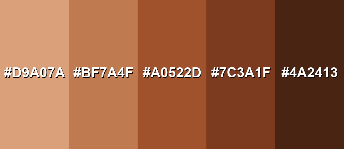
Shades, Tints & Variations of Sienna Color
Sienna has a surprisingly usable range—from light clay-like tints to deep, umber-leaning tones. Having a few ready variations makes it easier to build hierarchy in UI, add depth in branding, or create cozy layers in interior palettes.
- Pale Sienna (#D9A07A) - A light, clay-like tint that keeps the warmth while feeling airy and contemporary. It's best used for Backgrounds, cards, large sections, and soft gradients..
- Soft Sienna (#BF7A4F) - A muted mid tone that works as a gentle accent without looking too rustic. It's best used for Secondary buttons, icons, charts, and supportive highlights..
- Classic Sienna (#A0522D) - The recognizable standard with a balanced red-orange undertone and strong earthy presence. It's best used for Primary accents, brand marks, headings, and key UI elements..
- Deep Sienna (#7C3A1F) - A darker, richer variation that adds depth and a more traditional feel. It's best used for Footers, overlays, borders, and dramatic interior accents..
- Dark Umber (#4A2413) - A near-brown shade that reads strong and grounded, with only a hint of warmth left. It's best used for Text on light backgrounds, outlines, and high-contrast UI framing..
Industry Applications
Because it sits close to natural materials, sienna is a flexible choice for brands and products that want warmth, heritage, or a handcrafted tone—without going overly vintage.
Fashion & Beauty
- Textile-Friendly Tone - Works well for textiles as an earthy accent that feels cozy and natural.
- Accessory Color Direction - Matches the look of leather and wood-adjacent materials for grounded styling.
- Packaging Accents - Adds warmth and implied material quality when used as a secondary packaging tone.
- Seasonal Warmth - Fits seasonal campaigns that lean into autumnal and baked tones.
Interior Design & Decor
- Feature Walls & Accents - Supports cozy spaces as a feature wall color or dramatic accent.
- Textiles & Ceramics - Pairs naturally with textiles and ceramics for an earthy, lived-in look.
- Natural Material Pairing - Complements natural wood and stone for a cohesive palette.
- Modern Rustic Direction - Useful as a warm accent for modern rustic or organic contemporary rooms.
Branding & Marketing
- Heritage-Led Logos - Supports logos and wordmarks for craft, artisan, or heritage-led brands.
- UI Accent Roles - Works for call-to-action accents, tags, and highlights in warm-themed interfaces.
- Packaging Warmth - Helps packaging imply warmth and material honesty, especially for product lines with a handcrafted story.
- Hospitality & Menus - Fits menus and signage that aim to feel warm and welcoming.
Conclusion
The color Sienna is a dependable, earthy warm tone that brings comfort and character without shouting for attention. With #A0522D as your consistent reference, it's easy to apply across UI, branding, and decor—especially when you balance it with light neutrals and add a cooler counterpoint for contrast. Whether you're building a natural-looking palette, designing a cozy interior mood board, or polishing photo/video color, sienna's craft-forward feel and material honesty make designs look more human and easy to live with.
Design Smarter with AI: Media.io is an online AI studio that empowers creators with advanced image generation and enhancement tools. From text-to-image and image-to-image creation to AI upscaling and color optimization, it enables fast, creative, and professional results—all in your browser.

Frequently Asked Questions About Sienna Color
Sienna is an earthy brown with a noticeable red-orange undertone. It often resembles baked clay, terracotta, or sun-warmed soil, depending on lighting and surrounding tones.
A widely used digital reference for sienna is #a0522d. It is the standard value commonly associated with sienna in web and UI palettes.
It sits between brown and orange. In most layouts it reads primarily brown, but the orange-red undertone becomes more visible next to cool blues or clean whites.
Soft blues and blue-grays create a clean complement, while warm ivories keep it natural and calm. Related earth tones like sandstone, russet, and chestnut also pair smoothly for layered warmth.
Yes, especially as an accent for buttons, highlights, and illustrations. Keep the interface modern by pairing it with light neutrals, using plenty of whitespace, and checking contrast for accessibility.
Burnt sienna is typically darker, redder, and richer because it is associated with heated earth pigment. Sienna is usually lighter and slightly more orange-brown, making it easier to use as a flexible base tone.


