

Aquamarine color is a fresh blue-green shade that looks like shallow tropical water—bright, clear, and slightly minty. Its most common digital reference is #7FFFD4, which sits between cyan and green on the spectrum.
Many people read it as soothing, clean, and uplifting without feeling heavy. Below, you'll find aquamarine's color codes, conversions, meaning, pairings, and practical ways to use it in design.
Aquamarine Color: Codes & Values
If you're using aquamarine in UI, branding, or print production, these are the core values you'll reference most often.
| Parameters | VALUE |
| HEX Code | #7FFFD4 |
| RGB DECIMAL | 127, 255, 212 |
| RGB PERCENTAGE | 49.8%, 100%, 83.1% |
| CMYK | 50%,0%,17%,0% |
| HSL | 160°, 100%, 75% |
| HSV (HSB) | 160°, 50%, 100% |
| Web Safe | #66FFCC |
Key Color Space Explanations:
- HEX - #7fffd4. HEX is the most common way to specify this shade in web design. It encodes the red, green, and blue channels used on screens.
- RGB - 127, 255, 212. RGB defines the amount of red, green, and blue light mixed to display aquamarine. High green plus strong blue creates its clear, watery look.
- CMYK - 50%,0%,17%,0%. CMYK is used for printing and describes ink percentages rather than light. Aquamarine typically relies on cyan ink with a small touch of yellow for its green tilt.
- HSL - 160°, 100%, 75%. HSL describes hue, saturation, and lightness, which is helpful when adjusting tints and tones. The high lightness explains why it can feel airy and bright.
- Web Safe - #66ffcc. Web-safe is the closest legacy palette match for older display constraints. It is useful when you want a simple, consistent approximation across environments.
For day-to-day work, use HEX for web and product design, RGB for on-screen motion/graphics workflows, and CMYK when you're preparing files for print.
Aquamarine Color Conversions
Need aquamarine in a specific format for CSS, printing, or color-managed workflows? Use the conversion table below as a quick reference.
| Parameters | VALUE | CSS |
| HEX | #7fffd4 | #7fffd4 |
| RGB DECIMAL | 127, 255, 212 | rgb(127,255,212) |
| RGB PERCENTAGE | 49.8%, 100%, 83.1% | rgb(49.8%,100%,83.1%) |
| CMYK | 50%,0%,17%,0% | cmyk(50%,0%,17%,0%) |
| HSL | 160°, 100%, 75% | hsl(160°, 100%, 75%) |
| HSV (or HSB) | 160°, 50%, 100% | -- |
| Web Safe | 66ffcc | #66ffcc |
| CIE-LAB | L* 91.6, a* -32.0, b* 4.5 | -- |
| XYZ | X 63.2, Y 84.5, Z 74.2 | -- |
| xyY | x 0.29, y 0.39, Y 84.5 | -- |
| CIE-LCH | L* 91.6, C* 32.3, h° 172 | -- |
| CIE-LUV | L* 91.6, u* -41.0, v* 12.0 | -- |
| Hunter-Lab | L 92.2, a -24.5, b 3.2 | -- |
| Binary | 01111111 11111111 11010100 | -- |
Want to generate Aquamarine Color photos or posters? Try Media.io's AI Image Generator now!
Aquamarine Color Meaning & Symbolism
Aquamarine is commonly linked with clarity, calm, and freshness—like a breath of clean air or a clear shoreline. In everyday life, it often reads as peaceful and friendly, which is why it shows up in wellness visuals, water themes, and modern minimal layouts. When people look up Aquamarine Color meaning, they're usually trying to understand why it feels both soothing and energizing at the same time.
Psychological Effects
In most palettes, aquamarine lands as "light and open," especially compared with deeper teals.
- Eye-Soothing Balance - Its blue-green range feels natural and gentle, so it's easy to look at for longer periods.
- Freshness Cue - The bright, watery quality quickly signals "clean," "new," or "refreshed."
- Airy Spaciousness - High lightness can make layouts feel less cramped, particularly in dashboards and content-heavy screens.
- Friendly Energy - It can feel uplifting without the intensity of neon brights, which helps keep interfaces approachable.
- Cool-But-Distant Risk - Overuse (especially with stark white) may read as sterile or emotionally cool, so it benefits from a darker anchor.
Positive Associations
Designers often lean on aquamarine when they want a calm mood that still looks modern.
- Clarity - Suggests clean communication and "no-fuss" simplicity in visual systems.
- Calm - Creates a relaxed tone that works well for wellness, self-care, and gentle onboarding flows.
- Cleanliness - Fits hygiene- and health-adjacent visuals where "fresh" is the message.
- Water & Coast - Instantly evokes ocean, pools, and tropical shallows in branding and illustration.
- Light Optimism - Feels upbeat and bright without becoming loud, making it useful for friendly product moments.
Cultural Significance Across the World
Because the name is tied to a gemstone and the sea, its symbolism is broadly water-led, with details changing by context.
- Gemstone Heritage - The aquamarine gem connection gives the color a refined, jewel-inspired identity in art and styling.
- Maritime Storytelling - Frequently used to represent oceans, shorelines, and sea air across travel and coastal themes.
- Protection & Travel Motifs - Often appears in narratives that connect water colors with journeys and safe passage, depending on tradition.
- Modern Wellness Visuals - Common in contemporary design language for calm, cleanliness, and "reset" moments.
Design Applications
Aquamarine works best when you treat it as a bright accent or a light atmosphere builder. Because it's vivid and high in lightness, pairing and contrast decisions matter more than they do with deeper blue-greens.
Graphic Design Tips
- Use It as an Accent First - Start with icons, highlights, and small UI fills before committing to large backgrounds.
- Anchor with Dark Neutrals - Pair it with deep, grounded tones to keep the palette readable and not overly playful.
- Control the "Pool Bright" Look - Reduce saturation slightly if it feels too fluorescent on high-brightness displays.
- Make Hierarchy Obvious - Reserve aquamarine for active/selected states so it communicates meaning, not just decoration.
- Check Text Contrast Early - Test real typography on the final tint; light grays often fade on aquamarine.
If you want an "aqua" vibe without flooding the layout, keep your main canvas neutral and apply aquamarine to interactive states (selected tabs, toggles, badges) so it reads as a clear, consistent cue.
Aquamarine Color in Photography & Video
- White Balance Matters - Slight shifts in temperature can push aquamarine toward mint (warmer) or cyan (cooler), so lock WB for consistency.
- Protect Highlights - Because it's naturally bright, watch clipping in skies, water reflections, and glossy surfaces.
- Use as a Location Tone - Pools, beaches, and glass textures naturally support aquamarine without looking forced.
- Pair with Warm Accents - Skin tones, sand, and warm props help aquamarine feel inviting rather than chilly.
- Grade for Clean Contrast - Adding a deeper teal-like shadow tone can keep the image crisp while preserving the airy feel.
Recommended Tool for Image Enhancement: When incorporating aquamarine color into your photography projects, Media.io's AI Image tools can help you achieve more refined results. With AI-powered color enhancement, photo colorization, image upscaling, and old photo restoration, you can easily enrich aquamarine color tones, improve overall image quality, and highlight the color's elegant and sophisticated aesthetic.
Color Combinations
Aquamarine pairs well with deep anchors, warm accents, and nearby blue-green tones. Use these palettes as a starting point, then adjust lightness to match your layout and contrast needs.
Complementary Colors
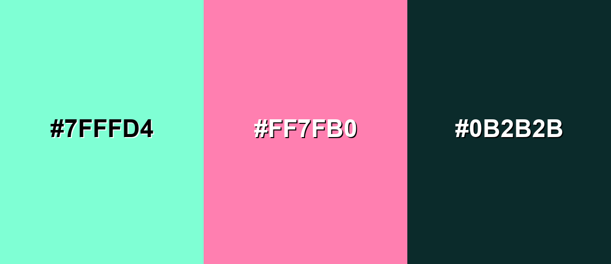
A complementary pairing adds energy by placing a warm pink-red opposite aquamarine. This is a reliable way to make callouts and focal elements pop without losing the clean, coastal feel.
Complementary Palette Example: Try aquamarine with a rosy accent and a deep teal anchor for balance.
Analogous Color Schemes
Analogous colors sit adjacent to each other on the color wheel, creating harmonious, cohesive palettes with subtle variation.
Green-leaning analogous tones feel fresh, botanical, and light.
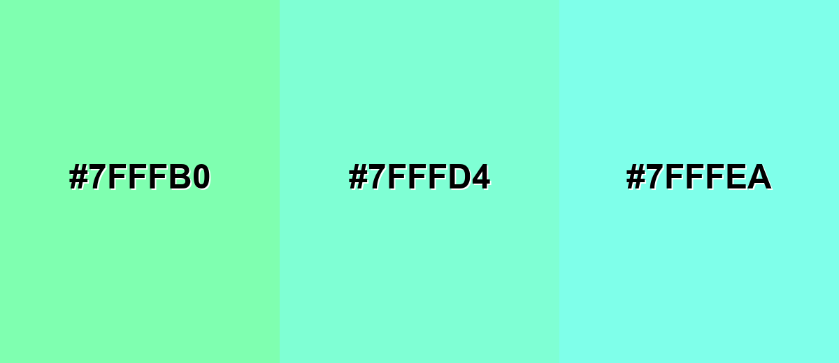
- Spring Mint: #7FFFB0
- Aquamarine: #7FFFD4
- Icy Aqua: #7FFFEA
Blue-leaning analogous tones look airy and slightly more tech-forward.
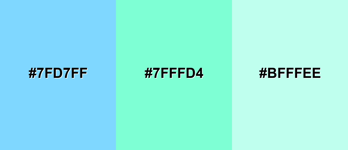
- Sky Aqua: #7FD7FF
- Aquamarine: #7FFFD4
- Soft Seafoam: #BFFFEE
Triadic & Tetradic Combinations
A triadic palette creates contrast while staying playful and balanced.
Combine aquamarine with a gentle violet and a warm amber for a bright, modern set.
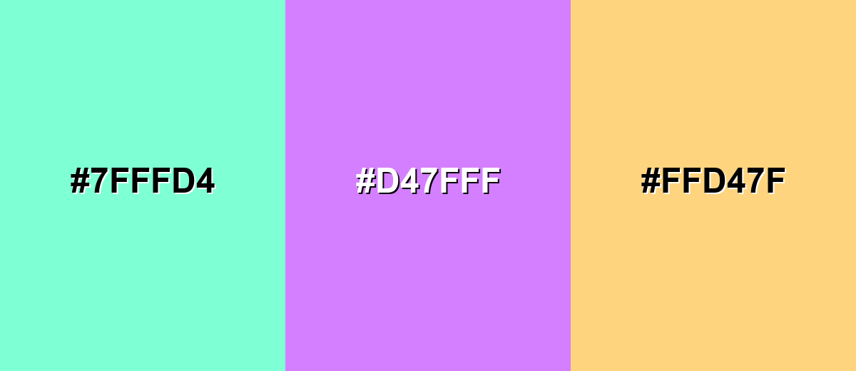
- Aquamarine: #7FFFD4
- Lavender Violet: #D47FFF
- Warm Amber: #FFD47F
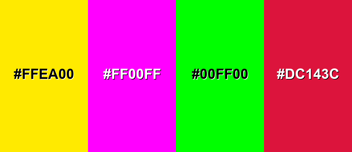
Colors to Avoid
While aquamarine color is remarkably versatile, certain combinations can create problematic visual effects:
- Neon Yellow (#FFEA00) - Both tones are very bright, so the pairing can feel glaring and reduce readability in UI blocks.
- Electric Magenta (#FF00FF) - Highly saturated magenta can overpower aquamarine and create a harsh, vibrating edge on screens.
- Pure Green (#00FF00) - The overlap in intensity can make the palette look accidental and overly synthetic, especially in large areas.
- Bright Crimson (#DC143C) - Strong, heavy reds can make aquamarine feel washed out unless carefully managed with neutrals and spacing.
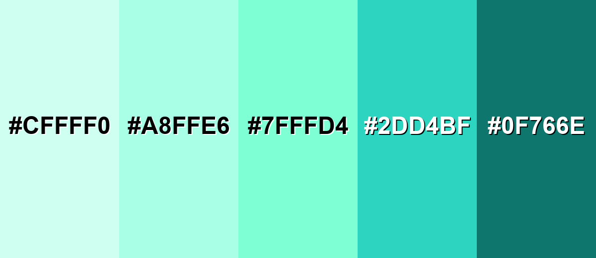
Shades, Tints & Variations of Aquamarine Color
Aquamarine isn't just one "pool blue" note—its range runs from barely-there, airy tints to deeper teal-leaning options with stronger contrast. Having a few variations makes it easier to build hierarchy (backgrounds, surfaces, buttons, text) while keeping the same coastal, clean feel.
- Pale Aquamarine (#CFFFF0) - A very light, airy tint that keeps the watery feel with minimal visual weight. It's best used for Large backgrounds, cards, and soft section breaks in web layouts.
- Light Aquamarine (#A8FFE6) - A gentle tint that still reads clearly as blue-green while staying easy on the eyes. It's best used for Secondary panels, onboarding screens, and subtle UI fills.
- Aquamarine (#7FFFD4) - The classic bright blue-green reference—clean, lively, and instantly water-coded. It's best used for Accents, highlights, icons, and brand moments that need freshness.
- Deep Aquamarine (#2DD4BF) - A richer, more modern teal-leaning variation with stronger presence and contrast potential. It's best used for Buttons, charts, and headings when you want the same vibe with more depth.
- Dark Teal Aquamarine (#0F766E) - A dark, grounded teal that pairs naturally with aquamarine while improving legibility. It's best used for Text, navigation bars, outlines, and contrast anchors.
Industry Applications
Because it reads as clean and water-adjacent, aquamarine shows up across digital products and physical spaces that want to feel light, safe, and modern. The key is to match its brightness to the seriousness of your message and the contrast needs of your layout.
Fashion & Beauty
- Clean Beauty Packaging - Works well as a "fresh" accent for labels, seals, and ingredient callouts.
- Skincare Visual Systems - Helps create a calm, hygienic look for product pages and social content.
- Summer Collections - Fits seasonal drops that lean into water, breeze, and coastal styling.
- Wellness Branding - Supports spa-like tones when balanced with deeper, more grounded neutrals.
Interior Design & Decor
- Bathrooms & Kitchens - A natural fit for crisp, water-inspired spaces and tile or paint accents.
- Small Rooms - Light aquamarine tints can help rooms feel more open and breathable.
- Accent Decor - Great for textiles, glass pieces, and painted furniture where you want a pop without heaviness.
- Finish Choices - Matte/eggshell reads softer, while glossy finishes look more "pool bright" under strong lighting.
Branding & Marketing
- SaaS & Mobile UI - Useful for selection states, success cues, and friendly highlights—especially with dark text for contrast.
- Travel & Hospitality - Instantly supports ocean, resort, and poolside storytelling in campaigns.
- Education & Kids Products - Playful but non-aggressive, making it easier to build upbeat palettes.
- Food & Beverage Specials - Fits "mint/citrus/summer" cues when used as a limited-edition accent.
Conclusion
Aquamarine stands out for its bright, clear blue-green look that feels fresh, calm, and modern—without the heaviness of deeper teals. With #7FFFD4 as a base, you can build practical palettes by adding darker variations for contrast, then introducing warm accents when you need extra energy. Whether you're designing a UI highlight, a clean wellness brand, or a breezy interior touch, aquamarine works best when it's paired thoughtfully and tested for readability, especially on text-heavy screens.
Design Smarter with AI: Media.io is an online AI studio that empowers creators with advanced image generation and enhancement tools. From text-to-image and image-to-image creation to AI upscaling and color optimization, it enables fast, creative, and professional results—all in your browser.

Frequently Asked Questions About Aquamarine Color
Aquamarine is a bright, light blue-green shade that resembles clear shallow water. It sits between cyan and green, so it can read slightly different depending on lighting and surrounding tones.
A widely used digital hex value for aquamarine is #7fffd4. This code is commonly referenced in web design, UI work, and digital illustration.
It's a balanced blue-green, but it often leans greener than cyan because of its strong green channel. Surrounding colors can shift perception: near blues it looks greener, and near greens it looks bluer.
Deep neutrals like charcoal or dark teal add readable contrast, while warm accents like coral, rose, or amber create lively balance. Nearby blue-green tones also work for calm, cohesive palettes.
Start with a cyan-leaning blue, then add green in small amounts to reach a blue-green hue. Lighten with white to achieve the bright, airy aquamarine look, and adjust with tiny touches of blue or green as needed.
Very dark text (charcoal, deep teal, or near-black) is usually the safest choice for readability on aquamarine. White text often lacks contrast on bright aquamarine unless the text is large and the background is darkened.


