

Dark violet color is a deep, moody purple—like violet pushed toward night—with a cool, inky richness that feels dramatic without being flashy.
Its go-to HEX code is #2E0854, and it's often read as thoughtful, creative, and slightly mysterious in branding, interiors, and modern UI.
Dark Violet Color: Codes & Values
If you want dark violet to look consistent across screens, print files, and brand assets, start with these core color values.
| Parameters | VALUE |
| HEX Code | #2E0854 |
| RGB DECIMAL | 46, 8, 84 |
| RGB PERCENTAGE | 18%, 3%, 33% |
| CMYK | 45%,90%,0%,67% |
| HSL | 270°, 83%, 18% |
| HSV (HSB) | 270°, 91%, 33% |
| Web Safe | #330066 |
Key Color Space Explanations:
- HEX HEX is the most common way to specify this shade on the web. Use #2e0854 in CSS and design tools for consistent on-screen results.
- RGB RGB defines the mix of red, green, and blue light used by screens. Dark violet uses low green with higher blue, creating a cool, shadowy purple.
- CMYK CMYK is used for printing and indicates ink percentages. These values help approximate the same deep violet feel on paper, though results vary by stock and profile.
- HSL HSL describes hue, saturation, and lightness, which is useful for building tints and shades. The low lightness is what makes this violet feel dark and dramatic.
- Web Safe Web-safe is the closest legacy-safe approximation for older displays. #330066 is the nearest match on the classic 216-color web-safe palette.
For web and UI work, use HEX/RGB; for print projects, start with CMYK and always check a proof because deep violets can shift depending on paper and color profiles.
Dark Violet Color Conversions
Need dark violet color in different formats for CSS, design systems, or print specs? Here are the most common conversions in one place.
| Parameters | VALUE | CSS |
| HEX | #2e0854 | #2e0854 |
| RGB DECIMAL | 46, 8, 84 | rgb(46,8,84) |
| RGB PERCENTAGE | 18%, 3%, 33% | rgb(18%,3%,33%) |
| CMYK | 45%,90%,0%,67% | cmyk(45%,90%,0%,67%) |
| HSL | 270°, 83%, 18% | hsl(270°, 83%, 18%) |
| HSV (or HSB) | 270°, 91%, 33% | -- |
| Web Safe | 330066 | #330066 |
| CIE-LAB | 12.0, 34.5, -37.4 | -- |
| XYZ | 2.83, 1.40, 8.57 | -- |
| xyY | 0.221, 0.109, 1.40 | -- |
| CIE-LCH | 12.0, 50.9, 312.5° | -- |
| CIE-LUV | 12.0, 4.7, -33.3 | -- |
| Hunter-Lab | 11.8, 23.3, -38.3 | -- |
| Binary | 00101110 00001000 01010100 | -- |
Want to generate Dark Violet Color photos or posters? Try Media.io's AI Image Generator now!
Dark Violet Color Meaning & Symbolism
Dark violet is commonly associated with imagination, dignity, and quiet confidence. Because it sits between purple and deep blue, it often feels both creative and controlled in everyday visual language. When people search for Dark Violet Color meaning, they are usually looking for that blend of mystery and refinement it brings to brands, rooms, and interfaces.
Psychological Effects
Because it's dark and cool, dark violet can shape mood quickly—especially in large areas.
- Calming Depth - Its low lightness reduces visual noise, which can make layouts feel quieter and more focused.
- Sophisticated Tone - It often reads premium and composed, helping brands feel elevated without being loud.
- Creative Mindset - Violet hues are closely tied to imagination, making this shade a natural fit for artistic or exploratory themes.
- Mysterious Atmosphere - The "inky" undertone can feel intriguing, which is useful for storytelling visuals and dramatic hero sections.
- Risk Of Heaviness - Overusing it in big blocks can feel distant or gloomy unless you add lighter accents and breathing space.
Positive Associations
Used with restraint, dark violet signals intention—like a design choice, not a default.
- Imagination - Suggests original thinking, experimentation, and a creative edge.
- Dignity - Carries a ceremonial, refined feeling that can elevate packaging and identity systems.
- Quiet Confidence - Feels self-assured rather than attention-seeking, especially with clean typography.
- Luxury - Reads rich and "crafted," particularly on coated print stock or velvet-like textures.
- Modern Drama - Adds atmosphere and contrast without relying on pure black for intensity.
Cultural Significance Across the World
Violet symbolism varies, but darker violets tend to modernize traditional meanings into something more design-forward.
- Ceremony - Violet shades have long been linked with formal rituals and special occasions in many cultures.
- Spirituality - Often associated with reflection, introspection, and inner life, especially in symbolic art and decor.
- Status - Historically connected to dignity and prestige, which still influences how it's perceived in branding.
- Artistry - In contemporary use, darker violets lean toward creativity and intentional design rather than overt opulence.
Design Applications
Dark violet is most effective when you treat it as a grounded base and let other elements do the breathing. Its low lightness gives strong contrast opportunities, but it also demands careful spacing and pairing to avoid looking too dense.
Graphic Design Tips
- Use dark violet as a background for premium layouts, then layer warm off-whites for readable text and UI labels.
- Keep typography clean and slightly heavier for small sizes; deep colors can swallow thin strokes.
- Use one bright accent for calls-to-action to keep hierarchy obvious (especially in dark mode).
- Build depth with subtle gradients and overlays instead of adding more dark colors that can turn muddy.
- In print, prefer coated paper for a richer, inkier finish and check proofs for blue-shift.
Pro tip: If dark violet is your base, reserve it for the biggest surfaces (hero sections, nav bars, packaging backgrounds) and let your light neutral do most of the readability work—your design will feel intentional, not heavy.
Dark Violet Color in Photography & Video
- Use dark violet gels or practical lights to create cinematic shadows and a controlled "night" mood.
- Pair it with warm highlights (skin tones, candlelight, brass) for pleasing contrast and less "cold" footage.
- Watch for crushed blacks: deep violets can lose detail if exposure is too low or contrast is too high.
- In product shots, matte textures make it feel modern, while glossy surfaces push it toward a luxe look.
- For social video, keep on-screen text bright and simple so it stays readable on smaller displays.
Recommended Tool for Image Enhancement: When incorporating dark violet color into your photography projects, Media.io's AI Image tools can help you achieve more refined results. With AI-powered color enhancement, photo colorization, image upscaling, and old photo restoration, you can easily enrich dark violet color tones, improve overall image quality, and highlight the color's elegant and sophisticated aesthetic.
Color Combinations
Dark violet pairs beautifully with crisp neutrals, yellow-green complements, and balanced multi-hue schemes. The palettes below show practical options for branding, UI, illustration, and interior styling.
Complementary Colors
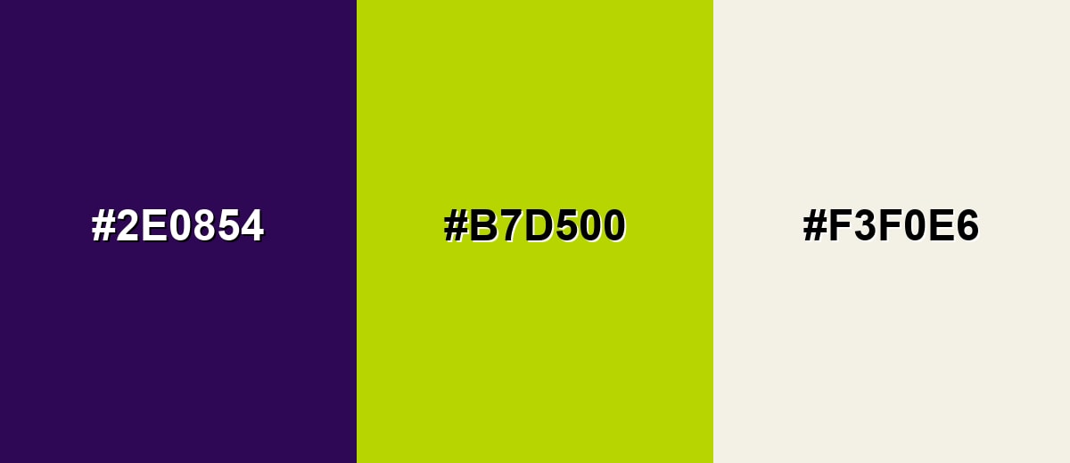
A complementary scheme uses the opposite hue on the wheel to create strong contrast. With dark violet, a lively yellow-green accent adds energy while the violet keeps everything grounded.
Complementary Palette Example: Use Dark Violet as the base, add Citrus Chartreuse for punch, and soften the look with Warm Ivory.
Analogous Color Schemes
Analogous colors sit adjacent to each other on the color wheel, creating harmonious, cohesive palettes with subtle variation.
Deep Indigo and Magenta Plum sit near Dark Violet, creating a smooth, atmospheric gradient.
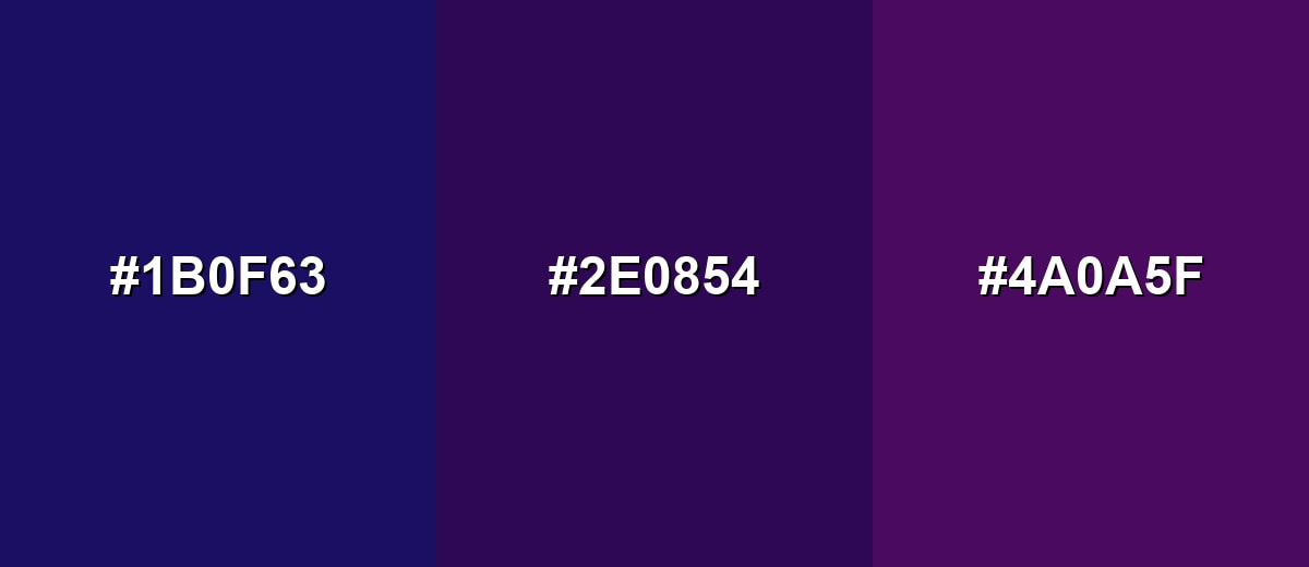
- Deep Indigo: #1B0F63
- Dark Violet: #2E0854
- Magenta Plum: #4A0A5F
Midnight Purple and Royal Violet keep the same family feel while adding subtle separation for layered layouts.
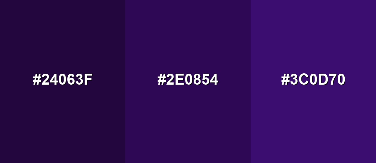
- Midnight Purple: #24063F
- Dark Violet: #2E0854
- Royal Violet: #3C0D70
Triadic & Tetradic Combinations
A triadic palette balances three evenly spaced hues, giving you contrast without chaos.
Pair Dark Violet with Burnt Orange and Deep Teal for a bold, modern mix that still feels intentional.
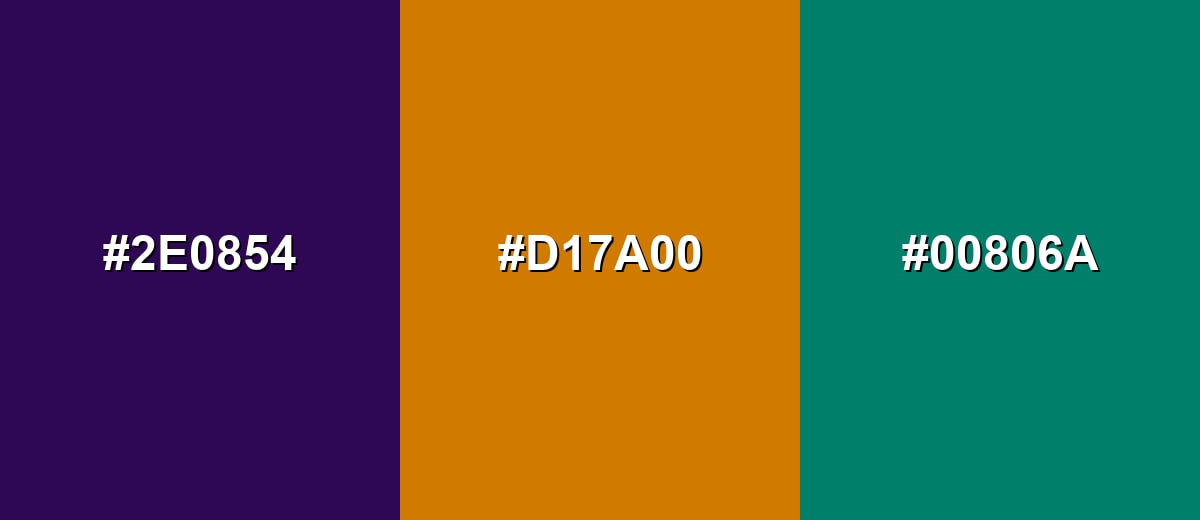
- Dark Violet: #2E0854
- Burnt Orange: #D17A00
- Deep Teal: #00806A
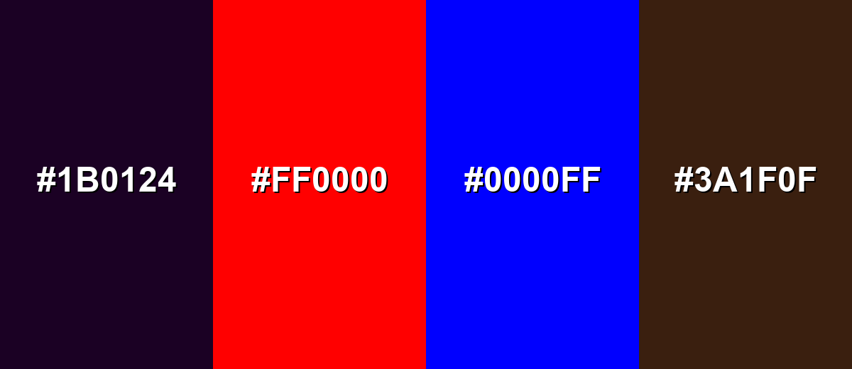
Colors to Avoid
While dark violet color is remarkably versatile, certain combinations can create problematic visual effects:
- Near-Black Purple (#1B0124) - Too close in value, so edges disappear and the design can look muddy instead of deep.
- Pure Red (#FF0000) - High saturation against dark violet can create a vibrating clash that feels harsh in UI and ads.
- Pure Blue (#0000FF) - Both are cool and intense, often competing and reducing clarity in charts, icons, and small elements.
- Dark Brown (#3A1F0F) - The low lightness on both sides can look dull and heavy unless separated by a lighter neutral.
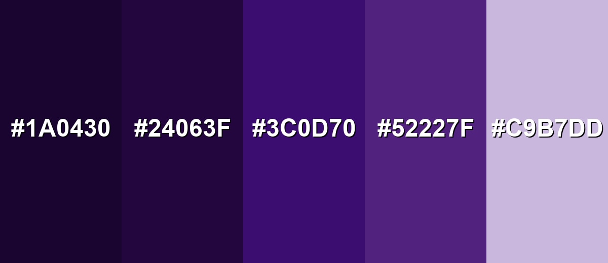
Shades, Tints & Variations of Dark Violet Color
Dark violet isn't just one "perfect" swatch—its range includes near-black shadows, clearer royal tones, and soft tints for backgrounds. Having these variations makes it easier to build depth, hierarchy, and contrast without leaving the same color family.
- Black Violet (#1A0430) - An even deeper, near-black take that keeps a violet undertone. It's best used for Backgrounds, luxury packaging, and high-contrast dark mode sections..
- Midnight Purple (#24063F) - A slightly darker, bluer-feeling variation that reads very night-sky. It's best used for Hero banners, gradients, and subdued UI surfaces..
- Royal Violet (#3C0D70) - A clearer violet that brings more presence while staying rich. It's best used for Brand accents, headings, and statement elements..
- Grape Purple (#52227F) - A brighter, more approachable violet-purple with extra lightness. It's best used for Illustrations, highlights, and secondary buttons..
- Pale Violet (#C9B7DD) - A soft tint that feels airy and gentle while still tied to the base hue. It's best used for Background panels, cards, and calming supporting areas..
Industry Applications
Because dark violet can feel premium, imaginative, and controlled at the same time, it shows up across many visual systems. It is especially useful when you need depth without relying on pure black.
Fashion & Beauty
- Use it on packaging backgrounds to create a polished, high-end feel that still looks modern.
- Pair it with warm ivories for clean readability on labels, especially for skincare and fragrance.
- Combine it with metallic accents (like gold-toned details) to highlight its rich, luxurious side.
- Use lighter violet tints for secondary panels, ingredient callouts, or soft promotional layouts.
Interior Design & Decor
- Apply it as a feature wall to add intimacy and depth without overwhelming the whole room.
- Use it on cabinetry for a bold statement that still feels refined and "designed."
- Lean into textured fabrics (velvet, wool) where dark violet looks especially intentional.
- Balance it with light woods, creamy whites, and warm metals to keep spaces from feeling closed-in.
Branding & Marketing
- Works well for creative studios and premium product lines that want a distinctive, thoughtful tone.
- Great for dark-mode interfaces, navigation bars, and hero sections with high-contrast typography.
- Strong choice for entertainment posters and event promos where atmosphere matters.
- Useful for publishing and education visuals that need seriousness while still hinting at curiosity.
Conclusion
Dark violet stands out for its deep, cool richness that feels both creative and composed. With #2E0854 as a reliable reference, you can build consistent palettes across web, product UI, and print—especially when you balance it with warm neutrals and a single clear accent. Its symbolism often lands on dignity and imagination, but the real advantage is practical: strong contrast, premium mood, and a memorable presence without the harshness of pure black.
Design Smarter with AI: Media.io is an online AI studio that empowers creators with advanced image generation and enhancement tools. From text-to-image and image-to-image creation to AI upscaling and color optimization, it enables fast, creative, and professional results—all in your browser.

Frequently Asked Questions About Dark Violet Color
A commonly used hex value for dark violet is #2e0854. It produces a deep, cool violet with low lightness and strong saturation.
For #2e0854, the RGB decimal values are 46, 8, 84. This mix keeps green very low while boosting blue to create a cool, inky violet.
Dark violet is often linked to imagination, dignity, and quiet confidence. In visual design it can also suggest mystery and a premium, crafted feel when used with restraint.
Warm off-whites, soft neutrals, and yellow-green accents tend to pair well. For bolder palettes, try burnt orange or deep teal to create structured contrast.
Yes, it works especially well in dark UI as a background or header shade. For accessibility, use high-contrast text and test key components like buttons and links across screens.
Dark violet typically leans cooler and bluer, while dark purple often has more red, giving it a warmer feel. The difference is subtle but noticeable in lighting, gradients, and side-by-side palettes.


