

Pastel green is a soft, light green that looks like fresh leaves seen through soft daylight. Its HEX code is #77DD77, giving it a clean, airy look without feeling loud.
Designers often choose it for calm, friendly visuals that still feel modern. Below, you'll find the exact color codes, conversion values, pairing ideas, shade variations, and practical ways to use pastel green across digital and print.
Pastel Green Color: Codes & Values
If you're trying to match pastel green across UI, print, and brand assets, these are the key values you'll use most often.
| Parameters | VALUE |
| HEX Code | #77DD77 |
| RGB DECIMAL | 119, 221, 119 |
| RGB PERCENTAGE | 46.7%, 86.7%, 46.7% |
| CMYK | 46%,0%,46%,13% |
| HSL | 120°, 60%, 67% |
| HSV (HSB) | 120°, 46%, 87% |
| Web Safe | #66CC66 |
Key Color Space Explanations:
- HEX - HEX is the six-digit code used most often in web design to specify an exact shade. For pastel green, #77dd77 is the reference value.
- RGB - RGB mixes red, green, and blue light for screens. The high green value here is what gives the shade its fresh, light look.
- CMYK - CMYK is used for print, describing how much cyan, magenta, yellow, and black ink to use. Pastel tones may print slightly duller, so paper and profiles matter.
- HSL - HSL describes hue, saturation, and lightness in a way many designers find intuitive. Pastel green sits at a green hue with moderate saturation and high lightness.
- Web Safe - Web-safe values are older standardized screen-safe approximations. #66cc66 is a close match when you need a classic web-safe alternative.
For consistent results, use HEX/RGB for digital screens and CMYK as a starting point for print—then test on your real paper stock and printer profile.
Pastel Green Color Conversions
Need pastel green in a different color model for your workflow? Use the conversion table below to copy values quickly.
| Parameters | VALUE | CSS |
| HEX | #77dd77 | #77dd77 |
| RGB DECIMAL | 119, 221, 119 | rgb(119,221,119) |
| RGB PERCENTAGE | 46.7%, 86.7%, 46.7% | rgb(46.7%,86.7%,46.7%) |
| CMYK | 46%,0%,46%,13% | cmyk(46%,0%,46%,13%) |
| HSL | 120°, 60%, 67% | hsl(120°,60%,67%) |
| HSV (or HSB) | 120°, 46%, 87% | -- |
| Web Safe | 66cc66 | #66cc66 |
| CIE-LAB | L* 80.0, a* -46.0, b* 40.6 | -- |
| XYZ | X 36.7, Y 56.9, Z 26.6 | -- |
| xyY | x 0.305, y 0.473, Y 56.9 | -- |
| CIE-LCH | L* 80.0, C* 61.4, h° 138.4 | -- |
| CIE-LUV | L* 80.0, u* -48.9, v* 62.4 | -- |
| Hunter-Lab | L 75.4, a -45.3, b 31.9 | -- |
| Binary | 01110111 11011101 01110111 | -- |
Want to generate Pastel Green Color photos or posters? Try Media.io's AI Image Generator now!
Pastel Green Color Meaning & Symbolism
Pastel green is commonly associated with renewal, softness, and a sense of balance. Because it is lighter than typical greens, it often feels more approachable and less intense in everyday visuals. In daily life, it is frequently used to suggest freshness, gentle growth, and a relaxed pace.
Psychological Effects
Most people read pastel green as calming first, then "clean" and organized.
- Calm - Helps designs feel quieter and more reassuring, especially in busy layouts.
- Reduced Visual Heat - Cools down warm color-heavy pages and softens sharp contrast.
- Welcoming - Feels friendly and approachable for UI surfaces, packaging, and wellness visuals.
- Orderly - Can signal cleanliness and structure when paired with clear typography and spacing.
- Low Urgency - Overuse can make a design feel sleepy or lacking in energy, so accents matter.
Positive Associations
These are the "good" messages pastel green tends to carry when used with balanced contrast.
- Renewal - Suggests fresh starts, springtime energy, and steady growth.
- Gentle Care - Often tied to wellness, skincare, and mindful routines.
- Freshness - Works well for clean ingredients, plant-forward products, and light packaging.
- Balance - Feels centered and easy to live with in both digital and physical spaces.
- Simplicity - Communicates a "less noise, more clarity" vibe in minimal design systems.
Cultural Significance Across the World
Green is widely linked to nature and life, but the exact meaning depends on audience and context.
- Nature - Commonly connects to plants, outdoors, and eco-friendly themes.
- Life - Often associated with growth, vitality, and renewal across many regions.
- Good Fortune - In some contexts, green is seen as a lucky or positive color.
- Softened Symbolism - Pastel versions feel more tender and "spring-like" than bold greens.
Design Applications
Pastel green works best when you want a fresh look that stays easy on the eyes. It's flexible across digital and physical design, but it benefits from intentional contrast and a clear visual hierarchy.
Graphic Design Tips
- Use pastel green for backgrounds, cards, or low-emphasis sections where content should feel relaxed.
- Pair it with darker text and defined dividers so labels and UI controls stay readable.
- Keep one "confident" accent color for buttons or highlights to prevent a washed-out layout.
- Add depth with slightly darker green variations for headings, icons, and separators.
- For print, run a quick proof—pastel tones can shift depending on paper and ink profiles.
A practical rule: treat pastel green as your soft base, then build clarity with a grounded neutral and one stronger accent for focus.
Pastel Green Color in Photography & Video
- Use pastel green props, walls, or wardrobe to create a clean, airy mood without overpowering skin tones.
- In color grading, keep highlights gentle—over-bright whites can make the green look dull by comparison.
- Balance the frame with warm neutrals (wood, beige, cream) to avoid a sterile, "too cool" feel.
- For product shots, add a deeper green detail to improve separation and shape definition.
- Test on multiple screens—light greens can shift quickly depending on display calibration.
Recommended Tool for Image Enhancement: When incorporating pastel green color into your photography projects, Media.io's AI Image tools can help you achieve more refined results. With AI-powered color enhancement, photo colorization, image upscaling, and old photo restoration, you can easily enrich pastel green color tones, improve overall image quality, and highlight the color's elegant and sophisticated aesthetic.
Color Combinations
Pastel green is easy to pair because it sits in the middle of the green family while keeping a light, airy value. The palettes below show reliable approaches for contrast, harmony, and accent-driven layouts.
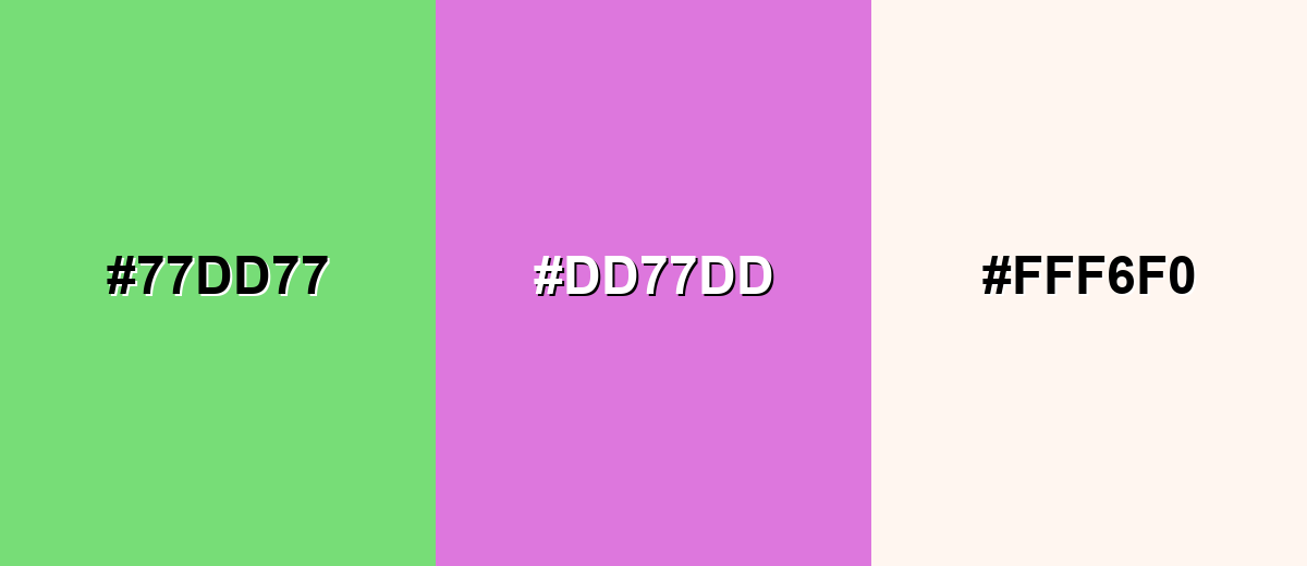
Complementary Colors
A complementary pairing adds a lively contrast by placing pastel green against a soft magenta-purple. This is useful for callouts, buttons, and focal points without turning the design harsh.
Complementary Palette Example: Keep the complementary accent smaller, and let a light neutral carry the open, breathable feel.
Analogous Color Schemes
Analogous colors sit adjacent to each other on the color wheel, creating harmonious, cohesive palettes with subtle variation.
Yellow-green, pastel green, and aqua create a smooth, nature-forward flow.
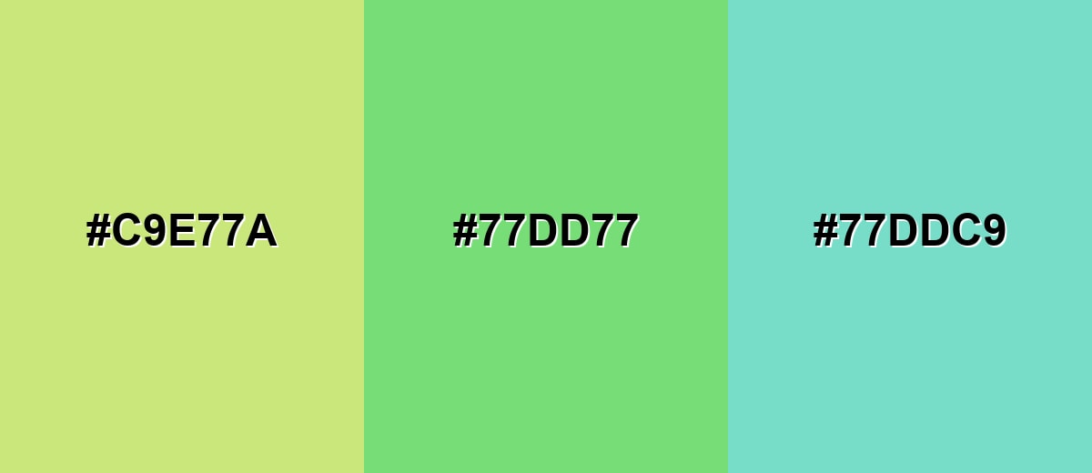
- Pale Yellow-Green: #C9E77A
- Pastel Green: #77DD77
- Soft Aqua: #77DDC9
Sage, pastel green, and sky blue feel clean and modern, especially for light UIs.
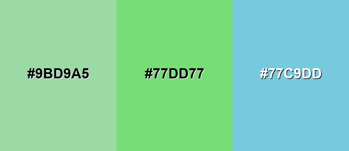
- Gentle Sage: #9BD9A5
- Pastel Green: #77DD77
- Light Sky Blue: #77C9DD
Triadic & Tetradic Combinations
A triadic palette uses three evenly spaced hues for balanced variety.
Pastel green with soft red and periwinkle creates playful contrast while staying light.
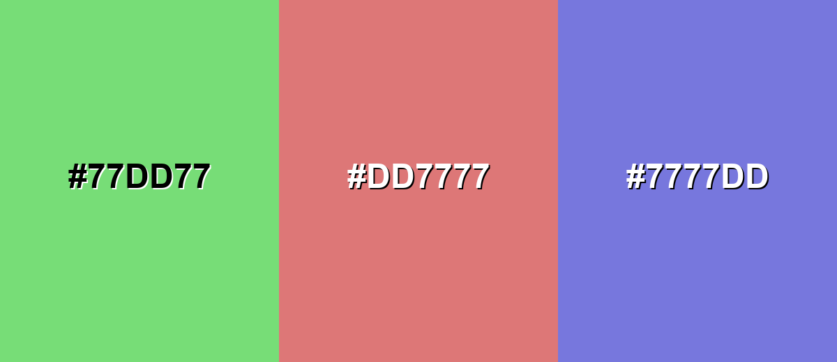
- Pastel Green: #77DD77
- Soft Coral: #DD7777
- Powder Blue: #7777DD
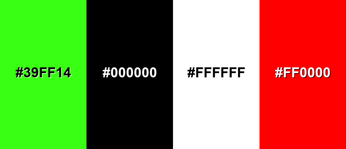
Colors to Avoid
While pastel green color is remarkably versatile, certain combinations can create problematic visual effects:
- Neon Green (#39FF14) - The intensity can overpower the softness of pastel green and make layouts feel visually noisy.
- Pure Black (#000000) - The contrast can look harsh and heavy, reducing the gentle, airy impression this shade is known for.
- Bright White (#FFFFFF) - On large areas, the combination can feel stark and can make pastel green look slightly dull by comparison.
- Primary Red (#FF0000) - The pairing can create a vibrating effect that feels urgent and distracts from calm, fresh messaging.
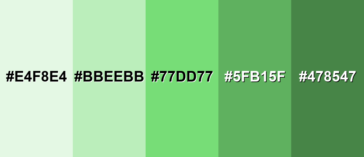
Shades, Tints & Variations of Pastel Green Color
Pastel green isn't just one "minty" tone—there's a full range from barely-there tints to deeper, muted greens that add structure. Exploring these variations makes it easier to build hierarchy (backgrounds, surfaces, buttons, and text) while keeping the same calm, fresh style.
- Mint Whisper (#E4F8E4) - A very light tint that feels airy and clean, with barely-there green. It's best used for Page backgrounds, subtle panels, and spacious layouts where text contrast is handled carefully.
- Pale Pastel Green (#BBEEBB) - A softer, lighter take that keeps the same friendly mood with less saturation. It's best used for Large UI surfaces, wellness visuals, and minimal packaging where you want gentle freshness.
- Pastel Green (#77DD77) - The classic pastel green balance: light, fresh, and easy to combine with neutrals and accents. It's best used for Primary brand accents, highlights, illustrations, and approachable product UI themes.
- Leafy Pastel (#5FB15F) - A deeper variation that adds structure while staying softer than a typical medium green. It's best used for Buttons, headings, icons, and separators when you need clearer hierarchy.
- Dusty Green Shade (#478547) - A muted, darker shade that brings contrast and depth to pastel palettes. It's best used for Text on light green tints, navigation elements, and grounding accents in layouts.
Industry Applications
Because it reads as fresh and calm, pastel green shows up in industries that benefit from approachability, cleanliness, and low-stress design. It can work as a main brand color or as a soft supporting background.
Fashion & Beauty
- Skincare and spa packaging that wants to feel gentle, clean, and reassuring.
- Wellness product labels where "fresh" and "light" matter more than bold energy.
- Spring collections, soft athleisure styling, and calm editorial looks.
- Beauty social content with botanical or "self-care" themes and airy color grading.
Interior Design & Decor
- Accent walls and décor pieces that brighten a room without feeling loud.
- Minimal home brands that lean into calm, tidy, and nature-forward aesthetics.
- Organization and home-care products where "clean and orderly" is the message.
- Soft textiles and matte finishes paired with warm wood for a balanced look.
Branding & Marketing
- Landing pages for wellness, sustainability, and gentle care positioning.
- Food and beverage promos for plant-forward or ingredient-focused product lines.
- Education and kids products that need friendly visuals without high intensity.
- Tech and SaaS UI states like success messages and calm dashboard themes.
Conclusion
Pastel green (#77DD77) is a reliable choice when you want design work to feel fresh, calm, and approachable—without slipping into dull or overly "cute" territory. Use it as a soft base for backgrounds and surfaces, then bring in clearer hierarchy with deeper green variations, defined dividers, and strong text contrast. When you pair it with light neutrals and a confident accent (instead of harsh black or high-intensity neon), pastel green stays flexible across branding, UI, packaging, and visual content.
Design Smarter with AI: Media.io is an online AI studio that empowers creators with advanced image generation and enhancement tools. From text-to-image and image-to-image creation to AI upscaling and color optimization, it enables fast, creative, and professional results—all in your browser.

Frequently Asked Questions About Pastel Green Color
It is a light, softened green similar to new leaves, mint candy, or a gentle spring grass tone. It feels bright but not intense, which is why it often reads as airy and clean.
A common reference HEX value for pastel green is #77dd77. This code is widely used in digital design to keep the shade consistent across pages and graphics.
For screens, it converts to RGB 119, 221, 119. For print workflows, a practical CMYK approximation is 46%,0%,46%,13%, though exact results can vary by printer, ink, and paper.
Soft lavender, pale aqua, powder blue, gentle sage, and warm apricot are reliable partners. Neutrals like cream and off-white keep it light, while a deeper green shade can add structure and contrast.
Yes, it can work well for backgrounds, cards, and sections because it is easy on the eyes. The key is to test contrast for text and icons so important elements stay readable on lighter green surfaces.
Mint green often leans slightly cooler and more cyan, while pastel green is typically a more balanced light green. In practice, both are soft, but mint can feel a bit crisper and more icy compared to pastel green's leafier warmth.


