

Honeysuckle color is a vivid, warm pink with a rosy-magenta edge, similar to the bright petals you see on honeysuckle blooms.
Its hex code is #D94F70, giving it a lively look that still feels approachable for branding, UI accents, packaging, and decor.
Honeysuckle Color: Codes & Values
If you want honeysuckle to look consistent across web, print, and product design, start with these core color values.
| Parameters | VALUE |
| HEX Code | #D94F70 |
| RGB DECIMAL | 217, 79, 112 |
| RGB PERCENTAGE | 85%, 31%, 44% |
| CMYK | 0%,64%,48%,15% |
| HSL | 346°, 65%, 58% |
| HSV (HSB) | 346°, 64%, 85% |
| Web Safe | #CC6666 |
Key Color Space Explanations:
- HEX - HEX is the most common code for web and UI work. Use #d94f70 to reproduce honeysuckle consistently across sites, apps, and design tools.
- RGB - RGB mixes red, green, and blue light for screens. Honeysuckle is rgb(217,79,112), which explains its bright, warm pink appearance on digital displays.
- CMYK - CMYK is used for printing with ink. The values 0%,64%,48%,15% help printers approximate honeysuckle on paper, though stock and coatings can shift the result.
- HSL - HSL describes hue, saturation, and lightness in an intuitive way for designers. Honeysuckle sits near 346° with strong saturation, making it feel bold but still soft enough to pair with neutrals.
- Web Safe - Web safe is the closest legacy palette match for older displays. For honeysuckle, the nearest web-safe equivalent is #cc6666.
Use HEX/RGB for screens and UI components, and switch to CMYK when you're preparing files for print—then proof if accuracy really matters.
Honeysuckle Color Conversions
Here's a handy conversion table you can copy into your workflow when you need honeysuckle across different tools and color models.
| Parameters | VALUE | CSS |
| HEX | #d94f70 | #d94f70 |
| RGB DECIMAL | 217, 79, 112 | rgb(217,79,112) |
| RGB PERCENTAGE | 85%, 31%, 44% | rgb(85%,31%,44%) |
| CMYK | 0%,64%,48%,15% | cmyk(0%,64%,48%,15%) |
| HSL | 346°, 65%, 58% | hsl(346°,65%,58%) |
| HSV (or HSB) | 346°, 64%, 85% | -- |
| Web Safe | cc6666 | #cc6666 |
| CIE-LAB | 54.0, 57.0, 10.8 | -- |
| XYZ | 34.4, 21.6, 17.7 | -- |
| xyY | 0.467, 0.293, 21.6 | -- |
| CIE-LCH | 54.0, 58.0, 11° | -- |
| CIE-LUV | 54.0, 94.7, 2.6 | -- |
| Hunter-Lab | 46.5, 54.9, 8.0 | -- |
| Binary | 110110010100111101110000 | -- |
Want to generate Honeysuckle Color photos or posters? Try Media.io's AI Image Generator now!
Honeysuckle Color Meaning & Symbolism
Honeysuckle is commonly associated with warmth, upbeat energy, and a friendly kind of confidence. Because it sits between pink and magenta, it often reads as romantic and playful, but also modern and attention-grabbing. In everyday life, it shows up when you want a message to feel welcoming, expressive, and a little bold.
Psychological Effects
In design, honeysuckle tends to influence how "alive" and personable a layout feels.
- Lively Energy - A saturated rosy pink can create momentum, which is why it's often used for highlights and key moments.
- Encouraging Tone - Honeysuckle feels upbeat and supportive, helping calls to action look friendly instead of harsh.
- Human Warmth - Compared with cooler pinks or purples, it can make interfaces and visuals feel more personal.
- Risk Of Visual Loudness - Overusing it in dense layouts can feel noisy or overly sweet, especially across long reading experiences.
- Balance Improves Clarity - Pairing it with calm supporting tones and neutral spacing makes the color's impact feel intentional, not overwhelming.
Positive Associations
These are common "good vibes" honeysuckle brings when it's used with restraint.
- Optimism - Its brightness can make a design feel hopeful and forward-looking.
- Affection - The pink-magenta range often reads as caring, romantic, or emotionally open.
- Confidence - A bold floral tone can feel expressive and self-assured without going neon.
- Approachability - Balanced with soft neutrals, it keeps visuals welcoming and easy to engage with.
- Celebration - Honeysuckle naturally fits festive themes, gifting, and upbeat seasonal campaigns.
Cultural Significance Across the World
Floral pinks can shift meaning by context, so it helps to let your typography, imagery, and brand voice do some of the work.
- Joyful Connection - Honeysuckle color symbolism frequently overlaps with ideas of joy and lively connection.
- Youthful Spirit - Bright rosy tones are often linked with youthfulness and playful expression in modern visuals.
- Romantic Styling - In many settings, pink-magenta hues signal romance and affectionate intent, especially in floral themes.
- Message Depends On Context - The same shade can feel bold and modern or sweet and delicate depending on surrounding neutrals, contrast, and layout density.
Design Applications
Honeysuckle is easiest to use when you treat it as an accent that brings energy into a palette, while calmer tones carry most of the layout.
Graphic Design Tips
- Use honeysuckle for primary actions, badges, and key highlights where you want a friendly punch.
- Keep large backgrounds light and neutral, then introduce honeysuckle through buttons, labels, or small blocks.
- If you need a softer look, use a lighter tint for surfaces and reserve the full tone for active/hover states.
- Balance the warmth with cool greens or teals for modern contrast, or pair it with warm off-whites for an editorial feel.
- Test contrast for small UI elements (icons, links, chips), not just big headings—mid-tone pinks can be tricky with white text.
If honeysuckle is doing the "attention" job in your layout, let spacing and neutrals do the "clarity" job—your hierarchy will feel instantly cleaner.
Honeysuckle Color in Photography & Video
- Use honeysuckle props (flowers, fabrics, packaging) as a focal pop against soft, neutral backgrounds.
- Expect it to look slightly brighter on backlit screens, so review your grade on the target device before publishing.
- In warm indoor lighting, honeysuckle can read deeper and redder; adjust white balance to keep it rosy instead of brick-toned.
- For beauty and product shots, honeysuckle works well in small accents that guide the eye without overpowering skin tones.
- When adding text over honeysuckle areas, use darker typography or add subtle separation (shadow/border) for readability.
Recommended Tool for Image Enhancement: When incorporating honeysuckle color into your photography projects, Media.io's AI Image tools can help you achieve more refined results. With AI-powered color enhancement, photo colorization, image upscaling, and old photo restoration, you can easily enrich honeysuckle color tones, improve overall image quality, and highlight the color's elegant and sophisticated aesthetic.
Color Combinations
Honeysuckle pairs well with crisp cool tones that balance its warmth, plus light neutrals that let it stand out. The palettes below cover high-contrast options, softer neighbors, and multi-color schemes for flexible design systems.
Complementary Colors
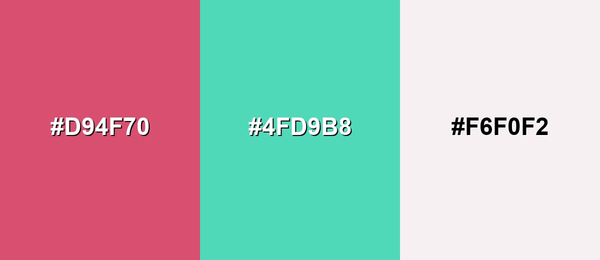
A complementary pairing places honeysuckle against a cool green-teal opposite on the wheel, creating bold contrast that still feels fresh and modern.
Complementary Palette Example: Use Honeysuckle with Seafoam Teal and a Soft Pearl neutral for vibrant accents that stay clean and readable.
Analogous Color Schemes
Analogous colors sit adjacent to each other on the color wheel, creating harmonious, cohesive palettes with subtle variation.
Berry Pink, Honeysuckle, and Coral Peach create a warm, floral blend with smooth transitions.
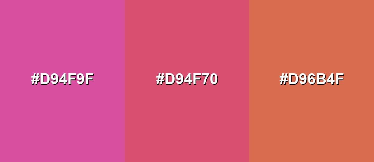
- Berry Pink: #D94F9F
- Honeysuckle: #D94F70
- Coral Peach: #D96B4F
Warm Rose, Honeysuckle, and Rose Violet keep the energy high while staying cohesive.
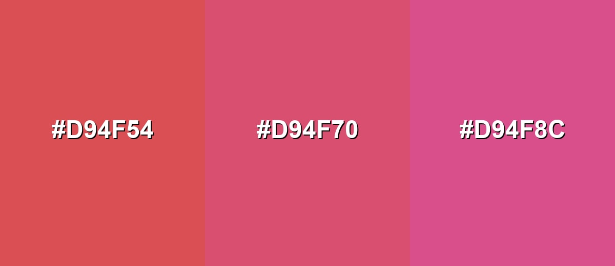
- Warm Rose: #D94F54
- Honeysuckle: #D94F70
- Rose Violet: #D94F8C
Triadic & Tetradic Combinations
A triadic scheme balances honeysuckle with two evenly spaced hues for a playful, high-contrast palette.
Honeysuckle, Fresh Green, and Cornflower Blue work well for bold graphics, campaigns, and illustrative UI.
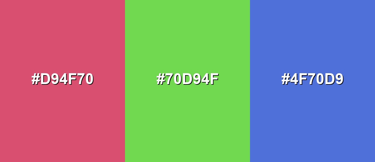
- Honeysuckle: #D94F70
- Fresh Green: #70D94F
- Cornflower Blue: #4F70D9
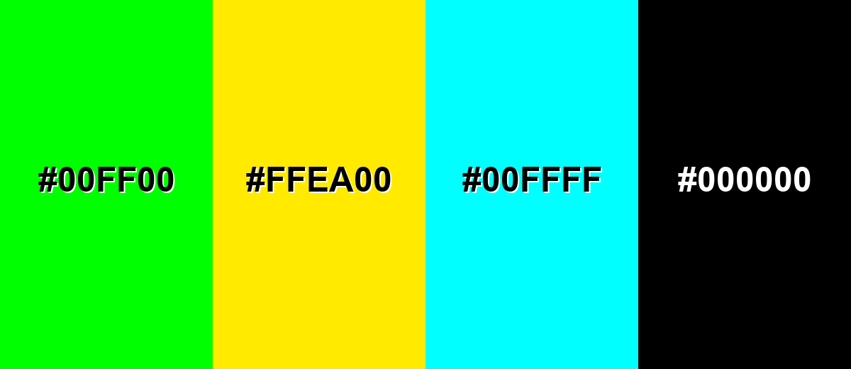
Colors to Avoid
While honeysuckle color is remarkably versatile, certain combinations can create problematic visual effects:
- Pure Neon Green (#00FF00) - High saturation clashes with honeysuckle and can make layouts feel noisy and hard to focus on.
- Electric Yellow (#FFEA00) - Both tones compete for attention, which can overwhelm interfaces and reduce hierarchy.
- Bright Cyan (#00FFFF) - The contrast can feel harsh and create a fluorescent effect, especially on screens.
- Flat Black (#000000) - The jump can look heavy and abrupt; softer charcoals or off-whites usually pair more smoothly.
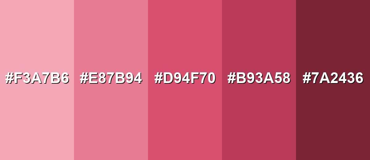
Shades, Tints & Variations of Honeysuckle Color
From airy tints to deeper, more grounded tones, honeysuckle has a surprisingly usable range. These variations help you build hierarchy (backgrounds, surfaces, accents, and emphasis) without losing the signature rosy-magenta character.
- Light Honeysuckle (#F3A7B6) - A gentle, airy tint that keeps the rosy character while feeling softer and more spacious. It's best used for Large backgrounds, subtle panels, and friendly editorial layouts..
- Blush Honeysuckle (#E87B94) - A balanced mid-light option that feels warm and modern without being too loud. It's best used for Cards, banners, product tiles, and secondary brand accents..
- Classic Honeysuckle (#D94F70) - The core honeysuckle shade: vivid, warm, and attention-friendly with a magenta-leaning rose tone. It's best used for Buttons, highlights, logos, and key visual moments..
- Deep Honeysuckle (#B93A58) - A darker, richer variation that feels more mature and grounded while staying expressive. It's best used for Headlines, premium packaging accents, and strong UI states..
- Dark Raspberry (#7A2436) - A deep, wine-leaning shade with a moody finish that reduces sweetness and adds weight. It's best used for Text overlays on light tints, dramatic branding, and high-contrast details..
Industry Applications
Because honeysuckle sits between cheerful pink and modern magenta, it adapts well across industries when it's matched to the right supporting tones.
Fashion & Beauty
- Use it for statement pieces and seasonal drops where you want energy and instant shelf appeal.
- It works as a sporty accent in trims, typography, or small graphic hits without dominating the whole look.
- In cosmetics, honeysuckle naturally supports lip, blush, and fragrance visuals that lean warm and confident.
- Pair it with clean neutrals in campaigns to keep the overall styling modern rather than overly sweet.
Interior Design & Decor
- Bring honeysuckle in through cushions, art, ceramics, or textiles for a friendly pop that's easy to swap out.
- In natural light it can look more rosy; under warm indoor lighting it may appear deeper and redder.
- Combine with warm whites and light woods for a cozy, approachable feel.
- Add muted green or teal accessories to balance the sweetness and keep the room feeling fresh.
Branding & Marketing
- Honeysuckle signals approachable confidence and helps brands feel expressive and current.
- Reserve the strongest saturation for logos, marks, or signature moments so it stays recognizable.
- For packaging and retail thumbnails, it helps products pop—especially when grounded with consistent neutrals.
- In digital products, it's great for engagement moments (primary actions, promos), but works best with careful contrast checks.
Conclusion
Honeysuckle color (#D94F70) is a vivid rosy pink that feels warm, expressive, and modern—ideal when you want designs to look inviting without drifting into neon. It performs best as an accent: use it for buttons, highlights, and brand moments, then lean on soft neutrals for breathing room and readability. For pairings, teals and cool greens add crisp contrast, while warm off-whites keep things clean and editorial. With the right spacing, hierarchy, and contrast testing, honeysuckle delivers energy and personality across UI, packaging, interiors, and campaigns.
Design Smarter with AI: Media.io is an online AI studio that empowers creators with advanced image generation and enhancement tools. From text-to-image and image-to-image creation to AI upscaling and color optimization, it enables fast, creative, and professional results—all in your browser.

Frequently Asked Questions About Honeysuckle Color
It's a warm, vivid pink with a rosy-magenta edge. Compared with pastel pinks, it looks brighter and more energetic, and it often feels similar to bold floral petals.
A commonly used digital hex for honeysuckle is #d94f70. It's a reliable reference for UI design, web graphics, and general brand systems.
It sits between the two, but it typically leans slightly toward magenta. That's why it feels bolder than classic rose pink while still staying warm.
Cool greens and teals create clean contrast, while warm off-whites and soft neutrals keep it light and modern. For playful schemes, add a bright green or a clear blue in small doses.
You can, but it's usually better as an accent or in a lighter tint for large areas. If you use it as a background, check text contrast carefully and keep typography simple.
Not always. Print can make it look deeper or slightly redder depending on paper, ink limits, and finish, so a proof or test print helps preserve the intended look.


