

Apple green color is a bright yellow-green that looks like the fresh, slightly golden skin of a green apple. Its signature HEX code is #8DB600, giving it a lively, zesty feel that stays readable when it's balanced with calm neutrals.
Because it sits between yellow and green, it can look warmer in sunlight and a bit sharper under cool LEDs—something worth noting for both screen design and print. Below, you'll find apple green codes, conversions, meaning, pairings, and practical ways to use it.
Apple Green Color: Codes & Values
Use these standard values to keep apple green consistent across web, UI, video, and print workflows.
| Parameters | VALUE |
| HEX Code | #8DB600 |
| RGB DECIMAL | 141, 182, 0 |
| RGB PERCENTAGE | 55%, 71%, 0% |
| CMYK | 23%,0%,100%,29% |
| HSL | 74°, 100%, 36% |
| HSV (HSB) | 74°, 100%, 71% |
| Web Safe | #99CC00 |
Key Color Space Explanations:
- HEX - HEX is the most common way to specify a screen-ready value for digital design. Use it in CSS, design tools, and UI systems for consistent rendering.
- RGB - RGB defines how much red, green, and blue light is mixed to display the hue on screens. It is ideal for web, video, and app interfaces.
- CMYK - CMYK is used for ink-based printing and packaging. Values can shift by paper and printer profiles, so always soft-proof or request a test print.
- HSL - HSL describes hue, saturation, and lightness in a way that makes adjustments intuitive. It helps when you need quick tints, shades, or UI states like hover and active.
- Web Safe - Web safe is the closest palette-aligned approximation used in older display constraints. It is mainly useful for reference and legacy workflows.
If you're building a design system, set #8DB600 as the source-of-truth token, then generate tints/shades from HSL so hover, active, and disabled states stay visually related.
Apple Green Color Conversions
This conversion table makes it easy to copy apple green values into design tools, CSS, and print specs.
| Parameters | VALUE | CSS |
| HEX | #8db600 | #8db600 |
| RGB DECIMAL | 141, 182, 0 | rgb(141,182,0) |
| RGB PERCENTAGE | 55%, 71%, 0% | rgb(55%,71%,0%) |
| CMYK | 23%,0%,100%,29% | cmyk(23%,0%,100%,29%) |
| HSL | 74°, 100%, 36% | hsl(74°,100%,36%) |
| HSV (or HSB) | 74°, 100%, 71% | -- |
| Web Safe | 99cc00 | #99cc00 |
| CIE-LAB | 69.4, -36.5, 70.8 | -- |
| XYZ | 27.8, 39.2, 6.1 | -- |
| xyY | 0.380, 0.536, 0.392 | -- |
| CIE-LCH | 69.4, 79.7, 117.4° | -- |
| CIE-LUV | 69.4, -20.3, 79.5 | -- |
| Hunter-Lab | 62.6, -27.8, 37.6 | -- |
| Binary | 100011011011011000000000 | -- |
Want to generate Apple Green Color photos or posters? Try Media.io's AI Image Generator now!
Apple Green Color Meaning & Symbolism
Apple green is widely associated with freshness, new beginnings, and a sense of healthy momentum. In everyday life, it often reads as upbeat and outdoorsy, like crisp produce and early spring growth. This practical, optimistic vibe is a big part of Apple Green Color meaning when people use it in visuals and spaces.
Psychological Effects
In most palettes, apple green adds energy and quick visual clarity.
- Energizing - Feels active and lively without the intensity of neon greens.
- Attention-Grabbing - The yellow-leaning hue naturally pulls focus, making it useful for highlights and key UI moments.
- Clean Momentum - Suggests progress and "moving forward," which works well for positive states and achievements.
- Playful Edge - Adds a youthful tone that can make a brand feel more approachable and modern.
- Overstimulation Risk - In large blocks, it can feel loud or tiring, especially on bright screens.
Positive Associations
These are common "at-a-glance" meanings audiences attach to apple green.
- Freshness - Strong food and produce cues make it feel crisp and newly made.
- Growth - Reads as springlike and growth-oriented, tied to plants and renewal.
- Optimism - The warm yellow influence adds a sunny, upbeat vibe.
- Health - Often used in wellness and clean-living visuals because it feels light and active.
- Simplicity - Works well in modern layouts where a single bright accent creates clear hierarchy.
Cultural Significance Across the World
Meanings shift by context, but these themes show up frequently in global design.
- Nature & Renewal - Commonly connects to plant life, outdoors, and the idea of restarting.
- Youthful Energy - Brighter greens like apple green often signal a younger, more playful tone.
- Food Signaling - "Green apple" cues can influence how people read flavors, freshness, and ingredients.
- Clean-Living Messaging - Often supports eco-adjacent and wellness narratives when paired with neutrals.
Design Applications
Apple green works best as an accent that adds life and direction to a palette. Before you apply it broadly, decide whether you want a fresh, friendly feel or a more energetic, attention-grabbing impact.
Graphic Design Tips
- Use apple green for key accents (badges, tags, icons) rather than full-page backgrounds.
- Pair it with quiet neutrals to prevent the layout from feeling sharp or overly busy.
- Build hierarchy by reserving apple green for one role (CTA, status, or highlight) and keeping the rest consistent.
- Create depth by mixing it with darker green shades for headings and dividers instead of relying on pure black.
- For print, request a proof—yellow-heavy greens can shift depending on paper brightness and color profiles.
Pro tip: If apple green feels too "loud," reduce saturation slightly (HSL) for large areas and keep the original #8DB600 for small, high-impact elements like buttons, toggles, and chart highlights.
Apple Green Color in Photography & Video
- In product shots, apple green props can add a clean, fresh cue without stealing attention from the subject.
- For outdoor footage, it can look warmer in sunlight—watch white balance so it doesn't drift yellow.
- Under cool LEDs, apple green may appear sharper; soften with neutral backgrounds or warmer practical lights.
- Use it in motion graphics for success states, progress moments, and upbeat transitions.
- For color grading, keep skin tones protected—use apple green as a selective accent rather than a global push.
Recommended Tool for Image Enhancement: When incorporating apple green color into your photography projects, Media.io's AI Image tools can help you achieve more refined results. With AI-powered color enhancement, photo colorization, image upscaling, and old photo restoration, you can easily enrich apple green color tones, improve overall image quality, and highlight the color's elegant and sophisticated aesthetic.
Color Combinations
Apple green pairs best with grounded neutrals and cool opposites that calm its brightness. Use the schemes below as starting points, then adjust lightness and saturation to match your layout, brand voice, or material finish.
Complementary Colors
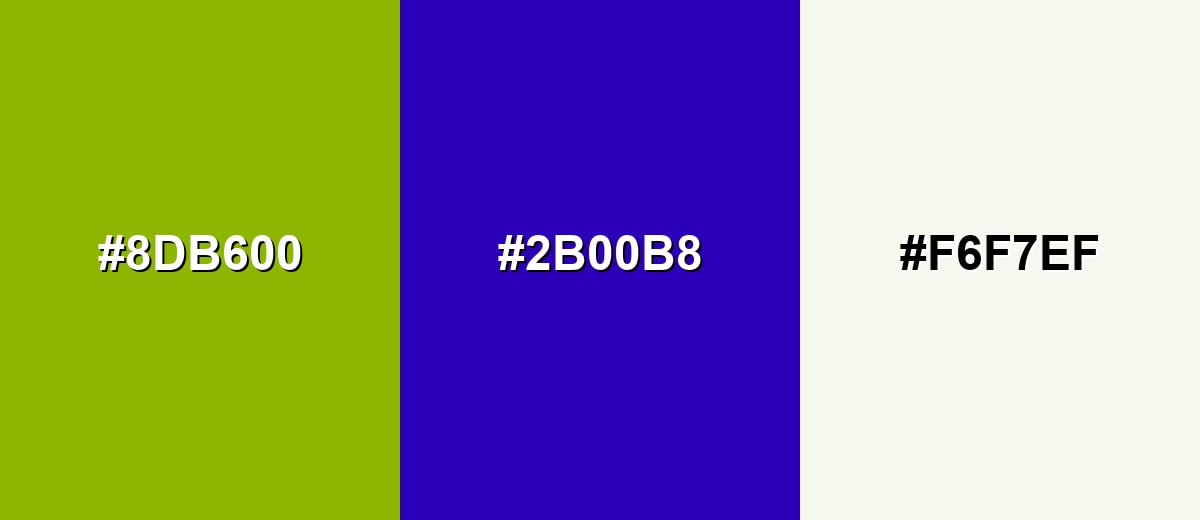
A complementary palette uses the opposite hue on the color wheel to create punchy contrast. With apple green, the opposite family leans toward blue-violet, which makes highlights feel vivid and modern.
Complementary Palette Example: Use apple green for primary accents, blue-violet for bold contrast moments, and an off-white to keep the composition breathable.
Analogous Color Schemes
Analogous colors sit adjacent to each other on the color wheel, creating harmonious, cohesive palettes with subtle variation.
Yellow-lime to apple green to fresh green creates a smooth, nature-forward blend that feels bright but cohesive.
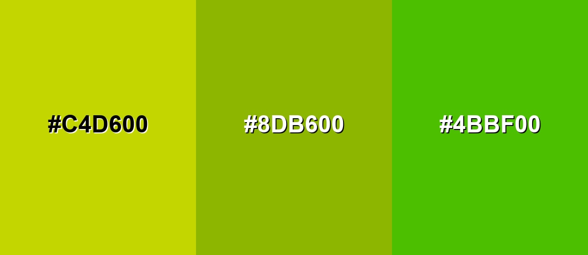
- Yellow Lime: #C4D600
- Apple Green: #8DB600
- Fresh Green: #4BBF00
Muted lime, apple green, and olive green form a more grounded analogous set for understated branding and packaging.
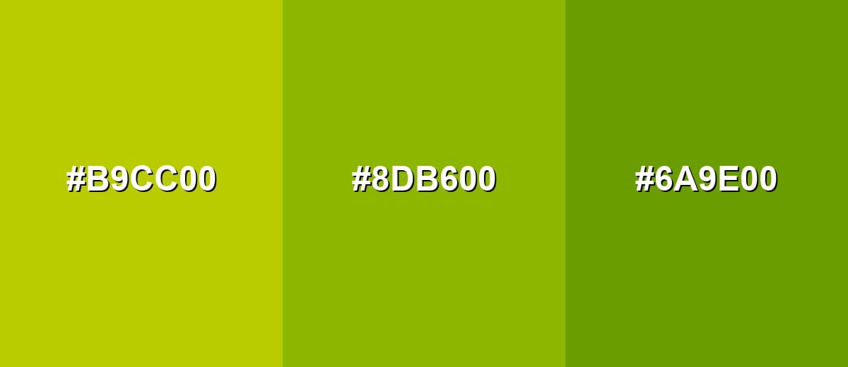
- Muted Lime: #B9CC00
- Apple Green: #8DB600
- Olive Green: #6A9E00
Triadic & Tetradic Combinations
A triadic scheme uses three evenly spaced hues for balance and variety.
Apple green with teal and magenta gives you a playful, high-contrast palette that still feels organized when each tone has a clear role.
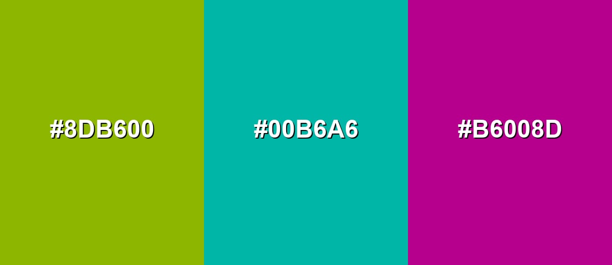
- Apple Green: #8DB600
- Teal: #00B6A6
- Magenta: #B6008D
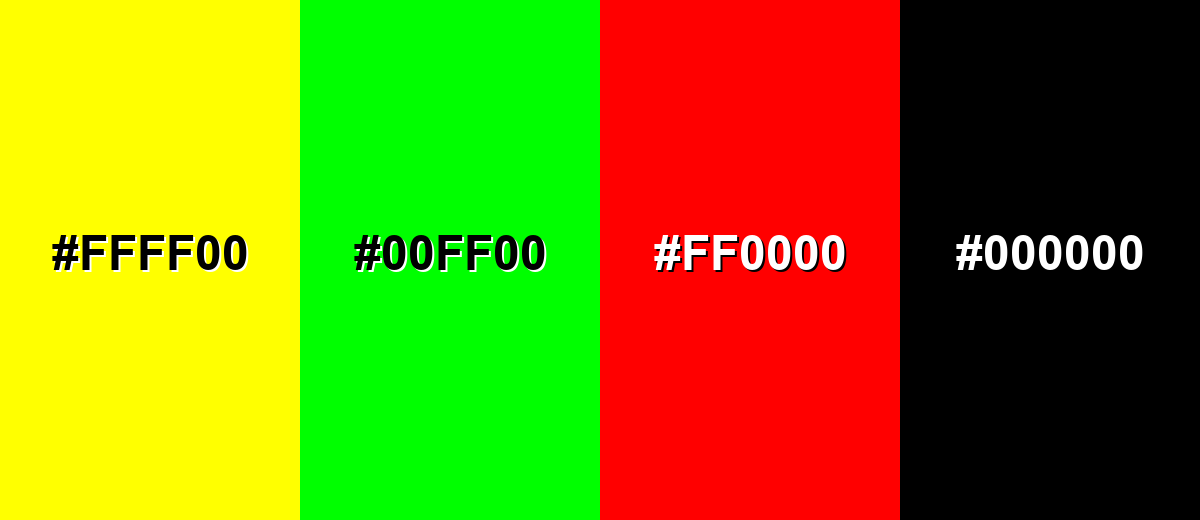
Colors to Avoid
While apple green color is remarkably versatile, certain combinations can create problematic visual effects:
- Pure Yellow (#FFFF00) - Too close in brightness and warmth, which can make the palette feel glaring and reduce hierarchy.
- Neon Green (#00FF00) - Creates a high-intensity mix that reads artificial and can become visually tiring, especially on screens.
- Pure Red (#FF0000) - Can cause strong visual vibration with yellow-greens and may communicate conflicting signals in UI states.
- Pure Black (#000000) - The jump in contrast can look harsh and make apple green feel sharper than intended unless carefully softened with spacing and neutrals.
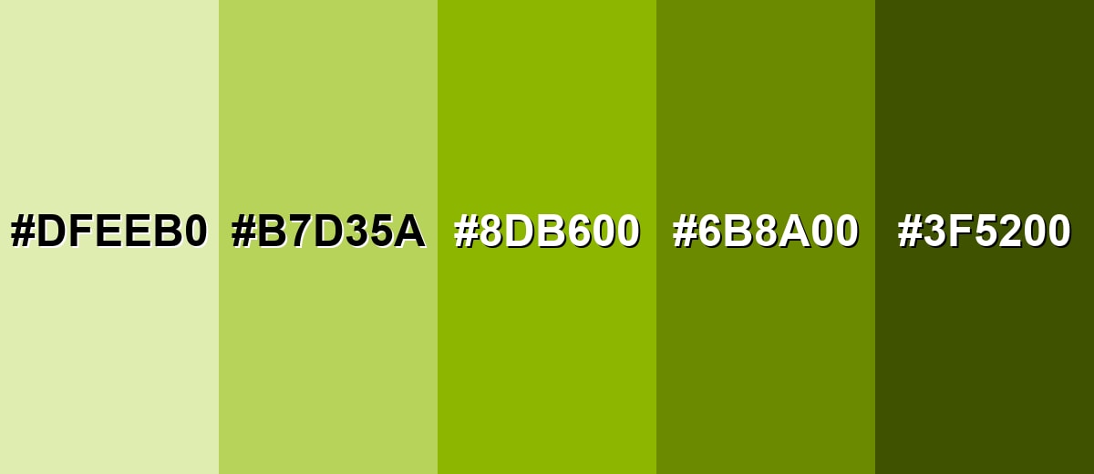
Shades, Tints & Variations of Apple Green Color
Apple green isn't just one "pop" shade—there's a full range from airy tints to earthy, olive-leaning darks. Having a few variations helps you keep the same fresh personality while improving contrast, readability, and flexibility across components.
- Pale Apple Green (#DFEEB0) - A light tint that keeps the cheerful apple note while feeling softer and more airy. It's best used for Background panels, subtle highlights, and spacious web sections..
- Soft Apple Green (#B7D35A) - A mellow, friendly version with less intensity than the main hue. It's best used for Secondary buttons, charts, and supportive brand accents..
- Classic Apple Green (#8DB600) - The bright, crisp reference shade that sits between yellow and green. It's best used for Primary accents, icons, tags, and energetic visual cues..
- Deep Apple Green (#6B8A00) - A darker shade that feels more grounded while still reading fresh. It's best used for Text on light tints, headers, and more mature brand palettes..
- Dark Olive Green (#3F5200) - A low-light, earthy variation that adds weight and contrast control. It's best used for Borders, typography on pale greens, and premium packaging details..
Industry Applications
Because apple green feels fresh and active, it shows up in industries that want to communicate momentum, simplicity, or nature-adjacent benefits. The key is to match saturation to the product tone: brighter for energy, softer for calm confidence.
Fashion & Beauty
- Sporty accents on athleisure graphics where a "fresh energy" cue helps the look feel faster and lighter.
- Wellness-forward packaging and labels that want to suggest clean ingredients and everyday vitality.
- Limited-edition colorways where apple green becomes the hero accent against neutrals.
- Category coding for multi-product collections (especially where high visibility improves shelf scanning).
Interior Design & Decor
- Crisp pops on pillows, throws, and small décor that brighten a room without overwhelming it.
- Accent walls in small doses (like nooks or feature sections) for a springlike, upbeat feel.
- Pairing with warm woods and creams to keep the palette inviting rather than harsh.
- Using darker green variations for contrast control in trims, borders, and detail elements.
Branding & Marketing
- Freshness cues for food and beverage branding, flavor callouts, and produce-inspired visuals.
- Tech and app UI elements like progress, success states, badges, and onboarding highlights.
- Youth and education materials where a playful, approachable tone improves engagement.
- Eco-adjacent messaging that needs a lively green without going full neon.
Conclusion
Apple green stands out for its crisp yellow-green character that feels both lively and clean. It's especially useful when you need a modern accent that signals growth, positivity, or forward motion without drifting into neon. In branding, UI, and visual communication, it works best when paired with calming neutrals or deeper greens so the hierarchy stays clear. If you're building a palette from scratch, starting with #8DB600 helps you anchor consistent digital and print conversions—and when it's used thoughtfully, apple green brings energy to layouts while still leaving room for readable typography and balanced contrast.
Design Smarter with AI: Media.io is an online AI studio that empowers creators with advanced image generation and enhancement tools. From text-to-image and image-to-image creation to AI upscaling and color optimization, it enables fast, creative, and professional results—all in your browser.

Frequently Asked Questions About Apple Green Color
Apple green is a bright yellow-green inspired by the look of fresh green apple skin. It sits between yellow and green, so it often feels both sunny and natural.
They are similar, but not identical. Lime green is typically more neon and electric, while apple green is usually a little more earthy and slightly softer, making it easier to use in broader palettes.
For the reference shade in this guide, RGB is 141, 182, 0 and CMYK is 23%,0%,100%,29%. For print, results can vary by paper and color profile, so proofing is recommended.
It pairs well with off-whites, warm grays, and charcoals for balance. For stronger contrast, blue-violet complements it nicely, and teal can add a clean, modern feel.
It is better as an accent than as body text, especially on white backgrounds. For readable text, use a darker green or charcoal, and reserve apple green for icons, badges, borders, and highlights.
Screens mix light (RGB), while print relies on inks (CMYK), and yellow-heavy greens can shift noticeably depending on calibration, paper brightness, and ink limits. Converting with a color-managed workflow reduces surprises.


