

Powder blue color is a pale, misty blue with a soft, slightly green-leaning tint that feels light and powdery in real life. Its most common digital reference is hex #b0e0e6, which sits in the pastel range and reads as gentle rather than bold.
People often perceive it as calm, fresh, and reassuring, with a clean, airy vibe. Below, you'll find powder blue color codes, conversions, pairings, shade ideas, and practical ways to use it across design and everyday visuals.
Powder Blue Color: Codes & Values
If you want consistent powder blue across screens and print, start with these core values and use them in your brand guide, UI styles, or production files.
| Parameters | VALUE |
| HEX Code | #B0E0E6 |
| RGB DECIMAL | 176, 224, 230 |
| RGB PERCENTAGE | 69.0%, 87.8%, 90.2% |
| CMYK | 23%,3%,0%,10% |
| HSL | 187°, 52%, 80% |
| HSV (HSB) | 187°, 24%, 90% |
| Web Safe | #99CCFF |
Key Color Space Explanations:
- HEX - HEX is the most common way to define a screen-ready shade in web design. Use it in CSS, design systems, and brand guidelines for consistent rendering.
- RGB - RGB mixes red, green, and blue light to display the shade on screens. It is the go-to format for UI work, video, and anything displayed digitally.
- CMYK - CMYK is used for printing and describes how much cyan, magenta, yellow, and black ink is applied. It helps approximate the shade on paper, though results vary by stock and finish.
- HSL - HSL describes the shade by hue, saturation, and lightness, which is intuitive for adjusting pastels. It is especially useful for building tints, shades, and hover states.
- Web Safe - Web safe values are a simplified palette historically used to reduce display differences. Today it is mainly helpful as a compatibility reference or quick fallback.
Use HEX for web and UI, RGB for digital content like video, and CMYK when preparing print files—then proof pastels to confirm the final look.
Powder Blue Color Conversions
Need the same powder blue in different tools? These conversions help you match the shade across design apps, CSS, and print workflows.
| Parameters | VALUE | CSS |
| HEX | #b0e0e6 | #b0e0e6 |
| RGB DECIMAL | 176, 224, 230 | rgb(176,224,230) |
| RGB PERCENTAGE | 69.0%, 87.8%, 90.2% | rgb(69.0%,87.8%,90.2%) |
| CMYK | 23%,3%,0%,10% | cmyk(23%,3%,0%,10%) |
| HSL | 187°, 52%, 80% | hsl(187°,52%,80%) |
| HSV (or HSB) | 187°, 24%, 90% | -- |
| Web Safe | 99ccff | #99ccff |
| CIE-LAB | 86.7, -12.2, -6.8 | -- |
| XYZ | 63.4, 71.0, 85.2 | -- |
| xyY | 0.288, 0.322, 71.0 | -- |
| CIE-LCH | 86.7, 14.0, 209.0 | -- |
| CIE-LUV | 86.7, -18.2, -10.4 | -- |
| Hunter-Lab | 84.3, -9.6, -4.9 | -- |
| Binary | 10110000 11100000 11100110 | -- |
Want to generate Powder Blue Color photos or posters? Try Media.io's AI Image Generator now!
Powder Blue Color Meaning & Symbolism
Powder blue is widely associated with calm, clarity, and softness. Because it is light and gentle, it often reads as approachable and clean in everyday visuals, from interfaces to interiors. In practical terms, the Powder Blue Color meaning tends to support a relaxed mood without feeling heavy or dramatic.
Psychological Effects
In many designs, powder blue helps reduce visual pressure and keeps attention steady.
- Calm - Its low intensity can make a layout feel quieter and less demanding to look at.
- Clarity - The airy tone supports clean structure, helping content feel easier to scan.
- Freshness - With its cool, misty feel, it often suggests cleanliness and a "just refreshed" look.
- Trust - Compared with deeper blues, it can signal care and reliability without feeling formal.
- Coolness - Overuse can feel chilly or sterile, especially on glossy screens or in cool lighting.
Positive Associations
These are the most common "good vibes" designers lean on when choosing powder blue.
- Softness - The pastel finish feels gentle and approachable rather than intense.
- Clean Aesthetic - It pairs naturally with white and cool neutrals for an orderly look.
- Breathable Space - Large areas of powder blue can make pages and rooms feel more open.
- Modern Minimalism - It supports a light, contemporary style without loud saturation.
- Reassurance - It can communicate comfort and care, especially in service-focused visuals.
Cultural Significance Across the World
Like most color meanings, context matters—pairings, typography, and setting influence how it's read.
- Gentle Occasions - Often chosen for ceremonies and events that aim for softness and calm.
- Everyday Wear - Common in apparel when the goal is a clean, polished, non-flashy look.
- Calming Spaces - Frequently used in environments designed to feel soothing and low-stress.
- Context-Driven Symbolism - Meanings shift by audience, so testing the palette in real comps is key.
Design Applications
Powder blue is easiest to use when you treat it as a base tone and let contrast do the heavy lifting. It performs well on large areas, subtle UI surfaces, and background blocks where you want softness without losing a clean, modern look.
Graphic Design Tips
- Use It as a Base - Apply powder blue to backgrounds, cards, and section blocks to keep layouts light.
- Anchor with Dark Neutrals - Pair it with a deep, slate-like text color for crisp readability.
- Save Accents for Actions - Keep buttons and key highlights in stronger accent colors so they stand out.
- Build a Soft System - Create tints and deeper companion tones for hover states, borders, and UI hierarchy.
- Design for Contrast Early - Avoid small white text on powder blue and add shape cues (borders/icons) for accessibility.
Pro tip: If powder blue feels a little cold, warm the overall composition with off-white backgrounds, natural textures, and a small amount of peach-toned accenting.
Powder Blue Color in Photography & Video
- Choose Soft Lighting - Diffused light keeps the pastel look smooth and prevents harsh, icy highlights.
- Watch White Balance - A cooler balance can push it toward sterile; a slightly warmer balance keeps it inviting.
- Use Neutrals for Styling - Whites, linens, and light wood props help powder blue read airy and premium.
- Control Contrast in Grade - Gentle contrast preserves the "powdery" feel better than heavy clarity or sharpening.
- Keep Skin Tones Natural - Balance cyan/green undertones carefully so people don't look washed out.
Recommended Tool for Image Enhancement: When incorporating powder blue color into your photography projects, Media.io's AI Image tools can help you achieve more refined results. With AI-powered color enhancement, photo colorization, image upscaling, and old photo restoration, you can easily enrich powder blue color tones, improve overall image quality, and highlight the color's elegant and sophisticated aesthetic.
Color Combinations
Because powder blue is light and cool-leaning, it pairs well with grounded dark neutrals, warm pastels, and gentle greens. The palettes below show reliable directions for branding, UI, and styling that keep the look balanced.
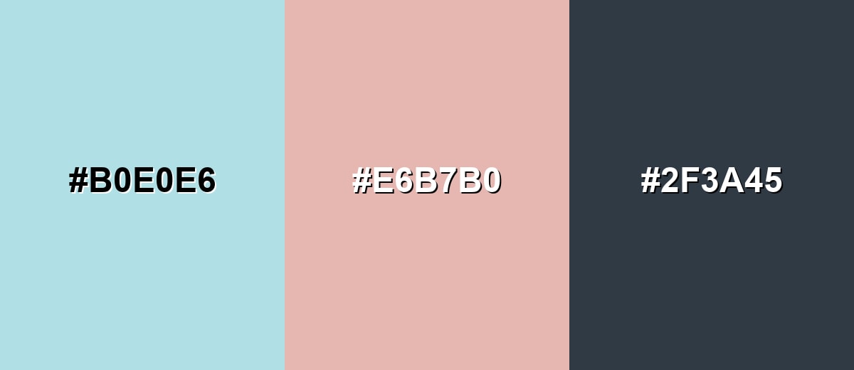
Complementary Colors
A soft peach works as a warm counterbalance, keeping the overall feel friendly and modern while maintaining the pastel softness.
Complementary Palette Example: Use powder blue for the base, add soft peach for warmth, and anchor the layout with deep slate for readable contrast.
Analogous Color Schemes
Analogous colors sit adjacent to each other on the color wheel, creating harmonious, cohesive palettes with subtle variation.
Aqua-leaning pastels create a fresh, coastal palette that stays quiet and cohesive.
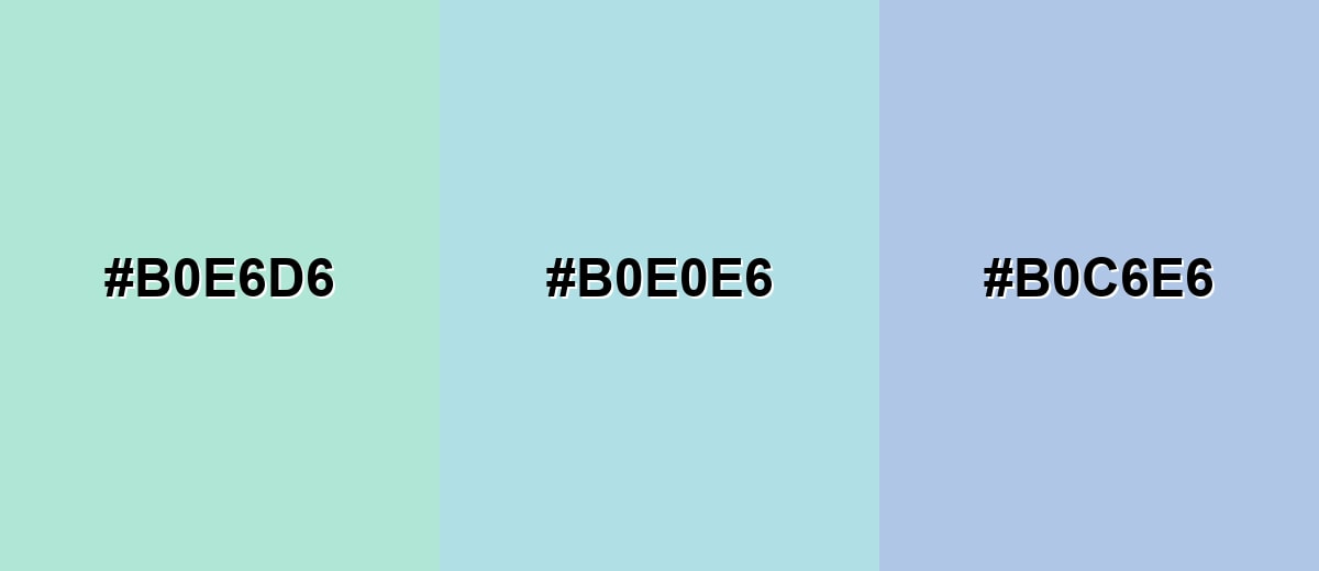
- Mint Aqua: #B0E6D6
- Powder Blue: #B0E0E6
- Periwinkle Mist: #B0C6E6
Brighter sky tints make the look more energetic while still feeling soft and clean.
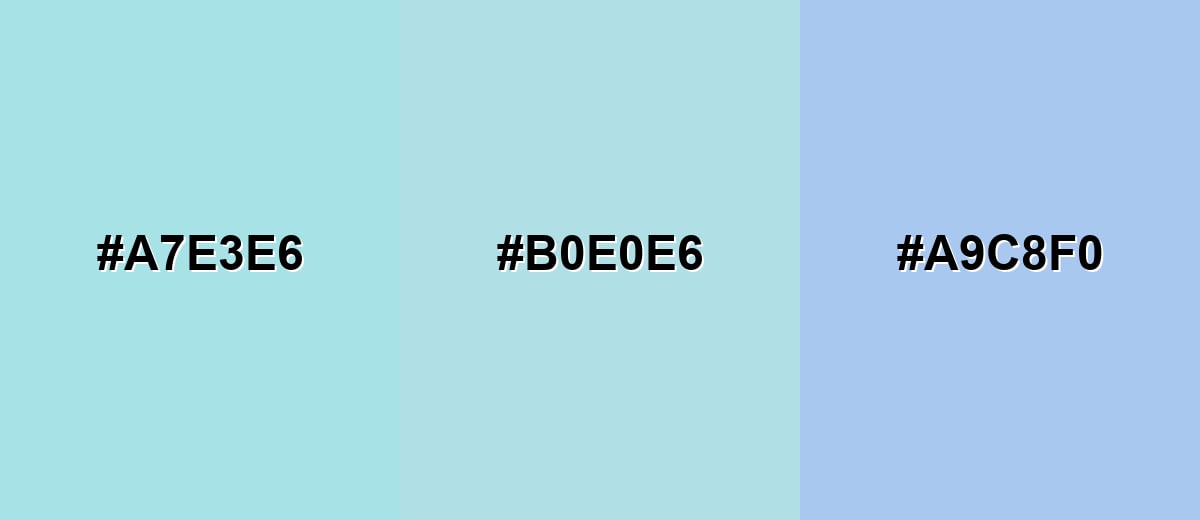
- Seafoam Tint: #A7E3E6
- Powder Blue: #B0E0E6
- Sky Tint: #A9C8F0
Triadic & Tetradic Combinations
A triadic set adds variety without losing the pastel mood.
Balance powder blue with a soft lime and a lavender-pink to create playful contrast that still feels gentle.
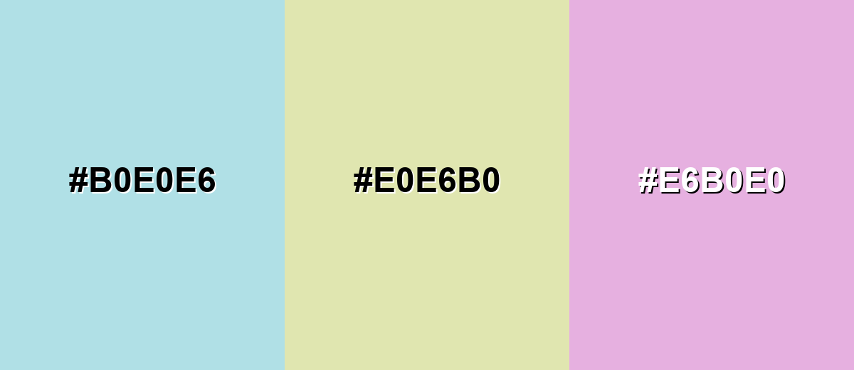
- Powder Blue: #B0E0E6
- Soft Lime: #E0E6B0
- Lavender Pink: #E6B0E0
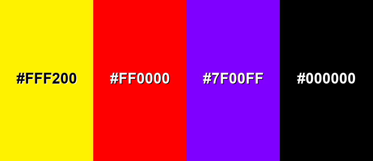
Colors to Avoid
While powder blue color is remarkably versatile, certain combinations can create problematic visual effects:
- Neon Yellow (#FFF200) - The intensity can overpower the softness and create harsh vibration at edges, especially on screens.
- Pure Red (#FF0000) - High-saturation red can feel alarm-like against powder blue and may look unbalanced in calm layouts.
- Electric Purple (#7F00FF) - The strong chroma competes with the pastel base and can make the palette feel noisy.
- Jet Black (#000000) - It can be too stark next to a light pastel; a softer dark neutral usually reads more refined.
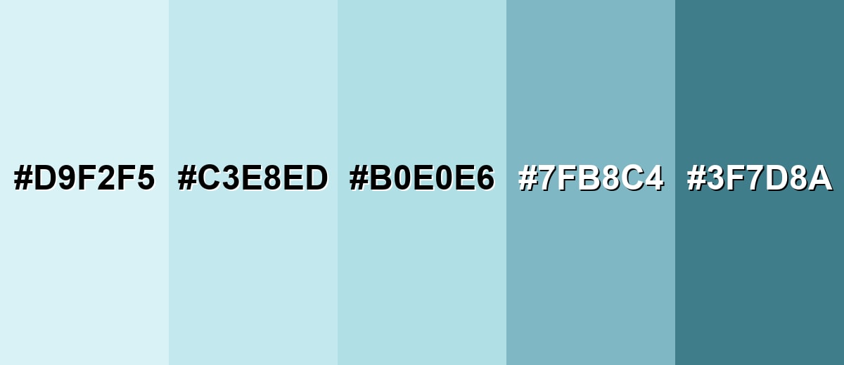
Shades, Tints & Variations of Powder Blue Color
Powder blue isn't just one fixed swatch—there's a useful range from frosted tints to deeper, contrast-friendly variations. Having a small "family" of related tones makes it easier to build consistent UI states, gradients, backgrounds, and supporting accents.
- Ice Powder Blue (#D9F2F5) - A very light, almost frosted tint that reads airy and minimal. It's best used for Large backgrounds, subtle UI panels, and gentle gradients.
- Light Powder Blue (#C3E8ED) - A brighter pastel that keeps the powdery feel but adds a touch more presence. It's best used for Cards, section dividers, product backdrops, and soft highlights.
- Powder Blue (#B0E0E6) - The classic reference shade: calm, clean, and softly blue-green. It's best used for Brand supporting tone, calm hero areas, and friendly interface styling.
- Dusty Powder Blue (#7FB8C4) - A muted, grayer take that feels more mature and less playful. It's best used for Secondary UI elements, textiles, and understated branding accents.
- Deep Powder Blue (#3F7D8A) - A darker, more grounded blue-teal that keeps the same direction but increases contrast. It's best used for Headings, icons, borders, and contrast-friendly companion elements.
Industry Applications
Powder blue shows up across industries that want calm communication and a clean visual tone. It's especially effective when you need friendliness without loud saturation.
Fashion & Beauty
- Everyday Apparel - Works well for soft, polished outfits that feel fresh and easy to wear.
- Beauty Branding - Supports a clean, gentle aesthetic for skincare, wellness, and self-care visuals.
- Product Backdrops - Makes a flattering pastel background for catalog shots and social posts.
- Seasonal Styling - Fits spring/summer themes where you want light color without high saturation.
Interior Design & Decor
- Airy Walls - Helps rooms feel open and calm, especially in bedrooms and small spaces.
- Warm Materials Pairing - Looks inviting with warm whites, light wood, and linen textures.
- Clean Contrast Details - Brushed metals or matte dark accents can define edges without overpowering.
- Lighting Balance - In cooler lighting, warm accents can prevent the space from feeling frosty.
Branding & Marketing
- Trust-Forward UI - Useful for backgrounds, cards, and onboarding screens that reduce visual fatigue.
- Service & Healthcare Materials - Supports clarity and comfort for informational pages and portals.
- Wellness Campaigns - Creates a soothing tone for promotions, packaging accents, and social templates.
- Education Visuals - Feels friendly in course headers and modules without looking overly bright.
Conclusion
Powder blue stands out for its airy softness and its ability to calm a layout without making it feel dull. Built around #B0E0E6, it works best as a background or supporting tone—then comes alive with smart contrast (deep neutrals for readability) and carefully chosen warm accents when you want extra friendliness. With a few coordinated tints and deeper variations, powder blue can power consistent design systems across UI, print, and interiors while keeping everything clean, modern, and easy on the eyes.
Design Smarter with AI: Media.io is an online AI studio that empowers creators with advanced image generation and enhancement tools. From text-to-image and image-to-image creation to AI upscaling and color optimization, it enables fast, creative, and professional results—all in your browser.

Frequently Asked Questions About Powder Blue Color
Powder blue is a light, soft blue with a slight cyan or green undertone. It looks misty and gentle rather than bright, which makes it popular for calm, clean visual styles.
They are similar, but not identical. Baby blue often leans more purely blue, while powder blue commonly has a cooler, slightly greenish cast that can feel more airy and muted.
It pairs smoothly with white, warm neutrals, light wood tones, and dark slate-like neutrals. For accents, soft peach, sage, and lavender-pink can add warmth and variety without overpowering the pastel base.
Yes, especially as a background or supporting brand tone. Use strong contrast for text and controls, and keep key actions distinct with darker accents so the interface stays readable.
Very high-saturation neons and harsh primaries can clash and make the palette feel noisy. Pure black can also look too stark; a softer dark neutral often looks more refined and accessible.
Add warm accents like peach or sandy neutrals, and introduce texture through materials or subtle gradients. Warmer whites and natural surfaces help keep it inviting, especially in interiors or lifestyle graphics.


