

Linen color is a soft, warm off-white inspired by natural flax fabric, with a gentle beige-peach undertone that feels bright without looking stark.
Its signature HEX code is #FAF0E6, making it a go-to backdrop for calm interiors, clean branding, and comfortable, content-heavy UI.
Linen Color: Codes & Values
Here are the standard color codes for linen color, so you can match it consistently across web, UI, and print projects.
| Parameters | VALUE |
| HEX Code | #FAF0E6 |
| RGB DECIMAL | 250, 240, 230 |
| RGB PERCENTAGE | 98.04%, 94.12%, 90.20% |
| CMYK | 0%,4%,8%,2% |
| HSL | 30°, 67%, 94% |
| HSV (HSB) | 30°, 8%, 98% |
| Web Safe | #FFFFFF |
Key Color Space Explanations:
- HEX - HEX is the most common digital identifier for this shade, used in web design and apps for consistent rendering across screens.
- RGB - RGB mixes red, green, and blue light to create the on-screen look. Linen is high in all three channels, which is why it reads as a bright, gentle neutral.
- CMYK - CMYK is used for print production and describes how inks combine on paper. Linen uses very little ink overall, so paper choice and coatings can noticeably affect the final result.
- HSL - HSL describes hue, saturation, and lightness in a way many designers find intuitive. Linen sits around a warm hue with low intensity and very high lightness.
- Web Safe - Web Safe is the closest legacy-safe screen approximation. Linen rounds to pure white in the web-safe palette, so subtle warmth may be lost on older constraints.
Use HEX for most web work, RGB for screen-based tools, and CMYK when you're preparing files for print proofs and production.
Linen Color Conversions
If you need linen color in different systems (or want quick copy-paste CSS), this conversion chart keeps everything in one place.
| Parameters | VALUE | CSS |
| HEX | #faf0e6 | #faf0e6 |
| RGB DECIMAL | 250, 240, 230 | rgb(250,240,230) |
| RGB PERCENTAGE | 98.04%, 94.12%, 90.20% | rgb(98.04%,94.12%,90.20%) |
| CMYK | 0%,4%,8%,2% | cmyk(0%,4%,8%,2%) |
| HSL | 30°, 67%, 94% | hsl(30°, 67%, 94%) |
| HSV | 30°, 8%, 98% | -- |
| Web Safe | ffffff | #ffffff |
| CIE-LAB | 95.7, 1.1, 5.6 | -- |
| XYZ | 90.3, 92.5, 86.7 | -- |
| xyY | 0.328, 0.336, 92.5 | -- |
| CIE-LCH | 95.7, 5.7, 79° | -- |
| CIE-LUV | 95.7, 2.2, 7.0 | -- |
| Hunter-Lab | 96.2, 0.6, 3.0 | -- |
| Binary | 11111010 11110000 11100110 | -- |
Want to generate Linen Color photos or posters? Try Media.io's AI Image Generator now!
Linen Color Meaning & Symbolism
Linen is widely associated with simplicity, freshness, and natural comfort. Because it resembles undyed cloth and light sand, it often signals honesty, quiet quality, and an uncluttered lifestyle in everyday settings. In design, linen color symbolism is frequently used to make spaces and interfaces feel softer than stark white while still staying clean.
Psychological Effects
As a warm near-white, linen changes the "temperature" of a design without adding visual noise.
- Calm Focus - Its high lightness keeps pages feeling open, which helps users settle in for reading or browsing.
- Reduced Visual Pressure - Compared to pure white, linen feels less harsh, especially on bright displays and in sunlit rooms.
- Approachability - The warm undertone makes brands and interfaces feel friendlier and more human.
- Quiet Premium - Linen can suggest thoughtful materials (paper, fabric, matte finishes) without looking flashy.
- Risk Of Flatness - Without contrast, it may look washed out; darker text and clear separators keep it crisp.
Positive Associations
Designers often choose linen to communicate "clean and natural" in a subtle, modern way.
- Simplicity - A minimal base that supports uncluttered layouts and straightforward messaging.
- Freshness - A bright neutral that feels airy, light, and well cared for.
- Comfort - Reminiscent of textiles and home basics, it reads as cozy and livable.
- Honesty - The undyed-fabric vibe can signal authenticity and transparency.
- Soft Cleanliness - Cleaner than beige, warmer than white, and easy on the eyes.
Cultural Significance Across the World
Because linen is tied to everyday textiles, the color often carries practical, heritage-driven meaning.
- Craft & Heritage - Linked to traditional weaving and natural fibers, it can feel handmade and timeless.
- Clean Living - Often associated with bedding, table linens, and home rituals that suggest neatness and care.
- Everyday Luxury - Signals subtle quality through texture and material rather than bold color.
- Neutral Hospitality - Works as a welcoming "default" in shared spaces because it's soft, bright, and non-distracting.
Design Applications
Linen works best when you want a light background that feels warm and real-world, not clinical. A few targeted choices around contrast and texture make it look intentional instead of plain.
Graphic Design Tips
- Backgrounds With Depth - Use linen as the main canvas, then add subtle shadows or thin dividers to separate sections.
- Typography First - Pair linen with darker neutrals for text so headlines and body copy stay sharp.
- Texture-Friendly - Paper grain, fabric overlays, and matte mockups make linen look richer instead of flat.
- Minimal Palettes - Stick to one strong accent color plus neutrals for a clean, premium feel.
- Print Proofing - On bright stock, linen can disappear; test on the actual paper to preserve warmth.
Pro tip: If linen looks "too white" on screen, introduce a slightly deeper linen variation on cards or section blocks, and keep your accent color reserved for CTAs and key highlights.
Linen Color in Photography & Video
- Soft Backdrops - Linen backgrounds keep the scene bright while letting skin tones, food, and products stay natural.
- Warm Light Boost - It picks up golden-hour warmth beautifully; watch white balance so it doesn't turn overly yellow.
- Studio Control - Under cool lights, linen can look more neutral; add a touch of warmth in lighting or grading if needed.
- Wardrobe & Props - Fabric-like neutrals photograph well with wood, ceramics, kraft paper, and matte metals.
- Contrast Planning - Use deeper elements (text, edges, props) to avoid a washed, low-contrast frame.
Recommended Tool for Image Enhancement: When incorporating linen color into your photography projects, Media.io's AI Image tools can help you achieve more refined results. With AI-powered color enhancement, photo colorization, image upscaling, and old photo restoration, you can easily enrich linen color tones, improve overall image quality, and highlight the color's elegant and sophisticated aesthetic.
Color Combinations
Linen is easy to combine because it sits close to white while keeping a warm undertone. The palettes below show reliable ways to build contrast, harmony, or a soft layered look.
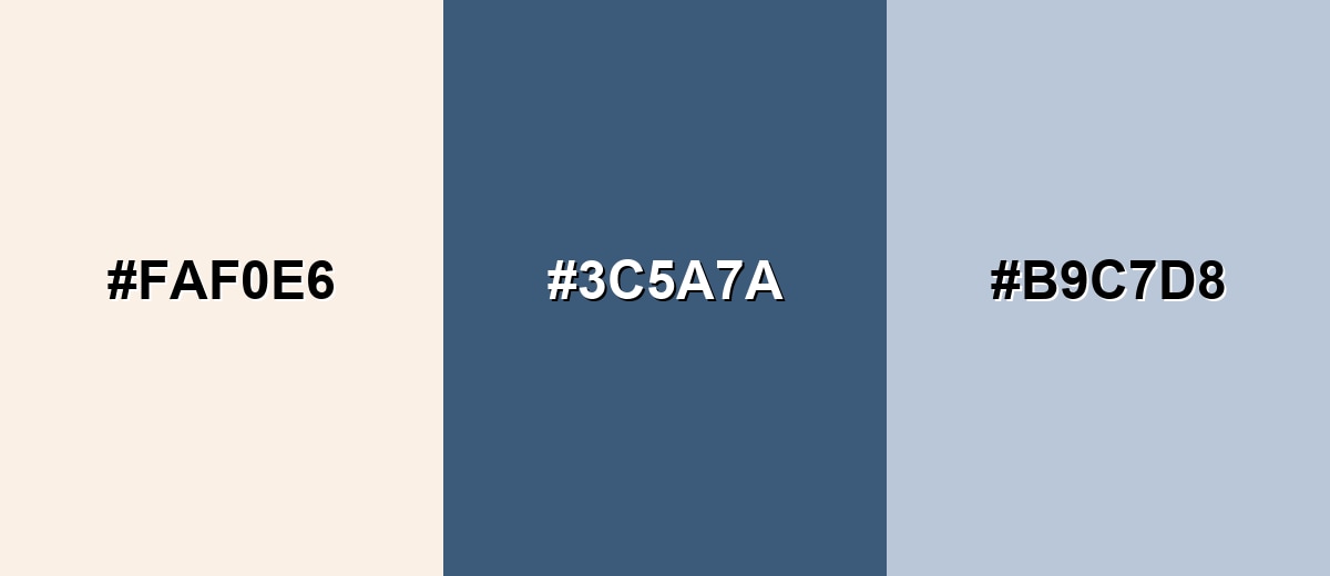
Complementary Colors
A complementary pairing uses a cool blue family accent to balance linen's warmth. This is a strong option for headlines, buttons, and focal points.
Complementary Palette Example: Try linen as the canvas, steel blue for structure, and a misty blue for soft transitions.
Analogous Color Schemes
Analogous colors sit adjacent to each other on the color wheel, creating harmonious, cohesive palettes with subtle variation.
Warm neighboring tones keep the look cohesive and cozy, ideal for lifestyle layouts and gentle branding.
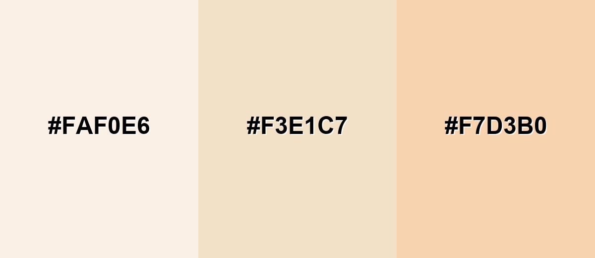
- Linen: #FAF0E6
- Soft Wheat: #F3E1C7
- Pale Peach: #F7D3B0
A slightly deeper neutral range adds definition while staying understated and modern.
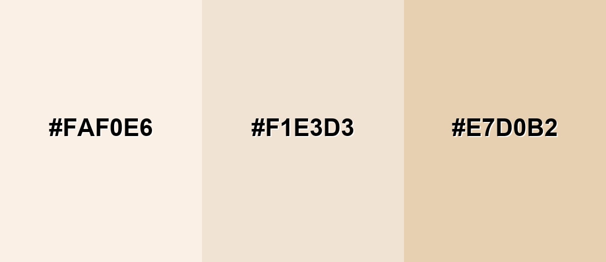
- Linen: #FAF0E6
- Oat Cream: #F1E3D3
- Light Tan: #E7D0B2
Triadic & Tetradic Combinations
Triadic palettes bring variety while staying balanced, using three evenly spaced hues.
Use linen as the anchor, then add mint and dusty lavender for a fresh, modern contrast.
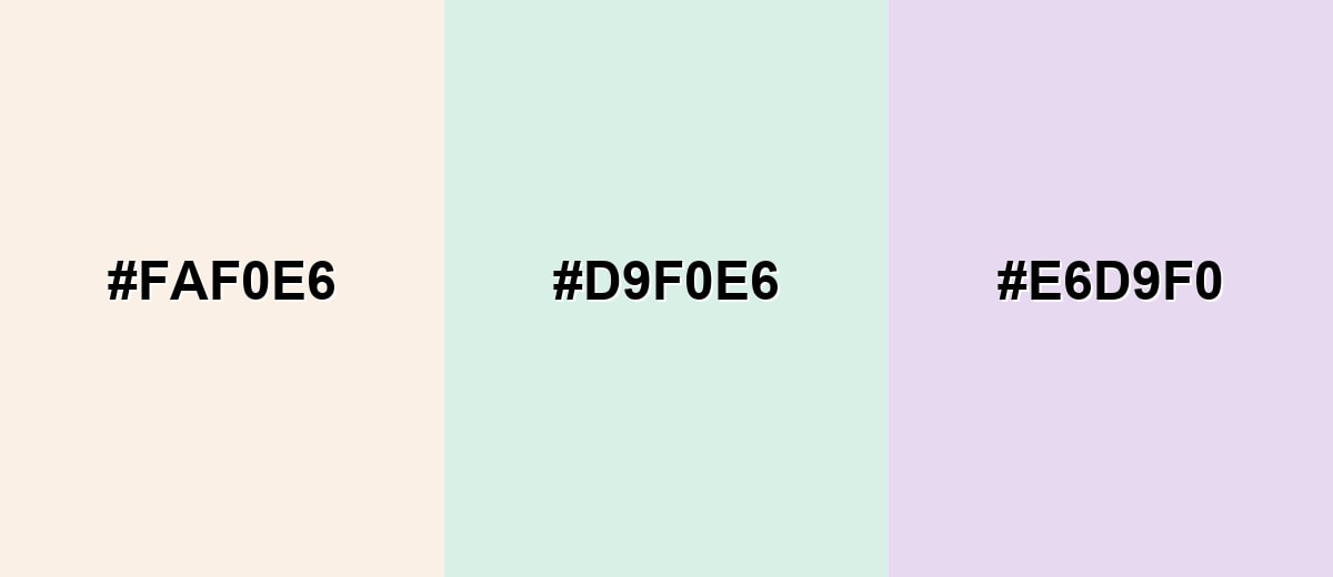
- Linen: #FAF0E6
- Soft Mint: #D9F0E6
- Dusty Lavender: #E6D9F0
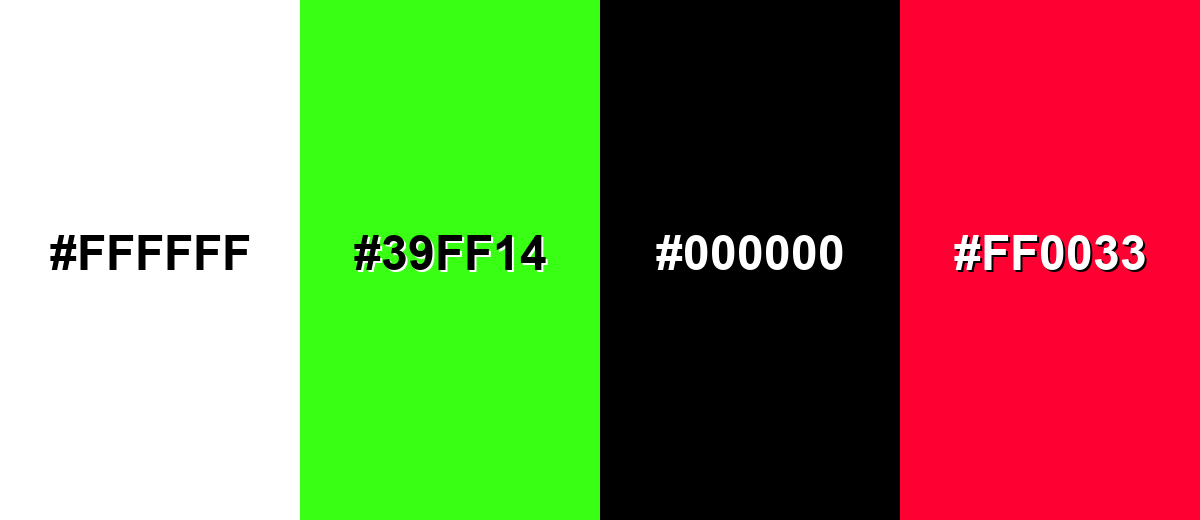
Colors to Avoid
While linen color is remarkably versatile, certain combinations can create problematic visual effects:
- Pure White (#FFFFFF) - Too close in value, so linen's warmth can disappear and the design may look unintentionally inconsistent.
- Neon Lime (#39FF14) - The high saturation can feel harsh against linen and quickly overwhelms the soft, natural mood.
- Pure Black (#000000) - The contrast is extremely strong and can look heavy or abrupt unless you add intermediate neutrals.
- Vivid Red (#FF0033) - Bright red can read aggressive next to linen's gentle tone, making the palette feel unbalanced.
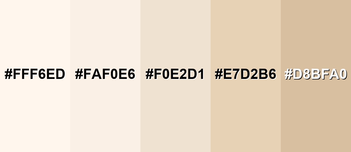
Shades, Tints & Variations of Linen Color
Linen isn't just one shade—small shifts in warmth and depth can make it easier to build hierarchy, separate sections, or better match real materials like paper, fabric, and wood.
- Cream Linen (#FFF6ED) - A brighter, creamier take that keeps the linen vibe while looking closer to soft white. It's best used for Large backgrounds, airy product pages, and minimal posters where you want maximum lightness..
- Classic Linen (#FAF0E6) - The standard linen shade with a warm off-white base and a subtle beige-peach undertone. It's best used for Default UI backgrounds, editorial layouts, and neutral brand systems..
- Oat Linen (#F0E2D1) - A slightly deeper, oat-like neutral that adds more visible warmth and definition. It's best used for Cards, secondary panels, and packaging backgrounds where pure linen feels too faint..
- Beige Linen (#E7D2B6) - A more grounded beige version that still reads natural but stands out more clearly from white. It's best used for Interior palettes, textile-inspired themes, and section blocks that need separation..
- Deep Linen (#D8BFA0) - A deeper, tan-leaning variation that moves linen into a warm neutral with stronger presence. It's best used for Accents, borders, illustrations, and warm UI highlights paired with darker text..
Industry Applications
Because linen sits between white and beige, it adapts well across industries that need a clean foundation with a human feel. It is especially effective when you want products, photos, or typography to take the spotlight.
Fashion & Beauty
- Beauty And Wellness Packaging - Works as a gentle, premium surface that feels clean without looking sterile.
- Skincare & Self-Care Branding - Supports minimal typography and calm layouts that signal "soft" and "safe."
- Editorial Product Shoots - Helps lighting look natural while keeping the scene bright and flattering.
- Texture-Led Design - Pairs well with matte finishes and subtle grain to hint at craftsmanship.
Interior Design & Decor
- Walls & Large Surfaces - Linen tones soften sunlight and can make rooms feel bigger and more breathable.
- Textiles - Ideal for upholstery and bedding where you want warmth without heavy color.
- Home Goods - Creates a calm backdrop for ceramics, wood, and natural materials.
- Layered Neutrals - Easy to mix with other soft neutrals for a cohesive, lived-in palette.
Branding & Marketing
- Ecommerce & Product UI - A comfortable alternative to pure white that reduces glare for long browsing sessions.
- Editorial & Publishing - Gives layouts a magazine-like feel that's easier on the eyes than bright white.
- Food & Lifestyle Visuals - Keeps scenes clean and neutral while enhancing warm subject tones.
- Minimal Campaign Systems - Lets photography and headlines stand out, while the background stays quiet and intentional.
Conclusion
Linen color (#FAF0E6) is a warm off-white that brings an easy, natural softness to modern design. It's bright enough to keep layouts clean and spacious, yet warm enough to feel approachable in branding, interiors, and UI—especially when you add clear contrast with darker text, defined dividers, and one focused accent. If you want a light neutral that doesn't feel clinical, linen is a practical, reliable base you can build on.
Design Smarter with AI: Media.io is an online AI studio that empowers creators with advanced image generation and enhancement tools. From text-to-image and image-to-image creation to AI upscaling and color optimization, it enables fast, creative, and professional results—all in your browser.

Frequently Asked Questions About Linen Color
Quick answers to common questions about what linen color looks like, how it behaves, and how to use it well.
Linen is a warm off-white that resembles natural linen fabric. It often shows a subtle beige or peach undertone, especially next to pure white.
The commonly used HEX code for linen is #faf0e6.
It sits closer to white in brightness, but its undertone leans beige. That hint of warmth is what separates it from stark white.
Deep blues, charcoal neutrals, soft greens, and muted mauves pair well with linen. Warm beiges and gentle peaches also create smooth, tonal palettes.
Yes. Linen is a comfortable background for content-heavy pages, but you should use dark text and clear UI states so the interface does not feel low-contrast.
Add contrast with a darker neutral for text, include one saturated accent for focus, and use texture or subtle shadows to separate sections. Slightly deeper linen shades can also improve definition.


