

Light cyan color is a very pale, icy blue-green tint that looks like a whisper of turquoise mixed with lots of white. Its hex code is #E0FFFF, giving it a bright, clean appearance on screens.
People often perceive it as calm, fresh, and breathable—like cool water or crisp air. Because it sits between blue and green on the spectrum, it behaves like a soothing "cool" tint in both RGB and print palettes, and this guide covers its meaning, codes, combinations, shades, and practical uses.
Light Cyan Color: Codes & Values
Here are the core light cyan color codes designers use for UI, branding, and print production.
| Parameters | VALUE |
| HEX Code | #E0FFFF |
| RGB DECIMAL | 224, 255, 255 |
| RGB PERCENTAGE | 87.8%, 100%, 100% |
| CMYK | 12%,0%,0%,0% |
| HSL | 180°, 100%, 94% |
| HSV (HSB) | 180°, 12%, 100% |
| Web Safe | #CCFFFF |
Key Color Space Explanations:
- HEX - HEX is the most common way to specify a screen tint in web and UI work. #e0ffff represents a very light cyan tint with high brightness.
- RGB - RGB describes how much red, green, and blue light is used on screens. Light cyan uses high green and blue values with slightly less red for a cool, watery look.
- CMYK - CMYK is used for print and reflects ink percentages. Light cyan has low cyan ink and near-zero other inks, which helps keep it clean and airy on paper.
- HSL - HSL expresses hue, saturation, and lightness, which is helpful for choosing tints and shades. At 180° with very high lightness, it sits on the cyan hue while staying pastel.
- Web Safe - Web-safe values are a legacy palette designed to reduce banding on older displays. #ccffff is the closest web-safe match to light cyan.
Use HEX or RGB for digital work, CMYK for print specs, and HSL/HSV when you're adjusting tint strength while keeping the same cyan hue.
Light Cyan Color Conversions
This conversion table makes it easy to move light cyan between common design tools and technical color spaces.
| Parameters | VALUE | CSS |
| HEX | #e0ffff | #e0ffff |
| RGB DECIMAL | 224, 255, 255 | rgb(224,255,255) |
| RGB PERCENTAGE | 87.8%, 100%, 100% | rgb(87.8%,100%,100%) |
| CMYK | 12%,0%,0%,0% | cmyk(12%,0%,0%,0%) |
| HSL | 180°, 100%, 94% | hsl(180°, 100%, 94%) |
| HSV (or HSB) | 180°, 12%, 100% | -- |
| Web Safe | ccffff | #ccffff |
| CIE-LAB | 97.9, -10.0, -3.3 | -- |
| XYZ | 84.4, 94.5, 108.4 | -- |
| xyY | 0.2938, 0.3290, 94.5 | -- |
| CIE-LCH | 97.9, 10.4, 198.3° | -- |
| CIE-LUV | 97.9, -16.7, -3.6 | -- |
| Hunter-Lab | 97.2, -10.3, -3.6 | -- |
| Binary | 11100000 11111111 11111111 | -- |
Want to generate Light Cyan Color photos or posters? Try Media.io's AI Image Generator now!
Light Cyan Color Meaning & Symbolism
Light cyan is commonly associated with clarity, coolness, and a sense of open space. In everyday life it can feel like clean water, fresh air, and a tidy, minimalist environment. Put simply, the Light Cyan Color meaning often points to calm communication and a modern, hygienic vibe.
Psychological Effects
Because it's so close to white, light cyan influences mood in subtle but noticeable ways.
- Breathing Room - Makes layouts feel lighter and less crowded, especially on large background surfaces.
- Cool Calm - Adds a "cooler" emotional temperature that can feel reassuring in wellness and service design.
- Order & Clarity - Supports clean typography and simple UI patterns that read as organized.
- Soft Focus - Works well for gentle gradients and quiet visuals where you want low drama.
- Sterile Risk - Overuse can feel cold or clinical, and low-contrast pairings can hurt readability.
Positive Associations
In modern design, light cyan often carries friendly, everyday meanings that audiences recognize quickly.
- Clean Water - Suggests freshness and purity, like a clear pool or filtered water.
- Fresh Air - Feels breathable and open, which helps minimalist layouts feel welcoming.
- Transparency - Can signal honesty and openness when paired with plenty of whitespace.
- Modern Minimalism - Reinforces a tidy, contemporary vibe in tech and product interfaces.
- Gentle Trust - Communicates a quiet, non-aggressive kind of confidence.
Cultural Significance Across the World
Meanings vary by context, but pale cyan tones tend to share a few consistent cues across regions.
- Water & Sky - Commonly tied to natural elements that feel cool, light, and expansive.
- Cleanliness - Frequently used in "hygiene" visuals, so it can read as fresh and sanitary.
- Contemporary Aesthetics - Often appears in modern UI themes where simplicity and clarity matter.
- Context-Dependent Meaning - Works best when supported by typography, imagery, and contrast that guide interpretation.
Design Applications
Light cyan is easiest to use when you treat it as a soft surface tint rather than the main headline or text tone. It adds a calm atmosphere without overpowering content, especially in digital layouts.
Graphic Design Tips
- Use light cyan for background sections, cards, and subtle highlights where you want a clean, friendly tone.
- Keep body text dark (near-black or deep blue-gray) to avoid washed-out readability.
- Add thin borders or soft shadows when panels blend into the page due to low contrast.
- Save stronger accents for buttons and links so calls-to-action stay obvious.
- For print, request proofs—pastel cyan can shift by paper stock and finishing.
If your layout feels "too icy," balance light cyan with warmer neutrals and a single darker anchor tone to restore contrast and visual comfort.
Light Cyan Color in Photography & Video
- Use light cyan as a cool overlay in highlights to create a clean, airy mood without crushing detail.
- In product shots (skincare, tech, wellness), it works well for background washes and reflective surfaces.
- For travel and lifestyle edits, enhance sea/sky tones carefully so whites don't drift into a sterile blue-green.
- In motion graphics, pair light cyan UI panels with darker typography so captions remain readable on bright screens.
- When color grading, watch skin tones—keep cyan influence off midtones unless you want a deliberate "cool" look.
Recommended Tool for Image Enhancement: When incorporating light cyan color into your photography projects, Media.io's AI Image tools can help you achieve more refined results. With AI-powered color enhancement, photo colorization, image upscaling, and old photo restoration, you can easily enrich light cyan color tones, improve overall image quality, and highlight the color's elegant and sophisticated aesthetic.
Color Combinations
Light cyan is flexible because it can act like a clean neutral with a cool undertone. The palettes below show reliable ways to add warmth, depth, or playful contrast while keeping the overall look airy.
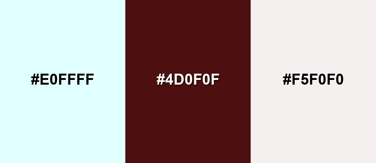
Complementary Colors
A complementary pairing adds punch by placing a warm, reddish tone against light cyan's cool base. This is useful when you want CTAs or key elements to stand out without using harsh neons.
Complementary Palette Example: Try light cyan with a deep burgundy anchor and a soft warm off-white to keep contrast elegant and readable.
Analogous Color Schemes
Analogous colors sit adjacent to each other on the color wheel, creating harmonious, cohesive palettes with subtle variation.
For a watery, relaxing feel, blend light cyan with pale sky blue and a minty green tint.
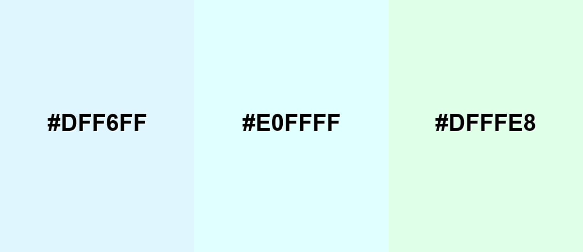
- Pale Sky Blue: #DFF6FF
- Light Cyan: #E0FFFF
- Mint Tint: #DFFFE8
For clean gradients and gentle UI surfaces, combine light cyan with ice blue and a soft aqua tint.
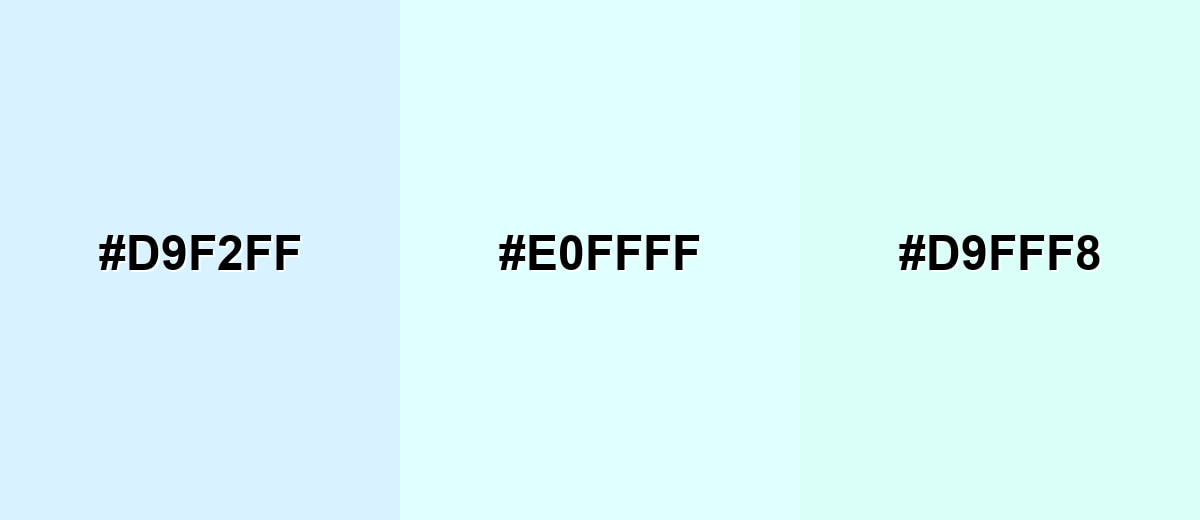
- Ice Blue: #D9F2FF
- Light Cyan: #E0FFFF
- Soft Aqua Tint: #D9FFF8
Triadic & Tetradic Combinations
A triadic palette brings balance by spacing hues evenly, creating contrast that still feels friendly.
Pair light cyan with pale magenta and soft butter yellow for playful, pastel energy in illustrations and brand accents.
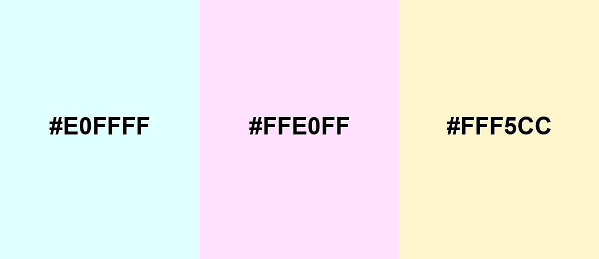
- Light Cyan: #E0FFFF
- Pale Magenta: #FFE0FF
- Soft Butter Yellow: #FFF5CC
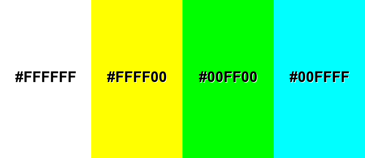
Colors to Avoid
While light cyan color is remarkably versatile, certain combinations can create problematic visual effects:
- Pure White (#FFFFFF) - White on light cyan can disappear, especially for thin UI dividers and small text, creating weak hierarchy.
- Neon Yellow (#FFFF00) - This combination can feel glaring and unstable, pulling attention away from content and making the palette look unrefined.
- Neon Green (#00FF00) - Highly saturated green can vibrate against cyan tints, producing visual noise that is tiring in interfaces.
- Pure Cyan (#00FFFF) - A fully saturated cyan next to light cyan often looks like an accidental mismatch rather than a deliberate shade step.
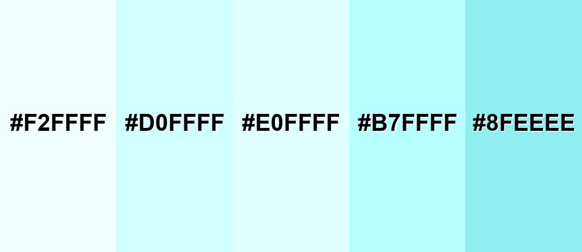
Shades, Tints & Variations of Light Cyan Color
The light cyan family ranges from barely-there icy tints to clearer cyan-turquoise accents. Having a few nearby variations makes it easier to build hierarchy (backgrounds, panels, highlights, and buttons) without switching to a totally different hue.
- Icy Cyan (#F2FFFF) - An extra-light tint that looks almost white with a cool, watery cast. It's best used for Large backgrounds, subtle sections, and minimalist layouts..
- Powder Cyan (#D0FFFF) - A soft pastel cyan that feels clean but slightly more noticeable than the lightest tints. It's best used for Cards, panels, and gentle highlights behind text..
- Light Cyan (#E0FFFF) - The classic light cyan tint: bright, airy, and refreshing without strong saturation. It's best used for Calm UI themes, wellness visuals, and clean brand backgrounds..
- Fresh Aqua (#B7FFFF) - A brighter, more colorful step that still stays on the pastel side. It's best used for Accents, badges, and soft illustrations that need more presence..
- Soft Turquoise (#8FEEEE) - A deeper, clearer cyan-turquoise shade that adds definition and contrast. It's best used for Buttons, icons, charts, and headers when you want a cool accent..
Industry Applications
Because it reads as clean and calm, light cyan shows up in many modern design systems. It is especially effective anywhere you want a fresh atmosphere without heavy saturation.
Fashion & Beauty
- Use it as a "clean" backdrop for skincare packaging and ingredient callouts.
- Works well in eCommerce banners to suggest freshness and water-based benefits.
- Helpful for highlighting sensitive-skin or "gentle" product lines without loud color.
- Pairs nicely with minimalist typography for premium, airy visual identity systems.
Interior Design & Decor
- Popular for bathrooms, spas, and bright rooms where a crisp mood is the goal.
- Use on walls or tiles as a light wash that makes spaces feel bigger and cooler.
- Balance with warm neutrals (cream, sand, light wood) to avoid a sterile feel.
- Add texture (linen, stone, matte finishes) so the palette doesn't look flat.
Branding & Marketing
- Tech and SaaS teams use it for background surfaces, onboarding screens, and calm dashboards.
- Healthcare and wellness brands lean on it to communicate cleanliness and reassurance.
- Education and productivity products use it to reduce visual stress in interfaces.
- Travel and hospitality visuals use it for pool/sea/sky themes on landing pages and brochures.
Conclusion
Light cyan (#E0FFFF) is a go-to tint when you want designs to feel airy, clean, and quietly modern. It shines as a background or supporting surface color—especially in UI, wellness, tech, and print washes—where you can keep layouts spacious while letting darker anchors handle readability and hierarchy. With the right combinations and a quick contrast check, light cyan can swing from calm minimalism to playful pastel palettes without losing its crisp, water-like character.
Design Smarter with AI: Media.io is an online AI studio that empowers creators with advanced image generation and enhancement tools. From text-to-image and image-to-image creation to AI upscaling and color optimization, it enables fast, creative, and professional results—all in your browser.

Frequently Asked Questions About Light Cyan Color
Light cyan is a very pale blue-green tint that looks cool, clean, and close to white. It is often used to create a fresh, airy mood in digital and print visuals.
A widely used light cyan value is #e0ffff. This matches the common LightCyan shade seen in many web and design tools.
It pairs well with deep anchors like navy or charcoal, warm accents like burgundy or soft coral, and gentle pastels such as pale lavender or butter yellow. The best pairing depends on whether you want a calm, modern, or playful feel.
Not exactly. Cyan is typically a strong, saturated blue-green, while light cyan is a much lighter tint with added white, making it softer and easier to use as a background.
It can, but the contrast is often low, so elements may look washed out. Add borders, shadows, or a slightly darker cyan-turquoise accent to keep components distinct.
Pastel tones can shift depending on paper and finishing, so proofs are important. Use the CMYK value as a starting point and adjust after testing to avoid the tint turning too gray or too blue.


