

Ocean blue color is a vivid, medium-to-deep blue that looks like sunlit seawater just off the shore. Its signature digital value is #0077be, giving it a bright yet grounded blue presence.
Often read as calm, refreshing, and trustworthy (with a slightly sporty, modern edge), ocean blue can shift cooler or warmer depending on nearby tones and lighting. Below, you'll find its codes, meaning, pairings, shade ideas, and practical ways to use it in real projects.
Ocean Blue Color: Codes & Values
If you're matching ocean blue across web, print, and design tools, these are the core values you'll want on hand.
| Parameters | VALUE |
| HEX Code | #0077BE |
| RGB DECIMAL | 0, 119, 190 |
| RGB PERCENTAGE | 0%, 46.7%, 74.5% |
| CMYK | 100%,37%,0%,25% |
| HSL | 202°, 100%, 37% |
| HSV (HSB) | 202°, 100%, 75% |
| Web Safe | #0066CC |
Key Color Space Explanations:
- HEX - HEX is the most common way to specify a screen-ready value for web and UI. Use it when you need consistent results across apps and style sheets.
- RGB - RGB describes how much red, green, and blue light make up the shade on digital displays. It is especially useful for UI states, overlays, and motion graphics.
- CMYK - CMYK is used for printing and describes ink percentages rather than light. Converting from RGB to CMYK helps reduce surprises when moving from screen to paper.
- HSL - HSL expresses hue, saturation, and lightness, which is handy for creating predictable tints and shades. It is a practical format for generating harmonious variations.
- Web Safe - Web-safe values are older, simplified screen palettes that reduce banding on limited displays. They are mainly used for legacy design constraints and quick approximations.
For most digital work, start with HEX (#0077BE) or RGB (0, 119, 190), then use HSL to build lighter tints and deeper shades that still feel like the same "ocean blue" family.
Ocean Blue Color Conversions
Need ocean blue in a different color format? Use this conversion table to move between design apps, CSS, and print workflows.
| Parameters | VALUE | CSS |
| HEX | #0077be | #0077be |
| RGB DECIMAL | 0, 119, 190 | rgb(0,119,190) |
| RGB PERCENTAGE | 0%, 46.7%, 74.5% | rgb(0%,46.7%,74.5%) |
| CMYK | 100%,37%,0%,25% | cmyk(100%,37%,0%,25%) |
| HSL | 202°, 100%, 37% | hsl(202°,100%,37%) |
| HSV (or HSB) | 202°, 100%, 75% | -- |
| Web Safe | 0066cc | #0066cc |
| CIE-LAB | 48.2, -1.5, -44.8 | -- |
| XYZ | 15.88, 16.90, 51.10 | -- |
| xyY | 0.1894, 0.2015, 16.90 | -- |
| CIE-LCH | 48.2, 44.8, 268.1° | -- |
| CIE-LUV | 48.2, -29.7, -67.9 | -- |
| Hunter-Lab | 41.1, -0.8, -51.1 | -- |
| Binary | 00000000 01110111 10111110 | -- |
Want to generate Ocean Blue Color photos or posters? Try Media.io's AI Image Generator now!
Ocean Blue Color Meaning & Symbolism
Ocean blue is commonly tied to clear thinking, steady confidence, and a sense of open space. In everyday life, it shows up anywhere you want things to feel clean, dependable, and easy to navigate, from apps to interiors. For many searches, Ocean Blue Color meaning is also about balance: energetic enough to stand out, but calm enough to trust.
Psychological Effects
Ocean blue tends to shape a space into something calmer, cleaner, and easier to scan.
- Lower Visual Tension - It can reduce "busy" energy in layouts and make screens feel more settled.
- Clarity And Structure - It often makes navigation, dashboards, and grids feel more organized.
- Trust And Safety - The hue commonly reads as dependable, which is why it works for primary actions and headers.
- Cool, Modern Distance - In large solid blocks, it can feel a bit cold or clinical without warm balance.
- Better With White Space - Pairing it with breathing room helps it stay crisp rather than heavy.
Positive Associations
When used thoughtfully, ocean blue can support a confident, friendly tone without feeling loud.
- Freshness - It hints at clean water and bright air, making visuals feel renewed.
- Confidence - Saturation gives it presence, so it stands out without screaming for attention.
- Focus - It supports readable hierarchy for buttons, links, and key callouts.
- Professionalism - It can feel polished and capable, especially with neutral typography and spacing.
- Openness - The seawater vibe suggests space, movement, and possibility.
Cultural Significance Across the World
Ocean-like blues tap into shared nature cues, so they travel well across many design contexts.
- Water And Sky - Often connected to depth, travel, and a sense of wide open space.
- Reliability - Frequently used in visual communication to signal steadiness and competence.
- Clean Design Language - Common in modern systems that prioritize clarity and easy navigation.
- Fresh, Coastal Energy - Can suggest leisure, wellness, and a lighter everyday mood.
Design Applications
Because ocean blue sits between cyan and classic blue, it can read crisp and technical or relaxed and coastal—depending on what you pair it with.
Graphic Design Tips
- Use It For Primary Actions - Ocean blue works well for buttons, links, tabs, and active states where clarity matters.
- Balance With Soft Neutrals - Off-whites and cool grays keep the palette modern and avoid oversaturation.
- Create Hierarchy With Warm Accents - A warm orange accent can instantly guide attention for CTAs and highlights.
- Prefer Tints For Large Surfaces - Use lighter ocean-blue tints on backgrounds and reserve the core shade for emphasis.
- Check Contrast Early - White text often works on ocean blue, but always validate font size/weight for accessibility.
Pro tip: treat #0077BE as your "hero" color, then build a small system around it—one darker shade for nav/footers and one light tint for panels—so your UI stays consistent across screens.
Ocean Blue Color in Photography & Video
- Lean Into Natural Light - Daylight and bright highlights help ocean blue feel fresh instead of heavy.
- Use Warm Counter-Tones - Skin tones, warm sand, or orange highlights keep scenes from looking too cool.
- Watch For Banding - Smooth blue gradients can band; add subtle grain or gentle texture when needed.
- Control Saturation In Shadows - Deep areas can turn "inky"; lift shadows slightly to keep details clean.
- Keep Whites Neutral - Correct white balance so whites don't drift cyan, especially in product shots.
Recommended Tool for Image Enhancement: When incorporating ocean blue color into your photography projects, Media.io's AI Image tools can help you achieve more refined results. With AI-powered color enhancement, photo colorization, image upscaling, and old photo restoration, you can easily enrich ocean blue color tones, improve overall image quality, and highlight the color's elegant and sophisticated aesthetic.
Color Combinations
Ocean blue pairs easily because it has strong saturation and a clear hue direction. Use warm complements for contrast, nearby blues and teals for smooth harmony, and controlled neutrals to keep the palette flexible.
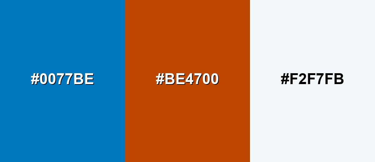
Complementary Colors
A complementary scheme places ocean blue against a warm orange to create high contrast and instant focus. It is ideal for calls to action, highlights, and sporty brand palettes.
Complementary Palette Example: Use ocean blue as the base, sunset orange as the attention grabber, and a soft off-white to keep spacing and typography clean.
Analogous Color Schemes
Analogous colors sit adjacent to each other on the color wheel, creating harmonious, cohesive palettes with subtle variation.
Teal-to-azure neighbors create a smooth, coastal gradient that feels fresh and cohesive.
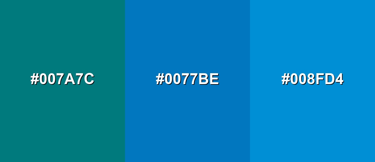
- Deep Teal: #007A7C
- Ocean Blue: #0077BE
- Bright Azure: #008FD4
Indigo, ocean blue, and aqua give a modern tech-meets-water look with clear depth.
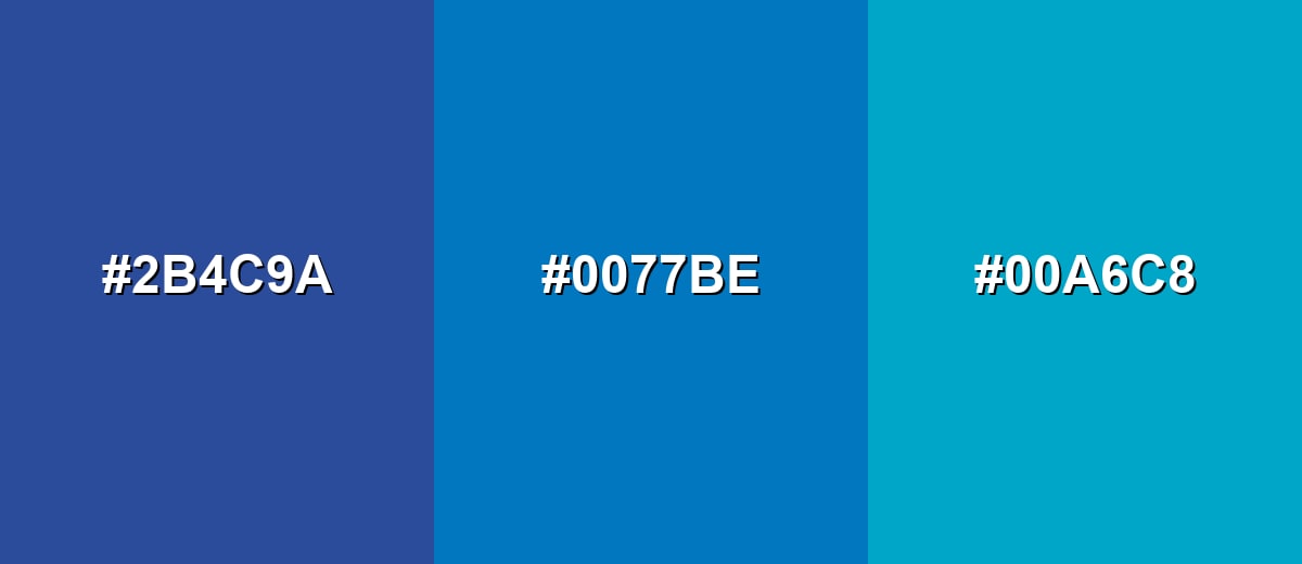
- Indigo Blue: #2B4C9A
- Ocean Blue: #0077BE
- Clear Aqua: #00A6C8
Triadic & Tetradic Combinations
A triadic palette adds variety while staying balanced, which helps for branding systems and illustrations.
Ocean blue with lime green and magenta feels bold and playful, especially when one hue is used sparingly as an accent.
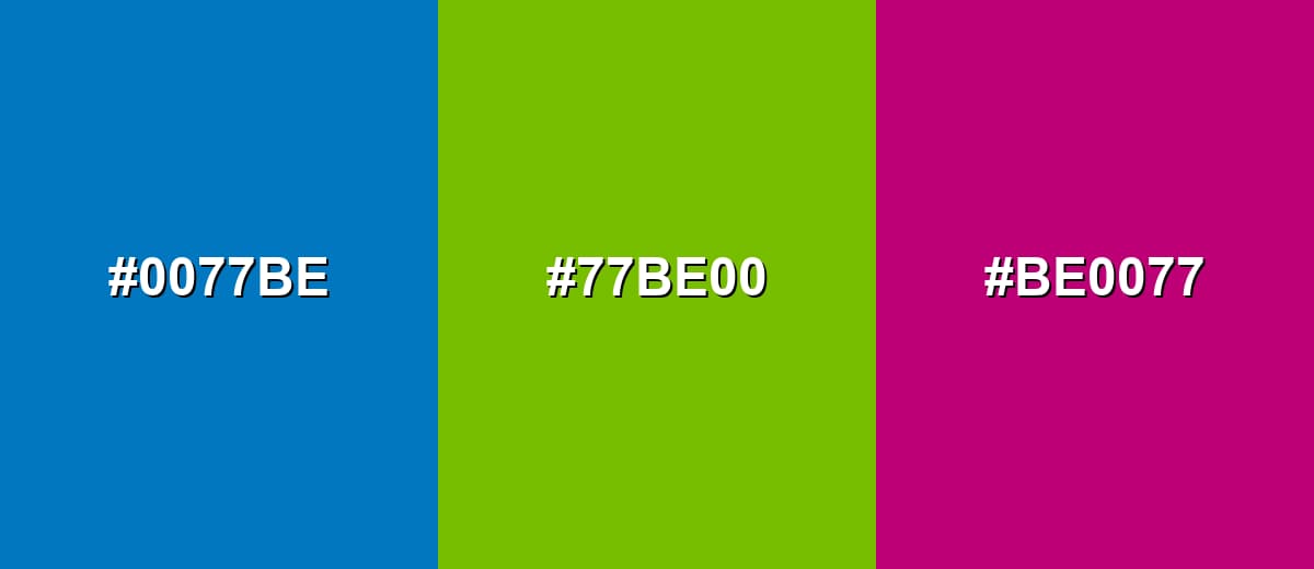
- Ocean Blue: #0077BE
- Seaweed Green: #77BE00
- Coral Magenta: #BE0077
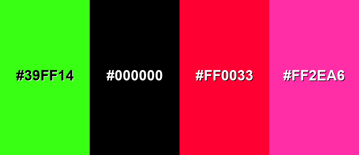
Colors to Avoid
While ocean blue color is remarkably versatile, certain combinations can create problematic visual effects:
- Neon Green (#39FF14) - The combined saturation can look harsh on screens and make interfaces feel noisy, especially in large blocks.
- Pure Black (#000000) - High contrast is useful, but the pairing can feel overly stark and heavy for friendly or coastal themes unless softened with neutrals.
- Bright Red (#FF0033) - This creates a loud, urgent clash that can overpower ocean blue and confuse visual hierarchy in UI.
- Hot Pink (#FF2EA6) - Two strong statement hues compete for attention and can push the palette into a trendy look that ages quickly.
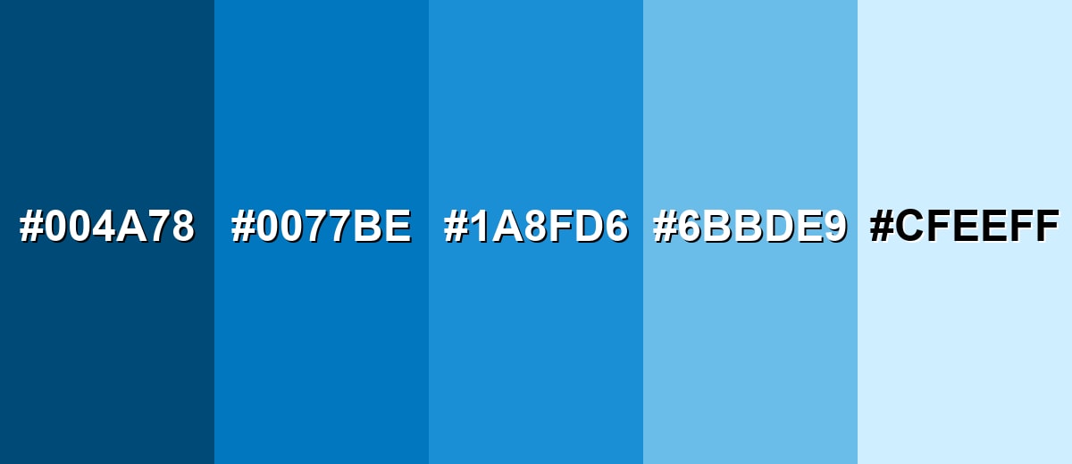
Shades, Tints & Variations of Ocean Blue Color
Ocean blue isn't just one flat swatch—it has a useful range from deeper, more serious tones to airy tints that work like cool neutrals. Having a few go-to variations makes it easier to build clean UI states, flexible brand systems, and smooth gradients without drifting away from the core hue.
- Deep Ocean (#004A78) - A darker, more serious blue that keeps the ocean character while adding weight and depth. It's best used for Headers, footers, nav bars, and dark-mode surfaces..
- Ocean Blue (#0077BE) - The core shade: bright, clean, and recognizable, with a crisp seawater feel. It's best used for Primary brand hue, key UI actions, and highlights..
- Pacific Blue (#1A8FD6) - A slightly lighter, friendlier take that feels airy without turning pastel. It's best used for Secondary buttons, charts, and supportive accents..
- Sea Mist (#6BBDE9) - A soft tint that reads relaxed and open, ideal for breathing room in layouts. It's best used for Background panels, cards, and subtle gradients..
- Ice Blue (#CFEEFF) - A very light tint that keeps a cool, aquatic hint while staying near-neutral. It's best used for Large backgrounds, hover states, and gentle UI fills..
Industry Applications
Ocean blue is a practical choice in many industries because it balances attention with clarity. It can look energetic in marketing, reliable in product interfaces, and soothing in physical spaces when paired with warmer materials.
Fashion & Beauty
- Sporty Essentials - Works well for activewear accents, trims, and performance-inspired color blocks.
- Clean, "Fresh" Packaging - Helps beauty and personal-care items feel crisp, modern, and easy to trust.
- Denim-Friendly Styling - Pairs naturally with indigo and lighter blues for layered monochrome looks.
- Cool-Tone Makeup Stories - Useful for editorial themes that lean aquatic, icy, or high-clarity.
Interior Design & Decor
- Coastal Accents - Great for textiles, ceramics, and small décor that brings in a seawater vibe.
- Bathrooms And Kitchens - Reads clean and refreshing, especially with soft whites and warm lighting.
- Balance With Wood - Warm wood tones help ocean blue avoid feeling overly cool or clinical.
- Easy Layering - Looks strong on an accent wall, but also works in lighter tints for broader surfaces.
Branding & Marketing
- Trust-First Identity - A solid option for logos, headers, and brand systems that need dependable energy.
- UI-Led Campaigns - Fits product-focused messaging where clarity and navigation are part of the story.
- High-Contrast CTAs - Plays nicely with warm orange accents for clear hierarchy and conversion moments.
- Data And Infographics - Strong separation against warm hues makes charts easier to read at a glance.
Conclusion
Ocean blue (#0077BE) is a seawater-inspired shade that feels refreshing, dependable, and modern—making it a natural fit for everything from brand identities to web UI and interior accents. Use it confidently for key actions and headers, soften it with lighter tints for large surfaces, and bring in warm counterpoints (like orange or sandy neutrals) when you want the palette to feel more welcoming. With smart contrast checks and a small set of supporting shades, ocean blue stays clean and clear without drifting into a cold or overly technical look.
Design Smarter with AI: Media.io is an online AI studio that empowers creators with advanced image generation and enhancement tools. From text-to-image and image-to-image creation to AI upscaling and color optimization, it enables fast, creative, and professional results—all in your browser.

Frequently Asked Questions About Ocean Blue Color
Ocean blue is a vivid blue that resembles sunlit seawater, sitting between cyan-leaning blues and classic blue. It typically feels clean, fresh, and modern in design.
A widely used ocean blue hex code is #0077be. It converts to RGB 0, 119, 190 for digital design work.
Teal shifts more toward green, while navy is much darker and more muted. Ocean blue stays brighter and more clearly blue than teal, but lighter and more energetic than navy.
Warm oranges, soft off-whites, and sandy neutrals create strong contrast and a welcoming balance. Nearby hues like teal, aqua, and indigo also pair smoothly for gradients and layered palettes.
White or near-white text often reads clearly on ocean blue for buttons and headers, but you should always verify contrast for your exact font size and weight. For lighter ocean-blue tints, switch to dark text for comfortable readability.
Ocean blue is often associated with calm, trust, and openness, echoing the visual cues of water and sky. In branding and UI, it is frequently used to suggest reliability while still feeling energetic and current.


