

Rose pink color is a soft, rosy pink that feels like a gentle blend of pink with a hint of red-violet—similar to fresh rose petals in daylight.
A reliable reference for this shade is hex #E8A0B8, a light, warm pink with a muted finish that's often used to convey affection, tenderness, and a polished, caring mood.
Rose Pink Color: Codes & Values
If you want rose pink color to look consistent across tools, screens, and print, start with these core values.
| Parameters | VALUE |
| HEX Code | #E8A0B8 |
| RGB DECIMAL | 232, 160, 184 |
| RGB PERCENTAGE | 91%, 63%, 72% |
| CMYK | 0%,31%,21%,9% |
| HSL | 340°, 61%, 77% |
| HSV (HSB) | 340°, 31%, 91% |
| Web Safe | #FF99CC |
Key Color Space Explanations:
- HEX - HEX is the most common digital identifier for this shade in web and UI work. Use it to keep rose pink consistent across screens and design tools.
- RGB - RGB describes how much red, green, and blue light make up the shade on displays. Higher red with moderate green and blue creates rose pink's soft, rosy look.
- CMYK - CMYK is used for print workflows and indicates ink percentages. Rose pink typically relies on magenta with some yellow and minimal black to keep it light.
- HSL - HSL expresses hue, saturation, and lightness, which is handy for building tints and tones. Rose pink sits around a magenta-leaning hue with a bright lightness level.
- Web Safe - Web safe is the closest legacy-safe approximation for older palettes. It's useful when you need a simple substitute that stays visually similar.
Use HEX for web/UI, RGB for screen-based tools, and CMYK when preparing rose pink for print so the shade stays predictable across formats.
Rose Pink Color Conversions
Need rose pink in different color systems for design apps, dev handoffs, or printing? Here are the most common conversions in one place.
| Parameters | VALUE | CSS |
| HEX | #e8a0b8 | #e8a0b8 |
| RGB DECIMAL | 232, 160, 184 | rgb(232,160,184) |
| RGB PERCENTAGE | 91%, 63%, 72% | rgb(91%,63%,72%) |
| CMYK | 0%,31%,21%,9% | cmyk(0%,31%,21%,9%) |
| HSL | 340°, 61%, 77% | hsl(340°,61%,77%) |
| HSV (or HSB) | 340°, 31%, 91% | -- |
| Web Safe | ff99cc | #ff99cc |
| CIE-LAB | 73.3, 30.0, -2.0 | -- |
| XYZ | 54.5, 45.8, 51.5 | -- |
| xyY | 0.359, 0.302, 45.8 | -- |
| CIE-LCH | 73.3, 30.1, 356.2° | -- |
| CIE-LUV | 73.3, 42.9, -8.1 | -- |
| Hunter-Lab | 67.7, 29.8, -1.6 | -- |
| Binary | 11101000 10100000 10111000 | -- |
Want to generate Rose Pink Color photos or posters? Try Media.io's AI Image Generator now!
Rose Pink Color Meaning & Symbolism
Rose pink is widely linked with warmth, affection, and gentle optimism. It often feels more mature and refined than bright bubblegum shades, which makes it easy to use in everyday visuals without becoming overwhelming. In daily life, it's frequently chosen to signal care, softness, and a welcoming tone.
Psychological Effects
Because it's soft and light, rose pink tends to warm up a layout without shouting for attention.
- Friendliness - Helps messages feel more personal, considerate, and approachable.
- Softened Contrast - Reduces a harsh, high-contrast look and makes layouts feel gentler.
- Supportive Mood - Can communicate comfort and reassurance, especially in lifestyle or wellness visuals.
- Polished Warmth - Adds warmth to minimal designs while still reading clean and refined.
- Need For Balance - Overuse can feel overly sweet or less serious unless grounded with deeper neutrals.
Positive Associations
When used thoughtfully, rose pink is often read as caring and inviting rather than loud or childish.
- Affection - Suggests tenderness, appreciation, and gentle romance.
- Welcoming Energy - Creates a friendly tone that can make brands feel more open and warm.
- Calm Optimism - Feels uplifting while staying soft enough for everyday design.
- Elegance - Works well with premium neutrals and metallics for a polished finish.
- Care & Nurturing - Common in beauty, skincare, and self-care spaces to signal comfort.
Cultural Significance Across the World
Its meaning shifts with context, but the “rose” reference often carries familiar symbolism worldwide.
- Rose Symbolism - In many places, roses represent affection and celebration, which rose pink naturally inherits.
- Romance Without Intensity - Communicates romance and appreciation in a softer way than deep reds.
- Gift & Event Color - Frequently used in cards, invitations, and packaging for warm, sentimental moments.
- Modern Lifestyle Aesthetic - Often appears in contemporary lifestyle branding where “soft luxury” is the goal.
Design Applications
Rose pink is easiest to work with when you treat it as a soft accent or a gentle foundation tone. The goal is to keep its rosy warmth while maintaining contrast and readability.
Graphic Design Tips
- Pair it with deep neutrals for modern contrast and clear typography.
- Swap stark white for warm off-whites if you want a softer, more premium feel.
- Use rose pink to support hierarchy (badges, tags, highlights) instead of covering entire screens.
- Keep supporting colors slightly muted so rose pink doesn't turn sugary or loud.
- For gradients, shift toward mauve or peach to mimic natural petal-like transitions.
Pro tip: if rose pink is your accent, let neutrals do most of the work—then use rose pink where you want the eye to land (buttons, highlights, key illustrations, or friendly micro-states).
Rose Pink Color in Photography & Video
- Use rose pink props (flowers, fabric, packaging) to add warmth without overpowering skin tones.
- In product shots, pair it with matte textures and warm neutrals to keep the look editorial and clean.
- For video overlays, keep rose pink as a background tint and place dark text on top for legibility.
- When color grading, avoid pushing magenta too far—aim for soft rosy mids instead of neon highlights.
- Test rose pink under different lighting temperatures since it can swing warmer or cooler fast.
Recommended Tool for Image Enhancement: When incorporating rose pink color into your photography projects, Media.io's AI Image tools can help you achieve more refined results. With AI-powered color enhancement, photo colorization, image upscaling, and old photo restoration, you can easily enrich rose pink color tones, improve overall image quality, and highlight the color's elegant and sophisticated aesthetic.
Color Combinations
Rose pink pairs best with grounded neutrals and fresh greens or blues that balance its warmth. The palettes below cover common harmony types you can reuse in UI themes, brand systems, and styling boards.
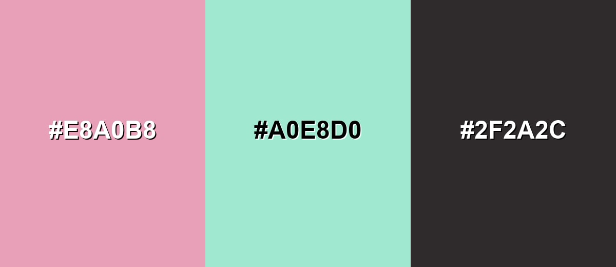
Complementary Colors
A complementary pairing adds energy by placing rose pink opposite a green-leaning tone. Keep both slightly softened to avoid harsh vibration.
Complementary Palette Example: Use rose pink as the main accent, soft mint for balance, and charcoal to anchor text and structure.
Analogous Color Schemes
Analogous colors sit adjacent to each other on the color wheel, creating harmonious, cohesive palettes with subtle variation.
A warm analogous set that leans slightly red for a cozy, romantic feel.
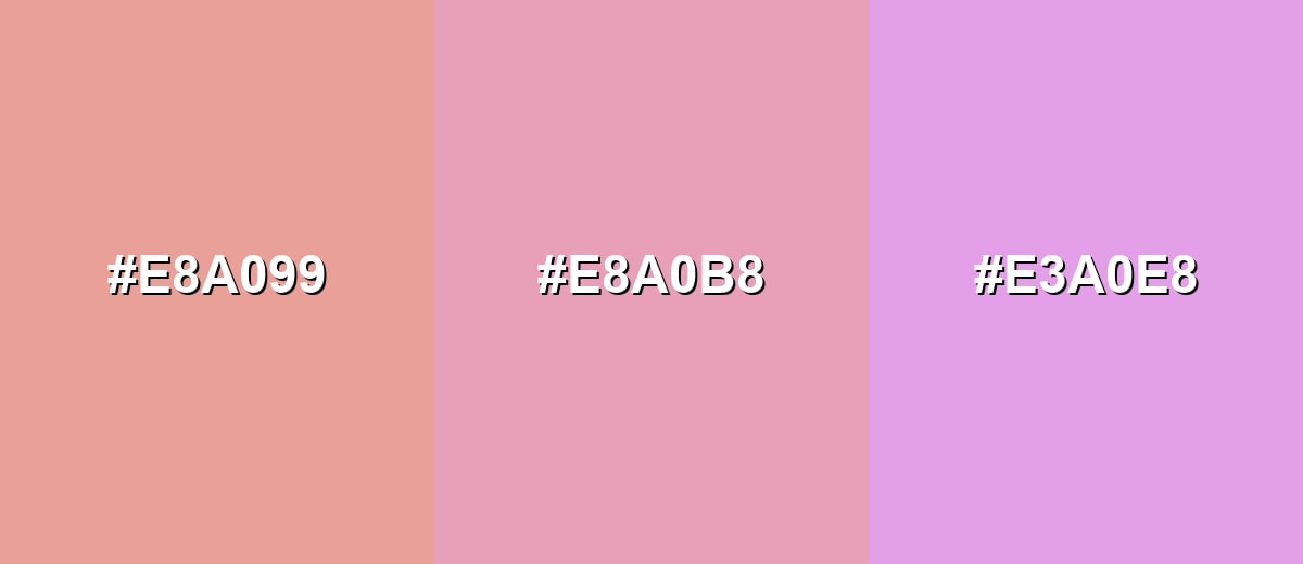
- Warm Blush: #E8A099
- Rose Pink: #E8A0B8
- Soft Orchid: #E3A0E8
A softer analogous mix that shifts toward peach and lilac for airy, editorial layouts.
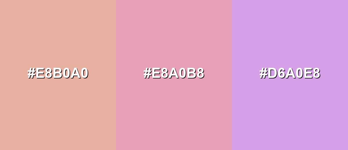
- Dusty Peach: #E8B0A0
- Rose Pink: #E8A0B8
- Mauve Lilac: #D6A0E8
Triadic & Tetradic Combinations
Triadic palettes create lively balance by spacing hues evenly around the wheel.
Pair rose pink with a fresh green and a soft blue to keep the look playful but still controlled.
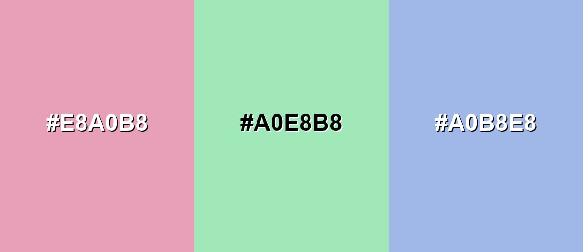
- Rose Pink: #E8A0B8
- Spring Green: #A0E8B8
- Soft Blue: #A0B8E8
Colors to Avoid
While rose pink color is remarkably versatile, certain combinations can create problematic visual effects:
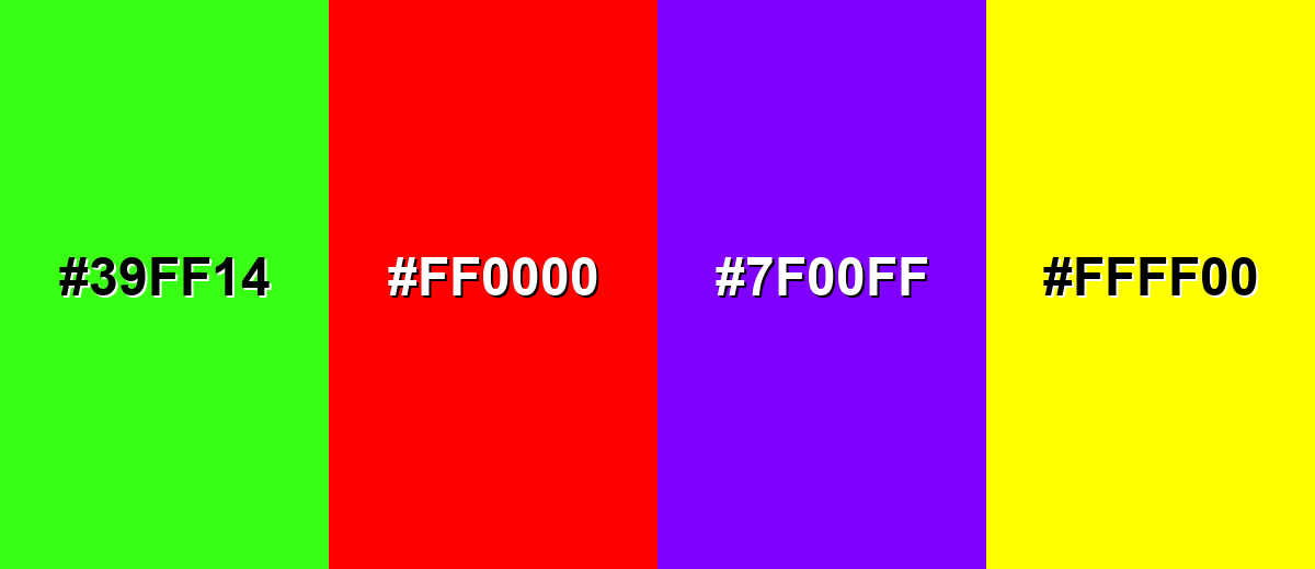
- Neon Green (#39FF14) - The extreme saturation can create a harsh, vibrating contrast that makes rose pink feel muddy or chaotic.
- Pure Red (#FF0000) - It can push the palette into a loud, urgent direction and reduce rose pink's soft, refined character.
- Electric Purple (#7F00FF) - A strong purple competes with rose pink's magenta undertone, which can feel busy in UI and branding.
- Bright Yellow (#FFFF00) - High-brightness yellow can overpower the palette and cause legibility issues unless heavily muted or separated by neutrals.
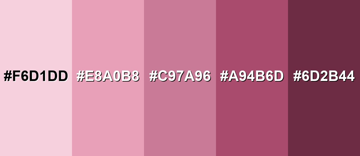
Shades, Tints & Variations of Rose Pink Color
Rose pink isn't just one look—it ranges from airy, pastel tints to deep, wine-leaning shades. Having a few variations on hand makes it easier to build hierarchy (backgrounds, accents, and contrast) without changing the overall mood.
- Pale Rose (#F6D1DD) - A light, airy tint that keeps the rosy feel while looking more pastel and spacious. It's best used for Backgrounds, section fills, and soft gradients in web layouts..
- Classic Rose Pink (#E8A0B8) - The balanced mid-tone reference that reads like rose petals with a gentle, modern softness. It's best used for Primary accent in brand palettes, highlights, and friendly UI states..
- Dusty Rose (#C97A96) - A muted, slightly deeper tone that feels more mature and less sweet. It's best used for Typography accents, icons, and understated packaging elements..
- Deep Rose (#A94B6D) - A richer rose that adds drama while staying within the pink family. It's best used for Buttons, emphasis elements, and contrast accents paired with warm neutrals..
- Rosewood (#6D2B44) - A dark, wine-leaning shade that grounds rose pink and adds sophistication. It's best used for Headings, borders, and high-contrast text on pale rose backgrounds..
Industry Applications
Rose pink shows up across many industries because it can feel both emotional and clean when handled with restraint. The examples below show where it typically performs best and how to keep it readable and balanced.
Fashion & Beauty
- Use it as a soft packaging accent to signal care, comfort, and a gentle premium feel.
- Try dusty, muted variants in lookbooks to make rose pink feel more wearable and less trend-dependent.
- Pair with warm off-whites and charcoal typography to keep product pages polished (not overly sweet).
- Works well in matte finishes and muted fabrics where the color reads refined instead of loud.
Interior Design & Decor
- As a wall accent, rose pink adds warmth without taking over the room—especially in well-lit spaces.
- Pair with warm wood, brass, and textured fabrics to create a cozy, layered look.
- Use pale tints for soft backdrops and deeper rosewood tones for contrast in trims or decor pieces.
- For event-like styling at home, combine with sand or soft metallics to keep it elevated.
Branding & Marketing
- Great for brands that want to feel caring and approachable while still looking modern.
- In UI, use rose pink for tags, badges, and friendly empty states—keep the core interface neutral.
- Protect readability with dark text and consistent contrast testing across hover/active/disabled states.
- Works well for celebration campaigns (cards, gifting, seasonal promos) where warmth matters.
Conclusion
Rose pink stands out for its petal-like warmth and the way it can feel soft and polished at the same time. With #e8a0b8 as a dependable reference, you can build consistent palettes for branding, UI, interiors, and content design—just balance it with grounding neutrals and keep contrast in check. Whether you're aiming for a caring, welcoming tone or a refined romantic mood, rose pink is flexible enough to support modern layouts without drifting into neon or overly sugary territory.
Design Smarter with AI: Media.io is an online AI studio that empowers creators with advanced image generation and enhancement tools. From text-to-image and image-to-image creation to AI upscaling and color optimization, it enables fast, creative, and professional results—all in your browser.

Frequently Asked Questions About Rose Pink Color
Rose pink is a soft, rosy pink with a slight red-violet undertone, similar to the look of fresh rose petals. It reads as warm, gentle, and refined rather than bright or neon.
A common hex code used for rose pink in digital design is #e8a0b8. This value creates a light, muted rosy tone that works well in modern palettes.
Start with a pink base (often made from red plus white), then adjust with a tiny amount of blue or violet to add a rosy undertone. If it becomes too purple, add a touch more red or warm it slightly with a hint of yellow.
Rose pink pairs nicely with charcoal and warm off-whites for a modern look, and with soft mint or muted greens for a fresh balance. Soft blues and sandy neutrals also complement it without competing for attention.
Rose pink is usually considered warm because it leans toward red, but it can look slightly cooler when paired with blue-based purples or cool lighting. Surrounding colors and materials strongly influence how it reads.
Yes, rose pink can look professional when used as an accent with strong neutrals and clear contrast. Keep body text dark, use rose pink for highlights or supportive elements, and test accessibility for key UI components.


