

Neon pink color is an intensely bright, fluorescent-looking pink with a strong magenta edge that seems to glow on screens and under vivid lighting.
A common reference for it in digital design is the hex code #ff2bd6, and it's often perceived as energetic, playful, and attention-grabbing—perfect when you want a bold, modern statement without being subtle.
Neon Pink Color: Codes & Values
If you want a reliable neon pink for UI, branding, or digital artwork, these are the core values designers commonly use as a reference.
| Parameters | VALUE |
| HEX Code | #FF2BD6 |
| RGB DECIMAL | 255, 43, 214 |
| RGB PERCENTAGE | 100%, 16.9%, 83.9% |
| CMYK | 0%,83%,16%,0% |
| HSL | 312°, 100%, 58% |
| HSV (HSB) | 312°, 83%, 100% |
| Web Safe | #FF33CC |
Key Color Space Explanations:
- HEX - HEX is the most common way to specify this shade for web and UI. Use #ff2bd6 to match the bright neon pink shown on this page.
- RGB - RGB defines the red, green, and blue light used on screens. With 255, 43, 214, this hue is driven by strong red and blue with minimal green, creating a vivid pink-magenta.
- CMYK - CMYK is used for print workflows and describes ink percentages. Neon-like shades can shift in print, so proofing is important when using 0%,83%,16%,0%.
- HSL - HSL describes hue, saturation, and lightness in a more intuitive way for tweaking palettes. At 312°, 100%, 58%, it sits in the magenta range with maximum saturation.
- Web Safe - Web safe values approximate colors on older or limited displays. #ff33cc is the closest web-safe alternative if you need that constraint.
For consistent results, use HEX/RGB for screens and HSL to fine-tune palette balance—then always preview contrast on the actual backgrounds and devices you'll ship.
Neon Pink Color Conversions
Need neon pink in a different format for design tools, printing, or color workflows? Here are the most common conversions in one place.
| Parameters | VALUE | CSS |
| HEX | #ff2bd6 | #ff2bd6 |
| RGB DECIMAL | 255, 43, 214 | rgb(255,43,214) |
| RGB PERCENTAGE | 100%, 16.9%, 83.9% | rgb(100%,16.9%,83.9%) |
| CMYK | 0%,83%,16%,0% | cmyk(0%,83%,16%,0%) |
| HSL | 312°, 100%, 58% | hsl(312°, 100%, 58%) |
| HSV (or HSB) | 312°, 83%, 100% | -- |
| Web Safe | ff33cc | #ff33cc |
| CIE-LAB | 59.8, 88.0, -38.8 | -- |
| XYZ | 54.25, 27.85, 66.22 | -- |
| xyY | 0.366, 0.188, 27.85 | -- |
| CIE-LCH | 59.8, 96.2, 336.2 | -- |
| CIE-LUV | 59.8, 97.7, -73.4 | -- |
| Hunter-Lab | 52.8, 96.9, -43.7 | -- |
| Binary | 11111111 00101011 11010110 | -- |
Want to generate neon pink color photos or posters? Try Media.io's AI Image Generator now!
Neon Pink Meaning & Symbolism
Neon pink is widely linked with bold self-expression, high energy, and playful confidence. In everyday visuals, it signals something meant to stand out fast, from labels and buttons to nightlife signage. When people search for neon pink color meaning, they're usually looking for why it feels so intense and how that intensity changes the message.
Psychological Effects
Because it's so saturated and bright, neon pink tends to get an immediate reaction.
- Instant Attention - It draws the eye quickly, making it ideal for highlights and "don't miss this" moments.
- High Energy - The color reads loud and fast, adding urgency and momentum to a layout.
- Playful Stimulation - It can feel fun and expressive, especially when used as a punchy accent.
- Digital Intensity - On screens, neon pink often looks like it's glowing, which increases its impact (and its risk of glare).
- Visual Fatigue Risk - Heavy use can feel overwhelming, so it's usually better as a spotlight than a full background.
Positive Associations
Used thoughtfully, neon pink communicates confidence and modern creativity.
- Bold Self-Expression - It signals a fearless, statement-making personality.
- Youthful Vibe - The shade often feels upbeat, fresh, and pop-culture friendly.
- Playful Confidence - It can come across as fun and empowered rather than delicate.
- Creative Energy - Great for creator brands, art-led campaigns, and experimental visuals.
- Modern Edge - The neon effect reads sleek, synthetic, and digital-forward in the best way.
Cultural Significance Across the World
In many places, neon pink is used when the goal is visibility, attitude, and a strong visual signature.
- Pop Culture Aesthetic - Frequently tied to nightlife, bold graphics, and high-visibility design trends.
- Fashion Statement - Often used in beauty and apparel to signal confidence and boldness.
- Futuristic Feel - Can read intentionally synthetic or techy because of its fluorescent intensity.
- Attention Signaling - Commonly used to highlight "important now" moments like promos, tags, and standout labels.
Design Applications
Neon pink is easiest to use when you treat it like a spotlight rather than a wall paint. Start with a clear role for it in your layout, then build supporting neutrals and secondary accents around it.
Graphic Design Tips
- Use neon pink as an accent for the elements that truly matter: badges, tags, price callouts, or key headlines.
- Anchor it with darker neutrals so the composition feels intentional instead of noisy.
- Avoid filling large areas with pure neon—try borders, strokes, or small blocks to keep it comfortable.
- If you're designing for print, plan for color shift and request proofs early.
- Choose thicker fonts and clear spacing when neon pink sits behind text to reduce "glow" and edge blur.
Pro tip: if neon pink is your hero accent, keep your secondary colors quieter—one strong neon usually performs better than several competing brights.
Neon Pink in Photography & Video
- Use neon pink lighting (or gels) as a rim light to create a modern, nightlife-inspired edge.
- Watch for clipped highlights—neon pink can blow out quickly, especially in saturated signage or LEDs.
- Balance it with darker backdrops so the pink reads clean and doesn't wash the whole scene.
- In color grading, protect skin tones by isolating magenta/pink ranges rather than pushing global saturation.
- For product shots, neon pink works best as a background accent or prop, keeping the subject as the focus.
Recommended Tool for Image Enhancement: When incorporating neon pink into your photography projects, Media.io's AI Image tools can help you achieve more refined results. With AI-powered color enhancement, photo colorization, image upscaling, and old photo restoration, you can easily enrich neon pink tones, improve overall image quality, and highlight the color's elegant and sophisticated aesthetic.
Color Combinations
Neon pink plays best with palettes that control intensity: either balance it with dark neutrals, or pair it with equally vivid hues in a deliberate, graphic way. The combinations below give you reliable starting points for UI, branding, and visual content.
Complementary Colors
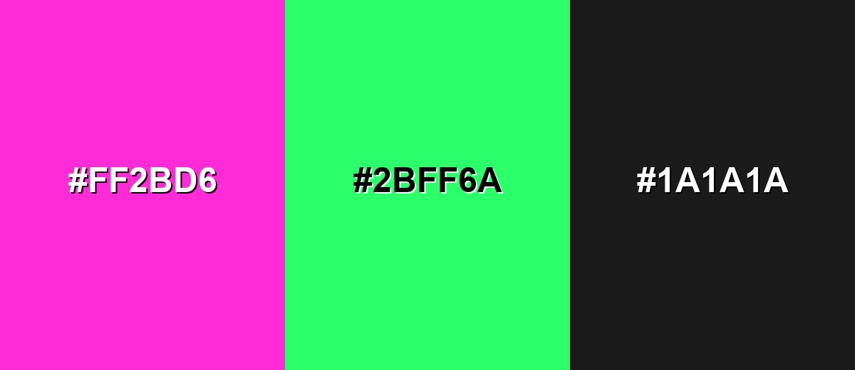
A complementary pairing uses the opposite side of the hue wheel to create maximum contrast and punch. With neon pink, a bright neon green brings a crisp, high-energy look that feels modern and attention-driven.
Complementary Palette Example: Try neon pink with neon green, grounded by a near-black neutral for structure.
Analogous Color Schemes
Analogous colors sit adjacent to each other on the color wheel, creating harmonious, cohesive palettes with subtle variation.
Pink-to-purple analogous: energetic and smooth, ideal for gradients and modern hero sections.
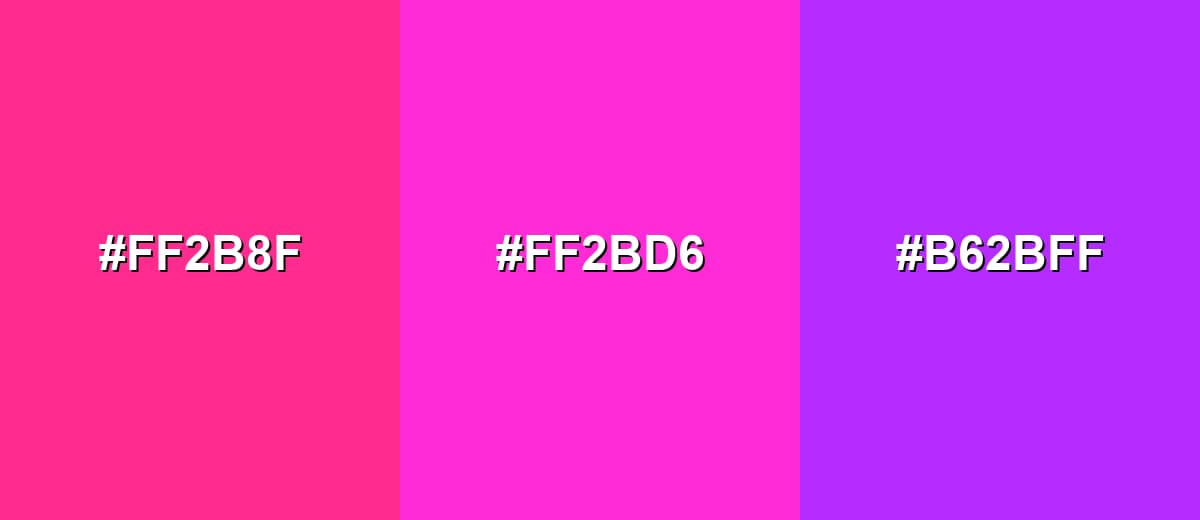
- Neon Rose: #FF2B8F
- Neon Pink: #FF2BD6
- Electric Purple: #B62BFF
Red-pink-magenta analogous: warmer, bolder, and great for social graphics and packaging accents.
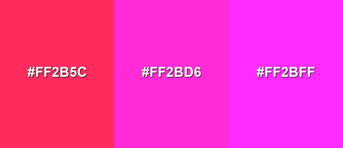
- Neon Red-Pink: #FF2B5C
- Neon Pink: #FF2BD6
- Neon Magenta: #FF2BFF
Triadic & Tetradic Combinations
A triadic palette spreads three hues evenly, keeping contrast lively without relying on a single opposite.
Neon pink with neon yellow and electric cyan creates a bold, playful, poster-like balance.
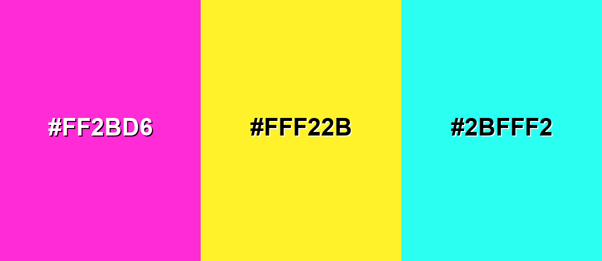
- Neon Pink: #FF2BD6
- Neon Yellow: #FFF22B
- Electric Cyan: #2BFFF2
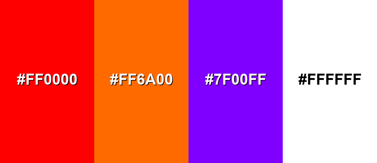
Colors to Avoid
While neon pink is remarkably versatile, certain combinations can create problematic visual effects:
- Pure Red (#FF0000) - Both are intense and warm-leaning, which can feel aggressive and muddy when placed side by side.
- Bright Orange (#FF6A00) - Competes at the same visual volume, making layouts feel chaotic unless heavily controlled.
- Electric Violet (#7F00FF) - Sits close in hue and saturation, creating a vibrating edge effect that strains the eye.
- Pure White (#FFFFFF) - The high brightness contrast can cause glare and reduce the legibility of small elements on neon pink.
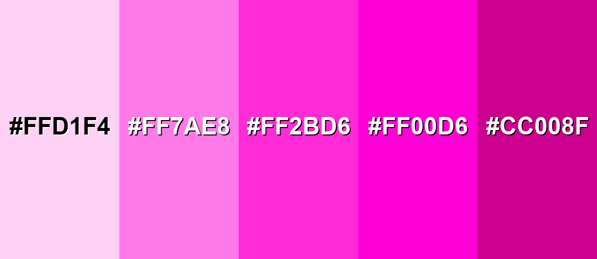
Shades, Tints & Variations of Neon Pink
Neon pink isn't just one "loud" color—there's a full range from airy tints to deeper, richer neon-inspired shades. This variety makes it easier to keep the vibe while adjusting readability, mood, and how much visual intensity your design can handle.
- Neon Pink Tint (#FFD1F4) - A soft, airy variation that keeps a pink-magenta feel without the glare. It's best used for Backgrounds, cards, subtle gradients, and large areas behind dark text..
- Bubblegum Neon (#FF7AE8) - A lighter neon-leaning pink that still feels playful and modern. It's best used for Illustrations, UI highlights, beauty branding, and friendly promotional graphics..
- Neon Pink (#FF2BD6) - The core bright neon pink with maximum saturation and high visibility. It's best used for CTAs, badges, key accents, and moments that must stand out instantly..
- Electric Magenta (#FF00D6) - A sharper, more intense magenta-leaning version with an even more synthetic punch. It's best used for Nightlife visuals, energetic hero sections, and high-impact display graphics..
- Deep Neon Pink (#CC008F) - A darker, richer take that reduces brightness while keeping the bold personality. It's best used for Headers, backgrounds with lighter accents, and sophisticated neon-inspired palettes..
Industry Applications
Neon pink shows up wherever visibility and personality matter more than subtlety. In most industries, it performs best as an accent that guides attention and signals a high-energy moment.
Fashion & Beauty
- Use it for statement pieces and limited drops where you want instant shelf and feed impact.
- Works well on cosmetic packaging and promo kits when balanced with clean neutrals.
- Pair with darker tones for a sharper, more modern finish that feels intentional.
- Keep typography bold and simple so the color doesn't overpower the message.
Interior Design & Decor
- Best as an accent in décor—art prints, cushions, signage—rather than full walls.
- Balance with matte textures and neutral backdrops to reduce visual noise.
- Be mindful of lighting; some LEDs can make neon pink appear even more intense.
- Use it to create focal points (a feature corner or pop piece) instead of filling the whole space.
Branding & Marketing
- Perfect for limited-time promotions, launches, and anything that needs fast recognition.
- Use it for CTA buttons, promo tags, and key highlights—then give it plenty of space.
- Anchor it with dark neutrals so your message stays readable and premium.
- For print campaigns, proof early since neon-like shades can dull in standard CMYK.
Conclusion
Neon pink earns its reputation as a high-impact color because it's bright, saturated, and almost "glowing" in digital spaces—making it a reliable choice for CTAs, promo accents, nightlife-inspired visuals, and modern branding. The trick is using it with restraint: give it a clear job in your layout, support it with neutrals, and test contrast so text and icons stay crisp. With #FF2BD6 as a dependable starting point, you can build neon pink palettes that feel bold and energetic without turning into visual noise.
Design Smarter with AI: Media.io is an online AI studio that empowers creators with advanced image generation and enhancement tools. From text-to-image and image-to-image creation to AI upscaling and color optimization, it enables fast, creative, and professional results—all in your browser.

Frequently Asked Questions About Neon Pink Color
Here are quick answers to the most common questions people ask when using neon pink in design, branding, and print.
They're related, but not identical. Hot pink is vivid, while neon pink pushes saturation and brightness further, often reading more electric or fluorescent on screens and under strong lighting.
A common neon pink reference is RGB 255, 43, 214. RGB is best for digital work because it matches how screens mix red, green, and blue light.
Its complementary partner is a bright green in the opposite hue range. A practical pairing is neon pink with a neon green like #2bff6a, balanced with a dark neutral.
Dark text usually reads best because it resists glare and keeps edges crisp. Try near-black tones such as #111111 or #1a1a1a, and always test small text for clarity.
It can be approximated, but truly neon intensity is hard to reproduce in standard CMYK. For critical matches, use proofs and consider spot inks or specialty fluorescent options when available.
Reduce the amount of neon pink on the page and increase neutral space around it. You can also use a lighter tint like #ffd1f4 or a deeper variant like #cc008f to keep the vibe without the glare.


