

Eggshell color is a soft, warm off-white that looks like the natural shell of a hen's egg—light, creamy, and slightly yellow-beige rather than stark white.
A reliable digital reference is #F0EAD6, which helps you match eggshell consistently across screens and print while keeping that calm, welcoming feel.
Eggshell Color: Codes & Values
Use these standard values to reproduce eggshell accurately in UI, print, and brand systems.
| Parameters | VALUE |
| HEX Code | #F0EAD6 |
| RGB DECIMAL | 240, 234, 214 |
| RGB PERCENTAGE | 94.1%, 91.8%, 83.9% |
| CMYK | 0%,3%,11%,6% |
| HSL | 46°, 47%, 89% |
| HSV (HSB) | 46°, 11%, 94% |
| Web Safe | #FFFFCC |
Key Color Space Explanations:
- HEX - HEX is a 6-digit code used on the web to define a specific sRGB shade. Use #f0ead6 to reproduce eggshell consistently in digital designs.
- RGB - RGB describes the mix of red, green, and blue light that creates the shade on screens. Higher values here keep eggshell bright while a slightly lower blue adds warmth.
- CMYK - CMYK is used for print and represents cyan, magenta, yellow, and black ink percentages. Eggshell stays light because black is low, with a small yellow component for its creamy tone.
- HSL - HSL expresses hue, saturation, and lightness, which is helpful when adjusting warmth or softness. Eggshell has a yellow-leaning hue with low-to-moderate saturation and very high lightness.
- Web Safe - Web-safe values are legacy display-safe steps used to reduce color shifts on older systems. The closest web-safe match to eggshell is #ffffcc.
For digital work, start with #F0EAD6 and adjust surrounding neutrals (not the base) to keep the warmth consistent across different screens and lighting.
Eggshell Color Conversions
Need eggshell in another color space? Here are quick conversions you can copy into design tools and style sheets.
| Parameters | VALUE | CSS |
| HEX | #f0ead6 | #f0ead6 |
| RGB DECIMAL | 240, 234, 214 | rgb(240,234,214) |
| RGB PERCENTAGE | 94.1%, 91.8%, 83.9% | rgb(94.1%,91.8%,83.9%) |
| CMYK | 0%,3%,11%,6% | cmyk(0%,3%,11%,6%) |
| HSL | 46°, 47%, 89% | hsl(46°, 47%, 89%) |
| HSV (or HSB) | 46°, 11%, 94% | -- |
| Web Safe | ffffcc | #ffffcc |
| CIE-LAB | 92.7, -1.3, 10.5 | -- |
| XYZ | 77.5, 82.3, 75.4 | -- |
| xyY | 0.3297, 0.3501, 82.3 | -- |
| CIE-LCH | 92.7, 10.6, 97.1° | -- |
| CIE-LUV | 92.7, 4.5, 15.9 | -- |
| Hunter-Lab | 90.7, -1.4, 10.1 | -- |
| Binary | 11110000 11101010 11010110 | -- |
Want to generate Eggshell Color photos or posters? Try Media.io's AI Image Generator now!
Eggshell Color Meaning & Symbolism
Eggshell commonly represents comfort, quiet cleanliness, and understated warmth. It often reads as more relaxed and lived-in than pure white, which is why Eggshell Color meaning is frequently tied to ease and approachability in everyday spaces.
Psychological Effects
As a warm near-white, eggshell keeps designs bright while softening the overall feel.
- Calmer Visual Tone - Eggshell can make a layout feel calmer and less clinical than bright white, while still keeping things airy.
- Reduced Screen Glare - On screens, it softens glare and helps interfaces feel friendly, especially for content-heavy pages.
- More Inviting Interiors - In interiors, its warmth can make rooms feel more inviting and can visually smooth harsh shadows.
- Less Formal Mood - That same softness can make a space feel less formal, which works well for cozy settings.
- Warmth Sensitivity - In low light it can lean more yellow than expected, so pairing it with clear contrast colors helps it avoid feeling vague.
Positive Associations
Eggshell is often chosen when you want "clean" without the starkness of pure white.
- Comfort - Its creamy warmth reads as comforting and easy to live with.
- Quiet Cleanliness - It suggests cleanliness in a softer, more relaxed way than bright white.
- Understated Warmth - The slight yellow-beige undertone adds warmth without turning fully beige.
- Approachability - It feels welcoming and friendly, especially as a background for text and photography.
- Natural Care - In packaging and product design, it can hint at gentle materials and thoughtful, minimal presentation.
Cultural Significance Across the World
Because it's a near-white neutral, eggshell tends to travel well across styles and markets.
- Simplicity - As a near-white neutral, eggshell is often associated with simplicity in modern design contexts.
- Minimalism - It supports minimalist layouts where you want softness instead of harsh, bright white.
- Natural Materials - In product and packaging design, it can signal natural materials without relying on stark white.
- Handcrafted Feel - Paired with muted inks and minimal typography, it can suggest a gentle, handcrafted tone.
Design Applications
Eggshell works best when you want the benefits of a light background without the harshness of pure white, making it a reliable base for digital products, print, and interiors.
Graphic Design Tips
- Use eggshell as a background for editorial layouts, dashboards, and settings screens to reduce visual fatigue.
- Pair it with a deep accent like #2b3a67 for navigation, buttons, and headings to keep hierarchy crisp.
- For borders and dividers, choose slightly darker neutrals such as #e6ddc5 or #b8a98a to avoid stark lines.
- Because it is very light, check proofs to ensure subtle warmth is preserved and does not drift too yellow.
- Avoid overly low-contrast text on eggshell; use strong darks like #000000 or deep accents like #2b3a67.
Pro tip: If eggshell starts to look "washed out," don't brighten the background—strengthen contrast with darker type, clearer spacing, and more defined UI states.
Eggshell Color in Photography & Video
- Use eggshell as a clean, warm backdrop for product shots when pure white feels too cold.
- Watch white balance: warmer lighting can push eggshell more yellow, so test under your actual scene lights.
- In color grading, eggshell works well for soft highlight tones that still feel natural and bright.
- For titles and lower-thirds, place dark text over eggshell surfaces to keep readability crisp on-camera.
- When mixing backgrounds, avoid pairing eggshell directly with pure white props to prevent the backdrop from looking dull.
Recommended Tool for Image Enhancement: When incorporating eggshell color into your photography projects, Media.io's AI Image tools can help you achieve more refined results. With AI-powered color enhancement, photo colorization, image upscaling, and old photo restoration, you can easily enrich eggshell color tones, improve overall image quality, and highlight the color's elegant and sophisticated aesthetic.
Color Combinations
Eggshell is a flexible near-white that pairs easily with both warm neutrals and cool anchors. These palettes highlight different moods, from classic and cozy to clean and modern.
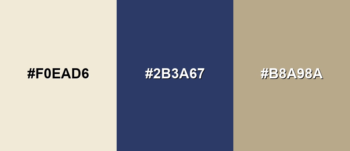
Complementary Colors
A cool blue complement balances eggshell's warmth, creating a crisp, modern contrast without feeling harsh.
Complementary Palette Example: Use #F0EAD6 with #2B3A67 for strong contrast, then add #B8A98A to keep the overall feel grounded and natural.
Analogous Color Schemes
Analogous colors sit adjacent to each other on the color wheel, creating harmonious, cohesive palettes with subtle variation.
Cream-to-sand neighbors keep the palette calm and cohesive for minimal layouts and soft interiors.
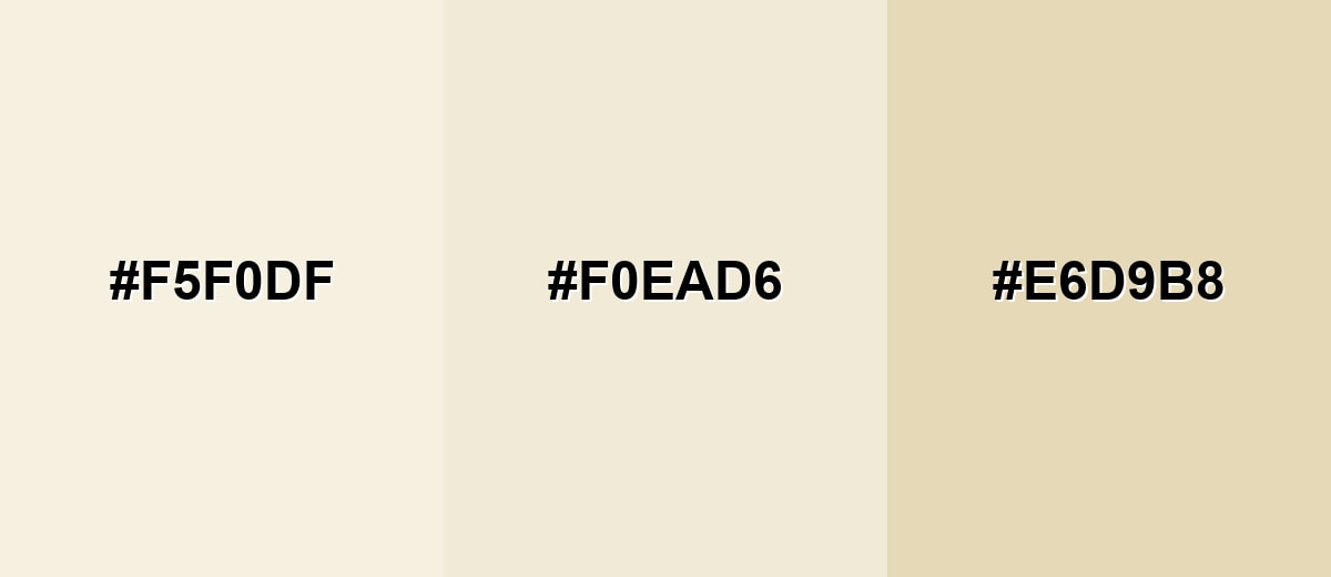
- Pale Cream: #F5F0DF
- Eggshell: #F0EAD6
- Light Sand: #E6D9B8
Warm ivory and blush tones add a subtle cozy lift while staying light and airy.
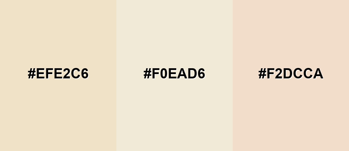
- Soft Beige: #EFE2C6
- Eggshell: #F0EAD6
- Blush Ivory: #F2DCCA
Triadic & Tetradic Combinations
A triadic palette adds variety while keeping balance, especially when the accents are softened and slightly dusty.
Combine eggshell with a muted green and a gentle purple for a fresh, creative look that still feels refined.
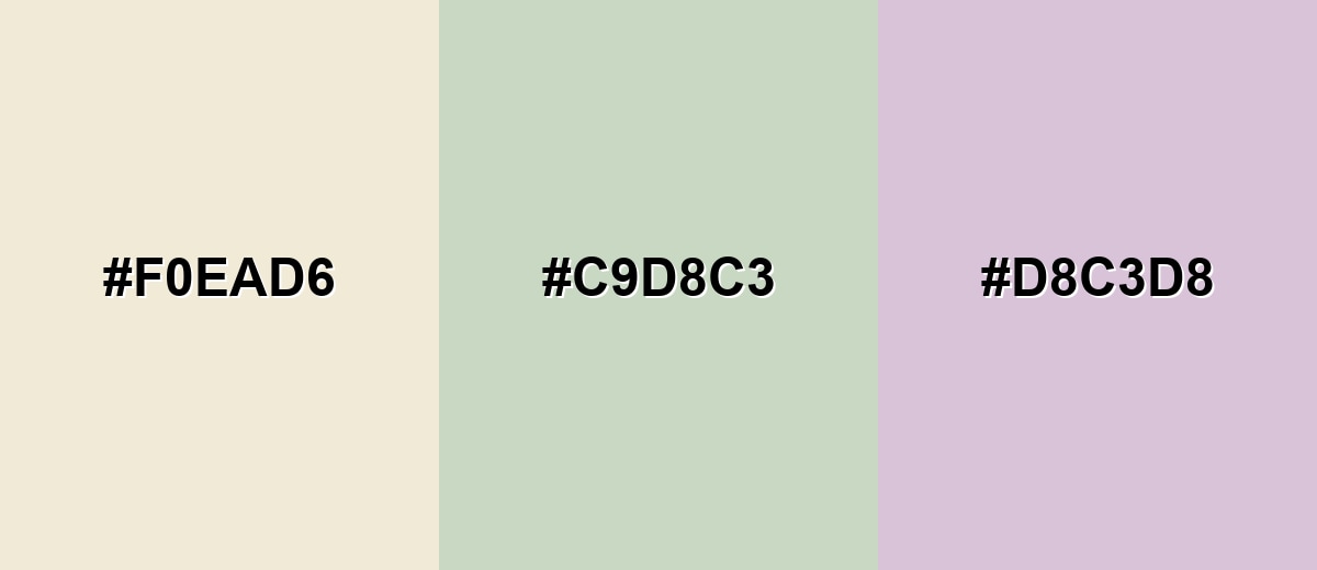
- Eggshell: #F0EAD6
- Dusty Sage: #C9D8C3
- Soft Lavender: #D8C3D8
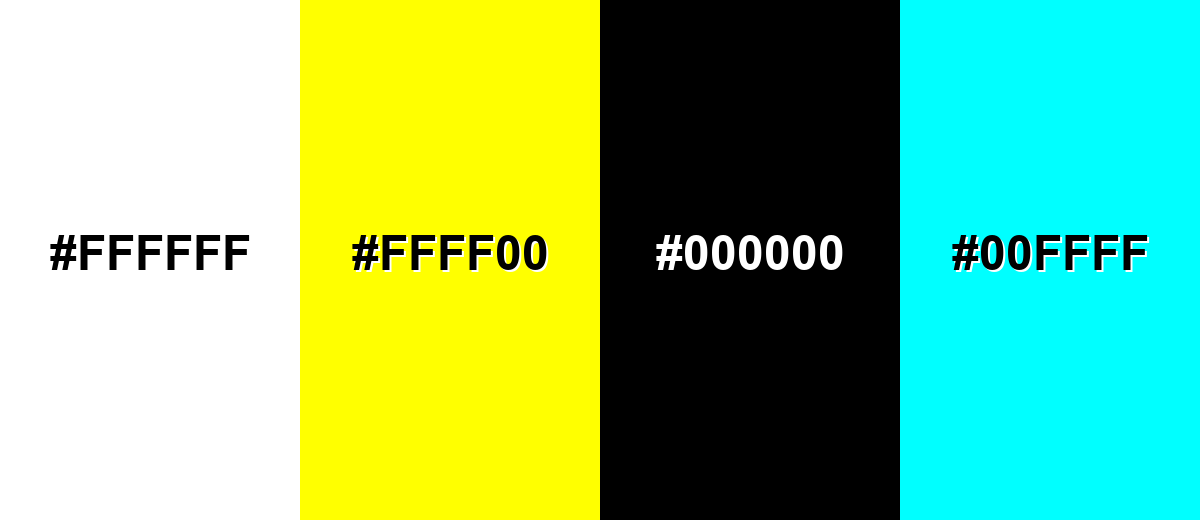
Colors to Avoid
While eggshell color is remarkably versatile, certain combinations can create problematic visual effects:
- Pure White (#FFFFFF) - Next to pure white, eggshell can look yellowed or dull, which may make surfaces feel mismatched.
- Neon Yellow (#FFFF00) - Highly saturated yellow exaggerates eggshell's warm undertone and can create a loud, unbalanced look.
- Jet Black (#000000) - The contrast can be extremely harsh, making soft backgrounds feel abrupt and less inviting.
- Bright Cyan (#00FFFF) - This intense cool tone can clash with eggshell's warmth, creating a jarring, mismatched palette.
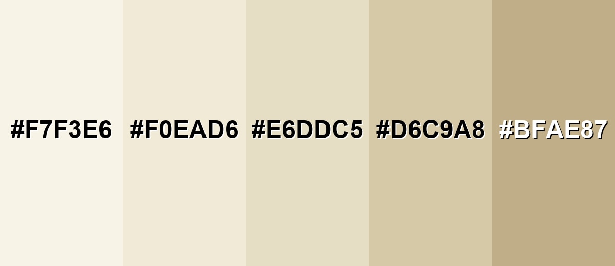
Shades, Tints & Variations of Eggshell Color
Eggshell isn't just one "off-white"—it spans a whole range from barely-there ivory to deeper, grounded neutrals. Knowing these close variations makes it easier to build depth in layouts, add gentle section contrast, and keep a warm tone consistent across a full design system.
- Ivory Mist (#F7F3E6) - A lighter, airier take on eggshell with a barely-there warmth. It's best used for Large backgrounds, subtle cards, and bright interiors where you want softness without noticeable beige.
- Classic Eggshell (#F0EAD6) - The balanced reference shade: creamy, warm, and gentle compared to pure white. It's best used for Primary background for UI, wall paint inspiration boards, and minimal branding systems.
- Warm Parchment (#E6DDC5) - A slightly deeper variant that reads more like natural paper. It's best used for Section backgrounds, subtle contrast panels, and editorial layouts that need warmth.
- Oat Beige (#D6C9A8) - A warmer mid-light neutral with more visible beige character. It's best used for Secondary surfaces, warm UI components, and soft interior accents like textiles.
- Toasted Almond (#BFAE87) - A darker, earthier shade that keeps the same warm family. It's best used for Borders, headings, packaging accents, and grounding elements paired with eggshell backgrounds.
Industry Applications
Because it is light, warm, and easy to read on, eggshell fits many industries that want a clean look without feeling sterile—especially when a neutral base needs to support photos, typography, or product details.
Fashion & Beauty
- Use eggshell as a gentle packaging background that feels clean and natural, not stark.
- Pair it with minimal typography to create a premium, care-forward look.
- Build calm landing pages and product detail sections where readability matters.
- Support photography-heavy layouts with warmer negative space so images don't feel cold.
Interior Design & Decor
- Use it in wall and trim inspiration palettes when you want a brighter space that still feels warm.
- Create catalog and lookbook backgrounds that keep home goods true-to-life.
- Layer eggshell with natural woods and textiles for a cozy, lived-in mood.
- Use slightly deeper variations for section breaks, panels, and soft contrast throughout a room plan.
Branding & Marketing
- Support premium, heritage-inspired branding with muted inks and simple layout structure.
- Use it in menus and hospitality visuals to add warmth and approachability.
- Build documentation themes and dashboard backgrounds that feel friendly (not clinical) while staying bright.
- Keep calls-to-action clear by pairing eggshell with deep accent elements for strong hierarchy.
Conclusion
Eggshell color is a warm off-white that stays bright while feeling softer and more welcoming than pure white. With #F0EAD6 as your reference, it becomes easy to keep that creamy tone consistent across UI backgrounds, print layouts, packaging, and interior mood boards. Pair eggshell with deep anchors for clarity, or build a calm, layered look using nearby warm neutrals—either way, it delivers a clean design that still feels human and comfortable.
Design Smarter with AI: Media.io is an online AI studio that empowers creators with advanced image generation and enhancement tools. From text-to-image and image-to-image creation to AI upscaling and color optimization, it enables fast, creative, and professional results—all in your browser.

Frequently Asked Questions About Eggshell Color
Eggshell is a warm off-white with a subtle creamy, slightly yellow-beige undertone. It looks softer than pure white and can shift warmer under yellow lighting.
A commonly used digital hex value for eggshell is #f0ead6. It is a light, warm neutral suitable for backgrounds and soft surfaces.
Eggshell sits between white and beige, but it usually reads closer to white at a glance. The beige warmth becomes more noticeable when placed next to pure white or cool grays.
Deep blues like #2b3a67, warm neutrals like #b8a98a, and muted greens such as #6b8f71 pair well with eggshell. Soft analogous tones like #e6ddc5 also keep the look cohesive.
Yes. Eggshell is comfortable for reading and reduces the starkness of pure white, especially in content-heavy interfaces. Use dark text like #000000 or #2b3a67 to maintain clear contrast.
Eggshell has a warm undertone, so surrounding colors and lighting can push it toward a more yellow appearance. Warm bulbs, nearby reds, or strong yellows can amplify that warmth.


