

Coral is a bright, sun-warmed color that sits between pink and orange. It feels energetic without being as intense as neon, which is why it's popular in branding, UI accents, beauty packaging, and seasonal design.
On this page, you'll find what coral color is, what it communicates, exact color codes, reliable combinations, and a set of coral shades you can use right away.
Coral Color: Codes & Values
If you want a coral color that stays consistent across design tools, devices, and print outputs, begin with the standard digital reference values below. Using accurate HEX, RGB, CMYK, and HSL coral color codes helps ensure reliable reproduction in web design, UI systems, branding materials, and professional print workflows. From this base coral shade, you can confidently create lighter tints or deeper shades while maintaining visual harmony and color accuracy across platforms.
| Parameters | VALUE |
| HEX Code | #FF7F50 |
| RGB DECIMAL | 255, 127, 80 |
| RGB PERCENTAGE | 100%, 49.8%, 31.4% |
| CMYK | 0%,50%,69%,0% |
| HSL | 16°, 100%, 66% |
| HSV (HSB) | 16°, 69%, 100% |
| Web Safe | #FF6666 |
Key Color Space Explanations:
- HEX is the most common code for screens and web design. Use #ff7f50 to match this exact coral color in digital projects.
- RGB mixes red, green, and blue light to create colors on displays. Coral is 255 red, 127 green, and 80 blue, giving it a warm pink-orange look.
- CMYK is used for printing and describes ink percentages. Coral converts to 0% cyan, 50% magenta, 69% yellow, and 0% black as a practical starting point for print workflows.
- HSL represents hue, saturation, and lightness, which is helpful for creating consistent tints and shades. Coral's hue is about 16° with full saturation and mid-high lightness for a bright, friendly tone.
- Web Safe colors are an older, limited palette designed for legacy display consistency. The closest web-safe match to coral is #ff6666.
Use HEX/RGB for web and UI work, switch to HSL when you're building tints and shades, and always proof CMYK if coral needs to print accurately.
Want to generate coral color photos or posters? Try Media.io's AI Image Generator now!
Coral Color Conversions
To keep your coral color consistent across different platforms, accurate color conversion is essential. The coral color conversions below provide equivalent values in HEX, RGB, CMYK, and HSL formats, making it easier to match coral color across design apps, CSS code, branding systems, and print workflows. Whether you're translating coral from screen to press or adjusting it inside your design software, these standardized conversion values help eliminate guesswork and maintain a balanced, true-to-tone coral color in every environment.
| Parameters | VALUE | CSS |
| HEX | #ff7f50 | #ff7f50 |
| RGB DECIMAL | 255, 127, 80 | rgb(255,127,80) |
| RGB PERCENTAGE | 100%, 49.8%, 31.4% | rgb(100%,49.8%,31.4%) |
| CMYK | 0%,50%,69%,0% | cmyk(0%,50%,69%,0%) |
| HSL | 16°, 100%, 66% | hsl(16°,100%,66%) |
| HSV (or HSB) | 16°, 69%, 100% | -- |
| Web Safe | ff6666 | #ff6666 |
| CIE-LAB | 67.4, 45.0, 47.6 | -- |
| XYZ | 50.33, 37.14, 12.08 | -- |
| xyY | 0.506, 0.373, 37.14 | -- |
| CIE-LCH | 67.4, 65.5, 46.6° | -- |
| CIE-LUV | 67.4, 100.8, 44.7 | -- |
| Hunter-Lab | 60.9, 45.4, 29.9 | -- |
| Binary | 11111111, 01111111, 01010000 | -- |
Coral Color Meaning & Symbolism
The coral color meaning comes from its unique balance between pink and orange. By blending pink’s friendliness with orange’s warmth and vitality, coral communicates a welcoming, upbeat personality that feels both modern and approachable. In branding and design, coral is often chosen to express energy without aggression and warmth without heaviness.
Psychological Effects
From a color psychology standpoint, coral tends to feel lively, social, and emotionally open. The psychological effects of coral make it a strong choice when you want to draw attention in a friendly way—offering visual energy without the harsh intensity of bright red or neon orange.
- Energy - Adds a bright, active feeling that can make layouts feel more dynamic.
- Warmth - Creates a sun-kissed tone that feels inviting and approachable.
- Optimism - Leans into a "fresh start" mood often linked with sunrise and summer.
- Comfort - Softer than pure red, coral can feel caring without looking pale.
- Trend Focus - Reads as modern and style-forward when used as a clean accent.
Positive Associations
Because it sits between pink and orange, the symbolism of coral often combines friendliness with confidence. In visual communication and branding, coral color associations frequently include vitality, encouragement, warmth, and contemporary style—making it especially effective for lifestyle brands, wellness design, and community-focused platforms.
- Friendly Social Energy - Signals warmth and ease in community-driven designs.
- Vitality - Suggests movement, health, and a light "active lifestyle" vibe.
- Encouragement - Feels supportive and uplifting without the urgency of red.
- Coastal Leisure - Brings subtle tropical cues that hint at travel and outdoor living.
- Fresh Contemporary Style - Works well for trend-forward brands and modern UI accents.
Cultural Significance Across the World
The cultural meaning of coral can vary by region, but it commonly falls within a warm, celebratory, and human-centered spectrum. Globally, coral appears in festive design, travel branding, seasonal campaigns, and coastal-inspired palettes where joy, sunlight, and connection are central themes.
- Celebration - Frequently used in festive, seasonal visuals where warmth and joy are the goal.
- Romance - A popular event accent (especially with ivory) when you want softer passion than red.
- Coastal Nature - Connected to sea-life inspiration, summer travel, and sunlit environments.
- Modern Pop - Common in contemporary branding to feel fresh, approachable, and current.
Design Applications
The coral color in design works best when used strategically. Because of its brightness and warmth, coral performs strongly as an accent color in UI design, branding systems, packaging, and marketing materials. Pairing coral with light neutrals and one cool contrast color—such as navy or teal—helps maintain clarity, balance, and visual sophistication.
Graphic Design Tips
- Use coral for primary buttons or highlights when you want a friendly, energetic call-to-action.
- Keep large coral areas to hero sections with generous spacing so the color doesn't feel loud.
- For text and icons, pair coral with darker neutrals or deeper cool hues to protect readability.
- In branding, balance coral with simple typography and clean layout grids for a premium feel.
- For print, test coral in proofs—bright corals can shift depending on paper and color profiles.
Pro tip: If coral feels too intense, don't change the whole palette—soften it by pushing the background toward off-white and letting coral live in small, high-impact areas like CTAs, tags, or key illustrations.
Coral Color in Photography & Video
- Use coral wardrobe or props to add warmth to lifestyle shots without going full red.
- Coral plays well in golden-hour lighting, helping skin tones and highlights look lively.
- For product videos, coral accents can guide the eye to key features or calls to action.
- Try coral in thumbnails or end cards to create a friendly "tap-worthy" contrast.
- When color grading, keep an eye on saturation—coral can clip quickly in bright scenes.
Recommended Tool for Image Enhancement: When incorporating coral color into your photography projects, Media.io's AI Image tools can help you achieve more refined results. With AI-powered color enhancement, photo colorization, image upscaling, and old photo restoration, you can easily enrich coral color tones, improve overall image quality, and highlight the color's elegant and sophisticated aesthetic.
Color Combinations
Coral is easy to pair because it naturally creates contrast with cool hues and harmony with nearby warm tones. Below are ready-made palettes for common design goals, plus a few combinations that often clash.
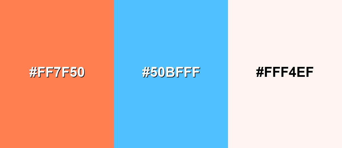
Complementary Colors
The complementary approach pairs coral with a cool blue-cyan to maximize contrast. This creates a fresh, energetic look that's great for modern UI and marketing.
Complementary Palette Example: Use Coral as the hero color, Ocean Blue for contrast, and Soft Ivory to keep the layout bright and breathable.
Analogous Color Schemes
Analogous colors sit adjacent to each other on the color wheel, creating harmonious, cohesive palettes with subtle variation.
A pink-leaning analogous palette that feels cheerful, sweet, and social.
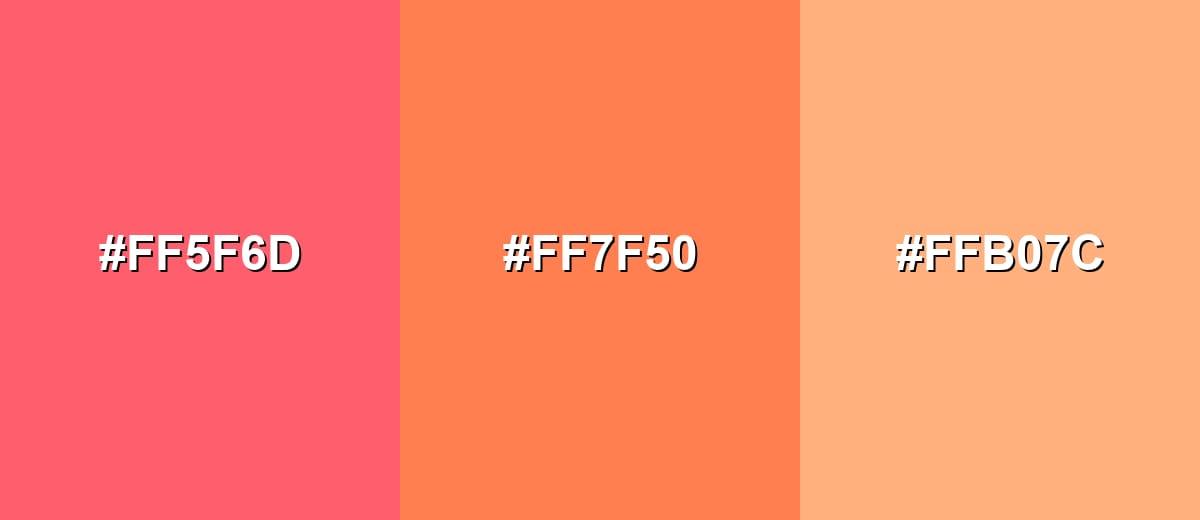
- Watermelon Pink: #FF5F6D
- Coral: #FF7F50
- Apricot: #FFB07C
An orange-leaning analogous palette that feels sunny, appetizing, and upbeat.
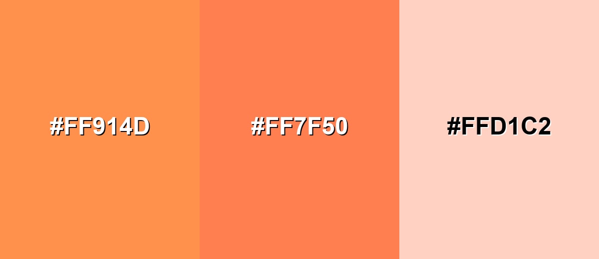
- Tangerine: #FF914D
- Coral: #FF7F50
- Peach Cream: #FFD1C2
Triadic & Tetradic Combinations
Triadic palettes use three evenly spaced hues for balanced variety and strong visual interest.
Pair Coral with a fresh mint and a soft violet for a playful, modern spectrum.
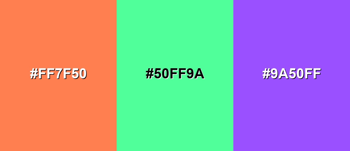
- Coral: #FF7F50
- Mint Green: #50FF9A
- Violet: #9A50FF
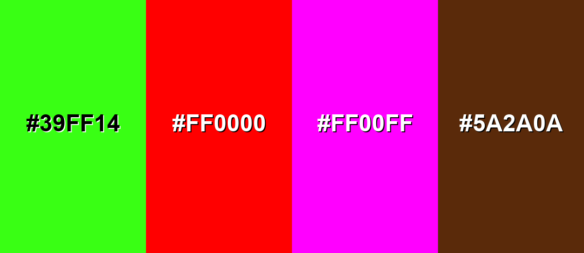
Colors to Avoid
While coral color is remarkably versatile, certain combinations can create problematic visual effects:
- Neon Green (#39FF14) - Competes with coral's saturation and creates harsh vibration, especially on screens.
- Pure Red (#FF0000) - Pushes the palette too hot; coral can start to look dull or muddy next to it.
- Electric Magenta (#FF00FF) - Overpowers coral and can make designs feel chaotic unless carefully balanced with strong neutrals.
- Dark Chocolate Brown (#5A2A0A) - The heavy, low-lightness contrast can make coral feel overly loud and reduce the airy warmth many people want from coral.
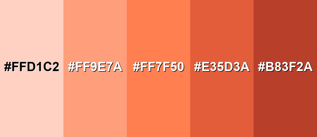
Shades, Tints & Variations of Coral Color
Coral isn't just one "set" color—its range includes airy tints for backgrounds, mid-tones for everyday UI accents, and deeper shades that hold up for buttons and headlines. Having a few coral variations on hand makes it easier to keep your design consistent across states, layouts, and lighting conditions.
- Peach Cream (#FFD1C2) - A light, airy coral tint with a soft, creamy feel. It's best used for Backgrounds, large surfaces, gentle gradients, and calming UI sections..
- Soft Coral (#FF9E7A) - A slightly muted coral that keeps warmth while feeling less intense. It's best used for Cards, badges, illustrations, and interior accents where you want warmth without loudness..
- Classic Coral (#FF7F50) - The bright, recognizable coral that sits between pink and orange. It's best used for CTAs, hero accents, brand highlights, packaging details, and social graphics..
- Deep Coral (#E35D3A) - A deeper coral with more red-orange weight and stronger contrast. It's best used for Buttons on light backgrounds, headlines, icons, and bold branding elements..
- Dark Coral (#B83F2A) - A darker, earthier coral that feels grounded and mature. It's best used for Text accents, outlines, UI states (active/pressed), and premium palettes with warm neutrals..
Industry Applications
Coral's friendly energy makes it versatile across industries. It can signal warmth and confidence, and it photographs well in both digital and print when managed carefully.
Fashion & Beauty
- Freshness - Supports "healthy glow" messaging in lip, blush, and skincare visuals.
- Modern Femininity - Reads playful and confident without the intensity of pure red.
- Seasonal Drops - Works well for spring/summer campaigns and limited-edition packaging.
- Social-First Creative - Pops in thumbnails, product shots, and short-form video overlays.
Interior Design & Decor
- Accent Decor - Shines in pillows, ceramics, and artwork when you want warmth in small doses.
- Softened Walls - Looks best as moderated tints rather than full-saturation paint.
- Natural Balance - Pairs nicely with warm woods, linen-like neutrals, and muted greens.
- Relaxed Modern Mood - Brings a cozy, welcoming tone without making a space feel heavy.
Branding & Marketing
- Approachable CTAs - Strong for buttons and highlights when you want friendly urgency.
- Lifestyle Positioning - Fits wellness, beauty, and consumer brands aiming for warmth and optimism.
- Premium Pairing - Can feel elevated when balanced with charcoal/ivory-like neutrals and minimal type.
- Print Awareness - Needs proofing in CMYK since bright corals can shift toward red or orange.
Conclusion
Coral color (#FF7F50) is a lively pink-orange that brings warmth, friendliness, and modern energy to everything from UI accents to packaging and decor. Use it as a confident highlight—especially for buttons, badges, and hero details—then balance it with light neutrals or cool blues for clean contrast. When you need a softer mood, choose a lighter coral tint; when you need stronger emphasis, step into deeper coral shades and proof the result for print.
Design Smarter with AI: Media.io is an online AI studio that empowers creators with advanced image generation and enhancement tools. From text-to-image and image-to-image creation to AI upscaling and color optimization, it enables fast, creative, and professional results—all in your browser.

Frequently Asked Questions About Coral Color
Coral is a warm color between pink and orange, inspired by natural sea coral. It's bright, cheerful, and often used as an accent to add warmth and energy.
A widely used digital coral is #ff7f50. It's a vivid pink-orange coral that matches the classic "coral" reference in many design tools.
For #ff7f50, RGB is 255, 127, 80. A practical CMYK conversion is 0%,50%,69%,0%, though print results can vary by paper and color profile.
Coral pairs well with cool blues/teals for contrast, with ivory and warm neutrals for softness, and with greens like sage or mint for a fresh, modern feel.
Coral sits in the middle and can lean pink or orange depending on the specific shade. More magenta makes it pink-leaning; more yellow makes it orange-leaning.
Use coral as an accent (buttons, highlights, small sections) and rely on light neutrals for the main background. For text, use dark neutrals or deep cool colors to maintain contrast and readability.


