
 TL;DR:
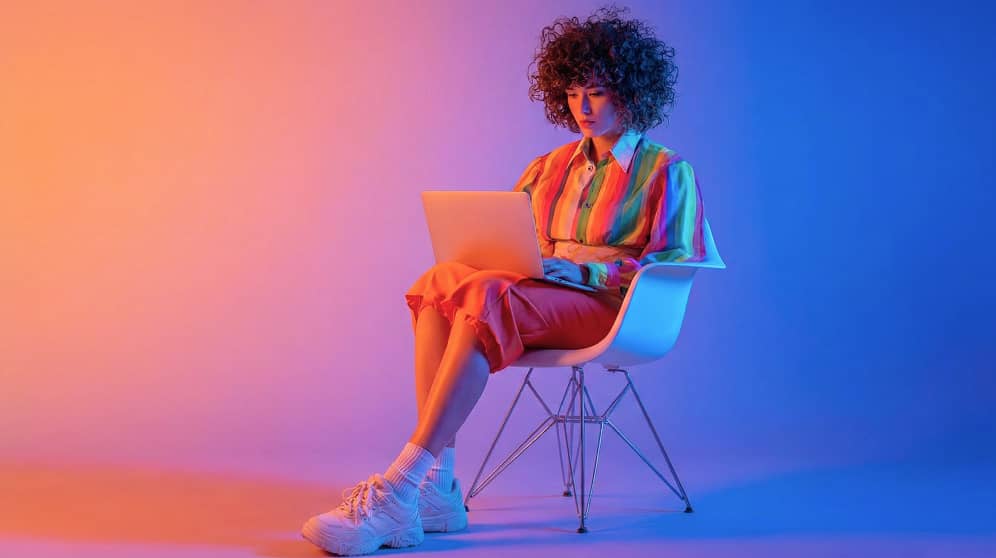
Gray (standard HEX #808080) acts as a neutral structural stabilizer in design, best utilized by building a multi-shade hierarchy and applying a single vibrant accent color to prevent visual flatness.
● Define a strict contrast hierarchy by reserving darker variations like Charcoal Gray (#36454F) for high-contrast text and light variations (#D9D9D9) for backgrounds, strictly avoiding mid-gray text on mid-gray layouts to prevent accessibility failures.
● Prevent the design from feeling cold or dull by pairing the gray base with one confident accent hue (such as vivid blue or signal red), while avoiding problematic pairings like Neon Yellow (#F8FF00) which causes harsh glare, or Dusty Brown (#6B4F3B) which creates a muddy appearance.
● Commit to either warm or cool gray undertones at the start of a project to maintain a cohesive palette across workflows, utilizing HEX values for UI design and switching to CMYK (0%,0%,0%,50%) when generating predictable physical print outputs.
Ask AI for a summary
 ChatGPT
 Perplexity
 Gemini
 Claude
 Grok
Grok
Gray is a neutral tone that sits between black and white—think overcast skies, stone, and brushed metal. A common digital reference for gray is the hex code #808080.
It's often perceived as calm, balanced, and practical, but it can feel distant when overused. Below, you'll find gray color codes, conversions, dependable pairings, shade ideas, and clear tips for using it in modern design.
Gray Color: Codes & Values
Use these standard values to match gray accurately across web design, UI tools, and print workflows.
| Parameters | VALUE |
| HEX Code | #808080 |
| RGB DECIMAL | 128, 128, 128 |
| RGB PERCENTAGE | 50.2%, 50.2%, 50.2% |
| CMYK | 0%,0%,0%,50% |
| HSL | 0°, 0%, 50% |
| HSV (HSB) | 0°, 0%, 50% |
| Web Safe | #999999 |
Key Color Space Explanations:
- HEX - HEX is the most common way to identify a screen-ready shade in web design. It uses a six-digit code to define red, green, and blue intensity.
- RGB - RGB represents how much red, green, and blue light is mixed to display the shade on screens. It is widely used in UI design and digital imaging.
- CMYK - CMYK describes the ink mix used for printing on paper. It helps you predict how the shade will reproduce in packaging, posters, and other print projects.
- HSL - HSL breaks the shade into hue, saturation, and lightness, which can be easier to adjust when building palettes. For gray, saturation stays near zero while lightness changes create different tones.
- Web Safe - Web safe values are the closest legacy-friendly picks that reduced banding on older displays. They are still useful as quick, consistent fallbacks in some workflows.
In practice, start with HEX for UI and web, switch to RGB when you're styling components or exporting assets, and use CMYK when you need predictable print output.
Gray Color Conversions
Need gray in a different color model? Use the conversion table below to copy the exact value into your design app or CSS.
| Parameters | VALUE | CSS |
| HEX | #808080 | #808080 |
| RGB DECIMAL | 128, 128, 128 | rgb(128,128,128) |
| RGB PERCENTAGE | 50.2%, 50.2%, 50.2% | rgb(50.2%,50.2%,50.2%) |
| CMYK | 0%,0%,0%,50% | cmyk(0%,0%,0%,50%) |
| HSL | 0°, 0%, 50% | hsl(0°,0%,50%) |
| HSV (or HSB) | 0°, 0%, 50% | -- |
| Web Safe | 999999 | #999999 |
| CIE-LAB | 53.6, 0.0, 0.0 | -- |
| XYZ | 20.5, 21.6, 23.5 | -- |
| xyY | 0.313, 0.329, 21.6 | -- |
| CIE-LCH | 53.6, 0.0, 0° | -- |
| CIE-LUV | 53.6, -0.2, 0.3 | -- |
| Hunter-Lab | 46.5, 0.0, 0.0 | -- |
| Binary | 10000000 10000000 10000000 | -- |
Want to generate Gray Color photos or posters? Try Media.io's AI Image Generator now!
Gray Color Meaning & Symbolism
Gray commonly represents neutrality, balance, and restraint. In everyday life it shows up in materials like concrete, stone, fog, and metal, which is why it often reads as steady and practical. When people look up gray color meaning, they are usually trying to understand why it feels modern and understated while still being highly versatile.
Psychological Effects
Because it's low-saturation, gray tends to support focus more than it competes for attention.
- Calm Visual Tone - Gray feels quieter than bright hues, helping layouts and screens feel less noisy.
- Content-First Clarity - Used in UI, gray often pushes text, imagery, and key actions forward.
- Professional Mood - It can suggest maturity and competence, which is why it's popular in tech and finance.
- Reduced Emotional Bias - Gray stays neutral, making it easier to let messaging and photography set the feeling.
- Risk Of Flatness - Without contrast or warmth, heavy gray use can read as cold, dull, or overly cautious.
Positive Associations
When balanced well, gray gives designs a refined, modern foundation.
- Reliability - Gray can communicate steadiness and trust through a restrained, consistent look.
- Balance - Sitting between black and white, it naturally supports "in-between" harmony in palettes.
- Minimal Elegance - Gray works with clean typography and spacing for a premium, understated feel.
- Versatility - It pairs easily with both cool and warm accents, making it simple to build systems around.
- Practicality - Because it's common in real-world materials (stone/metal), it often reads as functional and grounded.
Cultural Significance Across the World
Gray symbolism depends on context, but it often points to formality and moderation.
- Modesty - Gray is frequently linked to understated style and a "less is more" attitude.
- Formality - It shows up in tailored clothing and modern editorial design as a polished neutral.
- Industrial Heritage - Concrete, steel, and weathered stone connect gray with urban and architectural aesthetics.
- Ambiguity - As a midpoint between black and white, gray can symbolize compromise or something undecided.
Design Applications
Gray works best when you treat it as a stabilizer: it supports layout structure, type, and imagery while leaving room for accent tones to stand out.
Graphic Design Tips
- Use darker grays for headings and icons, mid grays for secondary elements, and light grays for backgrounds and dividers.
- Pair gray with one confident accent color for buttons, links, and highlights to keep the layout from feeling washed out.
- Decide early whether your project needs warm gray or cool gray undertones, then keep that choice consistent across screens.
- Avoid mid-gray text on mid-gray backgrounds—use near-black on light gray, or increase background darkness before using white.
- In dashboards and data-heavy pages, let gray grids and panels create structure so status colors and charts stay readable.
If your design feels "too gray," don't immediately add more colors—first tighten contrast (type weight + value), then introduce a single accent that repeats in key UI moments.
Gray Color in Photography & Video
- Use neutral gray backdrops to keep attention on faces, products, and key props.
- Watch lighting: flat light can make gray scenes look lifeless, while directional light adds shape and texture.
- In product shots, metallic-leaning grays can look premium, but reflections should be controlled to avoid clutter.
- For color grading, gray elements help balance a scene—just make sure highlights and shadows still have separation.
- In set design, gray works as a quiet anchor, but pairing it with one clear accent keeps the frame from feeling distant.
Recommended Tool for Image Enhancement: When incorporating gray color into your photography projects, Media.io's AI Image tools can help you achieve more refined results. With AI-powered color enhancement, photo colorization, image upscaling, and old photo restoration, you can easily enrich gray color tones, improve overall image quality, and highlight the color's elegant and sophisticated aesthetic.
Color Combinations
Because gray is neutral, it pairs cleanly with both cool and warm accents. The palettes below show dependable options for interfaces, branding, and editorial layouts, plus a few combinations that can cause low contrast or muddy results.
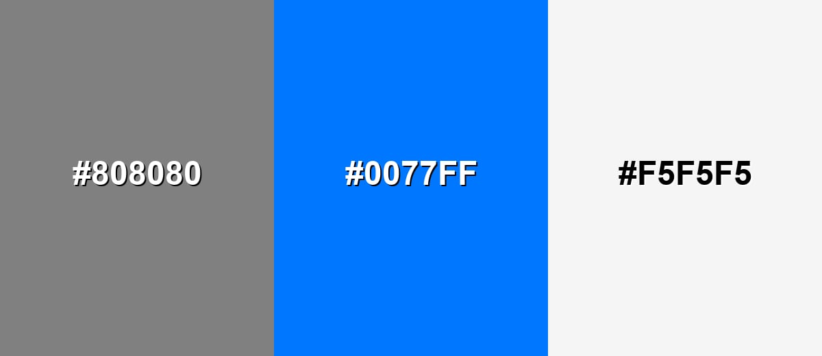
Complementary Colors
A classic approach is to keep gray as the base and use a saturated blue as the attention cue. This creates a modern, high-clarity look that works well for UI and product pages.
Complementary Palette Example: Use Neutral Gray for structure, Vivid Azure for calls to action, and Soft White for breathing room.
Analogous Color Schemes
Analogous colors sit adjacent to each other on the color wheel, creating harmonious, cohesive palettes with subtle variation.
A tonal grayscale set that feels clean, minimal, and easy to scale across layouts.
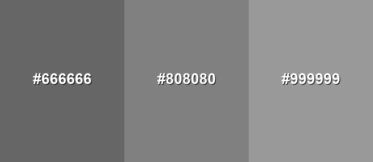
- Dark Gray: #666666
- Classic Gray: #808080
- Light Gray: #999999
A cool-to-warm gray run that adds subtle depth without looking colorful.
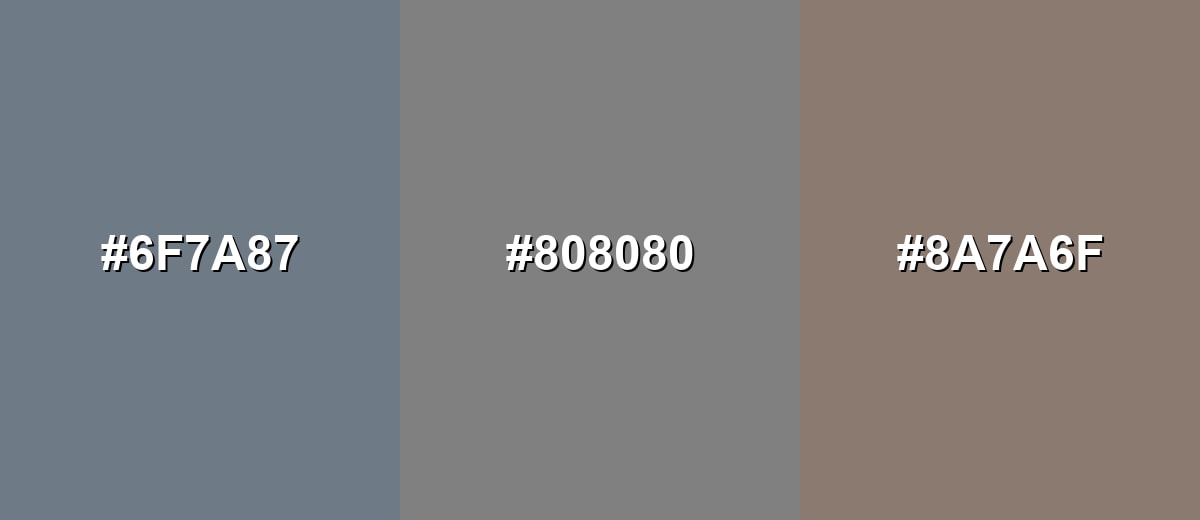
- Slate Gray: #6F7A87
- Neutral Gray: #808080
- Taupe Gray: #8A7A6F
Triadic & Tetradic Combinations
For a more energetic layout, add two accents while keeping gray as the stabilizing base.
This triad balances Neutral Gray with a warm red and a fresh green for clear emphasis.
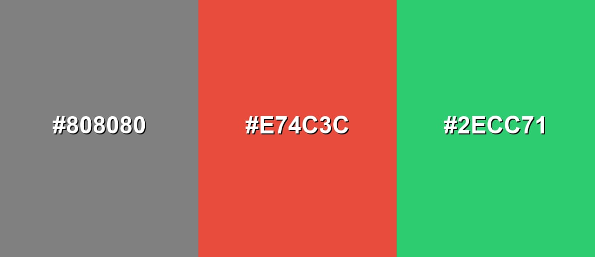
- Neutral Gray: #808080
- Signal Red: #E74C3C
- Leaf Green: #2ECC71
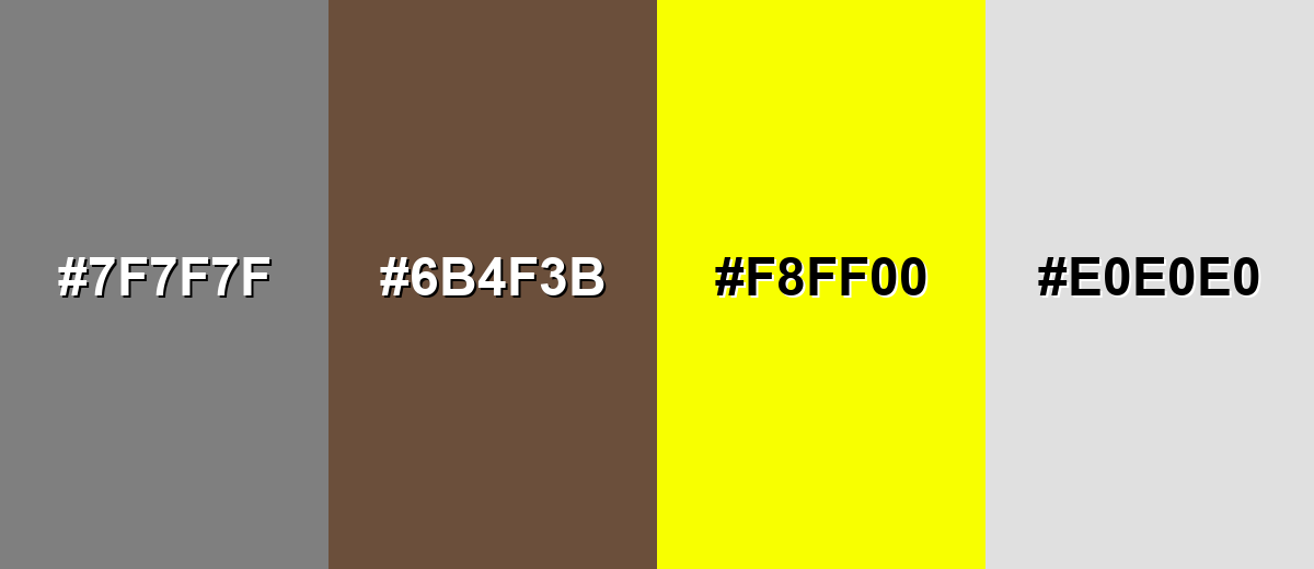
Colors to Avoid
While gray color is remarkably versatile, certain combinations can create problematic visual effects:
- Medium Gray (#7F7F7F) - Too close to the base tone, so text, borders, and icons can disappear due to low contrast.
- Dusty Brown (#6B4F3B) - Creates a muddy, heavy look next to gray and can make layouts feel dated if not carefully balanced.
- Neon Yellow (#F8FF00) - Overpowers gray and can cause glare, making the overall composition feel harsh and unrefined.
- Pale Gray (#E0E0E0) - Often lacks separation from light backgrounds, weakening hierarchy and reducing readability.
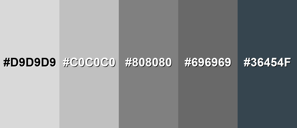
Shades, Tints & Variations of Gray Color
Gray isn't just "one" neutral—it ranges from airy near-whites to deep, architectural charcoals. Building a small gray scale helps you create cleaner hierarchy (backgrounds, dividers, text, and emphasis) without constantly introducing new colors.
- Light Gray (#D9D9D9) - A soft, airy tone that keeps layouts bright while still reducing the starkness of pure white. It's best used for Backgrounds, cards, subtle section breaks, and gentle UI surfaces..
- Silver (#C0C0C0) - A classic metallic-leaning gray that feels clean and slightly polished. It's best used for Borders, icons, product UI, and sleek industrial or tech visuals..
- Classic Gray (#808080) - The balanced mid tone that sits squarely between black and white. It's best used for Neutral foundations, secondary text (with contrast checks), and understated branding..
- Dim Gray (#696969) - A deeper mid-dark tone that adds weight without going fully black. It's best used for Headings, navigation elements, UI chrome, and subdued backgrounds for images..
- Charcoal Gray (#36454F) - A dark, slightly cool gray with an architectural feel and strong presence. It's best used for High-contrast text, hero sections, premium packaging, and modern editorial layouts..
Industry Applications
Gray shows up across industries because it's easy to standardize, easy to pair, and rarely feels out of place. The key is picking the right lightness for the job, then using one or two supporting tones to add clarity and personality.
Fashion & Beauty
- Use gray as a base neutral in outfits for a clean, modern look that doesn't fight statement pieces.
- Pair charcoal tones with crisp whites for sharp contrast and a more tailored, formal vibe.
- Lean on silver-like grays to suggest a polished, metallic finish in packaging or product styling.
- Add one accent (like a bold lip color or accessory) to keep gray from reading flat in visuals.
Interior Design & Decor
- Choose warm grays for living spaces to feel softer and more welcoming.
- Use cool grays in modern interiors for a crisp, technical, "gallery wall" effect.
- Layer multiple gray shades (light walls, mid-tone textiles, dark fixtures) to create depth without clutter.
- Balance gray with strong contrast (black details or bright whites) so rooms don't feel muted.
Branding & Marketing
- Build brand systems with gray typography and layout scaffolding, then let one accent drive recognition.
- Use darker grays for premium positioning, especially when paired with confident type choices.
- In UI marketing pages, keep gray as the background so product screenshots and benefits stand out.
- Avoid low-contrast gray-on-gray CTAs—make the action color unmistakable and consistent.
Conclusion
Gray stands out because it's truly neutral—an easy, modern base that supports almost any style, from minimal UI to editorial layouts and industrial-inspired branding. Start with #808080 as a reliable reference, then build a small range of lighter and darker grays for clear hierarchy, readable typography, and cleaner spacing. The best results come from thoughtful contrast and one confident accent color, so gray stays refined and purposeful instead of dull.
Design Smarter with AI: Media.io is an online AI studio that empowers creators with advanced image generation and enhancement tools. From text-to-image and image-to-image creation to AI upscaling and color optimization, it enables fast, creative, and professional results—all in your browser.

Frequently Asked Questions About Gray Color
A common standard gray used on the web is #808080. It represents a balanced mid tone between black and white.
Gray can be warm or cool depending on its undertone. Warm grays lean slightly toward beige or brown, while cool grays lean toward blue or green.
Gray often represents neutrality, balance, and professionalism. It is frequently used to support content and create clean hierarchy without strong emotional bias.
Gray pairs well with whites, blacks, blues, teals, greens, and warm accents like orange or red. The best pairing depends on whether you want a calm, modern feel or a higher-energy contrast.
Use strong contrast, add one saturated accent, and choose a warm or cool undertone that fits your project. Texture and lighting (in photos or interiors) also make a big difference.
Yes, but it is easy to lose readability with mid tones. Use near-black text on light gray backgrounds or darken the background significantly before switching to white text, and always check contrast for accessibility.
