

Ecru color is a soft, warm beige that looks like natural linen or unbleached fabric in real life.
A common digital reference for it is #C2B280, sitting between tan and muted gold; its name comes from the French word for "raw," reflecting its textile roots.
Ecru Color: Codes & Values
Use these core color values to keep your ecru color consistent across web, print, and branding work.
| Parameters | VALUE |
| HEX Code | #C2B280 |
| RGB DECIMAL | 194, 178, 128 |
| RGB PERCENTAGE | 76.1%, 69.8%, 50.2% |
| CMYK | 0%,8%,34%,24% |
| HSL | 45°, 35%, 63% |
| HSV (HSB) | 45°, 34%, 76% |
| Web Safe | #CC9999 |
Key Color Space Explanations:
- HEX - HEX is the most common way to specify a digital shade in web and UI work. Use #c2b280 to reproduce this ecru tone consistently across screens.
- RGB - RGB builds the tone with red, green, and blue light values. It is ideal for displays, video, and any on-screen graphics.
- CMYK - CMYK represents how inks mix for print output. It helps you estimate how ecru will translate on paper, packaging, and physical materials.
- HSL - HSL describes the hue, saturation, and lightness of the shade. It is useful when you want to create lighter tints, deeper shades, or related harmonies.
- Web Safe - Web-safe values are an older palette designed for broad display compatibility. The closest web-safe match is helpful when you need a simplified, safe approximation.
If you're designing for screens, start with HEX or RGB; if you're sending to print, check CMYK to avoid surprises on paper.
Ecru Color Conversions
This conversion table makes it easy to reuse ecru color across different tools, specs, and workflows.
| Parameters | VALUE | CSS |
| HEX | #c2b280 | #c2b280 |
| RGB DECIMAL | 194, 178, 128 | rgb(194,178,128) |
| RGB PERCENTAGE | 76.1%, 69.8%, 50.2% | rgb(76.1%,69.8%,50.2%) |
| CMYK | 0%,8%,34%,24% | cmyk(0%,8%,34%,24%) |
| HSL | 45°, 35%, 63% | hsl(45°, 35%, 63%) |
| HSV (or HSB) | 45°, 34%, 76% | -- |
| Web Safe | cc9999 | #cc9999 |
| CIE-LAB | 72.9, -2.5, 27.8 | -- |
| XYZ | 42.10, 44.93, 26.80 | -- |
| xyY | 0.370, 0.395, 44.93 | -- |
| CIE-LCH | 72.9, 27.9, 95.1° | -- |
| CIE-LUV | 72.9, 12.9, 37.4 | -- |
| Hunter-Lab | 67.0, -1.7, 21.2 | -- |
| Binary | 110000101011001010000000 | -- |
Want to generate Ecru Color photos or posters? Try Media.io's AI Image Generator now!
Ecru Color Meaning & Symbolism
Ecru is widely associated with natural materials, simplicity, and comfort. Because it resembles untreated fibers and warm sand, it often reads as practical and approachable in everyday visuals. This makes Ecru Color meaning closely tied to calm, understated warmth rather than high energy or drama.
Psychological Effects
In most designs, ecru feels soothing and steady when you handle contrast with care.
- Softens Visual Tension - Ecru tends to soften a layout and reduce visual tension, which is why it works well for backgrounds and long-form reading surfaces.
- Warmer Than White - It can make interfaces and interiors feel more lived-in than pure white.
- Trust And Stability - Its warmth can add a sense of trust and stability, especially when paired with darker neutrals for structure.
- Craft And Quality - In branding, it can communicate craft, care, and quality without looking flashy.
- Needs Clear Contrast - Too much ecru with low contrast can feel dull or faded, so clear typography and stronger accents matter.
Positive Associations
Because it looks like raw fabric, ecru often lands as "quietly premium" rather than attention-seeking.
- Natural Materials - It resembles untreated fibers and warm sand, which reads as grounded and practical.
- Simplicity - Its muted tone supports minimalist styling without feeling cold.
- Comfort - The linen-like vibe helps visuals feel calm and approachable.
- Reliability - Warm neutral undertones can signal steadiness and trust.
- Refinement - It feels quietly refined rather than stark or bright.
Cultural Significance Across the World
Ecru's symbolism often follows its strongest reference: raw, unbleached textiles.
- Raw Textiles - Historically, ecru is linked to raw or unbleached textiles.
- Authenticity - It often signals authenticity and a less processed, more natural aesthetic.
- Modern Minimal Styles - In modern use it commonly appears in minimalist, heritage, and eco-leaning styles.
- Context Dependent Meaning - Its meaning can shift depending on surrounding hues and materials.
Design Applications
Ecru is flexible: it can be a quiet foundation, a soft highlight, or a gentle alternative to bright neutrals. The key is managing contrast so the design stays readable and intentional.
Graphic Design Tips
- Use ecru as a background to reduce glare and create a warmer reading experience than white.
- Reserve darker accents for navigation, icons, and key actions so interactive elements stay obvious at a glance.
- For forms and cards, pair it with clean spacing and crisp borders to avoid a muddy, low-contrast look.
- Layer similar warm neutrals for a cohesive palette, then add one stronger accent to keep the layout from feeling flat.
- For accessibility, favor charcoal, deep brown, or near-black type on ecru backgrounds to keep readability strong.
Pro tip: treat ecru as your "quiet canvas," then build hierarchy with darker neutrals and clear spacing so the design doesn't drift into low-contrast beige-on-beige.
Ecru Color in Photography & Video
- Use ecru or linen-like tones as a set styling base to make scenes feel natural and comfortable.
- Pair ecru backdrops with deeper neutrals to keep subjects separated and avoid a faded look.
- When grading, keep saturation modest so ecru stays fabric-like instead of turning yellow or gold.
- Watch highlight and shadow contrast—too flat can feel dull, while overly harsh contrast can overpower ecru's softness.
- For editorial content, ecru surfaces can reduce glare and make long-form visuals feel easier on the eyes.
Recommended Tool for Image Enhancement: When incorporating ecru color into your photography projects, Media.io's AI Image tools can help you achieve more refined results. With AI-powered color enhancement, photo colorization, image upscaling, and old photo restoration, you can easily enrich ecru color tones, improve overall image quality, and highlight the color's elegant and sophisticated aesthetic.
Color Combinations
Because ecru sits in a warm, muted range, it pairs best with dusty blues, soft greens, and deep neutrals that provide structure. Use these palettes as starting points, then adjust saturation to match your project's mood.
Complementary Colors
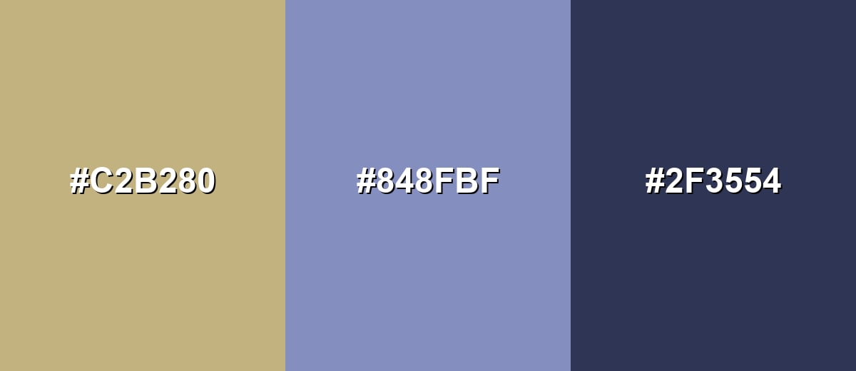
A complementary palette balances ecru's warm beige character with a cool, muted blue. This creates contrast that feels refined instead of loud.
Complementary Palette Example: Try ecru with dusty slate blue and a deep navy for calm, premium-looking contrast.
Analogous Color Schemes
Analogous colors sit adjacent to each other on the color wheel, creating harmonious, cohesive palettes with subtle variation.
For a warm, sunbaked feel, keep neighbors close to ecru on the wheel: sand, ecru, and olive-khaki.
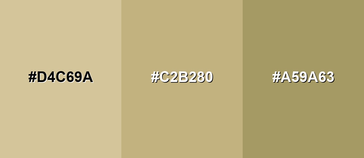
- Sandstone: #D4C69A
- Ecru: #C2B280
- Olive Khaki: #A59A63
For softer editorial or lifestyle looks, blend ecru with creamy neutrals and a grounded taupe.
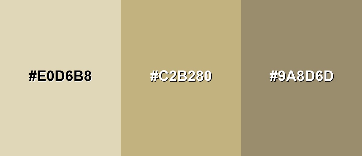
- Wheat Cream: #E0D6B8
- Ecru: #C2B280
- Warm Taupe: #9A8D6D
Triadic & Tetradic Combinations
A triadic scheme spreads hues evenly, giving you variety while staying balanced.
Pair ecru with soft teal and dusty orchid for a creative palette that still feels gentle.
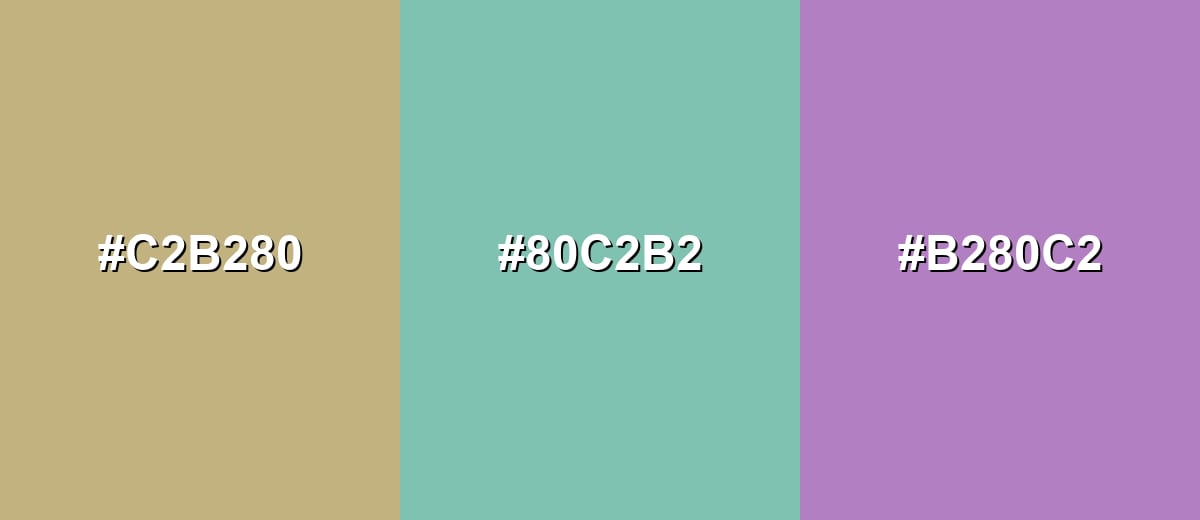
- Ecru: #C2B280
- Soft Teal: #80C2B2
- Dusty Orchid: #B280C2
Colors to Avoid
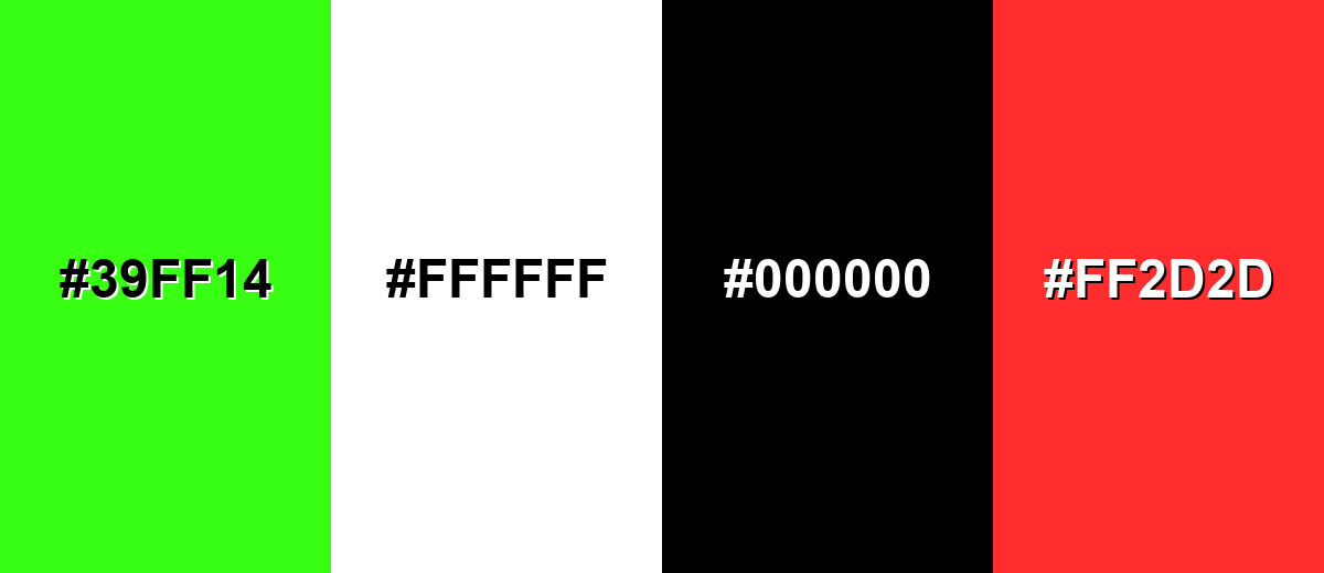
While ecru color is remarkably versatile, certain combinations can create problematic visual effects:
- Neon Green (#39FF14) - The extreme brightness clashes with ecru's muted, natural feel and can make layouts look unbalanced.
- Pure White (#FFFFFF) - Side-by-side, the warmth can look dingy and subtle elements may lose definition without careful contrast control.
- Pure Black (#000000) - The jump in contrast can feel overly harsh and can overpower the softness that makes ecru appealing.
- Bright Red (#FF2D2D) - High-saturation reds can create a jarring, noisy look next to ecru unless heavily toned down.
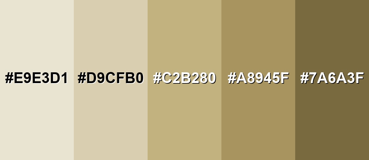
Shades, Tints & Variations of Ecru Color
Ecru isn't just one flat beige—there's a whole range from airy, fabric-light tints to deeper, earthier shades. Having a few variations on hand makes it easier to build hierarchy (backgrounds, surfaces, borders, and text) without leaving the same warm-neutral family.
- Pale Ecru (#E9E3D1) - A very light, airy take that feels like sunlit fabric. It's best used for Large backgrounds, minimalist layouts, and soft editorial spacing.
- Creamy Ecru (#D9CFB0) - A gentle mid-light tint that keeps warmth while staying subtle. It's best used for Cards, panels, packaging bases, and calm interface surfaces.
- Classic Ecru (#C2B280) - The balanced, linen-like reference tone most people think of as ecru. It's best used for Brand foundations, neutral palettes, and versatile backgrounds.
- Deep Ecru (#A8945F) - A darker, richer version that leans more earthy and grounded. It's best used for Accents, headings, borders, and warm neutral contrast.
- Dark Ecru Brown (#7A6A3F) - A shaded, brown-leaning variation with more weight and depth. It's best used for Text over light ecru tints, icons, and structured UI elements.
Industry Applications
Ecru shows up in many fields because it reads as natural, calm, and easy to pair. It works best when you want warmth without the attention-grabbing feel of brighter tones.
Fashion & Beauty
- Use ecru for neutral garments where the look of raw fiber is part of the appeal.
- Build tonal outfits by layering multiple warm neutrals for a cohesive, linen-inspired look.
- Pair ecru with deeper neutrals to add structure while keeping the overall mood soft.
- In textiles, ecru works as a natural base that complements craft and heritage styling.
Interior Design & Decor
- As a wall or textile base, ecru pairs easily with wood, stone, and metal finishes while keeping the palette warm.
- Layer similar warm tones to make a space feel cohesive and comfortable.
- Add one stronger accent color so the room doesn't feel flat.
- Use darker neutrals for definition in trim, décor, or typography-style wall art.
Branding & Marketing
- Ecru supports brands that want to feel grounded, tactile, and trustworthy.
- It's a strong base for labels and boxes when you want a natural-paper vibe without heavy texture.
- Pair it with deep neutrals or muted blues/greens to keep layouts premium-looking, not plain.
- In web and app design, ecru helps reduce glare in content sections and long-form pages.
Conclusion
Ecru is a linen-inspired neutral that brings calm warmth to modern design without feeling stark or overly trendy. With #C2B280 as a dependable digital reference, you can use ecru as a soft background, a natural packaging base, or a flexible brand foundation—just remember to build in clear contrast using deeper accents for type and UI elements. For balanced palettes, ecru pairs especially well with muted blues, sage greens, and grounded browns, helping your work look approachable, tactile, and quietly refined.
Design Smarter with AI: Media.io is an online AI studio that empowers creators with advanced image generation and enhancement tools. From text-to-image and image-to-image creation to AI upscaling and color optimization, it enables fast, creative, and professional results—all in your browser.

Frequently Asked Questions About Ecru Color
Ecru is a warm, muted beige that resembles unbleached linen or natural fabric. It sits between tan and soft gold, making it a versatile neutral.
It is typically closer to beige than ivory. Ivory and cream often look lighter and more yellow or white-leaning, while ecru tends to feel more fabric-like and earthy.
Ecru is generally warm because it contains yellow-brown undertones. It can look slightly cooler if paired with cool grays or blues, but the base impression stays warm.
Muted blues, sage greens, dusty pinks, and deep neutrals usually pair well. These options add structure and contrast without fighting ecru's softness.
Dark text is the safest choice for readability, such as deep brown, charcoal, or near-black tones. Light text on ecru often lacks contrast and can be hard to read.
Start with a warm beige base and keep saturation low so it feels natural rather than bright. Add texture cues like paper grain or linen patterns and use darker neutrals for clear hierarchy.


