

Ebony color is an ultra-dark, near-black shade with a subtle warm brown undertone, similar to polished ebony wood. Its most common digital reference is #0C0B0A, which reads deep, grounded, and slightly warmer than pure black on most screens.
Designers use ebony to create strong hierarchy, reduce visual noise, and give layouts a quiet, premium edge. Below you'll find the exact codes, conversions, pairing ideas, contrast notes, and related shades you can build with.
Ebony Color: Codes & Values
These values define ebony precisely across digital and print workflows, so your UI, branding, and layouts stay consistent.
| Parameters | VALUE |
| HEX Code | #0C0B0A |
| RGB DECIMAL | 12, 11, 10 |
| RGB PERCENTAGE | 5%, 4%, 4% |
| CMYK | 0%,9%,17%,95% |
| HSL | 30°, 9%, 4% |
| HSV (HSB) | 30°, 17%, 5% |
| Web Safe | #000000 |
Key Color Space Explanations:
- HEX - HEX is the most common web format for naming a shade. #0c0b0a defines ebony as a very dark, warm-leaning near-black.
- RGB - RGB mixes red, green, and blue light for screens. Ebony stays close to black at 12, 11, 10, which is why it feels dense and minimal.
- CMYK - CMYK is used for print and describes ink percentages. Ebony typically relies heavily on black ink (K) with small amounts of magenta and yellow to keep it from looking flat.
- HSL - HSL shows hue, saturation, and lightness in a way that is easy to tweak for UI themes. Ebony sits at very low lightness, so small shifts can noticeably change warmth and readability.
- Web Safe - Web-safe values are older standardized steps used to reduce variation across displays. Ebony's nearest web-safe match is pure black, #000000.
If you're building a brand kit or UI theme, start with HEX for consistency, then use HSL/HSV for controlled adjustments (like slightly lifting lightness for large backgrounds).
Ebony Color Conversions
Use this conversion chart when you need ebony to match across CSS, design tools, printing specs, or color-managed workflows.
| Parameters | VALUE | CSS |
| HEX | #0c0b0a | #0c0b0a |
| RGB DECIMAL | 12, 11, 10 | rgb(12,11,10) |
| RGB PERCENTAGE | 5%, 4%, 4% | rgb(5%,4%,4%) |
| CMYK | 0%,9%,17%,95% | cmyk(0%,9%,17%,95%) |
| HSL | 30°, 9%, 4% | hsl(30°, 9%, 4%) |
| HSV (or HSB) | 30°, 17%, 5% | -- |
| Web Safe | 000000 | #000000 |
| CIE-LAB | 3.1, 0.2, 0.5 | -- |
| XYZ | 0.325, 0.338, 0.335 | -- |
| xyY | 0.326, 0.339, 0.338 | -- |
| CIE-LCH | 3.1, 0.5, 67° | -- |
| CIE-LUV | 3.1, 0.2, 0.3 | -- |
| Hunter-Lab | 5.8, 0.1, 0.4 | -- |
| Binary | 00001100 00001011 00001010 | -- |
Want to generate Ebony Color photos or posters? Try Media.io's AI Image Generator now!
Ebony Color Meaning & Symbolism
Ebony is commonly linked with strength, refinement, protection, and seriousness. Because it sits so close to true black, it often signals confidence and restraint in everyday visuals, from fashion basics to minimalist interfaces. In practice, Ebony Color meaning is most noticeable when it frames lighter elements and makes them feel intentional and premium.
Psychological Effects
Ebony tends to shape how "calm" or "intense" a design feels, especially in dark-mode layouts.
- Stability - Ebony can make a layout feel grounded and controlled, which supports clear decision-making.
- Reduced Visual Noise - It helps simplify busy screens so key content and calls-to-action look sharper.
- Focus & Hierarchy - Ebony works well for navigation bars, typography, and framing elements that guide attention.
- Heaviness - When it dominates a screen or room, it may read as stern, distant, or overly formal.
- Readability Sensitivity - Because it's very low in lightness, small shifts in surrounding colors can change warmth and contrast quickly.
Positive Associations
When balanced with lighter space and one accent hue, ebony reads premium instead of harsh.
- Sophistication - Its near-black depth feels refined and elevated, especially in minimalist systems.
- Confidence - Ebony often signals restraint and certainty without needing loud color.
- Protection - Dark framing can feel sheltering, creating a "safe" visual container for content.
- Luxury - The polished-wood reference brings a quiet sense of craftsmanship and quality.
- Clarity - Used as a foundation shade, it makes bright accents and light neutrals look more intentional.
Cultural Significance Across the World
Very dark shades can mean different things depending on the context, audience, and industry.
- Craftsmanship - The name is rooted in ebony wood, long valued for density and deep appearance.
- Luxury Materials - Ebony's association with hardwoods can suggest premium finishes and careful build quality.
- Minimalist Aesthetics - In modern visuals, near-blacks often communicate restraint and "less but better" design.
- Context Matters - Symbolic meanings vary, so it's best to match ebony's tone to your audience and message.
Design Applications
Ebony is a practical foundation shade: it anchors palettes, supports high-contrast typography, and makes accent hues look more vivid. It is especially effective when you want a sleek, modern look without the harshness of pure black.
Graphic Design Tips
- Use ebony for UI backgrounds and headers when you want strong hierarchy without the flatness of pure black.
- Pair it with warm off-whites to keep the overall mood inviting instead of cold or sterile.
- Add one controlled accent (like teal, gold, or coral) to create a focal point and avoid a monotone look.
- For large dark backgrounds, consider subtle texture or a slightly lighter near-black to prevent banding.
- For small text, choose light foreground colors and verify contrast; avoid stacking multiple near-blacks where edges disappear.
Pro tip: If your "black" UI feels too harsh, swap pure black for #0C0B0A, then introduce a warm off-white for body text and keep accents limited to one primary hue for a cleaner system.
Ebony Color in Photography & Video
- Use ebony-toned backgrounds to reduce distractions and frame your subject with a cinematic feel.
- In moody grading, ebony helps keep shadows controlled while avoiding the "crushed" look of absolute black.
- For text overlays, keep type bright and spacing generous so dark-on-dark areas don't swallow detail.
- When shooting products, ebony surfaces can make reflective materials (like metal) pop with clean highlights.
- In editing, lift shadow detail slightly if ebony starts to hide edges or texture on lower-quality displays.
Recommended Tool for Image Enhancement: When incorporating ebony color into your photography projects, Media.io's AI Image tools can help you achieve more refined results. With AI-powered color enhancement, photo colorization, image upscaling, and old photo restoration, you can easily enrich ebony color tones, improve overall image quality, and highlight the color's elegant and sophisticated aesthetic.
Color Combinations
Because ebony sits near black, it pairs well with crisp lights, muted naturals, and a single saturated accent. The palettes below cover classic harmony rules and a few combinations that often look muddy.
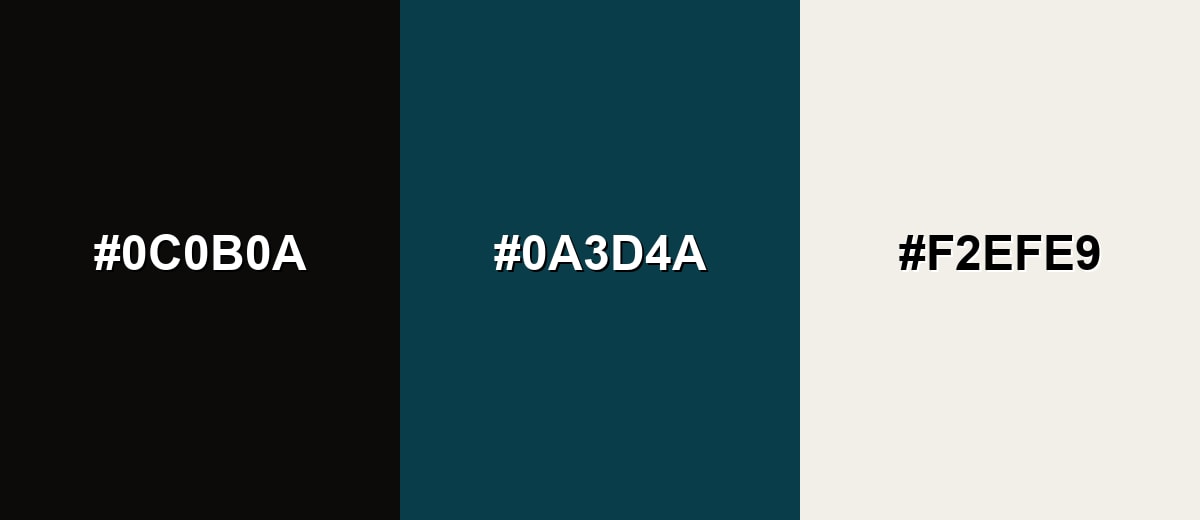
Complementary Colors
A complementary pairing adds energy by placing ebony against a blue-leaning counterpoint. Keep the accent controlled and let the light neutral handle readability.
Complementary Palette Example: Try ebony with deep teal and an ivory highlight for a modern, confident look.
Analogous Color Schemes
Analogous colors sit adjacent to each other on the color wheel, creating harmonious, cohesive palettes with subtle variation.
Warm-leaning near-blacks for a subtle, natural gradient.
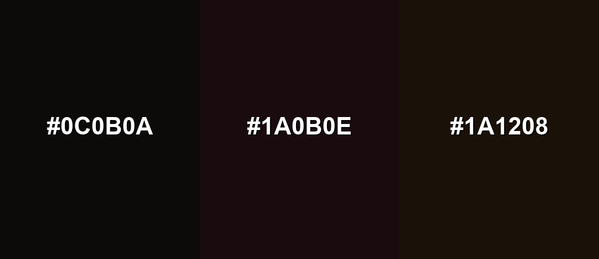
- Ebony: #0C0B0A
- Dark Mahogany: #1A0B0E
- Deep Coffee: #1A1208
Earthy analogs that feel grounded and slightly organic.
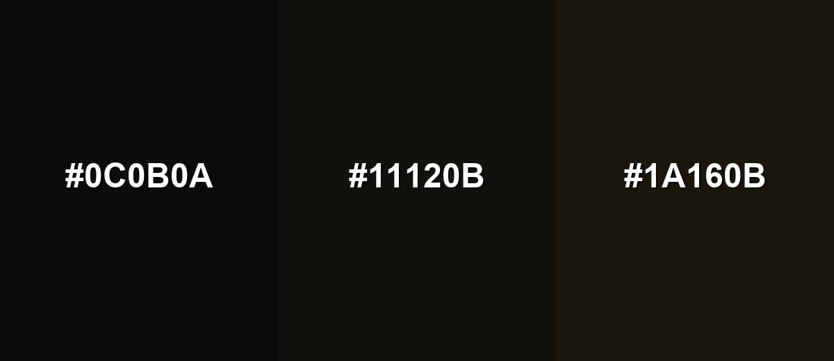
- Ebony: #0C0B0A
- Black Olive: #11120B
- Dark Bronze: #1A160B
Triadic & Tetradic Combinations
A triadic scheme adds variety while staying balanced.
Pair ebony with deep forest green and midnight indigo for a rich, creative mix.
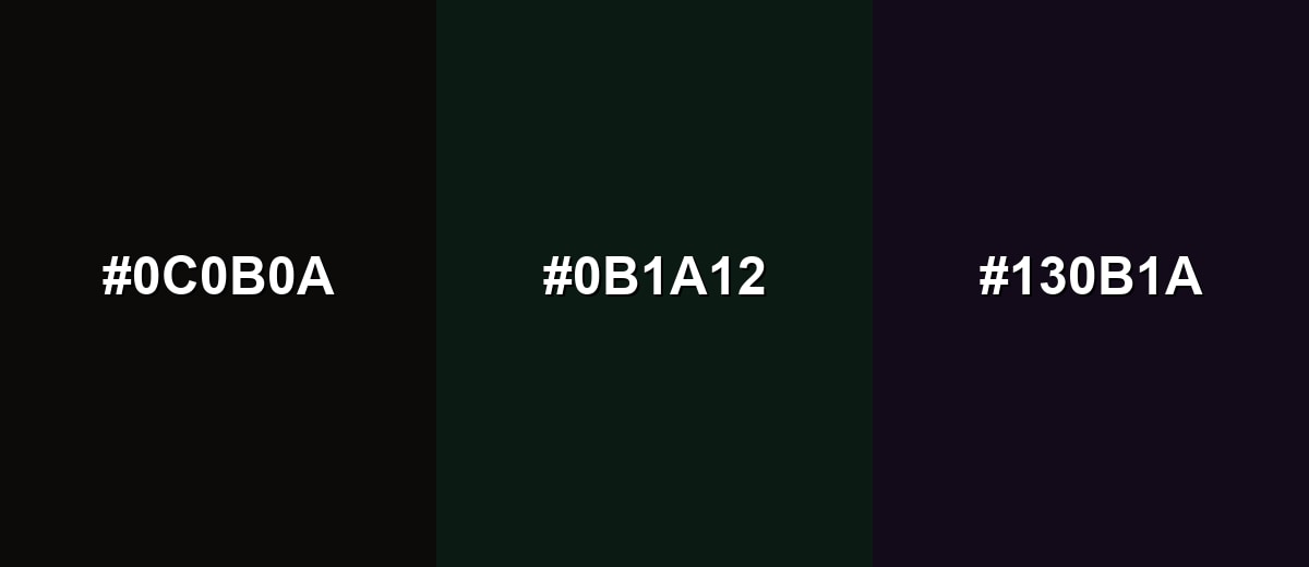
- Ebony: #0C0B0A
- Deep Forest: #0B1A12
- Midnight Indigo: #130B1A
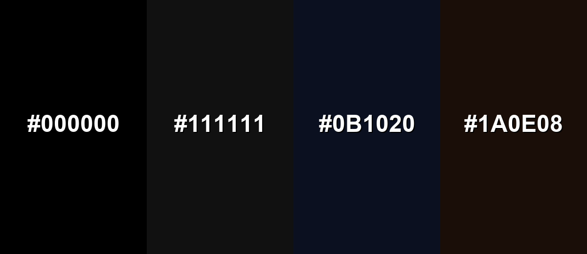
Colors to Avoid
While ebony color is remarkably versatile, certain combinations can create problematic visual effects:
- Pure Black (#000000) - It can collapse detail next to ebony, making edges and shadows hard to separate.
- Jet Charcoal (#111111) - Too close in value, so interfaces and layouts can look muddy rather than intentional.
- Deep Navy (#0B1020) - The low-lightness pairing hides contrast, especially in dark-mode UI.
- Dark Brown (#1A0E08) - The undertones blend together, reducing clarity and making typography feel dull.
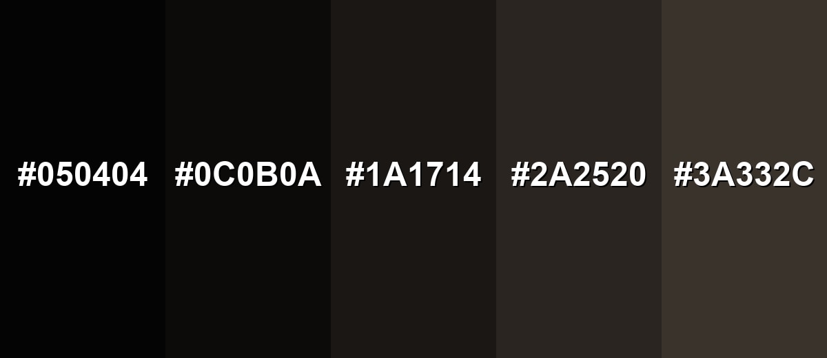
Shades, Tints & Variations of Ebony Color
Ebony isn't just one "almost-black"—it has a useful range from ink-deep shadows to softer, warmer near-blacks. These variations help you build depth in UI layers, create more natural gradients, and avoid a flat, featureless dark background.
- Pitch Ebony (#050404) - An even deeper near-black that reads almost ink-like. It's best used for headers, borders, and maximum depth behind bright accents.
- Deep Ebony (#0C0B0A) - The classic ebony reference: near-black with a faint warm undertone. It's best used for ideal as a primary background or typography shade in modern brand systems.
- Smoked Ebony (#1A1714) - A slightly lifted near-black with softer contrast. It's best used for great for large backgrounds where pure darkness would feel too heavy.
- Ash Ebony (#2A2520) - A dark, earthy neutral that keeps ebony's grounded feel. It's best used for use for secondary panels, cards, and subtle depth in UI.
- Soft Ebony (#3A332C) - A dark neutral that reads warmer and more approachable. It's best used for works well for interiors, textiles, and backgrounds that need comfort over drama.
Industry Applications
Ebony is widely used when a design needs authority, focus, or a premium finish. It adapts well across digital and physical materials, as long as contrast and lighting are considered.
Fashion & Beauty
- Use ebony as a base shade to make metallics and glossy finishes look richer and more intentional.
- Pair ebony with warm neutrals for timeless, "investment piece" styling that doesn't feel overly stark.
- In packaging, ebony backgrounds help typography and ingredient callouts feel clean and premium.
- For product photography, ebony surfaces can emphasize shape and highlight without distracting color noise.
Interior Design & Decor
- Apply ebony to accent walls, cabinetry, or hardware when you want depth without relying on pure black.
- Balance it with warm whites and natural wood to keep spaces from feeling too heavy.
- Use metal finishes like brass or brushed nickel to create contrast and add "lift" around dark elements.
- Choose slightly softer ebony variations for larger areas to maintain comfort and reduce harsh contrast.
Branding & Marketing
- Build luxury or premium identities with ebony as a restrained anchor for logos, wordmarks, and packaging.
- Use it as a secondary background so accent colors pop without competing for attention.
- In editorial layouts, ebony helps headings and images feel framed and deliberate.
- For product UI, ebony navigation bars and footers establish strong hierarchy when paired with accessible light text.
Conclusion
Ebony (#0C0B0A) is a near-black that feels richer and more crafted than plain black thanks to its subtle warm undertone. It's a dependable anchor for modern palettes—great for building hierarchy in UI, giving brands a premium tone, and framing photography with controlled depth. The key is contrast: pair it with warm off-whites for readability, introduce one accent color for energy, and avoid stacking multiple ultra-dark tones that blur together. With a few supportive variations, ebony delivers clarity, focus, and a quiet kind of sophistication across screens and print.
Design Smarter with AI: Media.io is an online AI studio that empowers creators with advanced image generation and enhancement tools. From text-to-image and image-to-image creation to AI upscaling and color optimization, it enables fast, creative, and professional results—all in your browser.

Frequently Asked Questions About Ebony Color
Ebony looks like an ultra-dark near-black with a slight warm brown undertone, similar to polished dark hardwood. In bright light it can show warmth rather than reading as a flat, cool black.
A common digital hex reference for ebony is #0c0b0a. It is very close to black, so small changes in surrounding colors can affect how it appears.
Not exactly. Black is typically neutral and absolute, while ebony often carries a subtle warm undertone that makes it feel more natural and less stark in many palettes.
Ebony pairs well with warm off-whites, soft neutrals, and controlled accents like teal, muted gold, or dusty rose. These combinations keep the look high-contrast without feeling harsh.
Use ebony for headers, navigation, or dark backgrounds, then layer lighter surfaces and clear text colors on top. Always check contrast for small text and avoid pairing it with other near-black tones that hide edges.
It works in both, but it behaves differently. On screens, it can look very dense and needs careful contrast; in print, deep near-blacks may require rich black mixes depending on the paper and process.


