

Peach color is a soft warm hue that sits between pale orange and pink, similar to the natural blush of a ripe peach. Its signature hex code is #FFCBA4, which gives it a gentle, creamy look on screens.
People often perceive peach as friendly, caring, and optimistic without feeling too loud. In real-world lighting it can lean more pink or more apricot, so this guide breaks down the meaning, exact code values, best combinations, shade ideas, and practical uses.
Peach Color: Codes & Values
If you want peach to look consistent across Figma, web CSS, and print proofs, start with these standard values.
| Parameters | VALUE |
| HEX Code | #FFCBA4 |
| RGB DECIMAL | 255, 203, 164 |
| RGB PERCENTAGE | 100%, 79.6%, 64.3% |
| CMYK | 0%,20%,36%,0% |
| HSL | 26°, 100%, 82% |
| HSV (HSB) | 26°, 36%, 100% |
| Web Safe | #FFCC99 |
Key Color Space Explanations:
- HEX - HEX is the most common way to specify this shade for web and UI work. Use #ffcba4 to reproduce the same peach tone across modern design tools.
- RGB - RGB defines the red, green, and blue light used on screens. Peach is made from high red with softer green and blue for a warm, creamy look.
- CMYK - CMYK is mainly used for print workflows and describes ink percentages. This mix stays light by keeping black at 0% and using moderate magenta and yellow.
- HSL - HSL describes hue, saturation, and lightness in a designer-friendly way. Peach has a warm hue and high lightness, which is why it feels airy and soft.
- Web Safe - Web Safe is the closest legacy palette match for older constraints. #ffcc99 is a practical approximation when you need a web-safe substitute.
Use HEX/RGB/HSL for digital layouts, and switch to CMYK for print—then always proof peach on the actual background, paper, or lighting you'll ship with.
Peach Color Conversions
Need peach color numbers for a specific workflow? Here are the common conversion formats (plus CSS-ready values where available).
| Parameters | VALUE | CSS |
| HEX | #ffcba4 | #ffcba4 |
| RGB DECIMAL | 255, 203, 164 | rgb(255,203,164) |
| RGB PERCENTAGE | 100%, 79.6%, 64.3% | rgb(100%,79.6%,64.3%) |
| CMYK | 0%,20%,36%,0% | cmyk(0%,20%,36%,0%) |
| HSL | 26°, 100%, 82% | hsl(26°,100%,82%) |
| HSV (or HSB) | 26°, 36%, 100% | -- |
| Web Safe | ffcc99 | #ffcc99 |
| CIE-LAB | 85.4, 13.0, 26.4 | -- |
| XYZ | 69.3, 66.7, 44.3 | -- |
| xyY | 0.384, 0.370, 66.7 | -- |
| CIE-LCH | 85.4, 29.4, 63.7° | -- |
| CIE-LUV | 85.4, 36.3, 34.2 | -- |
| Hunter-Lab | 81.7, 13.4, 22.3 | -- |
| Binary | 11111111 11001011 10100100 | -- |
Want to generate Peach Color photos or posters? Try Media.io's AI Image Generator now!
Peach Color Meaning & Symbolism
Peach is commonly associated with warmth, friendliness, and gentle optimism. It often reads as welcoming and supportive, which is why it shows up in lifestyle visuals, wellness themes, and soft modern branding. In everyday life, Peach Color meaning is usually tied to approachability rather than intensity.
Psychological Effects
Because it blends orange energy with pink softness, peach tends to calm a layout while still feeling lively.
- Comfort - Soft warmth can make interfaces and packaging feel more human and less harsh.
- Approachability - Peach often lowers the "formal" vibe, helping users feel welcome and supported.
- Gentle Focus - It creates a subtle highlight without the urgency of bright orange.
- Optimism - The warm undertone can add a light, upbeat mood to modern visuals.
- Low-Contrast Risk - Very light peach can look washed out, so it benefits from deeper neutrals for clarity.
Positive Associations
When used intentionally, peach sends "friendly and fresh" signals without feeling loud.
- Warmth - A cozy, inviting tone that feels personable in UI and branding.
- Care - Often linked with kindness, support, and wellness-oriented themes.
- Freshness - A light, airy look that works well for seasonal or "clean" aesthetics.
- Youthfulness - Reads soft and modern, especially in pastel-forward palettes.
- Soft Confidence - Communicates positivity without aggressive saturation.
Cultural Significance Across the World
Peach symbolism can shift by context, so it's best paired with the right imagery and tone of voice.
- Seasonal Spring/Summer Feel - Often used to signal lightness, warmth, and fresh-start energy.
- Lifestyle & Wellness Visuals - Common in modern design where calm, supportive moods matter.
- Soft Romantic Notes - Can suggest tenderness and gentleness when paired with warm neutrals.
- Context-Dependent Meaning - The same peach can read "blush" or "apricot" depending on lighting and surrounding colors.
Design Applications
Peach is easiest to use when you treat it as a warm accent or a soft background tone. The key is contrast: keep text and critical UI elements readable, and let peach support the hierarchy rather than replace it.
Graphic Design Tips
- Use It As A Soft Background - Peach works well for calm section blocks, cards, and banners where you want warmth without noise.
- Prioritize Readability - Pair peach backgrounds with dark text so labels and small UI elements stay crisp.
- Balance With Cool Accents - Mixing peach with cooler tones helps the palette feel modern instead of overly sweet.
- Reserve It For Secondary CTAs - Peach can highlight actions in a friendly way without competing with primary buttons.
- Proof For Print - Light peach can shift on paper, so check CMYK proofs and consider outlines for tiny text.
Pro tip: If peach is your main background, keep your neutrals darker and consistent (for headings, dividers, and icons) so the whole layout doesn't fade into a "pastel haze."
Peach Color in Photography & Video
- Protect Skin Tones - Peach overlays can warm faces quickly, so dial back opacity and watch for orange shifts.
- Use Warm Highlights - Add peach as a light flare, gradient, or accent light to create a welcoming mood.
- Keep Whites Neutral - If whites drift peach, the frame can look tinted; correct white balance first, then stylize.
- Pair With Muted Backgrounds - Soft neutrals help peach props and wardrobe pop without looking candy-like.
- Check Different Screens - Pastel peach can vary by display, so preview on mobile and desktop before export.
Recommended Tool for Image Enhancement: When incorporating peach color into your photography projects, Media.io's AI Image tools can help you achieve more refined results. With AI-powered color enhancement, photo colorization, image upscaling, and old photo restoration, you can easily enrich peach color tones, improve overall image quality, and highlight the color's elegant and sophisticated aesthetic.
Color Combinations
Peach pairs best with cool counterbalances and grounded neutrals. Use the combinations below as starting points, then adjust lightness to match your layout, lighting, and material choices.
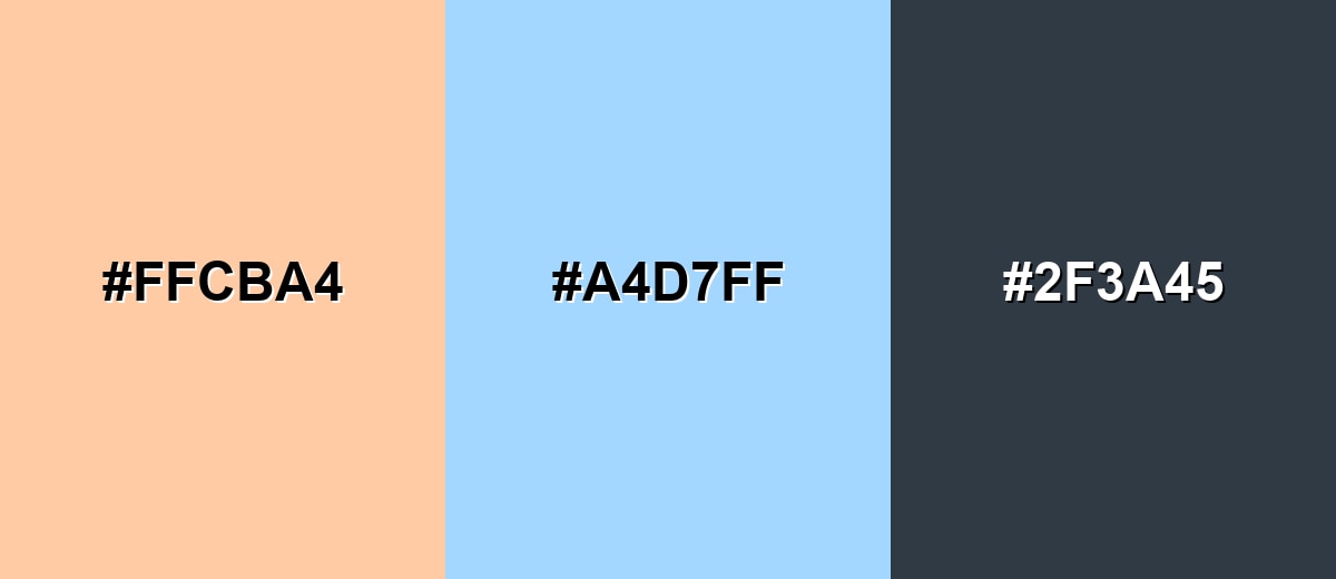
Complementary Colors
A soft blue is a natural complement to peach, creating a balanced warm–cool contrast that feels fresh rather than aggressive.
Complementary Palette Example: Combine peach with a light sky blue and a deep slate neutral for a clean, modern palette.
Analogous Color Schemes
Analogous colors sit adjacent to each other on the color wheel, creating harmonious, cohesive palettes with subtle variation.
Apricot, peach, and a creamy blush create a smooth warm gradient for backgrounds and soft highlights.
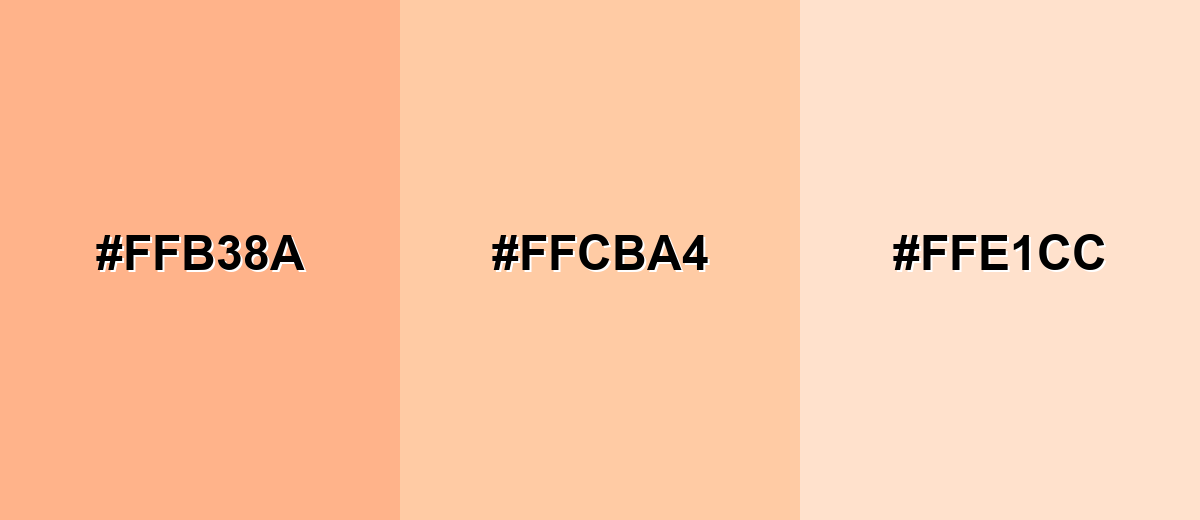
- Warm Apricot: #FFB38A
- Peach: #FFCBA4
- Creamy Blush: #FFE1CC
Blush pink, peach, and a light golden tint keep the palette warm while adding gentle separation.
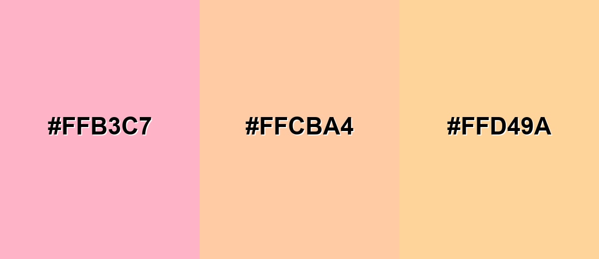
- Blush Pink: #FFB3C7
- Peach: #FFCBA4
- Soft Golden: #FFD49A
Triadic & Tetradic Combinations
A triadic set gives you variety while staying playful and bright.
Peach with mint and lavender is lively but still soft enough for modern UI and lifestyle branding.
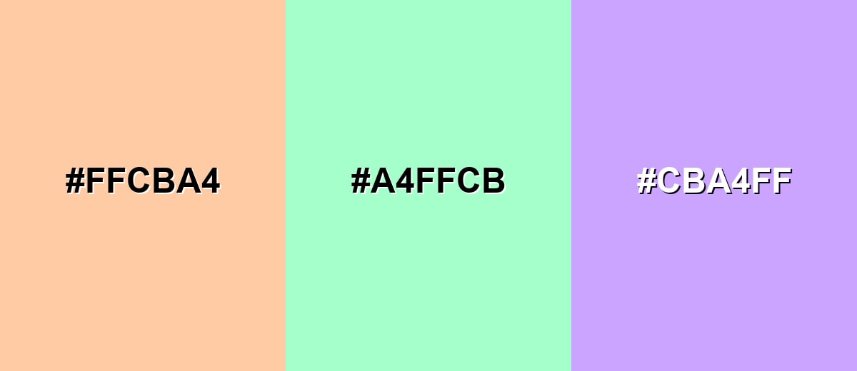
- Peach: #FFCBA4
- Fresh Mint: #A4FFCB
- Soft Lavender: #CBA4FF
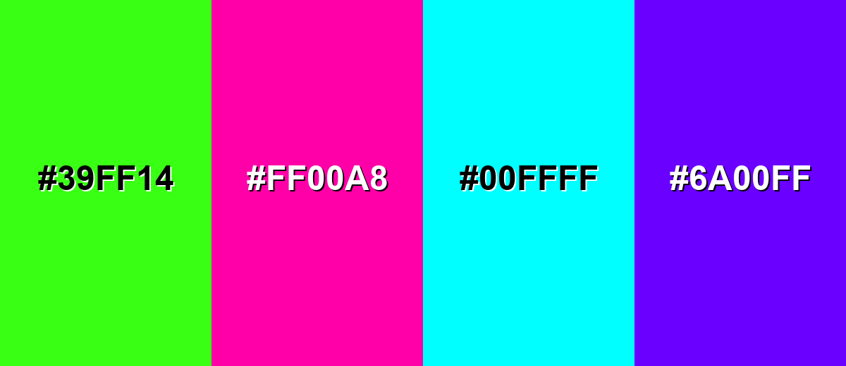
Colors to Avoid
While peach color is remarkably versatile, certain combinations can create problematic visual effects:
- Neon Green (#39FF14) - The saturation gap is so large that peach can look muddy or faded next to it.
- Vivid Magenta (#FF00A8) - Both hues compete for attention, creating a loud, candy-like effect that is hard to balance.
- Pure Cyan (#00FFFF) - The high-intensity cool tone overpowers peach and can make the overall palette feel abrasive.
- Electric Purple (#6A00FF) - The contrast is strong but not harmonious, which often reads as accidental rather than intentional.
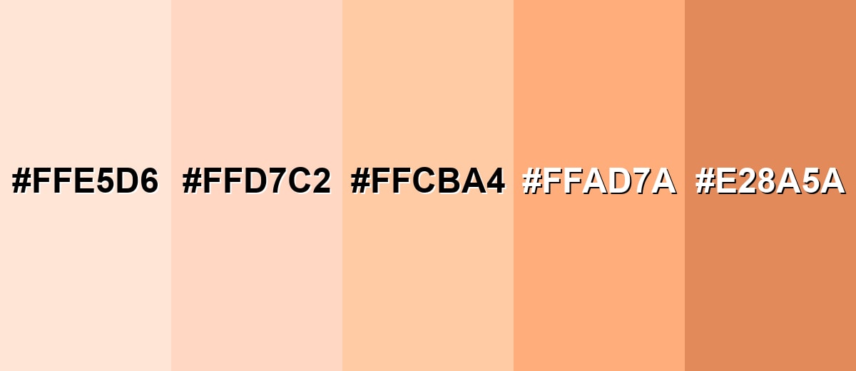
Shades, Tints & Variations of Peach Color
Peach isn't just one shade—its range runs from creamy near-white tints to richer, earthy peaches with more weight. Having a few coordinated variations makes it easier to build hierarchy (backgrounds, cards, buttons, and accents) without switching to a totally different color family.
- Pearl Peach (#FFE5D6) - A very light peach with a creamy, airy finish that feels soft and spacious. It's best used for large backgrounds, section blocks, subtle overlays, and calming interior accents.
- Pastel Peach (#FFD7C2) - A gentle pastel that stays warm while adding a touch more definition than near-white peach. It's best used for cards, banners, soft gradients, and brand backgrounds that still need separation from white.
- Classic Peach (#FFCBA4) - The recognizable peach tone: warm, friendly, and balanced between pink and orange. It's best used for primary accents, highlight panels, illustrations, and approachable brand elements.
- Sunset Peach (#FFAD7A) - A deeper, more orange-leaning peach that feels energetic while staying soft. It's best used for buttons, badges, emphasis areas, and packaging details that need more presence.
- Burnt Peach (#E28A5A) - A richer, earthier peach that brings warmth with stronger contrast and more weight. It's best used for headings, icons, outlines, warm shadows, and grounding accents in a neutral palette.
Industry Applications
Because peach is warm and light, it shows up across industries that want to communicate care, comfort, and modern friendliness. It works best when supported by darker neutrals and a clear contrast strategy.
Fashion & Beauty
- Soft Packaging - Peach supports flattering, gentle product presentation that doesn't feel harsh.
- Pastel Seasonal Drops - Works naturally in spring/summer collections and limited-edition releases.
- Lookbooks & Styling - A warm neutral that plays nicely with skin tones and minimal layouts.
- Product Visuals - Helps create a clean, approachable mood for ecommerce imagery and ads.
Interior Design & Decor
- Textiles & Accents - Great for cushions, throws, and decor highlights that add warmth without heavy color.
- Accent Walls - A softer alternative to beige or light terracotta when you want gentle character.
- Natural Pairings - Works with light woods, warm whites, and muted greens for calm, organic rooms.
- Room Mood - Adds a welcoming glow while staying light and airy in brighter spaces.
Branding & Marketing
- Lifestyle & Wellness Branding - Communicates care, comfort, and modern friendliness.
- Social Graphics - Useful for templates and story layouts where you want soft contrast and warmth.
- Seasonal Campaigns - Fits fresh, optimistic promotions without leaning into loud oranges.
- Design Systems - Works well as a background tint or secondary accent when paired with deeper neutrals.
Conclusion
Peach stands out for its warm softness—blending a hint of pink with a light orange glow that feels friendly, modern, and easy to live with. It works beautifully as a background tint or an accent, especially when you support it with deeper neutrals for clean contrast and readable UI. If you want a reliable baseline for consistent design, start with #FFCBA4, then build a small set of coordinated peach shades for hierarchy across web, print, and content visuals.
Design Smarter with AI: Media.io is an online AI studio that empowers creators with advanced image generation and enhancement tools. From text-to-image and image-to-image creation to AI upscaling and color optimization, it enables fast, creative, and professional results—all in your browser.

Frequently Asked Questions About Peach Color
Peach sits between light orange and soft pink. It keeps orange warmth but adds a creamy, blush-like softness that makes it feel gentler than most oranges.
A widely used peach hex value is #ffcba4. It is a light, warm peach that works well for backgrounds, highlights, and soft accents.
Peach pairs well with soft blues, minty greens, lavender, and grounded neutrals like slate or charcoal. These combinations balance warmth and keep the palette from feeling too sugary.
Yes, especially for friendly sections like onboarding, empty states, and highlight panels. Use dark text and test contrast to keep labels and small UI elements readable.
Add contrast with a darker neutral, increase the saturation slightly, or place it next to a cooler accent like soft blue. Also avoid using peach text on white backgrounds for important content.
It can shift depending on paper and ink limits because it is very light. Always check a proof, and consider slightly deepening the shade or adding a dark outline for small text and details.


