

 TL;DR:
Terracotta (#E2725B) is a warm, earthy orange-red hue resembling sun-baked clay, optimal for creating grounded, approachable accents in UI and branding when balanced with complementary tones.
● Apply lighter tints like Pale Terracotta (#F2B6A6) for large backgrounds to reduce visual weight, and strictly avoid placing small white text over mid-tone terracotta to prevent accessibility and readability failures.
● Pair the color with warm off-whites, textured neutrals, or dusty cyan for a natural aesthetic, while avoiding high-saturation hues like Electric Blue (#0066FF) or Neon Lime (#39FF14) that cause harsh visual vibration and distract from content.
● Maintain cross-format consistency by using HEX or RGB (226, 114, 91) for digital screens and CMYK (0%, 50%, 60%, 11%) for print, and consider utilizing tools like Media.io for AI-powered color enhancement and upscaling in photographic projects.
Ask AI for a summary
 ChatGPT
 Perplexity
 Gemini
 Claude
 Grok
Grok
Terracotta color is a warm, earthy hue that looks like sun-baked clay with a soft orange-red cast. A common reference point is hex #E2725B, which sits between muted orange and brick.
People often perceive it as grounded, welcoming, and naturally cozy. This guide covers meaning, codes, combinations, shades, and practical ways to use it across design.
Terracotta Color: Codes & Values
Here are the most-used digital and print values for terracotta, centered around the reliable reference #E2725B.
| Parameters | VALUE |
| HEX Code | #E2725B |
| RGB DECIMAL | 226, 114, 91 |
| RGB PERCENTAGE | 89%, 45%, 36% |
| CMYK | 0%,50%,60%,11% |
| HSL | 10°, 70%, 62% |
| HSV (HSB) | 10°, 60%, 89% |
| Web Safe | #CC6666 |
Key Color Space Explanations:
- HEX - HEX is the most common way to specify terracotta in digital design and web styling. Use it in CSS, design tools, and brand guidelines for consistent rendering.
- RGB - RGB defines the red, green, and blue light values used on screens. It is useful for UI work, motion graphics, and any workflow that stays in the sRGB space.
- CMYK - CMYK is used for ink-based printing, so it helps when preparing brochures, packaging, and posters. Always confirm with a proof because earthy oranges can shift depending on paper and coating.
- HSL - HSL describes hue, saturation, and lightness, making it easier to build lighter tints or deeper tones. It is handy for designing palettes and consistent UI states like hover and active.
- Web Safe - Web safe values are legacy approximations that reduce banding on limited displays. They are mostly a reference today, but can help when matching older systems or constrained render targets.
Use HEX and RGB for screens, CMYK for print, and HSL/HSV when you're building a consistent set of tints and deeper tones around terracotta.
Terracotta Color Conversions
If you're moving between design tools (or matching web to print), this conversion table helps you keep terracotta consistent across formats.
| Parameters | VALUE | CSS |
| HEX | #e2725b | #e2725b |
| RGB DECIMAL | 226, 114, 91 | rgb(226,114,91) |
| RGB PERCENTAGE | 89%, 45%, 36% | rgb(89%,45%,36%) |
| CMYK | 0%,50%,60%,11% | cmyk(0%,50%,60%,11%) |
| HSL | 10°, 70%, 62% | hsl(10°,70%,62%) |
| HSV (or HSB) | 10°, 60%, 89% | -- |
| Web Safe | cc6666 | #cc6666 |
| CIE-LAB | 61.0, 39.5, 31.0 | -- |
| XYZ | 36.5, 26.9, 13.4 | -- |
| xyY | 0.43, 0.32, 26.9 | -- |
| CIE-LCH | 61.0, 50.2, 38.0° | -- |
| CIE-LUV | 61.0, 77.0, 24.0 | -- |
| Hunter-Lab | 51.8, 34.2, 24.0 | -- |
| Binary | 11100010 01110010 01011011 | -- |
Want to generate Terracotta Color photos or posters? Try Media.io's AI Image Generator now!
Terracotta Color Meaning & Symbolism
Terracotta is commonly associated with warmth, stability, and a handcrafted, natural feel. Because it resembles fired clay and earth, it often reads as approachable and grounded in everyday settings. This Terracotta Color meaning shows up in spaces and visuals that want to feel lived-in, sincere, and quietly confident.
Psychological Effects
Terracotta's impact is subtle: it adds warmth without the "loudness" of brighter orange shades.
- Welcoming Warmth - Terracotta can make spaces feel inviting and comfortable, especially when balanced with light neutrals.
- Grounded Mood - Its earthy base often creates a stable, settled feeling that's easy to live with in long-form layouts.
- Human Touch - Because it resembles clay and natural pigment, it tends to feel handmade and personal rather than overly polished.
- Calm Energy - Compared to bright orange, terracotta brings energy in a softened way, which can reduce visual stress in UI.
- Visual Weight - Used too heavily, it may feel dusty or dated in low light, so pairing and spacing matter.
Positive Associations
When you want "cozy but confident," terracotta is a dependable direction.
- Comfort - Warmth with a hint of brown reads as cozy rather than sugary, making it great for welcoming visuals.
- Authenticity - The clay reference suggests honesty and real materials, which can support craft and lifestyle branding.
- Approachability - Terracotta often feels friendly and easygoing, especially next to calm off-whites.
- Maturity - It has a grown-up warmth that can look premium without becoming flashy.
- Balance - It pairs well with neutrals, helping designs feel warm while still structured and readable.
Cultural Significance Across the World
Terracotta's symbolism travels well because it's closely tied to earth, building, and everyday objects.
- Pottery & Craft - Terracotta is strongly linked to fired clay, handmade objects, and traditional making.
- Architecture - It often evokes roof tiles, adobe-like walls, and durable building materials associated with shelter.
- Natural Pigments - Earth-derived colorants give it a timeless quality that feels rooted in the physical world.
- Tradition & Durability - As a long-used material color, it can suggest longevity and reliability without needing a specific regional cue.
Design Applications
Terracotta works best when you want warmth with an earthy, mature character. It is flexible enough for digital interfaces, print layouts, and physical spaces, as long as you manage contrast and surrounding tones.
Graphic Design Tips
- Use terracotta as an accent for buttons, highlights, badges, or section headers when you want a friendly, grounded emphasis.
- Pair it with warm off-whites and textured neutrals to keep the palette natural and breathable.
- For a more modern look, combine it with deep teal or charcoal and keep saturation controlled across the palette.
- In large background areas, choose a lighter tint (pale terracotta) to reduce visual weight and improve readability.
- Test accessibility early: mid-tone terracotta can fail with small white text, so try darker text or increase size/weight.
Pro tip: If terracotta is your brand anchor, set a lighter tint for backgrounds and a deeper tone for headings—this keeps the look cohesive while improving contrast across components.
Terracotta Color in Photography & Video
- Lean into natural light: warm highlights make terracotta feel sun-baked and organic instead of flat.
- Use terracotta in wardrobe, props, or set accents to add warmth without dominating skin tones.
- In color grading, keep saturation controlled so the clay character stays earthy rather than turning orange-neon.
- Balance scenes with cooler counter-tones in the environment to create depth and separation.
- For product shots, terracotta backdrops can make matte textures look premium and handcrafted—watch white balance for accuracy.
Recommended Tool for Image Enhancement: When incorporating terracotta color into your photography projects, Media.io's AI Image tools can help you achieve more refined results. With AI-powered color enhancement, photo colorization, image upscaling, and old photo restoration, you can easily enrich terracotta color tones, improve overall image quality, and highlight the color's elegant and sophisticated aesthetic.
Color Combinations
Terracotta pairs naturally with warm neutrals and also looks striking with cooler blue-greens. The palettes below show practical options for branding, UI, and interior-inspired layouts.
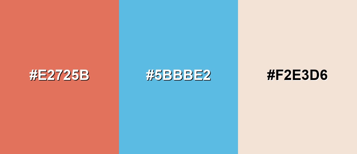
Complementary Colors
A complementary scheme balances terracotta with a blue-leaning counterpart, creating clear visual energy without needing extreme saturation.
Complementary Palette Example: Use terracotta for warmth, dusty cyan for contrast, and a soft off-white to keep the overall look clean.
Analogous Color Schemes
Analogous colors sit adjacent to each other on the color wheel, creating harmonious, cohesive palettes with subtle variation.
Apricot and clay-rose tones keep the mood warm and cohesive for gentle, natural designs.
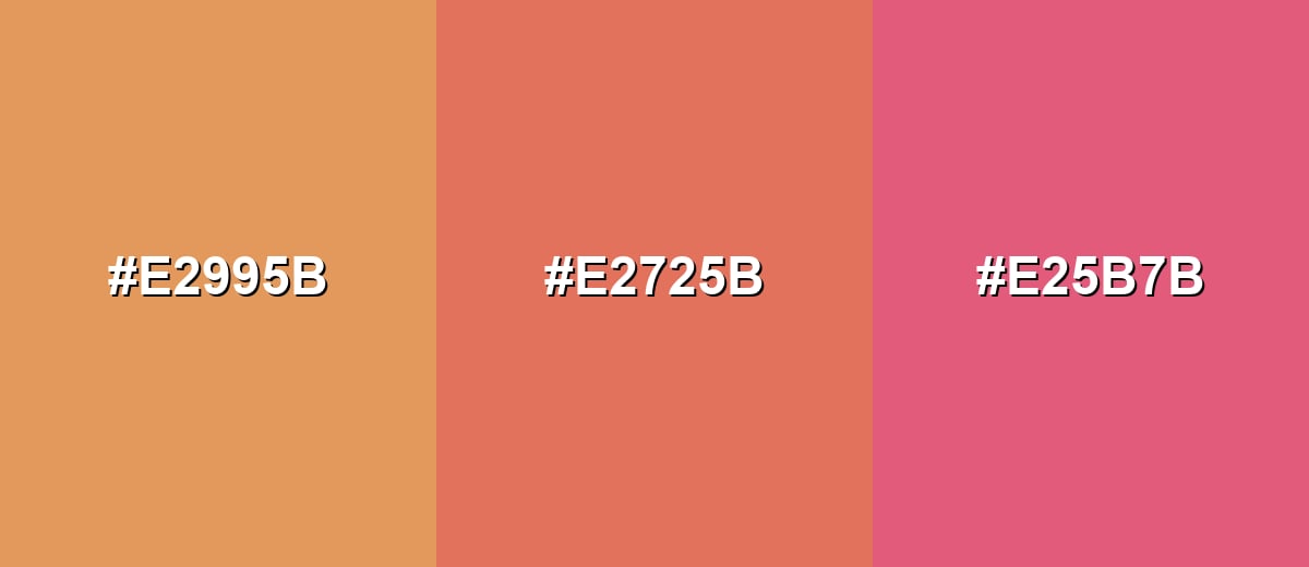
- Warm Apricot: #E2995B
- Terracotta: #E2725B
- Clay Rose: #E25B7B
Brick to salmon creates an earthy gradient that feels rustic yet lively in layouts and illustrations.
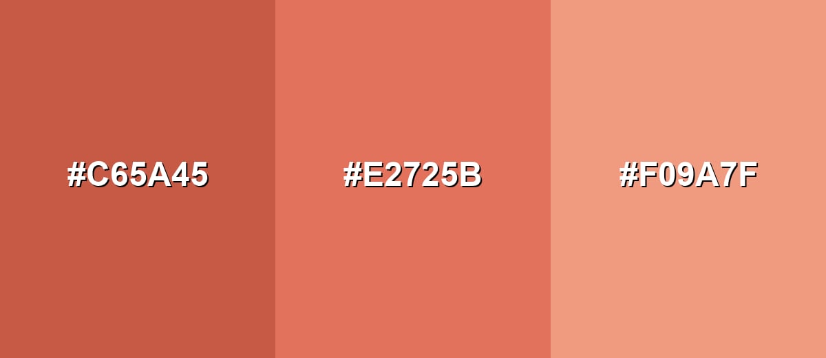
- Soft Brick: #C65A45
- Terracotta: #E2725B
- Muted Salmon: #F09A7F
Triadic & Tetradic Combinations
A triadic scheme adds variety while keeping the palette balanced across warm and cool directions.
Combine terracotta with a fresh green and a soft violet for playful, modern contrast.
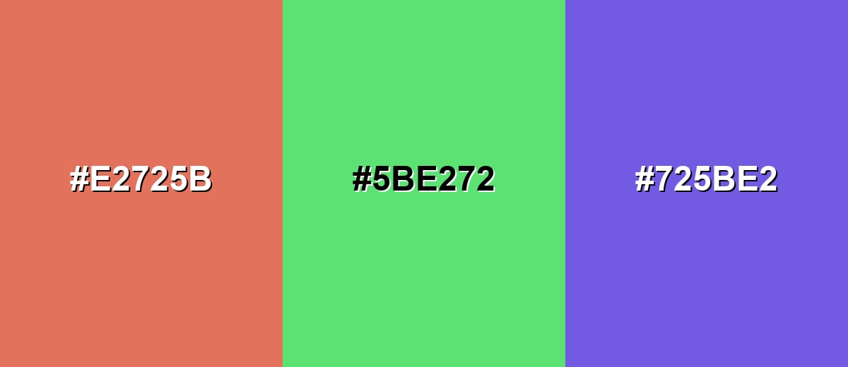
- Terracotta: #E2725B
- Fresh Green: #5BE272
- Soft Violet: #725BE2
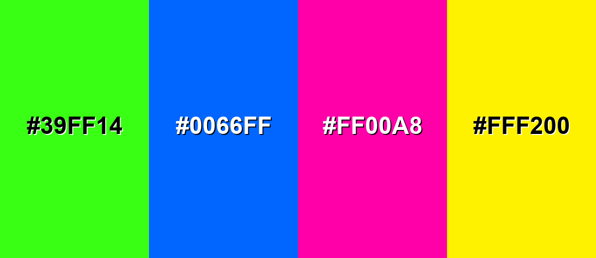
Colors to Avoid
While terracotta color is remarkably versatile, certain combinations can create problematic visual effects:
- Neon Lime (#39FF14) - Extremely bright greens can overpower terracotta and make the combination feel harsh and unstable.
- Electric Blue (#0066FF) - High-saturation blues can create a vibrating edge against terracotta and distract from content.
- Hot Magenta (#FF00A8) - Both hues compete for attention, which can look noisy in UI and reduce readability in small elements.
- Acid Yellow (#FFF200) - Sharp yellows can clash with terracotta's muted earthiness, making layouts feel unrefined.
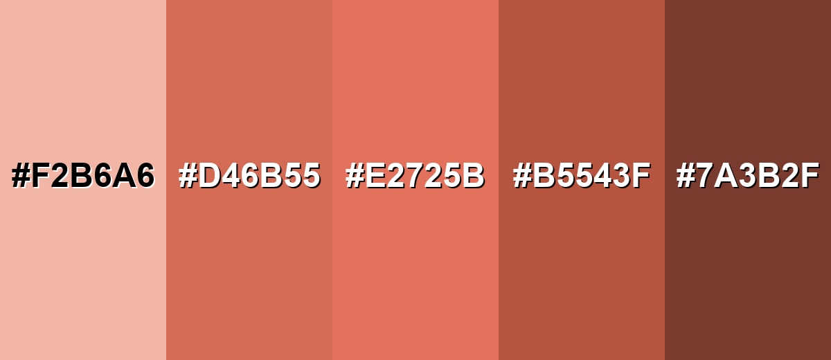
Shades, Tints & Variations of Terracotta Color
Terracotta isn't a single fixed swatch—it spans airy clay tints, classic mid-tones, and deeper baked shades. Knowing the range makes it easier to pick the right "weight" for backgrounds, accents, text, and premium brand moments.
- Pale Terracotta (#F2B6A6) - A light, airy tint that keeps the clay feel but reduces intensity. It's best used for Large backgrounds, cards, and gentle section panels..
- Dusty Terracotta (#D46B55) - A slightly muted mid-tone that feels natural and less orange-forward. It's best used for UI accents, illustrations, and secondary brand elements..
- Classic Terracotta (#E2725B) - The familiar baked-clay tone that sits between orange and brick. It's best used for Primary accents, feature blocks, and hero highlights..
- Burnt Terracotta (#B5543F) - A deeper, more baked shade with a stronger earthy weight. It's best used for Headings, strong accents, and warm, premium packaging..
- Deep Clay (#7A3B2F) - A dark clay-brown variant that adds depth and grounded contrast. It's best used for Text over light tints, borders, and anchoring dark elements..
Industry Applications
Because terracotta sits in a warm, earthy range, it fits industries that value craft, comfort, and authenticity. The key is choosing the right shade and pairing it with supportive neutrals for clarity.
Fashion & Beauty
- Earthy seasonal palettes for editorial layouts and lookbooks
- Warm-toned cosmetics packaging that feels natural and premium
- Accessory and backdrop colors that flatter leather, linen, and wood
- Soft, approachable brand accents for wellness and skincare visuals
Interior Design & Decor
- Accent walls, ceramics, textiles, and decor-inspired palettes
- Warm minimal spaces paired with off-whites and natural textures
- Balancing cool materials (stone, metal) with a cozy counterpoint
- Layering tints and deeper clay tones for a "lived-in" look
Branding & Marketing
- Handmade, artisan, or natural product identities
- Food, beverage, and hospitality visuals that need warmth
- Eco-minded branding when paired with calm neutrals and greens
- Human-centered UI accents for onboarding screens and highlights
Conclusion
Terracotta is a clay-inspired color that feels warm, grounded, and easy to work into real-world design—whether you're building a brand palette, styling a UI, or shaping an interior mood board. Using #E2725B as a stable reference makes it simple to keep consistency across web, print, and content creation, while smart pairings (like soft neutrals or blue-green contrast) help it stay fresh and readable. Pick lighter tints for breathing room, deeper baked shades for emphasis, and always check contrast so the warmth supports clarity instead of fighting it.
Design Smarter with AI: Media.io is an online AI studio that empowers creators with advanced image generation and enhancement tools. From text-to-image and image-to-image creation to AI upscaling and color optimization, it enables fast, creative, and professional results—all in your browser.

Frequently Asked Questions About Terracotta Color
Terracotta looks like sun-baked clay: a warm orange-red that is softened by earthy brown undertones. It typically feels more muted and natural than bright orange.
A widely used terracotta reference is #e2725b. Depending on the palette, terracotta can shift slightly more orange, more red, or more brown.
It sits between orange and red, but most versions lean orange-red with a noticeable earthy base. The exact direction depends on how much brown or pink is mixed into the tone.
Warm off-whites, sand, beige, and taupe create a calm, natural pairing. For stronger contrast, teal and dusty cyan are popular choices, while charcoal can add a modern edge.
Yes, it can work well as an accent or brand highlight, especially with clean neutrals and a restrained palette. Always check text and icon contrast because mid-tone terracottas may not support small white text.
To make lighter tints, mix terracotta with warm off-white or increase lightness in HSL. To make deeper tones, add a bit of brown or reduce value in HSV, keeping saturation controlled so it stays earthy rather than muddy.


