

 TL;DR:
Violet (#7F00FF) is a vivid, blue-leaning purple best utilized as a high-impact accent or CTA in digital interfaces, provided it is balanced with calm neutrals to prevent visual overstimulation.
● Define digital assets using HEX (#7F00FF) or RGB (127, 0, 255), but mandate physical color proofing for CMYK (50%,100%,0%,0%) print runs since the ink translates noticeably duller on paper than on backlit screens.
● Avoid pairing saturated violet with pure red, neon green, bright yellow, or pure black to prevent edge vibration and visual harshness; instead, utilize yellow-green for complementary contrast or adjacent blue-purples for cohesive gradients.
● Deploy the classic saturated violet strictly for small highlights and focus states, shifting to deep violet (#4A0080) for dark-mode backgrounds or pale lavender (#E6D9FF) for large UI surface areas to maintain typography contrast and accessibility.
Ask AI for a summary
 ChatGPT
 Perplexity
 Gemini
 Claude
 Grok
Grok
Violet is a vivid, blue-leaning purple that sits between blue and magenta on the color wheel. It's known for feeling imaginative and expressive, and it can read as both bold and refined depending on how much white, black, or gray you mix in.
If you're building a palette for branding, UI accents, or futuristic gradients, violet (#7F00FF) brings high energy without the harshness you sometimes get from ultra-bright reds.
Violet Color: Codes & Values
Below are the standard violet color codes you can copy directly into design tools, CSS stylesheets, and print workflows.
| Parameters | VALUE |
| HEX Code | #7F00FF |
| RGB DECIMAL | 127, 0, 255 |
| RGB PERCENTAGE | 49.8%, 0%, 100% |
| CMYK | 50%,100%,0%,0% |
| HSL | 270°, 100%, 50% |
| HSV (HSB) | 270°, 100%, 100% |
| Web Safe | #6600FF |
Key Color Space Explanations:
- HEX HEX is the most common way to define violet for web design and digital products. It's a compact code that maps directly to red, green, and blue light values.
- RGB RGB describes violet using red, green, and blue channel intensities for screens. It's useful for animations, overlays, and situations where you adjust opacity.
- CMYK CMYK is used for printing and describes how inks combine to approximate violet on paper. Because inks behave differently from light, printed violet may look duller unless you proof and tweak.
- HSL HSL expresses violet as hue, saturation, and lightness, which is intuitive when building tints and shades. Designers often prefer HSL for systematic palette building.
- Web Safe Web-safe is the closest match from the legacy 216-color palette. It's mainly helpful for compatibility references and quick approximations.
For most digital design, start with HEX or RGB; for systematic palette building, HSL makes it easy to create consistent tints and shades.
Want to generate violet color photos or posters? Try Media.io's AI Image Generator now!
Violet Color Conversions
Need violet in another format? Use this violet color conversion table to move between web, design software, and print-friendly values.
| Parameters | VALUE | CSS |
| HEX | #7f00ff | #7f00ff |
| RGB DECIMAL | 127, 0, 255 | rgb(127,0,255) |
| RGB PERCENTAGE | 49.8%, 0%, 100% | rgb(49.8%,0%,100%) |
| CMYK | 50%,100%,0%,0% | cmyk(50%,100%,0%,0%) |
| HSL | 270°, 100%, 50% | hsl(270°, 100%, 50%) |
| HSV (or HSB) | 270°, 100%, 100% | -- |
| Web Safe | 6600ff | #6600ff |
| CIE-LAB | 40.84, 83.00, -93.40 | -- |
| XYZ | 26.84, 11.75, 95.46 | -- |
| xyY | 0.200, 0.088, 11.75 | -- |
| CIE-LCH | 40.84, 125.00, 311.40° | -- |
| CIE-LUV | 40.84, 11.46, -133.90 | -- |
| Hunter-Lab | 34.28, 84.25, -154.98 | -- |
| Binary | 01111111, 00000000, 11111111 | -- |
Violet Meaning & Symbolism
The violet color meaning sits at the intersection of imagination and intensity. Positioned between blue and purple on the spectrum, violet carries creative energy while retaining a sense of depth and control.
Psychological Effects
From a color psychology perspective, violet often reads as expressive and high-impact. The psychological effects of violet include heightened creativity, visual focus, and a subtle sense of mystery—qualities that make it especially effective in digital interfaces, entertainment design, and bold brand systems.
- Imagination - Violet can spark a creative, idea-driven mood that feels inventive and forward-looking.
- Self-Expression - It often supports individuality and a "stand-out" personality without needing loud typography.
- Depth - Violet can bring a mysterious, night-sky kind of intensity that adds drama to a scene.
- Bold Focus - In interfaces, violet tends to stand out without feeling as aggressive as bright red.
- Overstimulation Risk - Highly saturated violet can overwhelm large surfaces, so it feels best when balanced with breathing room.
Positive Associations
In practice, the symbolism of violet is commonly linked to creativity, individuality, and refined luxury. With thoughtful contrast and supportive neutrals, violet can feel premium and contemporary rather than overpowering—adapting easily from playful lighter tints to deeper, more sophisticated shades.
- Creativity - It's commonly tied to creativity and imagination in branding and visuals.
- Individuality - Violet supports individuality and self-expression, especially in creator-focused design.
- Mystery - It can communicate depth and intrigue, making layouts feel cinematic.
- Luxury - Violet can give luxury cues when paired with neutrals or metallic-like highlights.
- Refinement - Depending on the tint or shade, violet can read playful (lighter) or premium (darker).
Cultural Significance Across the World
The cultural significance of violet varies by region and industry, but it consistently appears in categories where mood and distinction matter. Across entertainment, tech, beauty, and creative tools, violet is often used to signal innovation, artistry, and visually immersive experiences.
- Entertainment & Media - Violet is used for neon-style graphics, event posters, and futuristic promo art.
- Tech & Apps - It's a popular accent for interactive states, gradients, and dark-mode theming.
- Beauty & Personal Care - Violet supports premium "night" or "repair" cues and artistic editorial visuals.
- Education & Creativity Tools - It helps signal experimentation, imagination, and feature emphasis in UI.
Design Applications
In design, violet is flexible: it can be a bold accent, a gradient anchor, or a moody background. The key is controlling saturation and contrast so it stays readable and intentional.
Graphic Design Tips
- Use violet for focus states, highlights, and key actions, then balance it with calm neutrals for layout stability.
- For dark UIs, try deep violet backgrounds with soft, high-contrast typography and restrained glow effects.
- In charts and dashboards, reserve violet for a single category or emphasis to avoid confusion with nearby blues and magentas.
- Pair violet with clean typography and simple shapes to keep the look contemporary rather than overly ornate.
- Proof violet in CMYK before large print runs—purples are sensitive to paper, ink limits, and lighting.
If violet feels too "loud," shift toward a deeper or softer violet variation and reduce overall saturation across the palette to keep the system cohesive.
Violet in Photography & Video
- Use violet as a controlled accent (lighting, props, overlays) instead of flooding the entire frame with full saturation.
- Lean into violet for futuristic or cinematic moods, especially when you want a modern edge without heavy contrast.
- When color grading, keep an eye on readability and edge "vibration" if violet sits beside very bright, fully saturated hues.
- For posters, thumbnails, and hero visuals, violet works well as a gradient anchor with neighboring purple tones.
- In darker scenes, deep violets can add depth—just maintain clear luminance contrast for titles, captions, and UI elements.
Recommended Tool for Image Enhancement: When incorporating violet into your photography projects, Media.io's AI Image tools can help you achieve more refined results. With AI-powered color enhancement, photo colorization, image upscaling, and old photo restoration, you can easily enrich violet tones, improve overall image quality, and highlight the color's elegant and sophisticated aesthetic.
Color Combinations
Violet pairs beautifully with energetic complements, nearby purples, and high-contrast modern neutrals. Below are practical palettes you can adapt for branding, UI themes, or visual content.
Complementary Colors
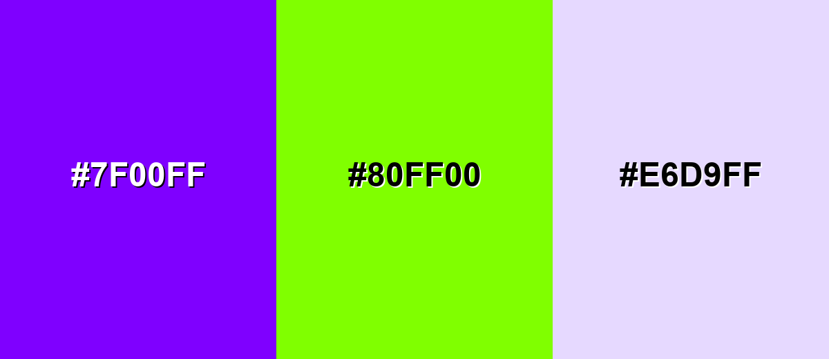
Complementary palettes maximize contrast and punch. With violet, the opposite side of the wheel brings a bright yellow-green that feels lively and attention-grabbing.
Complementary Palette Example: Use violet as the anchor, add a chartreuse pop for emphasis, and soften the overall look with a pale lavender neutral.
Analogous Color Schemes
Analogous colors sit adjacent to each other on the color wheel, creating harmonious, cohesive palettes with subtle variation.
Cool analogous: Blue-Violet → Violet → Purple-Magenta for smooth gradients and modern glow effects.
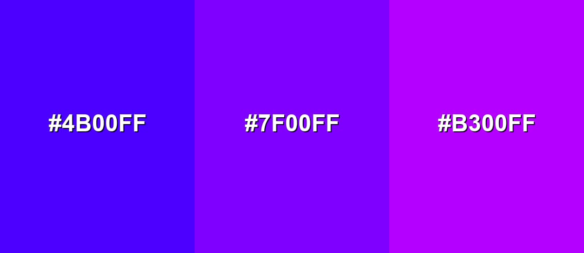
- Blue Violet: #4B00FF
- Violet: #7F00FF
- Purple Magenta: #B300FF
Soft analogous: Deep Violet → Violet → Orchid Violet for friendly brand palettes and softer hero sections.
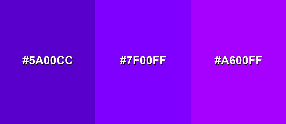
- Deep Violet: #5A00CC
- Violet: #7F00FF
- Orchid Violet: #A600FF
Triadic & Tetradic Combinations
Triadic palettes keep strong contrast while staying balanced across the wheel.
Violet + bright orange + spring green creates a bold, playful system for posters, creator brands, and energetic UI accents.
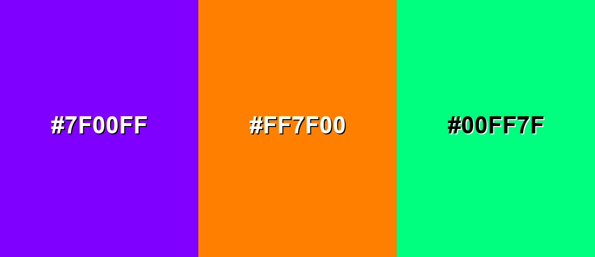
- Violet: #7F00FF
- Bright Orange: #FF7F00
- Spring Green: #00FF7F
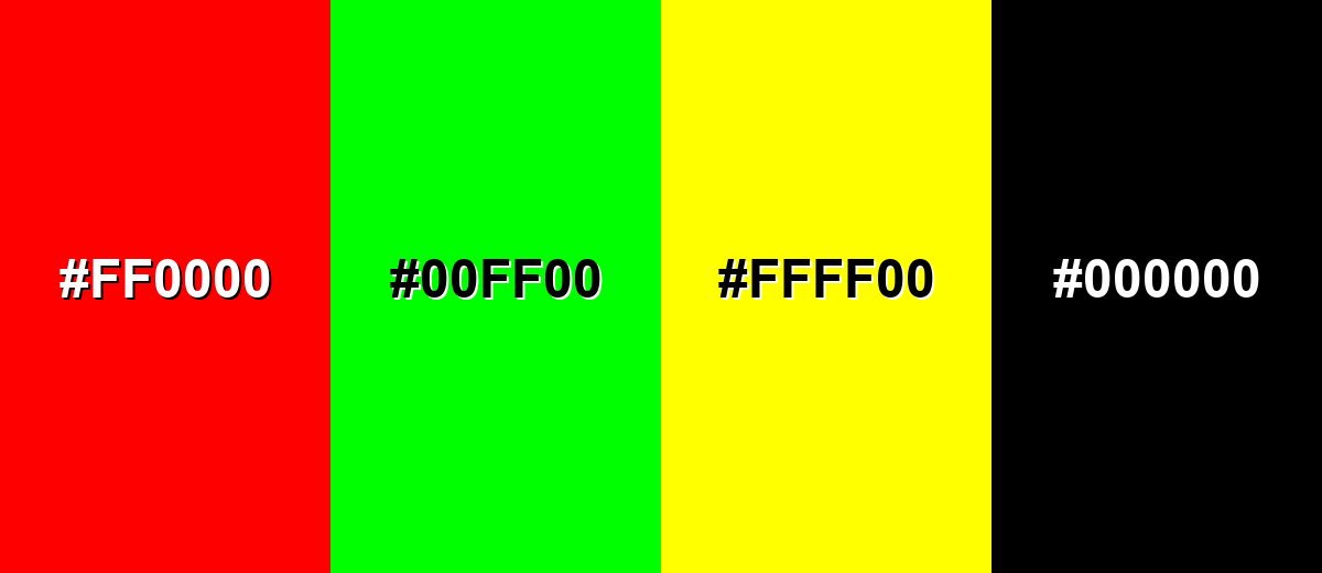
Colors to Avoid
While violet is remarkably versatile, certain combinations can create problematic visual effects:
- Pure Red (#FF0000) - Both colors are intense and can compete for attention, creating a harsh, noisy look when used in equal amounts.
- Neon Green (#00FF00) - This pairing can cause strong visual vibration and feels overly aggressive unless carefully toned down with neutrals.
- Bright Yellow (#FFFF00) - High saturation plus high brightness can make layouts feel unstable and can reduce perceived readability around edges.
- Pure Black (#000000) - On large areas, the jump from black to saturated violet can feel heavy and cramped; soften with dark charcoal-like tones or add spacing.
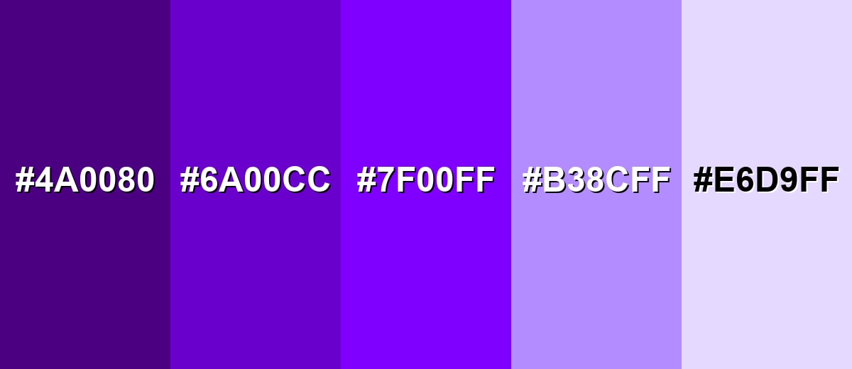
Shades, Tints & Variations of Violet
Violet can move from moody and cinematic to soft and airy just by adjusting lightness and saturation. This range is useful for building a full design system—primary accents, secondary surfaces, and backgrounds that still feel connected.
- Deep Violet (#4A0080) - A darker, more grounded violet that feels moody and cinematic. It's best used for Night-mode themes, premium packaging, and dramatic backgrounds.
- Royal Violet (#6A00CC) - A rich violet that keeps intensity while reading a little more polished. It's best used for Brand primaries, headings, and gradient anchors.
- Classic Violet (#7F00FF) - A bright, saturated violet with strong presence and high color energy. It's best used for CTAs, highlights, and eye-catching hero elements.
- Soft Violet (#B38CFF) - A lighter violet that feels friendly, modern, and less forceful. It's best used for Background tints, cards, and secondary UI surfaces.
- Pale Lavender (#E6D9FF) - A very light violet-tinted lavender that adds calm and airiness. It's best used for Large background areas, editorial layouts, and subtle brand texture.
Industry Applications
Because violet can feel both expressive and premium, it shows up across creative and consumer-facing industries—especially where differentiation matters.
Fashion & Beauty
- Use violet with soft neutrals to add premium cues in beauty and personal care visuals.
- Apply violet accents on packaging for "night" or "repair" product lines.
- Build editorial layouts that feel artistic and bold with violet as a key highlight.
- Shift toward deeper violets when you want a more polished, luxe feel.
Interior Design & Decor
- Create dramatic, cinematic spaces by using deeper violets on feature walls or as nighttime mood lighting inspiration.
- For a calmer look, use pale lavender tones on large surfaces to keep the room airy and light.
- Balance saturated violet accents with supportive neutrals to avoid visual overwhelm.
- Keep contrast in mind for signage and wayfinding so violet stays readable in different lighting.
Branding & Marketing
- Position creative tools, entertainment, or modern lifestyle brands as expressive by using violet as a signature accent.
- Use gradient-based hero sections in tech and apps for a modern product-page feel.
- In campaigns, reserve violet for emphasis so it doesn't compete with nearby blues and magentas.
- For premium branding, reduce overall saturation and lean into deeper violets supported by clean typography.
Conclusion
Violet is a high-impact color that can feel imaginative, modern, and premium when used with intention. Start with a strong base violet (#7F00FF), balance it with supportive neutrals for breathing room, and choose combinations—complementary, analogous, triadic, or tetradic—based on how much contrast your design needs.
Design Smarter with AI: Media.io is an online AI studio that empowers creators with advanced image generation and enhancement tools. From text-to-image and image-to-image creation to AI upscaling and color optimization, it enables fast, creative, and professional results—all in your browser.

Frequently Asked Questions About Violet Color
Violet is a saturated purple that leans toward blue, positioned between blue and magenta on the color wheel. It often looks cooler and more electric than warmer purples.
They're closely related, but not always identical. Violet typically skews bluer, while "purple" can be a broader label that includes warmer, red-leaning purples.
For this violet, the RGB value is 127, 0, 255 and the CMYK value is 50%,100%,0%,0%. Use RGB for screens and CMYK for print workflows.
Violet pairs well with yellow-green complements for high contrast, with neighboring purples for smooth gradients, and with bright oranges/greens for bold triadic palettes. Soft neutrals help keep it readable and balanced.
Use violet as an accent rather than a full background, and support it with light or dark neutrals to give the layout breathing room. If it still feels too loud, shift to a deeper or softer violet variation and reduce saturation across the palette.
Yes, but treat contrast as the deciding factor. Ensure text and icons meet contrast requirements against violet backgrounds, and use additional cues (labels, icons, patterns) so meaning isn't communicated by color alone.


