

 TL;DR:
The pure red color (Hex #FF0000) is a high-energy hue ideal for driving urgency and capturing attention, but it requires strict moderation and careful contrast balancing to prevent visual fatigue and readability issues.
● Pure screen red reproduces darker and less vividly in print workflows, requiring early CMYK conversion and physical proofing to prevent unexpected color shifts.
● Restrict fully saturated red to critical accents or destructive UI states, utilizing deeper shades like #C62828 for readable text and separating it from primary actions to avoid mixed signals.
● Avoid pairing red with neon yellow (#FFFF00) or hot magenta (#FF00FF) to prevent edge vibration, and lower saturation before raising exposure during video grading to prevent color clipping and overly warm skin tones.
Ask AI for a summary
 ChatGPT
 Perplexity
 Gemini
 Claude
 Grok
Grok
Red color is a high-energy hue that sits at the warm end of the visible spectrum and instantly pulls attention in a layout.
The classic red color hex code is #ff0000, a pure, fully saturated red that's easy to recognize but tricky to balance for readability and mood.
Red Color: Codes & Values
If you're saving a style guide or handing off a file, consistent values prevent "almost red" mismatches across tools.
| Parameters | VALUE |
| HEX Code | #FF0000 |
| RGB DECIMAL | 255, 0, 0 |
| RGB PERCENTAGE | 100%, 0%, 0% |
| CMYK | 0%,100%,100%,0% |
| HSL | 0°, 100%, 50% |
| HSV (HSB) | 0°, 100%, 100% |
| Web Safe | #FF0000 |
Key Color Space Explanations:
- HEX - HEX is the most common way to specify red in digital design and front-end work, using a six-digit code. For many teams, the red color hex code becomes a shared source of truth in tokens and CSS variables.
- RGB - RGB defines red as light on screens, using red/green/blue channel values. It's useful when you need to match how red color appears across devices, video, and UI components.
- CMYK - CMYK is used for print workflows where colors are created by mixing inks. Converting red helps set expectations during print proofing, because saturated screen reds often reproduce darker or less vivid on paper.
- HSL - HSL describes red by hue, saturation, and lightness, which is intuitive for adjusting tints and shades. It's handy when you're building a scale of red color shades and tints for states like hover, active, and background fills.
- Web Safe - Web safe colors are a legacy set that were historically safer on older displays. For pure red, the closest web safe match is identical, which simplifies basic palette building and red Color combinations.
Use these values as your "source of truth" in design tokens, CSS variables, and handoffs so your red stays consistent from mockups to production.
Want to generate red color photos or posters? Try Media.io's AI Image Generator now!
Red Color Conversions
Conversions keep red consistent when you move from a UI mockup to production CSS or to print proofing.
| Parameters | VALUE | CSS |
| HEX | #ff0000 | #ff0000 |
| RGB DECIMAL | 255, 0, 0 | rgb(255,0,0) |
| RGB PERCENTAGE | 100%, 0%, 0% | rgb(100%,0%,0%) |
| CMYK | 0%,100%,100%,0% | cmyk(0%,100%,100%,0%) |
| HSL | 0°, 100%, 50% | hsl(0°, 100%, 50%) |
| HSV (or HSB) | 0°, 100%, 100% | -- |
| Web Safe | ff0000 | #ff0000 |
| CIE-LAB | 53.24, 80.09, 67.20 | -- |
| XYZ | 41.24, 21.26, 1.93 | -- |
| xyY | 0.6400, 0.3300, 21.26 | -- |
| CIE-LCH | 53.24, 104.55, 40.00° | -- |
| CIE-LUV | 53.24, 175.05, 37.75 | -- |
| Hunter-Lab | 46.11, 78.96, 29.79 | -- |
| Binary | 11111111 00000000 00000000 | -- |
Red Color Meaning & Symbolism
Now that you have the codes, the next question is why red feels so intense in real designs—this is where red color meaning shows up. Because it's highly saturated and visually forward, red tends to read as "closer" than cooler hues, which changes how we notice hierarchy and urgency.
Psychological Effects
Red is visually "loud," so your eye keeps returning to it—great for focus, risky for fatigue.
- Urgency - Red increases perceived priority, making actions and alerts feel time-sensitive.
- Attention Capture - Because it visually advances, red can pull focus even in busy layouts.
- Higher Arousal - Red can feel energizing, which helps CTAs but can raise tension if overused.
- Perceived Closeness - Large red areas can make spaces and components feel nearer and more intense.
- Cognitive Load - Too much saturated red can feel stressful and reduce scan-ability in minimal UIs.
Positive Associations
Used intentionally, red reads as bold, lively, and confident rather than aggressive.
- Energy - Red signals action and momentum, helping key moments stand out quickly.
- Passion - It's strongly tied to romance and emotional intensity in many visual languages.
- Confidence - A controlled red can feel powerful and decisive in branding and headlines.
- Vitality - Red often communicates warmth, life, and a "fresh" sense of movement.
- Celebration - In festive design, red can feel joyful and high-spirited when balanced with neutrals.
Cultural Significance Across the World
Red's message shifts by context—always check cultural and industry norms before standardizing a palette.
- Festivity - In many cultures, red is used in celebrations and special occasions to signal joy and good fortune.
- Warning - Globally, red is widely recognized for danger, stop signals, and critical alerts.
- Authority - Red can communicate power and status, especially in bold flags, sports, and ceremonial visuals.
- Love - Red commonly represents romance and affection in valentine's day gifts, cards, and lifestyle branding.
Design Applications
With that meaning in mind, the real win is choosing where red earns its attention rather than letting it spill everywhere.
Graphic Design Tips
- Use pure red (#FF0000) as a top-level accent, not a default fill for large blocks.
- When you need readable type, lean into deeper reds (like #C62828) instead of fully saturated red.
- Anchor red-heavy compositions with whitespace and calm neutrals so hierarchy stays clear.
- Separate "error/danger" red from "primary action" red to avoid mixed signals in UI.
- Always test contrast for text-on-red and red-on-light backgrounds before shipping.
Pro tip: Build a small red scale (tints for backgrounds, mid-tones for badges, deep shades for text) so you can stay consistent across states like hover, active, and disabled.
Red Color in Photography & Video
- Watch skin tones—bright reds nearby can push faces overly warm and distract from the subject.
- In color grading, reduce saturation before raising exposure so reds don't clip and lose texture.
- Use red props or wardrobe as a focal point, then keep the rest of the frame neutral.
- For product shots, check how red renders on different displays; small hue shifts are common.
- In video, avoid noisy reds by keeping ISO under control and using softer, even lighting.
Recommended Tool for Image Enhancement: When incorporating red color into your photography projects, Media.io's AI Image tools can help you achieve more refined results. With AI-powered color enhancement, photo colorization, image upscaling, and old photo restoration, you can easily enrich red color tones, improve overall image quality, and highlight the color's elegant and sophisticated aesthetic.
Color Combinations
Once you know where you'll use red, pairing becomes the lever that controls intensity, harmony, and contrast. The best red Color combinations either calm red down with neutrals or sharpen it with clean opposites and structured palettes.
Complementary Colors
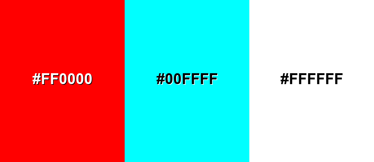
Complementary pairing creates maximum contrast, which is useful when you want red to pop without adding more saturation—an effective tactic for red color in branding. Use the opposite hue as an accent, and keep one side dominant so the layout doesn't vibrate.
Complementary Palette Example: This complementary set gives you a punchy red color combinations option for highlights, balanced by a cool counterpoint and a clean neutral.
Analogous Color Schemes
Analogous colors sit adjacent to each other on the color wheel, creating harmonious, cohesive palettes with subtle variation.
An analogous sweep like this is great when you want a cohesive feel while exploring red color shades and tints across a single UI or poster.
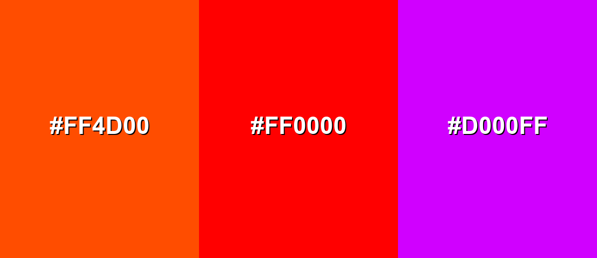
- Hot Magenta: #FF00A8
- Pure Red: #FF0000
- Flame Orange: #FF4D00
For softer transitions, this analogous set keeps the energy but feels more controlled—handy when you're dialing in red color in UI design.
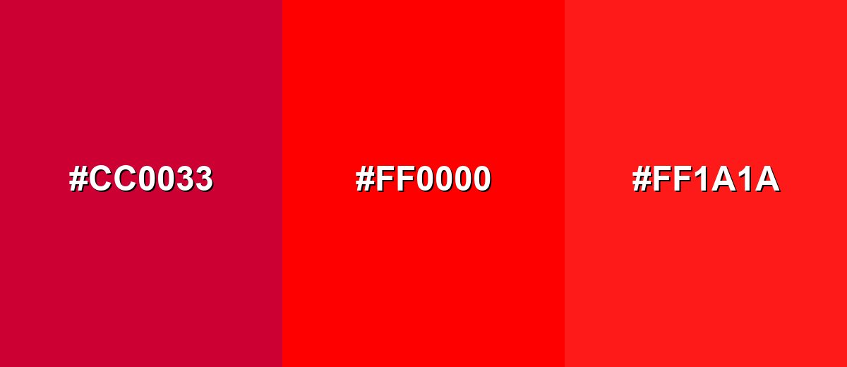
- Berry Red: #CC0033
- Pure Red: #FF0000
- Warm Scarlet: #FF1A1A
Triadic & Tetradic Combinations
Triadic palettes spread contrast evenly, so you can keep red bold without making it the only attention magnet in red Color combinations.
Use this triad for clear category coding, playful branding, or dashboards—just pick one dominant color and let the others support red color in branding.
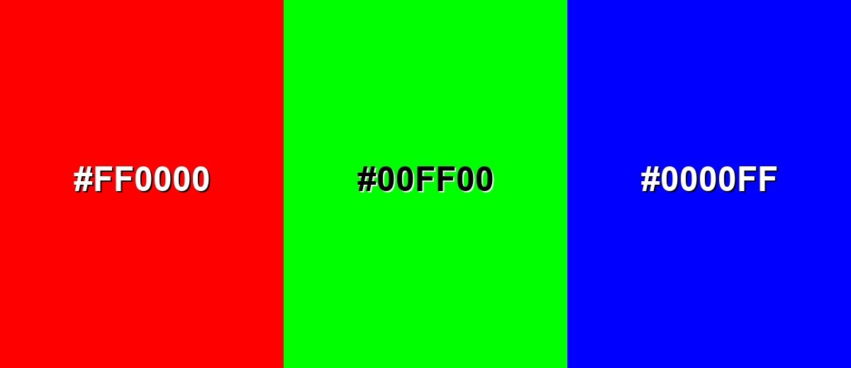
- Pure Red: #FF0000
- Pure Green: #00FF00
- Pure Blue: #0000FF
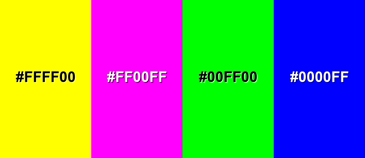
Colors to Avoid
While red color is remarkably versatile, certain combinations can create problematic visual effects:
- Neon Yellow (#FFFF00) - Next to bright red, neon yellow can create harsh edge vibration and visual fatigue; it's a risky choice for red color in UI design.
- Hot Magenta (#FF00FF) - Two highly saturated warms together can feel chaotic and reduce hierarchy, complicating red Color combinations.
- Pure Green (#00FF00) - This pairing can trigger strong seasonal/novelty associations and may look noisy at equal weight—watch it in red color in branding.
- Pure Blue (#0000FF) - At equal prominence, red and blue can feel confrontational and overly loud; balance carefully when exploring red color shades and tints.
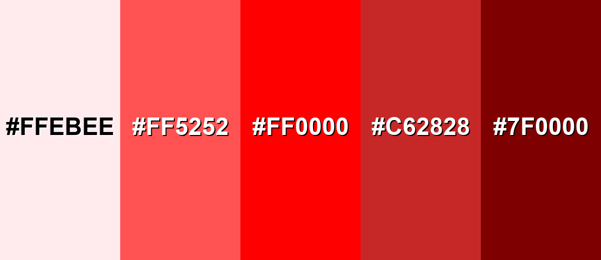
Shades, Tints & Variations of Red Color
Red isn't just one loud primary—its tints and shades range from soft, friendly warmth to deep, dramatic tones. Building a small set of variations makes it easier to design states, backgrounds, and accents without losing brand consistency.
- Blush Tint (#FFEBEE) - A very pale red tint that reads soft and warm without demanding attention. It's best used for Background fills, subtle emphasis blocks, gentle onboarding screens..
- Light Coral Red (#FF5252) - A lighter, friendlier red that keeps energy while improving approachability. It's best used for Badges, highlights, friendly CTAs, illustrations..
- Pure Red (#FF0000) - A fully saturated primary red with maximum visual impact. It's best used for Key accents, urgent states, strong brand moments (use sparingly)..
- Crimson Shade (#C62828) - A deeper red shade that feels more grounded and less fluorescent. It's best used for Text on light backgrounds, headers, premium packaging accents..
- Deep Maroon (#7F0000) - A very dark red with a mature, dramatic character. It's best used for Luxury branding, dark-mode accents, rich background panels..
Industry Applications
Because it's emotionally direct, red often becomes a strategic tool in attention management and persuasion—especially for red color in branding. The key is matching intensity to context so it signals importance, not noise.
Fashion & Beauty
- Use deeper reds to feel premium and wearable, while bright reds read trend-forward and bold.
- Pair red with clean neutrals to keep the look intentional (and avoid overwhelming the product).
- In lookbooks, keep red as the hero accent so skin tones and textures stay natural.
- For UI in beauty apps, reserve red for key moments (sale tags, limited drops), not every button.
Interior Design & Decor
- Muted reds work best for large surfaces; vivid reds shine as accents (pillows, art, small furniture).
- Red visually "pulls forward," so use it to make a cozy corner feel closer and warmer.
- Balance with wood tones, stone-like neutrals, and warm lighting to avoid harshness.
- Always test red paint under multiple lighting temperatures; it can shift quickly from warm to heavy.
Branding & Marketing
- Standardize a signature red in guidelines so campaigns don't drift into "almost red" territory.
- Use red to spotlight one primary message per screen (CTA, urgency label, key offer).
- Support red with whitespace and a reliable neutral to prevent a loud or aggressive tone.
- For print and packaging, convert to CMYK early and proof—bright screen reds can reproduce darker.
Conclusion
Red color is easiest to identify and hardest to balance: it can clarify hierarchy in a second, but it can also overwhelm if it's treated as a default. Start with consistent codes like #FF0000, choose a shade that matches the emotion you want (friendly coral, grounded crimson, or dramatic maroon), and rely on smart pairings plus contrast checks so your designs stay bold, readable, and intentional across screen and print.
Design Smarter with AI: Media.io is an online AI studio that empowers creators with advanced image generation and enhancement tools. From text-to-image and image-to-image creation to AI upscaling and color optimization, it enables fast, creative, and professional results—all in your browser.

Frequently Asked Questions About Red Color
The standard red color hex code is #ff0000, which represents fully saturated red with no green or blue in sRGB.
Red is generally considered warm because it visually advances and suggests heat and energy. However, cooler reds (with more blue, like crimson) can feel more serious and less fiery.
Strong options include neutrals (white and gray) for balance, cyan/teal for crisp complementary contrast, and warm oranges or pinks for smooth analogous palettes. The best choice depends on whether you want harmony or high contrast.
Limit red to critical accents (errors, destructive actions, one primary highlight), then verify text contrast and add non-color cues like icons and labels. This approach keeps red color in UI design clear without increasing cognitive load.
Red is memorable and attention-grabbing, which helps with recognition and urgency cues in campaigns. Red color in branding works best when paired with calmer supporting colors so it feels confident rather than aggressive.
Not always—screens mix light (RGB), while print relies on inks (CMYK), and bright reds can shift depending on paper and press settings. If accuracy matters, convert early, proof prints, and consider spot colors for consistent brand red.


