

Serenity color is a soft, powdery blue that resembles a clear morning sky with a light haze. With its cool, airy tone, it feels calming and clean without looking icy.
Commonly referenced as HEX #91A8D0, serenity blue is popular in modern UI, lifestyle branding, and pastel-forward design. Below, you'll find its exact color codes, conversions, matching palettes, shade ideas, and practical ways to use it.
Serenity Color: Codes & Values
If you're building a palette or updating brand guidelines, these are the core serenity color values to copy into your design tools and specs.
| Parameters | VALUE |
| HEX Code | #91A8D0 |
| RGB DECIMAL | 145, 168, 208 |
| RGB PERCENTAGE | 57%, 66%, 82% |
| CMYK | 30%,19%,0%,18% |
| HSL | 218°, 40%, 69% |
| HSV (HSB) | 218°, 30%, 82% |
| Web Safe | #9999CC |
Key Color Space Explanations:
- HEX - HEX is the most common way to specify a screen-friendly value in web and UI design. Use #91a8d0 in CSS, design tools, and brand guidelines.
- RGB - RGB defines how much red, green, and blue light is mixed to display this shade. It's the standard for screens, video, and digital graphics.
- CMYK - CMYK is used for printing, describing ink mixes for cyan, magenta, yellow, and black. Converting from RGB can shift results, so proof prints help for accurate output.
- HSL - HSL describes hue, saturation, and lightness, which is handy for building tints, shades, and matching palettes. It's often easier to tweak than RGB when refining tone.
- Web Safe - Web Safe is the nearest legacy palette match used on older displays. While modern screens support full color, #9999cc is a practical approximation when needed.
Use HEX and RGB for UI and digital assets, switch to CMYK for print, and lean on HSL when you want quick tints/shades that still feel like "serenity."
Serenity Color Conversions
Need serenity color in another format? Use this conversion table for quick copy/paste into CSS, print specs, and color-managed workflows.
| Parameters | VALUE | CSS |
| HEX | #91a8d0 | #91a8d0 |
| RGB DECIMAL | 145, 168, 208 | rgb(145,168,208) |
| RGB PERCENTAGE | 57%, 66%, 82% | rgb(57%,66%,82%) |
| CMYK | 30%,19%,0%,18% | cmyk(30%,19%,0%,18%) |
| HSL | 218°, 40%, 69% | hsl(218°,40%,69%) |
| HSV (or HSB) | 218°, 30%, 82% | -- |
| Web Safe | 9999cc | #9999cc |
| CIE-LAB | 68.6, 1.0, -23.0 | -- |
| XYZ | 37.1, 38.6, 65.4 | -- |
| xyY | 0.263, 0.274, 38.6 | -- |
| CIE-LCH | 68.6, 23.0, 272.5° | -- |
| CIE-LUV | 68.6, -13.5, -36.1 | -- |
| Hunter-Lab | 62.2, 1.2, -24.2 | -- |
| Binary | 100100011010100011010000 | -- |
Want to generate Serenity Color photos or posters? Try Media.io's AI Image Generator now!
Serenity Color Meaning & Symbolism
Serenity is commonly linked with calm focus, openness, and gentle stability. In everyday visuals, it reads as a quiet blue that feels friendly rather than formal. When people look up Serenity Color meaning, they're usually trying to understand why it feels soothing and why it works so well in modern design.
Psychological Effects
Because it's light, cool, and softly saturated, serenity tends to feel easy on the eyes in both print and digital layouts.
- Lower Visual Tension - The pastel, cool tone reduces "sharpness," helping pages feel less busy.
- Calm Focus - Serenity supports concentration without demanding attention like brighter blues can.
- Long-View Comfort - Its gentle saturation is friendly for dashboards, reading, and scrolling-heavy pages.
- Reliable Signal - It subtly communicates clarity and trust, especially in information-rich UI.
- Risk Of Feeling Cold - Used with too much white and too little contrast, it can read distant or low-energy.
Positive Associations
In branding and everyday visuals, serenity blue is often chosen to feel welcoming, clean, and quietly confident.
- Calm - A soothing mood that's ideal for wellness, lifestyle, and slow-design aesthetics.
- Clarity - A "fresh air" feeling that helps content look organized and easy to navigate.
- Trust - A friendly, dependable blue that doesn't feel overly corporate or strict.
- Cleanliness - Works well for minimal layouts and product visuals that need a tidy look.
- Gentle Confidence - Feels composed and modern without being loud or aggressive.
Cultural Significance Across the World
Soft blues like serenity tend to land well across many audiences because they read as peaceful and approachable.
- Peaceful Tone - Often linked to quiet, restful feelings thanks to its sky- and air-like look.
- Clean & Fresh - Common in modern product styling to suggest hygiene and simplicity.
- Trust & Stability - A familiar "reliable" cue in communication-heavy design contexts.
- Contemporary Comfort - Frequently used in fashion and lifestyle visuals to signal soft, modern ease.
Design Applications
Because serenity sits between sky blue and muted periwinkle, it adapts well to digital design, print, and interiors. It works best when you treat it as a calming base and let contrast and texture do the heavy lifting.
Graphic Design Tips
- Use serenity for backgrounds and large sections to create a soft, breathable layout.
- Pair it with warm neutrals (like sand/beige tones) to keep the palette from feeling chilly.
- For readable UI, set headings and body text in deeper tones (slate or indigo-like shades).
- Keep surrounding neutrals slightly warm (off-white or light greige) for a balanced, modern look.
- If you need more energy, add one controlled accent and keep everything else muted.
Pro tip: Treat serenity as your "canvas" color—then build hierarchy with typography weight and one deeper blue for buttons, links, and key UI states.
Serenity Color in Photography & Video
- Use serenity backgrounds or props to create a clean, airy product mood (especially for lifestyle shots).
- In color grading, push blues gently toward soft pastel to keep skin tones natural and friendly.
- Balance it with warmer highlights (subtle beige or peach light) for a more human, less clinical feel.
- For motion graphics, serenity works well as a calm lower-third or title-card color with dark text.
- Avoid over-saturating: serenity looks best when it stays soft and slightly muted.
Recommended Tool for Image Enhancement: When incorporating serenity color into your photography projects, Media.io's AI Image tools can help you achieve more refined results. With AI-powered color enhancement, photo colorization, image upscaling, and old photo restoration, you can easily enrich serenity color tones, improve overall image quality, and highlight the color's elegant and sophisticated aesthetic.
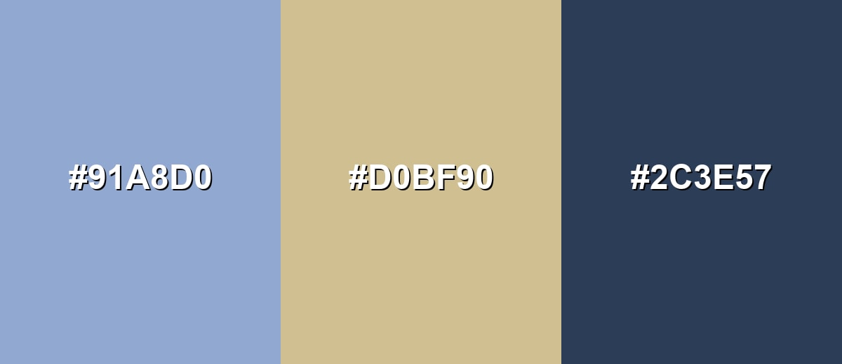
Color Combinations
Serenity pairs best with warm neutrals, deep blues, and a few carefully chosen accents. Use these palettes as starting points, then adjust saturation and contrast to match your layout or brand tone.
Complementary Colors
A complementary palette balances serenity with a warm orange-tinted neutral, creating a calm-but-inviting look. This is a strong choice for landing pages, packaging, and editorial layouts that need softness plus contrast.
Complementary Palette Example: Pair Serenity with Warm Sand, then anchor the layout with Deep Slate for readable contrast.
Analogous Color Schemes
Analogous colors sit adjacent to each other on the color wheel, creating harmonious, cohesive palettes with subtle variation.
Blue-leaning analogs feel airy and cohesive, ideal for calm brand systems and soft gradients.
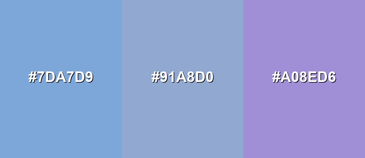
- Sky Blue: #7DA7D9
- Serenity: #91A8D0
- Periwinkle Mist: #A08ED6
A teal-to-violet run adds variety while keeping the same gentle, modern mood.
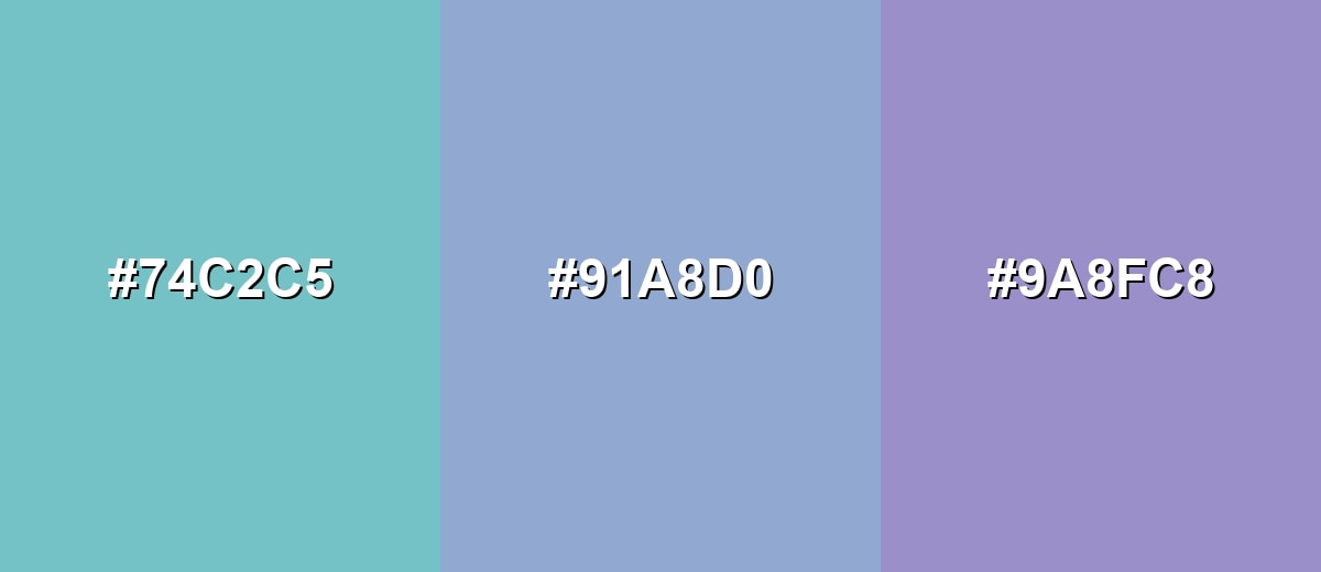
- Seafoam Tint: #74C2C5
- Serenity: #91A8D0
- Dusty Violet: #9A8FC8
Triadic & Tetradic Combinations
Triadic palettes give you more energy without losing balance, as long as you keep the tones similarly muted.
Use Serenity with Soft Chartreuse and Rose Mauve for a playful, editorial-friendly mix.
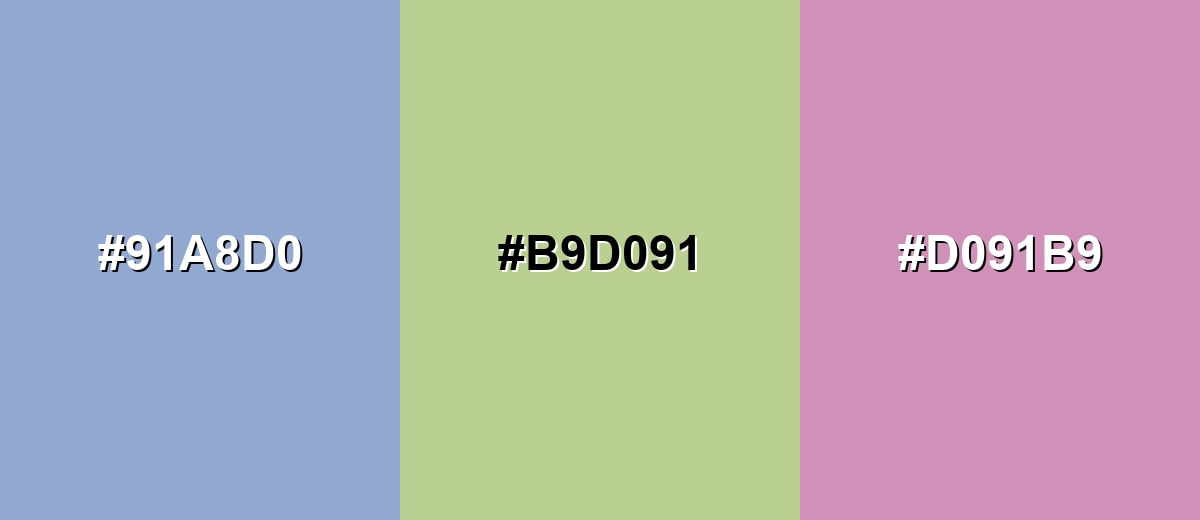
- Serenity: #91A8D0
- Soft Chartreuse: #B9D091
- Rose Mauve: #D091B9
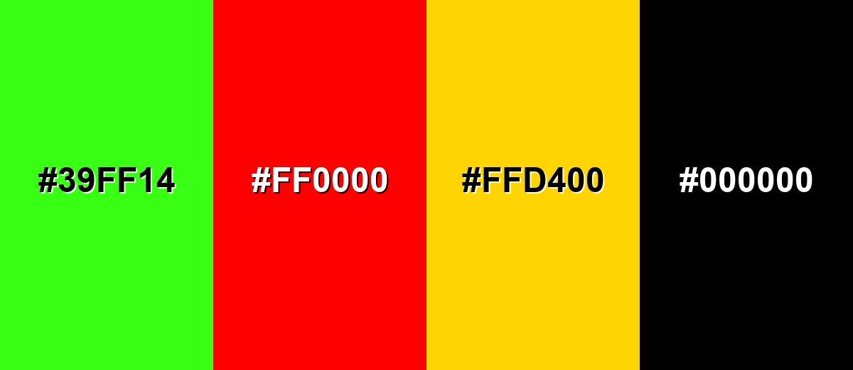
Colors to Avoid
While serenity color is remarkably versatile, certain combinations can create problematic visual effects:
- Neon Green (#39FF14) - The intensity overwhelms serenity and makes the palette feel harsh and unbalanced.
- Pure Red (#FF0000) - High contrast and saturation can read as alarming, fighting the calm tone serenity sets.
- Bright Yellow (#FFD400) - The brightness can create a sharp, vibrating look next to a soft pastel blue.
- Pure Black (#000000) - It can feel too severe against serenity; deep slate or navy usually achieves better harmony.
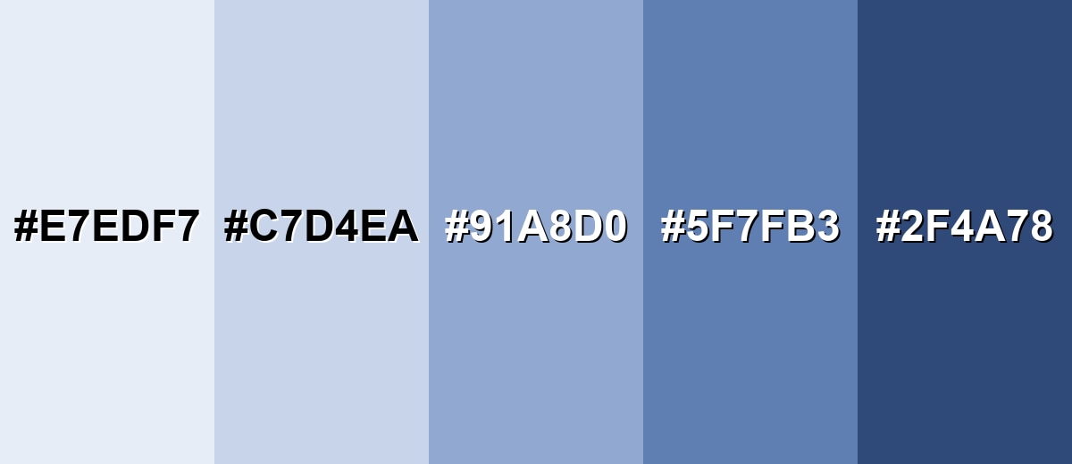
Shades, Tints & Variations of Serenity Color
Serenity has a flexible range—from near-white tints for backgrounds to deeper blues for contrast and UI structure. Having these variations ready makes it easier to design consistent pages, components, and brand assets without the palette drifting.
- Porcelain Sky (#E7EDF7) - A very light tint that keeps the cool, airy character with a nearly-white finish. It's best used for page backgrounds, large sections, soft cards, and subtle gradients.
- Pale Serenity (#C7D4EA) - A lighter, washed version that still reads clearly as blue but stays gentle. It's best used for UI surfaces, panels, inactive states, and calm illustration fills.
- Serenity (#91A8D0) - The balanced base tone: soft, modern, and easy to pair with neutrals. It's best used for primary brand accent, headers, icons, and soft emphasis blocks.
- Dusk Blue (#5F7FB3) - A deeper shade that adds structure while staying in the same cool family. It's best used for buttons, links, navigation highlights, and chart series.
- Deep Indigo (#2F4A78) - A dark, grounded variation that provides strong contrast and a more serious tone. It's best used for text on light serenity tints, hero overlays, and accessibility-focused UI.
Industry Applications
Serenity fits industries that want to communicate calm competence and a clean, modern experience. It's especially effective when supported by clear typography and deliberate contrast.
Fashion & Beauty
- Use serenity for clean, pastel-forward packaging accents that feel fresh and modern.
- Pair it with warm neutrals to suggest softness and care rather than a cold, clinical mood.
- Build social templates around serenity backgrounds for an airy, lifestyle aesthetic.
- Use deeper blue variations for product names and key claims to keep readability strong.
Interior Design & Decor
- Use serenity-like pastels to create a light, open room feel that still reads contemporary.
- Combine with warm, sand-toned neutrals for balance and a lived-in comfort vibe.
- Layer texture (linen, matte paint, soft ceramics) so the palette doesn't feel flat.
- Bring in darker blue accents for visual structure in trim, textiles, or decor details.
Branding & Marketing
- Wellness and lifestyle brands can use serenity backgrounds to set a relaxed, reassuring tone.
- Tech and SaaS teams can apply it as a calm UI accent in onboarding, charts, and dashboards.
- Education platforms can use serenity to reduce visual pressure and keep pages approachable.
- Healthcare communication can rely on serenity for clean, calming info graphics without looking sterile.
Conclusion
Serenity color is a dependable pastel blue that communicates calm, clarity, and modern simplicity—especially when you build around its core value, #91A8D0. It works beautifully as a soft base for UI, branding, print, and lifestyle visuals, but it really shines when you support it with intentional contrast (deep blues for text and structure) and a touch of warmth (sand or beige-style neutrals). Use the codes, conversions, palettes, and shade variations in this guide to keep your designs consistent, readable, and confidently understated.
Design Smarter with AI: Media.io is an online AI studio that empowers creators with advanced image generation and enhancement tools. From text-to-image and image-to-image creation to AI upscaling and color optimization, it enables fast, creative, and professional results—all in your browser.

Frequently Asked Questions About Serenity Color
It looks like a soft, powdery sky blue with a slight gray-lavender undertone. It reads cool and airy rather than bright or icy.
A commonly used HEX value for serenity is #91a8d0. In RGB, that converts to 145, 168, 208.
Serenity is often associated with calm, clarity, and gentle trust. It can also suggest cleanliness and openness in modern visual design.
Warm neutrals like sand and beige, deep slate or navy for contrast, and muted accents like mauve, sage, or soft chartreuse pair well. These combinations keep the palette balanced and readable.
Deep slate or deep indigo usually works best for body text because serenity is fairly light. Pure white text can lose contrast unless the background is darkened to a deeper shade.
They are close, but not identical. Serenity is typically a softer sky-leaning blue, while periwinkle usually has a stronger violet influence and can appear slightly more purple.


