

 TL;DR:
Pure cyan (#00FFFF) is a highly saturated, digital blue-green best utilized sparingly as an accent color for UI highlights and focus states rather than full-page backgrounds to prevent visual fatigue.
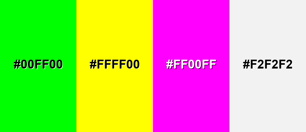
● Avoid pairing pure cyan with fully saturated Neon Green (#00FF00), Bright Yellow (#FFFF00), Hot Magenta (#FF00FF), or Light Gray (#F2F2F2) to prevent harsh visual vibrations, screen glare, and text legibility issues.
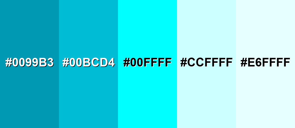
● For larger digital surfaces, charts, or areas requiring sustained readability, substitute the pure hue with Deep Cyan (#0099B3) or Pale Cyan (#CCFFFF) while anchoring the layout with dark neutrals.
Ask AI for a summary
 ChatGPT
 Perplexity
 Gemini
 Claude
 Grok
Grok
Cyan is a bright blue-green that sits between blue and green on the color wheel. It's one of the most vivid "digital" colors and a cornerstone of modern color systems, especially in screen graphics and printing.
With its cool, electric energy, cyan can feel clean and futuristic—perfect for modern UI highlights, data visuals, and crisp accents when you manage contrast carefully.
Cyan Color: Codes & Values
If you're matching cyan across web, UI, and print, these are the standard codes of cyan color that designers and developers use most often.
| Parameters | VALUE |
| HEX Code | #00FFFF |
| RGB DECIMAL | 0, 255, 255 |
| RGB PERCENTAGE | 0%, 100%, 100% |
| CMYK | 100%,0%,0%,0% |
| HSL | 180°, 100%, 50% |
| HSV (HSB) | 180°, 100%, 100% |
| Web Safe | #00FFFF |
Key Color Space Explanations:
- HEX - HEX is the most common web format for color, written as a # followed by six hexadecimal digits. It represents the red, green, and blue channels used on screens.
- RGB - RGB defines a color by mixing red, green, and blue light. Cyan is created by using full green and full blue with no red.
- CMYK - CMYK is mainly for print and describes how much cyan, magenta, yellow, and black ink to use. Pure cyan uses 100% cyan ink with no other inks.
- HSL - HSL describes colors by hue, saturation, and lightness, which can feel more intuitive for styling. Cyan sits around 180° on the hue wheel at maximum saturation.
- Web Safe - Web-safe colors were designed to render consistently on older displays using a limited palette. Cyan is already a web-safe color, so no approximation is needed.
For most web and product work, start with HEX (#00FFFF) or RGB (0, 255, 255), then adjust saturation/lightness in HSL when you need a softer or deeper cyan.
Want to generate cyan color photos or posters? Try Media.io's AI Image Generator now!
Cyan Color Conversions
Need cyan values in other color systems? Use this conversion table to keep your designs consistent across tools and workflows.
| Parameters | VALUE | CSS |
| HEX | #00ffff | #00ffff |
| RGB DECIMAL | 0, 255, 255 | rgb(0,255,255) |
| RGB PERCENTAGE | 0%, 100%, 100% | rgb(0%,100%,100%) |
| CMYK | 100%,0%,0%,0% | cmyk(100%,0%,0%,0%) |
| HSL | 180°, 100%, 50% | hsl(180°, 100%, 50%) |
| HSV (or HSB) | 180°, 100%, 100% | -- |
| Web Safe | 00ffff | #00ffff |
| CIE-LAB | 91.07, -48.00, -14.20 | -- |
| XYZ | 53.81, 78.74, 106.97 | -- |
| xyY | 0.2246, 0.3287, 78.74 | -- |
| CIE-LCH | 91.07, 50.05, 196.5° | -- |
| CIE-LUV | 91.07, -70.20, -15.30 | -- |
| Hunter-Lab | 88.74, -43.60, -15.40 | -- |
| Binary | 00000000, 11111111, 11111111 | -- |
Cyan Meaning & Symbolism
The cyan color meaning is closely tied to clarity, freshness, and digital precision. Sitting between blue and green on the color spectrum, cyan feels lighter than traditional blue yet cooler and more technical than green. This balance makes it a strong choice when you want visual energy without warmth—especially in modern UI design, tech branding, and clean, minimal layouts.
Psychological Effects
From a color psychology standpoint, cyan’s brightness and cool temperature can instantly influence how a screen-based layout feels. The psychological effects of cyan often include alertness, clarity, and a sense of active responsiveness—qualities that are especially noticeable in digital interfaces and high-contrast environments.
- Invigorating - Its bright, cool tone can feel energizing and wake up an interface.
- Alertness - Cyan often reads as "active" or "online," helping users notice key states.
- Clean Focus - The color can promote a calm, modern sense of clarity in small doses.
- Clinical Intensity - In large blocks, very saturated cyan may feel sterile or overly sharp.
- Visual Fatigue - Overuse can be tiring, particularly on bright displays with high saturation.
Positive Associations
In branding and visual communication, the symbolism of cyan leans toward transparency, innovation, and modern cleanliness. Used with restraint, cyan supports messaging that feels straightforward, lightweight, and forward-thinking without becoming emotionally heavy or overly warm.
- Clarity - It suggests clean communication and straightforward information.
- Cleanliness - Cyan is commonly linked to hygienic, polished, "fresh" visuals.
- Freshness - It naturally evokes air, water, and cool refreshment.
- Innovation - Cyan is strongly associated with science, technology, and digital interfaces.
- Modern Calm - It can feel composed and cool-headed, especially when paired with dark neutrals.
Cultural Significance Across the World
The cultural meaning of cyan often connects to water, air, and technology. While interpretations shift by region and context, cyan is widely recognized in global design as a signal of freshness, digital culture, and performance-driven aesthetics.
- Water And Nature - Frequently connected to oceans, skies, and clean environments.
- Science And Digital Culture - Often used to signal high-tech, futuristic, or "neon UI" aesthetics.
- Health And Clean Spaces - Common in visuals that aim to feel sterile, sanitized, or clinically precise.
- Speed And Performance - Popular in sporty and tech branding to communicate quick, lightweight energy.
Design Applications
Cyan is easiest to use when you treat it as a spotlight color: a little goes a long way, and contrast decisions matter.
Graphic Design Tips
- Use cyan as an accent for buttons, links, and focus states rather than full-page fills.
- Anchor cyan with dark neutrals to keep it readable and premium-looking.
- In charts, reserve cyan for one key series or highlight so it doesn't steal every glance.
- Pair cyan with generous spacing and simple typography to avoid a "noisy" layout.
- When you need a calmer look, switch to a deeper or paler cyan variation for larger areas.
Pro tip: If cyan feels too neon, keep the hue but lower saturation or lightness slightly—your UI will still feel modern, just less harsh on the eyes.
Cyan in Photography & Video
- Use cyan grading to create a clean, futuristic mood—especially in night scenes or tech footage.
- Boost cyan selectively (HSL/curves) to emphasize water, glass, and reflective surfaces.
- On skin tones, keep cyan subtle to avoid a cold or clinical cast.
- For product shots, cyan accents can make metals and glossy materials feel more high-tech.
- In video, balance cyan highlights with controlled blacks to maintain contrast and avoid washout.
Recommended Tool for Image Enhancement: When incorporating cyan into your photography projects, Media.io's AI Image tools can help you achieve more refined results. With AI-powered color enhancement, photo colorization, image upscaling, and old photo restoration, you can easily enrich cyan tones, improve overall image quality, and highlight the color's elegant and sophisticated aesthetic.
Color Combinations
Cyan can swing futuristic, playful, or clean depending on its partners. These palettes cover classic harmony rules you can reuse in UI, branding, and illustration.
Complementary Colors
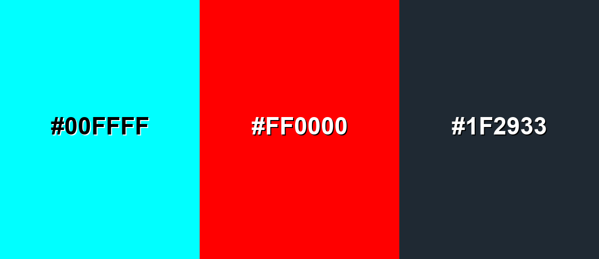
A complementary palette pairs cyan with a red opposite on the color wheel. This creates the strongest contrast and is great for attention-grabbing highlights.
Complementary Palette Example: Use cyan as the main cool accent, red for critical calls-to-action, and charcoal to stabilize the look.
Analogous Color Schemes
Analogous colors sit adjacent to each other on the color wheel, creating harmonious, cohesive palettes with subtle variation.
Cyan with blue and green stays cohesive and modern, perfect for calm gradients and product UI.
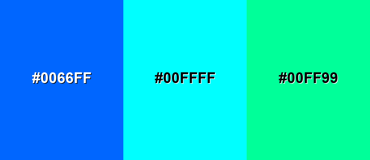
- Electric Blue: #0066FF
- Cyan: #00FFFF
- Spring Green: #00FF99
A teal-to-cyan-to-ice range feels aquatic and clean, ideal for backgrounds, cards, and subtle brand systems.
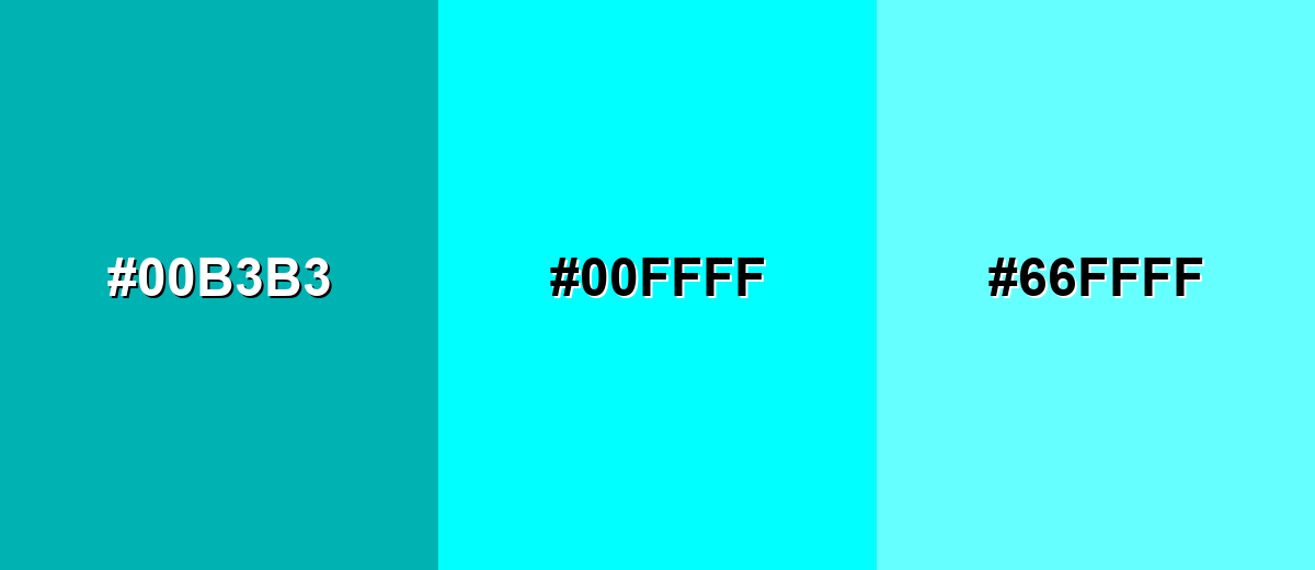
- Deep Teal: #00B3B3
- Cyan: #00FFFF
- Light Aqua: #66FFFF
Triadic & Tetradic Combinations
Triadic palettes balance three evenly spaced hues for a lively, colorful result.
Cyan, magenta, and yellow produce an energetic, high-saturation trio that works best with clean layouts and plenty of whitespace.
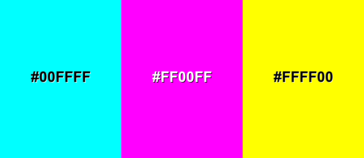
- Cyan: #00FFFF
- Magenta: #FF00FF
- Yellow: #FFFF00
Colors to Avoid
While cyan is remarkably versatile, certain combinations can create problematic visual effects:
- Neon Green (#00FF00) - At full saturation, neon green next to cyan can create a vibrating edge effect that feels harsh and reduces legibility.
- Bright Yellow (#FFFF00) - Yellow plus cyan can become visually glaring, especially on screens, and can overwhelm content hierarchy.
- Hot Magenta (#FF00FF) - Cyan and magenta together are extremely intense; without neutrals, the palette can look noisy and fatiguing.
- Light Gray (#F2F2F2) - Cyan on very light gray often lacks contrast for text and thin icons, making UI elements feel washed out.
Shades, Tints & Variations of Cyan
From deeper, more readable cyans to soft, airy tints, this range helps you keep the same cool character while adapting to different surfaces—buttons, backgrounds, charts, and brand accents.
- Deep Cyan (#0099B3) - A darker, more grounded cyan that keeps the same cool direction but feels less neon. It's best used for Navigation bars, headers, charts, and brand accents that need better readability.
- Teal Cyan (#00BCD4) - A slightly greener cyan with a modern "app UI" vibe and smoother saturation. It's best used for Buttons, badges, illustrations, and friendly tech branding.
- Pure Cyan (#00FFFF) - The brightest cyan—fully saturated, high-impact, and unmistakably digital. It's best used for Highlights, glow effects, focus states, and small, high-attention UI elements.
- Pale Cyan (#CCFFFF) - A soft tint that keeps cyan's freshness while moving into pastel territory. It's best used for Background panels, subtle sections, and large areas where pure cyan would be too intense.
- Icy Cyan (#E6FFFF) - An ultra-light cyan that reads almost white but still feels cool and clean. It's best used for Minimal backgrounds, spacing blocks, and light-themed UI surfaces.
Industry Applications
Cyan shows up anywhere a brand wants to communicate clarity, tech, water, or speed. The key is controlling saturation and contrast for the medium.
Fashion & Beauty
- Use cyan accents in athleisure graphics for an energetic, performance-forward feel.
- Pair cyan packaging with clean typography to signal freshness and "just-out-of-the-shower" simplicity.
- For makeup and skincare visuals, lean on pale cyan backgrounds for a sterile, polished look.
- Reserve pure cyan highlights for small details (labels, seals, callouts) to avoid visual harshness.
Interior Design & Decor
- Add cyan through small decor pieces (pillows, art, vases) to brighten neutral rooms.
- Use pale or icy cyan on walls for a cool, airy feel that still reads clean.
- In bathrooms and kitchens, cyan naturally reinforces water and cleanliness themes.
- Balance brighter cyan accents with darker elements for contrast and comfort.
Branding & Marketing
- In tech and SaaS, cyan is effective for interactive states (hover, active, focus) and UI highlights.
- For campaigns, cyan works well as a "signal" color—badges, new-feature tags, and key metrics.
- Pair cyan with strong neutrals to create a modern, premium, neon-like pop without clutter.
- In performance marketing creatives, use cyan sparingly to keep calls-to-action crisp and readable.
Conclusion
Cyan is a vivid blue-green that can look clean, futuristic, and refreshing. Use pure cyan sparingly for emphasis, lean on deeper or softer variations for larger areas, and prioritize contrast to keep content readable across screens and print.
Design Smarter with AI: Media.io is an online AI studio that empowers creators with advanced image generation and enhancement tools. From text-to-image and image-to-image creation to AI upscaling and color optimization, it enables fast, creative, and professional results—all in your browser.

Frequently Asked Questions About Cyan Color
Cyan is a bright blue-green color positioned between blue and green on the color wheel. On screens, it's produced by combining full green and full blue light with no red.
They're related but not identical. Aqua is often used informally for light cyan tones, while teal is typically darker and greener than pure cyan.
The complementary color of cyan is red. Used together, cyan and red create very strong contrast and quickly draw attention.
Cyan can work for short text like labels or links, especially on dark backgrounds. For long paragraphs, use a neutral text color and keep cyan for accents to avoid readability issues.
Pure cyan is fully saturated in RGB and sits at a high perceived brightness because it includes maximum green and blue light. That intensity is why it's effective as a highlight but tiring when overused.
Start with a deeper cyan or teal for primary surfaces, add pure cyan only for key highlights, and anchor the palette with dark neutrals (charcoal/near-black) or soft cool grays for balance.


