

Dark cyan color is a deep blue-green tone that looks like shaded tropical water or a muted teal with extra depth and less brightness. Its HEX code is #008B8B, with a balanced mix of green and blue at a darker value.
Designers often read dark cyan as calm, reliable, and quietly sophisticated. Since it can lean slightly greener or bluer depending on lighting and surrounding colors, this guide covers its meaning, codes, conversions, pairings, shades, and practical uses.
Dark Cyan Color: Codes & Values
If you want dark cyan color to look consistent across UI, print, and brand assets, start with the core color codes below.
| Parameters | VALUE |
| HEX Code | #008B8B |
| RGB DECIMAL | 0, 139, 139 |
| RGB PERCENTAGE | 0%, 55%, 55% |
| CMYK | 100%,0%,0%,45% |
| HSL | 180°, 100%, 27% |
| HSV (HSB) | 180°, 100%, 55% |
| Web Safe | #009999 |
Key Color Space Explanations:
- HEX - HEX is the most common web format and represents the red, green, and blue channels in hexadecimal. #008b8b means no red with equal mid-high green and blue.
- RGB - RGB defines the on-screen light mix using red, green, and blue values. Dark cyan is made with 0 red and matching green/blue at 139 for a balanced blue-green.
- CMYK - CMYK is used for print and estimates how inks combine on paper. This tone relies heavily on cyan ink, with minimal magenta and yellow plus a moderate black component for depth.
- HSL - HSL describes hue, saturation, and lightness, which is useful for picking lighter or darker variants. Dark cyan sits at 180° with full saturation and a low lightness value.
- Web Safe - Web-safe is the closest match from the classic 216-color palette used by older displays. The nearest web-safe option to #008b8b is #009999.
Use HEX/RGB for digital UI and web, HSL/HSV for quick palette adjustments, and CMYK when you need print estimates (always proof if exact matching matters).
Dark Cyan Color Conversions
These conversions make it easier to move dark cyan between design tools, CSS, and print-oriented workflows without guesswork.
| Parameters | VALUE | CSS |
| HEX | #008b8b | #008b8b |
| RGB DECIMAL | 0, 139, 139 | rgb(0,139,139) |
| RGB PERCENTAGE | 0%, 55%, 55% | rgb(0%,55%,55%) |
| CMYK | 100%,0%,0%,45% | cmyk(100%,0%,0%,45%) |
| HSL | 180°, 100%, 27% | hsl(180°,100%,27%) |
| HSV (or HSB) | 180°, 100%, 55% | -- |
| Web Safe | 009999 | #009999 |
| CIE-LAB | 52.2, -33.5, -9.0 | -- |
| XYZ | 13.86, 20.32, 27.60 | -- |
| xyY | 0.224, 0.329, 20.32 | -- |
| CIE-LCH | 52.2, 34.7, 195° | -- |
| CIE-LUV | 52.2, -40.5, -8.7 | -- |
| Hunter-Lab | 45.1, -22.3, -7.8 | -- |
| Binary | 00000000 10001011 10001011 | -- |
Want to generate Dark Cyan Color photos or posters? Try Media.io's AI Image Generator now!
Dark Cyan Color Meaning & Symbolism
Dark cyan is commonly linked with composure, clarity, and a steady sense of control. Because it sits between blue and green, it often suggests trust and balance at the same time. In everyday life, it can feel like a quieter alternative to brighter aqua tones, bringing a more grounded, mature mood.
Psychological Effects
These are the most common emotional cues dark cyan communicates in visual work.
- Calm Dependability - Dark cyan tends to read as calm and dependable, helping designs feel steady instead of flashy.
- Organized Interfaces - It can make interfaces feel organized and thoughtful, which suits navigation bars, dashboards, and structured layouts.
- Confident Accents - It works well for primary buttons when you want a confident accent that isn't loud.
- Clean Refreshing Tone - The color carries a clean, refreshing quality that can make brands feel modern and capable.
- Cool Reserved Mood - Because it's deep and low-lightness, it can feel cool and reserved compared with brighter aqua tones.
Positive Associations
Use these associations to guide mood boards, brand language, and palette direction.
- Trust And Balance - Sitting between blue and green, dark cyan often suggests trust and balance at the same time.
- Competence - In branding, it can signal competence and a "knows what it's doing" attitude.
- Modernity - Its crisp blue-green feel supports modern, clean visual identities.
- Spa-Like Calm - In interiors, it can create a cool, spa-like atmosphere when paired with warm neutrals or natural textures.
- Restorative Depth - Blue-green hues are commonly tied to water and depth, which can make dark cyan feel restorative.
Cultural Significance Across the World
Meanings vary by context, but blue-green cues tend to translate well across audiences.
- Water And Cleanliness - Blue-green tones are widely associated with water, cleanliness, and a fresh, hygienic feel.
- Calm Focus - The "depth" of ocean-like colors can imply calm focus and steady attention.
- Thoughtful Restraint - Dark cyan reads as a quieter, more grounded alternative to bright aqua in many everyday settings.
- Context Matters - Since meanings vary by culture and setting, it's best used for broadly understood cues like steadiness and clarity.
Design Applications
Dark cyan is versatile because it can act as a strong base tone or a refined accent. It holds up well in digital work and can bring structure to palettes that need a cooler anchor.
Graphic Design Tips
- Use dark cyan for headers, sidebars, and key UI sections when you want a professional tone without the intensity of pure blue.
- Pair it with off-whites and warm grays to keep pages readable and prevent a cold, clinical feel.
- In charts and dashboards, treat it as a category color that stays distinct without overpowering adjacent series.
- For logos and typography, it complements minimal marks and geometric type, where the depth adds authority.
- In print layouts, test on your chosen paper stock—dark cyan can shift and lose vibrancy on uncoated surfaces.
Pro tip: When dark cyan is your main brand color, reserve a lighter tint for backgrounds and states (cards, panels, hover) so your primary dark cyan stays punchy and readable.
Dark Cyan Color in Photography & Video
- Lean into dark cyan for moody water, travel, and lifestyle looks where you want "cool calm" rather than bright tropical aqua.
- Balance it with warmer neutrals (skin-friendly tones, sand-like backdrops, wood textures) to avoid a distant, cold cast.
- For cinematic grading, keep an eye on midtones—too much dark cyan can flatten contrast and make scenes feel muted.
- In product shots, use dark cyan as a backdrop or prop color to add sophistication without competing with the subject.
- On dark themes, protect separation by lifting highlights and using near-white text/graphics on dark cyan surfaces.
Recommended Tool for Image Enhancement: When incorporating dark cyan color into your photography projects, Media.io's AI Image tools can help you achieve more refined results. With AI-powered color enhancement, photo colorization, image upscaling, and old photo restoration, you can easily enrich dark cyan color tones, improve overall image quality, and highlight the color's elegant and sophisticated aesthetic.
Color Combinations
Pairing dark cyan is easiest when you decide whether you want a calm, oceanic palette or a bold, high-contrast statement. The schemes below cover both directions, using balanced companions that help it look intentional rather than heavy.
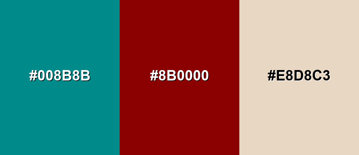
Complementary Colors
A complementary pairing places dark cyan against a red-based opposite for crisp contrast. This is a strong choice for highlights and calls to action, especially when you soften the palette with a warm neutral.
Complementary Palette Example: Use Dark Cyan as the anchor, Dark Red for contrast accents, and Warm Sand to keep the overall look comfortable.
Analogous Color Schemes
Analogous colors sit adjacent to each other on the color wheel, creating harmonious, cohesive palettes with subtle variation.
A blue-green analogous set that stays cool, layered, and cohesive for backgrounds and UI sections.
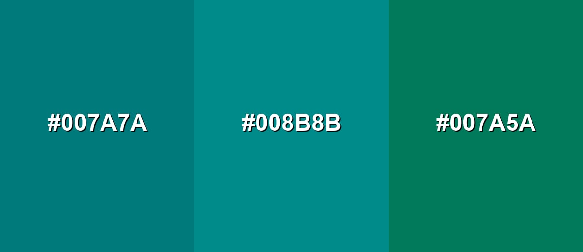
- Deep Teal: #007A7A
- Dark Cyan: #008B8B
- Deep Sea Green: #007A5A
A darker, moodier run from teal-blue into deeper cyan for modern branding and editorial layouts.
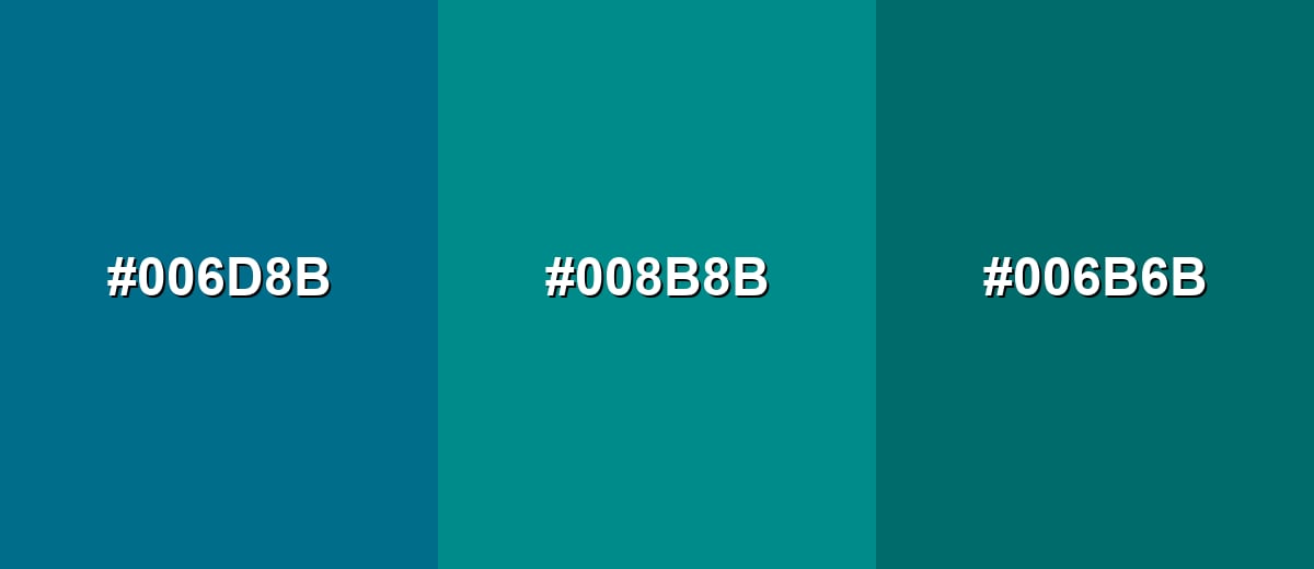
- Midnight Teal: #006D8B
- Dark Cyan: #008B8B
- Deep Pine: #006B6B
Triadic & Tetradic Combinations
Triadic palettes add variety while keeping balance, making them useful for illustrations, charts, and multi-section landing pages.
Combine Dark Cyan with Olive Gold and Dark Magenta for a confident, energetic look that still feels controlled.
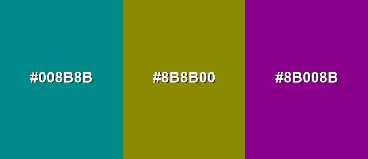
- Dark Cyan: #008B8B
- Olive Gold: #8B8B00
- Dark Magenta: #8B008B
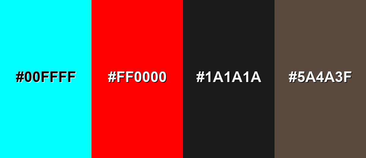
Colors to Avoid
While dark cyan color is remarkably versatile, certain combinations can create problematic visual effects:
- Neon Cyan (#00FFFF) - The jump in brightness can look harsh and reduce legibility, especially in UI where the eye is pulled away from content.
- Pure Red (#FF0000) - This pairing can create a vibrating effect and feel aggressive, which is risky for long-form reading or calm brand tones.
- Near Black (#1A1A1A) - On dark themes, dark cyan can lose separation from very dark neutrals, making buttons and icons harder to scan quickly.
- Mud Brown (#5A4A3F) - Both tones can look subdued together, producing a dull, murky palette without enough contrast or freshness.
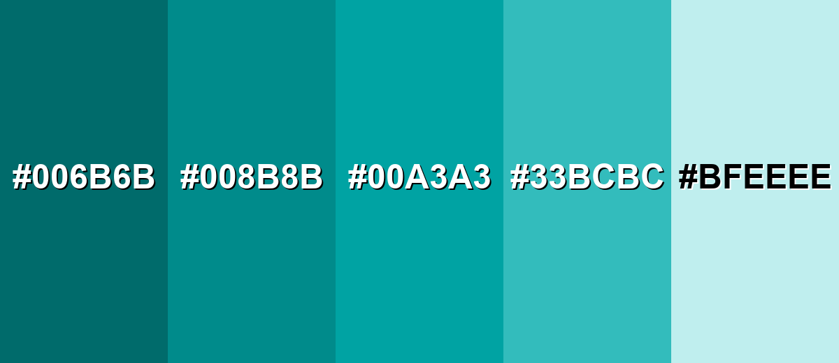
Shades, Tints & Variations of Dark Cyan Color
Dark cyan has a surprisingly usable range—from deep, formal variants to airy aqua tints. Having a few ready-made options helps you build hierarchy (backgrounds, surfaces, hover states, and accents) without drifting away from the same blue-green identity.
- Deep Cyan (#006B6B) - A darker, more subdued variation that feels heavier and more formal than the base tone. It's best used for navigation bars, footers, and dark-mode surfaces where you want depth without pure black.
- Dark Cyan (#008B8B) - The classic dark cyan reference shade: balanced blue-green with a calm, mature presence. It's best used for primary brand accents, UI buttons, and structured layouts that need a confident cool anchor.
- Rich Cyan (#00A3A3) - A slightly brighter, clearer variation that keeps the same hue but feels more energetic. It's best used for hover states, tags, charts, and highlights that should stand out without turning neon.
- Dusty Aqua (#33BCBC) - A softer, lighter option that reads friendly and airy while staying within the same family. It's best used for background panels, onboarding screens, and supportive UI surfaces.
- Pale Aqua (#BFEEEE) - A very light tint with a fresh, clean look that pairs naturally with darker accents. It's best used for page backgrounds, subtle section breaks, and spacious interior-style palettes.
Industry Applications
Because dark cyan communicates steadiness and cleanliness without feeling overly corporate, it shows up across many industries. It is especially useful when you want a cool-toned identity with clear hierarchy and strong readability.
Fashion & Beauty
- Use dark cyan as a premium accent in packaging where you want "clean and modern" without sterile white-on-white.
- Pair it with warm neutrals to keep the look approachable and skin-friendly in campaigns and product photography.
- It works well for spa, skincare, and wellness visuals that lean into calm, water-inspired cues.
- In editorial layouts, dark cyan headers and section dividers add structure while staying easy on the eyes.
Interior Design & Decor
- Apply it to an accent wall, cabinetry, or textiles for a cool, relaxing mood that feels more mature than bright teal.
- Combine with wood tones, brass, or sand-like neutrals to add warmth and avoid a clinical look.
- Use lighter aqua tints for backgrounds and reserve dark cyan for focal points to maintain visual balance.
- In low-light rooms, increase contrast with warm lighting and lighter surrounding surfaces so the color doesn't feel heavy.
Branding & Marketing
- For tech and SaaS, dark cyan supports composed product branding, navigation, and dashboard UI.
- In healthcare and wellness, it reinforces calm, hygienic visuals—especially when balanced with warm neutrals.
- For finance and professional services, it feels trust-focused but less conventional than navy.
- In travel and hospitality, it fits ocean-inspired palettes that aim for relaxed confidence across booking flows and signage.
Conclusion
Dark cyan is a dependable deep blue-green that feels calm, capable, and quietly sophisticated—making it an easy win for UI accents, brand systems, and modern editorial palettes. With #008B8B as your starting point (plus clear RGB, HSL, and CMYK conversions), you can keep the color consistent across screens and print while still building flexible palettes through tints and deeper variants. The key is balance: pair dark cyan with warm neutrals for comfort, or introduce intentional contrast for energy, so it never reads cold or flat. Used thoughtfully, dark cyan supports messages of trust, clarity, and steady focus in visual communication.
Design Smarter with AI: Media.io is an online AI studio that empowers creators with advanced image generation and enhancement tools. From text-to-image and image-to-image creation to AI upscaling and color optimization, it enables fast, creative, and professional results—all in your browser.

Frequently Asked Questions About Dark Cyan Color
Quick answers to common questions designers ask when working with dark cyan in palettes, UI, and branding.
Dark cyan is a deep blue-green tone that looks like a shaded teal. It sits between blue and green, with a darker value that makes it feel more muted and mature.
They are close, but not identical. Teal is often lighter or more saturated, while dark cyan is typically deeper and more reserved, especially in interface and branding palettes.
Warm neutrals (ivory, sand, beige), deep reds for complementary contrast, and nearby blue-green tones for calm analogous palettes work especially well. Choose pairings based on whether you want subtle harmony or bold contrast.
Use it for primary actions, headers, and navigation when you want a calm but confident look. For accessibility, pair it with very light backgrounds and verify contrast for text and icons.
The exact shade may not be in the classic web-safe set, but the closest web-safe match is #009999. Modern screens display #008b8b accurately in most cases.
Start with a cyan-leaning blue or teal, then deepen it with a small amount of black or a dark blue. Adjust with a touch of green if it drifts too blue, and test on the final surface because drying and lighting can shift the look.


