

Ice blue color is a very light, crisp blue that looks like glacial water or frost-tinted daylight. Its hex code is #b9e7ff, giving it a bright, airy feel without looking stark.
Many people read it as calm, fresh, and clear, though it can also feel a little cool or distant when overused. Because it's essentially a blue tint pushed toward white, it can shift subtly with lighting and surrounding tones—so it helps to build with solid codes, smart pairings, and a few reliable shades.
Ice Blue Color: Codes & Values
If you want ice blue to look consistent across screens (and predictable in print), start with these standard values.
| Parameters | VALUE |
| HEX Code | #B9E7FF |
| RGB DECIMAL | 185, 231, 255 |
| RGB PERCENTAGE | 73%, 91%, 100% |
| CMYK | 28%,9%,0%,0% |
| HSL | 201°, 100%, 86% |
| HSV (HSB) | 201°, 28%, 100% |
| Web Safe | #CCFFFF |
Key Color Space Explanations:
- HEX - #b9e7ff is the standard web code used to reproduce ice blue consistently across websites and digital products.
- RGB - 185, 231, 255 describes how much red, green, and blue light are mixed on screens to create this frosty, high-lightness blue.
- CMYK - 28%,9%,0%,0% is a practical starting point for print, though results can vary by paper, ink, and calibration.
- HSL - 201°, 100%, 86% explains it as a blue hue with full saturation but very high lightness, which is why it reads soft and icy.
- Web Safe - #ccffff is the closest web-safe alternative if you need legacy-friendly display behavior in older systems.
Use HEX/RGB for UI and web assets, HSL/HSV for fine-tuning in design tools, and CMYK as a baseline for print tests and proofs.
Ice Blue Color Conversions
Need ice blue in a different format for design systems, development, or print workflows? Here are the common conversions in one place.
| Parameters | VALUE | CSS |
| HEX | #b9e7ff | #b9e7ff |
| RGB DECIMAL | 185, 231, 255 | rgb(185,231,255) |
| RGB PERCENTAGE | 73%, 91%, 100% | rgb(73%,91%,100%) |
| CMYK | 28%,9%,0%,0% | cmyk(28%,9%,0%,0%) |
| HSL | 201°, 100%, 86% | hsl(201°, 100%, 86%) |
| HSV (or HSB) | 201°, 28%, 100% | -- |
| Web Safe | ccffff | #ccffff |
| CIE-LAB | 89.3, -10.5, -16.4 | -- |
| XYZ | 66.7, 74.6, 105.5 | -- |
| xyY | 0.270, 0.302, 74.6 | -- |
| CIE-LCH | 89.3, 19.5, 237.4° | -- |
| CIE-LUV | 89.3, -23.5, -24.7 | -- |
| Hunter-Lab | 86.3, -9.0, -18.1 | -- |
| Binary | 10111001 11100111 11111111 | -- |
Want to generate Ice Blue Color photos or posters? Try Media.io's AI Image Generator now!
Ice Blue Color Meaning & Symbolism
Ice blue is commonly linked to freshness, clarity, and a sense of quiet space. In everyday visuals, it often suggests clean air, water, and a cool, modern mood, which is why it appears in calm interfaces and bright, minimal interiors. This ice blue color symbolism also makes it a popular choice when you want a look that feels light and organized rather than heavy or dramatic.
Psychological Effects
Because it's so light and cool-toned, ice blue can change the "temperature" of a design fast.
- Calm - Helps layouts feel steadier and less visually stressful.
- Breathing Room - Adds airy space on dashboards, landing pages, and product screens.
- Precision - Reads clean and exact, supporting messages around transparency.
- Trust - Reinforces a refined, reliable vibe in branding and packaging.
- Cool Distance - Can feel sterile if you don't balance it with a warm accent or grounding neutral.
Positive Associations
When used with contrast and warmth, ice blue tends to land as "fresh" rather than "cold."
- Freshness - Suggests clean air and crisp, new energy.
- Clarity - Supports a clear, organized, easy-to-scan visual structure.
- Cleanliness - Commonly tied to hygiene, care, and neat presentation.
- Modern Minimalism - Feels understated and contemporary instead of loud or flashy.
- Quiet Focus - Keeps attention steady, especially in information-heavy interfaces.
Cultural Significance Across the World
Like most pale blues, the meaning shifts by context, but it usually stays gentle and approachable.
- Water & Sky - Often linked to open air, water, and light-filled space.
- Winter Light - Commonly reads as frosty, cool, and seasonally "icy."
- Purity - Frequently used to signal clean, pure, and careful design choices.
- Understated Style - Typically interpreted as modern and subtle rather than aggressive.
Design Applications
Ice blue works best when you want a clean, light atmosphere that still feels distinctly cool-toned. It's a strong base for airy backgrounds, soft gradients, and subtle highlights—especially when balanced with darker anchors.
Graphic Design Tips
- Use ice blue as a background tint for sections, cards, and empty states to reduce pure-white glare.
- Anchor typography and icons with a dark tone like Polar Navy (#0f3b57) to keep contrast crisp.
- For interactive elements, reserve stronger blues (like Glacier Blue #86d3ff or Arctic Blue #4bb6e6) for borders, charts, and emphasis.
- Keep CTAs warm and minimal—one accent (like Soft Apricot #ffb45c) can do most of the hierarchy work.
- In print layouts, avoid relying on ice blue for tiny details; matte stocks can soften contrast.
If your design starts to feel chilly, don't "warm up" the whole palette—add a small warm accent and keep your text on a dark, readable anchor.
Ice Blue Color in Photography & Video
- Lean into winter daylight, snow scenes, and cool highlights to make ice blue feel natural and believable.
- Balance cool casts with skin-tone protection—use ice blue in backgrounds, wardrobe accents, or props instead of pushing the whole frame blue.
- Use ice blue for clean, modern product shots where "fresh" and "pure" are the message.
- Pair ice blue grading with deep, cool shadows (like Polar Navy #0f3b57) to avoid a washed-out look.
- For motion graphics, ice-blue gradients work well behind titles when the type is dark and high-contrast.
Recommended Tool for Image Enhancement: When incorporating ice blue color into your photography projects, Media.io's AI Image tools can help you achieve more refined results. With AI-powered color enhancement, photo colorization, image upscaling, and old photo restoration, you can easily enrich ice blue color tones, improve overall image quality, and highlight the color's elegant and sophisticated aesthetic.
Color Combinations
Because ice blue is light and cool, it pairs well with both deep neutrals and soft, warm accents. The palettes below cover common harmony types so you can build everything from minimal UI themes to more playful visuals.
Complementary Colors
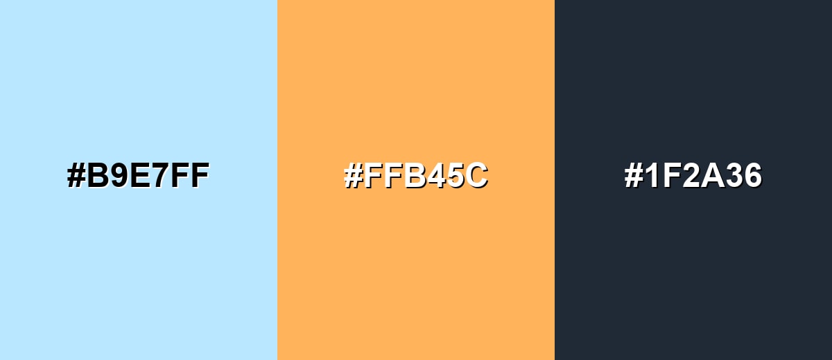
A complementary pairing adds energy by mixing ice blue with a warm orange family accent. This is ideal for call-to-action elements, highlights, and focal points that need to pop without turning harsh.
Complementary Palette Example: Try Ice Blue with Soft Apricot and Deep Slate for a clean layout with clear hierarchy.
Analogous Color Schemes
Analogous colors sit adjacent to each other on the color wheel, creating harmonious, cohesive palettes with subtle variation.
Aqua Mist, Ice Blue, and Soft Periwinkle create a smooth, ocean-sky flow.
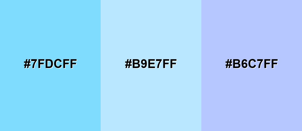
- Aqua Mist: #7FDCFF
- Ice Blue: #B9E7FF
- Soft Periwinkle: #B6C7FF
Seafoam Tint, Ice Blue, and Powder Lavender feel airy and gentle for backgrounds.
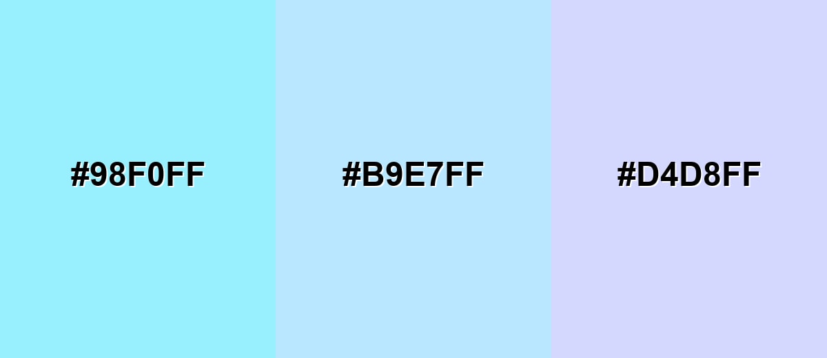
- Seafoam Tint: #98F0FF
- Ice Blue: #B9E7FF
- Powder Lavender: #D4D8FF
Triadic & Tetradic Combinations
A triadic scheme adds balanced contrast while staying playful and readable when you control saturation.
Ice Blue with Rose Magenta and Lime Pastel works well for lively illustrations and modern hero graphics.
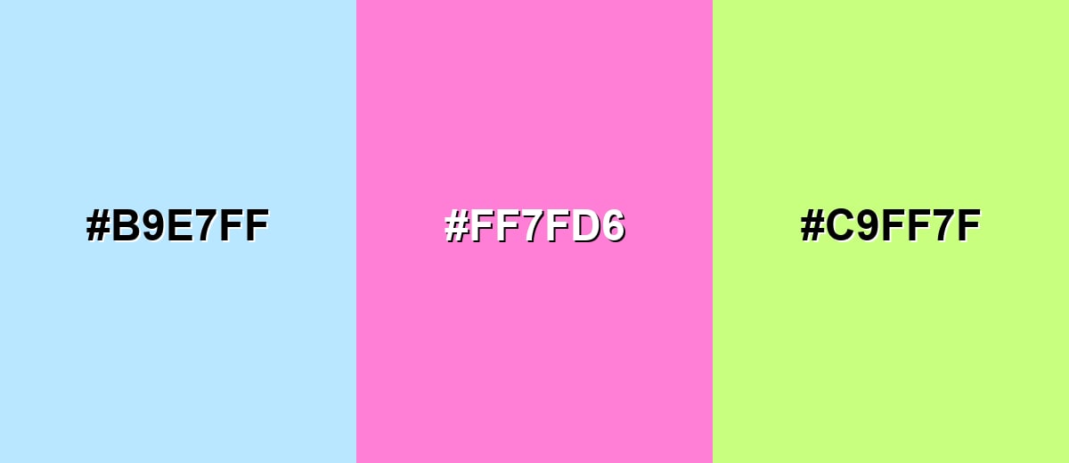
- Ice Blue: #B9E7FF
- Rose Magenta: #FF7FD6
- Lime Pastel: #C9FF7F
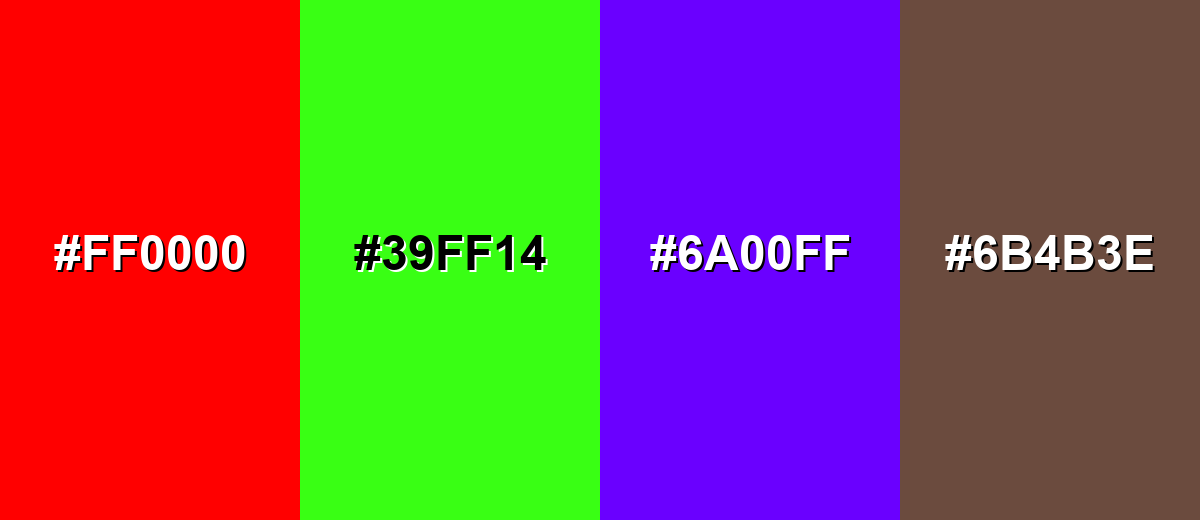
Colors to Avoid
While ice blue color is remarkably versatile, certain combinations can create problematic visual effects:
- Pure Red (#FF0000) - The contrast is aggressive and can make ice blue feel washed out, especially in UI elements.
- Neon Green (#39FF14) - Both feel bright in different ways, creating visual noise and a strained, highlighter-like look.
- Electric Purple (#6A00FF) - The saturation gap is too large, so the palette can feel unbalanced and distracting.
- Muddy Brown (#6B4B3E) - The warmth and dullness can make ice blue appear overly cold and slightly dirty by comparison.
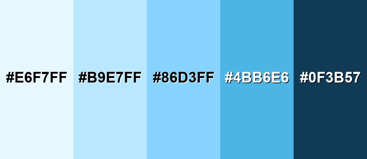
Shades, Tints & Variations of Ice Blue Color
Ice blue isn't just one "frosty" swatch—its range runs from barely-there tints to deeper, clearer blues that add definition. Keeping a small ladder of shades makes it easier to build hierarchy (backgrounds, borders, buttons, and text) without drifting away from the same cool mood.
- Frosted Ice (#E6F7FF) - An extra-light, almost white tint that keeps just a hint of blue. It's best used for Large backgrounds, gentle panels, and minimal layouts where you want softness.
- Ice Blue (#B9E7FF) - The main ice blue tone: bright, crisp, and airy with a cool cast. It's best used for Primary background tint, brand support color, and subtle highlights.
- Glacier Blue (#86D3FF) - A clearer, slightly deeper blue that adds definition while staying light. It's best used for Icons, borders, charts, and secondary UI elements that need more presence.
- Arctic Blue (#4BB6E6) - A stronger blue that still feels fresh, like cold water under sunlight. It's best used for Buttons, links, badges, and emphasis areas where you need contrast.
- Polar Navy (#0F3B57) - A deep, cool navy that grounds ice blue and improves readability. It's best used for Text, navigation bars, outlines, and high-contrast UI foundations.
Industry Applications
Ice blue is a practical choice when you want visuals to feel open, clean, and modern. It's especially effective in digital products and environments where clarity and comfort matter.
Fashion & Beauty
- Minimal packaging systems that emphasize purity and clarity.
- Product pages where the tone supports a lightweight feel.
- Highlight sections paired with soft warm accents for balance.
- Retail-friendly backgrounds that keep products as the hero without heavy framing.
Interior Design & Decor
- Spa-like interior accents that feel quiet and restorative.
- As a wall tint or soft accent to make small rooms feel more open and luminous.
- Pairing with warm woods or neutral stones to avoid a clinical look.
- Room collateral and wayfinding that keeps a cool, clean mood.
Branding & Marketing
- Onboarding screens and empty states that feel friendly and light.
- Trust-building UI surfaces for checkout and account areas.
- Web visuals that suggest sky, water, and fresh air for travel and hospitality.
- Section headers and backgrounds that improve scanning in education and productivity content.
Conclusion
Ice blue (#B9E7FF) stands out for its frosty brightness and calm, modern character, which makes it easy to use without overwhelming a layout. It shines as a background tint, soft highlight, or supporting brand color—especially in UI where you want a clean, breathable feel. The key is balance: ground it with dark neutrals for legibility and add a small warm accent to keep the design from feeling sterile. With a simple ladder of shades (from Frosted Ice to Polar Navy), ice blue can move from minimal and clinical to friendly and inviting while staying crisp and consistent.
Design Smarter with AI: Media.io is an online AI studio that empowers creators with advanced image generation and enhancement tools. From text-to-image and image-to-image creation to AI upscaling and color optimization, it enables fast, creative, and professional results—all in your browser.

Frequently Asked Questions About Ice Blue Color
It is a very light, frosty blue similar to glacial water, pale winter sky, or the blue cast you see in clean ice under bright light.
A commonly used hex value for ice blue is #b9e7ff, which produces a bright, airy tint on most screens.
For digital work, use RGB 185, 231, 255. For print starting points, CMYK 28%,9%,0%,0% can help, though results vary by paper and ink.
Deep neutrals like Polar Navy (#0f3b57) and Deep Slate (#1f2a36) keep it readable, while a warm accent like Soft Apricot (#ffb45c) adds contrast and energy.
Yes. It works well as a background tint because it feels clean and spacious, but make sure text and icons use a dark anchor for clear contrast.
The closest web-safe option is #ccffff, which keeps the same cool, light feeling with legacy-friendly channel steps.


