

 TL;DR:
Dusty rose (#D1A3A4) is a muted, gray-brown toned pink that serves effectively as a soft, vintage-leaning background or accent color rather than a primary shade for body text.
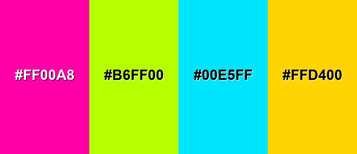
● Ensure layout readability by pairing dusty rose surfaces with deep charcoal or Rosewood (#7A4B55) typography, and avoid highly saturated colors like Neon Magenta or Vivid Cyan that will clash and make the muted pink appear muddy.
● Maintain exact color consistency across mediums by using RGB (209, 163, 164) for digital workflows and CMYK (0, 22, 22, 18) for print, utilizing matte paper finishes or Media.io's AI enhancement tools to preserve its velvety aesthetic.
● Distinguish it from lighter blush or purple-heavy mauve by pairing it with warm neutrals and muted greens like Soft Sage, while strictly managing white balance in studio photography to prevent the shade from unintentionally shifting toward a cooler mauve.
Ask AI for a summary
 ChatGPT
 Perplexity
 Gemini
 Claude
 Grok
Grok
Dusty rose color is a soft, muted pink that looks like classic rose petals toned down with a gentle gray-brown veil. The HEX code for this shade is #d1a3a4, giving it a warm, vintage feel that reads calm rather than bright.
Many people associate it with tenderness, nostalgia, and understated romance, without the intensity of hot pink. This guide covers its meaning, key codes, best combinations, popular shades, and practical ways to use it.
Dusty Rose Color: Codes & Values
Here are the core color values you'll need to recreate dusty rose accurately across web, UI, and print.
| Parameters | VALUE |
| HEX Code | #D1A3A4 |
| RGB DECIMAL | 209, 163, 164 |
| RGB PERCENTAGE | 82%, 64%, 64% |
| CMYK | 0%,22%,22%,18% |
| HSL | 359°, 33%, 73% |
| HSV (HSB) | 359°, 22%, 82% |
| Web Safe | #CC9999 |
Key Color Space Explanations:
- HEX - HEX is the most common way to specify this shade on the web and in design tools. Use #d1a3a4 to match the dusty rose swatch consistently across screens.
- RGB - RGB mixes red, green, and blue light to display the shade digitally. The values 209, 163, 164 create a soft pink that is muted by balanced green and blue.
- CMYK - CMYK is used for print production and describes how inks combine on paper. This dusty rose uses low cyan with moderate magenta and yellow, plus a touch of black for a subdued look.
- HSL - HSL describes hue, saturation, and lightness, which is helpful for making lighter or deeper variations. Dusty rose sits near red on the wheel with reduced saturation and high lightness for a gentle finish.
- Web Safe - Web-safe values approximate the shade using the classic 216-color palette. The closest web-safe match is #cc9999, which keeps the same muted rosy character.
For consistency, stick to the HEX value for digital work, use RGB for on-screen motion/graphics workflows, and switch to CMYK when you're preparing files for print.
Dusty Rose Color Conversions
If you're matching dusty rose across multiple tools, these conversions make it easier to keep the shade consistent from screen to print.
| Parameters | VALUE | CSS |
| HEX | #d1a3a4 | #d1a3a4 |
| RGB DECIMAL | 209, 163, 164 | rgb(209,163,164) |
| RGB PERCENTAGE | 82%, 64%, 64% | rgb(82%,64%,64%) |
| CMYK | 0%,22%,22%,18% | cmyk(0%,22%,22%,18%) |
| HSL | 359°, 33%, 73% | hsl(359°,33%,73%) |
| HSV (or HSB) | 359°, 22%, 82% | -- |
| Web Safe | cc9999 | #cc9999 |
| CIE-LAB | 71.2, 17.0, 6.2 | -- |
| XYZ | 46.1, 42.5, 40.8 | -- |
| xyY | 0.356, 0.328, 42.5 | -- |
| CIE-LCH | 71.2, 18.1, 20.0° | -- |
| CIE-LUV | 71.2, 28.8, 6.2 | -- |
| Hunter-Lab | 65.2, 16.1, 5.4 | -- |
| Binary | 11010001 10100011 10100100 | -- |
Want to generate Dusty Rose Color photos or posters? Try Media.io's AI Image Generator now!
Dusty Rose Color Meaning & Symbolism
Dusty rose is often linked with warmth, softness, and a sense of quiet confidence. It keeps the affectionate tone of pink, but the muted finish makes it feel more grounded and mature. In everyday design, Dusty Rose Color meaning often comes through as gentle, welcoming, and thoughtfully understated rather than flashy.
Psychological Effects
These are the most common emotional cues dusty rose tends to bring into a space or layout.
- Calming Mood - This shade tends to feel calming and supportive, helping designs read more approachable.
- Friendly Warmth - It adds a friendly tone without leaning too sweet or overly playful.
- Refined Stability - Because it is muted, dusty rose can communicate refinement and a grounded sense of stability.
- Human Touch - In branding and UI, it often reads as caring and human when paired with clean typography.
- Softness Risk - If overused or paired with low-contrast text, it may feel dull, dated, or too soft for high-energy messages.
Positive Associations
When used intentionally, dusty rose supports a polished, modern-vintage vibe that still feels warm.
- Tenderness - It keeps the gentle, affectionate feel associated with pink, but in a quieter way.
- Nostalgia - The muted finish naturally leans vintage, making visuals feel familiar and comforting.
- Understated Romance - It suggests romance without the intensity of brighter pinks.
- Quiet Confidence - The tone feels self-assured and composed rather than loud or trendy.
- Welcoming Atmosphere - It can make pages, products, and rooms feel more inviting and thoughtfully designed.
Cultural Significance Across the World
In modern visual culture, dusty rose has become a go-to for soft, lifestyle-forward aesthetics.
- Romantic Aesthetics - Across many modern contexts, dusty rose is tied to romance and gentle, intimate styling.
- Vintage Styling - It's strongly associated with vintage aesthetics, especially when paired with warm neutrals and textures.
- Comfort & Coziness - The color is often used to suggest comfort, softness, and a homey mood.
- Wedding Visuals - It's popular in weddings and lifestyle visuals because it photographs softly and blends easily with natural materials.
Design Applications
Dusty rose works best when you lean into its muted character and give it room to breathe. Use it as a main background for softness, or as an accent to add warmth without overpowering the rest of the palette.
Graphic Design Tips
- Use dusty rose for surfaces, cards, banners, and section backgrounds rather than body text.
- Pair it with deep charcoal or near-black typography to keep hierarchy crisp and readable.
- Try subtle gradients for a premium look, especially in hero areas and editorial layouts.
- Balance it with warm whites and natural textures so the palette stays light and modern.
- In print, consider matte or soft-touch finishes to reinforce its muted, velvety feel.
Pro tip: If dusty rose is your primary brand accent, build the system on strong neutrals first (off-white + charcoal), then layer dusty rose in small, repeatable components like badges, highlights, and section headers.
Dusty Rose Color in Photography & Video
- In golden-hour lighting, dusty rose reads warmer and more vintage—great for lifestyle storytelling.
- In daylight or cool studio setups, it can shift slightly mauve; white balance matters for consistency.
- Use it in props and styling (textiles, paper backdrops, florals) to soften scenes without stealing focus.
- Pair it with natural wood, linen, and brass to get an organic, cozy frame that feels elevated.
- Keep contrast intentional: place dusty rose near deeper accents (like rose-browns) to avoid a washed-out look.
Recommended Tool for Image Enhancement: When incorporating dusty rose color into your photography projects, Media.io's AI Image tools can help you achieve more refined results. With AI-powered color enhancement, photo colorization, image upscaling, and old photo restoration, you can easily enrich dusty rose color tones, improve overall image quality, and highlight the color's elegant and sophisticated aesthetic.
Color Combinations
Dusty rose pairs beautifully with muted greens, warm neutrals, and deep grounding tones. The combinations below cover balanced classics as well as more playful schemes for modern layouts.
Complementary Colors
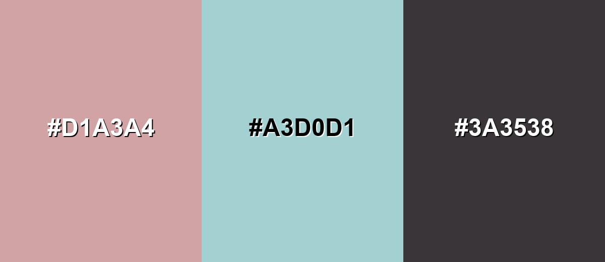
A complementary pairing uses opposite sides of the color wheel for contrast. With dusty rose, a soft teal-green brings freshness while keeping the overall look calm.
Complementary Palette Example: Use Dusty Rose with Misty Teal and Charcoal to keep the palette soft, modern, and readable.
Analogous Color Schemes
Analogous colors sit adjacent to each other on the color wheel, creating harmonious, cohesive palettes with subtle variation.
Try Dusty Rose with Soft Mauve and Warm Nude for a smooth, romantic transition.
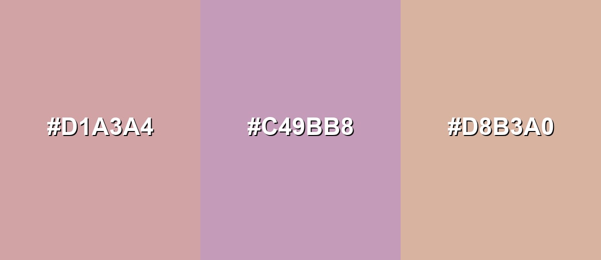
- Dusty Rose: #D1A3A4
- Soft Mauve: #C49BB8
- Warm Nude: #D8B3A0
Blend Dusty Rose with Antique Plum and Blush Beige for a vintage, editorial feel.
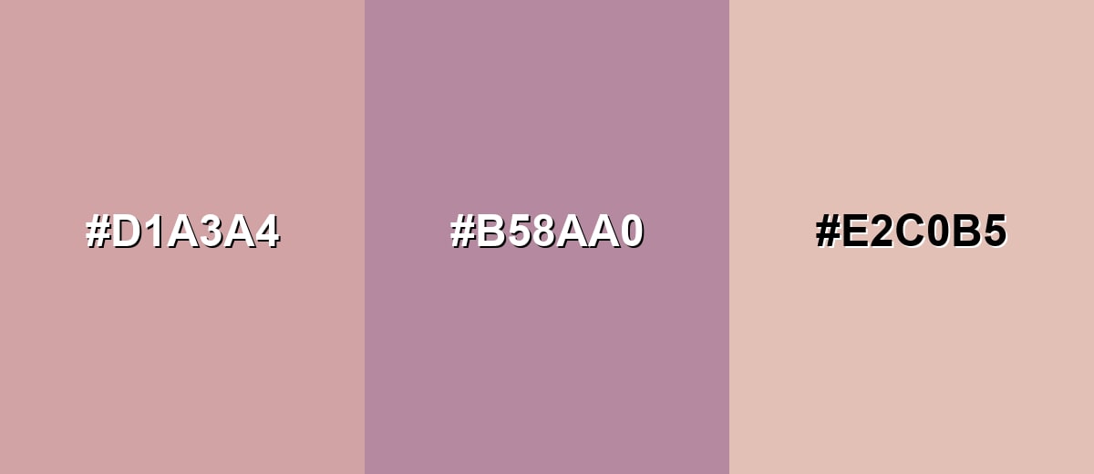
- Dusty Rose: #D1A3A4
- Antique Plum: #B58AA0
- Blush Beige: #E2C0B5
Triadic & Tetradic Combinations
A triadic scheme balances three evenly spaced hues for variety without chaos.
Pair Dusty Rose with Soft Sage and Periwinkle for a gentle but lively palette.
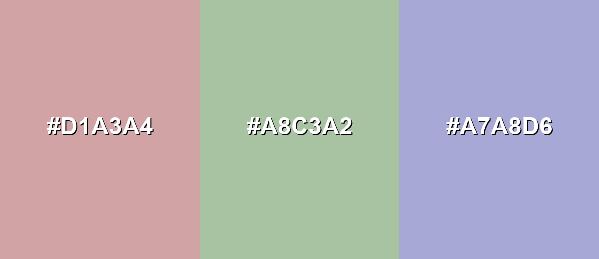
- Dusty Rose: #D1A3A4
- Soft Sage: #A8C3A2
- Periwinkle: #A7A8D6
Colors to Avoid
While dusty rose color is remarkably versatile, certain combinations can create problematic visual effects:
- Neon Magenta (#FF00A8) - Its intensity can make dusty rose look muddy by comparison and can overwhelm soft, muted layouts.
- Electric Lime (#B6FF00) - The sharp brightness clashes with dusty rose's gentle tone, creating a jarring, unbalanced look.
- Vivid Cyan (#00E5FF) - This highly saturated blue-green can feel harsh next to dusty rose and pulls attention away from primary content.
- Signal Yellow (#FFD400) - Strong yellow can turn the palette loud and can make dusty rose read more faded than intended.
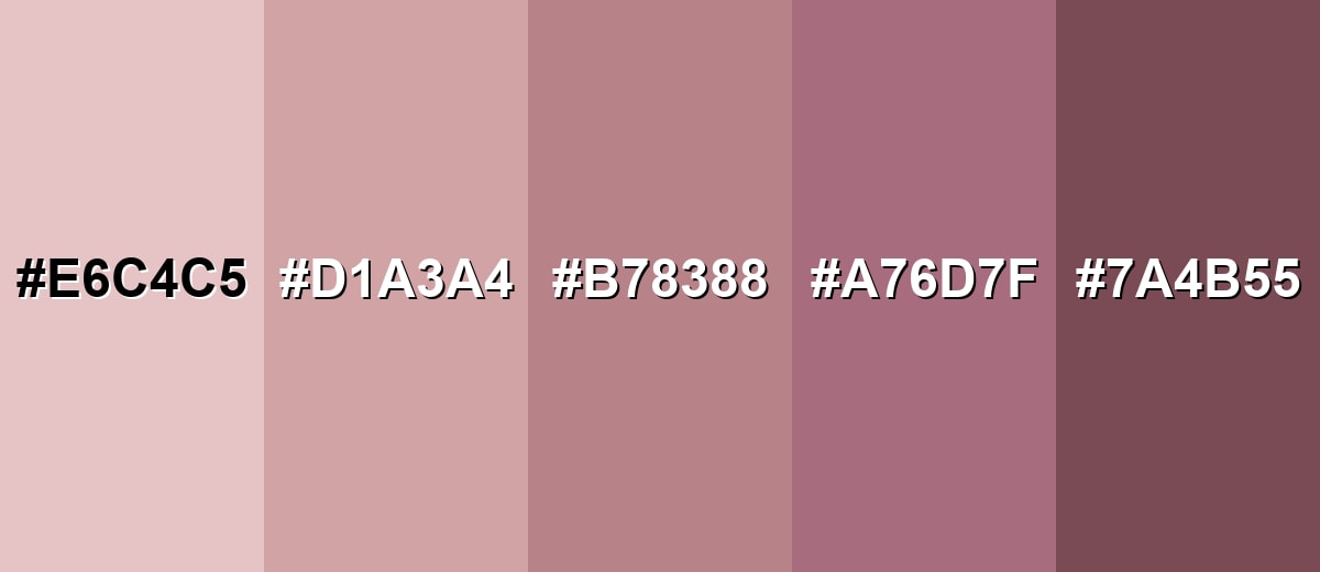
Shades, Tints & Variations of Dusty Rose Color
Dusty rose isn't just one flat pink—its range runs from airy blush tones to deeper rose-browns. Having a few reliable variations helps you build contrast, hierarchy, and mood while staying in the same soft, cohesive family.
- Pale Dusty Rose (#E6C4C5) - A lighter, airier variation that feels delicate and soft on large surfaces. It's best used for Backgrounds, large UI surfaces, and bright interior walls where you want warmth without heaviness.
- Classic Dusty Rose (#D1A3A4) - The core dusty rose tone: muted, warm, and balanced between pink and neutral. It's best used for Brand accents, product photography styling, feature sections, and textiles.
- Deep Dusty Rose (#B78388) - A deeper, more grounded rose that adds structure and a slightly vintage mood. It's best used for Secondary buttons, headings, accent walls, and packaging details.
- Dusty Mauve (#A76D7F) - A cooler, mauve-leaning take that feels more dramatic and editorial. It's best used for Typography accents, patterns, and contrast elements alongside warm neutrals.
- Rosewood (#7A4B55) - A dark rose-brown that reads sophisticated and adds strong depth. It's best used for Text on light dusty rose backgrounds, borders, icons, and premium branding accents.
Industry Applications
Because it sits between pink and neutral, dusty rose adapts across industries that need warmth without loud saturation. It is especially effective in visuals that rely on comfort, trust, and a curated, modern-vintage style.
Fashion & Beauty
- Use it for packaging backgrounds, soft gradients, and lifestyle imagery to signal gentleness and care.
- Pair with warm white, rosewood, and subtle gold accents for a premium skincare feel.
- In accessories, it's a wearable romantic tone for leather goods, knitwear, and outerwear.
- Style it with denim blues, taupe, and antique plum to keep the look grounded and modern.
Interior Design & Decor
- Use on upholstery, throws, ceramics, or as an accent paint to bring warmth without dominating the room.
- Combine with natural wood, charcoal, and muted teal for a calm, lived-in palette.
- For events at home, it works beautifully in linens and table styling thanks to its soft photographic look.
- Pair with blush beige, sage greens, and candlelit neutrals to reinforce a cozy atmosphere.
Branding & Marketing
- Use it in hero sections, quote cards, and lifestyle thumbnails when you want softness with a refined edge.
- Pair with clean off-whites, deep neutral text, and restrained accent hues for clarity.
- For wedding and event brands, it fits invitations, floral palettes, and signage with a modern-romantic tone.
- Pair with blush beige, sage greens, and candlelit neutrals to keep campaigns cohesive across print and digital.
Conclusion
Dusty rose (#D1A3A4) stands out for its muted warmth—romantic enough to feel inviting, but grounded enough to work like a soft neutral in real projects. It's easy to live with in interiors and translates smoothly into branding and UI as long as you protect contrast with deep neutrals and a clear visual hierarchy. Whether you're building a calm palette with muted greens or adding depth with rosewood-style accents, dusty rose gives designs a polished, modern-vintage finish that doesn't shout for attention.
Design Smarter with AI: Media.io is an online AI studio that empowers creators with advanced image generation and enhancement tools. From text-to-image and image-to-image creation to AI upscaling and color optimization, it enables fast, creative, and professional results—all in your browser.

Frequently Asked Questions About Dusty Rose Color
Dusty rose is a muted pink with gray and sometimes slightly brown undertones. It looks like softened rose petals rather than a bright, candy-like pink.
A commonly used HEX code for dusty rose is #d1a3a4. Small variations exist across palettes, but this value represents a balanced, muted rosy tone.
Dusty rose usually reads warm because of its red base and gentle beige influence. In cooler lighting or next to blue-grays, it can appear slightly cooler and more mauve.
It pairs well with warm whites, taupe, natural wood tones, charcoal, sage greens, muted teals, and soft lavenders. These combinations keep the overall look calm and intentional.
Use it for backgrounds, cards, or subtle accents and keep text in deep neutrals like charcoal. For buttons and key actions, add a stronger accent or a darker rosewood shade to maintain clear visual hierarchy.
Not exactly. Blush is typically lighter and fresher, while mauve leans more purple. Dusty rose sits between them, with a muted finish that feels more neutral and vintage.


