

 TL;DR:
Aubergine (HEX #3D0734) is a deep, wine-toned purple that serves as a sophisticated, grounding alternative to pure black for premium branding, fashion, and dark-mode UI designs.
● In UI applications, using aubergine as a background requires pairing it with high-contrast off-white text or warm metallics to prevent the interface from feeling excessively heavy and causing readability risks.
● Combine this shade with soft creams, muted golds, or deep forest greens, but strictly avoid neon pink (#FF2BD6) and bright red (#FF3B30) to prevent harsh, vibrating edges or muddy visual compositions.
● When transitioning from screen to physical outputs, you must convert the color to CMYK (0%, 89%, 15%, 76%) and perform a proofing check to prevent its signature dark purple depth from shifting.
Ask AI for a summary
 ChatGPT
 Perplexity
 Gemini
 Claude
 Grok
Grok
Aubergine color is a deep, dark purple that looks like the glossy skin of an eggplant, often reading as a purple-burgundy in real life.
Its signature hex code is #3d0734, a shade that can feel nearly black in low light and richly saturated under bright illumination.
Aubergine Color: Codes & Values
If you're using aubergine in UI, print, or branding, these core values help you keep the shade consistent across tools and outputs.
| Parameters | VALUE |
| HEX Code | #3D0734 |
| RGB DECIMAL | 61, 7, 52 |
| RGB PERCENTAGE | 23.9%, 2.7%, 20.4% |
| CMYK | 0%,89%,15%,76% |
| HSL | 310°, 80%, 13% |
| HSV (HSB) | 310°, 89%, 24% |
| Web Safe | #330033 |
Key Color Space Explanations:
- HEX HEX is the most common way to specify aubergine in web and UI work. Use #3d0734 for consistent rendering across modern browsers and design tools.
- RGB RGB defines how the shade appears on screens using red, green, and blue light. It is useful for digital design, video, and on-screen branding.
- CMYK CMYK is used for printing with cyan, magenta, yellow, and black inks. Converting aubergine to CMYK helps reduce surprises when moving from screen to print.
- HSL HSL describes hue, saturation, and lightness, which makes it easier to create lighter or darker variants. It is especially helpful when building harmonious palettes and UI states.
- Web Safe Web safe is the closest older-display-friendly approximation of the shade. For aubergine, #330033 is the nearest web-safe match.
For most digital work, start with HEX (#3D0734) or RGB (61, 7, 52). If you're printing, check the CMYK conversion and do a quick proof to keep the purple depth from shifting.
Aubergine Color Conversions
Need aubergine values for different workflows? Use this conversion table to move smoothly between screen, print, and color-managed spaces.
| Parameters | VALUE | CSS |
| HEX | #3d0734 | #3d0734 |
| RGB DECIMAL | 61, 7, 52 | rgb(61,7,52) |
| RGB PERCENTAGE | 23.9%, 2.7%, 20.4% | rgb(23.9%,2.7%,20.4%) |
| CMYK | 0%,89%,15%,76% | cmyk(0%,89%,15%,76%) |
| HSL | 310°, 80%, 13% | hsl(310°,80%,13%) |
| HSV (or HSB) | 310°, 89%, 24% | -- |
| Web Safe | 330033 | #330033 |
| CIE-LAB | 12.0, 30.5, -15.0 | -- |
| XYZ | 2.63, 1.40, 3.42 | -- |
| xyY | 0.353, 0.188, 1.40 | -- |
| CIE-LCH | 12.0, 34.0, 334° | -- |
| CIE-LUV | 12.0, 17.6, -15.1 | -- |
| Hunter-Lab | 11.8, 20.2, -10.3 | -- |
| Binary | 00111101 00000111 00110100 | -- |
Want to generate Aubergine Color photos or posters? Try Media.io's AI Image Generator now!
Aubergine Color Meaning & Symbolism
Aubergine is often linked with sophistication, creativity, and depth because it sits in the darker end of the purple family. In everyday life, it can read as elegant and expressive without feeling as loud as brighter purples. This makes it a popular choice when you want a rich accent that still feels grounded.
Psychological Effects
Because it's such a deep shade, aubergine can shift the mood of a design quickly depending on lighting and contrast.
- Calm And Steady - Aubergine can feel calm and steady, especially when used in large areas with soft lighting.
- Maturity And Taste - It tends to communicate maturity and taste, which is why it works well for premium packaging, editorial layouts, and brand accents that need to look intentional.
- Heavy When Overused - Because it is so dark, it can also feel heavy or overly serious if it dominates a layout.
- Readability Risk In UI - In UI, using it as a background without enough contrast may reduce readability and make interfaces feel less open.
- Grounding Base - A practical approach is to treat aubergine as a grounding base and pair it with lighter neutrals or warm metallics.
Positive Associations
Used thoughtfully, aubergine reads premium and intentional without screaming for attention.
- Sophistication - Aubergine is often linked with sophistication, creativity, and depth because it sits in the darker end of the purple family.
- Creativity - It can feel elegant and expressive without feeling as loud as brighter purples.
- Depth - Its deep tone adds visual weight that makes layouts feel structured and designed.
- Refined Mood - People often perceive it as refined, moody, and quietly bold.
- Luxury Pairing - Pair it with lighter neutrals or warm metallics to keep the mood rich while still supporting clarity in signage, apps, and interior spaces.
Cultural Significance Across the World
Deep purples often carry "special occasion" energy, and aubergine tends to inherit that impression.
- Status - Across many contexts, deep purple tones are associated with status, ceremony, and artistry.
- Ceremony - Aubergine often inherits formal, intentional impressions from the darker end of the purple family.
- Artistry - It can signal creativity and a curated, editorial style rather than a casual vibe.
- Organic Reference - Since the name comes from the eggplant, it also carries a natural, organic reference that can soften its formal feel.
Design Applications
Aubergine is easiest to use when you decide whether it should be a main backdrop or a supporting accent. Its depth gives structure to layouts, but it also needs thoughtful contrast to stay readable and modern.
Graphic Design Tips
- Use aubergine in logos, icons, borders, and key highlights to signal refinement.
- As a background, keep typography light and avoid low-contrast grays.
- Use aubergine for primary CTAs only when the surrounding palette is light enough to support strong contrast.
- Balance it with at least one brightening element: a light neutral, a warm highlight, or a clean white space strategy.
- For gradients, blend toward deep plum or near-black purple rather than pure black to keep the tone cohesive.
Because aubergine is very dark, accessibility usually depends on how you handle text and interactive states.
Aubergine Color in Photography & Video
- It performs well in fashion, beauty, and lifestyle visuals where you want a moody, studio-like feel.
- Photographs often look richer when aubergine is used as a framing color.
- Title cards and overlays can feel more cinematic when aubergine is treated as a deep, purple-leaning shadow tone.
- Background panels behind text work best when balanced with sufficient contrast.
- Aubergine can be a useful reference when color grading toward deep purple shadows in creative projects.
Recommended Tool for Image Enhancement: When incorporating aubergine color into your photography projects, Media.io's AI Image tools can help you achieve more refined results. With AI-powered color enhancement, photo colorization, image upscaling, and old photo restoration, you can easily enrich aubergine color tones, improve overall image quality, and highlight the color's elegant and sophisticated aesthetic.
Color Combinations
Aubergine pairs best with tones that either brighten it up or create a controlled, moody harmony. Use these palettes as starting points, then adjust lightness to match your medium and contrast needs.
Complementary Colors
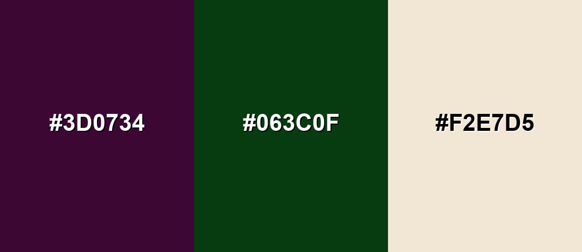
A green complement brings out aubergine's purple richness and adds energy without turning loud. A soft cream keeps the palette usable for backgrounds, text areas, and packaging.
Complementary Palette Example: Try aubergine with deep forest green and a warm cream for a refined, nature-meets-luxury look.
Analogous Color Schemes
Analogous colors sit adjacent to each other on the color wheel, creating harmonious, cohesive palettes with subtle variation.
For a smooth, moody blend, stay close to aubergine with deep violet and wine tones.
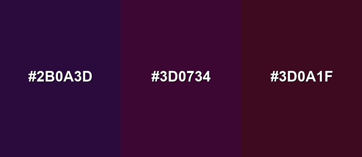
- Deep Violet: #2B0A3D
- Aubergine: #3D0734
- Dark Raspberry: #3D0A1F
To soften the mood, add a dusty plum and a darker blackberry shade around the same hue range.
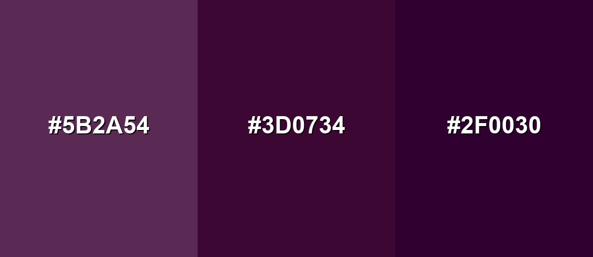
- Dusty Plum: #5B2A54
- Aubergine: #3D0734
- Blackberry: #2F0030
Triadic & Tetradic Combinations
A triadic palette gives aubergine more variety while still feeling balanced.
Pair aubergine with olive-gold and deep teal for a creative, modern contrast that works in branding and illustrations.
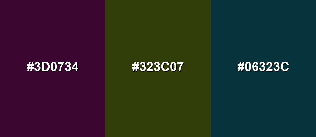
- Aubergine: #3D0734
- Olive Gold: #323C07
- Deep Teal: #06323C
Colors to Avoid
While aubergine color is remarkably versatile, certain combinations can create problematic visual effects:
- Neon Pink (#FF2BD6) - High saturation can overpower aubergine and create a harsh, vibrating edge in UI and print.
- Bright Red (#FF3B30) - This pairing can read as muddy or overly intense, especially in darker, low-contrast compositions.
- Near Black (#111111) - It can flatten the depth of aubergine and make layouts feel heavy with little separation.
- Dark Brown (#5B3A2E) - Similar darkness and warmth can reduce clarity, making the palette look dull rather than intentional.
Shades, Tints & Variations of Aubergine Color
Aubergine has a surprisingly usable range—from softened plum-like tints to near-black, inky purples. Exploring these variations makes it easier to build hierarchy in layouts (background, surfaces, accents, and borders) while keeping the same moody character.
- Pale Aubergine (#8A5A7A) - A softened, rosy-purple variant that feels approachable and less dramatic than the base shade. It's best used for Backgrounds, large surfaces, and gentle gradients in lifestyle designs.
- Soft Aubergine (#6B2F5F) - A mid-depth plum that keeps the aubergine character while improving flexibility in mixed palettes. It's best used for Secondary UI elements, cards, and supporting brand accents.
- Classic Aubergine (#3D0734) - The signature deep purple that looks rich, moody, and refined, especially next to warm neutrals. It's best used for Primary accents, headers, packaging details, and dramatic backgrounds with light text.
- Deep Eggplant (#2A0424) - A darker, more ink-like version that leans closer to black while staying distinctly purple. It's best used for Luxury branding, high-contrast photography backdrops, and dark-mode surfaces.
- Near-Black Aubergine (#1A0016) - An ultra-dark purple for maximum depth when pure black feels too flat. It's best used for Borders, shadows, and deep backgrounds where subtle purple warmth is desired.
Industry Applications
Aubergine works across industries because it can read as both modern and classic. It is especially effective when you need a dark base that still feels expressive.
Fashion & Beauty
- Eveningwear palettes and seasonal collections
- Cosmetics packaging that needs a moody, elegant tone
- Editorial styling where deep purple adds depth to neutrals
- It is especially effective when you need a dark base that still feels expressive.
Interior Design & Decor
- Accent walls in bedrooms, lounges, or dining areas
- Velvet, matte finishes, and textured fabrics
- Pairing with warm wood, brass, and soft beige upholstery
- Aubergine can feel calm and steady, especially when used in large areas with soft lighting.
Branding & Marketing
- Premium logo accents and brand patterns
- Sophisticated social templates with light typography
- Packaging systems with cream, gold, or muted green companions
- Use aubergine in logos, icons, borders, and key highlights to signal refinement.
Conclusion
Aubergine is a deep purple that brings instant sophistication, depth, and a modern moody edge—without the loudness of brighter purples or the flatness of pure black. Start with #3D0734, then build contrast with warm creams, light neutrals, or controlled greens to keep layouts readable and intentional. Whether you're designing a dark-mode UI, premium packaging, or a cinematic visual style, aubergine works best as an anchor color that lets accents and typography shine.
Design Smarter with AI: Media.io is an online AI studio that empowers creators with advanced image generation and enhancement tools. From text-to-image and image-to-image creation to AI upscaling and color optimization, it enables fast, creative, and professional results—all in your browser.

Frequently Asked Questions About Aubergine Color
Aubergine is a very dark purple with a subtle wine or burgundy undertone, similar to the skin of an eggplant. Depending on lighting, it can look richly purple or nearly black.
A commonly used digital hex value for aubergine is #3d0734. It is a deep purple that works well as a background or premium accent when paired with light neutrals.
It sits between purple and wine tones. Most versions lean purple first, with a red undertone that becomes more noticeable in warm lighting or when paired with creams and browns.
Soft creams, warm beiges, muted golds, deep greens, and dark teals are reliable pairings. These shades either brighten aubergine or add contrast without clashing.
Yes, it can be a strong dark-mode base because it feels warmer and more expressive than flat black. Use high-contrast text (off-white) and clear interactive states to maintain readability.
They are very similar deep purple shades and are often used interchangeably. In many palettes, aubergine may lean slightly more wine-toned, while eggplant can read a touch more neutral or smoky.


