

Emerald color is a vivid, jewel-like green that looks rich and slightly cool, similar to polished emerald gemstones and lush spring foliage.
Its signature digital reference is hex #50C878—a balanced green that stays bright without turning neon. Many people read emerald as a symbol of growth, renewal, and confident luxury, with a calm, reassuring presence.
Emerald Color: Codes & Values
If you want emerald color to look consistent across web, UI, and print, start with these standard color codes.
| Parameters | VALUE |
| HEX Code | #50C878 |
| RGB DECIMAL | 80, 200, 120 |
| RGB PERCENTAGE | 31.4%, 78.4%, 47.1% |
| CMYK | 60%,0%,40%,22% |
| HSL | 140°, 52%, 55% |
| HSV (HSB) | 140°, 60%, 78% |
| Web Safe | #66CC66 |
Key Color Space Explanations:
- HEX - HEX is the most common way to specify emerald for web and UI. Use #50c878 in CSS, design tools, and product style guides.
- RGB - RGB defines the same shade for screens using red, green, and blue light. It helps you match emerald consistently across digital assets and displays.
- CMYK - CMYK is used for print, mixing cyan, magenta, yellow, and black inks. It is useful when you need emerald-like greens in brochures, packaging, and posters.
- HSL - HSL describes emerald by hue, saturation, and lightness, which is handy for building tints and shades. It also makes it easier to adjust contrast without changing the overall vibe.
- Web Safe - Web-safe values are older, simplified screen-safe approximations. #66cc66 is the closest web-safe match when you need legacy-friendly consistency.
For most modern design work, HEX and RGB are the quickest way to apply emerald consistently; use CMYK when you're preparing print files and always test on your final material.
Emerald Color Conversions
Need emerald color in a different format for a design tool, stylesheet, or print workflow? Use these quick conversions.
| Parameters | VALUE | CSS |
| HEX | #50c878 | #50c878 |
| RGB DECIMAL | 80, 200, 120 | rgb(80,200,120) |
| RGB PERCENTAGE | 31.4%, 78.4%, 47.1% | rgb(31.4%,78.4%,47.1%) |
| CMYK | 60%,0%,40%,22% | cmyk(60%,0%,40%,22%) |
| HSL | 140°, 52%, 55% | hsl(140°, 52%, 55%) |
| HSV (or HSB) | 140°, 60%, 78% | -- |
| Web Safe | 66cc66 | #66cc66 |
| CIE-LAB | 72.6, -49.0, 27.0 | -- |
| XYZ | 31.9, 49.9, 27.9 | -- |
| xyY | 0.292, 0.457, 49.9 | -- |
| CIE-LCH | 72.6, 55.9, 151.1 | -- |
| CIE-LUV | 72.6, -58.3, 40.2 | -- |
| Hunter-Lab | 70.6, -44.1, 20.1 | -- |
| Binary | 010100001100100001111000 | -- |
Want to generate Emerald Color photos or posters? Try Media.io's AI Image Generator now!
Emerald Color Meaning & Symbolism
Emerald is widely associated with growth, renewal, balance, and prosperity. In everyday life, it often reads as a confident green that feels premium and intentional rather than casual. This makes emerald a reliable choice when you want a fresh look with a touch of sophistication, which is a big part of Emerald Color meaning in visual communication.
Psychological Effects
Because it's saturated but not neon, emerald tends to feel lively while still grounded.
- Restorative - Emerald can feel steady and calming, which helps reduce visual stress in busy layouts.
- Trust-Building - It often communicates stability and clarity, making interfaces feel more reliable and "sorted."
- Attention Without Alarm - Emerald grabs focus without the urgency that reds and yellows can create.
- Bold Authority - Used heavily, its strong saturation can feel assertive and premium, especially in branding.
- Intensity Risk - In large blocks or low-contrast pairings, emerald may feel heavy and reduce readability.
Positive Associations
Emerald's "jewel tone" identity adds a confident, elevated layer to its natural green roots.
- Growth - Emerald is commonly linked to progress, development, and forward momentum.
- Renewal - It can suggest freshness and a clean start, similar to spring foliage.
- Balance - As a composed green, emerald often reads as steady and well-measured.
- Prosperity - Its gemstone connection frequently implies value, success, and abundance.
- Confident Luxury - Emerald feels intentional and polished, helping designs look premium without being flashy.
Cultural Significance Across the World
Across many contexts, emerald's meaning stays fairly consistent thanks to nature and gemstone symbolism.
- Gemstone Prestige - Emerald's jewel association is tied to celebration, status, and high value.
- Nature Connection - As a green family color, it's often used for eco, garden, and outdoors storytelling.
- Wellness & Calm - Emerald can support restorative themes in lifestyle, mindfulness, and wellbeing visuals.
- Heritage Aesthetic - It works well in classic, timeless palettes that feel established and intentional.
Design Applications
Emerald is versatile: it can look elegant in editorial layouts, energetic in product UI, and grounded in interior accents. The key is deciding whether you want it to lead the palette or support it as a refined highlight.
Graphic Design Tips
- Use emerald as a primary accent color for buttons, badges, or key labels rather than flooding the entire layout.
- Pair emerald with calm neutrals (off-white, cream, soft gray) to keep the overall look breathable and premium.
- Choose clean, simple typography so the color reads sophisticated instead of loud.
- Build hierarchy with tints: reserve the strongest emerald for the most important elements and use lighter variations for backgrounds.
- Check contrast early—emerald can look gorgeous but still fail readability if type weight or background values are too close.
If emerald is your hero color, give it room: generous whitespace and a limited secondary palette will make it look more "jewel-like" and less busy.
Emerald Color in Photography & Video
- Use emerald accents in wardrobe, props, or set styling to create a premium focal point on camera.
- In color grading, keep greens controlled—over-saturating can push emerald toward a harsh digital look.
- Balance with warm skin tones using neutral lighting so emerald doesn't make scenes feel chilly.
- For product shots, emerald backgrounds work best with clean separation (rim light or soft shadows) to preserve depth.
- When adding emerald overlays or titles, choose high-contrast text and avoid thin fonts for better legibility.
Recommended Tool for Image Enhancement: When incorporating emerald color into your photography projects, Media.io's AI Image tools can help you achieve more refined results. With AI-powered color enhancement, photo colorization, image upscaling, and old photo restoration, you can easily enrich emerald color tones, improve overall image quality, and highlight the color's elegant and sophisticated aesthetic.
Emerald Color Combinations
Emerald color pairs best with palettes that either celebrate its jewel-like richness or balance its intensity. Use the combinations below as ready-made starting points for branding, UI, graphics, and decor planning.
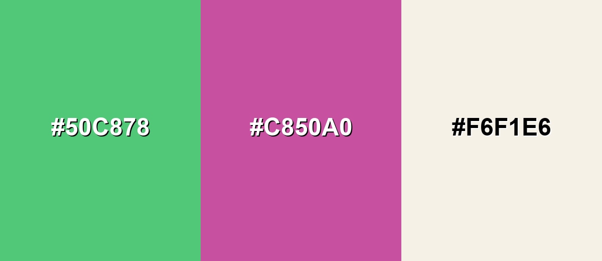
Complementary Colors
A complementary pairing places emerald opposite a red-violet tone for high energy and clear separation. This is a strong choice for highlights, calls to action, and modern branding when you want emerald to pop without looking neon.
Complementary Palette Example: Use emerald as the anchor, the magenta accent for punch, and the cream tone to keep the layout breathable.
Analogous Color Schemes
Analogous colors sit adjacent to each other on the color wheel, creating harmonious, cohesive palettes with subtle variation.
Emerald with teal and soft lime feels fresh and natural, ideal for calm but modern visuals.
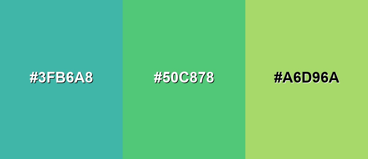
- Teal Green: #3FB6A8
- Emerald: #50C878
- Soft Lime: #A6D96A
A deeper green plus a bright aqua keeps the family cohesive while adding crisp contrast for UI elements.
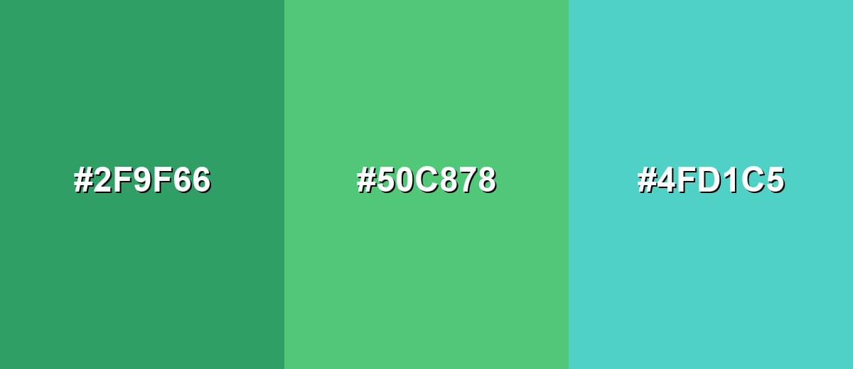
- Deep Green: #2F9F66
- Emerald: #50C878
- Aqua Mist: #4FD1C5
Triadic & Tetradic Combinations
Triadic palettes create lively balance using three evenly spaced hues on the color wheel.
Emerald with soft purple and warm orange brings playful contrast while staying polished for modern layouts.
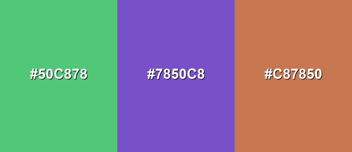
- Emerald: #50C878
- Amethyst Purple: #7850C8
- Warm Terracotta: #C87850
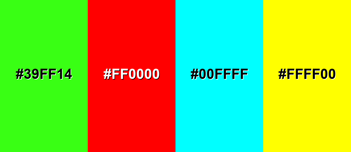
Colors to Avoid
While emerald color is remarkably versatile, certain combinations can create problematic visual effects:
- Neon Green (#39FF14) - Too close in hue but much brighter, which can create a vibrating edge and make emerald look dull by comparison.
- Pure Red (#FF0000) - High-saturation contrast can feel aggressive and can overwhelm emerald in small UI elements or dense layouts.
- Pure Cyan (#00FFFF) - Both are intense and cool, so they compete for attention and can make interfaces feel harsh or overly digital.
- Pure Yellow (#FFFF00) - Extremely bright against emerald, often causing glare and reducing readability in text-heavy designs.
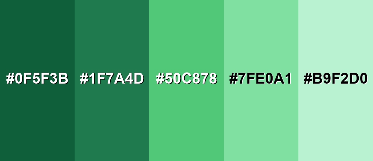
Shades, Tints & Variations of Emerald Color
Emerald isn't just one green—its range runs from deep, dramatic forest tones to airy mint tints. Having a few reliable variations makes it easier to control mood, build hierarchy, and keep contrast comfortable across backgrounds, text, and accents.
- Dark Emerald (#0F5F3B) - A deep, forest-leaning emerald that feels grounded and dramatic. It's best used for Background panels, headers, luxury packaging, and high-contrast UI sections..
- Deep Emerald (#1F7A4D) - A richer mid-dark tone that keeps the jewel character while staying practical. It's best used for Brand primaries, navigation bars, and premium product accents..
- Classic Emerald (#50C878) - The balanced, iconic emerald tone: vivid, clean, and naturally fresh. It's best used for Primary accents, buttons, icons, and standout details in layouts..
- Light Emerald (#7FE0A1) - A brighter, airier variation that feels friendly and modern. It's best used for Large UI surfaces, highlights, gradients, and soft brand backgrounds..
- Mint Emerald (#B9F2D0) - A gentle mint-leaning tint with a clean, soothing finish. It's best used for Subtle sections, cards, wellness aesthetics, and understated overlays..
Industry Applications
Emerald shows up across many industries because it can communicate freshness and trust while still feeling elevated. These examples highlight where it tends to perform best and how to use it without overpowering the message.
Fashion & Beauty
- Use emerald in statement pieces and hero visuals—its jewel tone photographs with a naturally premium finish.
- Keep supporting colors simple so emerald remains the focal point in packaging and campaigns.
- Pair emerald with clean typography and generous spacing for an upscale, modern beauty aesthetic.
- Lean on texture (velvet, satin, gloss) to make emerald feel even richer without increasing saturation.
Interior Design & Decor
- Try emerald on statement walls, cabinetry accents, or decor pieces where depth is an advantage.
- Balance with soft neutrals and warm lighting to prevent the space from feeling too cool or formal.
- Use darker emeralds for dramatic zones (entryways, bars, reading corners) and lighter tints for open areas.
- Mix with natural materials to keep it grounded: wood tones, stone surfaces, and matte metals work especially well.
Branding & Marketing
- Use emerald as a hero accent to signal quality, stability, and a modern natural aesthetic.
- Reserve the strongest emerald for CTAs and key highlights, then use softer tints for backgrounds and sections.
- Watch contrast and accessibility—don't rely on emerald alone to communicate status or success states.
- Limit competing saturated hues so emerald reads intentional (premium) rather than noisy (playful).
Conclusion
Emerald stands out as a jewel-like green that feels both fresh and sophisticated, which makes it a dependable pick for modern branding, UI accents, editorial layouts, and even interior details. Start with the core HEX #50C878 for consistent digital work, then fine-tune the vibe with darker emeralds for drama or lighter tints for soft, spacious surfaces. With thoughtful pairings and solid contrast checks, emerald can deliver growth-and-balance symbolism while still looking confident, premium, and current.
Design Smarter with AI: Media.io is an online AI studio that empowers creators with advanced image generation and enhancement tools. From text-to-image and image-to-image creation to AI upscaling and color optimization, it enables fast, creative, and professional results—all in your browser.

Frequently Asked Questions About Emerald Color
Quick answers to the most common questions designers and creators ask about using emerald.
Emerald is a vivid, jewel-like green that sits between bright green and teal. It looks rich and polished, similar to the appearance of emerald gemstones.
A widely used hex reference for emerald is #50c878. It is a balanced, saturated green that stays vibrant without becoming neon.
Emerald is commonly associated with growth, renewal, balance, and prosperity. It can also suggest quality and confidence because of its gemstone connection.
Emerald pairs well with red-violet accents for strong contrast, and with nearby greens and teals for a calmer, nature-inspired look. Soft neutrals are helpful for balance and readability.
Yes, emerald can work well for primary actions because it is attention-grabbing without signaling danger. Make sure there is enough contrast with text and surrounding elements for accessibility.
Pick darker emeralds for dramatic backgrounds and premium branding, and lighter tints for large surfaces and gentle highlights. Testing your shade in context is the best way to confirm readability and mood.


