

Whitesmoke color is a very light, soft off-white that looks like clean paper with a faint gray haze rather than stark, bright white. Its hex code is #F5F5F5, which gives it a gentle, low-contrast appearance on screens.
People often perceive it as calm, tidy, and modern, making it a popular background choice. This guide breaks down whitesmoke's meaning, color codes, best combinations, shades, and practical ways to use it.
Whitesmoke Color: Codes & Values
Whitesmoke sits just under pure white, so it stays bright while looking a bit softer and easier on the eyes.
| Parameters | VALUE |
| HEX Code | #F5F5F5 |
| RGB DECIMAL | 245, 245, 245 |
| RGB PERCENTAGE | 96.08%, 96.08%, 96.08% |
| CMYK | 0%,0%,0%,4% |
| HSL | 0°, 0%, 96% |
| HSV (HSB) | 0°, 0%, 96% |
| Web Safe | #FFFFFF |
Key Color Space Explanations:
- HEX - HEX (#f5f5f5) is the standard web notation for whitesmoke and is commonly used in CSS and design tools. It's an off-white that stays bright but looks softer than pure white.
- RGB - RGB (245, 245, 245) defines whitesmoke by mixing red, green, and blue light at nearly equal, very high levels. This is ideal for digital UI, video, and on-screen graphics.
- CMYK - CMYK (0%,0%,0%,4%) describes how inks are combined for print. Whitesmoke uses a small amount of black to create a subtle gray cast compared with unprinted paper.
- HSL - HSL (0°, 0%, 96%) represents a neutral tone with no saturation and very high lightness. It's useful when adjusting lightness for hover states, borders, and background layers.
- Web Safe - The closest web-safe option is #ffffff. If you need a guaranteed web-safe substitute, pure white is the nearest match, though it will look brighter than whitesmoke.
Use HEX for CSS and UI mockups, RGB for any screen-based work, and CMYK when you're prepping designs for print.
Whitesmoke Color Conversions
If you need whitesmoke across tools and workflows, these conversions help you keep the shade consistent from web to print.
| Parameters | VALUE | CSS |
| HEX | #f5f5f5 | #f5f5f5 |
| RGB DECIMAL | 245, 245, 245 | rgb(245,245,245) |
| RGB PERCENTAGE | 96.08%, 96.08%, 96.08% | rgb(96.08%,96.08%,96.08%) |
| CMYK | 0%,0%,0%,4% | cmyk(0%,0%,0%,4%) |
| HSL | 0°, 0%, 96% | hsl(0°,0%,96%) |
| HSV (or HSB) | 0°, 0%, 96% | -- |
| Web Safe | ffffff | #ffffff |
| CIE-LAB | 96.6, 0.0, 0.0 | -- |
| XYZ | 86.8, 91.3, 99.4 | -- |
| xyY | 0.313, 0.329, 91.3 | -- |
| CIE-LCH | 96.6, 0.0, 0° | -- |
| CIE-LUV | 96.6, 0.0, 0.0 | -- |
| Hunter-Lab | 95.6, 0.0, 0.0 | -- |
| Binary | 11110101 11110101 11110101 | -- |
Want to generate whitesmoke color photos or posters? Try Media.io's AI Image Generator now!
Whitesmoke Meaning & Symbolism
Whitesmoke is commonly linked with cleanliness, simplicity, and quiet confidence. Because it sits just below pure white, it often feels more livable and less glaring in everyday environments. In day-to-day design, it reads as a neutral base that lets typography, photos, and accent hues stand out without looking stark.
Psychological Effects
As a near-white neutral, whitesmoke supports clarity without the intensity of pure white.
- Calm Focus - Reduces visual noise, making it easier to concentrate on content, forms, and reading-heavy layouts.
- Open Space - Creates an airy, uncluttered feel that helps interfaces and pages look more organized.
- Low Glare Comfort - Feels gentler than #FFFFFF on bright displays, which can improve long-session usability.
- Neutral Confidence - Lets accent colors feel intentional while keeping the overall tone understated and modern.
- Sterile Risk - When overused with cold grays and thin type, it can lean clinical unless balanced with warmth or texture.
Positive Associations
Whitesmoke often acts like a "quiet backdrop" that makes everything else look more polished.
- Cleanliness - Suggests hygiene and freshness, which is why it's common in minimal and product-first design.
- Simplicity - Supports a less-is-more aesthetic and keeps layouts from feeling busy.
- Honesty - Feels straightforward and transparent in branding, especially with clear typography.
- Modern Minimalism - Reads contemporary without needing bold decoration or heavy gradients.
- Premium Space - Adds "breathing room" that can make products, photos, and headlines feel more elevated.
Cultural Significance Across the World
Whitesmoke borrows many broad associations of white, but its softness can make it feel more approachable.
- Fresh Starts - Often tied to a clean slate vibe, ideal for launches, portfolios, and new-product pages.
- Clean Aesthetics - Common in modern design languages where order, grid, and spacing are part of the "message."
- Approachable Neutral - Its subtle gray haze can feel less formal than pure white in everyday settings.
- Context Dependent - Meaning shifts by culture and industry, so supporting imagery and accent colors help set the mood.
Design Applications
Whitesmoke works best when you want a bright foundation that is gentler than pure white. It's especially useful for layouts where readability, spacing, and hierarchy matter.
Graphic Design Tips
- Use whitesmoke as a primary canvas for typography-first layouts where you want a clean, print-like feel.
- Create subtle section separation with borders, dividers, and elevation layers instead of jumping to darker panels.
- Pair it with a dark anchor tone for headings and body text so your hierarchy stays crisp.
- Keep accents intentional: one saturated button/CTA color usually looks more premium than many competing highlights.
- If the design starts to feel cold, introduce warmth with beige-leaning neutrals or natural imagery textures.
If you're building UI components, treat whitesmoke as a "surface" color and test contrast early—thin icons and light gray labels can disappear faster than you expect.
Whitesmoke in Photography & Video
- Use whitesmoke backdrops for bright, airy product shots without the harshness of pure white.
- Design lower-thirds and captions on whitesmoke panels to keep text readable while staying visually quiet.
- For thumbnails, whitesmoke helps subjects pop—especially when paired with a single strong accent.
- In color grading, it can help your layout feel "clean" while avoiding blown-out white UI frames.
- When exporting, check how whitesmoke behaves across displays; subtle near-white differences can shift in compression.
Recommended Tool for Image Enhancement: When incorporating whitesmoke into your photography projects, Media.io's AI Image tools can help you achieve more refined results. With AI-powered color enhancement, photo colorization, image upscaling, and old photo restoration, you can easily enrich whitesmoke tones, improve overall image quality, and highlight the color's elegant and sophisticated aesthetic.
Color Combinations
Whitesmoke is flexible because it behaves like a softened white base. The most successful pairings use clear contrast, a single strong accent, or a mix of warm and cool neutrals for balance.
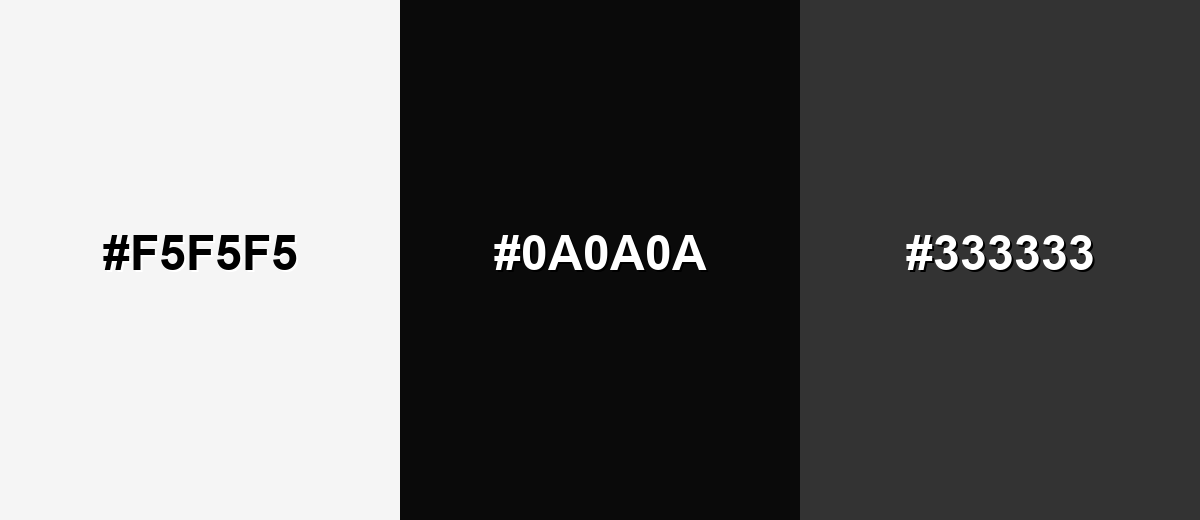
Complementary Colors
A deep, near-black counterpoint creates maximum clarity and a modern, editorial feel. This complementary approach is ideal for typography-first layouts and high-contrast UI.
Complementary Palette Example: Use whitesmoke as the background, then rely on near-black for text and a mid charcoal for secondary elements.
Analogous Color Schemes
Analogous colors sit adjacent to each other on the color wheel, creating harmonious, cohesive palettes with subtle variation.
A warm-leaning off-white set for soft, cozy minimal layouts.
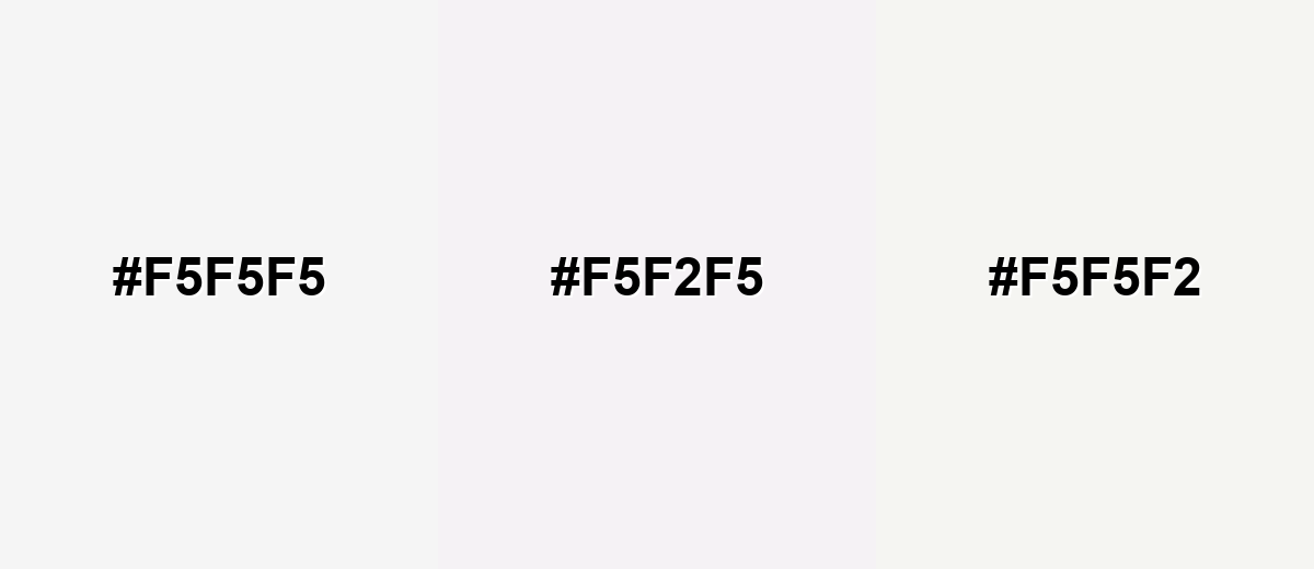
- Whitesmoke: #F5F5F5
- Blush White: #F5F2F5
- Cream Mist: #F5F5F2
A cooler off-white mix that feels crisp and tech-friendly without going icy.
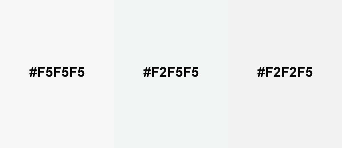
- Whitesmoke: #F5F5F5
- Ice Tint: #F2F5F5
- Lavender Fog: #F2F2F5
Triadic & Tetradic Combinations
A triadic palette adds energy while keeping a clean base. It's useful for dashboards, presentations, and modern brand systems.
Pair whitesmoke with a balanced blue and a warm coral accent for clear hierarchy and friendly contrast.
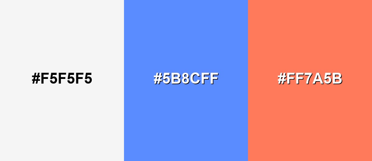
- Whitesmoke: #F5F5F5
- Sky Blue: #5B8CFF
- Coral Accent: #FF7A5B
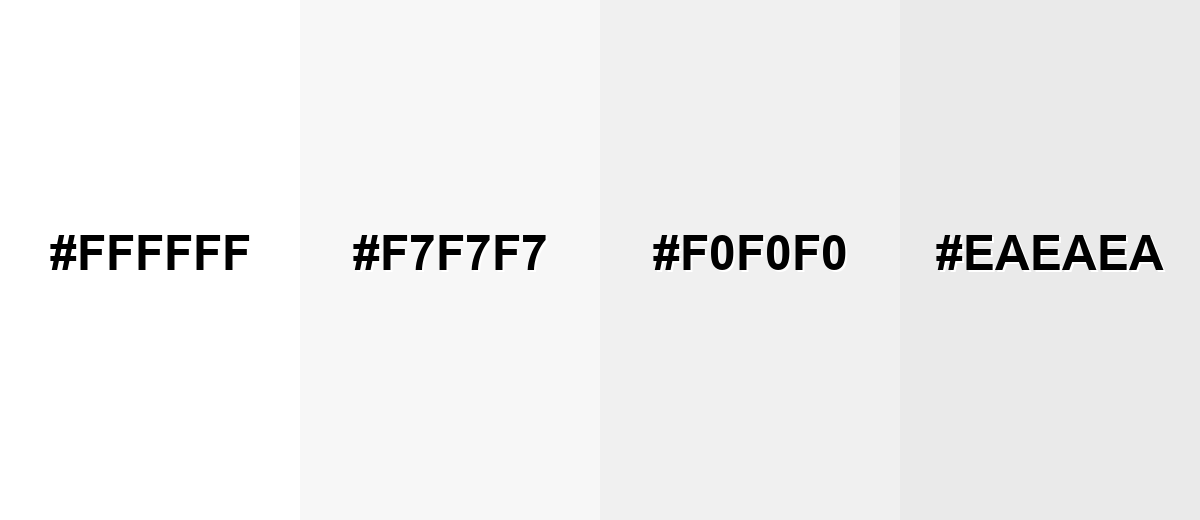
Colors to Avoid
While whitesmoke is remarkably versatile, certain combinations can create problematic visual effects:
- Pure White (#FFFFFF) - Side by side, the difference is subtle, so edges and sections can disappear without borders or shadows.
- Paper White (#F7F7F7) - The values are too close, which can make layouts look washed out and reduce visual hierarchy.
- Light Neutral Gray (#F0F0F0) - Low contrast against whitesmoke can weaken button states, cards, and separators.
- Pale Gray (#EAEAEA) - Still too light for reliable separation; it can read like a printing artifact instead of an intentional panel.
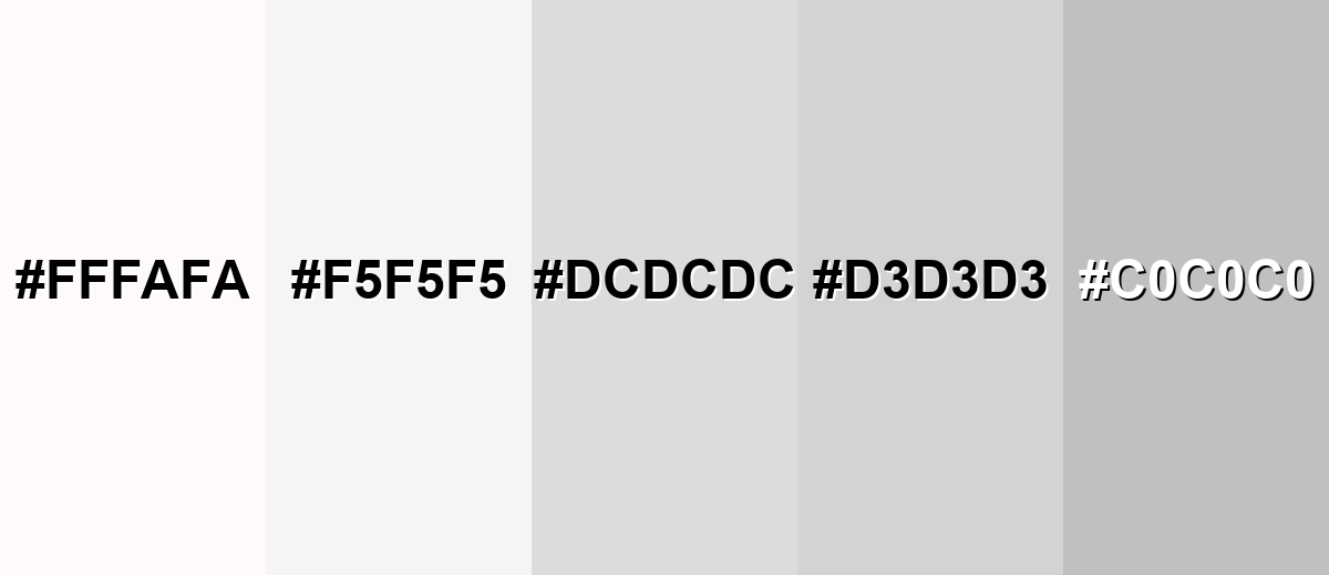
Shades, Tints & Variations of Whitesmoke
Whitesmoke lives in a near-white range where tiny shifts make a big difference in hierarchy, depth, and comfort. Using nearby tints and grays helps you build cleaner UI layers, more visible borders, and more intentional "paper-like" backgrounds.
- Snow (#FFFAFA) - A very bright off-white with a faint warm-pink cast that feels softer than pure white. It's best used for highlight panels, hero sections, and subtle contrast against whitesmoke without introducing obvious gray.
- Whitesmoke (#F5F5F5) - A balanced near-white that reduces harsh glare while staying clean and modern. It's best used for primary backgrounds for apps, websites, documents, and product mockups.
- Gainsboro (#DCDCDC) - A light gray that adds visible structure while remaining neutral and understated. It's best used for borders, dividers, secondary surfaces, and card backgrounds to create hierarchy.
- Light Gray (#D3D3D3) - A slightly deeper neutral that reads as functional and supportive rather than decorative. It's best used for disabled states, secondary UI, and subtle iconography when you still need visibility.
- Silver (#C0C0C0) - A mid-light neutral that can act as a stronger contrast partner for near-white palettes. It's best used for UI outlines, data grid lines, and background alternation where gainsboro is too subtle.
Industry Applications
Because whitesmoke is bright but not harsh, it fits industries that rely on clarity, trust, and easy scanning—especially when you want a clean look that won't compete with products or content.
Fashion & Beauty
- Minimal lookbooks and catalog pages where the product needs to lead.
- Soft backgrounds that flatter skincare, makeup, and fragrance photography.
- Clean label and packaging mockups that feel modern and premium.
- Editorial-style campaigns that rely on whitespace and strong typography.
Interior Design & Decor
- Wall and trim inspiration for a calm, modern base.
- Pairing with wood, stone, and textiles to add warmth and texture.
- Brightening smaller rooms without the starkness of pure white.
- Backdrop color for mood boards and material presentations.
Branding & Marketing
- Brand systems that use one strong accent color with a neutral foundation.
- Product launches where images need a quiet stage to stand out.
- Typography-first landing pages with crisp hierarchy and low visual noise.
- Presentation templates that stay readable across different screens and lighting.
Conclusion
Whitesmoke (#F5F5F5) is a near-white neutral that keeps designs bright while feeling softer and more comfortable than pure white. It's an easy win for backgrounds, cards, and print-inspired layouts because it reduces glare and makes typography and imagery feel more intentional. For the best results, pair it with a clear dark anchor for readability, add separation with slightly deeper neutrals like gainsboro, and use one confident accent color to guide attention. Whether you're building UI surfaces, brand templates, product pages, or clean editorial layouts, whitesmoke gives you a modern, calm foundation that still looks crisp and professional.
Design Smarter with AI: Media.io is an online AI studio that empowers creators with advanced image generation and enhancement tools. From text-to-image and image-to-image creation to AI upscaling and color optimization, it enables fast, creative, and professional results—all in your browser.

Frequently Asked Questions About Whitesmoke Color
Whitesmoke is a very light off-white with a subtle gray haze. It looks like softened white, similar to bright paper or a lightly misted surface rather than a stark, pure white.
The hex code for whitesmoke is #f5f5f5. It's a standard CSS named value and is widely used as a clean background shade.
No. White is typically pure #ffffff, while whitesmoke (#f5f5f5) is slightly darker. That small shift makes whitesmoke feel less glaring and often more comfortable as a background.
RGB is 245, 245, 245 and CMYK is 0%,0%,0%,4%. RGB is most useful for screens, while CMYK is used for print workflows.
Deep charcoal and near-black tones tend to read best because they create strong contrast. For body text and UI labels, avoid very light grays, which can reduce readability and accessibility.
Whitesmoke pairs well with dark anchors like charcoal or navy, plus one clear accent such as teal, coral, or a calm blue. Warm neutrals and natural textures also help keep the overall look inviting.


