

Rose quartz color is a soft blush pink with a slightly milky, muted finish that feels calm and approachable in real life. Its signature HEX code is #f7cac9, a pastel pink that stays warm without turning overly bright.
People often read it as gentle, caring, and quietly romantic rather than flashy. Named after the gemstone, it tends to look smoother in matte pigments and more luminous in soft, diffused light.
Rose Quartz Color: Codes & Values
If you want rose quartz to look consistent across screens and files, start with its core codes and use them as your single source of truth.
| Parameters | VALUE |
| HEX Code | #F7CAC9 |
| RGB DECIMAL | 247, 202, 201 |
| RGB PERCENTAGE | 97%, 79%, 79% |
| CMYK | 0%,18%,19%,3% |
| HSL | 1°, 74%, 88% |
| HSV (HSB) | 1°, 19%, 97% |
| Web Safe | #FFCCCC |
Key Color Space Explanations:
- HEX is the most common way to specify this shade for web and UI. Use #f7cac9 to match rose quartz consistently across screens.
- RGB mixes red, green, and blue light for digital displays. For rose quartz, 247, 202, 201 produces a warm, pastel pink appearance.
- CMYK is used for print inks and can shift depending on paper and coating. The CMYK values help approximate rose quartz in brochures, packaging, and stationery.
- HSL describes hue, saturation, and lightness, which can be easier for tweaking tone. Rose quartz sits near a red hue with high lightness for a soft finish.
- Web Safe values are older standardized screen colors used for broader consistency. The closest web-safe match to rose quartz is #ffcccc.
For digital design, HEX and RGB are usually enough; for print, keep CMYK as your starting point and always proof on the exact stock and finish you'll use.
Rose Quartz Color Conversions
Need rose quartz in different formats for design tools, CSS, or print workflows? Use the quick conversions below as a handy reference.
| Parameters | VALUE | CSS |
| HEX | #f7cac9 | #f7cac9 |
| RGB DECIMAL | 247, 202, 201 | rgb(247,202,201) |
| RGB PERCENTAGE | 97%, 79%, 79% | rgb(97%,79%,79%) |
| CMYK | 0%,18%,19%,3% | cmyk(0%,18%,19%,3%) |
| HSL | 1°, 74%, 88% | hsl(1°,74%,88%) |
| HSV (or HSB) | 1°, 19%, 97% | -- |
| Web Safe | ffcccc | #ffcccc |
| CIE-LAB | 86.4, 17.3, 6.7 | -- |
| XYZ | 74.9, 72.1, 64.8 | -- |
| xyY | 0.340, 0.328, 72.1 | -- |
| CIE-LCH | 86.4, 18.6, 21.2° | -- |
| CIE-LUV | 86.4, 27.5, 7.8 | -- |
| Hunter-Lab | 84.9, 14.8, 6.0 | -- |
| Binary | 11110111 11001010 11001001 | -- |
Want to generate rose quartz color photos or posters? Try Media.io's AI Image Generator now!
Rose Quartz Meaning & Symbolism
Rose quartz is widely associated with softness, care, and emotional warmth. It often reads as supportive and reassuring, which is why it shows up in everything from wellness visuals to modern lifestyle branding. In everyday life, it can make spaces and interfaces feel kinder and less intense.
Psychological Effects
Because it's light, warm, and muted, rose quartz tends to shape mood in subtle (but noticeable) ways.
- Reduced Visual Tension - The light warmth softens harsh layouts and can feel less "loud" than brighter pinks.
- Welcoming Atmosphere - It often makes screens and spaces feel friendlier, which is useful for onboarding and supportive messaging.
- Gentle Pace - Rose quartz encourages a pause-and-breathe feeling, helping calm CTAs and less frantic interfaces.
- Softening Hard Materials - In interiors, it can visually balance metal, glass, or concrete so the space feels less cold.
- Low-Authority Risk - Overuse can read as overly delicate or lacking contrast, so it's best balanced with deeper anchors.
Positive Associations
These are the most common "good vibes" people attach to rose quartz in modern design.
- Tenderness - A gentle pink that communicates care without demanding attention.
- Compassion - Often used to support kinder, more reassuring brand tones in wellness and lifestyle spaces.
- Quiet Romance - Romantic, but in a muted, modern way rather than a bold Valentine-red vibe.
- Approachability - Helps brands feel more human, especially paired with clean typography and white space.
- Calm Modernity - Fits minimalist and pastel-led aesthetics that feel fresh and contemporary.
Cultural Significance Across the World
While meanings shift by context, rose quartz symbolism is strongly shaped by popular culture and design trends.
- Gemstone Inspiration - Named after the rose quartz gem, it's commonly linked to themes of love, tenderness, and compassion.
- Fashion-Led Softness - Frequently used in fashion and product design to signal softness and approachability.
- Wellness Visual Language - Often appears in self-care and mindfulness branding where calm, supportive tones are preferred.
- Event Romance - A go-to for wedding and celebration styling when a softer alternative to red is needed.
Design Applications
Rose quartz is easiest to use when you treat it as a soft foundation and build contrast with deeper neutrals or cool accents. Below are practical ways to apply it across digital, print, and physical spaces.
Graphic Design Tips
- Use rose quartz as a background tint or secondary brand color to keep layouts gentle and modern.
- Anchor the palette with a dark neutral for logos, headings, and UI labels so the design doesn't feel washed out.
- Keep typography simple and uncluttered; the color shines in minimal compositions with breathing room.
- For print, proof on the final paper—matte stocks keep it powdery, while glossy finishes can push it brighter.
- Save stronger pinks for micro-accents (icons, tags, small highlights) to preserve rose quartz's calm mood.
Pro tip: treat rose quartz like a "soft light" layer—use it to set a friendly tone, then rely on contrast (not more pink) to create hierarchy.
Rose Quartz in Photography & Video
- It looks most natural under diffused light; harsh direct lighting can make it feel flat or overly bright.
- Pair rose quartz props or backdrops with warm woods and light neutrals for a clean lifestyle look.
- For skincare and product shots, use it as a soft surface or packaging accent to communicate gentleness.
- In video, keep skin tones realistic by balancing whites first; then nudge blush tones subtly for harmony.
- If you need contrast on screen, introduce muted cool accents (like soft greens or blues) rather than neon colors.
Recommended Tool for Image Enhancement: When incorporating rose quartz into your photography projects, Media.io's AI Image tools can help you achieve more refined results. With AI-powered color enhancement, photo colorization, image upscaling, and old photo restoration, you can easily enrich rose quartz tones, improve overall image quality, and highlight the color's elegant and sophisticated aesthetic.
Color Combinations
Rose quartz pairs best with grounded neutrals and muted cool tones that keep the palette calm and modern. Use the combinations below as starting points for brand palettes, UI themes, and styling boards.
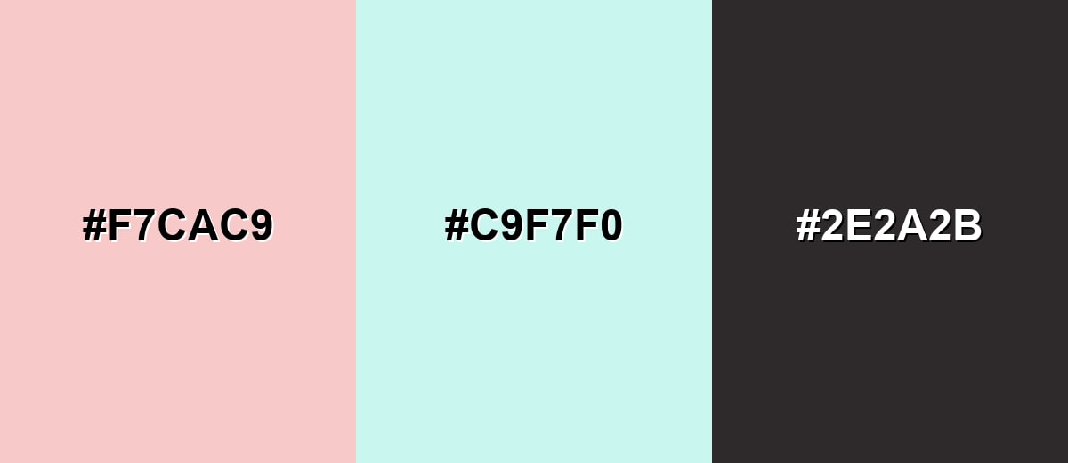
Complementary Colors
A complementary pairing adds crisp energy by contrasting rose quartz with a cool mint tone. This creates a fresh, balanced look that still feels soft.
Complementary Palette Example: Try rose quartz with a pale mint and a charcoal anchor for clean contrast.
Analogous Color Schemes
Analogous colors sit adjacent to each other on the color wheel, creating harmonious, cohesive palettes with subtle variation.
Warm analogous tones keep everything gentle by moving from blush into lighter and deeper roses.
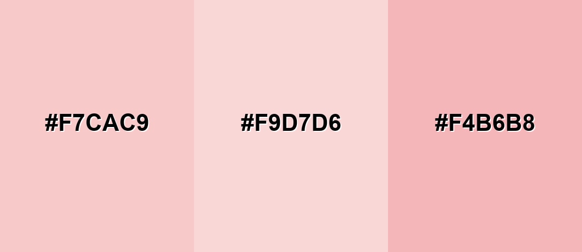
- Rose Quartz: #F7CAC9
- Pale Petal: #F9D7D6
- Rosy Clay: #F4B6B8
A peach-to-lilac analogous set feels airy and modern, great for editorial layouts and soft gradients.
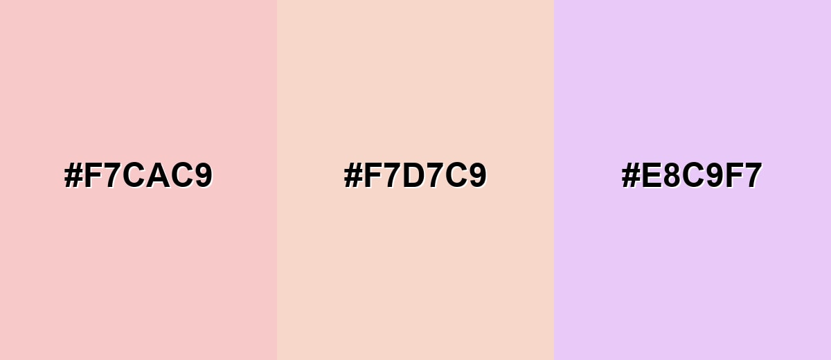
- Rose Quartz: #F7CAC9
- Peach Cream: #F7D7C9
- Lavender Mist: #E8C9F7
Triadic & Tetradic Combinations
Triadic palettes add variety while staying balanced, which helps when you need multiple UI accents.
Combine rose quartz with a mint green and a soft periwinkle for a playful but controlled mix.
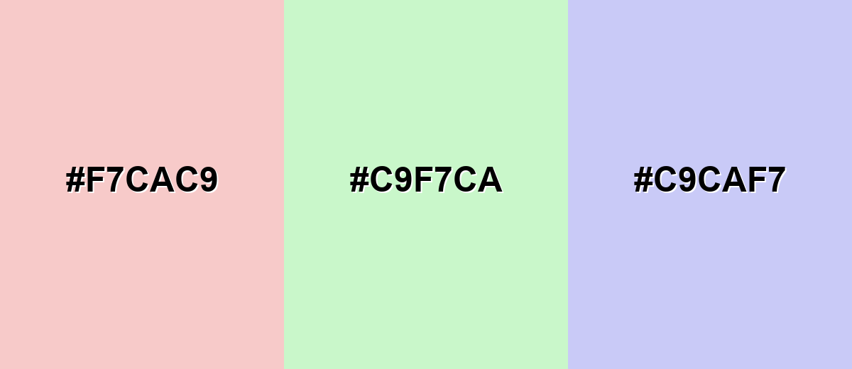
- Rose Quartz: #F7CAC9
- Mint Leaf: #C9F7CA
- Periwinkle: #C9CAF7
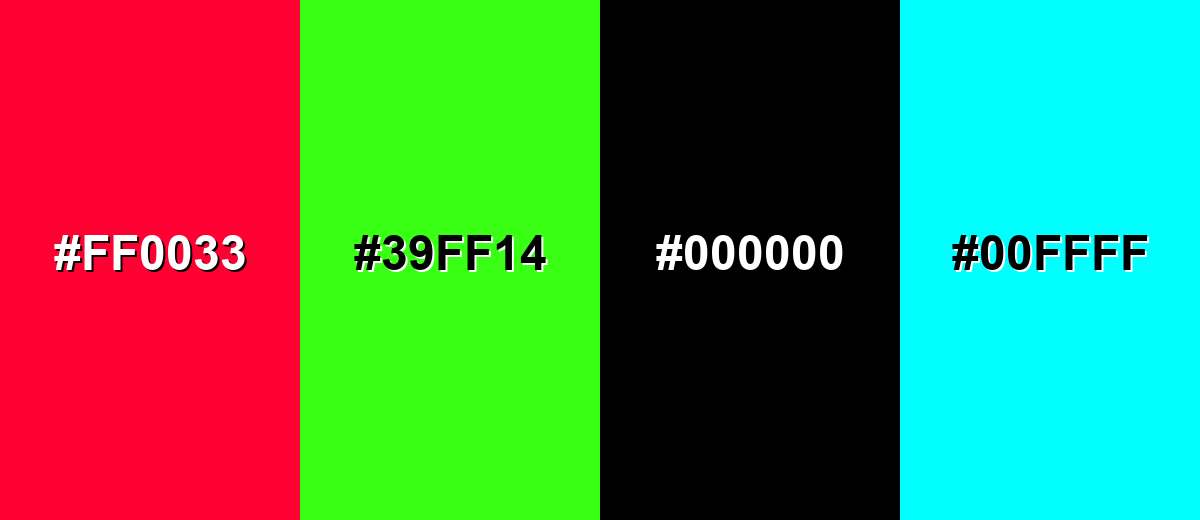
Colors to Avoid
While rose quartz is remarkably versatile, certain combinations can create problematic visual effects:
- Neon Crimson (#FF0033) - The saturation jump makes rose quartz look dull and can create a harsh, clashing hierarchy in layouts.
- Neon Green (#39FF14) - This pairing feels loud and unstable, pulling attention away from soft messaging and calm branding.
- Pure Black (#000000) - The contrast can be overly stark, making the overall look feel less gentle and more aggressive than intended.
- Electric Cyan (#00FFFF) - The high intensity competes with rose quartz and can read as mismatched across different screens.
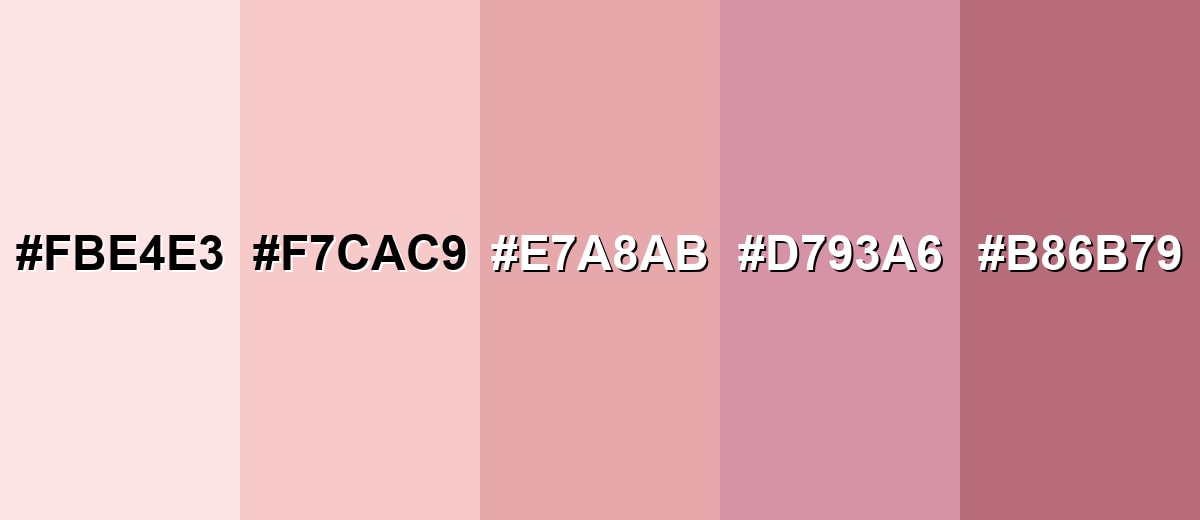
Shades, Tints & Variations of Rose Quartz
Rose quartz isn't just one pink—it's a whole range from barely-there blush tints to deeper, moodier rosewood tones. Knowing the spectrum makes it easier to build hierarchy in UI, create depth in print, and keep a palette cohesive across backgrounds, accents, and typography.
- Blush Tint (#FBE4E3) - A very light, airy tint that keeps the pink presence subtle and clean. It's best used for Backgrounds, large sections, soft UI surfaces, and minimal packaging..
- Rose Quartz (#F7CAC9) - The classic rose quartz tone: warm, muted blush with a calm, modern feel. It's best used for Secondary branding, hero backgrounds, gentle highlights, and lifestyle visuals..
- Dusty Rose (#E7A8AB) - A more grounded, slightly grayer rose that feels mature and editorial. It's best used for Typography accents, buttons (with contrast checks), and interior textiles..
- Mauve Rose (#D793A6) - A mauve-leaning rose that adds sophistication and pairs well with cool neutrals. It's best used for Brand accents, gradient endpoints, and cosmetic packaging details..
- Deep Rosewood (#B86B79) - A deeper rose that brings weight and structure while staying in the same family. It's best used for Headlines, icons, borders, and high-contrast UI accents alongside lighter pinks..
Industry Applications
Rose quartz is popular anywhere a soft, reassuring tone supports the message. These examples show where it fits naturally and how to keep it looking intentional.
Fashion & Beauty
- Supports a gentle, clean aesthetic on skincare product pages and packaging.
- Pairs well with minimal layouts and soft photography for a premium, modern feel.
- Works as a secondary tone for labels, ingredient callouts, and seasonal collections.
- Helps brands look approachable without relying on loud, saturated pinks.
Interior Design & Decor
- Warms up rooms without the intensity of brighter pinks, especially in bedrooms and living spaces.
- Feels best as an accent (textiles, upholstery, one wall) to avoid overpowering a room.
- Balances hard finishes like metal, glass, and concrete for a softer visual temperature.
- Plays nicely with warm woods and light neutrals for an airy, comfortable look.
Branding & Marketing
- Ideal for wellness and self-care messaging where a calmer emotional tone improves trust.
- Useful for friendly UI moments like onboarding, empty states, and subtle banners.
- Fits boutique e-commerce brands that want warmth while keeping the design clean and cohesive.
- Performs best when balanced with darker neutrals for readability and clear visual hierarchy.
Conclusion
Rose quartz (#F7CAC9) stands out as a soft, milky blush pink that feels warm, modern, and easy to use across branding, UI, print, and interiors. Its strength is emotional: it reads supportive, calm, and approachable—perfect for wellness, beauty, lifestyle, and any design that benefits from a gentler tone. The key to making it look intentional is contrast: anchor it with deep neutrals and add restrained cool accents so typography stays readable and layouts stay balanced.
Design Smarter with AI: Media.io is an online AI studio that empowers creators with advanced image generation and enhancement tools. From text-to-image and image-to-image creation to AI upscaling and color optimization, it enables fast, creative, and professional results—all in your browser.

Frequently Asked Questions About Rose Quartz Color
Rose quartz is a soft, muted blush pink inspired by the rose quartz gemstone. It is typically used to create a gentle, warm, and modern look in design.
It is commonly linked with tenderness, care, and warmth. In visual communication, it often feels supportive and approachable rather than bold or demanding.
A common digital reference is HEX #f7cac9, with RGB 247, 202, 201 and CMYK 0%,18%,19%,3%. Always test across devices and materials to confirm the appearance.
Muted greens, soft blues, light neutrals, and deep charcoals pair well. These combinations keep the palette balanced while preserving rose quartz's gentle mood.
They are close, and rose quartz is often described as a type of blush pink. The difference is that rose quartz usually looks slightly milkier and more muted, with less saturation.
It can be, but it needs careful contrast choices because it is very light. Use dark text and avoid relying on it alone to communicate states such as errors, success, or warnings.


