

 TL;DR:
Neon orange (#FF5F1F) is a high-visibility, high-energy hue best utilized sparingly as a spotlight accent for digital call-to-actions, alerts, and badges rather than full background fills to prevent user visual fatigue.
● True neon intensity is native to RGB screens, but physical printing typically requires specialized fluorescent spot inks because standard CMYK cannot replicate the glowing effect.
● To maintain structural contrast and UI readability, pair this color with deep neutrals or bright cyan, while strictly avoiding pure red (#FF0000) and neon yellow (#FFFF00) which cause harsh visual vibration.
● Fine text rendered in neon orange on light backgrounds poses a distinct readability risk, requiring designers to use heavier font weights or shift to a deeper shade like #D94A14 for interaction states.
Ask AI for a summary
 ChatGPT
 Perplexity
 Gemini
 Claude
 Grok
Grok
Neon orange color is a blazing, high-visibility orange that can look like it's glowing—especially when it sits next to darker tones. A common digital reference for this vivid hue is #FF5F1F.
Because it feels energetic, urgent, and playful, neon orange is hard to ignore in a layout. Below, you'll find the key color codes, conversion values, pairing ideas, shade options, and practical tips for using it without overwhelming your design.
Neon Orange Color: Codes & Values
If you're building with neon orange in UI, branding, or digital art, these are the core values to keep your color consistent across tools and screens.
| Parameters | VALUE |
| HEX Code | #FF5F1F |
| RGB DECIMAL | 255, 95, 31 |
| RGB PERCENTAGE | 100%, 37.3%, 12.2% |
| CMYK | 0%,63%,88%,0% |
| HSL | 17°, 100%, 56% |
| HSV (HSB) | 17°, 88%, 100% |
| Web Safe | #FF6633 |
Key Color Space Explanations:
- HEX - HEX is the most common way to specify a screen value in web design. Use #ff5f1f to match this neon orange precisely in CSS and design tools.
- RGB - RGB describes how much red, green, and blue light are mixed on a display. With 255, 95, 31, this hue is dominated by red for maximum intensity.
- CMYK - CMYK is used for printing with cyan, magenta, yellow, and black inks. Neon-looking oranges can shift in print, so use the CMYK value as a starting point and soft-proof when possible.
- HSL - HSL maps the hue angle plus saturation and lightness, which is helpful for building tints and shades. At 17° with full saturation, it sits firmly in the orange range with a bright mid-lightness.
- Web Safe - Web-safe values are older, limited palettes that approximate modern hues. #ff6633 is a close, widely supported alternative if you want a simplified match.
For most web and app design work, start with the HEX code and validate contrast on real screens; for print, treat CMYK as a baseline and test proofs when accuracy matters.
Neon Orange Color Conversions
Need neon orange in a different format for your editor, CSS, or print workflow? Use the conversion table below as a quick copy-and-paste reference.
| Parameters | VALUE | CSS |
| HEX | #ff5f1f | #ff5f1f |
| RGB DECIMAL | 255, 95, 31 | rgb(255,95,31) |
| RGB PERCENTAGE | 100%, 37.3%, 12.2% | rgb(100%,37.3%,12.2%) |
| CMYK | 0%,63%,88%,0% | cmyk(0%,63%,88%,0%) |
| HSL | 17°, 100%, 56% | hsl(17°, 100%, 56%) |
| HSV (or HSB) | 17°, 88%, 100% | -- |
| Web Safe | ff6633 | #ff6633 |
| CIE-LAB | 61.1, 59.0, 63.2 | -- |
| XYZ | 45.57, 29.51, 4.59 | -- |
| xyY | 0.572, 0.370, 29.51 | -- |
| CIE-LCH | 61.1, 86.5, 46.7° | -- |
| CIE-LUV | 61.1, 131.3, 48.2 | -- |
| Hunter-Lab | 54.4, 59.4, 32.6 | -- |
| Binary | 11111111 01011111 00011111 | -- |
Want to generate neon orange color photos or posters? Try Media.io's AI Image Generator now!
Neon Orange Meaning & Symbolism
Neon orange commonly represents high energy, visibility, and action. In everyday life, it is tied to moments when something needs to be noticed fast, from alerts to bold sporty styling. This is why neon orange color meaning often lands somewhere between fun and urgency, depending on the context.
Psychological Effects
Because it's warm and extremely bright, neon orange tends to push designs forward and demand attention.
- Upbeat Energy - Its warmth and brightness can feel lively, motivating, and "on."
- Urgency - In UI and signage, it often reads like an alert, making actions feel time-sensitive.
- Perceived Speed - Neon orange can make experiences feel faster or more intense, especially in motion-heavy layouts.
- Visual Fatigue - Overuse (especially in large blocks) can feel loud and tiring to look at.
- Readability Risk - Fine text in neon orange can appear shaky on light backgrounds, so contrast matters.
Positive Associations
Used intentionally, neon orange communicates confidence and modern punch without needing extra decoration.
- Playfulness - Brings a fun, youthful vibe that suits pop graphics and energetic brands.
- Confidence - Works like a spotlight color, making key messages feel bold and decisive.
- Action - Naturally fits buttons, badges, and "do this next" moments in product design.
- Visibility - Helps users find important elements quickly when hierarchy is clear.
- Modern Edge - Feels fresh in tech, streetwear, and event visuals when balanced with neutrals.
Cultural Significance Across the World
Neon orange tends to be understood through context—safety, sports, or entertainment can change its "tone" instantly.
- Safety & Caution - Often associated with high-visibility gear and quick-scan warning cues.
- Sports & Streetwear - Common in athletic styling and bold fashion drops where impact matters.
- Events & Nightlife - Reads as excitement and energy in posters, tickets, and club visuals.
- Attention-First Messaging - Generally signals "look here" across many settings, from promos to wayfinding.
Design Applications
Neon orange is easiest to use when you treat it as a spotlight rather than a backdrop. The goal is to control intensity so it stays readable and intentional.
Graphic Design Tips
- Use it as an accent - Save neon orange for buttons, badges, and key highlights instead of full-page fills.
- Build structure with neutrals - Surround it with deep grays, near-black, or muted off-whites to avoid visual overload.
- Increase spacing - Give neon orange elements room to breathe so they feel premium, not chaotic.
- Watch small type - If you must use it for text, go heavier in weight and test at real sizes.
- Plan for hover/active states - Use a darker shade for interactions so users can "feel" the state change.
If your layout starts to feel like it's shouting, pull neon orange back to one primary job (CTA, alert, or tag) and let the rest of the palette do the supporting work.
Neon Orange in Photography & Video
- Lean into contrast - Neon orange pops hardest against deep shadows, dark wardrobe, and night scenes.
- Use it as a hero prop - A single object (jacket, signage, product label) can anchor the frame without oversaturating everything.
- Control saturation carefully - Push too far and you'll lose detail; aim for "glow" without clipping.
- Try gradient lighting - Warm-to-cool mixes can make neon orange feel more dimensional and cinematic.
- Keep skin tones natural - If neon orange lighting spills onto faces, correct selectively to avoid unnatural warmth.
Recommended Tool for Image Enhancement: When incorporating neon orange into your photography projects, Media.io's AI Image tools can help you achieve more refined results. With AI-powered color enhancement, photo colorization, image upscaling, and old photo restoration, you can easily enrich neon orange tones, improve overall image quality, and highlight the color's elegant and sophisticated aesthetic.
Color Combinations
Neon orange pairs best with hues that either cool it down or give it clean structure. The combinations below cover classic harmony options plus a few cautionary mixes.
Complementary Colors
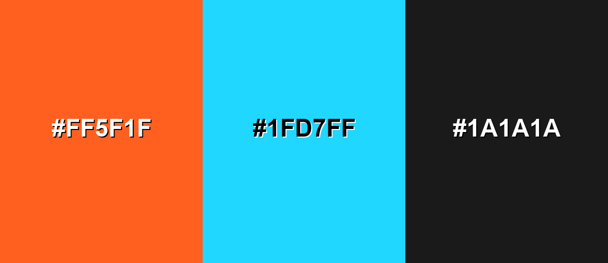
A complementary scheme uses the opposite hue on the color wheel to create maximum contrast and impact. With neon orange, bright cyan brings a crisp, modern energy while a dark neutral keeps the palette usable.
Complementary Palette Example: Pair Neon Orange with Electric Cyan and Charcoal for sharp contrast and a tech-forward look.
Analogous Color Schemes
Analogous colors sit adjacent to each other on the color wheel, creating harmonious, cohesive palettes with subtle variation.
Stay warm with a red-leaning and amber-leaning neighbor for a fiery gradient feel.
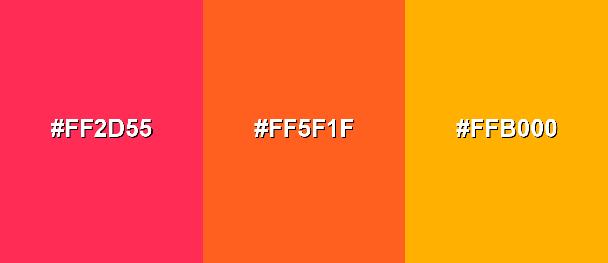
- Neon Red-Orange: #FF2D55
- Neon Orange: #FF5F1F
- Neon Amber: #FFB000
Push toward pop graphics by blending warm pink and bright yellow around neon orange.
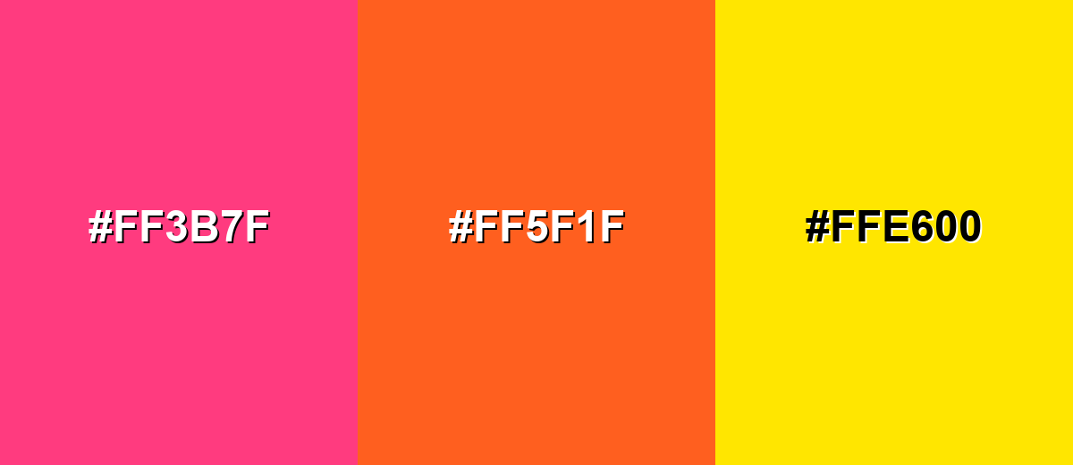
- Hot Pink: #FF3B7F
- Neon Orange: #FF5F1F
- Electric Yellow: #FFE600
Triadic & Tetradic Combinations
A triadic palette spreads three hues evenly for bold but balanced contrast.
Combine Neon Orange with Neon Lime and Electric Violet to get an energetic, playful mix that still feels structured.
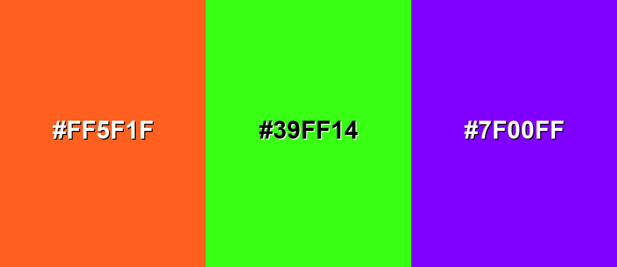
- Neon Orange: #FF5F1F
- Neon Lime: #39FF14
- Electric Violet: #7F00FF
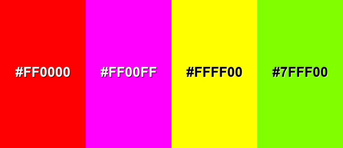
Colors to Avoid
While neon orange is remarkably versatile, certain combinations can create problematic visual effects:
- Pure Red (#FF0000) - Too close in warmth and intensity, which can create harsh visual vibration and muddy hierarchy.
- Hot Magenta (#FF00FF) - Both are high-saturation accents, so the pair can feel chaotic and reduce readability in UI.
- Neon Yellow (#FFFF00) - Extremely bright alongside neon orange, it can blow out highlights and make text and icons hard to scan.
- Bright Chartreuse (#7FFF00) - Competing neon warmth makes layouts feel noisy, especially in large blocks or dense graphics.
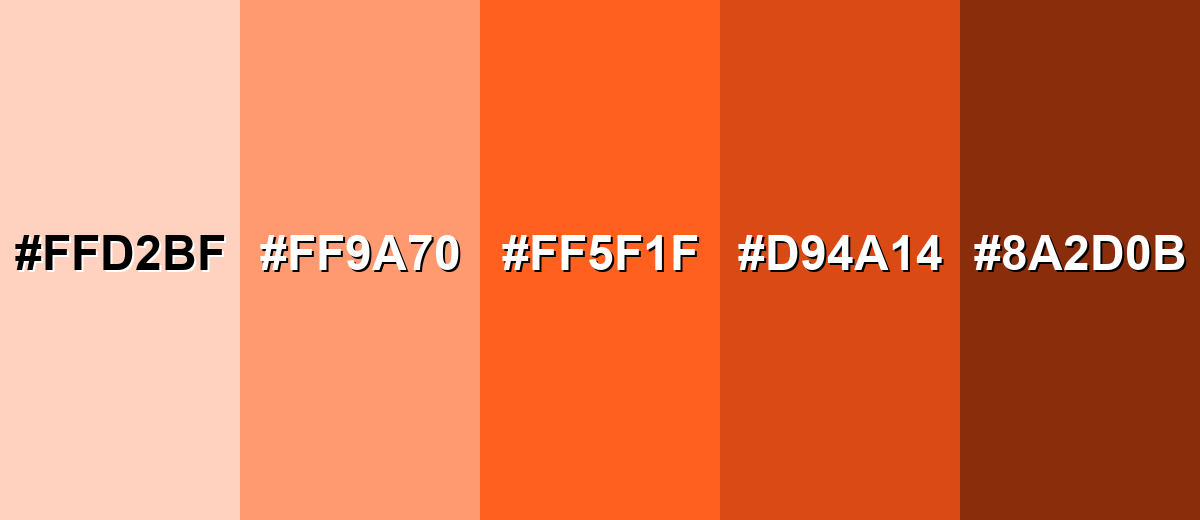
Shades, Tints & Variations of Neon Orange
Neon orange isn't just one "loud" color—its tints and shades give you a full range, from soft peachy backgrounds to deeper oranges that feel more grounded. This range is especially useful for building UI states, gradients, and supporting accents that still feel on-brand.
- Soft Peach Tint (#FFD2BF) - A pale, warm tint that keeps the friendly feel while reducing intensity. It's best used for Background panels, subtle highlights, and airy packaging..
- Light Neon Orange (#FF9A70) - A lighter, more approachable take that still reads lively and modern. It's best used for Large UI sections, hero gradients, and supportive brand accents..
- Neon Orange (#FF5F1F) - The vivid, high-impact base that looks bright and attention-grabbing on screens. It's best used for CTAs, alerts, tags, and small focal elements..
- Deep Orange Shade (#D94A14) - A darker version that feels more grounded while staying bold. It's best used for Hover states, outlines, typography on light backgrounds, and contrast layering..
- Burnt Orange (#8A2D0B) - A rich, earthy shade that reduces the neon feel and adds warmth and depth. It's best used for Premium packaging, autumnal palettes, and supporting neutrals in brand systems..
Industry Applications
Because neon orange is built for visibility, it shows up wherever quick recognition matters. These common use cases can help you choose the right context and pairing.
Fashion & Beauty
- Activewear Accents - Works well on trims, logos, and panels where motion and energy are the message.
- Streetwear Drops - Adds instant hype as a highlight color on graphics, tags, and limited releases.
- Sporty Color Blocking - Pairs cleanly with dark neutrals for sharp, modern contrast.
- Seasonless Pop - A small neon orange element can make an otherwise minimal look feel current.
Interior Design & Decor
- Statement Accessories - Use on a chair, art print, or décor piece to energize a room without taking over.
- Industrial Pairings - Looks striking against concrete gray, black, and warm wood tones.
- Wayfinding Moments - Great for small directional cues in studios, gyms, and modern workspaces.
- Accent-Only Approach - Large neon-painted surfaces can overwhelm, so keep it controlled and intentional.
Branding & Marketing
- Promotional Badges - Ideal for sale stickers and limited-time tags when you want fast scanning.
- Event Graphics - Strong for posters and tickets—especially on dark backdrops that enhance the "glow."
- App Highlights - Useful for onboarding cues, progress moments, and gamified states (with contrast checks).
- Bold Brand Personality - Signals movement and confidence when balanced with a stable supporting palette.
Conclusion
Neon orange stands out for its fluorescent, almost glowing intensity and its ability to pull focus instantly—making it a smart pick for CTAs, alerts, high-impact branding, posters, and fast-scanning visuals. Start with #FF5F1F for reliable digital consistency, then keep the color feeling premium by using it as an accent and balancing it with deep cool tones or calm neutrals. With the right pairings and a controlled footprint, neon orange delivers energy without turning your design into visual noise.
Design Smarter with AI: Media.io is an online AI studio that empowers creators with advanced image generation and enhancement tools. From text-to-image and image-to-image creation to AI upscaling and color optimization, it enables fast, creative, and professional results—all in your browser.

Frequently Asked Questions About Neon Orange Color
Neon orange is a very bright, high-visibility orange that can appear to glow, especially next to darker tones. It is often used as an accent to grab attention quickly.
They are related but not always identical. Safety orange is typically standardized for visibility in safety contexts, while neon orange in digital design often leans more fluorescent and saturated depending on the palette.
Deep navy, charcoal, bright cyan, and clean whites are common partners because they balance intensity and improve contrast. For playful palettes, neon lime or violet can also work when used carefully.
Use it sparingly for CTAs, badges, alerts, and key icons. Keep large surfaces neutral, and test contrast so text and interactive states remain readable.
Screens produce light using RGB, which can make highly saturated oranges look more luminous. Printing uses inks (CMYK), and true neon effects often require fluorescent spot inks or specialized processes.
A common web-safe approximation is #ff6633. It will not look identical to a modern neon palette, but it is a close simplified match.


