

Rose red color is a rich, rosy red that looks like a deep rose petal—red at its core, with a soft pink undertone. Its hex code is #C21F4A, giving it a vivid, modern punch without tipping into neon.
Often read as romantic, confident, and expressive, rose red is a go-to for accents and hero elements. Because it sits between red and pink, it can feel warmer or cooler depending on nearby hues and lighting—so this guide breaks down its meaning, codes, pairings, shades, and best-use scenarios.
Rose Red Color: Codes & Values
Use these core values to keep rose red consistent across UI, brand assets, and print handoffs.
| Parameters | VALUE |
| HEX Code | #C21F4A |
| RGB DECIMAL | 194, 31, 74 |
| RGB PERCENTAGE | 76.1%, 12.2%, 29.0% |
| CMYK | 0%,84%,62%,24% |
| HSL | 344°, 72%, 44% |
| HSV (HSB) | 344°, 84%, 76% |
| Web Safe | #CC3333 |
Key Color Space Explanations:
- HEX - HEX is the most common digital identifier for this shade in web and UI work. Use it to keep rose red consistent across screens and tools.
- RGB - RGB mixes red, green, and blue light to display rose red on screens. It is the go-to format for CSS effects, animations, and digital graphics.
- CMYK - CMYK is used for printing and describes ink percentages. It helps you predict how rose red may shift on paper compared to a backlit display.
- HSL - HSL organizes the shade by hue, saturation, and lightness, which makes adjustments feel more intuitive. It is handy when you need lighter tints or deeper tones while keeping the same hue family.
- Web Safe - Web safe is the closest legacy palette match for older displays and strict constraints. It is useful as a fallback when a system cannot render the exact shade reliably.
For most digital work, start with HEX (#C21F4A), switch to RGB for motion/filters, and use CMYK only after a print proof confirms the final look.
Rose Red Color Conversions
If you're moving between design tools (web, print, 3D, or motion), this conversion table helps you keep rose red aligned across formats.
| Parameters | VALUE | CSS |
| HEX | #c21f4a | #c21f4a |
| RGB DECIMAL | 194, 31, 74 | rgb(194,31,74) |
| RGB PERCENTAGE | 76.1%, 12.2%, 29.0% | rgb(76.1%,12.2%,29.0%) |
| CMYK | 0%,84%,62%,24% | cmyk(0%,84%,62%,24%) |
| HSL | 344°, 72%, 44% | hsl(344°, 72%, 44%) |
| HSV (or HSB) | 344°, 84%, 76% | -- |
| Web Safe | cc3333 | #cc3333 |
| CIE-LAB | 42.8, 61.5, 19.0 | -- |
| XYZ | 24.00, 12.95, 7.71 | -- |
| xyY | 0.537, 0.290, 12.95 | -- |
| CIE-LCH | 42.8, 64.4, 17.2° | -- |
| CIE-LUV | 42.8, 111.2, 8.0 | -- |
| Hunter-Lab | 36.0, 59.8, 11.4 | -- |
| Binary | 11000010 00011111 01001010 | -- |
Want to generate Rose Red Color photos or posters? Try Media.io's AI Image Generator now!
Rose Red Color Meaning & Symbolism
Rose red usually represents affection with strength—more grounded than light pink, but softer than pure red. In everyday life it often signals passion, celebration, care, and bold self-expression without feeling harsh. That balance is a big reason rose red color symbolism shows up so often in gifting, beauty, and modern brand accents.
Psychological Effects
Emotionally, rose red lands fast—warm, energetic, and personal when it's used with restraint.
- Energy - It tends to feel lively and motivating, helping key messages stand out quickly.
- Emotional Warmth - The rosy undertone makes it feel human and inviting rather than harsh.
- Attention & Focus - In UI and layouts, it naturally pulls the eye toward primary actions and highlights.
- Approachability - Compared with a pure red, it often reads more friendly and community-oriented.
- Overuse Risk - Large blocks can feel loud or overly romantic, and may cause visual fatigue on bright backgrounds.
Positive Associations
When you want intensity without aggression, rose red is a smart middle ground between red and pink.
- Affection - Communicates care and admiration in a way that feels modern and confident.
- Confidence - Feels bold and expressive, making it effective for standout moments.
- Celebration - Works well for promotions, gifting, and "special occasion" visuals.
- Beauty - Often linked to style and self-expression in fashion and cosmetics contexts.
- Passion - Suggests romantic energy, especially when paired with soft neutrals or floral tones.
Cultural Significance Across the World
Like many rose-inspired reds, its meaning is strongly shaped by context, audience, and tradition.
- Rose Symbolism - Commonly associated with love, admiration, and heartfelt gestures due to rose traditions.
- Celebratory Use - Frequently appears in event design and gifting where warmth and romance matter.
- Beauty & Femininity - Often tied to elegance and beauty in lifestyle and personal-care visuals (with audience variation).
- Context Dependence - Interpretations shift by region and setting, so pairing and messaging should guide the tone.
Design Applications
Rose red works best when you treat it as a focused statement shade: bold enough for emphasis, but refined enough to stay elegant. The key is controlling contrast, spacing, and the supporting palette so it feels intentional rather than overwhelming.
Graphic Design Tips
- Use it as a "hero" accent - Keep rose red for CTAs, labels, and key highlights so it reads premium, not overpowering.
- Anchor with neutrals - Warm whites and soft grays help the rosy undertone feel clean and deliberate.
- Build a clear hierarchy - Let rose red be the loudest note, then support it with calmer surrounding colors.
- Check contrast early - White or near-white text is usually the safest on rose red backgrounds; verify in your tool.
- Plan for print shifts - Proof it on your target stock and finish, since rose red can deepen on uncoated paper.
If you need a quick system, create tints and deeper tones using HSL adjustments so the hue stays consistent while your UI or brand layouts gain flexibility.
Rose Red Color in Photography & Video
- Wardrobe and props - Rose red is great for a controlled "pop" in portraits, product shoots, and lifestyle scenes.
- Lighting awareness - Warm lighting pushes it redder; cooler lighting can bring out the pink undertone.
- Skin-tone balance - Keep saturation in check so the shade stays flattering and doesn't overpower faces.
- Color grading - Pair with teal/blue shadows for modern contrast, but avoid extreme cyan mixes that look noisy.
- Compression safety - Highly saturated reds can band in gradients; soften transitions and monitor export settings.
Recommended Tool for Image Enhancement: When incorporating rose red color into your photography projects, Media.io's AI Image tools can help you achieve more refined results. With AI-powered color enhancement, photo colorization, image upscaling, and old photo restoration, you can easily enrich rose red color tones, improve overall image quality, and highlight the color's elegant and sophisticated aesthetic.
Color Combinations
Rose red pairs beautifully with calm neutrals, crisp greens, and deep blues. Below are reliable palettes you can use for branding, UI accents, illustrations, and layouts—each designed to keep the rosy undertone feeling intentional.
Complementary Colors
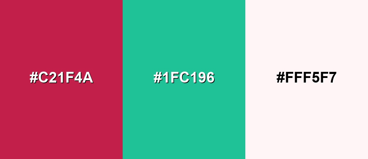
The complementary partner for rose red is a blue-leaning green, which creates strong, lively contrast. This combo is attention-grabbing, so it works best when one shade leads and the other supports.
Complementary Palette Example: Try rose red with a fresh teal and a warm white base for a clean, modern balance.
Analogous Color Schemes
Analogous colors sit adjacent to each other on the color wheel, creating harmonious, cohesive palettes with subtle variation.
For a romantic, cohesive look, blend rose red with neighboring purples and coral-leaning reds.
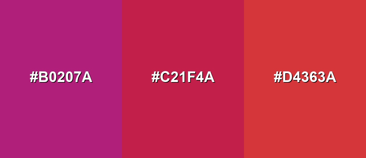
- Rose Purple: #B0207A
- Rose Red: #C21F4A
- Coral Red: #D4363A
For richer, moodier visuals, keep the hue family tight and shift depth between magenta and cherry.
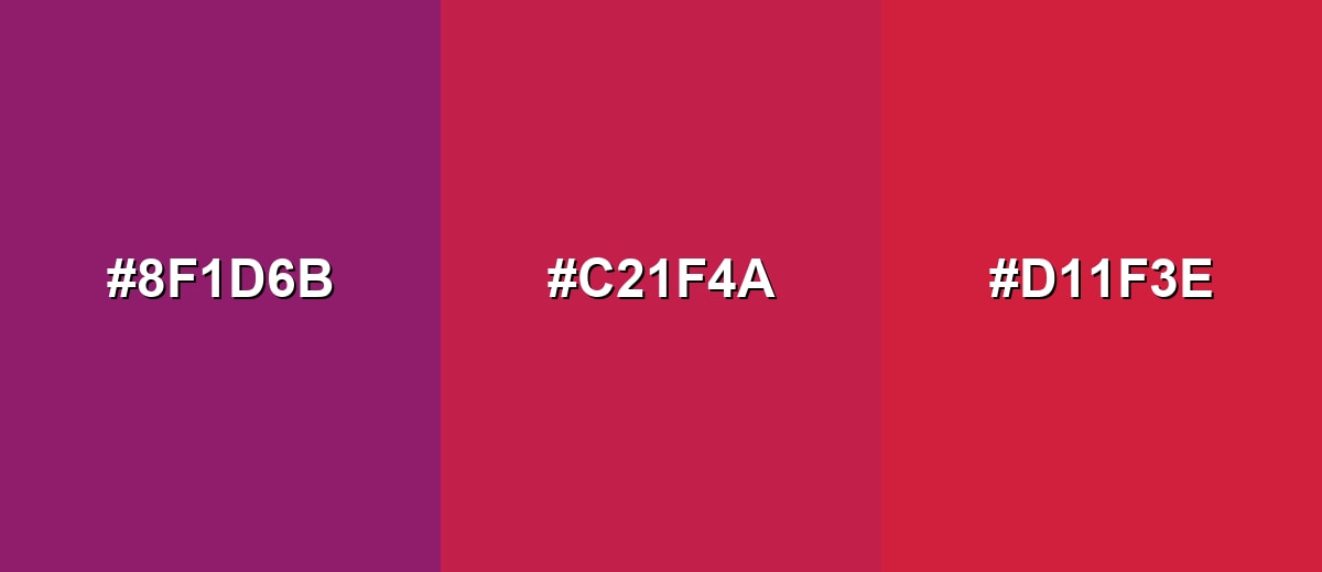
- Mulberry: #8F1D6B
- Rose Red: #C21F4A
- Cherry Red: #D11F3E
Triadic & Tetradic Combinations
A triadic palette gives you contrast without the harshness of direct complements.
Pair rose red with a zesty green and a strong blue for playful, high-energy designs.
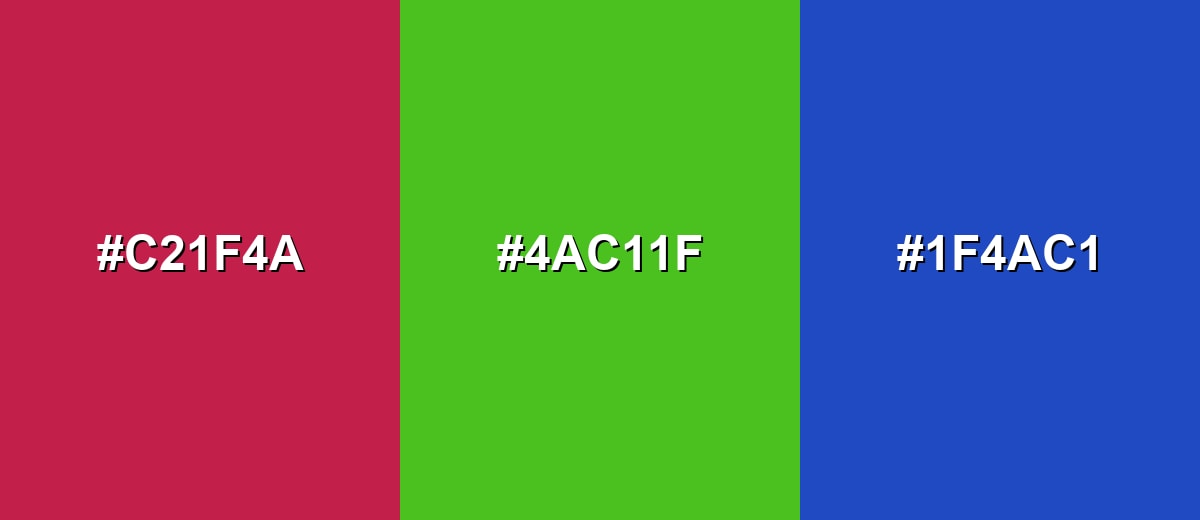
- Rose Red: #C21F4A
- Zesty Green: #4AC11F
- Royal Blue: #1F4AC1
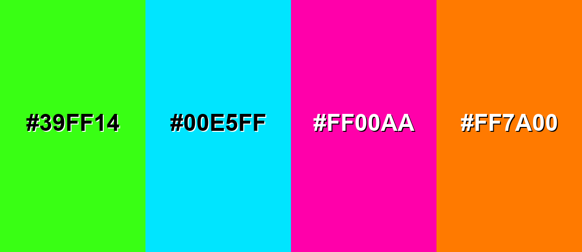
Colors to Avoid
While rose red color is remarkably versatile, certain combinations can create problematic visual effects:
- Neon Green (#39FF14) - The extreme saturation clashes and can create a vibrating edge effect next to rose red, especially in small UI elements.
- Electric Cyan (#00E5FF) - Both shades compete for attention, which can make layouts feel noisy and reduce hierarchy.
- Neon Magenta (#FF00AA) - Too close in hue but much brighter, it can make rose red look dull or muddy by comparison.
- Bright Orange (#FF7A00) - The warmth stacks up quickly and can feel overly intense, especially on light backgrounds.
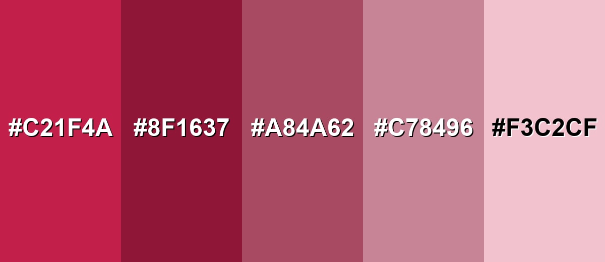
Shades, Tints & Variations of Rose Red Color
Rose red has a useful range—from deep, wine-like tones to soft blush tints. Exploring these variations helps you build a flexible palette for UI states, brand systems, backgrounds, and highlights while keeping the same rosy direction.
- Rose Red (#C21F4A) - A vivid rose-petal red with a pink undertone and strong presence. It's best used for Primary accents, hero buttons, standout highlights.
- Deep Rose Red (#8F1637) - A darker, wine-leaning version that feels more dramatic and mature. It's best used for Headings, luxury branding, evening themes, rich backgrounds.
- Muted Rose (#A84A62) - A softened, slightly gray version that reads calmer and more editorial. It's best used for Background tints, cards, subtle UI states, typography accents.
- Dusty Rose (#C78496) - A balanced, desaturated rose that feels gentle and approachable. It's best used for Lifestyle visuals, wellness branding, soft gradients, packaging.
- Blush Tint (#F3C2CF) - A light, airy tint that keeps the rosy direction while staying delicate. It's best used for Large backgrounds, gentle highlights, minimal interfaces.
Industry Applications
Because rose red sits between classic red and pink, it adapts well across industries that need warmth, attention, and a premium feel. It can signal excitement in small accents or create a romantic tone in broader visual systems when paired with quiet neutrals.
Fashion & Beauty
- Cosmetics packaging - Works well for limited-edition boxes, labels, and premium finishes.
- Shade storytelling - Strong for lip and nail visuals, shade naming graphics, and product badges.
- Campaign accents - Adds punch to seasonal drops, lookbooks, and editorial typography.
- Social templates - Ideal for swipe-stopping highlights without going full neon.
Interior Design & Decor
- Textiles and accents - Great on pillows, throws, and artwork for a lively, welcoming mood.
- Statement moments - Effective for a single feature wall when balanced with calm neutrals.
- Natural material pairing - Looks polished with wood, stone, and linen textures.
- Controlled saturation - Avoid stacking too many high-saturation neighbors so the space doesn't feel noisy.
Branding & Marketing
- Signature highlights - Strong choice for brand marks, packaging accents, and recognizable UI moments.
- CTA performance - Works well for primary buttons, badges, selected states, and promotional banners.
- Celebration themes - Popular for events and gifting where warmth and emotion matter.
- Clarity in messaging - In digital products, pair with labels/icons so status isn't communicated by color alone.
Conclusion
Rose red stands out because it blends the energy of red with a softer, rosier edge—making it ideal for designers who want bold emphasis without a harsh feel. With #C21F4A as your reliable anchor, you can keep branding, UI components, photography overlays, and print pieces consistent across tools and formats. Pair it with calm neutrals for a polished look, or lean into teal and deep blue for crisp contrast and hierarchy. Used thoughtfully (especially as an accent), rose red delivers a memorable, modern tone that still feels approachable.
Design Smarter with AI: Media.io is an online AI studio that empowers creators with advanced image generation and enhancement tools. From text-to-image and image-to-image creation to AI upscaling and color optimization, it enables fast, creative, and professional results—all in your browser.

Frequently Asked Questions About Rose Red Color
Rose red is a saturated rosy red that sits between red and pink. It resembles the deeper tones of rose petals and is often used as a bold accent shade.
It is generally warm because it is red-based, but the pink undertone can make it feel slightly cooler than orange-leaning reds. Surrounding hues and lighting can push it warmer or cooler.
It commonly represents affection, confidence, celebration, and expressive energy. In everyday visuals, it often communicates warmth and emotional closeness without being as intense as pure red.
Reliable pairings include warm whites, soft grays, deep navy, teal greens, and gentle blush tints. For higher contrast, use its complementary teal and keep one shade dominant.
Use it for key actions like primary buttons, badges, or selected states, and keep the rest of the UI neutral. Limit large blocks of rose red and verify text contrast to maintain readability.
Blush pink is lighter and softer with more white mixed in, while burgundy is darker and more purple-brown. Rose red sits in the middle: brighter than burgundy and stronger than blush.


