

Red orange color is a fiery in-between shade that lives right on the border of bright red and vivid orange—think heated metal, embers, or the edge of a sunset.
The go-to digital reference for this look is #FF5349, a saturated red-leaning orange that feels energetic, bold, and made to grab attention.
Red Orange Color: Codes & Values
If you're trying to match red orange across tools (web, UI, print, and templates), these are the core values designers typically reference.
| Parameters | VALUE |
| HEX Code | #FF5349 |
| RGB DECIMAL | 255, 83, 73 |
| RGB PERCENTAGE | 100%, 32.5%, 28.6% |
| CMYK | 0%,67%,71%,0% |
| HSL | 3°, 100%, 64% |
| HSV (HSB) | 3°, 71%, 100% |
| Web Safe | #FF6633 |
Key Color Space Explanations:
- HEX - HEX is the most common way to specify a screen-ready shade in web and UI work. Use #ff5349 to reproduce this red orange consistently across digital tools.
- RGB - RGB describes how much red, green, and blue light is mixed to create the shade on displays. Higher red with moderate green and blue gives red orange its hot, vivid look.
- CMYK - CMYK is used for print, based on ink percentages. These values help you get closer to the same warm punch on paper, though results can vary by stock and finish.
- HSL - HSL organizes the shade by hue, saturation, and lightness, which is handy for picking tints and shades. It also makes it easier to plan harmonious palettes around nearby hues.
- Web Safe - Web-safe values are the closest match from an older standard palette. #ff6633 is a practical fallback when you need a broadly compatible approximation.
For consistent results, set the HEX value in your UI styles, then use HSL to create softer tints or deeper shades while keeping the same overall hue direction.
Red Orange Color Conversions
Need red orange in a different format for a specific tool or workflow? Use this conversion chart to copy the exact value you need.
| Parameters | VALUE | CSS |
| HEX | #ff5349 | #ff5349 |
| RGB DECIMAL | 255, 83, 73 | rgb(255,83,73) |
| RGB PERCENTAGE | 100%, 32.5%, 28.6% | rgb(100%,32.5%,28.6%) |
| CMYK | 0%,67%,71%,0% | cmyk(0%,67%,71%,0%) |
| HSL | 3°, 100%, 64% | hsl(3°, 100%, 64%) |
| HSV (or HSB) | 3°, 71%, 100% | -- |
| Web Safe | ff6633 | #ff6633 |
| CIE-LAB | 60.0, 64.5, 42.2 | -- |
| XYZ | 45.53, 27.93, 9.33 | -- |
| xyY | 0.550, 0.337, 27.93 | -- |
| CIE-LCH | 60.0, 77.1, 33.2° | -- |
| CIE-LUV | 60.0, 133.6, 32.7 | -- |
| Hunter-Lab | 52.9, 66.1, 25.6 | -- |
| Binary | 11111111 01010011 01001001 | -- |
Want to generate Red Orange Color photos or posters? Try Media.io's AI Image Generator now!
Red Orange Color Meaning & Symbolism
Red orange is commonly linked with heat, momentum, and confident expression. In everyday life, this Red Orange Color meaning often shows up where you want something to feel bold, upbeat, and impossible to miss.
Psychological Effects
Because it's bright and warm, red orange tends to create fast emotional "impact" in a design or space.
- Energy Boost - Often feels energizing, making layouts seem more active and lively.
- Urgency Signal - Can communicate "act now," which is why it's common for calls to action and limited-time messages.
- Friendly Boldness - Reads adventurous and approachable when balanced with clean neutrals.
- Intensity & Heat - In large blocks, it can feel intense and make a space or screen feel "hotter" or more crowded.
- Focus Direction - Works best as an accent that guides the eye—especially when contrast is carefully tested for readability.
Positive Associations
When used with intention, red orange can add a confident, optimistic tone that feels modern and human.
- Warmth - Suggests comfort and heat, similar to firelight and sunset tones.
- Momentum - Implies movement, drive, and forward progress in campaigns and interfaces.
- Confidence - Feels bold and expressive, making brand accents more decisive.
- Celebration - Commonly reads festive and upbeat, helping visuals feel more social and inviting.
- Vitality - Adds a "full of life" mood that can make designs feel more energetic and fresh.
Cultural Significance Across the World
Its symbolism can shift by context, so it's smart to consider audience, category, and placement.
- Fire & Sunsets - Frequently connected to warmth and natural glow because it resembles flames and evening skies.
- Festive Spirit - Often used to communicate celebration and lively gatherings in visual culture.
- Vital Energy - Can signal liveliness and passion, especially in entertainment and sports contexts.
- Caution Notes - In some settings, it may hint at warning or alert messaging, so intent and hierarchy matter.
Design Applications
Red orange is easiest to use when you decide what role it should play: main brand tone, supporting accent, or short-term highlight. The suggestions below help you keep its energy while maintaining balance and clarity.
Graphic Design Tips
- Use red orange for CTAs, badges, or key highlights where fast attention matters most.
- Balance it with whitespace and restrained typography so the layout doesn't feel overly loud.
- Pair it with a cool counter-tone (like cyan/teal) for modern contrast in posters and social graphics.
- Keep text readable by reserving red orange for icons, borders, and emphasis rather than long paragraphs.
- For packaging or labels, combine it with a simple palette so the design still feels premium and clear.
Pro tip: If the base shade feels too intense, nudge it toward a coral tint or slightly reduce saturation—then re-check contrast on real devices and in real lighting.
Red Orange Color in Photography & Video
- Use red orange wardrobe, props, or set details as "eye magnets" that pull focus without overpowering the frame.
- In color grading, treat it like an accent—boost selectively so skin tones don't skew too red.
- Watch for clipping in bright reds/oranges, especially in sunsets, neon signage, and stage lighting.
- For a sharper cinematic look, balance warm highlights with cooler shadows for cleaner separation.
- On saturated screens, test multiple devices to avoid overcooked reds in exports and thumbnails.
Recommended Tool for Image Enhancement: When incorporating red orange color into your photography projects, Media.io's AI Image tools can help you achieve more refined results. With AI-powered color enhancement, photo colorization, image upscaling, and old photo restoration, you can easily enrich red orange color tones, improve overall image quality, and highlight the color's elegant and sophisticated aesthetic.
Color Combinations
Red orange pairs best with either crisp cool tones (to create contrast) or nearby warm hues (to keep a smooth, sunset-like flow). Use the palettes below as starting points, then adjust lightness to match your layout and readability needs.
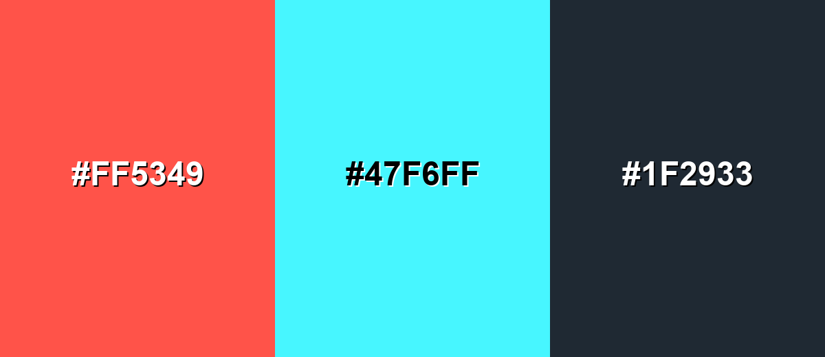
Complementary Colors
A complementary pairing uses the opposite side of the color wheel to create the strongest contrast. With red orange, a bright cyan or teal can make the warm tone feel even more vivid and modern.
Complementary Palette Example: Try red orange with bright cyan and a dark neutral to keep the contrast clean and usable.
Analogous Color Schemes
Analogous colors sit adjacent to each other on the color wheel, creating harmonious, cohesive palettes with subtle variation.
Warm analogous blend: Vivid Red, Red Orange, and Tangerine for a punchy, flame-like palette.
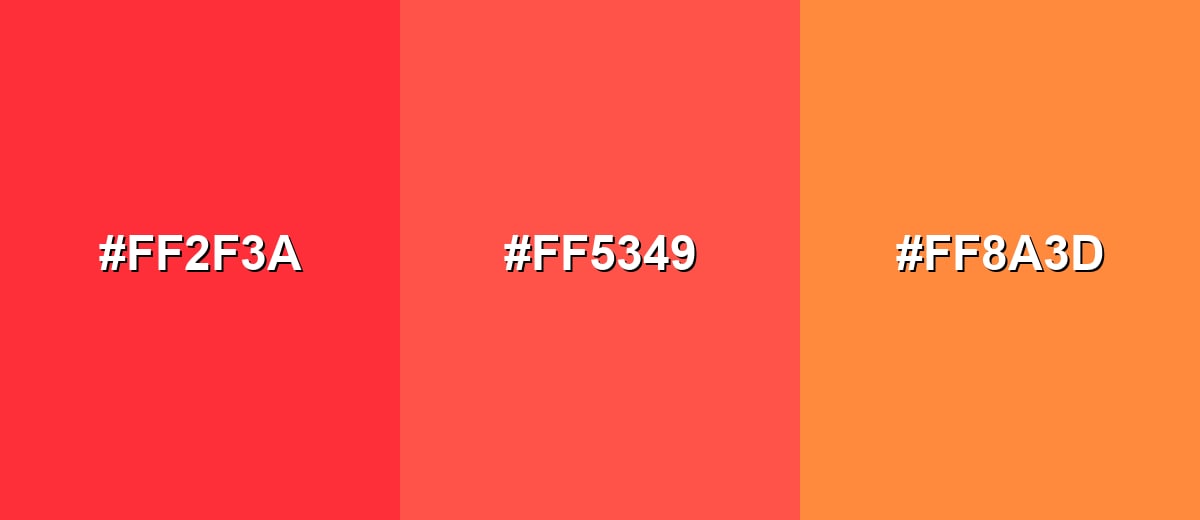
- Vivid Red: #FF2F3A
- Red Orange: #FF5349
- Tangerine: #FF8A3D
Soft analogous set: Brick, Coral, and Apricot for a friendlier, more approachable warmth.
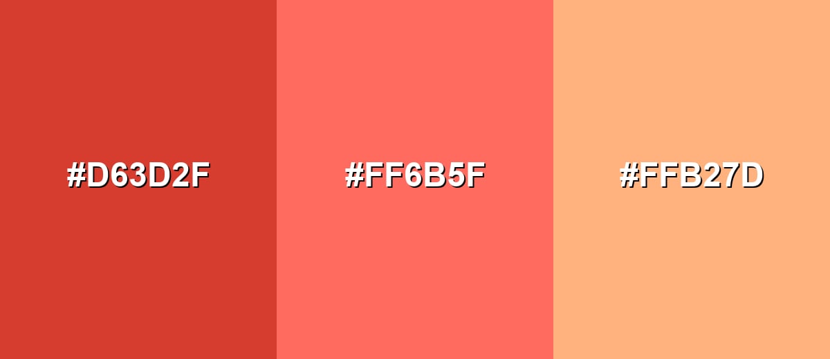
- Brick: #D63D2F
- Coral: #FF6B5F
- Apricot: #FFB27D
Triadic & Tetradic Combinations
A triadic palette spreads hues evenly, giving you variety without losing balance.
Triadic mix: Red Orange with Sea Green and Royal Purple for a lively, modern contrast.
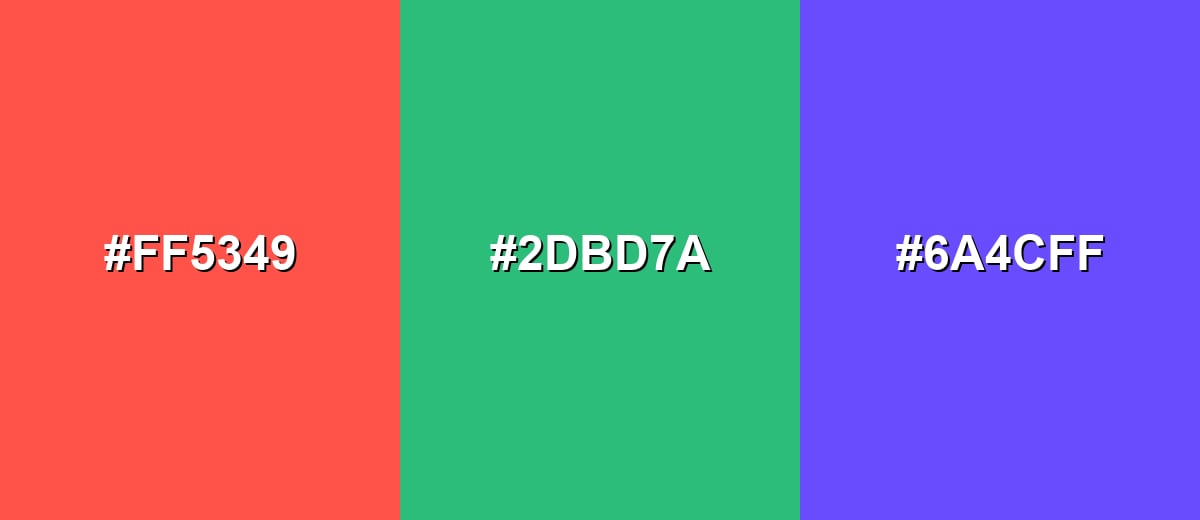
- Red Orange: #FF5349
- Sea Green: #2DBD7A
- Royal Purple: #6A4CFF
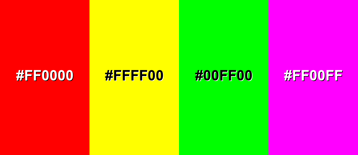
Colors to Avoid
While red orange color is remarkably versatile, certain combinations can create problematic visual effects:
- Pure Red (#FF0000) - Too close in intensity and hue, which can feel aggressive and muddy the hierarchy in UI or posters.
- Pure Yellow (#FFFF00) - Creates harsh vibration at high saturation and can reduce legibility, especially for small text.
- Neon Green (#00FF00) - Competes for attention and often looks jarring unless you are intentionally designing a neon aesthetic.
- Neon Magenta (#FF00FF) - Can overwhelm the composition and make red orange feel less intentional, particularly in branding work.
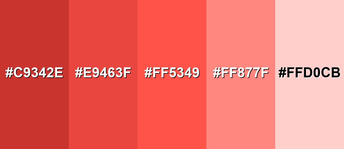
Shades, Tints & Variations of Red Orange Color
Red orange has a surprisingly flexible range—from grounded, deeper tones to soft, airy tints. Exploring these variations helps you keep the same warm personality while adjusting readability, mood, and visual "volume" across different layouts.
- Deep Red Orange (#C9342E) - A darker, heavier version that keeps the warmth but feels more grounded and serious. It's best used for Headers, overlays, and accents where you want intensity without the brightness.
- Rich Red Orange (#E9463F) - A slightly deeper take that stays saturated while reading a bit more refined than the brightest tone. It's best used for Buttons, badges, and brand accents with a confident, energetic feel.
- Classic Red Orange (#FF5349) - The vivid midpoint between red and orange, bright and attention-grabbing. It's best used for Highlights, CTA elements, and hero accents that need to stand out quickly.
- Soft Coral Tint (#FF877F) - A lighter, friendlier variation that feels warmer and more approachable than the base shade. It's best used for Background panels, illustrations, and lifestyle branding where softness matters.
- Pale Peach Blush (#FFD0CB) - A gentle pastel tint that hints at red orange without the strong saturation. It's best used for Large backgrounds, cards, and subtle UI states where you want warmth without noise.
Industry Applications
Because it reads as warm and energetic, red orange shows up in industries that benefit from fast attention, appetite appeal, or bold differentiation. The key is deciding whether it should be a headline tone or a controlled accent.
Fashion & Beauty
- Use red orange as a statement accent in seasonal collections where warmth and energy are the message.
- In activewear and athleisure, it can add a "speed" feeling without going full warning-red.
- For cosmetics visuals, it pairs naturally with warm complexions—great for bold lip, blush, or nail themes.
- As an accessory color (bags, sneakers, trims), it delivers impact without taking over the whole look.
Interior Design & Decor
- Use it on smaller elements like cushions, vases, or artwork for warmth without overheating a room.
- Balance with muted woods and warm whites to keep the vibe inviting and livable.
- For a modern contrast, set it against deeper, darker anchors (like navy-like tones) to add depth.
- In well-lit spaces, consider softer tints to avoid harsh saturation bouncing off bright walls.
Branding & Marketing
- Works well for CTA buttons, promo badges, and "new" highlights that need instant visibility.
- In food and beverage, it can suggest warmth, spice, and roasted flavor cues on packs and menus.
- For entertainment and events, it helps posters and thumbnails stand out quickly in crowded feeds.
- In tech products, it's most effective as an accent for notifications and feature callouts rather than a full UI background.
Conclusion
Red orange sits in that sweet spot between red's intensity and orange's friendliness, which is why it feels so confident, hot, and upbeat in real-world design. Start with #FF5349 for strong highlights and CTAs, then soften into coral or peach tints when you need a warmer, calmer background. To keep layouts readable, pair it with steady neutrals or crisp cool contrasts—and use it with a clear job in mind (accent, spotlight, or hero moment) so the energy stays intentional rather than overwhelming.
Design Smarter with AI: Media.io is an online AI studio that empowers creators with advanced image generation and enhancement tools. From text-to-image and image-to-image creation to AI upscaling and color optimization, it enables fast, creative, and professional results—all in your browser.

Frequently Asked Questions About Red Orange Color
Here are the most common questions designers ask when working with red orange in palettes, branding, and UI.
It looks like a vivid warm tone between red and orange, similar to glowing embers, ripe persimmon, or a bright sunset edge. It usually appears energetic and intense rather than soft.
A common hex value for red orange is #ff5349. This is a saturated red-leaning orange that works well for digital design and strong accents.
It depends on the exact shade, but red orange typically leans slightly closer to red than standard orange does. That red influence is what makes it feel bolder and more urgent.
Cool cyan or teal tones create strong contrast, while warm neighbors like tangerine and coral create a smooth, sunset-like palette. Deep neutrals (charcoal and near-black) help keep it controlled and readable.
Use it as an accent for CTAs, icons, or small highlights rather than a full background. Balance it with generous whitespace and neutrals, and always test text contrast at real sizes.
Red orange is usually more saturated and closer to red, which makes it feel hotter and more attention-driven. Coral tends to be lighter or softer, often with a friendlier, less urgent vibe.


