

Mint green color is a soft, pale green with a cool, slightly bluish freshness—like new mint leaves mixed with a hint of white. Its most recognized HEX code is #98FF98, a bright pastel that feels clean and lively on screens.
It's often associated with renewal, calm energy, and a light, hygienic vibe. Below, you'll find mint green color codes, conversions, matching palettes, popular shades, and practical design tips for real projects.
Mint Green Color: Codes & Values
If you're building a palette or a design system, these are the core mint green values you'll use most often across web, UI, and print workflows.
| Parameters | VALUE |
| HEX Code | #98FF98 |
| RGB DECIMAL | 152, 255, 152 |
| RGB PERCENTAGE | 59.6%, 100%, 59.6% |
| CMYK | 40%,0%,40%,0% |
| HSL | 120°, 100%, 80% |
| HSV (HSB) | 120°, 40%, 100% |
| Web Safe | #99FF99 |
Key Color Space Explanations:
- HEX - HEX is the most common way to specify a screen color in web design. #98ff98 represents the red, green, and blue channels in a compact 6-digit format.
- RGB - RGB defines the amount of red, green, and blue light used on displays. Mint green is 152 red, 255 green, and 152 blue, giving it a bright, airy green appearance.
- CMYK - CMYK is used for printing and describes ink percentages. The 40%,0%,40%,0% mix suggests a light green made mainly from cyan and yellow with no black ink.
- HSL - HSL describes hue, saturation, and lightness, which can be easier to tweak for UI themes. At 120° with high saturation and high lightness, it stays vivid while still reading pastel.
- Web Safe - Web-safe values are the closest matches from an older, limited palette used across systems. The nearest web-safe match to #98ff98 is #99ff99.
Use HEX/RGB for digital design, and rely on CMYK when prepping files for print—then proof early, since light greens can shift depending on paper and coating.
Mint Green Color Conversions
Need mint green color in a different format? Here's a quick conversion table for common design and color science workflows.
| Parameters | VALUE | CSS |
| HEX | #98ff98 | #98ff98 |
| RGB DECIMAL | 152, 255, 152 | rgb(152,255,152) |
| RGB PERCENTAGE | 59.6%, 100%, 59.6% | rgb(59.6%,100%,59.6%) |
| CMYK | 40%,0%,40%,0% | cmyk(40%,0%,40%,0%) |
| HSL | 120°, 100%, 80% | hsl(120°, 100%, 80%) |
| HSV (or HSB) | 120°, 40%, 100% | -- |
| Web Safe | 99ff99 | #99ff99 |
| CIE-LAB | 91.2, -48.5, 34.1 | -- |
| XYZ | 61.8, 85.4, 45.9 | -- |
| xyY | 0.300, 0.415, 85.4 | -- |
| CIE-LCH | 91.2, 59.3, 144.8 | -- |
| CIE-LUV | 91.2, -62.0, 50.0 | -- |
| Hunter-Lab | 92.4, -32.0, 20.0 | -- |
| Binary | 10011000 11111111 10011000 | -- |
Want to generate Mint Green Color photos or posters? Try Media.io's AI Image Generator now!
Mint Green Color Meaning & Symbolism
Mint green is widely linked to freshness, clarity, and a gentle sense of renewal. Because it sits between green and a cool tint, it can feel both natural and clean in everyday contexts. This balance is why it shows up often in wellness visuals, modern packaging, and calm digital interfaces.
Psychological Effects
In most designs, mint green reads as calm but energizing—lightweight without being bland.
- Soothing Feel - Mint green tends to read as soothing and breathable, helping reduce visual intensity in busy layouts.
- Clean Impression - It often signals cleanliness and lightness, which is why it fits hygiene- and wellness-adjacent visuals.
- Approachable Tone - Compared with deeper greens, mint green can feel friendlier and less heavy for modern branding.
- Risk Of Detachment - Its cool, pale tone can feel slightly detached when overused, especially with lots of white or gray.
- Contrast Dependency - It works best when you control contrast by anchoring with darker neutrals and using mint as support.
Positive Associations
These are the "default" vibes people commonly attach to mint green when the styling supports it.
- Freshness - Mint green is frequently linked to a fresh, just-cleaned look in packaging and digital design.
- Renewal - Its spring-like lightness often suggests a reset, new habits, or a "start again" moment.
- Clarity - The airy tint can make compositions feel clearer and more breathable than saturated greens.
- Gentle Vitality - It communicates energy in a softer way than neon greens, keeping the mood calm.
- Modern Minimalism - In contemporary design, mint green is often tied to clean, minimalist aesthetics.
Cultural Significance Across the World
Meanings can shift by context, so typography, lighting, and pairing colors do a lot of the storytelling.
- Springtime Themes - Mint green is frequently associated with spring and "newness" in seasonal visuals.
- Cleanliness Cues - It's commonly used to reinforce clean, tidy, hygienic messages in modern design.
- Health-Forward Positioning - Contemporary branding often uses mint green to support wellness and fresh-routine narratives.
- Context Matters - Because meanings vary by culture and setting, pairing and layout choices shape how it's perceived.
Design Applications
Mint green is easiest to use when you treat it as a light, modern base or a soft accent. It has enough brightness to feel uplifting, but it needs smart contrast to stay readable and intentional.
Graphic Design Tips
- Use mint green as a background tint or section panel to keep layouts airy without going fully white.
- Pair it with darker text (think charcoal or deeper green) to maintain readability on web and mobile.
- Reserve stronger, saturated accents for CTAs so mint doesn't make the whole composition feel washed out.
- In branding, consider mint as a secondary color—very light greens can lose detail at small logo sizes.
- For print assets, test early proofs; light greens can shift noticeably depending on paper and coating.
Pro tip: If mint green is your main surface color, pick a deeper companion shade for headings, borders, and icons so the design still has structure (especially in minimal layouts).
Mint Green Color in Photography & Video
- Use mint green props or backdrops to create a clean, modern mood without overpowering skin tones.
- Watch your whites: mint can look "clinical" under sharp lighting, so add texture or warm materials for balance.
- In product shots, mint backgrounds work well for skincare and fresh flavors—keep edges crisp for a tidy feel.
- For video graphics, use mint for lower-thirds, badges, and supportive highlights rather than dense full-screen text.
- Always check contrast on overlays; mint-on-white can disappear, so anchor with darker labels and outlines.
Recommended Tool for Image Enhancement: When incorporating mint green color into your photography projects, Media.io's AI Image tools can help you achieve more refined results. With AI-powered color enhancement, photo colorization, image upscaling, and old photo restoration, you can easily enrich mint green color tones, improve overall image quality, and highlight the color's elegant and sophisticated aesthetic.
Color Combinations
Mint green color pairs well with both cool and warm tones, as long as you balance its lightness. Below are practical palettes for contrast, harmony, and a few combinations that often cause readability or "neon clash" issues.
Complementary Colors
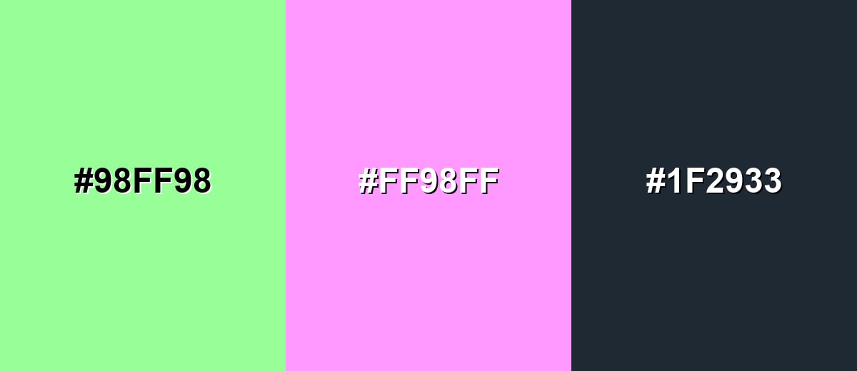
A complementary palette places mint green opposite a pink-magenta tone for energetic contrast that still feels playful and modern. Add a deep neutral to keep the look grounded.
Complementary Palette Example: Use Mint Green with Soft Magenta for punch, then anchor layouts with Deep Charcoal for readable text and structure.
Analogous Color Schemes
Analogous colors sit adjacent to each other on the color wheel, creating harmonious, cohesive palettes with subtle variation.
Stay in the fresh range by blending mint with a yellow-green and a seafoam tint for a gentle, nature-forward gradient.
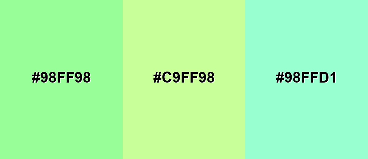
- Mint Green: #98FF98
- Spring Lime: #C9FF98
- Seafoam: #98FFD1
For a cooler harmony, shift toward aqua tones; this keeps the palette airy and clean for modern UI backgrounds.
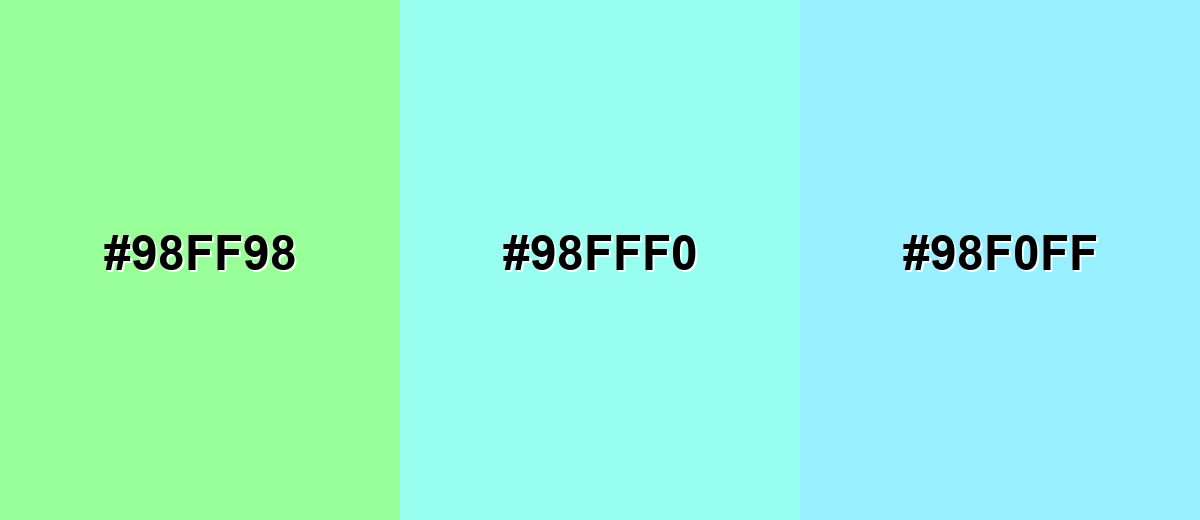
- Mint Green: #98FF98
- Aqua Mist: #98FFF0
- Cool Cyan: #98F0FF
Triadic & Tetradic Combinations
A triadic scheme adds two equally spaced hues to create variety without losing balance.
Mint Green with soft Coral and light Periwinkle creates a friendly, upbeat palette for illustrations, charts, and playful brand systems.
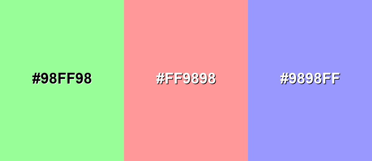
- Mint Green: #98FF98
- Soft Coral: #FF9898
- Light Periwinkle: #9898FF
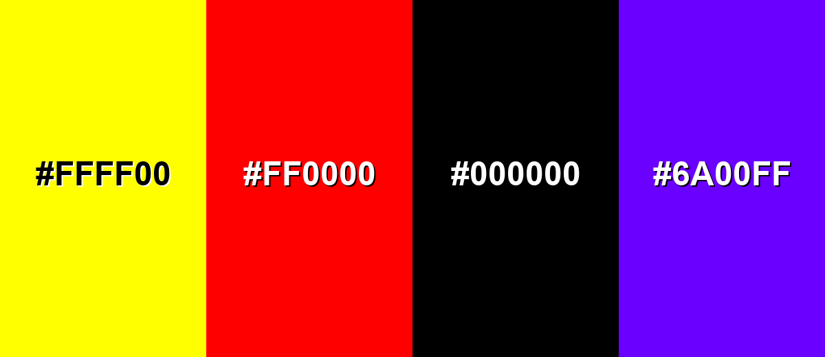
Colors to Avoid
While mint green color is remarkably versatile, certain combinations can create problematic visual effects:
- Pure Yellow (#FFFF00) - Both tones are very bright, so the combination can feel harsh and create vibrating edges, especially in small UI elements.
- Pure Red (#FF0000) - Strong red can overpower mint green and push the look toward a holiday or warning vibe, which may conflict with calm messaging.
- Pure Black (#000000) - The contrast is extreme and can make mint green feel fluorescent; it's better to use a softer charcoal for a smoother result.
- Electric Violet (#6A00FF) - Highly saturated violet can clash with mint's pastel lightness, making layouts look noisy rather than clean and fresh.
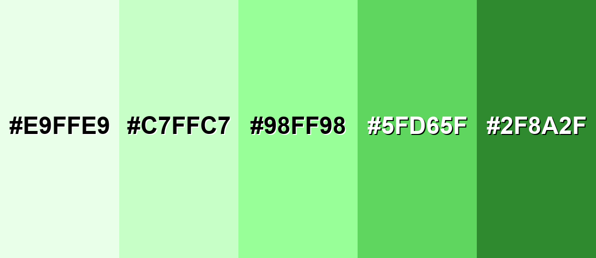
Shades, Tints & Variations of Mint Green Color
Mint green isn't just one shade—it spans from barely-there tints to deeper, more structured greens with a minty undertone. Having a range helps you keep the "fresh" vibe while still building contrast for text, components, and visual hierarchy.
- Pale Mint (#E9FFE9) - An almost-white mint that reads airy and minimal while keeping a hint of green. It's best used for Large backgrounds, soft sections, subtle UI panels.
- Soft Mint (#C7FFC7) - A gentle, pastel mint that stays fresh without feeling neon. It's best used for Cards, secondary surfaces, light brand accents.
- Classic Mint Green (#98FF98) - The bright, clean mint green reference tone—fresh, lively, and noticeably cool. It's best used for Highlights, badges, illustrations, playful brand elements.
- Fresh Mint (#5FD65F) - A stronger, greener mint that feels more energetic and grounded. It's best used for Buttons, icons, chart series, active states with good contrast.
- Deep Mint (#2F8A2F) - A darker green with a minty undertone, useful for structure and readability. It's best used for Text on mint backgrounds, borders, navigation, headings.
Industry Applications
Mint green shows up in industries that benefit from a fresh, clean impression. It works especially well when you want to soften a layout while still signaling energy and modernity.
Fashion & Beauty
- Skincare labels and packaging often use mint green to suggest cleanliness and gentle care.
- Beauty landing pages use mint accents to communicate a refreshing routine and a light, modern aesthetic.
- Minimal product visuals pair mint with confident neutrals to feel friendly without losing premium clarity.
- Wellness-forward collections use mint green to keep the vibe calm, breathable, and approachable.
Interior Design & Decor
- Mint green brightens kitchens and bathrooms while staying calm and tidy-looking.
- It's popular in nurseries and light-filled offices where you want softness without dullness.
- Pairing mint with warm woods, beige textiles, or brass finishes helps avoid a cold or sterile feel.
- In decor graphics, mint supports a clean lifestyle mood that still feels inviting with natural materials.
Branding & Marketing
- Food and beverage brands use mint green to signal mint/lime freshness and "better-for-you" positioning.
- Tech and SaaS products use it for success messaging, onboarding, and calm dashboards (with dark text for accessibility).
- Event and stationery designs lean on mint for spring themes and modern invitations with subtle personality.
- Marketing graphics often treat mint as a base tone, then add a warm accent to keep the composition balanced.
Conclusion
Mint green stands out for its light, fresh look that sits between natural green and a cool, clean tint. In design systems, #98FF98 works beautifully for calm surfaces, friendly highlights, and modern brand accents—especially when you balance it with deeper neutrals for readability. Whether you're building UI states, packaging, or interior-inspired visuals, mint green's associations with renewal and cleanliness make it a flexible, contemporary choice. With a few well-chosen shades and smart pairings, it stays crisp, approachable, and easy to use across both digital and print.
Design Smarter with AI: Media.io is an online AI studio that empowers creators with advanced image generation and enhancement tools. From text-to-image and image-to-image creation to AI upscaling and color optimization, it enables fast, creative, and professional results—all in your browser.

Frequently Asked Questions About Mint Green Color
Mint green is a light, cool-toned green that often looks like softened green with a hint of blue and white. It feels fresh and pastel rather than deep or earthy.
A commonly used mint green reference is #98ff98. Depending on the exact shade you want, mint greens can range from more bluish seafoam to more yellow-green pastels.
For #98ff98, the RGB decimal values are 152, 255, 152. This high green channel is what gives mint green its bright, clean appearance on screens.
Mint green is generally considered cool because it often leans slightly toward cyan and has a crisp, airy feel. Warmer mint variations shift toward yellow-green and can feel more sunny.
Mint green pairs well with charcoal and white for a clean look, with blush or magenta for contrast, and with light blues and seafoam tones for soft harmony. Warm accents like peach can add balance and keep it from feeling too cold.
Use it as a background tint, highlight, or status color, then support it with dark text and clear borders. Avoid using mint green as small text on white, and always verify contrast for buttons, labels, and icons.


