

Orchid color is a lively purple-pink that looks like the petals of an orchid bloom, sitting between soft magenta and light violet. A common reference for this shade is the hex code #DA70D6.
It’s often read as expressive, romantic, and a little whimsical, with a polished, modern edge. Below, you’ll find the exact codes, practical pairing ideas, shade options, and real-world design tips for using orchid well.
Orchid Color: Codes & Values
If you want consistent results across tools, start with the core orchid values below and use them as your source of truth for UI, graphics, and print planning.
| Parameters | VALUE |
| HEX Code | #DA70D6 |
| RGB DECIMAL | 218, 112, 214 |
| RGB PERCENTAGE | 86%, 44%, 84% |
| CMYK | 0%,49%,2%,15% |
| HSL | 302°, 59%, 65% |
| HSV (HSB) | 302°, 49%, 86% |
| Web Safe | #CC66CC |
Key Color Space Explanations:
- HEX - HEX is the most common way to specify orchid in web and UI work. Use it when you need a consistent screen-ready value across tools.
- RGB - RGB defines orchid by mixing red, green, and blue light. It is the standard for displays and anything built for digital viewing.
- CMYK - CMYK is used for ink-based printing and can shift this shade toward a duller purple if not profiled correctly. Always soft-proof and test print when accuracy matters.
- HSL - HSL describes orchid by hue, saturation, and lightness, which makes it easier to tweak. It is especially helpful for creating coordinated tints and shades.
- Web Safe - Web safe is the closest legacy screen approximation to orchid. It is useful for simple palettes and backwards-friendly design constraints.
In practice, use HEX/RGB for anything on-screen, then switch to CMYK (with proper profiles and proofs) when you’re preparing orchid-heavy print pieces.
Orchid Color Conversions
Need orchid in another format for a specific workflow? This conversion table makes it easy to copy the right value into your editor or stylesheet.
| Parameters | VALUE | CSS |
| HEX | #da70d6 | #da70d6 |
| RGB DECIMAL | 218, 112, 214 | rgb(218,112,214) |
| RGB PERCENTAGE | 86%, 44%, 84% | rgb(86%,44%,84%) |
| CMYK | 0%,49%,2%,15% | cmyk(0%,49%,2%,15%) |
| HSL | 302°, 59%, 65% | hsl(302°, 59%, 65%) |
| HSV (or HSB) | 302°, 49%, 86% | -- |
| Web Safe | cc66cc | #cc66cc |
| CIE-LAB | 63.0, 54.5, -34.2 | -- |
| XYZ | 46.8, 31.4, 67.2 | -- |
| xyY | 0.322, 0.216, 31.4 | -- |
| CIE-LCH | 63.0, 64.3, 327.9 | -- |
| CIE-LUV | 63.0, 50.7, -61.3 | -- |
| Hunter-Lab | 56.0, 55.7, -37.9 | -- |
| Binary | 11011010 01110000 11010110 | -- |
Want to generate Orchid Color photos or posters? Try Media.io's AI Image Generator now!
Orchid Color Meaning & Symbolism
Orchid is commonly associated with creativity, charm, and a refined kind of romance. It feels more playful than deep purple, but more sophisticated than hot pink. In everyday life, it often shows up when people want a gentle statement that still stands out.
Psychological Effects
Orchid can shift the mood of a layout fast, so it helps to be intentional about where you place it.
- Creative Energy - Orchid tends to make visuals feel imaginative and expressive, which supports playful or original brand stories.
- Warm Personality - The purple-pink mix adds warmth, helping interfaces feel more human when balanced with clean neutrals.
- Modern Romance - It reads romantic without feeling heavy, which can make designs feel polished rather than overly dramatic.
- Attention Direction - Because it sits close to magenta, orchid works well for highlights, badges, and small UI accents that guide the eye.
- Sweetness Risk - Overusing orchid on large areas can feel busy, overly trendy, or less serious, so structure it with darker anchors and strong type.
Positive Associations
When used thoughtfully, orchid communicates emotion and refinement without shouting.
- Creativity - Orchid is often linked to artistic expression, innovation, and a sense of "made with taste."
- Charm - The floral vibe can make branding feel friendly and approachable while still elevated.
- Refined Romance - It suggests affection and softness, but with a more modern, curated feel than typical pinks.
- Beauty & Care - Orchid-like hues echo beauty rituals and self-care moments, which is why they show up in lifestyle visuals.
- Rarity - The association with orchids as special blooms can lend a premium, "treat yourself" tone to packaging and campaigns.
Cultural Significance Across the World
Orchid meanings vary, but the color often borrows symbolism from the flower itself.
- Beauty & Elegance - In many contexts, orchid-like hues are tied to visual refinement and careful presentation.
- Gifting & Celebration - Floral purples and pinks commonly appear in gifting moments where warmth and appreciation matter.
- Self-Expression - In fashion and cosmetics, orchid shades often signal individuality without going fully neon.
- Premium Cue - Because orchids are seen as rare or special, the hue can support luxury positioning when paired with dark neutrals.
Design Applications
Orchid is easiest to use when you treat it as a floral accent that adds emotion and polish. It can feel modern in digital products, elegant in print, and playful in lifestyle visuals depending on what surrounds it.
Graphic Design Tips
- Use orchid for accent buttons, chips, tags, and micro-interactions to add personality without overwhelming the layout.
- Anchor orchid with deep neutrals (especially for headers and body text) to keep the overall look premium and readable.
- Pair orchid with muted greens when you want a fresh, botanical contrast that still feels sophisticated.
- For airy, gentle compositions, place orchid against warm beiges or soft off-whites and let whitespace do the heavy lifting.
- Be careful with accessibility: orchid is mid-light, so small white text on an orchid fill can miss contrast targets.
Pro tip: Save #DA70D6 as a design token (or a brand "accent" color) and build a small tint/shade ramp around it for hover, pressed, and background states—this keeps your UI consistent without guessing.
Orchid Color in Photography & Video
- Use orchid in wardrobe, florals, props, or set dressing to create a soft "hero" detail that pops without feeling harsh.
- In color grading, push orchid through highlights or midtones for a modern, dreamy look—especially in beauty and lifestyle scenes.
- Try orchid-to-violet gradients for backgrounds or overlays to add depth while keeping the mood cohesive.
- Balance orchid with neutral skin-tone protection (avoid over-saturating magenta) so portraits stay natural.
- For product shots, pair orchid accents with clean neutrals to prevent color casts and keep the item’s true color readable.
Recommended Tool for Image Enhancement: When incorporating orchid color into your photography projects, Media.io's AI Image tools can help you achieve more refined results. With AI-powered color enhancement, photo colorization, image upscaling, and old photo restoration, you can easily enrich orchid color tones, improve overall image quality, and highlight the color's elegant and sophisticated aesthetic.
Color Combinations
Orchid pairs best with grounded neutrals and natural greens, but it can also support bright, playful palettes when you control contrast and spacing. The combinations below are built to help you choose a mood quickly, from modern minimal to energetic and bold.
Complementary Colors
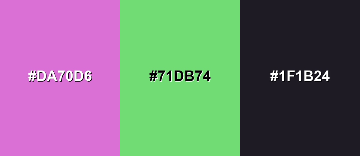
A complementary pairing puts orchid against a green opposite on the color wheel, creating crisp visual energy. Add a dark neutral to keep the palette readable and mature.
Complementary Palette Example: Use orchid as the highlight, fresh green as the counterpoint, and deep charcoal for structure and text.
Analogous Color Schemes
Analogous colors sit adjacent to each other on the color wheel, creating harmonious, cohesive palettes with subtle variation.
Purple-leaning orchid with violet and rosy pink feels smooth and floral, ideal for gradients and soft branding.
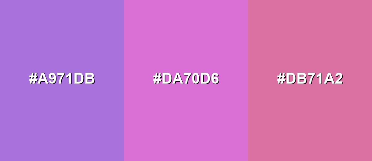
- Soft Violet: #A971DB
- Orchid: #DA70D6
- Rose Pink: #DB71A2
A tighter neighborhood of pink-violet tones keeps the mood consistent while still adding enough variety for UI states.
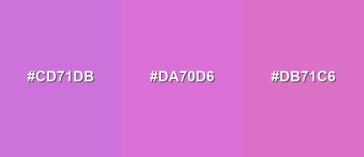
- Lavender Purple: #CD71DB
- Orchid: #DA70D6
- Pink Mauve: #DB71C6
Triadic & Tetradic Combinations
A triadic scheme balances orchid with two evenly spaced hues for a lively, modern mix.
Orchid with soft lime-yellow and aqua-blue creates a playful, high-contrast palette that still feels light.
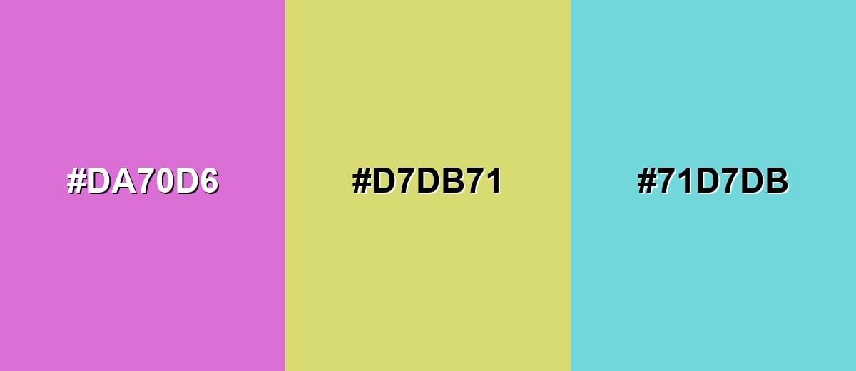
- Orchid: #DA70D6
- Soft Lime: #D7DB71
- Aqua Blue: #71D7DB
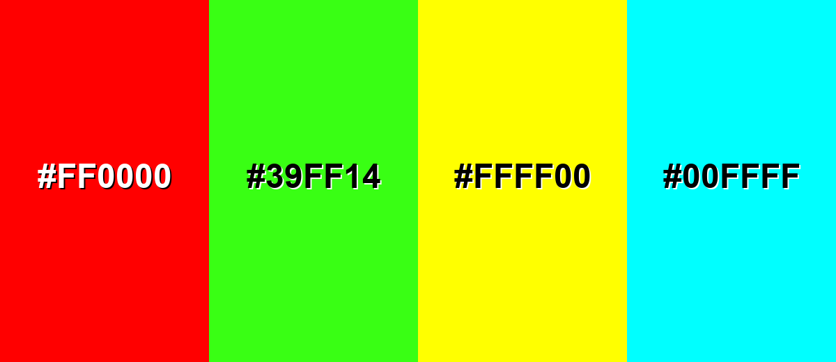
Colors to Avoid
While orchid color is remarkably versatile, certain combinations can create problematic visual effects:
- Pure Red (#FF0000) - Both hues compete for attention, and the combination can feel harsh and unrefined unless heavily neutralized.
- Neon Green (#39FF14) - The neon intensity overpowers orchid and can create a vibrating, uncomfortable edge on screens.
- Bright Yellow (#FFFF00) - High brightness next to orchid can look loud and reduce legibility in UI elements and text overlays.
- Pure Cyan (#00FFFF) - Two highly saturated, high-energy notes together can feel chaotic, especially in interfaces or small layouts.
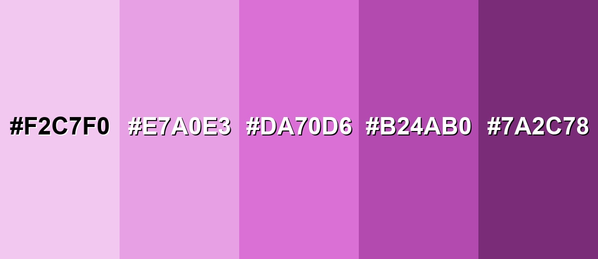
Shades, Tints & Variations of Orchid Color
Orchid isn’t just one look—its tints and deeper plum-leaning shades can completely change the mood, from soft and airy backgrounds to dramatic accents. Having a small range ready also makes it easier to build UI states, gradients, and print-friendly options.
- Pale Orchid (#F2C7F0) - A light, airy tint that keeps the floral feel while reading soft and spacious. It’s best used for Backgrounds, large panels, and subtle sections in UI or editorial layouts..
- Light Orchid (#E7A0E3) - A gentle mid-tint that still feels lively, with less intensity than the base shade. It’s best used for Cards, hover states, and accent blocks where you want warmth without high saturation..
- Classic Orchid (#DA70D6) - The reference orchid tone: purple-pink with a bright, floral presence. It’s best used for Primary accents, highlights, icons, and brand details..
- Deep Orchid (#B24AB0) - A richer, more grounded version that feels more mature and premium. It’s best used for Headlines, button fills (with careful contrast), and luxury-style packaging accents..
- Dark Orchid (#7A2C78) - A shadowed, plum-leaning shade that adds drama and depth. It’s best used for Text on light orchid tints, borders, overlays, and night-mode accents..
Industry Applications
Orchid fits industries that benefit from a creative, expressive tone, but it can also work in more serious spaces when paired with dark neutrals and restrained typography.
Fashion & Beauty
- Use orchid as a signature accent on packaging, labels, and social templates to create a recognizable "brand pop."
- Pair orchid with off-whites and deeper neutrals to keep beauty visuals clean, modern, and premium.
- Lean on deep or dark orchid shades for headline typography on campaigns to avoid an overly sweet feel.
- In product photos, keep orchid as a backdrop accent or prop so the item color stays true and readable.
Interior Design & Decor
- Use pale or light orchid tones for textiles, pillows, or art when you want a soft floral mood without dominating the room.
- Consider orchid as a feature wall rather than an all-over paint—especially in smaller spaces.
- Balance orchid decor with grounded neutrals to prevent the palette from feeling too busy or trendy.
- Bring in botanical energy by pairing orchid accents with muted greens for a fresh, natural contrast.
Branding & Marketing
- Use orchid for badges, highlights, and UI chips to guide attention without the aggression of bright red.
- Build a small tint-and-shade system around orchid so your website and ads stay consistent across components.
- For creative tools and portfolios, orchid makes a strong category/tag color that still feels polished.
- In print campaigns, soft-proof and request a proof—orchid can shift more purple or lose brightness in CMYK.
Conclusion
Orchid is a standout purple-pink that feels floral, expressive, and polished—especially when you use it as an accent instead of an all-over fill. With #DA70D6 as your anchor, you can keep your web and UI work consistent, then adapt for print with CMYK previews and proofs when accuracy matters. For pairings, lean on deep neutrals for a modern premium vibe or fresh greens for a lively botanical contrast. Used with thoughtful spacing, strong typography, and contrast checks, orchid adds personality while still keeping your design clear and readable.
Design Smarter with AI: Media.io is an online AI studio that empowers creators with advanced image generation and enhancement tools. From text-to-image and image-to-image creation to AI upscaling and color optimization, it enables fast, creative, and professional results—all in your browser.

Frequently Asked Questions About Orchid Color
Orchid is a bright purple-pink that resembles orchid petals, sitting between light violet and soft magenta. It tends to feel floral and modern rather than muted or dusty.
A common digital reference for orchid is #da70d6. Depending on the palette or brand system, nearby orchid-like shades may vary slightly in saturation or lightness.
Orchid is balanced, but many people perceive it as pink-forward purple because it has strong red and blue with relatively less green. In different lighting or screens, it may lean more magenta or more violet.
Orchid pairs well with charcoal and soft off-whites for a clean modern look, and with fresh greens for a botanical contrast. For more playful palettes, add light aqua or soft yellow in small doses.
Dark text is usually safer for readability on orchid backgrounds, such as deep charcoal tones. If you need white text, test contrast carefully and consider using a darker orchid shade behind small type.
Not always. Orchid can lose brightness or shift more purple in CMYK printing, so it is best to soft-proof with the right profile and run a test print when accuracy matters.


