

Heliotrope color is a vivid purple-pink shade that reads like a bright lavender with a rosy glow. Its signature digital value is #DF73FF, so it feels lively without losing that soft, floral character.
Often seen as imaginative, youthful, and a little whimsical, heliotrope takes its name from the heliotrope flower. Below, you'll find the exact color codes, conversions, palette pairings, shade ideas, and practical ways to use it in design.
Heliotrope Color: Codes & Values
If you want heliotrope color to look consistent across websites, apps, print, and templates, start with these core color values.
| Parameters | VALUE |
| HEX Code | #DF73FF |
| RGB DECIMAL | 223, 115, 255 |
| RGB PERCENTAGE | 87.5%, 45.1%, 100% |
| CMYK | 13%,55%,0%,0% |
| HSL | 286°, 100%, 73% |
| HSV (HSB) | 286°, 55%, 100% |
| Web Safe | #CC66FF |
Key Color Space Explanations:
- HEX - HEX is the most common way to specify this shade for websites and digital products. Use it when you need an exact match across UI elements and graphics.
- RGB - RGB defines the amount of red, green, and blue light used on screens. It is helpful for motion graphics, overlays, and any display-based work.
- CMYK - CMYK is used for printing with cyan, magenta, yellow, and black inks. Because heliotrope is highly saturated, proofs and paper choice can noticeably shift the result.
- HSL - HSL describes hue, saturation, and lightness in a way that is intuitive for adjusting tints and tones. It is especially useful when creating consistent UI states like hover and active.
- Web Safe - Web safe is the closest legacy palette match for older display constraints. It is mainly used as a compatibility reference rather than a modern requirement.
Use HEX for web/UI specs, RGB for screen-based creative work, and CMYK for print files—then fine-tune with HSL when you need lighter tints or deeper variants that still feel "on brand."
Heliotrope Color Conversions
Need heliotrope in a specific format for CSS, printing, or color-managed workflows? Here are the most common conversions in one place.
| Parameters | VALUE | CSS |
| HEX | #df73ff | #df73ff |
| RGB DECIMAL | 223, 115, 255 | rgb(223,115,255) |
| RGB PERCENTAGE | 87.5%, 45.1%, 100% | rgb(87.5%,45.1%,100%) |
| CMYK | 13%,55%,0%,0% | cmyk(13%,55%,0%,0%) |
| HSL | 286°, 100%, 73% | hsl(286°, 100%, 73%) |
| HSV (or HSB) | 286°, 55%, 100% | -- |
| Web Safe | cc66ff | #cc66ff |
| CIE-LAB | 66.0, 62.0, -52.2 | -- |
| XYZ | 54.6, 35.1, 98.5 | -- |
| xyY | 0.2900, 0.1867, 35.1 | -- |
| CIE-LCH | 66.0, 81.0, 319.5° | -- |
| CIE-LUV | 66.0, 43.7, -92.5 | -- |
| Hunter-Lab | 59.3, 60.7, -57.1 | -- |
| Binary | 11011111 01110011 11111111 | -- |
Want to generate Heliotrope Color photos or posters? Try Media.io's AI Image Generator now!
Heliotrope Color Meaning & Symbolism
Heliotrope commonly represents creativity, individuality, and a playful kind of confidence. Because it sits between purple and pink, it can feel both imaginative and friendly in everyday visual choices, from packaging to social posts.
Psychological Effects
In most designs, heliotrope reads as expressive energy—bright enough to pop, but still soft and floral at heart.
- Uplifting Mood - Its bright purple-pink glow can make layouts feel optimistic and lively without turning harsh.
- Creative Signal - Heliotrope hints at imagination and artistry, making it a natural fit for creator-led visuals.
- Attention Pull - Used as an accent, it grabs the eye fast, which helps with highlights, badges, and key UI states.
- Dreamy Softness - Despite the saturation, it can still feel romantic and airy, especially when paired with light tints.
- Overstimulation Risk - On large surfaces or with other neon tones, it can feel visually loud and reduce readability.
Positive Associations
When balanced with neutrals or deeper purples, heliotrope tends to communicate personality in a friendly, modern way.
- Individuality - The shade feels distinctive and confident, helping brands look less generic.
- Playfulness - Its pink-leaning warmth can add a fun, lighthearted vibe to campaigns and social graphics.
- Modern Energy - Heliotrope looks especially crisp on screens, giving digital-first design a fresh punch.
- Expressive Romance - The floral undertone suggests a softer, more emotional tone than purely electric purples.
- Creative Luxury - Purple roots can hint at premium taste, especially when paired with darker anchors.
Cultural Significance Across the World
Across many contexts, purple- and pink-leaning hues carry different meanings—heliotrope blends both, so it often reads as expressive rather than formal.
- Artistic Feel - Purple-leaning tones are often linked with imagination and artistry, which heliotrope amplifies with brightness.
- Warm Optimism - Pink undertones can suggest friendliness and positivity, keeping the shade approachable.
- Romantic Expression - The mix frequently lands as romantic or dreamy in lifestyle visuals and decor choices.
- Creative Confidence - In modern branding contexts, it commonly signals bold self-expression without looking aggressive.
Design Applications
Heliotrope is easiest to use when you treat it like a statement accent and let neutrals or deeper purples support it. The goal is to keep the energy while preserving legibility and hierarchy.
Graphic Design Tips
- Use heliotrope for CTA buttons, tags, and highlights where quick attention matters.
- Pair it with cool neutrals or deep anchors so the layout stays readable and structured.
- Try gradients with violet, magenta, or soft peach to create a glossy, modern hero section.
- For softer layouts, apply heliotrope tints to backgrounds and keep the pure shade for emphasis.
- Always check contrast for button labels and UI text—dark text often performs better than white on this shade.
Pro tip: If heliotrope is competing with other bright colors, make it the "hero" and mute everything else—your hierarchy will instantly feel clearer.
Heliotrope Color in Photography & Video
- Use heliotrope as a set accent (props, wardrobe, or lighting gels) to create a strong focal point.
- In color grading, push purples gently toward pink to keep the floral feel instead of going full neon.
- For product shots, pair heliotrope accents with neutral backdrops so the subject stays clean and premium.
- In motion graphics, reserve heliotrope for key overlays (titles, stickers, progress states) to avoid visual noise.
- When exporting for different screens, preview saturation—this hue can look more intense on high-contrast displays.
Recommended Tool for Image Enhancement: When incorporating heliotrope color into your photography projects, Media.io's AI Image tools can help you achieve more refined results. With AI-powered color enhancement, photo colorization, image upscaling, and old photo restoration, you can easily enrich heliotrope color tones, improve overall image quality, and highlight the color's elegant and sophisticated aesthetic.
Color Combinations
Heliotrope pairs well with fresh yellow-greens, warm golden notes, and cool aqua tones. Use the palettes below to build balanced schemes for branding, UI, and illustrations.
Complementary Colors
A complementary match uses the opposite hue on the wheel, creating strong contrast that feels energetic and modern.
Complementary Palette Example: Pair heliotrope with a springy yellow-green and a dark neutral to keep the contrast crisp and readable.
Analogous Color Schemes
Analogous colors sit adjacent to each other on the color wheel, creating harmonious, cohesive palettes with subtle variation.
For a smooth, floral gradient feel, stay near heliotrope with violet and pink neighbors.
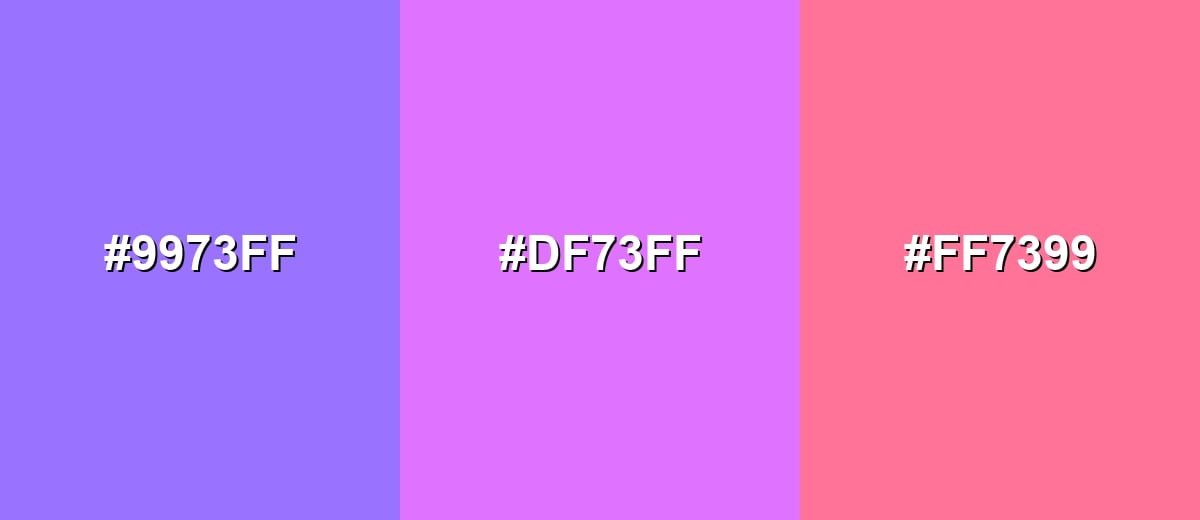
- Electric Violet: #9973FF
- Heliotrope: #DF73FF
- Candy Pink: #FF7399
To push a bolder look, combine heliotrope with deeper indigo and a hot magenta accent.
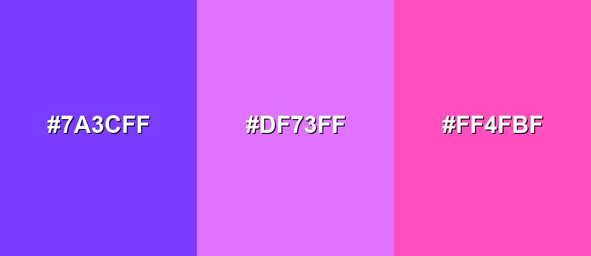
- Electric Indigo: #7A3CFF
- Heliotrope: #DF73FF
- Hot Magenta: #FF4FBF
Triadic & Tetradic Combinations
A triadic palette spreads hues evenly, giving you contrast without the harshness of a direct opposite.
Use heliotrope with warm gold and minty aqua for a vibrant, playful three-way balance.
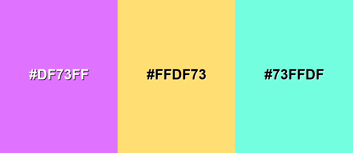
- Heliotrope: #DF73FF
- Soft Gold: #FFDF73
- Aqua Mint: #73FFDF
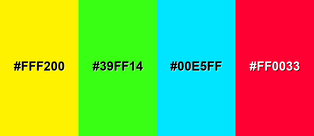
Colors to Avoid
While heliotrope color is remarkably versatile, certain combinations can create problematic visual effects:
- Vivid Yellow (#FFF200) - Both shades are extremely bright, so the combo can look harsh and reduce readability, especially on screens.
- Neon Lime (#39FF14) - This pairing can create a vibrating effect that feels busy and uncomfortable in UI, signage, or text-heavy layouts.
- Bright Cyan (#00E5FF) - Two high-energy accents compete for attention and can make hierarchy unclear in dashboards and marketing graphics.
- Hot Red (#FF0033) - The clash can feel chaotic and can skew the overall mood away from the dreamy, creative feel heliotrope is known for.
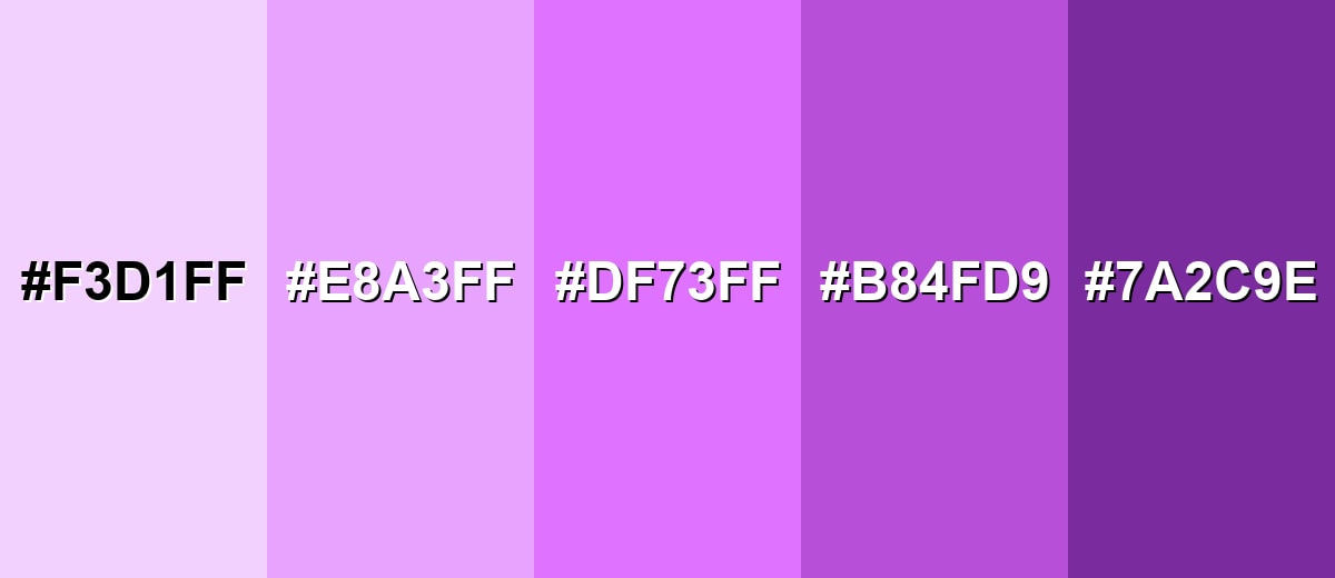
Shades, Tints & Variations of Heliotrope Color
Heliotrope isn't just one look—its range goes from airy pastels to rich plums. Having a few variations ready makes it easier to build depth, create UI states, and keep your palette consistent across light and dark surfaces.
- Heliotrope Tint (#F3D1FF) - A pale, airy version that keeps the purple-pink identity while feeling light and spacious. It's best used for Background panels, cards, and soft gradients behind text..
- Soft Heliotrope (#E8A3FF) - A gentler mid-tint that feels friendly and modern without the full intensity of the base shade. It's best used for Secondary UI elements, subtle highlights, and pastel illustrations..
- Classic Heliotrope (#DF73FF) - The bright, floral purple-pink most people associate with heliotrope. It's best used for Accents, CTAs, brand marks, and attention-grabbing details..
- Deep Heliotrope (#B84FD9) - A richer, darker variant that adds depth while staying clearly in the same family. It's best used for Buttons with stronger contrast, headers, and shadows or outlines..
- Plum Heliotrope (#7A2C9E) - A moody, muted plum that tones down the brightness and feels more sophisticated. It's best used for Text over light tints, premium packaging accents, and dark-mode surfaces..
Industry Applications
Heliotrope shows up in digital-first design because it reads clearly on modern displays and adds personality quickly. These examples can help you use it with intention instead of dropping it in as a random bright accent.
Fashion & Beauty
- Use it as a packaging highlight for lip products to create a bold, playful shelf presence.
- Apply it as a premium accent on fragrance packaging and gift sets.
- Add heliotrope backdrops to editorial product photography and lookbooks for a dreamy, modern vibe.
- Work it into seasonal collections that blend pastel and neon trends without losing cohesion.
Interior Design & Decor
- Bring it in through throw pillows or textiles when you want a playful statement without repainting.
- Use heliotrope artwork or small decor pieces to add a creative pop in neutral rooms.
- Try it on an accent wall in studios or creative spaces, balanced with light neutrals.
- Lean into it for kids rooms and craft corners where a bright, imaginative vibe fits.
Branding & Marketing
- Build a signature accent for creator brands that want an expressive, recognizable look.
- Support lifestyle identities with heliotrope highlights that feel friendly and modern.
- Use it for campaign accents in launches, limited editions, and seasonal drops to boost excitement.
- Design social templates with heliotrope emphasis to improve scroll-stopping power and clarity.
Conclusion
Heliotrope is a vivid purple-pink that feels floral, expressive, and unmistakably modern—and it shines most when it's used with a plan. Start with #DF73FF for accurate matching, then build out a small set of tints and deeper variants for backgrounds, hover states, and contrast-friendly buttons. Pair it with calming neutrals or carefully chosen companions like minty aqua or soft gold to keep the palette balanced. Whether you're designing a UI, a brand accent, or a dreamy visual campaign, heliotrope can deliver strong personality as long as you protect readability and keep hierarchy crisp.
Design Smarter with AI: Media.io is an online AI studio that empowers creators with advanced image generation and enhancement tools. From text-to-image and image-to-image creation to AI upscaling and color optimization, it enables fast, creative, and professional results—all in your browser.

Frequently Asked Questions About Heliotrope Color
Heliotrope looks like a bright lavender with a pink glow, sitting between purple and magenta. It is vivid and eye-catching, especially on screens.
A widely used heliotrope hex code is #df73ff. It maps to a high-brightness purple-pink that is common in digital palettes.
It depends on the exact shade, but heliotrope typically leans purple with a noticeable pink undertone. In different lighting and on different displays, it can read slightly warmer or cooler.
Fresh yellow-greens, soft golds, and aqua-mint tones create lively pairings, while charcoal and deep plum help it feel grounded. For calm designs, use light tints alongside warm whites or light grays.
You can, but it is usually better as an accent or in a very light tint. For large backgrounds, reduce saturation or increase lightness and always test text contrast for readability.
Use deeper variants like plum-toned shades, add plenty of neutral space, and limit it to one or two key elements. Pairing it with muted grays or deep navy can shift it from playful to refined.


