

Cardinal color is a vivid deep red inspired by the rich plumage of a cardinal bird—bold, warm, and slightly rosy.
With the signature HEX code #C41E3A, it reads saturated and confident on screens and in print, often linked with passion, courage, and ceremony.
Cardinal Color: Codes & Values
Use these official values to keep cardinal consistent across UI mockups, brand systems, and print files.
| Parameters | VALUE |
| HEX Code | #C41E3A |
| RGB DECIMAL | 196, 30, 58 |
| RGB PERCENTAGE | 76.9%, 11.8%, 22.7% |
| CMYK | 0%,85%,70%,23% |
| HSL | 350°, 74%, 44% |
| HSV (HSB) | 350°, 85%, 77% |
| Web Safe | #CC3333 |
Key Color Space Explanations:
- HEX - HEX is the most common way to specify cardinal for screens and web design. Use #c41e3a to reproduce the same deep red across modern apps and browsers.
- RGB - RGB describes cardinal using red, green, and blue light values. It's useful for UI work, motion graphics, and any workflow that starts on screens.
- CMYK - CMYK is used for ink-based printing like packaging, posters, and stationery. The CMYK mix helps printers approximate cardinal's saturation on paper.
- HSL - HSL organizes the shade by hue, saturation, and lightness, which is handy when building tints and tones. It makes it easier to keep the red consistent while adjusting brightness for backgrounds or accents.
- Web Safe - Web-safe values are older, limited palettes that try to look consistent on legacy displays. #cc3333 is the closest web-safe match, though it may appear slightly less nuanced than the original.
If you're designing for digital, start with HEX/RGB; for print, begin with CMYK and always proof on your real paper stock.
Cardinal Color Conversions
Need cardinal color in another format? Here's a quick conversion chart you can copy into your workflow.
| Parameters | VALUE | CSS |
| HEX | #c41e3a | #c41e3a |
| RGB DECIMAL | 196, 30, 58 | rgb(196,30,58) |
| RGB PERCENTAGE | 76.9%, 11.8%, 22.7% | rgb(76.9%,11.8%,22.7%) |
| CMYK | 0%,85%,70%,23% | cmyk(0%,85%,70%,23%) |
| HSL | 350°, 74%, 44% | hsl(350°,74%,44%) |
| HSV (or HSB) | 350°, 85%, 77% | -- |
| Web Safe | cc3333 | #cc3333 |
| CIE-LAB | 42.8, 61.5, 28.6 | -- |
| XYZ | 23.99, 12.98, 5.25 | -- |
| xyY | 0.568, 0.307, 12.98 | -- |
| CIE-LCH | 42.8, 67.8, 25.0° | -- |
| CIE-LUV | 42.8, 117.8, 16.8 | -- |
| Hunter-Lab | 36.0, 55.8, 16.6 | -- |
| Binary | 11000100 00011110 00111010 | -- |
Want to generate Cardinal Color photos or posters? Try Media.io's AI Image Generator now!
Cardinal Color Meaning & Symbolism
Cardinal is often read as a confident, ceremonial red—one that signals importance and draws the eye quickly. In everyday contexts, the Cardinal Color meaning is often tied to love, determination, and a sense of urgency, which is why it shows up in accents, headlines, and calls to action.
Psychological Effects
Because it's deep and saturated, cardinal tends to feel bold without looking childish.
- Energy - Cardinal can make a layout feel active and motivated, helping key elements stand out fast.
- Decisiveness - It supports strong visual hierarchy, which is why it works well for buttons, badges, and priority states.
- Premium Maturity - As a deep red (not a bright primary), it often reads more refined and intentional.
- Focus - In small doses, it draws attention to critical UI moments like price highlights or important labels.
- Intensity Risk - Overuse can feel demanding, so pairing it with calmer supporting tones and generous spacing matters.
Positive Associations
When balanced with neutrals, cardinal is a confident red that still feels polished.
- Passion - It's commonly linked with strong emotion and commitment, making it a natural fit for high-impact messaging.
- Courage - Cardinal often suggests bravery and drive, useful for brands that want an assertive voice.
- Ceremony - The shade has a formal, "special occasion" vibe that can elevate event or editorial design.
- Importance - It signals priority, which helps when you need users to notice a headline, CTA, or alert.
- Confidence - In branding, it can communicate presence and strong identity without relying on extra decoration.
Cultural Significance Across the World
Its name and history give cardinal a distinctive sense of tradition and authority.
- Cardinal Bird Inspiration - The color name connects directly to the cardinal bird, known for its vivid, unmistakable red plumage.
- Ceremonial Roots - It's associated with historical ceremonial garments, which contributes to its formal tone.
- Institutional Identity - Many organizations use cardinal for visibility and tradition, especially in long-standing identity systems.
- Team Spirit - It's a common sports and team shade because it reads energetic, bold, and easy to spot from a distance.
Design Applications
Cardinal is best treated as a statement shade—ideal for emphasis, hierarchy, and a red that feels refined rather than playful.
Graphic Design Tips
- Use cardinal for primary actions, sale tags, and key highlights—then let neutrals do the heavy lifting elsewhere.
- Balance it with dark, grounded supports to avoid visual fatigue in busy layouts.
- If you want cardinal on large surfaces, shift to a softer tint so the page doesn't feel overly urgent.
- Keep typography and spacing clean so the red feels intentional, not noisy.
- For print, test on your actual stock—uncoated paper can mute saturation and deepen the overall tone.
Pro tip: treat #C41E3A as your "hero accent," then build a small set of tints for backgrounds and UI states so the system stays consistent.
Cardinal Color in Photography & Video
- Use cardinal props or wardrobe to create a clear focal point in otherwise neutral scenes.
- In color grading, keep reds controlled—too much saturation can clip detail in skin tones and fabric.
- Pair cardinal with cooler shadows for a modern, cinematic contrast.
- For product shots, cardinal accents can add "premium energy" without overwhelming the subject.
- When exporting for web, review on multiple screens—deep reds can shift depending on display settings.
Recommended Tool for Image Enhancement: When incorporating cardinal color into your photography projects, Media.io's AI Image tools can help you achieve more refined results. With AI-powered color enhancement, photo colorization, image upscaling, and old photo restoration, you can easily enrich cardinal color tones, improve overall image quality, and highlight the color's elegant and sophisticated aesthetic.
Color Combinations
Cardinal color pairs best with crisp cool tones, dark neutrals, and select warm accents that don't compete with its saturation. Use these palettes to build clear contrast and a balanced hierarchy.
Complementary Colors
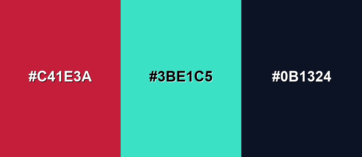
A complementary match adds maximum contrast by pairing cardinal with a blue-green opposite. This is ideal when you want energetic, modern visuals without relying on extra saturation everywhere.
Complementary Palette Example: Combine Cardinal, Aqua Mint, and Deep Navy for a punchy but controlled contrast.
Analogous Color Schemes
Analogous colors sit adjacent to each other on the color wheel, creating harmonious, cohesive palettes with subtle variation.
Crimson Red, Cardinal, and Rose Red create a smooth, tonal red range for gradients and layered accents.
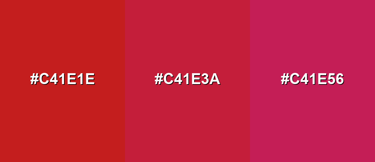
- Crimson Red: #C41E1E
- Cardinal: #C41E3A
- Rose Red: #C41E56
Burgundy, Cardinal, and Bright Ruby shift from deep to vivid for dramatic headings and premium packaging.
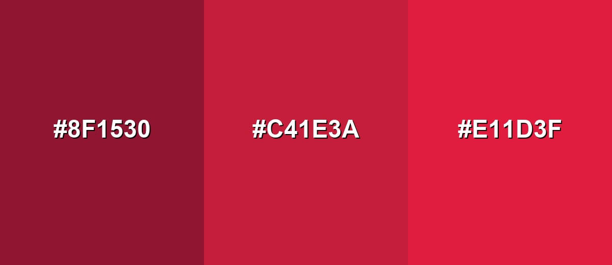
- Burgundy: #8F1530
- Cardinal: #C41E3A
- Bright Ruby: #E11D3F
Triadic & Tetradic Combinations
A triadic palette keeps the design lively while staying balanced across the wheel.
Cardinal, Leaf Green, and Royal Blue work well for illustrations, dashboards, and bold brand systems.
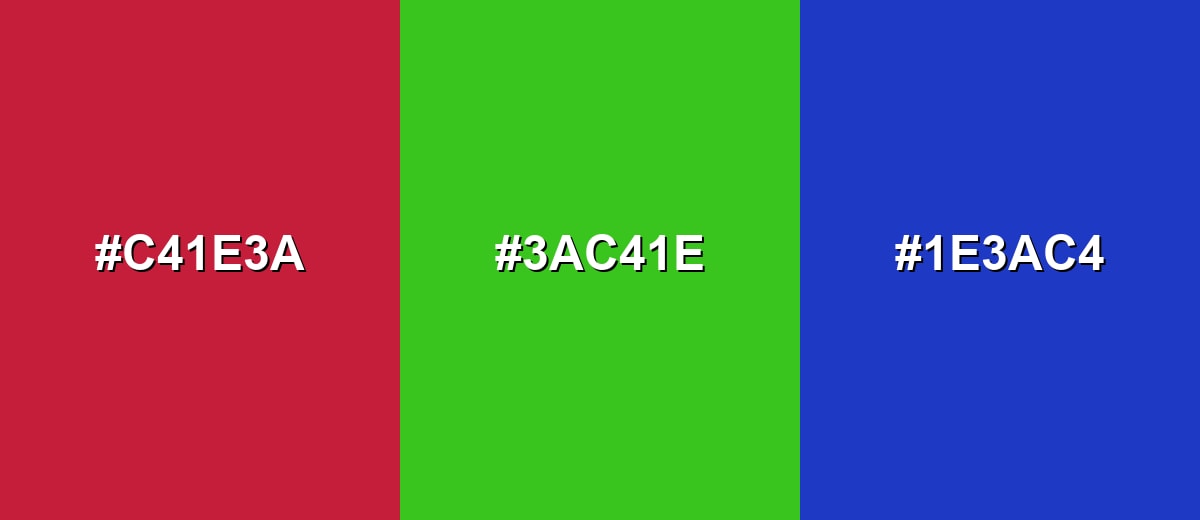
- Cardinal: #C41E3A
- Leaf Green: #3AC41E
- Royal Blue: #1E3AC4
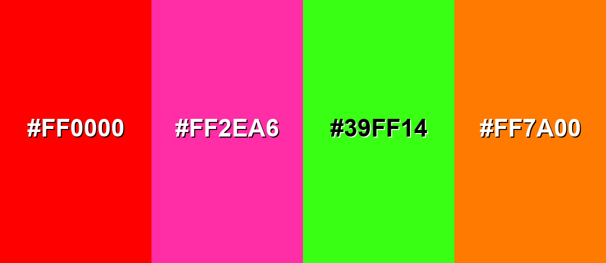
Colors to Avoid
While cardinal color is remarkably versatile, certain combinations can create problematic visual effects:
- Pure Red (#FF0000) - Too close in intent and intensity, it can make cardinal feel muddy or overly aggressive when placed side by side.
- Hot Pink (#FF2EA6) - Both are highly saturated, so the pairing can look loud and reduce readability in UI and headlines.
- Neon Green (#39FF14) - The contrast is harsh and can cause visual vibration, especially on bright screens or thin typography.
- Vivid Orange (#FF7A00) - Competes with cardinal's warmth and can make the overall palette feel unbalanced or overly promotional.
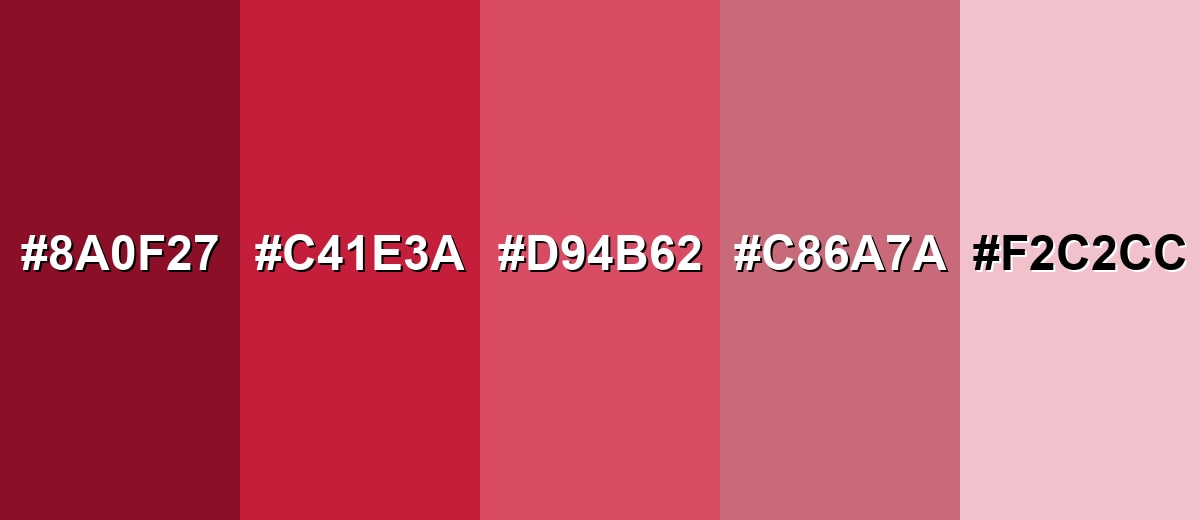
Shades, Tints & Variations of Cardinal Color
From moody, dramatic darks to soft blush-like tints, cardinal has a flexible range you can use for hierarchy, depth, and more comfortable large-area design.
- Deep Cardinal (#8A0F27) - A darker, more dramatic take that keeps the red identity but feels heavier and more formal. It's best used for Headers, luxury branding, and dark-mode accents..
- Cardinal (#C41E3A) - The classic vivid deep red with a slightly cool, rosy cast and strong visibility. It's best used for Primary accents, CTAs, badges, and brand highlights..
- Soft Cardinal (#D94B62) - A gentler tint that reads warmer and friendlier while still feeling confident. It's best used for Hover states, secondary buttons, and editorial highlights..
- Dusty Rose (#C86A7A) - Muted and mature, with less saturation for calmer layouts and longer reading experiences. It's best used for Background panels, subtle charts, and lifestyle branding..
- Pale Rose (#F2C2CC) - A light blush variant that adds warmth without dominating the layout. It's best used for Large backgrounds, cards, and soft gradient transitions..
Industry Applications
Because cardinal is high-impact and emotionally direct, it shows up in industries that need urgency, confidence, or a recognizable signature accent—often in controlled proportions for clarity.
Fashion & Beauty
- Statement pieces and accessories where a saturated red becomes the focal point.
- Seasonal styling that leans formal and dramatic rather than playful.
- Beauty packaging accents that feel premium and energetic when paired with clean neutrals.
- Editorial looks where cardinal adds contrast against minimal wardrobe palettes.
Interior Design & Decor
- Accent pillows, artwork, or a single feature piece against warm whites and natural woods.
- Dining or lounge areas where you want a cozy, dramatic focal point.
- Matte finishes for a softer look, or glossy finishes for a sharper modern punch.
- Layering tints like softer rose tones for larger surfaces while keeping cardinal as the highlight.
Branding & Marketing
- Signature accent for logos and brand marks that need a bold, recognizable red.
- Campaign headers, sale tags, and product highlights that must be noticed quickly.
- Ecommerce CTAs like add-to-cart and checkout, used sparingly for maximum emphasis.
- Premium packaging details when balanced with dark neutrals and clean spacing.
Conclusion
Cardinal is a deep, vivid red that feels energetic yet ceremonial—perfect when you want high visibility without the "toy-bright" vibe of primary red. Anchor your palette with #C41E3A, then build contrast with cool complements, dark neutrals, and softer rose-like tints for larger surfaces. Used intentionally in buttons, headlines, badges, and brand accents (and checked for readability), cardinal delivers impact that still looks refined, modern, and confident.
Design Smarter with AI: Media.io is an online AI studio that empowers creators with advanced image generation and enhancement tools. From text-to-image and image-to-image creation to AI upscaling and color optimization, it enables fast, creative, and professional results—all in your browser.

Frequently Asked Questions About Cardinal Color
Cardinal is a vivid deep red with a slight rosy, cool-leaning cast. It feels richer and more formal than bright primary red, while still reading as bold and energetic.
They're related but not identical. Crimson often leans a bit darker or more blue-red, while cardinal typically looks slightly rosier and cleaner, especially in digital palettes.
Cool blue-greens, deep navies, and clean off-whites pair especially well because they balance the intensity. For warm pairings, try muted golds or warm neutrals rather than bright orange.
You can, but it's usually better as an accent or in a softened tint for large areas. A full cardinal background can feel intense and may reduce readability unless typography and spacing are carefully controlled.
Increase contrast by pairing it with very light text (like white) or using it as text on a very light background. For small elements, consider a darker shade, stronger font weight, and avoid low-contrast pink or gray text on top of it.
Screens use light (RGB) while print uses ink (CMYK), and paper type affects saturation and depth. Always proof on the intended stock—uncoated papers can mute the shade and make it appear darker.


