

Xanadu color is a muted gray-green that looks like weathered foliage or soft eucalyptus leaves. Its HEX code is #738678, giving it a calm, slightly cool presence that reads natural without being bright.
Often perceived as balanced, steady, and quietly refined, xanadu fits the "serene escape" vibe suggested by its name. Below, you'll find the key codes, conversions, best pairings, shade ideas, and practical ways to use it in modern design.
Xanadu Color: Codes & Values
If you're building a palette or design system, these are the core values you'll use most for accurate, repeatable xanadu color results.
| Parameters | VALUE |
| HEX Code | #738678 |
| RGB DECIMAL | 115, 134, 120 |
| RGB PERCENTAGE | 45.1%, 52.5%, 47.1% |
| CMYK | 14%,0%,10%,48% |
| HSL | 136°, 8%, 49% |
| HSV (HSB) | 136°, 14%, 53% |
| Web Safe | #669966 |
Key Color Space Explanations:
- HEX - HEX is the most common way to specify xanadu in digital design. Use #738678 in CSS, design tools, and UI systems for consistent results.
- RGB - RGB defines xanadu with red, green, and blue light values (115, 134, 120). It is helpful for on-screen work, animations, and programmatic graphics.
- CMYK - CMYK (14%,0%,10%,48%) is used for print workflows where ink mixing matters. Because xanadu is muted, proofs and paper choice can noticeably shift the final appearance.
- HSL - HSL expresses xanadu by hue, saturation, and lightness (136°, 8%, 49%). It is practical for building lighter tints or deeper shades while keeping the same overall character.
- Web Safe - Web Safe is the closest legacy-safe approximation for older palettes. For xanadu, the nearest match is #669966.
For most web and product work, start with HEX (#738678). Use HSL/HSV when you need controlled tints and shades, and switch to CMYK when preparing anything for print.
Xanadu Color Conversions
Need xanadu in a different color model? Here are the most common conversions for design tools, development, and print production.
| Parameters | VALUE | CSS |
| HEX | #738678 | #738678 |
| RGB DECIMAL | 115, 134, 120 | rgb(115,134,120) |
| RGB PERCENTAGE | 45.1%, 52.5%, 47.1% | rgb(45.1%,52.5%,47.1%) |
| CMYK | 14%,0%,10%,48% | cmyk(14%,0%,10%,48%) |
| HSL | 136°, 8%, 49% | hsl(136°, 8%, 49%) |
| HSV (HSB) | 136°, 14%, 53% | -- |
| Web Safe | 669966 | #669966 |
| CIE-LAB | 54.2, -10.0, 5.4 | -- |
| XYZ | 19.0, 22.1, 21.1 | -- |
| xyY | 0.306, 0.356, 22.1 | -- |
| CIE-LCH | 54.2, 11.4, 152° | -- |
| CIE-LUV | 54.2, -9.9, 8.8 | -- |
| Hunter-Lab | 47.0, -7.8, 4.2 | -- |
| Binary | 01110011 10000110 01111000 | -- |
Want to generate Xanadu Color photos or posters? Try Media.io's AI Image Generator now!
Xanadu Color Meaning & Symbolism
Xanadu is commonly linked with balance, restraint, and a nature-forward calm. Because it sits between green and gray, it often reads as mature and dependable in everyday visuals, from apps to interiors. In practice, Xanadu Color meaning tends to lean toward grounded stability rather than energetic freshness.
Psychological Effects
These are the most common "felt" reactions people have when xanadu shows up in a layout or space.
- Calm Focus - Its muted green-gray can make interfaces and rooms feel quieter and more settled.
- Low Visual Noise - The gray base reduces harshness, which can support concentration in dashboards, editorial pages, and product grids.
- Natural Without the "Bright Green" Energy - It keeps a botanical vibe while avoiding the intensity of saturated greens.
- Better Accent Control - As a background or supporting tone, it helps brighter accents feel more intentional and less random.
- Risk of Feeling Cold - Used too heavily (especially under cool lighting), it can read subdued; warmer neutrals and soft highlights help.
Positive Associations
When you want a modern, grounded look, xanadu delivers subtle meaning without shouting.
- Balance - Sitting between green and gray, it communicates steadiness and moderation.
- Reliability - The restrained saturation reads mature and dependable across many contexts.
- Quiet Refinement - It feels curated and tasteful, especially paired with soft neutrals.
- Nature-Forward - The foliage-like tone hints at plants, wood, and outdoor calm without looking overly "eco green."
- Tranquility - The overall mood is restful, making it a popular choice for soothing visuals.
Cultural Significance Across the World
While not tied to one strict tradition, xanadu's name and muted green character carry recognizable themes.
- Idealized Retreat - "Xanadu" is linked with an imagined lush place in literature, suggesting escape and serenity.
- Curated Nature - The tone often implies a designed, intentional natural setting rather than wild brightness.
- Eco-Mindedness - Like many muted greens, it can signal responsibility and sustainability in a subtle way.
- Steadiness - Its green-gray balance reads stable and composed without relying on strong cultural specificity.
Design Applications
Xanadu is easiest to use as a stabilizing base: a backdrop, a muted primary, or a supporting tone that keeps layouts feeling composed. It plays nicely with warm neutrals, soft whites, and dusty accent shades.
Graphic Design Tips
- Use xanadu as a background or large surface color to create a calm, editorial foundation.
- Build hierarchy with contrast: keep main text on light neutrals and use deeper green-gray shades for emphasis.
- Pair it with dusty accent tones for highlights (think labels, callouts, and section headers) instead of neon brights.
- In brand systems, treat xanadu as a "primary neutral" that's warmer and more organic than standard gray.
- For print, proof before final output—muted tones can shift depending on paper and ink limits.
Pro tip: If your layout looks a little flat, don't increase saturation first—add structure instead (spacing, typography weight, and one controlled accent) and let xanadu stay soft.
Xanadu Color in Photography & Video
- It's a great fit for lifestyle shots with plants, stone, linen, and natural wood where you want a quiet, premium mood.
- In color grading, lean into its green-gray character for "calm documentary" tones rather than vivid, tropical greens.
- Use it as a wardrobe or prop color to keep the scene grounded without pulling focus from skin tones.
- When lighting is cool, watch for a gray shift—balance with warmer highlights to keep it from feeling chilly.
- For product video, it works well as a backdrop tone that reduces glare and helps metallic or bright labels stand out.
Recommended Tool for Image Enhancement: When incorporating xanadu color into your photography projects, Media.io's AI Image tools can help you achieve more refined results. With AI-powered color enhancement, photo colorization, image upscaling, and old photo restoration, you can easily enrich xanadu color tones, improve overall image quality, and highlight the color's elegant and sophisticated aesthetic.
Color Combinations
Xanadu pairs best with equally muted companions: warm neutrals, dusty reds, soft purples, and slate blues. These palettes keep its calm personality intact while adding enough contrast for clarity and hierarchy.
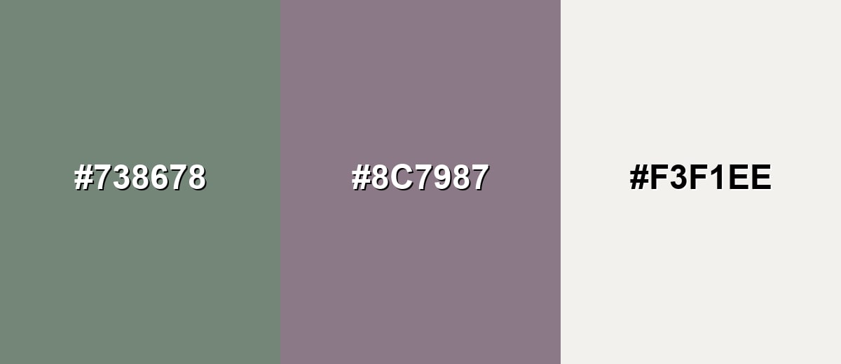
Complementary Colors
A complementary palette places xanadu against a muted mauve to create balanced contrast without harsh saturation. This approach is great for headlines, callouts, and brand accents.
Complementary Palette Example: Use xanadu as the base, add dusty mauve for contrast, and soften the layout with a light parchment neutral.
Analogous Color Schemes
Analogous colors sit adjacent to each other on the color wheel, creating harmonious, cohesive palettes with subtle variation.
This analogous set leans into nearby green-grays for a natural, seamless gradient feel.
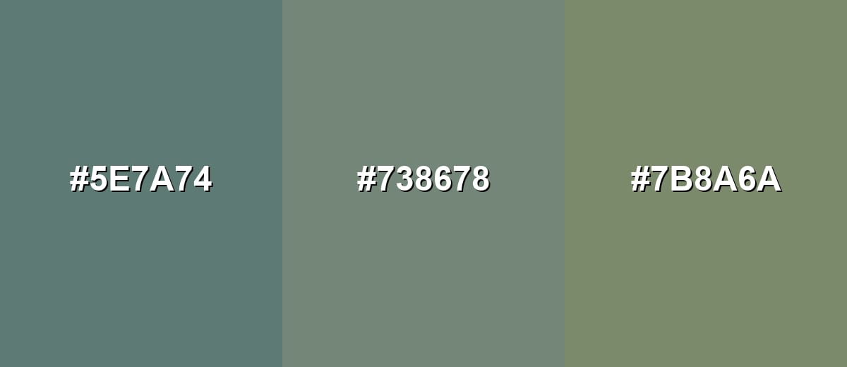
- Deep Riverstone: #5E7A74
- Xanadu: #738678
- Dusty Olive: #7B8A6A
A cooler analogous option shifts toward slate and misty greens for a breezy, modern look.
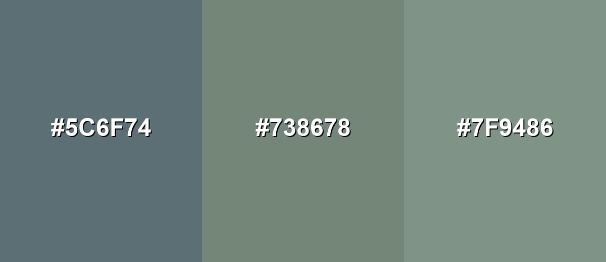
- Slate Teal: #5C6F74
- Xanadu: #738678
- Eucalyptus Mist: #7F9486
Triadic & Tetradic Combinations
A triadic palette adds variety while staying controlled and design-friendly.
Pair xanadu with a muted purple-gray and a clay brown to create a balanced, editorial-ready trio.
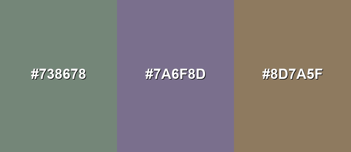
- Xanadu: #738678
- Muted Orchid: #7A6F8D
- Soft Clay: #8D7A5F
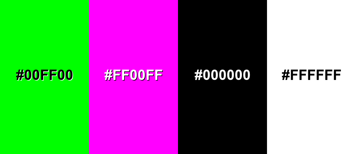
Colors to Avoid
While xanadu color is remarkably versatile, certain combinations can create problematic visual effects:
- Neon Green (#00FF00) - Its intensity overpowers xanadu and makes the overall look feel loud and unrefined.
- Hot Magenta (#FF00FF) - The saturation clash can create visual vibration, especially on screens and in small UI components.
- Pure Black (#000000) - Against pure black, xanadu can look dull and heavy; a softer charcoal is usually easier on the eye.
- Pure White (#FFFFFF) - With bright white, xanadu may appear flatter and slightly gray; warmer off-whites keep it more natural.
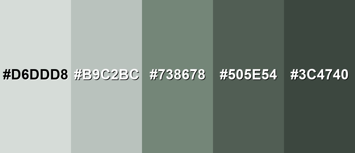
Shades, Tints & Variations of Xanadu Color
The xanadu range runs from airy, near-neutral tints to deep green-gray shades. Having a few variations on hand makes it easier to build contrast, UI states, and layered backgrounds without losing that calm, natural feel.
- Pale Xanadu (#D6DDD8) - A very light, airy tint that keeps the green-gray character while feeling clean and open. It's best used for Backgrounds, spacious layouts, and soft UI surfaces.
- Xanadu Mist (#B9C2BC) - A gentle tint that reads neutral first, with a subtle botanical undertone. It's best used for Cards, form fields, dividers, and large wall areas.
- Xanadu (#738678) - The classic muted gray-green that looks grounded and quietly natural. It's best used for Primary brand tone, navigation areas, and supporting blocks of color.
- Deep Xanadu (#505E54) - A darker, more serious shade with stronger contrast and a slightly cooler mood. It's best used for Headings, icon fills, borders, and contrast accents.
- Dark Xanadu (#3C4740) - A deep green-gray that feels earthy and refined without going fully black. It's best used for Text on light backgrounds, footers, and high-contrast UI elements.
Industry Applications
Because xanadu sits in a calm, muted range, it works across many industries where clarity, trust, and a natural tone matter more than flash.
Fashion & Beauty
- Use it as a grounding brand color for minimalist packaging and clean typography that feels premium, not loud.
- For wellness-forward collections, xanadu supports a relaxed mood that fits self-care positioning.
- In product photography, it pairs naturally with linen, stone, and soft matte finishes for a refined look.
- As a secondary shade, it helps highlight hero products without competing with labels or skincare imagery.
Interior Design & Decor
- Works well in lookbooks and mood boards to create a lived-in, timeless feel that complements natural materials.
- As a wall-friendly tone, it can read greener in warm light and grayer in cool light—always sample in-room.
- Pairs nicely with wood, warm neutrals, and subtle contrast details for a calm, grounded atmosphere.
- Ideal for bedrooms, studies, and living areas where you want comfort without heavy saturation.
Branding & Marketing
- For sustainability messaging, it signals responsibility without relying on bright greens.
- In SaaS dashboards, it's useful for sidebars and secondary surfaces to reduce harsh contrast and visual fatigue.
- In editorial layouts, it makes a refined accent for pull quotes, section headers, and cover palettes.
- For packaging, keep contrast strong (labels, type, or finishing details) so the design doesn't feel too quiet.
Conclusion
Xanadu stands out for its balanced gray-green tone that feels natural, composed, and easy to live with. With #738678 as your base, you can build warm, modern palettes using soft neutrals, dusty mauves, clay tones, or slate blues—perfect for UI surfaces, branding, and interiors where calm clarity matters. Keep an eye on contrast (especially for text), and xanadu becomes a reliable anchor color that supports content instead of competing with it.
Design Smarter with AI: Media.io is an online AI studio that empowers creators with advanced image generation and enhancement tools. From text-to-image and image-to-image creation to AI upscaling and color optimization, it enables fast, creative, and professional results—all in your browser.

Frequently Asked Questions About Xanadu Color
Xanadu is a muted green with a noticeable gray undertone. It often resembles soft eucalyptus leaves or weathered foliage rather than a bright, fresh green.
The hex code for xanadu is #738678. It is a balanced green-gray that stays subdued across most screens.
It generally reads slightly cool because of its gray base, but it can look warmer next to creamy neutrals or natural wood tones. Lighting and surrounding hues make a big difference.
It pairs well with off-whites, warm beiges, dusty mauves, clay browns, and slate blues. These combinations keep the palette calm while still providing contrast.
It can work for large text or headings on very light backgrounds, but it may be too low-contrast for small body text. For accessibility, consider a darker xanadu shade or a charcoal alternative.
Use plenty of clean neutral space, keep accents muted rather than neon, and add one structured contrast tone like slate blue or dusty mauve. Simple typography and consistent spacing help it feel crisp, not dull.


