

Pink color is a light, rosy tone that looks like red softened with white—think blush petals or cotton candy. A widely recognized pink is #FFC0CB, which reads as bright but gentle on most screens.
It's often perceived as caring, romantic, and friendly, but it can also feel playful or youthful depending on the shade. Below, you'll find the key codes, conversions, pairings, and practical ways to use pink with confidence.
Pink Color: Codes & Values
Use these standard pink color values to match the classic pink swatch accurately across web, app, and print workflows.
| Parameters | VALUE |
| HEX Code | #FFC0CB |
| RGB DECIMAL | 255, 192, 203 |
| RGB PERCENTAGE | 100%, 75.3%, 79.6% |
| CMYK | 0%,25%,20%,0% |
| HSL | 350°, 100%, 88% |
| HSV (HSB) | 350°, 25%, 100% |
| Web Safe | #FFCCCC |
Key Color Space Explanations:
- HEX - HEX is the most common way to specify pink for websites and apps. Use #ffc0cb to match this page's main swatch.
- RGB - RGB defines the on-screen mix of red, green, and blue light. For this pink, high red with moderate green and blue keeps it soft rather than neon.
- CMYK - CMYK is used for print and packaging where inks, not light, create the look. It helps you estimate how pink may shift when printed on different papers.
- HSL - HSL describes hue, saturation, and lightness in a way that is easy to tweak. Adjusting lightness is a quick way to move from blush to hot pink without changing the basic tone.
- Web Safe - Web-safe values are the closest matches from a limited legacy palette. #ffcccc is a near substitute when you need a classic, broadly compatible approximation.
If you're designing for screens, start with HEX or RGB; for print proofs and packaging, rely on CMYK and always test on the actual paper stock when color accuracy matters.
Pink Color Conversions
Need pink in a different format for code, print specs, or color grading? Here are the most common conversions in one place.
| Parameters | VALUE | CSS |
| HEX | #ffc0cb | #ffc0cb |
| RGB DECIMAL | 255, 192, 203 | rgb(255,192,203) |
| RGB PERCENTAGE | 100%, 75.3%, 79.6% | rgb(100%,75.3%,79.6%) |
| CMYK | 0%,25%,20%,0% | cmyk(0%,25%,20%,0%) |
| HSL | 350°, 100%, 88% | hsl(350°, 100%, 88%) |
| HSV (or HSB) | 350°, 25%, 100% | -- |
| Web Safe | ffcccc | #ffcccc |
| CIE-LAB | 83.8, 23.5, 3.6 | -- |
| XYZ | 70.86, 63.26, 64.94 | -- |
| xyY | 0.356, 0.318, 63.26 | -- |
| CIE-LCH | 83.8, 23.8, 8.7° | -- |
| CIE-LUV | 83.8, 38.6, 0.3 | -- |
| Hunter-Lab | 79.5, 24.9, 3.2 | -- |
| Binary | 11111111 11000000 11001011 | -- |
Want to generate Pink Color photos or posters? Try Media.io's AI Image Generator now!
Pink Color Meaning & Symbolism
Pink is commonly linked with warmth, kindness, affection, and a softer kind of confidence. In everyday life, it is used to make messages feel more approachable and less severe than pure red. This Pink Color meaning often shows up in anything meant to feel friendly, sweet, or supportive.
Psychological Effects
Pink's impact changes fast with lightness and saturation, so small tweaks can shift the whole mood.
- Comforting Calm - Gentle pink shades can feel soothing, which helps create welcoming, low-pressure experiences.
- Approachable Energy - Pink keeps an emotional "human" tone without the intensity that strong reds can bring.
- Playful Lift - Brighter pinks tend to read as fun and upbeat, especially in social or lifestyle visuals.
- Attention Without Neon - Saturated pink can draw the eye for badges or promos while staying less harsh than neon accents.
- Overuse Fatigue - Too much pink can feel overly sweet, and very light tints can lose contrast on white backgrounds.
Positive Associations
When balanced well, pink is an easy way to add warmth and friendliness to a design system.
- Warmth - Pink often makes layouts feel inviting and emotionally open.
- Kindness - It can soften messaging and reduce the "severity" you might get from pure red.
- Affection - Many audiences read pink as caring, supportive, and gentle.
- Romance - Rosy pinks naturally connect to love, sweetness, and celebration contexts.
- Friendly Confidence - Deeper pinks can feel bold and modern while still approachable.
Cultural Significance Across the World
Pink meanings vary by context, so the safest approach is matching the shade to the tone of the message.
- Romance And Celebration - Pink is widely used to signal tenderness, gifting, and festive moments.
- Pop Culture Expression - Brighter pinks are often tied to playful, confident self-expression in modern visuals.
- Support And Awareness - Pink is commonly used in community-driven, supportive awareness messaging.
- Context Shifts - The same pink can read sweet, premium, or youthful depending on pairing, contrast, and setting.
Design Applications
Pink works best when you decide whether you want it to feel soft, playful, premium, or bold. The same base tone can look delicate in a tint or loud in a saturated version, so pairing and contrast do most of the heavy lifting.
Graphic Design Tips
- Use classic pink as an accent for badges, highlights, and small brand moments—especially when you want warmth without aggression.
- Pair pink with stable neutrals (soft gray or warm cream) to keep layouts modern and less "sugary."
- When pink is a background, choose a darker text color and check contrast early to avoid readability issues.
- Build depth by mixing multiple pink tints rather than pushing saturation too high across the whole page.
- For a cleaner, fresher contrast, balance pink with minty/teal-leaning tones and keep one side more muted.
Pro tip: If pink feels too sweet, reduce saturation slightly and add more negative space—both changes can make the same shade read more premium and intentional.
Pink Color in Photography & Video
- Use pink as a wardrobe or prop accent when you want a friendly focal point without overwhelming the scene.
- In portraits, keep an eye on skin tones—soft pink lighting can look flattering, while heavy magenta shifts can feel unnatural.
- Balance pink sets with neutral backdrops so the subject stays crisp and the frame doesn't become "all one note."
- When grading, protect highlights—bright pink areas can clip quickly, especially in glossy surfaces and neon signage.
- For strong contrast, introduce cooler supporting hues in the environment while keeping pink as the hero accent.
Recommended Tool for Image Enhancement: When incorporating pink color into your photography projects, Media.io's AI Image tools can help you achieve more refined results. With AI-powered color enhancement, photo colorization, image upscaling, and old photo restoration, you can easily enrich pink color tones, improve overall image quality, and highlight the color's elegant and sophisticated aesthetic.
Color Combinations
Pink pairs easily with cool mints, soft purples, and warm neutrals, but the best match depends on whether you want a gentle or high-contrast look. Use these palettes as starting points, then adjust lightness to fit your layout and readability needs.
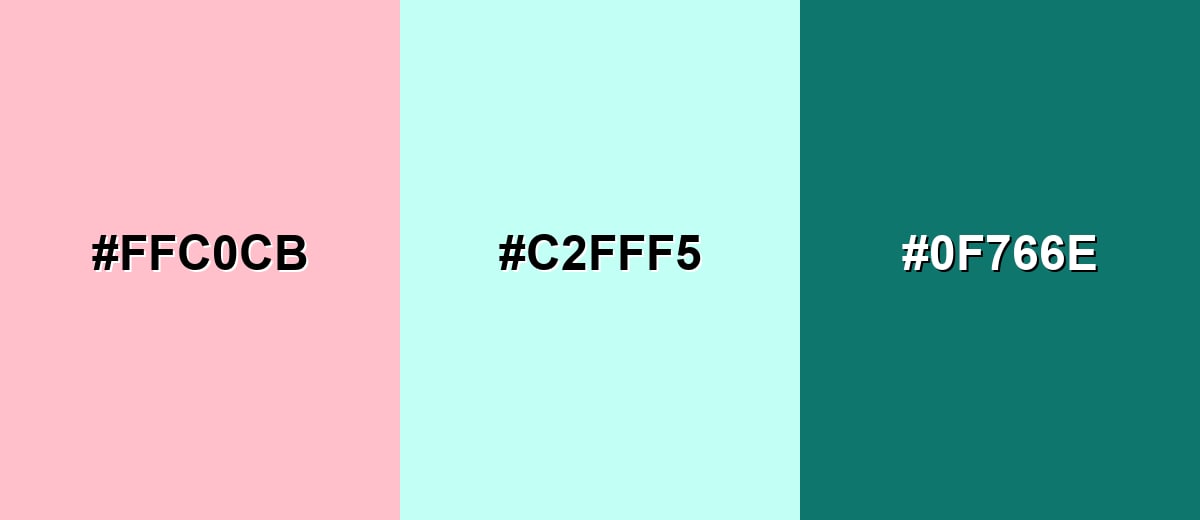
Complementary Colors
A teal-leaning mint sits opposite pink on the wheel, creating a clean, fresh contrast that still feels friendly. Add a deeper teal for structure and readable UI elements.
Complementary Palette Example: Try pink with a light mint and a deep teal for a modern, balanced palette.
Analogous Color Schemes
Analogous colors sit adjacent to each other on the color wheel, creating harmonious, cohesive palettes with subtle variation.
Pink, soft magenta, and peach create a warm, romantic flow that feels cohesive in gradients and editorial layouts.
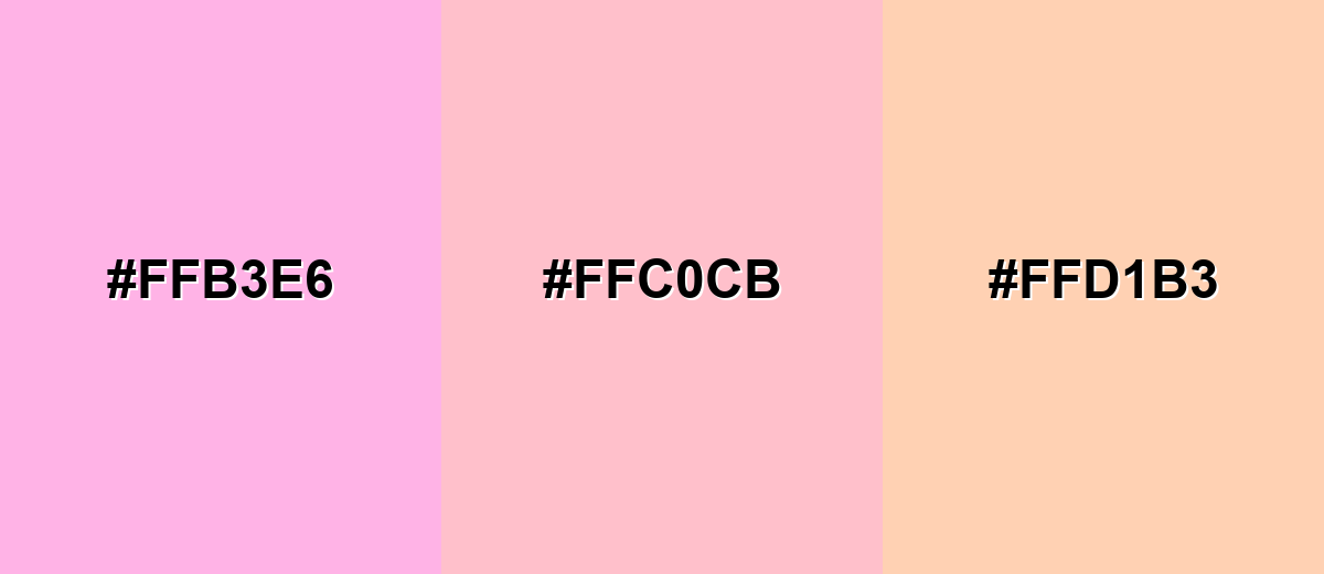
- Soft Magenta: #FFB3E6
- Pink: #FFC0CB
- Soft Peach: #FFD1B3
A tighter rosy range works well for beauty, lifestyle, and subtle UI highlights where you want variation without strong contrast.
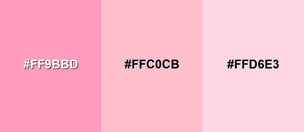
- Warm Rose: #FF9BBD
- Pink: #FFC0CB
- Pale Rose: #FFD6E3
Triadic & Tetradic Combinations
Triadic sets keep things lively by spacing hues evenly, which helps pink feel playful without becoming overwhelming.
Combine pink with a soft lime and light periwinkle for a cheerful, creative mix that still stays readable.
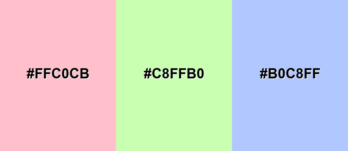
- Pink: #FFC0CB
- Soft Lime: #C8FFB0
- Light Periwinkle: #B0C8FF
Colors to Avoid
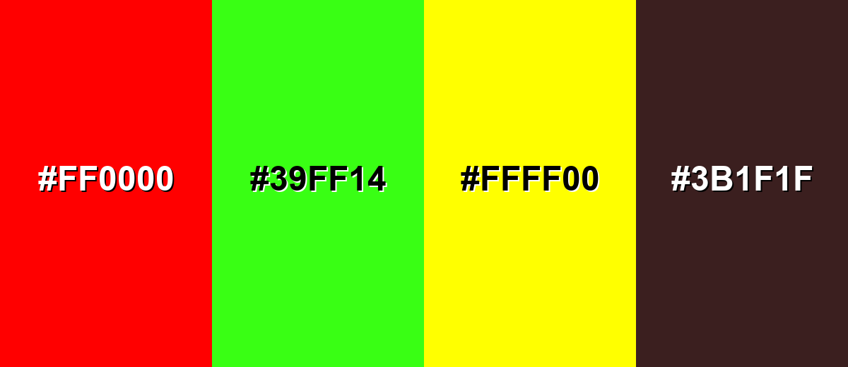
While pink color is remarkably versatile, certain combinations can create problematic visual effects:
- Pure Red (#FF0000) - Red can overpower pink and make it look washed out or accidental, especially in headings and alerts.
- Neon Green (#39FF14) - This pairing often creates visual vibration, which is tiring on screens and can reduce legibility.
- Bright Yellow (#FFFF00) - Both are high-energy; together they can feel loud and make it hard to establish hierarchy.
- Dark Brown (#3B1F1F) - Heavy brown tones can make soft pink look muddy unless carefully balanced with neutrals and spacing.
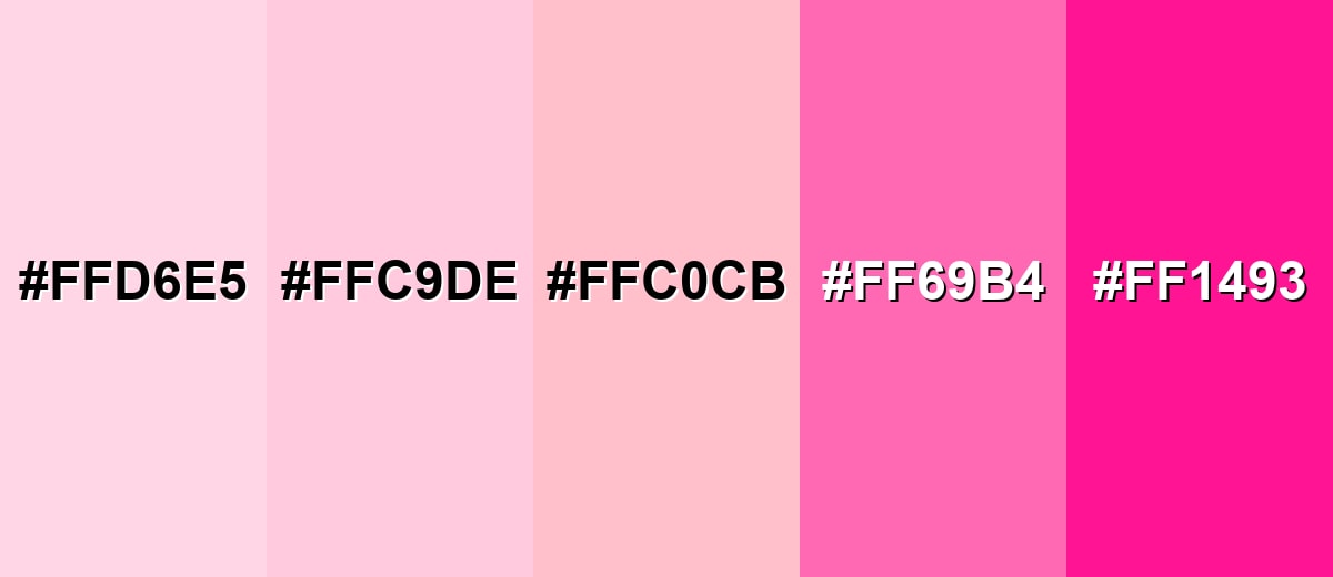
Shades, Tints & Variations of Pink Color
Pink has a surprisingly wide range—from airy pastels to bold, high-impact tones. Exploring a few reliable pink shades makes it easier to build hierarchy, create depth, and keep your palette consistent across UI, branding, and print.
- Light Pink (#FFD6E5) - A pale tint that feels airy and gentle, with minimal visual weight. It's best used for Backgrounds, large panels, and subtle gradients where you want warmth without strong attention.
- Baby Pink (#FFC9DE) - Softer than the standard swatch, with a sweet, friendly tone. It's best used for Cards, onboarding screens, and supportive messaging where a calm mood matters.
- Classic Pink (#FFC0CB) - The well-known pink tone that reads rosy, bright, and approachable. It's best used for Accents, badges, highlights, and brand moments that need warmth and visibility.
- Deep Pink (#FF69B4) - A stronger, more saturated pink that feels energetic and modern. It's best used for CTAs, promotions, and hero accents when you want higher impact than a pastel.
- Hot Pink (#FF1493) - Bold and vivid, leaning toward a punchy, statement-making look. It's best used for Campaign graphics, nightlife or entertainment visuals, and small accents where intensity is the point.
Industry Applications
Pink is used across many industries because it can signal softness, fun, or confidence depending on the shade and supporting palette. The key is to match saturation and contrast to the context and the audience's expectations.
Fashion & Beauty
- Skincare and makeup packaging cues that feel soft, clean, and approachable.
- Soft, premium editorial visuals where pink reads modern instead of overly sweet.
- Before-and-after layouts that need warmth without harsh contrast.
- Friendly product visuals and social creatives that highlight glow, blush, and rosy tones.
Interior Design & Decor
- Blush and dusty pink walls or accents to add warmth without visual heaviness.
- Pairing pink with natural textures like light wood, stone, and woven fabrics for a modern look.
- Soft pink textiles (pillows, rugs, throws) to bring comfort into minimal spaces.
- Muted pink + greens for balanced, nature-inspired rooms that still feel fresh.
Branding & Marketing
- Friendly brand identities and social campaigns that need a human tone.
- Seasonal promotions and limited editions where pink adds instant shelf and feed appeal.
- Customer appreciation and community messaging that feels supportive and warm.
- CTA accents and highlight chips that stand out without looking aggressive.
Conclusion
Pink is one of those colors that can shift from gentle and comforting to bright and expressive simply by changing the shade and contrast. Starting with #FFC0CB gives you a dependable reference you can translate into RGB, CMYK, and HSL for both digital and print projects. When you balance pink with clean neutrals or a fresh complementary mint-teal direction, it stays readable, modern, and memorable—making it a practical choice for everything from UI accents to branding and packaging.
Design Smarter with AI: Media.io is an online AI studio that empowers creators with advanced image generation and enhancement tools. From text-to-image and image-to-image creation to AI upscaling and color optimization, it enables fast, creative, and professional results—all in your browser.

Frequently Asked Questions About Pink Color
Quick answers to the most common questions about using, pairing, and understanding Pink Color in design.
A widely recognized standard pink hex code is #ffc0cb. It is the classic light pink used in many web palettes and examples.
Pink is commonly associated with warmth, affection, gentleness, and approachability. Brighter shades can also signal playful energy and confident self-expression.
Pink's opposite on the color wheel leans toward minty teal tones. A light mint can feel fresh and clean beside pink, and a deeper teal can add structure and contrast.
Yes, pink works well as an accent for CTAs, badges, and highlights, and as a soft background when you need a welcoming mood. The best results come from careful contrast checks and pairing it with stable neutrals.
Use pale tints for calm, supportive layouts and deeper pinks for energy and attention. Test the shade in the final context, because surrounding tones and lighting can make it feel warmer, cooler, softer, or louder.
Pink is typically a tint of red, made lighter with white, so it feels softer and brighter. Magenta is more saturated and sits closer to purple, often appearing bolder and more intense on screens.


