

 TL;DR:
Azul (#0077FF) is a vivid, cyan-leaning blue that communicates clarity, trust, and calm, making it a highly effective anchor hue for digital interfaces, branding, and clear navigation.
● **Primary Design Use:** Treat Azul as a strong anchor for hierarchy by applying #0077FF to primary actions (like CTAs and links), while using lighter tints (like #CCE4FF) for large backgrounds to reduce eye fatigue and glare.
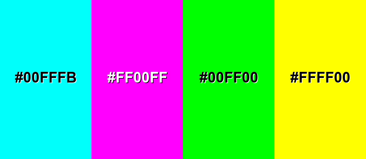
● **Color Combinations:** Pair Azul with warm oranges or crisp neutrals for bold, readable contrast, and avoid mixing it with highly saturated neons (like #00FFFB, #FF00FF, #00FF00, or #FFFF00) to prevent harsh visual vibration and readability issues on screens.
● **Format Considerations:** While HEX (#0077FF) and RGB are best for screen design, always verify CMYK values (100%, 53%, 0%, 0%) with proofs for print workflows, as paper and profiles can shift saturated blues.
Ask AI for a summary
 ChatGPT
 Perplexity
 Gemini
 Claude
 Grok
Grok
Azul color is a vivid, slightly cyan-leaning blue that looks like clear sky over deep water. On screens it's commonly represented by the hex code #0077FF.
It's often perceived as calm, dependable, and refreshing, and the name comes from the Spanish word for blue used widely across art and design. Below you'll find its meaning, codes, pairings, shades, and practical ways to use it.
Azul Color: Codes & Values
Use these standard values to keep azul consistent across UI design, branding assets, and print workflows.
| Parameters | VALUE |
| HEX Code | #0077FF |
| RGB DECIMAL | 0, 119, 255 |
| RGB PERCENTAGE | 0%, 46.7%, 100% |
| CMYK | 100%,53%,0%,0% |
| HSL | 212°, 100%, 50% |
| HSV (HSB) | 212°, 100%, 100% |
| Web Safe | #0066FF |
Key Color Space Explanations:
- HEX - HEX is the most common way to specify azul for screens and web design. Use it for CSS, UI components, and consistent brand assets.
- RGB - RGB defines azul using red, green, and blue light values for displays. It's the most direct format for digital graphics and video.
- CMYK - CMYK translates azul into ink percentages for printing. Results can vary by paper and profile, so soft-proof when accuracy matters.
- HSL - HSL describes azul by hue, saturation, and lightness, which makes it easier to create tints and tones. It's useful for theming systems and quick adjustments.
- Web Safe - Web Safe is the closest legacy-safe match for older displays and simplified palettes. It helps when you want a predictable, widely supported approximation.
If you're designing for screens, start with HEX (#0077FF) or RGB, then derive lighter tints and deeper shades for backgrounds, borders, and states.
Azul Color Conversions
Need azul in a different color model? Here are quick conversions you can copy into your workflow.
| Parameters | VALUE | CSS |
| HEX | #0077ff | #0077ff |
| RGB DECIMAL | 0, 119, 255 | rgb(0,119,255) |
| RGB PERCENTAGE | 0%, 46.7%, 100% | rgb(0%,46.7%,100%) |
| CMYK | 100%,53%,0%,0% | cmyk(100%,53%,0%,0%) |
| HSL | 212°, 100%, 50% | hsl(212°,100%,50%) |
| HSV (or HSB) | 212°, 100%, 100% | -- |
| Web Safe | 0066ff | #0066ff |
| CIE-LAB | 52.3, 24.0, -75.0 | -- |
| XYZ | 24.65, 20.42, 97.25 | -- |
| xyY | 0.173, 0.144, 20.42 | -- |
| CIE-LCH | 52.3, 78.8, 287.7° | -- |
| CIE-LUV | 52.3, -26.8, -117.7 | -- |
| Hunter-Lab | 45.2, 21.4, -106.7 | -- |
| Binary | 00000000 01110111 11111111 | -- |
Want to generate Azul Color photos or posters? Try Media.io's AI Image Generator now!
Azul Color Meaning & Symbolism
Azul is widely associated with clarity, reliability, and a sense of open space. In everyday life, it often shows up where people want things to feel stable, clean, and easy to trust, from interfaces to signage.
Psychological Effects
In design, azul tends to shape both mood and attention in a very direct way.
- Calm Focus - Azul can make layouts feel calmer and more organized, helping users scan content with less effort.
- Lower Visual Noise - It naturally supports navigation, buttons, and info panels because it reads clean and structured.
- Modern Energy - Its bright saturation feels active and current, which can make interfaces feel faster and fresher.
- Confident Action - Azul often works well for calls to action because it stands out without feeling aggressive.
- Cool Distance - Overuse can feel cold or impersonal, especially in large, flat blocks with no texture or warmth.
Positive Associations
These are the "safe" meanings azul communicates most often across branding and UI.
- Trust - A dependable signal that supports credibility in products, services, and messaging.
- Clarity - Helps information feel easy to understand and visually organized.
- Cleanliness - Often reads as crisp and polished, especially when paired with white space.
- Freshness - The slight cyan lean adds a refreshing, airy feel compared to deeper blues.
- Stability - Reinforces a steady tone that works well for long-form experiences and systems.
Cultural Significance Across the World
As a general blue, azul tends to stay consistent, but context still matters.
- Sky And Water - Commonly linked to open space and nature, supporting a calm, breathable mood.
- Dependability - Typically read as reliable rather than risky, which is why it's popular in informational design.
- Clarity In Signage - Works well in wayfinding and guidance systems because it's visible and easy to recognize.
- Neutral Professionalism - Often feels "serious but friendly," making it versatile across many audiences.
Design Applications
Azul is easiest to work with when you treat it as a strong anchor hue and let other elements support it. The sections below show practical ways to apply it in digital layouts, branding systems, and print work.
Graphic Design Tips
- Use it for hierarchy - Apply #0077FF to primary actions and key links so the interface clearly "points" to what matters.
- Go lighter for big surfaces - For large backgrounds, switch to lighter options like #CCE4FF to reduce glare and eye fatigue.
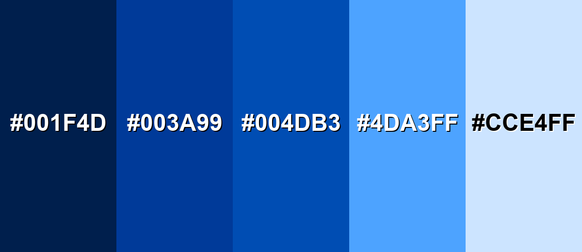
- Build a simple scale - Keep a core azul plus a deep support like #003A99 and a soft tint like #CCE4FF for predictable design systems.
- Strengthen dark mode - Deep shades like #001F4D make bright azul elements pop cleanly without harsh contrast.
- Print-proof your blues - Start from CMYK values, but always verify with proofs since paper and profiles can shift saturated blues.
If azul feels too 'cold" in a layout, balance it with whitespace, softer tints, and one warm accent rather than adding multiple competing bright colors.
Azul Color in Photography & Video
- Enhance sky and water - Azul-style blues are perfect for emphasizing clean skies, ocean tones, and travel visuals.
- Control saturation - Keep highlights from clipping by dialing back saturation in bright areas before pushing overall vibrance.
- Use split toning - Add cool blue to shadows and keep skin tones warm for a modern, cinematic contrast.
- Create depth with contrast - Pair deeper blues in the background with lighter blue accents to make subjects stand out.
- Keep UI overlays readable - For titles and captions, place text on deeper blues (like #001F4D) or on soft tints (like #CCE4FF) to maintain clarity.
Recommended Tool for Image Enhancement: When incorporating azul color into your photography projects, Media.io's AI Image tools can help you achieve more refined results. With AI-powered color enhancement, photo colorization, image upscaling, and old photo restoration, you can easily enrich azul color tones, improve overall image quality, and highlight the color's elegant and sophisticated aesthetic.
Color Combinations
Azul pairs well with crisp neutrals, warm oranges, and energetic greens when you want a modern, readable palette. The combinations below cover reliable harmony options plus a few high-risk mixes to use carefully.
Complementary Colors
A complementary scheme uses the opposite hue on the color wheel to create strong, attention-grabbing contrast.
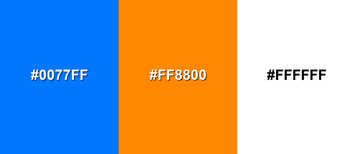
Complementary Palette Example: Pair Azul with a warm orange accent and a clean neutral to keep the contrast bold but usable.
Analogous Color Schemes
Analogous colors sit adjacent to each other on the color wheel, creating harmonious, cohesive palettes with subtle variation.
This analogous set stays in the blue-to-cyan range for a smooth, ocean-like feel.
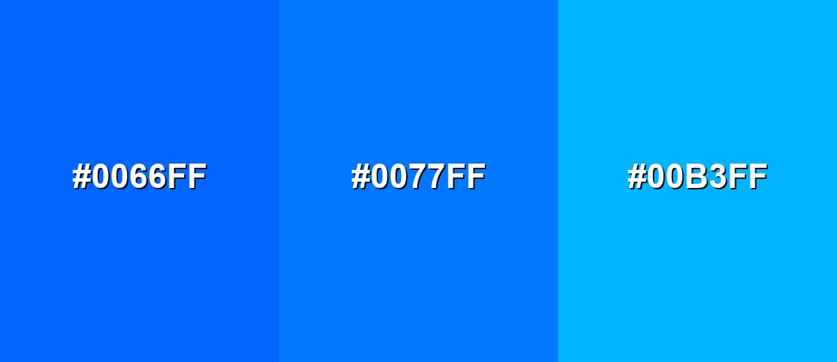
- Web-Safe Blue: #0066FF
- Azul: #0077FF
- Bright Cyan: #00B3FF
This analogous set adds depth by combining a darker blue with a lighter sky tone.
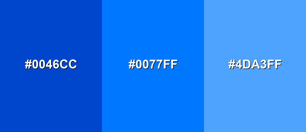
- Deep Blue: #0046CC
- Azul: #0077FF
- Sky Blue: #4DA3FF
Triadic & Tetradic Combinations
A triadic palette spreads three hues evenly for a balanced, lively look.
Use Azul with a punchy magenta and a bright yellow-green when you need playful energy with clear separation.
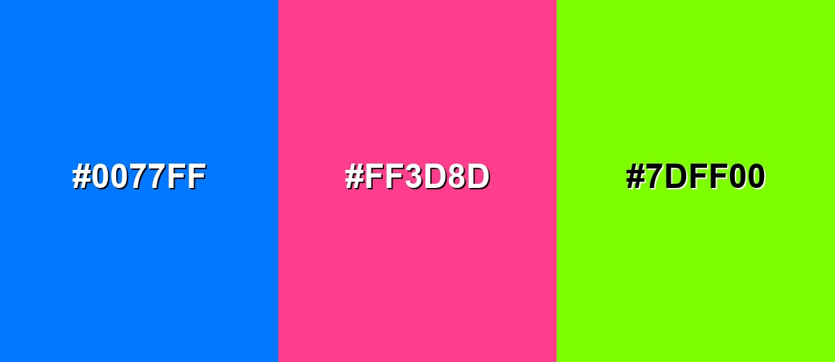
- Azul: #0077FF
- Vivid Magenta: #FF3D8D
- Electric Yellow-Green: #7DFF00
Colors to Avoid
While azul color is remarkably versatile, certain combinations can create problematic visual effects:
- Neon Aqua (#00FFFB) - Too close in brightness and saturation to azul, which can create a vibrating edge on screens.
- Pure Magenta (#FF00FF) - Both hues are highly saturated, so the pairing can feel noisy and reduce readability in UI.
- Pure Green (#00FF00) - The mix can look overly synthetic and can be harsh for long viewing, especially in large blocks.
- Pure Yellow (#FFFF00) - High luminance next to azul can cause glare and makes fine text and icons harder to parse.
Shades, Tints & Variations of Azul Color
From deep, navy-leaning options to soft pastel tints, azul has a wide range that's easy to build into a usable palette. These variations help you control contrast, mood, and readability across backgrounds, components, and highlights.
- Midnight Azul (#001F4D) - A very dark navy-leaning azul that feels steady and serious. It's best used for Dark mode backgrounds, headers, and high-contrast layouts..
- Deep Azul (#003A99) - A richer, darker take that keeps the same hue family with more weight. It's best used for Primary brand shade, hero banners, and strong typography accents..
- Cobalt Azul (#004DB3) - A saturated medium-dark blue that reads bold without the brightness of the base tone. It's best used for Buttons, charts, and UI states where you want less glare..
- Sky Azul (#4DA3FF) - A lighter, airy version that feels friendly and open. It's best used for Secondary backgrounds, highlights, and spacious web sections..
- Pale Azul (#CCE4FF) - A soft tint that keeps the blue identity while staying gentle on the eyes. It's best used for Panels, empty states, subtle gradients, and background fills..
Industry Applications
Because azul reads as clear and reliable, it fits many industries where trust, usability, and visibility matter. These examples highlight common ways teams apply it in real projects.
Fashion & Beauty
- Clean seasonal stories - Works well for "fresh" spring/summer campaigns that need an airy, modern feel.
- Product contrast - Helps packaging labels and shade names stand out clearly in eCommerce listings.
- Minimal editorial layouts - Pairs nicely with white space for lookbooks, landing pages, and brand launches.
- Accent styling - A strong blue accent can make accessories and detail shots feel sharper and more premium.
Interior Design & Decor
- Open-space vibe - Azul-inspired blues evoke sky and water, helping rooms feel brighter and more breathable.
- Feature walls - A bold blue focal point can anchor a space without the heaviness of darker navies.
- Balanced warmth - Looks more welcoming when paired with warm woods, neutrals, or a small orange accent.
- Wayfinding clarity - Useful for signage and room markers where legibility matters.
Branding & Marketing
- Trust-building identity - Azul supports a dependable tone for brands that need credibility fast.
- CTA performance - Bright, saturated blue is a common choice for primary buttons and key links.
- Readable content design - Helps structure dashboards, charts, and information-heavy pages.
- Simple palette systems - Easy to scale into tints and shades for consistent assets across teams.
Conclusion
Azul stands out as a bright, clean blue that feels modern and dependable—one of the main reasons it shows up so often in interfaces and brand systems. With #0077FF as a strong digital anchor, you can build clear hierarchy for CTAs and navigation, then soften the cool edge with light tints or add energy with a warm complementary accent. Whether you're designing for web, print, or visual content, keeping Azul Color meaning in mind helps you choose pairings that stay readable, balanced, and confident.
Design Smarter with AI: Media.io is an online AI studio that empowers creators with advanced image generation and enhancement tools. From text-to-image and image-to-image creation to AI upscaling and color optimization, it enables fast, creative, and professional results—all in your browser.

Frequently Asked Questions About Azul Color
Here are quick, practical answers to the most common questions about using azul in design.
Azul is a vivid blue with a slight cyan lean, similar to a clear sky or bright ocean water. It's commonly used as a modern primary blue in digital design.
A common digital reference for azul is #0077ff, which produces a bright, clean blue on most screens.
Azul sits firmly in the blue family, but it leans a bit toward cyan. That extra green-blue energy is what makes it feel fresh and modern.
Azul is often linked with clarity, trust, and calm. It's frequently chosen for UI elements and branding where you want people to feel guided and confident.
Reliable pairings include white (#ffffff) for a crisp look, orange (#ff8800) for strong contrast, and lighter blues like #4da3ff or #cce4ff for smooth, cohesive palettes.
Be cautious with highly saturated neon hues like #00fffb, #ff00ff, #00ff00, and #ffff00. These can create harsh visual vibration and reduce readability, especially on screens.


