

 TL;DR:
Classic Brown (#8B5A2B) functions best as a grounding surface or background material in design, requiring balance with light neutrals like ivory or warm grays to prevent visual heaviness.
● Restrict brown from being used as a primary text color, as dark brown-on-brown layers severely reduce scanning readability and create a dense, muddy interface.
● Combine brown with deep slate blue or teal green for structured contrast, but avoid highly saturated neon cyans, magentas, and pure yellows that clash with or dull its earthy tone.
● Always test brown on actual paper finishes before finalizing print or packaging production, because the physical substrate can unexpectedly shift the color to appear duller or warmer.
Ask AI for a summary
 ChatGPT
 Perplexity
 Gemini
 Claude
 Grok
Grok
Brown is a warm, earthy tone that brings to mind wood, soil, coffee, and other familiar natural textures. A reliable reference point is #8B5A2B, a medium brown that feels grounded with a gentle golden warmth.
It's often seen as dependable, cozy, and organic, but it can look heavy if used without enough light contrast. Below, you'll find key brown color codes, conversions, pairing ideas, popular shades, and practical ways to use brown in design.
Brown Color: Codes & Values
Use these standard values to match brown consistently across UI, branding, illustration, and print production.
| Parameters | VALUE |
| HEX Code | #8B5A2B |
| RGB DECIMAL | 139, 90, 43 |
| RGB PERCENTAGE | 54.5%, 35.3%, 16.9% |
| CMYK | 0%,35%,69%,46% |
| HSL | 29°, 53%, 36% |
| HSV (HSB) | 29°, 69%, 55% |
| Web Safe | #996633 |
Key Color Space Explanations:
- HEX - HEX is the most common way to identify a screen-ready shade in web and UI design. It's a quick, consistent reference for CSS and design tools.
- RGB - RGB defines the red, green, and blue light values used by displays. It's helpful for on-screen work, motion graphics, and digital asset creation.
- CMYK - CMYK is used for printing and describes ink percentages. It's important when you need predictable results on paper or packaging.
- HSL - HSL breaks a shade into hue, saturation, and lightness, which makes it easier to adjust warmth and depth. Designers often use it to build coherent palettes and states.
- Web Safe - Web Safe is the nearest legacy-safe match for older display standards. It can be useful when you want a simple, broadly compatible approximation.
For web work, start with HEX (or RGB) and adjust HSL/HSV when you need lighter UI states or a deeper, more premium brown for emphasis.
Brown Color Conversions
These conversions make it easier to translate the same brown across design apps, development handoff, and print specs.
| Parameters | VALUE | CSS |
| HEX | #8b5a2b | #8b5a2b |
| RGB DECIMAL | 139, 90, 43 | rgb(139,90,43) |
| RGB PERCENTAGE | 54.5%, 35.3%, 16.9% | rgb(54.5%,35.3%,16.9%) |
| CMYK | 0%,35%,69%,46% | cmyk(0%,35%,69%,46%) |
| HSL | 29°, 53%, 36% | hsl(29°, 53%, 36%) |
| HSV (or HSB) | 29°, 69%, 55% | -- |
| Web Safe | 996633 | #996633 |
| CIE-LAB | 40.6, 16.0, 33.5 | -- |
| XYZ | 17.9, 14.7, 4.7 | -- |
| xyY | 0.48, 0.39, 14.7 | -- |
| CIE-LCH | 40.6, 37.1, 64° | -- |
| CIE-LUV | 40.6, 31.0, 37.0 | -- |
| Hunter-Lab | 38.3, 12.7, 26.5 | -- |
| Binary | 10001011 01011010 00101011 | -- |
Want to generate Brown Color photos or posters? Try Media.io's AI Image Generator now!
Brown Color Meaning & Symbolism
Brown is widely associated with earth, wood, and natural stability, which is why it often feels grounded and reassuring. In everyday life it shows up in materials and foods that signal warmth, familiarity, and practicality. Brown color symbolism commonly points to reliability, comfort, and a down-to-earth attitude.
Psychological Effects
In spaces and interfaces, brown tends to steady the mood and make things feel more “real” and tactile.
- Grounded Feeling - Brown can make layouts feel stable and anchored, especially when it's used as a base color.
- Comfort & Safety - Soft browns paired with warm neutrals can create a cozy, reassuring atmosphere.
- Trust & Tradition - Brown often reads as established and dependable, which supports heritage-style branding.
- Visual Heaviness - Overusing dark browns can feel dense or dated, particularly in small layouts or low-light rooms.
- Reduced Readability - Low-contrast brown-on-brown combinations can make text and UI elements harder to scan.
Positive Associations
When balanced well, brown signals real materials, honest craft, and everyday warmth.
- Nature - Brown is closely tied to earth, wood, and organic surfaces that feel natural and familiar.
- Craftsmanship - It commonly suggests handmade quality and attention to detail.
- Warmth - Brown can bring a welcoming, homey tone to palettes and environments.
- Practicality - It often communicates a no-fuss, functional mindset that feels reliable.
- Material Quality - Brown evokes leather, timber, and coffee tones that can feel premium when paired with clean typography.
Cultural Significance Across the World
Brown meanings can shift with context, so it's best read as part of the full palette and setting.
- Rustic vs. Formal - Depending on styling, brown can read as rustic and casual or classic and refined.
- Humble Materials - It's frequently linked to simple, grounded materials and practical living.
- Craft & Heritage - In many contexts, brown supports ideas of tradition, durability, and long-lasting value.
- Nature First - Brown is widely tied to outdoor life and natural environments, especially when paired with greens and off-whites.
Design Applications
Brown is easiest to use when you treat it like a material: a surface, a frame, or a foundation that other tones can sit on.
Graphic Design Tips
- Use brown as a grounding base for backgrounds, containers, and “surface” areas rather than as the main text color.
- Pair it with off-whites and warm grays to keep layouts airy and avoid a heavy, muddy feel.
- Lean on texture cues (paper grain, wood, leather, soft gradients) so brown feels intentional and tactile.
- Keep spacing generous and typography strong; brown palettes look best with clear hierarchy and breathing room.
- When you need modern contrast, add a cooler counterpoint (like muted blues or greens) to sharpen the composition.
If your design starts to feel too dark, don't rush to brighten the brown—often the fastest fix is adding more light neutral space (ivory/beige) and reserving brown for key accents and frames.
Brown Color in Photography & Video
- Use brown props and backgrounds (wood, kraft paper, leather) to create warmth without oversaturating the scene.
- In product shots, brown can make food and lifestyle items feel richer and more “crafted,” especially under soft light.
- For cinematic grading, brown works well with warm highlights and controlled shadows to maintain a grounded tone.
- Balance brown-dominant scenes with crisp whites or cooler accents so the image doesn't look flat or underexposed.
- When filming UI or packaging, ensure labels and fine text keep strong contrast against brown surfaces.
Recommended Tool for Image Enhancement: When incorporating brown color into your photography projects, Media.io's AI Image tools can help you achieve more refined results. With AI-powered color enhancement, photo colorization, image upscaling, and old photo restoration, you can easily enrich brown color tones, improve overall image quality, and highlight the color's elegant and sophisticated aesthetic.
Color Combinations
Brown pairs well with both warm neutrals and cooler opposites. Use it as a grounding base, then add contrast with blues, greens, or bright highlights to control the mood.
Complementary Colors
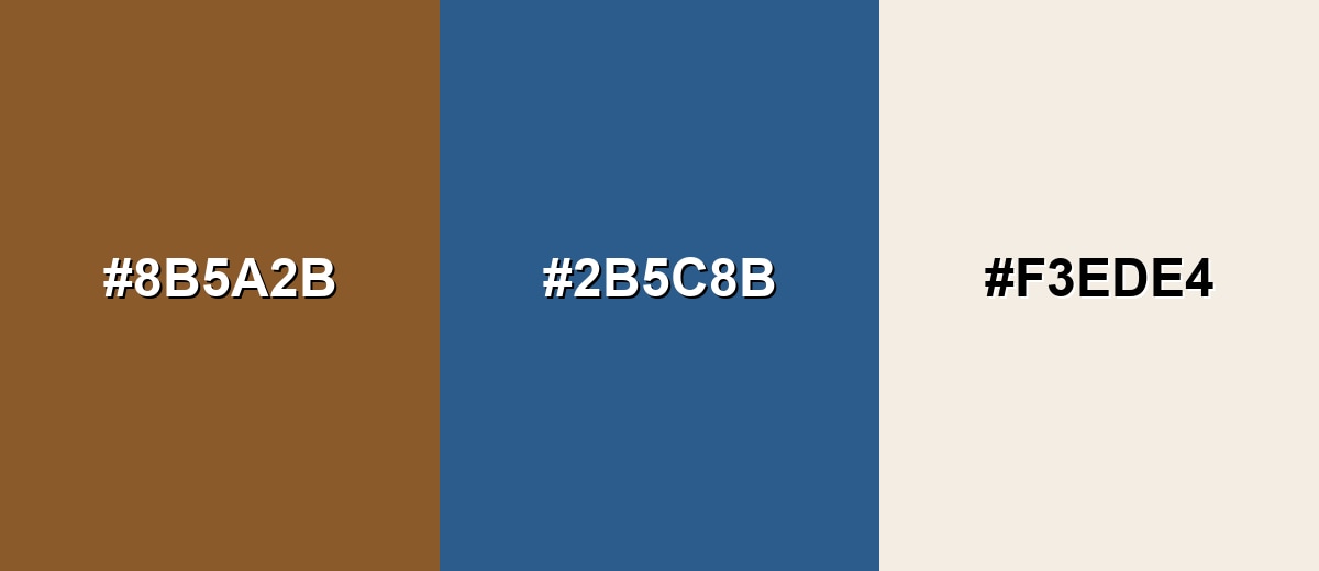
A blue complement adds clean contrast to brown's earthy warmth, making layouts feel balanced and more modern. This pairing works well when brown is the base and blue is used for emphasis.
Complementary Palette Example: Try brown with a deep slate blue and a warm ivory for a grounded palette with clear visual contrast.
Analogous Color Schemes
Analogous colors sit adjacent to each other on the color wheel, creating harmonious, cohesive palettes with subtle variation.
Warm analogous browns with a hint of red and olive feel natural and rustic.
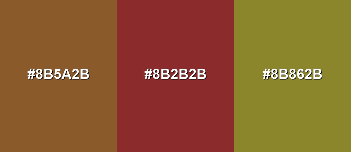
- Classic Brown: #8B5A2B
- Brick Brown: #8B2B2B
- Olive Gold: #8B862B
A coffee-to-tan range creates a soft gradient that's easy to use in backgrounds and packaging.
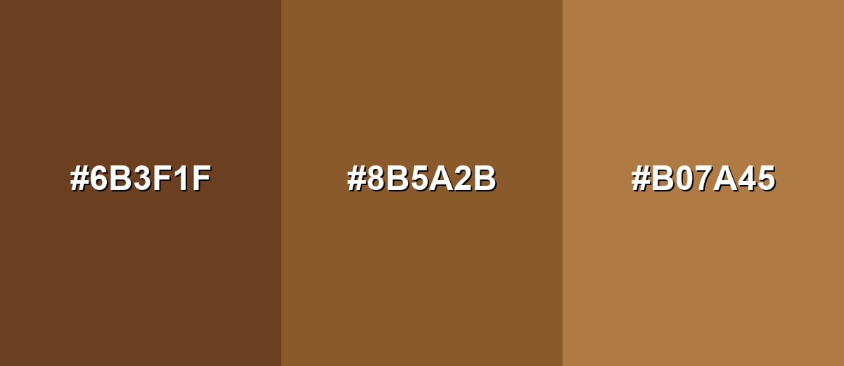
- Deep Coffee: #6B3F1F
- Classic Brown: #8B5A2B
- Warm Tan: #B07A45
Triadic & Tetradic Combinations
Triadic palettes keep energy high while staying balanced across the wheel.
Combine brown with a teal-leaning green and a deep purple for a bold but structured look.
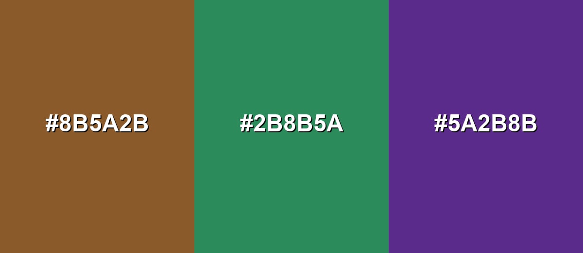
- Classic Brown: #8B5A2B
- Teal Green: #2B8B5A
- Deep Purple: #5A2B8B
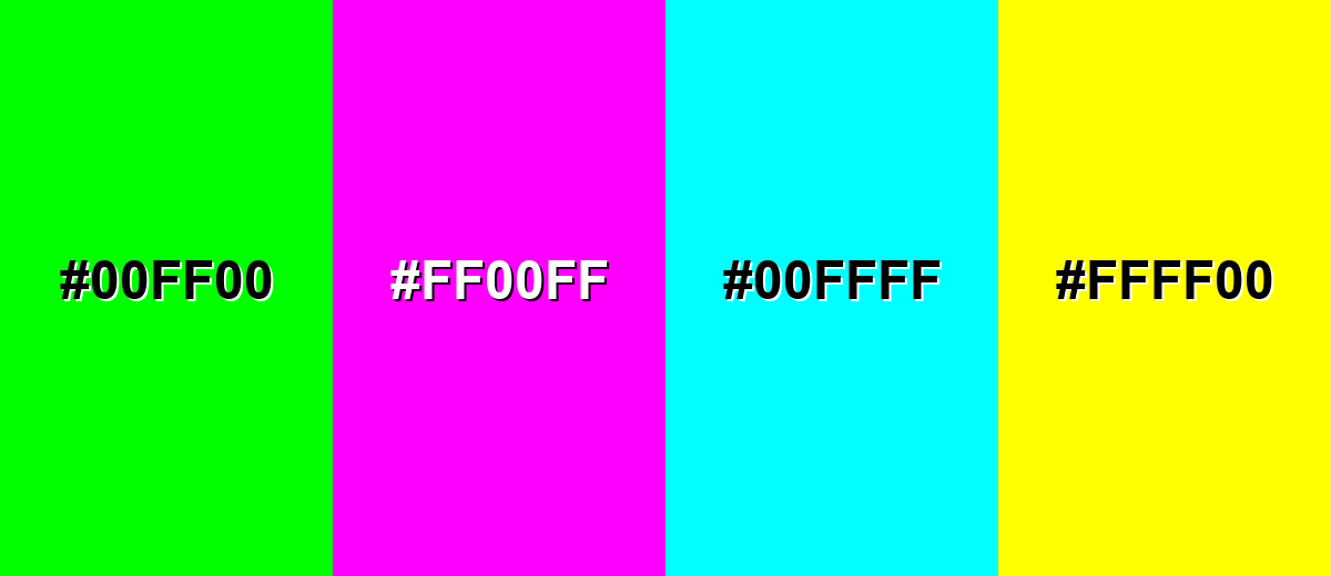
Colors to Avoid
While brown color is remarkably versatile, certain combinations can create problematic visual effects:
- Neon Green (#00FF00) - The intensity can overpower brown and make the palette feel harsh rather than grounded.
- Neon Magenta (#FF00FF) - Highly saturated magenta can clash with brown's earthy tone and look visually noisy in UI.
- Neon Cyan (#00FFFF) - The sharp coolness can create an abrasive contrast that feels less natural and harder to harmonize.
- Pure Yellow (#FFFF00) - Bright yellow can make brown appear dull or dirty unless carefully balanced with neutrals and spacing.
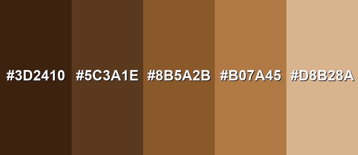
Shades, Tints & Variations of Brown Color
Brown has a wide, usable range—from deep chocolate tones that feel premium to soft beige tints that brighten layouts without losing that earthy character. This spectrum makes it easy to build depth, hierarchy, and texture in both digital and print design.
- Dark Chocolate (#3D2410) - A deep, rich brown that feels serious and premium with strong contrast. It's best used for Headlines, logo marks, dark mode accents, and luxury packaging details.
- Espresso Brown (#5C3A1E) - A darker, warmer brown that still reads clearly without feeling black. It's best used for Navigation bars, borders, product labels, and grounded UI components.
- Classic Brown (#8B5A2B) - A balanced medium brown with a warm, natural look. It's best used for Primary brand accents, illustrations, and earthy palettes with strong neutrals.
- Warm Tan (#B07A45) - A lighter brown that feels friendly and approachable. It's best used for Background blocks, cards, gradients, and soft brand systems.
- Soft Beige (#D8B28A) - A pale, warm tone that keeps designs airy while staying earthy. It's best used for Large backgrounds, UI surfaces, interiors mood boards, and gentle contrast setups.
Industry Applications
Brown is most effective in industries that benefit from a sense of material quality, comfort, or tradition. It can signal natural ingredients, durability, and craftsmanship when paired with clean typography and enough breathing room.
Fashion & Beauty
- Support heritage styling for leather goods, belts, bags, and classic accessories.
- Build neutral capsule-collection palettes with browns, beiges, and warm off-whites.
- Create a grounded, premium feel in lookbooks by pairing brown with minimal typography.
- For natural positioning in wellness/personal care, keep brown accents light and balanced with clean neutrals.
Interior Design & Decor
- Use brown as structure: floors, furniture, and wood tones that anchor the room.
- Choose lighter browns and tans to warm spaces without making them feel dim.
- Layer textures (wood grain, linen, stone) so browns feel rich instead of flat.
- Add bright highlights or a cooler accent color to prevent an overly enclosed look.
Branding & Marketing
- Great for coffee, chocolate, bakery, and spice packaging where warmth supports appetite appeal.
- Works well for outdoor, gardening, and eco-focused products that lean into natural materials.
- Use strong typography and clear spacing; mid-tone browns can mute contrast if layouts get crowded.
- For print and packaging, test on your actual paper/finish since brown can shift warmer or duller by substrate.
Conclusion
Brown stands out for its grounded, material feel—more like wood or soil than a bright synthetic hue. If you want warmth, stability, and an approachable tone in branding, interiors, or UI, #8B5A2B is a strong starting point that anchors layouts without shouting. The key is balance: give brown plenty of breathing room with light neutrals, and introduce a cooler counterpoint (like a deep blue or muted green) when you need sharper contrast and a more modern finish.
Design Smarter with AI: Media.io is an online AI studio that empowers creators with advanced image generation and enhancement tools. From text-to-image and image-to-image creation to AI upscaling and color optimization, it enables fast, creative, and professional results—all in your browser.

Frequently Asked Questions About Brown Color
Brown is a warm, earthy tone often seen in natural materials like wood, soil, and leather. It typically looks like a darker, muted orange and is commonly used as a grounding base in palettes.
A widely used medium brown reference is #8b5a2b. It's a practical starting point for earthy UI accents, branding elements, and print work.
Brown pairs easily with warm neutrals like ivory and beige, plus cooler accents like deep blues and muted greens. These combinations help brown feel modern while keeping its natural warmth.
Most browns lean warm because they sit near orange on the color wheel, but the undertone can shift. Browns with more blue or gray can feel cooler and more contemporary.
A common approach is mixing complementary pigments (like a blue with an orange) and adjusting with small amounts of white or black. You can also mix red, yellow, and blue, then refine the warmth by adding more red/yellow or coolness by adding more blue.
Yes, especially when you want a dependable, handcrafted, or natural feel. For UI, keep readability high with strong contrast and use brown more for surfaces and accents than for dense text.


