

Forest green is a deep, natural green that looks like dense pine needles and shaded woodland leaves. Its classic digital reference is the hex code #228b22, which sits between a true green and a muted evergreen.
Many people perceive it as calming, steady, and connected to growth and the outdoors. This guide covers forest green color meaning, color codes, combinations, shades, and practical ways to use it.
Forest Green Color: Codes & Values
If you want a reliable "forest green" reference for design tools, these values are the go-to starting point.
| Parameters | VALUE |
| HEX Code | #228B22 |
| RGB DECIMAL | 34, 139, 34 |
| RGB PERCENTAGE | 13.33%, 54.51%, 13.33% |
| CMYK | 76%,0%,76%,45% |
| HSL | 120°, 61%, 34% |
| HSV (HSB) | 120°, 76%, 55% |
| Web Safe | #339933 |
Key Color Space Explanations:
- HEX - HEX is the most common way to specify this shade in web design and digital tools, using a six-digit code. For forest green, #228b22 maps directly to its screen-ready sRGB values.
- RGB - RGB defines the mix of red, green, and blue light used on screens. The higher green channel gives forest green its strong, lively base while keeping it darker and natural.
- CMYK - CMYK is used for print, describing how much cyan, magenta, yellow, and black ink to apply. Forest green uses heavy cyan and yellow with a noticeable black component to keep the tone deep.
- HSL - HSL describes hue, saturation, and lightness in a way many designers find intuitive. Forest green's hue is centered around 120° with moderate saturation and lower lightness for a shaded, wooded feel.
- Web Safe - Web-safe colors come from a limited palette that older displays could render consistently. The closest web-safe match to forest green is #339933.
Use HEX for most web workflows, RGB for screen-based apps, and CMYK when you're preparing print files and need more predictable ink behavior.
Forest Green Color Conversions
Need forest green in a different format for your editor, CSS, or print workflow? Copy the conversion you need below.
| Parameters | VALUE | CSS |
| HEX | #228b22 | #228b22 |
| RGB DECIMAL | 34, 139, 34 | rgb(34,139,34) |
| RGB PERCENTAGE | 13.33%, 54.51%, 13.33% | rgb(13.33%,54.51%,13.33%) |
| CMYK | 76%,0%,76%,45% | cmyk(76%,0%,76%,45%) |
| HSL | 120°, 61%, 34% | hsl(120°, 61%, 34%) |
| HSV (or HSB) | 120°, 76%, 55% | -- |
| Web Safe | 339933 | #339933 |
| CIE-LAB | 50.7, -50.0, 45.0 | -- |
| XYZ | 10.21, 18.99, 4.64 | -- |
| xyY | 0.302, 0.561, 18.99 | -- |
| CIE-LCH | 50.7, 67.3, 138.0° | -- |
| CIE-LUV | 50.7, -43.3, 55.9 | -- |
| Hunter-Lab | 43.6, -33.1, 23.7 | -- |
| Binary | 00100010 10001011 00100010 | -- |
Want to generate Forest Green Color photos or posters? Try Media.io's AI Image Generator now!
Forest Green Color Meaning & Symbolism
Forest green is widely associated with nature, resilience, and steady energy. Because it resembles evergreen trees and shaded foliage, it often feels grounded and dependable in everyday visuals like signage, packaging, and home decor.
Psychological Effects
In practice, forest green tends to calm the eye while adding weight and structure to a layout or space.
- Calming Atmosphere - It can make interfaces and rooms feel quieter and more settled, especially as a backdrop.
- Steady Focus - The darker value helps reduce glare, which can support long-form reading and concentrated work.
- Trust & Reliability - It often reads as dependable, making it a solid choice for brands that want to feel established.
- Natural Energy - The green hue keeps it connected to growth and outdoorsy cues without looking neon or trendy.
- Heavy When Overused - Too much can feel dim or overly serious, and weak contrast may hurt readability.
Positive Associations
When balanced with light neutrals or warm accents, forest green communicates confidence without shouting.
- Nature & Outdoors - It instantly suggests forests, foliage, and organic textures.
- Resilience - Evergreen tones are often linked to endurance and long-term strength.
- Stability - It feels grounded, practical, and steady in both digital and physical designs.
- Quiet Confidence - The depth feels premium and composed rather than flashy.
- Responsibility - It can hint at sustainability and care, especially in packaging and messaging.
Cultural Significance Across the World
Meanings vary by context, but deeper greens are commonly tied to tradition and lasting value.
- Growth Symbolism - Green broadly connects to growth and the natural world across many cultures.
- Tradition & Heritage - Deeper greens can feel classic, established, and rooted in history.
- Endurance - Evergreen references often imply persistence through seasons and change.
- Organic Confidence - It's frequently used to signal something natural, stable, and quietly confident.
Design Applications
Forest green is easiest to use when you treat it as a foundation tone and build the rest of the palette around it—clean neutrals for breathing room, plus one strong accent for personality.
Graphic Design Tips
- Use forest green for headers, navigation, or section blocks when you want a grounded "anchor" color.
- Pair it with soft neutrals (off-whites, warm grays) to keep layouts airy instead of heavy.
- Limit saturated accents to one focal color so the palette stays controlled and modern.
- For UI, reserve forest green for confirmed/safe states if bright green feels too loud.
- Always test contrast with your actual font size and weight—dark greens can swallow thin type.
If your design starts to feel too dark, lighten the surrounding surfaces first (cards, panels, margins) before changing the forest green itself.
Forest Green Color in Photography & Video
- In outdoor shots, forest green helps deepen foliage without pushing the scene into neon territory.
- For product videos, it creates a premium, heritage feel—especially with wood, leather, or stone textures.
- Use it as a background for warm subjects (skin tones, amber lighting) to add contrast and mood.
- In grading, watch shadow detail: deep greens can clip quickly in low light if contrast is too strong.
- For social content, add a light neutral overlay (text boxes or margins) to keep captions readable.
Recommended Tool for Image Enhancement: When incorporating forest green color into your photography projects, Media.io's AI Image tools can help you achieve more refined results. With AI-powered color enhancement, photo colorization, image upscaling, and old photo restoration, you can easily enrich forest green color tones, improve overall image quality, and highlight the color's elegant and sophisticated aesthetic.
Color Combinations
Forest green pairs well with both warm and cool accents, but it looks best when the supporting tones are chosen with clear intent. Use the palettes below to get balanced contrast, natural harmony, or bold emphasis without losing the grounded feel.
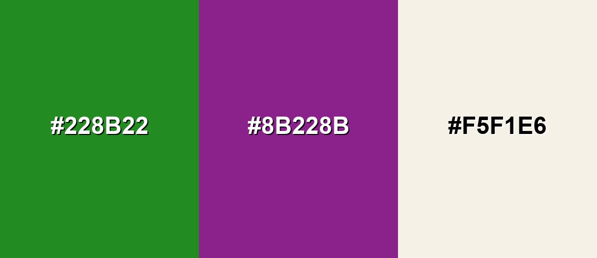
Complementary Colors
A complementary palette uses opposite hues to create punchy contrast. With forest green, a deep magenta accent brings energy while a soft neutral keeps the combination usable.
Complementary Palette Example: Use Forest Green as the base, Dark Magenta for highlights, and Soft Ivory to open up space.
Analogous Color Schemes
Analogous colors sit adjacent to each other on the color wheel, creating harmonious, cohesive palettes with subtle variation.
For a calm, outdoorsy blend, stay close on the wheel with Deep Teal, Forest Green, and Leaf Green.
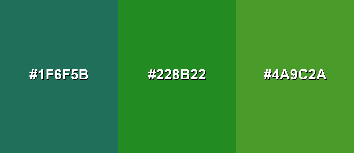
- Deep Teal: #1F6F5B
- Forest Green: #228B22
- Leaf Green: #4A9C2A
For a more classic, earthy harmony, combine Olive Drab, Forest Green, and Sea Green.
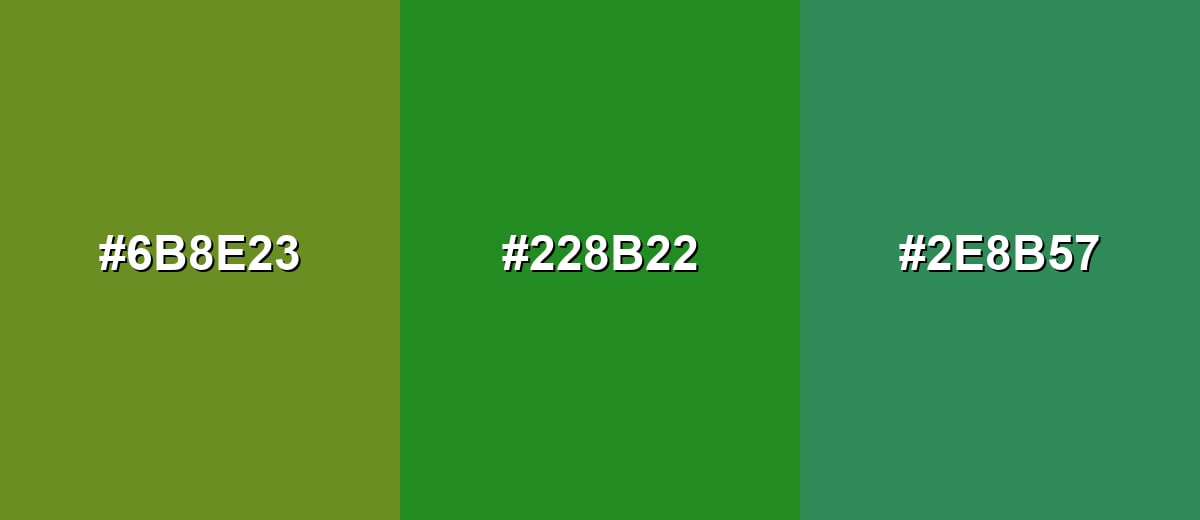
- Olive Drab: #6B8E23
- Forest Green: #228B22
- Sea Green: #2E8B57
Triadic & Tetradic Combinations
A triadic scheme spaces hues evenly for balanced contrast that still feels intentional.
Pair Forest Green with Deep Blue and Brick Red for a bold but structured palette.
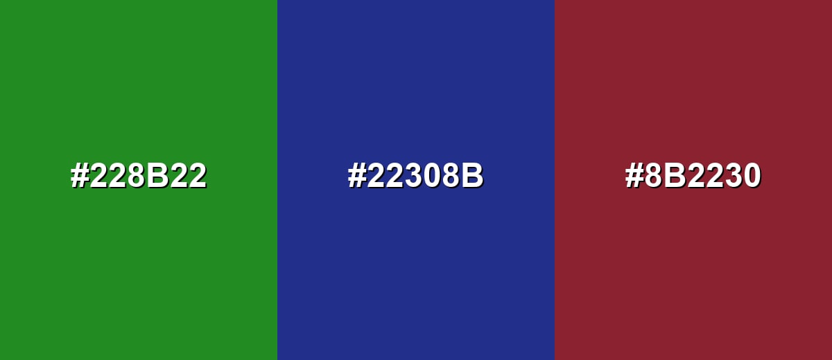
- Forest Green: #228B22
- Deep Blue: #22308B
- Brick Red: #8B2230
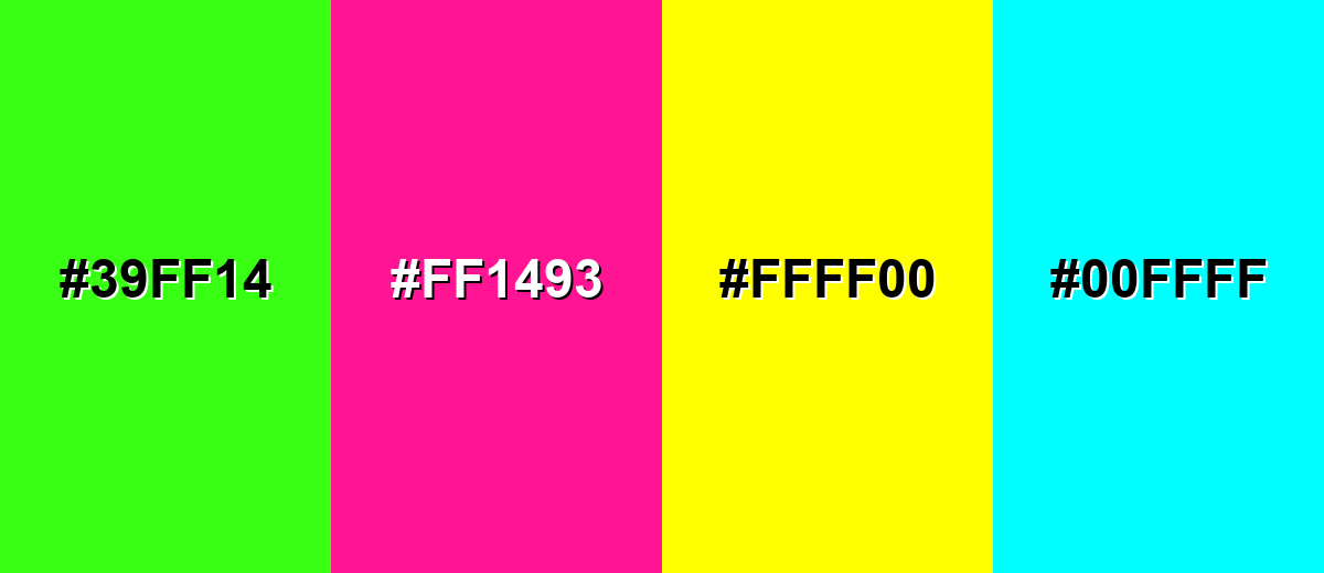
Colors to Avoid
While forest green color is remarkably versatile, certain combinations can create problematic visual effects:
- Neon Green (#39FF14) - Too close in hue but far brighter, which can make forest green look dull and create a vibrating effect.
- Hot Pink (#FF1493) - High saturation can overpower the natural tone and push the palette into a loud, less cohesive look.
- Pure Yellow (#FFFF00) - The intensity can feel harsh next to forest green and may reduce legibility in UI accents.
- Cyan (#00FFFF) - Strong contrast in both hue and brightness can look flashy and distract from a grounded, organic theme.
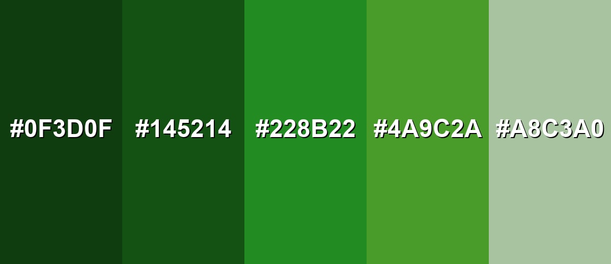
Shades, Tints & Variations of Forest Green Color
Forest green isn't a single "one-size" shade—there's a full range from near-black evergreen tones to soft, airy tints. Having a few variations makes it easier to build hierarchy (backgrounds, surfaces, accents) without switching to a totally different color family.
- Deep Forest Green (#0F3D0F) - A much darker take that feels shaded and dramatic, closer to deep woods at dusk. It's best used for Moody backgrounds, premium packaging, and high-contrast layouts with light typography..
- Pine Green (#145214) - A dense evergreen tone with a slightly stronger green presence than the deepest shade. It's best used for Headers, navigation bars, and brand marks that need a classic outdoor feel..
- Forest Green (#228B22) - The standard forest green reference: balanced, natural, and recognizable across digital uses. It's best used for Primary brand color, UI accents, and nature-forward visual themes..
- Moss Green (#4A9C2A) - A livelier, slightly lighter variation that adds freshness while staying grounded. It's best used for Highlights, illustrations, infographics, and secondary buttons..
- Soft Sage (#A8C3A0) - A muted tint that feels airy and calm, like sunlit greenery seen through haze. It's best used for Background panels, interior walls, and subtle UI surfaces..
Industry Applications
Because it feels both natural and professional, forest green fits a wide range of industries—from modern digital products to heritage-inspired physical goods.
Fashion & Beauty
- Outerwear and knitwear palettes where you want a wearable, timeless green.
- Accent color for logos, tags, and packaging that leans "clean" and grounded.
- Neutral-friendly styling that pairs easily with black, cream, denim, and brown leather tones.
- Beauty branding that wants an earthy vibe without looking overly bright or sporty.
Interior Design & Decor
- Accent walls, cabinetry, and upholstery for a classic evergreen mood.
- Pairing with wood tones, stone textures, and soft neutrals to keep the room warm.
- Layering with brass or matte black hardware for a more premium, tailored look.
- Creating restful spaces that feel cozy rather than stark or clinical.
Branding & Marketing
- Eco and nature positioning without relying on bright, trendy greens.
- Navigation bars, footers, and hero sections that need a stable "base" tone.
- Packaging for durable, outdoorsy, or heritage-inspired product lines.
- Campaign visuals where you want trust, longevity, and a calm premium feel.
Conclusion
Forest green (#228B22) is a dependable, evergreen shade that brings calm structure to brands, interfaces, and interiors. It's dark enough to feel premium and grounded, yet still unmistakably green—making it easy to pair with soft neutrals for breathing room or warm accents for a more inviting contrast. When you use it thoughtfully (especially with strong text contrast and a controlled set of supporting colors), forest green communicates stability, growth, and a quiet connection to the outdoors that stays timeless across trends.
Design Smarter with AI: Media.io is an online AI studio that empowers creators with advanced image generation and enhancement tools. From text-to-image and image-to-image creation to AI upscaling and color optimization, it enables fast, creative, and professional results—all in your browser.

Frequently Asked Questions About Forest Green Color
Forest green is a deep, evergreen-inspired green that resembles dense woodland foliage. It's darker than many standard greens, with a natural, grounded look.
A widely used hex code for forest green is #228b22. It's the standard value many design tools recognize for the ForestGreen shade.
Forest green pairs well with soft neutrals, warm earthy tones, and deep accents like magenta or navy-style blues. For easy balance, use it as a base and keep accents limited to one or two stronger hues.
They're related but not identical. Hunter green is usually darker and more muted, while forest green is often a touch brighter and clearer, especially in digital palettes.
Light text is typically the safest choice on forest green, especially for small UI labels and body copy. Always test contrast with your font size and weight to ensure comfortable readability.
Start with a strong green and deepen it with a small amount of black or a dark blue, then adjust with a touch of yellow if it becomes too cool. Mix gradually, because darkening happens quickly.


