

Viridian color is a deep blue-green that looks like cool sea glass or shaded tropical water. Its most common digital reference is hex #40826d, which sits between green and teal without turning neon.
People often read it as calm, grounded, and quietly sophisticated. The name also comes from a historic chromium-based pigment prized by painters for its stable, transparent green-blue character.
Viridian Color: Codes & Values
Here are the standard color codes for viridian so you can match it consistently across UI, branding, and print workflows.
| Parameters | VALUE |
| HEX Code | #40826D |
| RGB DECIMAL | 64, 130, 109 |
| RGB PERCENTAGE | 25.1%, 51.0%, 42.7% |
| CMYK | 51%,0%,16%,49% |
| HSL | 161°, 34%, 38% |
| HSV (HSB) | 161°, 51%, 51% |
| Web Safe | #339966 |
Key Color Space Explanations:
- HEX - HEX is the most common way to specify viridian in digital design. Use #40826d in CSS, design tools, and brand guidelines to keep the tone consistent.
- RGB - RGB defines the mix of red, green, and blue light used on screens. Viridian uses more green than red or blue, creating a cool blue-green look.
- CMYK - CMYK is used for print production and describes ink percentages. Values can shift by paper and press, so a proof helps maintain the intended blue-green depth.
- HSL - HSL describes hue, saturation, and lightness, which is handy for building tints and shades. Viridian's hue sits near the green-cyan boundary, keeping it fresh but not loud.
- Web Safe - Web-safe values approximate the closest legacy palette match. #339966 is a nearby substitute when you need compatibility with limited color systems.
Use HEX for web styles, RGB for screen comps, and CMYK as a print starting point—then fine-tune with proofs to keep viridian's blue-green depth intact.
Viridian Color Conversions
Need viridian color in a different format? This conversion table makes it easy to copy the right value into your tool or stylesheet.
| Parameters | VALUE | CSS |
| HEX | #40826D | #40826d |
| RGB DECIMAL | 64, 130, 109 | rgb(64,130,109) |
| RGB PERCENTAGE | 25.1%, 51.0%, 42.7% | rgb(25.1%,51.0%,42.7%) |
| CMYK | 51%,0%,16%,49% | cmyk(51%,0%,16%,49%) |
| HSL | 161°, 34%, 38% | hsl(161°, 34%, 38%) |
| HSV (or HSB) | 161°, 51%, 51% | -- |
| Web Safe | 339966 | #339966 |
| CIE-LAB | 49.5, -27.0, 4.8 | -- |
| XYZ | 12.8, 18.1, 17.2 | -- |
| xyY | 0.267, 0.376, 18.1 | -- |
| CIE-LCH | 49.5, 27.4, 170.0° | -- |
| CIE-LUV | 49.5, -29.0, 10.7 | -- |
| Hunter-Lab | 42.5, -18.8, 3.8 | -- |
| Binary | 01000000 10000010 01101101 | -- |
Want to generate Viridian Color photos or posters? Try Media.io's AI Image Generator now!
Viridian Color Meaning & Symbolism
Viridian is commonly associated with balance, steady focus, and a clean connection to nature. Because it leans slightly blue, it often feels more composed and modern than brighter greens, which is why Viridian Color meaning is frequently tied to calm confidence in everyday design choices.
Psychological Effects
Viridian tends to "quiet the room," making visuals feel steadier and easier to trust.
- Calm Control - Viridian can make spaces and interfaces feel calmer and more controlled, especially when used as a primary background or navigation tone.
- Slow-Down Readability - It's a reliable choice for layouts where you want users to slow down, read, and trust what they see.
- Fresh Without Neon - It communicates freshness without the sharp energy of neon greens, keeping the mood composed.
- Stable Craft Feel - In branding and product design, it can suggest stability, quality, and thoughtful craftsmanship.
- Coolness Risk - If overused or paired with overly cool neutrals, viridian may read as distant, corporate, or slightly cold.
Positive Associations
These are common "good vibes" designers tap into when building a viridian-led palette.
- Balance - A steady middle ground between green growth and blue composure.
- Clarity - Clean, water-leaning tones can make information feel organized and easier to process.
- Nature - Suggests leaves, water, and shaded landscapes without going bright or loud.
- Refinement - Reads quietly sophisticated, especially when paired with warm neutrals.
- Trust - A dependable blue-green that often feels thoughtful and professional in modern design.
Cultural Significance Across the World
Viridian's meaning can shift depending on material, context, and what it sits next to.
- Historic Pigment Roots - Viridian refers to a chromium oxide green-blue pigment introduced in the 19th century and widely adopted for its durability and transparency.
- Water & Renewal - Blue-green tones are often linked with water, growth, and renewal in many visual traditions.
- Context-Dependent Symbolism - The exact interpretation can vary by context, material, and surrounding hues.
- Modern, Composed Energy - Because it leans slightly blue, viridian is often perceived as more modern and restrained than brighter greens.
Design Applications
Viridian works best when you want a composed blue-green that still feels organic. Use it as a grounding base tone, then layer lighter tints for spaciousness or warmer accents for energy.
Graphic Design Tips
- Use It as a Visual Anchor - Treat viridian as your main brand tone for headers, key panels, and stable UI foundations.
- Build Depth with Shades - Add darker viridian shades for navigation bars and overlays to create a premium, grounded hierarchy.
- Keep Layouts Inviting - Balance viridian with warm off-whites and sand tones so pages feel welcoming instead of chilly.
- Choose Softer Accents - For a modern look, pair viridian with muted rose or dusty violet rather than high-saturation reds.
- Check Contrast Early - Deep charcoal or near-black often reads cleaner than pure black on viridian backgrounds; verify contrast for small UI labels.
Pro tip: Start with #40826D as your "master" swatch, then create a small system (dark shade + light tint) so buttons, cards, and charts stay consistent across screens.
Viridian Color in Photography & Video
- Lean Into Natural Scenes - Viridian tones shine in water, foliage, and shaded outdoor shots where the color already feels believable.
- Use as a Grade Direction - A subtle blue-green push can make edits feel calmer and more cinematic without going full teal-and-orange.
- Control Skin Tone Balance - If viridian dominates the shadows, bring back warmth in midtones/highlights to keep people looking natural.
- Watch for Cool Neutrals - Over-cooling whites and grays can make the frame feel sterile; add gentle warmth or texture when needed.
- Keep Saturation in Check - Viridian looks best slightly muted; heavy saturation can make the image feel artificial.
Recommended Tool for Image Enhancement: When incorporating viridian color into your photography projects, Media.io's AI Image tools can help you achieve more refined results. With AI-powered color enhancement, photo colorization, image upscaling, and old photo restoration, you can easily enrich viridian color tones, improve overall image quality, and highlight the color's elegant and sophisticated aesthetic.
Color Combinations
Viridian pairs well with warm neutrals, soft reds, and subdued purples because its cool blue-green base creates natural contrast. The palettes below help you build everything from calm minimal layouts to lively, balanced themes.
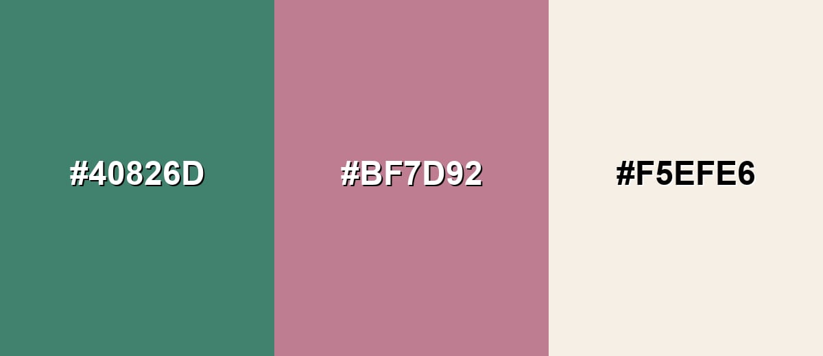
Complementary Colors
A muted rose acts as a true opposite for viridian, adding warmth and visual pop without turning harsh. An ivory neutral keeps the contrast usable for backgrounds and text.
Complementary Palette Example: Try Viridian with Muted Rose and Warm Ivory for a balanced, modern look.
Analogous Color Schemes
Analogous colors sit adjacent to each other on the color wheel, creating harmonious, cohesive palettes with subtle variation.
Deep Teal, Viridian, and Emerald Leaf create a smooth blue-green gradient that feels cohesive and calm.
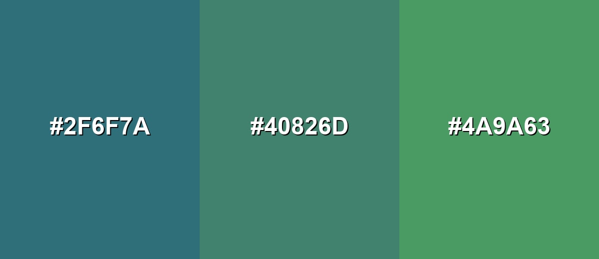
- Deep Teal: #2F6F7A
- Viridian: #40826D
- Emerald Leaf: #4A9A63
Pine Green, Viridian, and Sea Green lean more natural and work well for botanical or wellness themes.
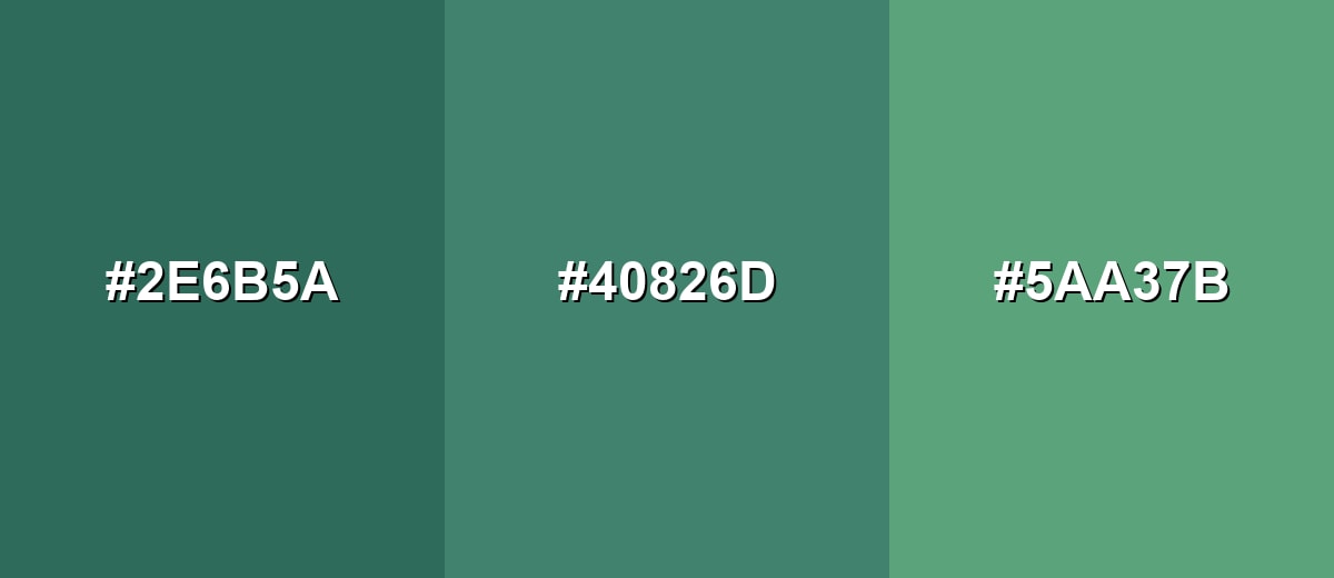
- Pine Green: #2E6B5A
- Viridian: #40826D
- Sea Green: #5AA37B
Triadic & Tetradic Combinations
A triadic palette keeps variety while staying balanced across the color wheel.
Viridian with Saffron Gold and Dusty Violet is energetic but still refined when the accents are kept slightly muted.
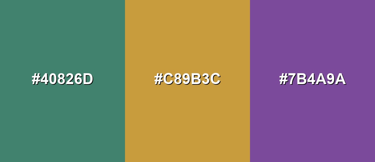
- Viridian: #40826D
- Saffron Gold: #C89B3C
- Dusty Violet: #7B4A9A
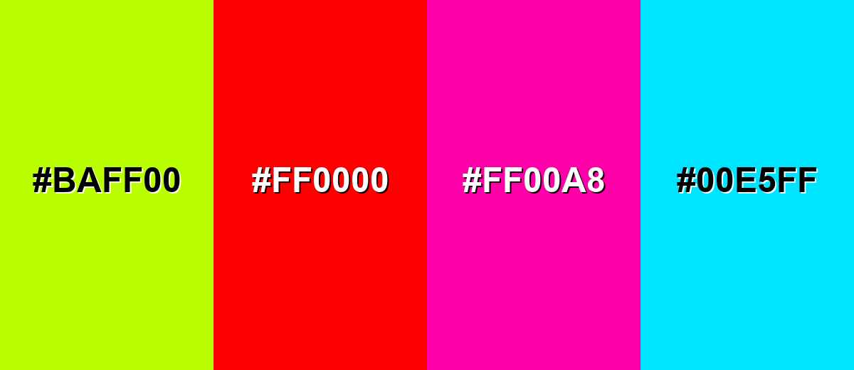
Colors to Avoid
While viridian color is remarkably versatile, certain combinations can create problematic visual effects:
- Neon Lime (#BAFF00) - Too bright next to viridian, creating a sharp, vibrating edge that can feel chaotic in UI and print.
- Pure Red (#FF0000) - The contrast is aggressive and can overpower viridian, especially in large blocks or call-to-action elements.
- Hot Magenta (#FF00A8) - Highly saturated pinks can make viridian look dull or gray by comparison and reduce the sense of calm.
- Electric Cyan (#00E5FF) - Both are cool and intense together, which can cause glare and readability problems on screens.
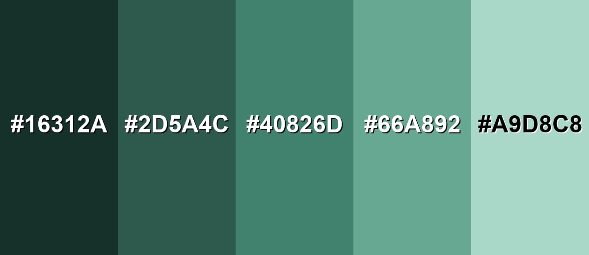
Shades, Tints & Variations of Viridian Color
Viridian isn't just one flat swatch—its range goes from near-black, inky blue-greens to pale, watery tints. Keeping a few variations on hand helps you design clearer hierarchy (backgrounds, borders, buttons, and emphasis) while staying in the same color family.
- Near-Black Viridian (#16312A) - A very dark, ink-like blue-green that keeps viridian's character while adding strong depth. It's best used for Footers, overlays, dark-mode surfaces, and high-emphasis accents.
- Deep Viridian (#2D5A4C) - A richer, shadowed version that feels earthy and grounded without turning muddy. It's best used for Headings, navigation bars, packaging backgrounds, and premium brand palettes.
- Classic Viridian (#40826D) - The core viridian tone: balanced between green and teal with a calm, mature presence. It's best used for Primary brand color, UI highlights, and stable visual anchors.
- Soft Viridian (#66A892) - A lighter, friendlier take that reads airy and approachable while staying cool. It's best used for Cards, secondary backgrounds, infographics, and soft callouts.
- Pale Viridian (#A9D8C8) - A gentle tint with a clean, watery feel that supports content without heavy contrast. It's best used for Large backgrounds, subtle sections, and calming interior accents.
Industry Applications
Viridian shows up across industries that need a blend of trust, freshness, and modern restraint. It can look technical in digital products, natural in lifestyle branding, and timeless in print when paired with the right paper and neutrals.
Fashion & Beauty
- Statement Outerwear - Viridian works as a refined alternative to black or navy, especially in coats and structured pieces.
- Premium Accessories - Bags and small leather goods in a deep blue-green read quietly luxurious.
- Beauty Packaging - A viridian label can suggest 'clean," calm, and science-forward positioning without going clinical.
- Jewelry Pairings - It complements gold-toned metals well, keeping the overall look balanced and modern.
Interior Design & Decor
- Cabinetry & Built-Ins - Viridian cabinetry feels cool and natural, especially with warm hardware and light stone.
- Tile & Backsplashes - Blue-green tile brings a water-like calm that suits kitchens, baths, and hospitality spaces.
- Feature Walls - A deeper viridian wall adds depth without the heaviness of pure dark green.
- Balanced Neutrals - Pair with warm whites or sandy tones to keep rooms inviting rather than overly cool.
Branding & Marketing
- Sustainable & Craft Brands - Viridian signals nature and quality without leaning into bright, "eco neon" green.
- Web & App UI - Great for navigation, badges, and calm success states when paired with clear labels.
- Packaging & Print - Works well on textured stocks and premium labels where blue-green depth suggests durability and care.
- Data Visualization - A distinct blue-green helps separate categories from pure blues and greens while reducing visual fatigue.
Conclusion
Viridian stands out as a deep blue-green that feels calm, natural, and quietly confident without drifting into neon or muddy olive. With #40826D as a dependable reference, you can keep branding, UI, and print materials consistent while still exploring darker shades for depth and lighter tints for breathing room. For an inviting modern look, balance viridian with warm neutrals, then add controlled contrast using muted rosy accents. Once you understand the overall Viridian Color meaning, it becomes easier to build palettes that feel intentional, readable, and refined across every touchpoint.
Design Smarter with AI: Media.io is an online AI studio that empowers creators with advanced image generation and enhancement tools. From text-to-image and image-to-image creation to AI upscaling and color optimization, it enables fast, creative, and professional results—all in your browser.

Frequently Asked Questions About Viridian Color
Quick answers to the most common questions designers and creators ask when working with viridian.
Viridian is a deep blue-green often described as a cool, sea-like green that sits between teal and green. It is commonly referenced in digital design with the hex value #40826d.
They are related but not identical. Teal often leans brighter and bluer, while viridian typically looks slightly greener, softer, and more pigment-like.
Viridian's complement is a muted red-magenta family tone. In practical palettes, dusty rose shades work well because they contrast without overwhelming the blue-green base.
For readability, try near-black or deep charcoal for body text on lighter viridian tints, and off-white or white for larger text on darker viridian shades. Always verify contrast for small UI labels.
It can print well, but blue-greens may shift depending on paper, ink, and press settings. Use the CMYK values as a starting point and request a proof to match the intended depth and coolness.
Add warm neutrals like ivory or sand and include a gentle warm accent such as muted rose or soft gold. This keeps the overall look balanced and avoids an overly clinical feel.


