

Cinnabar color is a vivid red-orange tone that looks like hot vermilion paint with a slightly earthy, mineral warmth. Its signature HEX code is #E34234, giving it a bold presence that feels energetic and attention-grabbing.
Named after the historic cinnabar pigment (mercury sulfide), this color is often associated with confidence, urgency, and warmth. Below, you'll find its key codes, conversions, palettes, shades, and practical ways to use it in real design work.
Cinnabar Color: Codes & Values
Here are the core digital and print values designers use to reproduce cinnabar consistently across screens, apps, and marketing materials.
| Parameters | VALUE |
| HEX Code | #E34234 |
| RGB DECIMAL | 227, 66, 52 |
| RGB PERCENTAGE | 89%, 26%, 20% |
| CMYK | 0%,71%,77%,11% |
| HSL | 5°, 76%, 55% |
| HSV (HSB) | 5°, 77%, 89% |
| Web Safe | #CC6633 |
Key Color Space Explanations:
- HEX - HEX is the most common way to specify this tone for web and UI. Use #e34234 for consistent on-screen rendering across modern apps and browsers.
- RGB - RGB defines the red, green, and blue light values used on displays. The high red channel is what gives cinnabar its intense, warm impact.
- CMYK - CMYK is used for printing and packaging where inks mix subtractively. The low cyan with high magenta and yellow helps reproduce its red-orange character in print workflows.
- HSL - HSL describes hue, saturation, and lightness in a way many designers find intuitive. With a hue near 5°, it sits close to red, pushed toward orange.
- Web Safe - Web Safe is the closest legacy-safe alternative for older color constraints. #cc6633 is a practical fallback when you need a simplified palette.
For best results, treat #E34234 as your "source of truth," then convert to RGB/HSL for UI work and CMYK for print proofs and packaging checks.
Cinnabar Color Conversions
This conversion chart helps you move cinnabar between common color systems without guessing—especially useful when a project spans web, video, and print.
| Parameters | VALUE | CSS |
| HEX | #e34234 | #e34234 |
| RGB DECIMAL | 227, 66, 52 | rgb(227,66,52) |
| RGB PERCENTAGE | 89%, 26%, 20% | rgb(89%,26%,20%) |
| CMYK | 0%,71%,77%,11% | cmyk(0%,71%,77%,11%) |
| HSL | 5°, 76%, 55% | hsl(5°,76%,55%) |
| HSV (or HSB) | 5°, 77%, 89% | -- |
| Web Safe | cc6633 | #cc6633 |
| CIE-LAB | 52.6, 62.9, 44.5 | -- |
| XYZ | 39.2, 26.4, 8.0 | -- |
| xyY | 0.535, 0.360, 26.4 | -- |
| CIE-LCH | 52.6, 77.0, 35.2° | -- |
| CIE-LUV | 52.6, 126.0, 34.0 | -- |
| Hunter-Lab | 51.4, 53.2, 29.8 | -- |
| Binary | 11100011 01000010 00110100 | -- |
Want to generate Cinnabar Color photos or posters? Try Media.io's AI Image Generator now!
Cinnabar Color Meaning & Symbolism
Cinnabar is often linked to heat, drive, and bold expression because it sits between red and orange and reads instantly at a distance. In everyday life, it tends to signal action and urgency, while still feeling warmer and more inviting than a pure red.
Psychological Effects
Because it's intense by nature, cinnabar changes the "energy level" of a layout almost immediately.
- Attention - Naturally pulls the eye, which is why it works well for calls to action and key UI states.
- Momentum - Adds a sense of speed and decisiveness, making designs feel more active and forward.
- Warmth - Feels welcoming compared to pure red, especially when balanced with neutral space.
- Pressure - In large blocks, it can feel impatient or overwhelming, particularly alongside other saturated hues.
- Hierarchy - Works best as a highlight color so important elements stand out without overpowering the page.
Positive Associations
Used thoughtfully, cinnabar can communicate confidence while staying lively and human.
- Confidence - Reads bold and self-assured, ideal for brands that want to feel direct and memorable.
- Excitement - Brings a punchy, upbeat tone that supports launches, events, and promotions.
- Vitality - Suggests energy and heat, making visuals feel more dynamic and "alive."
- Friendliness - Warmer than pure red, so it can feel inviting when paired with soft tints and clean typography.
- Craft - Hints at tradition and artistry because of its pigment history in decorative finishes.
Cultural Significance Across the World
Like many strong reds, cinnabar's symbolism depends heavily on context, imagery, and what it's paired with.
- Art & Decoration - Historically tied to mineral pigment use, which can add a sense of heritage and craft.
- Celebration - Often read as festive and bold in visual communication, especially in high-contrast palettes.
- Protection - Strong reds may be interpreted as protective or warning-adjacent depending on the setting.
- Authority - Can feel commanding and decisive, particularly when supported by structured layout and typography.
Design Applications
Cinnabar works best when you treat it as an accent or a focal point rather than a background default. Its warmth and saturation help it stand out, which is useful for guiding attention and creating strong contrast relationships.
Graphic Design Tips
- Use it for primary actions - Apply #e34234 to buttons, badges, or key states where speed and clarity matter.
- Balance with cool counterweights - Pair it with cooler tones to prevent layouts from feeling too hot or heavy.
- Protect readability - Keep strong light-dark contrast for text; don't rely on hue alone to communicate meaning.
- Control scale - Small accents often look more premium than full-section fills with such a saturated tone.
- Mind print shifts - In CMYK workflows, proof for unwanted dull-orange drift across different paper stocks.
Pro tip: if cinnabar is your "hero" accent, keep the rest of the palette calmer (neutrals, softer tints, or cool blues) so your hierarchy stays clean and the color still feels special.
Cinnabar Color in Photography & Video
- Use as a subject anchor - A cinnabar prop, wardrobe piece, or product label can instantly create a focal point.
- Watch skin tones - Red-orange reflections can push skin warmer; fine-tune white balance and saturation gently.
- Try warm-cool contrast - Cinnabar pops nicely against teal/blue backgrounds for crisp separation in frames.
- Prevent clipping - Highly saturated reds can clip in highlights; expose carefully and check scopes when grading.
- Keep branding consistent - If #e34234 is a brand accent, match it across thumbnails, lower-thirds, and end cards.
Recommended Tool for Image Enhancement: When incorporating cinnabar color into your photography projects, Media.io's AI Image tools can help you achieve more refined results. With AI-powered color enhancement, photo colorization, image upscaling, and old photo restoration, you can easily enrich cinnabar color tones, improve overall image quality, and highlight the color's elegant and sophisticated aesthetic.
Color Combinations
The palettes below show practical ways to pair cinnabar with cooler complements, nearby warm neighbors, and balanced multi-hue schemes. Use these as starting points, then adjust lightness and saturation based on your medium and contrast needs.
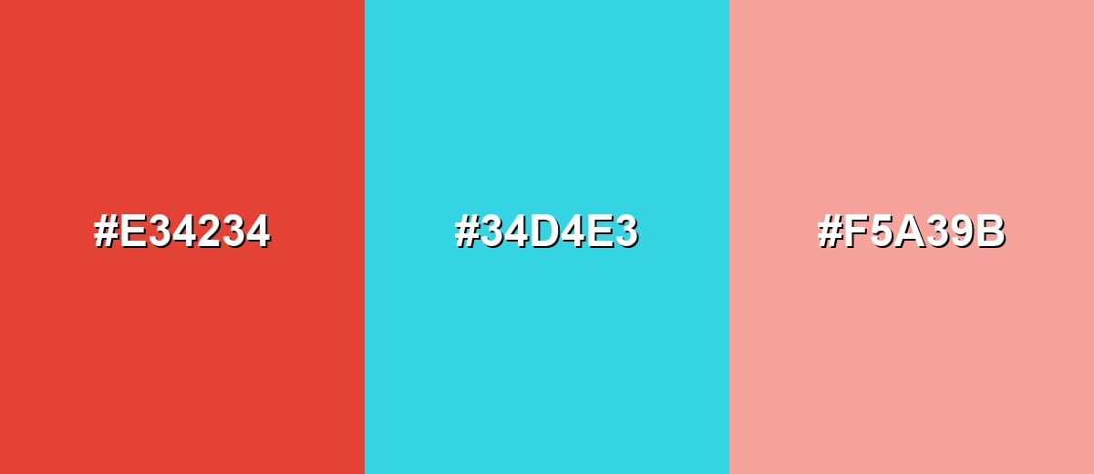
Complementary Colors
A complementary partner adds crisp contrast and makes cinnabar feel even more vivid. This approach is great for calls to action, sports-style energy, or punchy hero sections when you want clear separation.
Complementary Palette Example: Try Cinnabar with Deep Aqua for a bold warm-cool split, then soften the edges with a light neutral tint.
Analogous Color Schemes
Analogous colors sit adjacent to each other on the color wheel, creating harmonious, cohesive palettes with subtle variation.
Warm analogous pairing: Cinnabar with Tangerine and Cherry for a cohesive, energetic gradient feel.
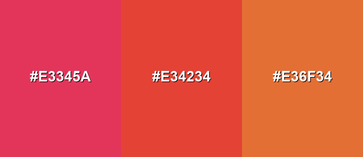
- Cherry: #E3345A
- Cinnabar: #E34234
- Tangerine: #E36F34
Muted analogous pairing: Brick Red with Cinnabar and Apricot Orange for a warmer, more editorial tone.
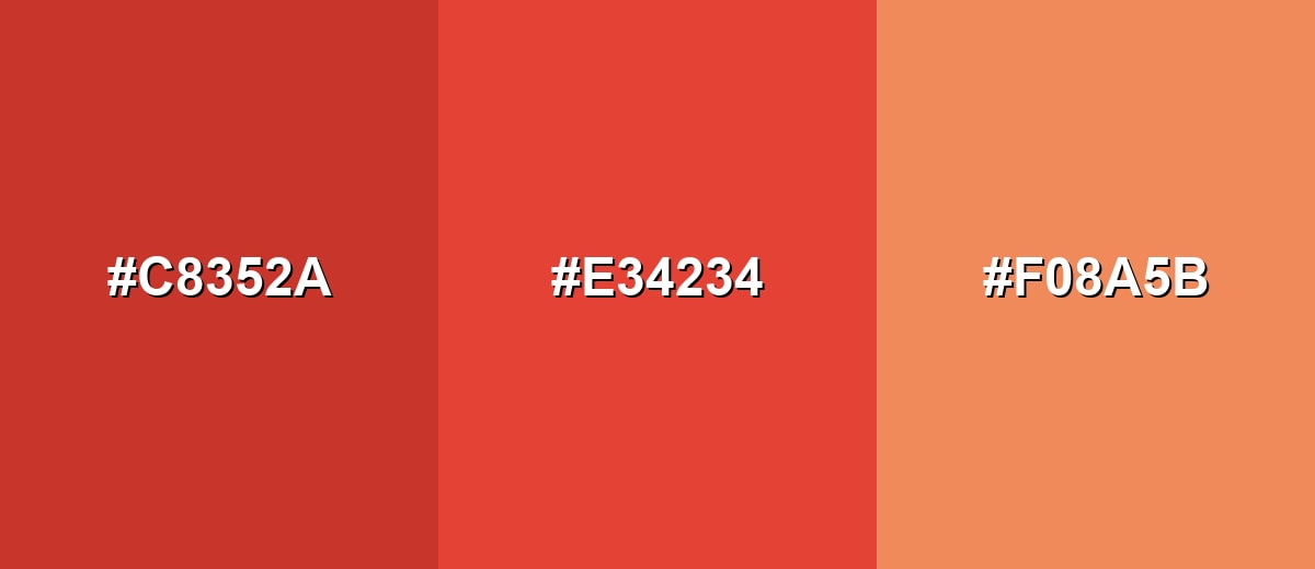
- Brick Red: #C8352A
- Cinnabar: #E34234
- Apricot Orange: #F08A5B
Triadic & Tetradic Combinations
A triadic scheme spreads hues evenly for a balanced, playful system that still has contrast.
Use Cinnabar with Leaf Green and Royal Blue to build three clear roles: primary accent, secondary accent, and interactive highlights.
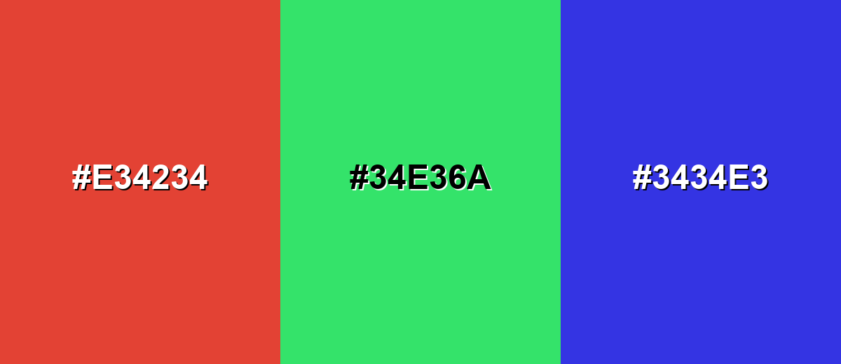
- Cinnabar: #E34234
- Leaf Green: #34E36A
- Royal Blue: #3434E3
Colors to Avoid
While cinnabar color is remarkably versatile, certain combinations can create problematic visual effects:
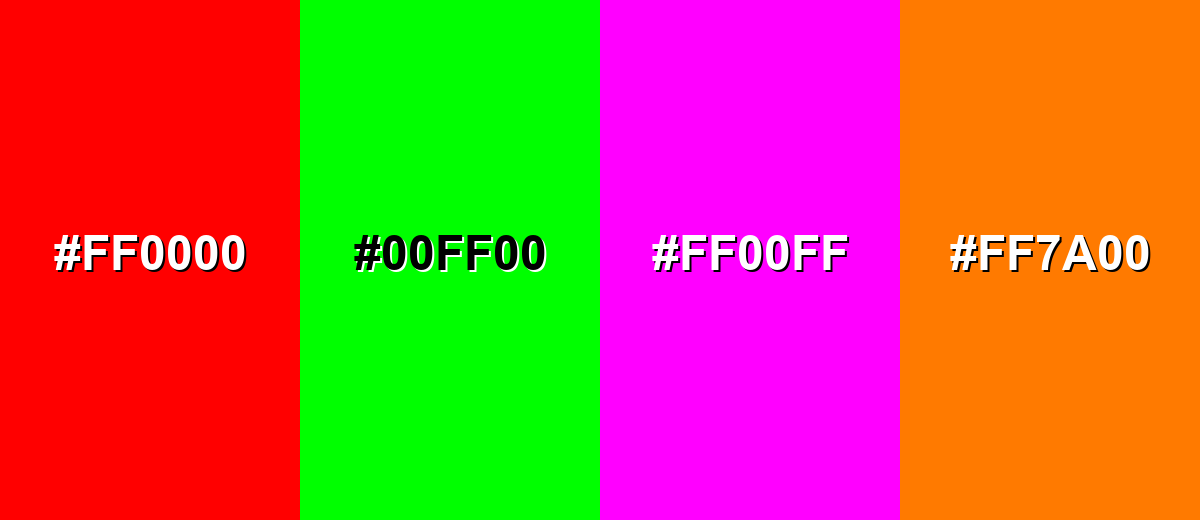
- Pure Red (#FF0000) - Too close in intensity and temperature, which can make cinnabar feel flat while increasing visual stress.
- Neon Green (#00FF00) - Creates harsh vibration against cinnabar and can look unrefined in most UI and branding contexts.
- Pure Magenta (#FF00FF) - Competes for attention and often feels loud or chaotic when paired with a strong red-orange.
- Bright Orange (#FF7A00) - Stacks too much warmth, reducing contrast and making layouts look overly saturated.
Shades, Tints & Variations of Cinnabar Color
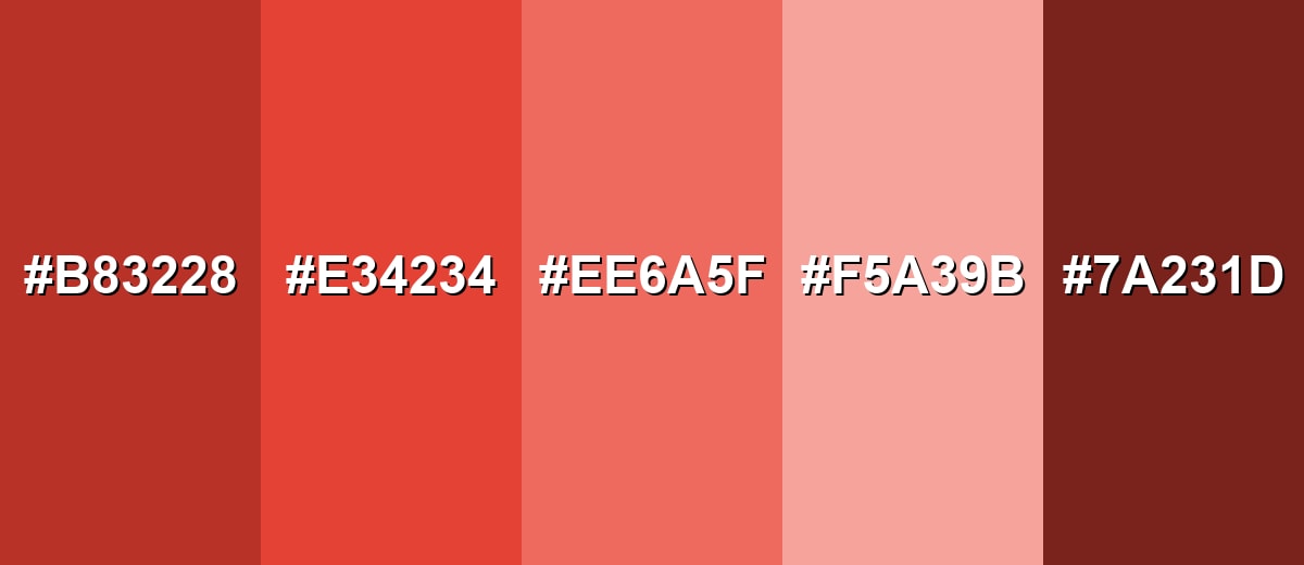
Cinnabar isn't a one-note color—its darker shades feel grounded and premium, while lighter tints soften the heat for backgrounds, cards, and editorial layouts. This range makes it easier to keep a consistent brand feel without overusing the loudest version.
- Deep Cinnabar (#B83228) - A darker, richer version that feels grounded and slightly more mature than the base tone. It's best used for Headlines, premium packaging accents, or deeper UI emphasis states..
- Classic Cinnabar (#E34234) - The core vivid red-orange that reads energetic, confident, and highly visible. It's best used for Primary accents, buttons, tags, and attention-focused highlights..
- Soft Cinnabar (#EE6A5F) - A lighter, friendlier take that keeps warmth while reducing intensity. It's best used for Background accents, illustration fills, or less aggressive callouts..
- Blush Cinnabar (#F5A39B) - A pale tint that feels gentle and airy while still echoing the original warmth. It's best used for Subtle panels, cards, gradients, and roomy editorial layouts..
- Cinnabar Brown (#7A231D) - A deep brown-red shade that adds a smoky, earthy undertone. It's best used for Borders, shadows, typography accents, and grounded brand systems..
Industry Applications
Because cinnabar is vivid and warm, it tends to work best in industries that benefit from momentum, appetite appeal, or quick recognition. The key is controlling scale: use it for emphasis, then let calmer tones do the heavy lifting for readability.
Fashion & Beauty
- Statement accents - Use cinnabar as a pop color in lookbooks, drop promos, or product shots for instant focus.
- Packaging highlights - Works well for limited-edition markers and "new" callouts without needing extra graphics.
- Warm editorial mood - Pairs nicely with clean typography and soft neutrals to keep layouts upscale.
- Seasonless energy - Feels bold year-round, especially when balanced with cooler backdrops.
Interior Design & Decor
- Accent décor - Great for pillows, art, or a single statement piece rather than full-room coverage.
- Warmth on demand - Adds perceived energy quickly, especially in cooler or minimalist spaces.
- Texture-friendly - Looks strong next to natural textures that help it feel less "flat" and more lived-in.
- Balance matters - Cooler tones and breathing room keep the result from feeling visually crowded.
Branding & Marketing
- High recall - As a signature accent, cinnabar makes brand moments feel direct and memorable.
- E-commerce emphasis - Useful for sale markers and limited-time callouts when paired with clear typography.
- UI clarity - Strong for buttons, active states, and onboarding moments where attention matters.
- Print visibility - Stands out on shelves and posters, but always confirm CMYK proofs for accuracy.
Conclusion
Cinnabar stands out for its vivid red-orange warmth and its ability to grab attention without feeling as harsh as a pure red. In practice, it shines most as a controlled accent—buttons, badges, key headlines, and product highlights—where it can guide the eye and reinforce hierarchy. With #E34234 as your baseline, you can build consistent systems using cool complementary contrast, warm analogous blends, or balanced triads, then scale the intensity with deeper shades or softer tints. Keep saturation in check, confirm contrast for readability, and cinnabar will deliver confident impact across UI, branding, print, and content design.
Design Smarter with AI: Media.io is an online AI studio that empowers creators with advanced image generation and enhancement tools. From text-to-image and image-to-image creation to AI upscaling and color optimization, it enables fast, creative, and professional results—all in your browser.

Frequently Asked Questions About Cinnabar Color
Cinnabar is a vivid red-orange that feels hot, bright, and slightly earthy, like vermilion paint with a mineral warmth. It tends to read energetic and attention-forward in both print and digital layouts.
A commonly used hex code for cinnabar is #e34234. It maps to RGB 227, 66, 52, which explains its strong red channel and warm orange lean.
They are closely related and often used interchangeably, but cinnabar usually reads a touch more earthy or mineral, while vermilion can feel cleaner and more purely red-orange. In real projects, the exact shade depends on the chosen code and surrounding palette.
Cool partners like Deep Aqua (#34d4e3) create strong contrast, while nearby warm tones like Tangerine (#e36f34) produce smooth, cohesive schemes. For a more structured system, try a triad with Leaf Green (#34e36a) and Royal Blue (#3434e3).
Use it when you need emphasis: primary actions, badges, highlights, and short bursts of visual energy. It is most effective when balanced with calmer neutrals and used consistently for one clear role in the hierarchy.
Limit large fills and switch to a tint like Soft Cinnabar (#ee6a5f) or Blush Cinnabar (#f5a39b) for backgrounds and spacious sections. Pair it with cooler hues and prioritize contrast for text and icons so the layout stays readable.


