

 TL;DR:
Sepia (HEX #704214) serves as a warm, amber-brown structural alternative to pure black, offering softer visual contrast for heritage and editorial designs without appearing overly rustic.
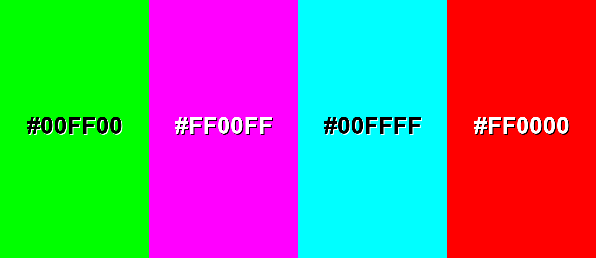
● Pair sepia with cool blues for complementary contrast or soft neutrals like ivory for breathing room, while strictly avoiding highly saturated neons (such as Neon Green #00FF00 or Hot Magenta #FF00FF) that overpower its subtle tone.
● Maintain strict contrast checks to prevent digital UI elements from becoming illegible or muddy, and always run physical proofs for print projects since warm browns shift noticeably on uncoated paper stocks.
Ask AI for a summary
 ChatGPT
 Perplexity
 Gemini
 Claude
 Grok
Grok
Sepia color is a warm, muted brown with golden-amber undertones, similar to aged paper, antique leather, or classic photo prints.
A widely used digital reference is #704214, a nostalgic yet grounded tone that can feel quietly sophisticated in modern design.
Sepia Color: Codes & Values
Use these core sepia color codes to keep your palette consistent across web, UI, motion, and print workflows.
| Parameters | VALUE |
| HEX Code | #704214 |
| RGB DECIMAL | 112, 66, 20 |
| RGB PERCENTAGE | 44%, 26%, 8% |
| CMYK | 0%,41%,82%,56% |
| HSL | 30°, 70%, 26% |
| HSV (HSB) | 30°, 82%, 44% |
| Web Safe | #663300 |
Key Color Space Explanations:
- HEX - HEX is the most common way to specify sepia for web and UI elements. Use #704214 in CSS, design tools, and style guides for consistent rendering.
- RGB - RGB defines sepia using red, green, and blue light values for screens. It's useful for digital work, motion graphics, and any workflow that outputs to displays.
- CMYK - CMYK translates sepia into ink percentages for print production. Because paper and ink vary, it's best to proof when accuracy matters.
- HSL - HSL describes sepia by hue, saturation, and lightness, which is handy for building matching tints and shades. It's a practical model for adjusting warmth without guessing.
- Web Safe - Web Safe is the closest older-browser-safe approximation of sepia. #663300 is a nearby match when you need a classic 216-palette fallback.
For most projects, start with HEX (#704214), then use HSL to create lighter tints or deeper shades while keeping the same warm direction.
Sepia Color Conversions
Need sepia in a different format? Here are common conversions you can copy into design tools and documentation.
| Parameters | VALUE | CSS |
| HEX | #704214 | #704214 |
| RGB DECIMAL | 112, 66, 20 | rgb(112,66,20) |
| RGB PERCENTAGE | 44%, 26%, 8% | rgb(44%,26%,8%) |
| CMYK | 0%,41%,82%,56% | cmyk(0%,41%,82%,56%) |
| HSL | 30°, 70%, 26% | hsl(30°, 70%, 26%) |
| HSV (or HSB) | 30°, 82%, 44% | -- |
| Web Safe | 663300 | #663300 |
| CIE-LAB | 32.1, 18.0, 33.8 | -- |
| XYZ | 8.76, 7.39, 1.63 | -- |
| xyY | 0.493, 0.416, 7.39 | -- |
| CIE-LCH | 32.1, 38.3, 62.0° | -- |
| CIE-LUV | 32.1, 34.9, 27.5 | -- |
| Hunter-Lab | 27.2, 11.8, 15.2 | -- |
| Binary | 01110000 01000010 00010100 | -- |
Want to generate Sepia Color photos or posters? Try Media.io's AI Image Generator now!
Sepia Color Meaning & Symbolism
Sepia color is widely associated with nostalgia, warmth, and authenticity, thanks to its link with aged paper and classic photographs. In everyday visuals, it often signals heritage, craft, and a slower, more reflective mood. In short, Sepia Color meaning tends to land somewhere between comforting and historic, rather than loud or flashy.
Psychological Effects
Sepia's warm-brown base can subtly shape how a layout feels and how long people want to stay with it.
- Calm And Grounded - Its earthy tone echoes natural materials like wood and leather, helping visuals feel stable and relaxed.
- Approachable Warmth - Sepia can make brands and interfaces feel friendly and human, especially with clean typography.
- Softer Contrast - Compared with pure black, sepia reduces harshness and can be easier on the eyes in long-form reading.
- Cozy, Tactile Mood - It suggests texture and comfort without needing heavy "rustic" styling.
- Risk Of Feeling Dated - Overuse can read dusty or subdued, and low-contrast pairings may hurt clarity in UI.
Positive Associations
When balanced with neutrals and a modern layout, sepia communicates "timeless" more than "old-fashioned."
- Nostalgia - It instantly recalls vintage photography and timeworn prints.
- Heritage - Sepia often signals tradition, legacy, and a sense of history.
- Authenticity - The muted warmth feels honest and lived-in rather than overly polished.
- Craftsmanship - It pairs naturally with handmade, artisanal, and detail-driven branding cues.
- Comfort - Its amber undertones add a welcoming tone to packaging, interiors, and editorial design.
Cultural Significance Across the World
Sepia's symbolism is strongly shaped by photography, archival media, and the colors of natural materials.
- Vintage Photography - Globally linked to early photographic processes and archival printing aesthetics.
- Documentary Tone - Often reads as historic, reflective, or story-driven in editorial and media work.
- Tradition And Craft - Common in branding that emphasizes heritage, makers, and long-standing quality.
- Context-Dependent Meaning - Its "modern vs. retro" feel shifts based on surrounding hues and contemporary styling.
Design Applications
Sepia works best when you want warmth without strong saturation—making it a dependable base color, a softened "near-black," or a refined accent.
Graphic Design Tips
- Use sepia as a structural color for frames, dividers, and typography when pure black feels too sharp.
- Pair it with light neutrals for breathable layouts (think parchment-style backgrounds for editorial pages).
- Keep textures subtle; too much grain + sepia can tip a design into "dusty" territory.
- Balance the warmth with a cooler counter-tone for a more contemporary finish (especially in branding systems).
- For print, test on your final stock—warm browns can shift noticeably on uncoated paper.
Pro tip: If sepia is your hero color, reserve one clearer accent for primary actions and highlights so the interface doesn't become uniformly warm.
Sepia Color in Photography & Video
- Use sepia grading to create an archival, documentary mood without extreme saturation.
- Dial back contrast slightly to keep the "aged print" feel smooth rather than crunchy.
- Combine sepia tones with careful exposure so shadows don't turn muddy on darker screens.
- Apply consistently across a series for cohesive storytelling (posters, albums, and editorial photo sets).
- In motion work, keep skin tones natural by controlling the strength of the sepia filter shot-to-shot.
Recommended Tool for Image Enhancement: When incorporating sepia color into your photography projects, Media.io's AI Image tools can help you achieve more refined results. With AI-powered color enhancement, photo colorization, image upscaling, and old photo restoration, you can easily enrich sepia color tones, improve overall image quality, and highlight the color's elegant and sophisticated aesthetic.
Color Combinations
Because sepia sits in a warm orange-brown range, it pairs naturally with soft neutrals and looks especially striking when contrasted with cooler blues. Use these palettes as starting points, then adjust lightness to fit your layout and readability goals.
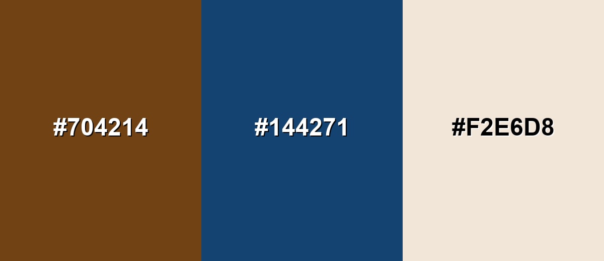
Complementary Colors
A complementary scheme pairs sepia with a cool blue opposite it on the color wheel, creating clear contrast while keeping a balanced, classic feel.
Complementary Palette Example: Use sepia for structure, the deep blue as a crisp counterpoint, and a light neutral to give the palette breathing room.
Analogous Color Schemes
Analogous colors sit adjacent to each other on the color wheel, creating harmonious, cohesive palettes with subtle variation.
Warm analogous tones keep the look cohesive and natural, ideal for earthy branding and editorial layouts.
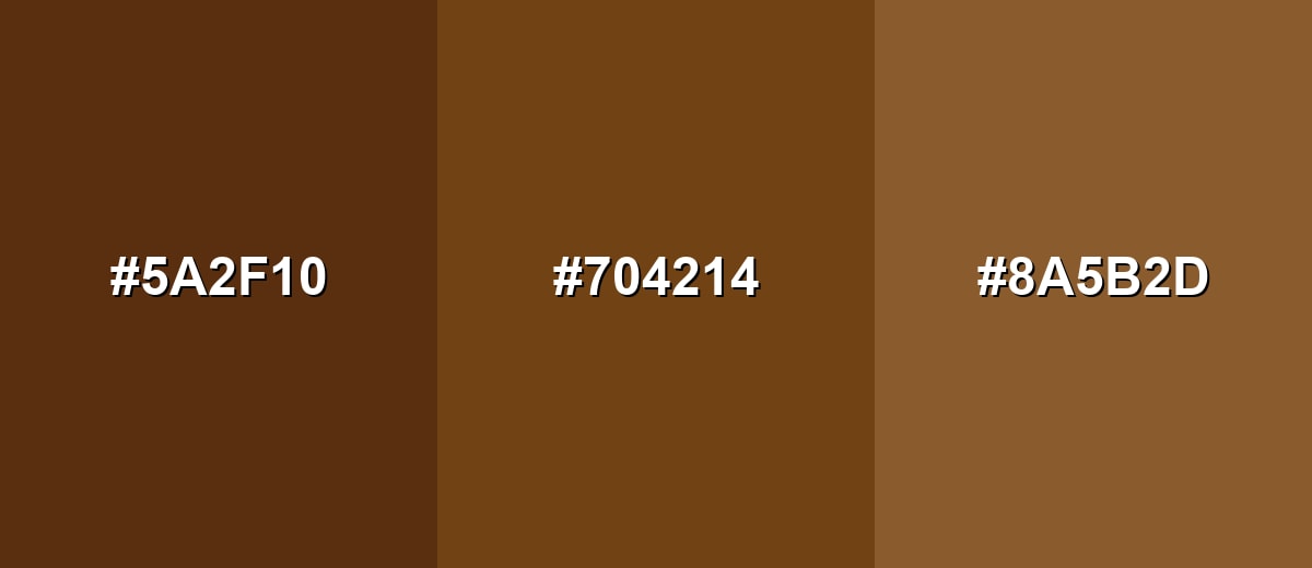
- Burnt Umber: #5A2F10
- Sepia: #704214
- Antique Gold: #8A5B2D
A slightly more varied analogous set adds depth by moving from brown into muted olive, while staying understated.
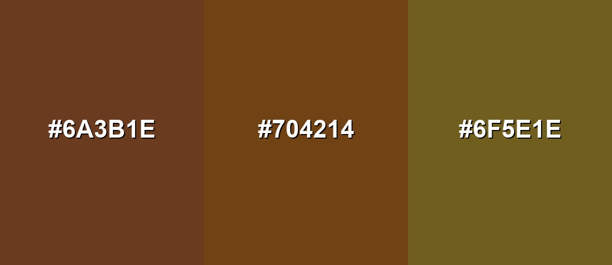
- Cocoa Brown: #6A3B1E
- Sepia: #704214
- Soft Olive: #6F5E1E
Triadic & Tetradic Combinations
Triadic palettes use three evenly spaced hues, giving you contrast without the sharpness of a direct complement.
Keep sepia as the anchor, then use the green and purple accents sparingly for emphasis and hierarchy.
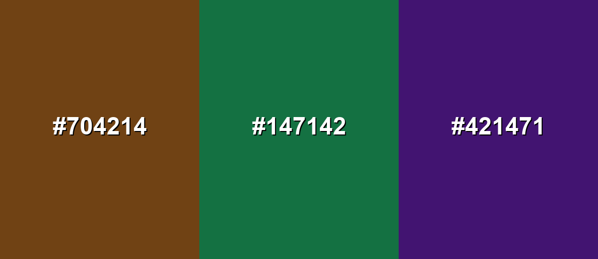
- Sepia: #704214
- Muted Teal Green: #147142
- Deep Violet: #421471
Colors to Avoid
While sepia color is remarkably versatile, certain combinations can create problematic visual effects:
- Neon Green (#00FF00) - The intensity overpowers sepia's subtle warmth and can make designs feel jarring rather than vintage or refined.
- Hot Magenta (#FF00FF) - High saturation competes with sepia and often creates a harsh, mismatched retro effect.
- Electric Cyan (#00FFFF) - The brightness creates extreme contrast that pulls attention away from sepia and can disrupt a calm, heritage tone.
- Pure Red (#FF0000) - Strong reds can push sepia toward muddiness and make warm palettes look overly heavy or aggressive.
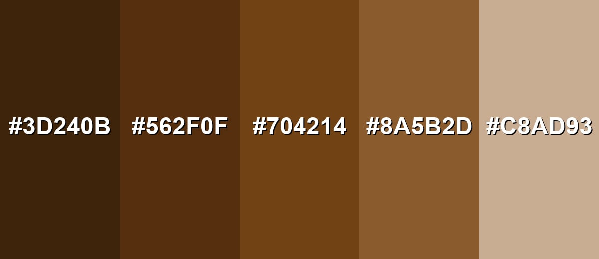
Shades, Tints & Variations of Sepia Color
Sepia isn't just one brown—there's a full range from deep, shadowy tones to parchment-like tints. Building with variations helps you create hierarchy (text, backgrounds, borders, highlights) while keeping the overall mood consistent.
- Dark Sepia (#3D240B) - A deep, shadowy brown that keeps sepia's warmth while adding weight and drama. It's best used for Body text on light backgrounds, header bars, and high-contrast UI elements..
- Deep Sepia (#562F0F) - A richer mid-dark tone that feels earthy and classic without turning blackish. It's best used for Navigation, outlines, icons, and product packaging details..
- Classic Sepia (#704214) - The balanced reference tone with a clear amber-brown character and a vintage feel. It's best used for Primary brand hue, hero accents, and warm illustration bases..
- Soft Sepia (#8A5B2D) - A lighter, more golden interpretation that reads friendlier and less formal. It's best used for Cards, badges, subtle highlights, and warm backgrounds..
- Pale Sepia (#C8AD93) - A gentle, paper-like tint that nods to aged parchment and soft neutrals. It's best used for Large background areas, section breaks, and calm editorial layouts..
Industry Applications
Sepia shows up wherever brands want a warm, trustworthy look that feels established—especially in storytelling, packaging, and spaces built around natural materials.
Fashion & Beauty
- Heritage-inspired lookbooks, outdoors themes, and leather-goods aesthetics that feel classic and durable.
- Hang tags and printed packaging inserts that aim for a timeless, premium tone.
- Autumn seasonal palettes where warmth and earthiness support the collection story.
- Brand visuals that lean lifestyle and craft, using sepia to soften contrast while staying elevated.
Interior Design & Decor
- Wood, textile, and decor branding that feels natural, grounded, and tactile.
- Room palettes built around warm neutrals and textured materials for cozy spaces.
- Catalog and brochure design where softer tones can improve reading comfort.
- Accent applications that echo sepia's "aged paper" feel for a calm, lived-in mood.
Branding & Marketing
- Heritage storytelling and artisanal positioning for craft-focused products.
- Packaging that aims for natural, organic, handmade cues—especially labels and detail callouts.
- Warm editorial layouts and portfolios where sepia creates a softer alternative to black.
- More modern finishes when paired with clean sans-serif typography and a cool balancing tone.
Conclusion
Sepia is a warm, timeworn brown that instantly suggests history, craft, and comfort—yet it can still look modern when you pair it with clean typography, light neutrals, and a clear accent color. From editorial UI backgrounds to heritage branding and vintage photo treatments, sepia's strength is its balance: it's muted enough to feel calm, but rich enough to anchor a palette. If you need a dependable starting point, build around #704214, then expand with lighter tints and deeper shades while keeping an eye on contrast for readable, accessible design.
Design Smarter with AI: Media.io is an online AI studio that empowers creators with advanced image generation and enhancement tools. From text-to-image and image-to-image creation to AI upscaling and color optimization, it enables fast, creative, and professional results—all in your browser.

Frequently Asked Questions About Sepia Color
Sepia is a warm brown with golden undertones, often associated with aged paper and vintage photographs. It sits between brown and amber, with a muted, nostalgic look.
It's a type of brown, but sepia typically has a softer, more amber-leaning cast than many standard browns. That slight warmth is what gives it an antique, archival feel.
A common digital reference is HEX #704214, which corresponds to RGB 112, 66, 20 and CMYK 0%,41%,82%,56%. Codes can vary slightly depending on the sepia shade you choose.
Soft neutrals (ivory, parchment, warm gray) create a calm palette, while cool blues add strong contrast. Muted greens and deep purples can also work as controlled accents in more expressive designs.
Yes—sepia can feel modern when used with clean typography, generous spacing, and one clear accent for calls to action. It's especially effective for editorial, lifestyle, and heritage-inspired interfaces, as long as contrast is checked for text.
Tan and beige are lighter neutrals that often lean sandy or creamy, while sepia is darker and richer with a more noticeable amber-brown tone. Sepia also carries stronger vintage and archival associations than most beiges.


