

 TL;DR:
Nude color (#E3C2A5) is a soft, warm neutral with peach or tan undertones that functions best as a calming design base, provided you anchor it with darker text colors like navy or charcoal to ensure UI readability and prevent a washed-out appearance.
● When using nude in physical print, always run proofs for the CMYK (0%,15%,27%,11%) values on your specific paper stock to catch unpredictable color shifts, and closely monitor white balance in photography to prevent the shade from skewing overly pink or yellow.
● Avoid pairing this subtle tone with highly saturated colors like neon lime, pure cyan, or signal red which will overpower it; instead, balance it with muted cool blues for crisp contrast or adjacent warm sand tones for a cohesive monochrome look.
● Because the term "nude" does not represent a single universal skin tone, consumer and beauty applications should incorporate a spectrum of variations, such as lighter porcelain (#F3E2D5) or deeper caramel (#B88863), to maintain inclusivity and add layered visual depth.
Ask AI for a summary
 ChatGPT
 Perplexity
 Gemini
 Claude
 Grok
Grok
Nude color is a soft, warm neutral that sits between beige and blush, often carrying subtle peach or tan undertones.
Because "nude" is a broad idea rather than a single skin tone, designers treat it as a versatile family of muted, skin-inspired neutrals that's easy to build palettes around.
Nude Color: Codes & Values
If you're using nude in a UI, brand system, or print layout, start with a fixed value to keep your neutrals consistent across components and pages.
| Parameters | VALUE |
| HEX Code | #E3C2A5 |
| RGB DECIMAL | 227, 194, 165 |
| RGB PERCENTAGE | 89%, 76%, 65% |
| CMYK | 0%,15%,27%,11% |
| HSL | 28°, 53%, 77% |
| HSV (HSB) | 28°, 27%, 89% |
| Web Safe | #CCCC99 |
Key Color Space Explanations:
- HEX - HEX is the most common way to define a digital color in web design. It encodes red, green, and blue values into a six-digit format.
- RGB - RGB defines the color by mixing red, green, and blue light. It's ideal for screens, UI design, and any work intended for digital display.
- CMYK - CMYK is used for print and represents cyan, magenta, yellow, and black ink percentages. Conversions can vary by printer, paper, and color profile, so proofs matter.
- HSL - HSL describes hue, saturation, and lightness, which matches how people often tweak color by eye. It's helpful for generating lighter tints or deeper tones while keeping the same hue.
- Web Safe - Web-safe colors are legacy values that mapped well to older displays. Today they're mainly useful as a compatibility reference or when you want a simplified palette.
Use HEX or RGB for web and product design, then reference CMYK when you're preparing packaging or print files (and always proof warm neutrals on your chosen stock).
Want to generate nude color photos or posters? Try Media.io's AI Image Generator now!
Nude Color Conversions
Need nude color in a different format? Use the conversions below to copy the exact value into your workflow.
| Parameters | VALUE | CSS |
| HEX | #e3c2a5 | #e3c2a5 |
| RGB DECIMAL | 227, 194, 165 | rgb(227,194,165) |
| RGB PERCENTAGE | 89%, 76%, 65% | rgb(89%,76%,65%) |
| CMYK | 0%,15%,27%,11% | cmyk(0%,15%,27%,11%) |
| HSL | 28°, 53%, 77% | hsl(28°,53%,77%) |
| HSV (or HSB) | 28°, 27%, 89% | -- |
| Web Safe | cccc99 | #cccc99 |
| CIE-LAB | 80.5, 8.0, 19.0 | -- |
| XYZ | 57.8, 57.6, 43.6 | -- |
| xyY | 0.363, 0.362, 57.6 | -- |
| CIE-LCH | 80.5, 20.6, 67.4° | -- |
| CIE-LUV | 80.5, 23.0, 25.1 | -- |
| Hunter-Lab | 75.9, 7.4, 16.2 | -- |
| Binary | 11100011, 11000010, 10100101 | -- |
Nude Color Meaning & Symbolism
Nude color reads as quiet, grounded, and human. It's often chosen when you want warmth without the loudness of saturated hues.
Psychological Effects
In palettes, nude tends to soften the overall mood while still feeling modern and intentional.
- Quiet And Grounded - Nude reads as calm and steady, making layouts feel less "busy" even with lots of content.
- Warmth Without Loudness - Its muted tone adds gentle warmth without competing with imagery or accent colors.
- Approachable Atmosphere - Soft neutrals feel familiar and welcoming, which can lower visual friction in interfaces.
- Clean But Not Stark - Compared with cool grays or bright white, nude keeps things minimal while feeling more lived-in.
- Understated Refinement - When paired with refined typography and texture, nude can suggest quality and restraint.
Positive Associations
Designers often reach for nude when they want a neutral base that still feels human and premium.
- Comfort And Approachability - Soft neutrals feel calming and can make pages, packaging, and spaces more inviting.
- Minimalism With Warmth - Nude supports a clean aesthetic while avoiding the coldness some grays can create.
- Natural, Understated Luxury - Its resemblance to sand, clay, and skin tones can signal subtle sophistication.
- Airy Softness With Creams - With white and creams, nude looks light and gentle for editorial or product layouts.
- Calm Sophistication With Dark Anchors - With deep blues and charcoals, nude gains contrast while staying relaxed.
Cultural Significance Across the World
Because "nude" is used widely in fashion, beauty, and design, it's best handled with care and clear labeling.
- Inclusivity Consideration - "Nude" is not one universal shade, so offering multiple nude options helps avoid a single default.
- Beauty And Personal Care Context - Nude commonly supports skin-forward visuals, soft lighting, and minimal layouts in cosmetics.
- Fashion Neutral Staple - Nude works as a base for minimal looks and benefits from a deeper anchor color to avoid a washed-out feel.
- Home And Lifestyle Aesthetic - In interiors, nude pairs naturally with wood, stone, and woven textures for warm, lived-in spaces.
Design Applications
Nude is a practical "support color": it can carry backgrounds, soften contrast, and make bolder accents feel intentional. Use it as a base, then decide whether you want cool contrast (blues) or warm harmony (peach/tan).
Graphic Design Tips
- Use It For Backgrounds And Surfaces - Apply nude to page backgrounds, cards, or sections where white feels too stark.
- Pick Dark, Clean Text Colors - Because nude is light, deep navy or charcoal often reads cleaner than pure black for typography.
- Design Gentle UI Emphasis - Nude works well for secondary buttons, subtle badges, and hover states when you want quiet hierarchy.
- Build Depth With Layered Neutrals - Instead of one flat beige block, layer related warm neutrals to add dimension.
- Proof For Print - Warm neutrals can shift in CMYK, so test on your paper stock and finish (matte or soft-touch reinforces the look).
Pro tip: Since nude is a light neutral, run a quick contrast check for body text and small UI labels—then use weight, spacing, and one darker anchor color to keep the design crisp.
Nude Color in Photography & Video
- Use As A Backdrop That Won't Compete - Nude makes a clean base for product shots and lifestyle templates, especially with minimal styling.
- Watch White Balance Carefully - Small shifts can push nude too pink or too yellow depending on lighting, so monitor your color temperature.
- Support Skin-Friendly Color Grading - Nude can serve as a helpful reference for warm, natural-looking grading.
- Pair With Soft Lighting - Gentle light complements nude's muted character and keeps highlights from feeling harsh.
- Keep Accents Intentional - Add one deeper tone for contrast so nude elements don't blend into each other on camera.
Recommended Tool for Image Enhancement: When incorporating nude color into your photography projects, Media.io's AI Image tools can help you achieve more refined results. With AI-powered color enhancement, photo colorization, image upscaling, and old photo restoration, you can easily enrich nude color tones, improve overall image quality, and highlight the color's elegant and sophisticated aesthetic.
Color Combinations
Nude color pairs easily, but results depend on contrast and undertone. Use cool complements for crisp balance, or stay in warm neighbors for a soft, monochrome feel.
Complementary Colors
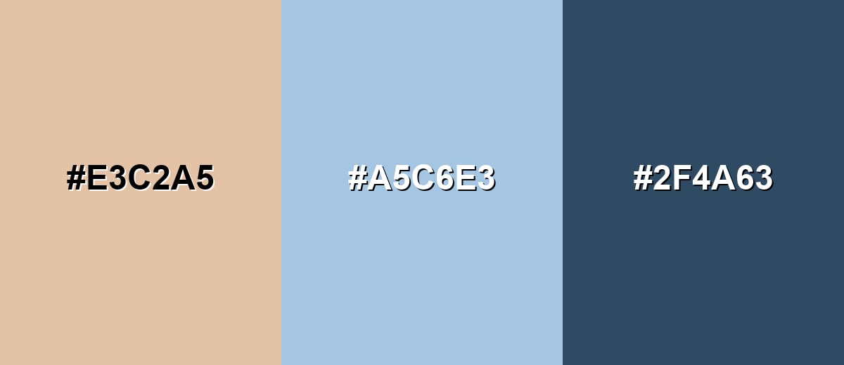
A cool blue complement offsets nude's warmth and adds a clean, modern contrast. Keep both sides slightly muted to avoid a harsh split.
Complementary Palette Example: Try nude as the base, a soft blue for balance, and a deep slate blue as the anchor.
Analogous Color Schemes
Analogous colors sit adjacent to each other on the color wheel, creating harmonious, cohesive palettes with subtle variation.
Warm-neighbor palette: peach, nude, and soft sand for a gentle, cohesive look.
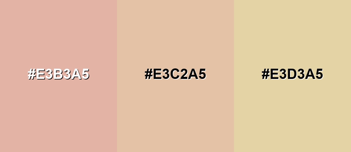
- Peach Nude: #E3B3A5
- Nude: #E3C2A5
- Soft Sand: #E3D3A5
Earthy analogous palette: tan, nude, and rosy brown for depth without losing softness.
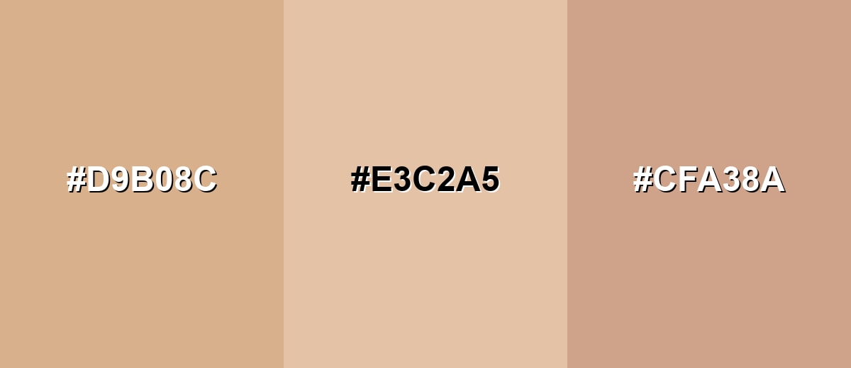
- Warm Tan: #D9B08C
- Nude: #E3C2A5
- Rosy Brown: #CFA38A
Triadic & Tetradic Combinations
A triadic scheme adds variety while staying balanced.
Use nude with a muted mint and a soft lavender to keep the palette airy and modern.
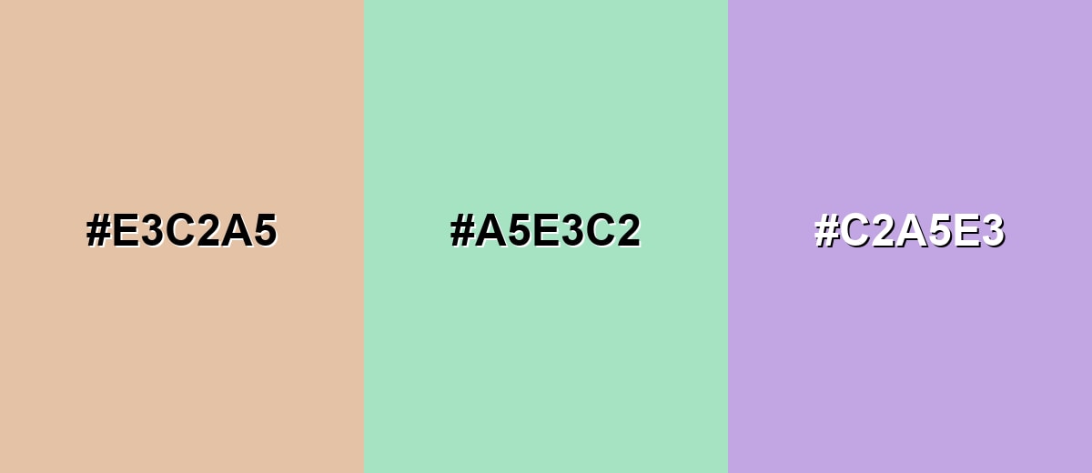
- Nude: #E3C2A5
- Muted Mint: #A5E3C2
- Soft Lavender: #C2A5E3
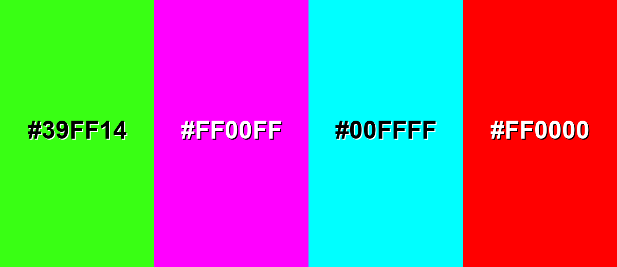
Colors to Avoid
While nude color is remarkably versatile, certain combinations can create problematic visual effects:
- Neon Lime (#39FF14) - Its high saturation can overpower nude and make the palette feel unbalanced and noisy.
- Electric Magenta (#FF00FF) - A very intense cool-warm clash that usually looks accidental unless you're intentionally going for pop-art contrast.
- Pure Cyan (#00FFFF) - The brightness and chroma can create a harsh, digital feel next to nude's softness.
- Signal Red (#FF0000) - Strong red can make nude read dull or "dirty" by comparison, especially in large blocks.
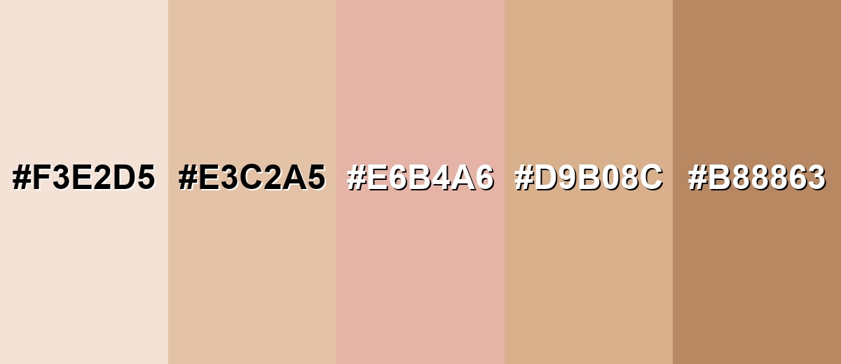
Shades, Tints & Variations of Nude Color
Nude isn't a single fixed shade—it's a flexible range from airy, porcelain tints to deeper caramel tones. Having a few coordinated variations makes it easier to create depth, hierarchy, and contrast without leaving the warm-neutral family.
- Porcelain Nude (#F3E2D5) - A very light nude tint that feels airy and delicate, with a subtle warm blush. It's best used for Backgrounds, minimalist layouts, and soft product photography backdrops..
- Classic Nude (#E3C2A5) - A balanced warm nude with peach-tan undertones—neutral enough for everyday design use. It's best used for Base color for UI surfaces, branding neutrals, and calm editorial sections..
- Blush Nude (#E6B4A6) - A nude shade that leans rosier, adding a gentle warmth and a more romantic feel. It's best used for Beauty visuals, highlight blocks, and feminine or cozy palette directions..
- Sand Nude (#D9B08C) - A deeper, earthier nude that reads closer to tan, adding grounded warmth. It's best used for Accents, dividers, icons, and pairing with creams and dark blues..
- Caramel Nude (#B88863) - A rich nude-brown tone that brings contrast while staying warm and natural. It's best used for Typography accents, outlines, leather/wood styling, and premium packaging details..
Industry Applications
Because nude is subtle and versatile, it shows up across digital products and physical goods wherever a warm, neutral foundation is needed.
Fashion & Beauty
- Shade Range Visuals - Use nude tones in swatches and shade presentations, and include multiple nude options for "skin-tone" concepts.
- Minimal Lookbooks - Nude supports clean, premium layouts that keep attention on silhouettes and materials.
- Natural Campaign Direction - It fits natural-look designs that rely on soft lighting and understated typography.
- Anchor With Depth - Balance nude with one stronger anchor color so products and text don't feel washed out.
Interior Design & Decor
- Warm Neutral Base - Nude works well for walls and textiles when you want warmth without heavy color.
- Material-Friendly Pairing - It complements wood, stone, and woven textures for a natural, cohesive space.
- Layered Tone-On-Tone - Mix multiple nude variations to add depth instead of relying on a single beige.
- Texture Adds Dimension - Linen, matte paint, and brushed metal finishes help nude interiors feel richer and less flat.
Branding & Marketing
- Wellness And Lifestyle Brands - Nude creates a calm, human tone that can feel approachable and premium.
- Soft Digital Surfaces - Use it for hero sections, cards, and separators where white feels too stark.
- Print And Packaging - Matte or soft-touch finishes reinforce nude's gentle character; CMYK proofs matter for warm neutrals.
- Readable Pairings - For clean contrast, pair nude backgrounds with darker navy or charcoal text.
Conclusion
Nude color (#E3C2A5) is a warm, skin-inspired neutral that brings softness, approachability, and a refined minimalist feel to modern design. Start with a specific reference value, then build your look with gentle analogous tones (for warm harmony) or muted blues (for crisp contrast), and keep readability strong by anchoring the palette with darker text colors and clear contrast checks—especially for UI and small typography.
Design Smarter with AI: Media.io is an online AI studio that empowers creators with advanced image generation and enhancement tools. From text-to-image and image-to-image creation to AI upscaling and color optimization, it enables fast, creative, and professional results—all in your browser.

Frequently Asked Questions About Nude Color
Nude color is a family of warm, muted neutrals inspired by natural skin, sand, and beige tones. It often includes subtle peach, pink, or tan undertones rather than being a single fixed shade.
Not exactly. Beige is usually a more straightforward light brown neutral, while nude often has a softer, skin-like quality and may lean peachy or blush depending on the undertone.
Nude pairs well with creams, warm browns, and terracotta for a cohesive warm palette. For contrast, try muted blues or slate tones; for a lighter look, add soft greens or lavender accents.
Add one darker anchor color (like deep blue or charcoal), and use contrast through typography weight, spacing, and texture. Layering multiple nude shades also creates depth without adding loud color.
Yes—nude is popular for warm, calm backgrounds. Just ensure sufficient contrast for text and UI elements, and test the color on different displays to avoid overly yellow or pink shifts.
Warm neutrals are sensitive to color profiles, paper stock, and lighting. RGB (screens) and CMYK (print) handle color differently, so it's best to proof prints and adjust using your printer's recommended profile.


