

Peach fuzz color is a soft, warm peach tone that looks like sunlit peach skin with a light, creamy finish. Its hex code is #ffbe98, which gives it a gentle balance of orange warmth and pink softness.
Often seen as comforting, friendly, and uplifting (without being loud), peach fuzz can read warmer or rosier depending on lighting and nearby colors. Below, you'll find the essential codes, pairings, shades, and practical ways to use it in design.
Peach Fuzz Color: Codes & Values
Use these standard values to match peach fuzz accurately across screens, design tools, and print workflows.
| Parameters | VALUE |
| HEX Code | #FFBE98 |
| RGB DECIMAL | 255, 190, 152 |
| RGB PERCENTAGE | 100%, 74.5%, 59.6% |
| CMYK | 0%,25%,40%,0% |
| HSL | 22°, 100%, 80% |
| HSV (HSB) | 22°, 40%, 100% |
| Web Safe | #FFCC99 |
Key Color Space Explanations:
- HEX - HEX is the most common way to specify this shade in digital design and CSS. For peach fuzz, #ffbe98 is the value to copy into design tools and style sheets.
- RGB - RGB defines how much red, green, and blue light are mixed on screens. A high red channel with moderate green and blue creates peach fuzz's warm, pastel look.
- CMYK - CMYK is used for printing and describes ink percentages. Peach fuzz uses low-to-mid magenta and yellow with no black for a clean, soft result.
- HSL - HSL describes hue, saturation, and lightness, which is helpful for adjusting tints and shades. Peach fuzz sits at a warm hue with high saturation but high lightness, making it feel airy.
- Web Safe - Web-safe colors approximate shades that display consistently on older systems. The closest web-safe match to peach fuzz is #ffcc99.
For most digital work, start with HEX (#FFBE98) or RGB, then adjust lightness in HSL to create softer tints or deeper peachy accents.
Peach Fuzz Color Conversions
Need peach fuzz in another color model? Here are the most common conversions and ready-to-copy CSS formats.
| Parameters | VALUE | CSS |
| HEX | #ffbe98 | #ffbe98 |
| RGB DECIMAL | 255, 190, 152 | rgb(255,190,152) |
| RGB PERCENTAGE | 100%, 74.5%, 59.6% | rgb(100%,74.5%,59.6%) |
| CMYK | 0%,25%,40%,0% | cmyk(0%,25%,40%,0%) |
| HSL | 22°, 100%, 80% | hsl(22°,100%,80%) |
| HSV (or HSB) | 22°, 40%, 100% | -- |
| Web Safe | ffcc99 | #ffcc99 |
| CIE-LAB | 82.0, 18.5, 28.4 | -- |
| XYZ | 65.3, 60.3, 37.9 | -- |
| xyY | 0.399, 0.369, 60.3 | -- |
| CIE-LCH | 82.0, 33.9, 56.9 | -- |
| CIE-LUV | 82.0, 46.2, 34.6 | -- |
| Hunter-Lab | 77.6, 18.9, 23.0 | -- |
| Binary | 11111111 10111110 10011000 | -- |
Want to generate Peach Fuzz Color photos or posters? Try Media.io's AI Image Generator now!
Peach Fuzz Color Meaning & Symbolism
Peach fuzz is commonly associated with warmth, care, and approachability. It feels human and inviting, which is why it often shows up in soothing visuals, friendly packaging, and soft interior accents. In everyday life, this Peach Fuzz Color meaning tends to signal comfort, kindness, and a gentle optimism rather than high energy.
Psychological Effects
Because it's light and warm, peach fuzz tends to soften the "feel" of a layout or space.
- Welcoming Mood - The warm, pastel look can make interfaces and rooms feel more inviting and less intimidating.
- Gentle Nurturing - It often suggests softness and care, which supports wellness, beauty, and community-focused messages.
- Calm Modernity - Paired with clean neutrals, it reads contemporary and relaxed rather than overly playful.
- Balanced Contrast - With deeper tones, it gains maturity and structure without turning intense or harsh.
- Sweetness Risk - Overuse can feel overly cute or low-authority, and low contrast can reduce readability for key UI elements.
Positive Associations
In branding and everyday visuals, peach fuzz usually lands on friendly, optimistic territory.
- Comfort - It creates a soft, reassuring atmosphere that feels easy to approach.
- Kindness - The gentle warmth can support messaging about care, support, and connection.
- Uplift - It brings a light, upbeat tone without the "loudness" of brighter oranges or reds.
- Freshness - Peach tones naturally hint at fruit-like freshness and a clean, airy vibe.
- Approachability - It can make products and interfaces feel more human and friendly at first glance.
Cultural Significance Across the World
Peach fuzz doesn't carry a strict universal meaning, so context and pairing choices matter most.
- Fruit-Linked Warmth - Peach tones are often connected to freshness and tenderness through their association with fruit.
- Skin-Like Softness - The natural, skin-adjacent warmth can feel personal and comforting in lifestyle visuals.
- Modern Pastel Energy - As a contemporary pastel, it's commonly read as friendly and current rather than traditional.
- Context-Driven Meaning - Its symbolism shifts based on surrounding colors, typography, and the message you're delivering.
Design Applications
Peach fuzz is easiest to use when you treat it as a soft foundation or accent rather than a heavy, all-over statement. It shines in warm palettes, pairs well with grounded neutrals, and can be pushed modern with cool blues or teals.
Graphic Design Tips
- Use peach fuzz as a background tint to add warmth without competing with your main content.
- Pair it with a deep neutral for logos and typography so the design doesn't feel washed out.
- Keep layouts clean and spacing generous; this shade looks best in airy, minimal compositions.
- Use it in gradients with nearby peach tones for a soft, cohesive depth in hero sections and posters.
- For CTAs, choose a darker companion color (or strong outline) so buttons stay clear and scannable.
If you're building a palette around peach fuzz, start with one grounded neutral for structure and one cool accent for balance—then let peach fuzz do the "friendly" work in highlights and backgrounds.
Peach Fuzz Color in Photography & Video
- Use peach fuzz in backdrops, wardrobe, or props to add a warm, flattering cast to lifestyle scenes.
- Watch white balance: warmer lighting can make it look rosier, while cooler light can push it toward a softer orange.
- In product shots, pair peach fuzz with clean neutrals to keep packaging and labels feeling premium.
- For video graphics, use peach fuzz on lower-thirds or overlays at low opacity so it doesn't reduce contrast.
- When color grading, preserve detail in highlights—pastels can clip quickly if exposure runs hot.
Recommended Tool for Image Enhancement: When incorporating peach fuzz color into your photography projects, Media.io's AI Image tools can help you achieve more refined results. With AI-powered color enhancement, photo colorization, image upscaling, and old photo restoration, you can easily enrich peach fuzz color tones, improve overall image quality, and highlight the color's elegant and sophisticated aesthetic.
Color Combinations
Peach fuzz pairs best with grounded neutrals, cool blue-greens, and soft purples that balance its warmth. Use the combinations below as starting points, then adjust lightness to match your medium and contrast needs.
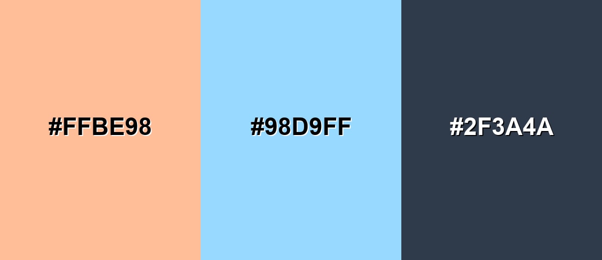
Complementary Colors
A complementary scheme places peach fuzz against a cool blue-cyan for crisp balance. This is a strong way to make the peach tone feel fresher and more modern.
Complementary Palette Example: Try peach fuzz with a breezy sky blue and a deep slate for structure.
Analogous Color Schemes
Analogous colors sit adjacent to each other on the color wheel, creating harmonious, cohesive palettes with subtle variation.
Warm analogous blend: apricot, peach fuzz, and soft coral for a cozy gradient.
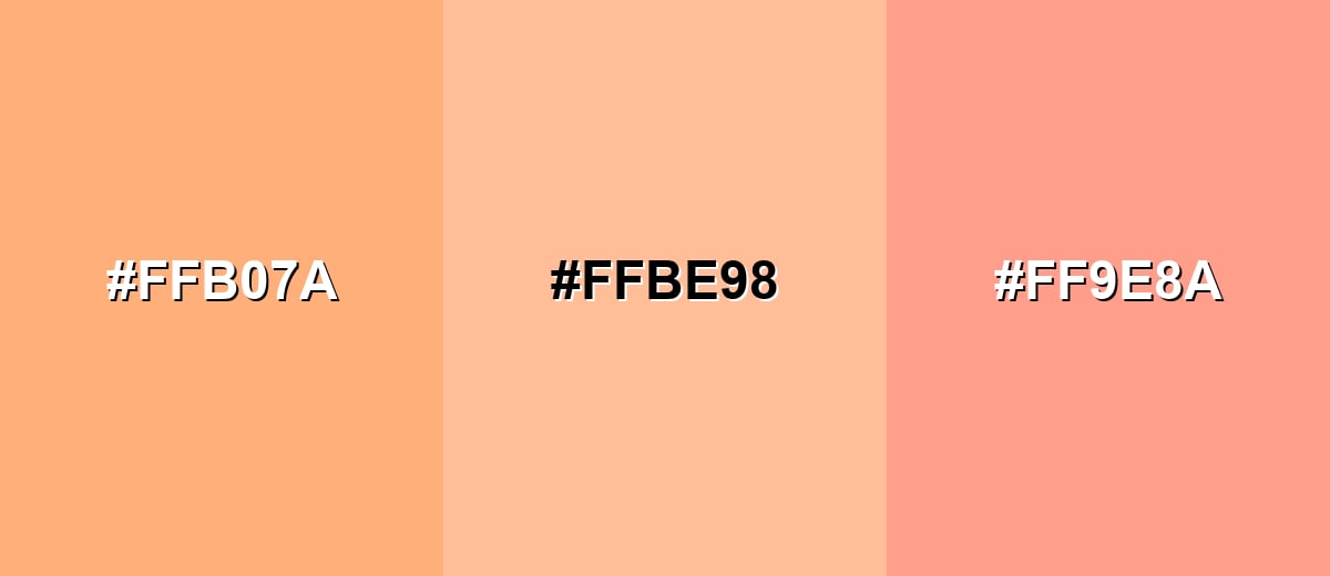
- Soft Apricot: #FFB07A
- Peach Fuzz: #FFBE98
- Gentle Coral: #FF9E8A
Light analogous set: creamy off-white, peach fuzz, and blush-salmon for a clean, friendly look.
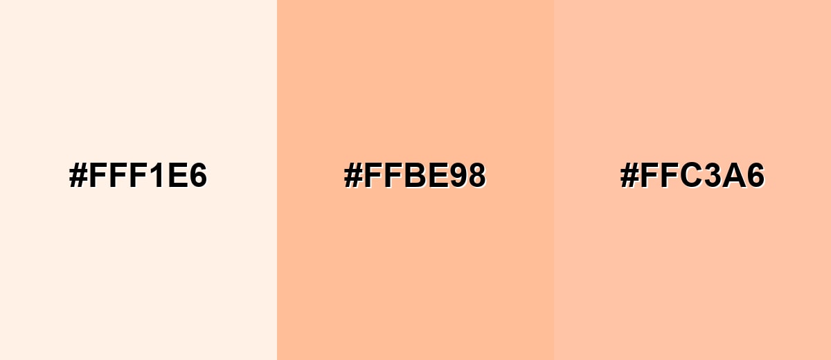
- Cream Veil: #FFF1E6
- Peach Fuzz: #FFBE98
- Blush Salmon: #FFC3A6
Triadic & Tetradic Combinations
A triadic palette adds variety while keeping harmony by spacing hues evenly around the wheel.
Playful triad: peach fuzz with soft seafoam and light lavender for balanced contrast.
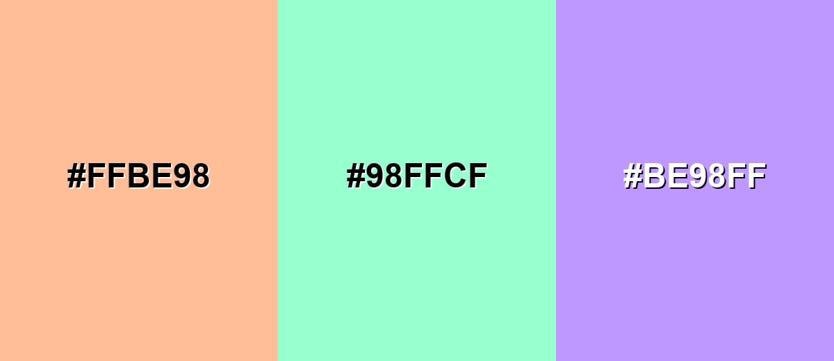
- Peach Fuzz: #FFBE98
- Seafoam Green: #98FFCF
- Lavender Violet: #BE98FF
Colors to Avoid
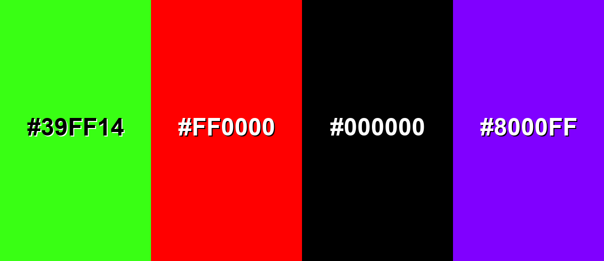
While peach fuzz color is remarkably versatile, certain combinations can create problematic visual effects:
- Neon Green (#39FF14) - The intensity fights the softness of peach fuzz and can feel visually jarring in most layouts.
- Pure Red (#FF0000) - This combination can skew overly loud and clash with peach fuzz's gentle warmth.
- Harsh Black (#000000) - The contrast is extremely sharp and can make peach fuzz look washed out or overly sweet by comparison.
- Electric Purple (#8000FF) - A highly saturated purple can overpower the palette and make the overall look feel unbalanced.
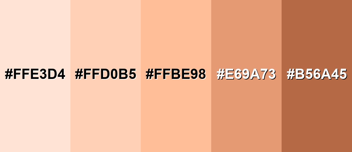
Shades, Tints & Variations of Peach Fuzz Color
Peach fuzz has a surprisingly flexible range—from barely-there creamy tints to richer, earthy peach-browns. Having a few coordinated variations makes it easier to build hierarchy in UI, create depth in illustrations, and keep branding consistent across different materials.
- Peach Mist (#FFE3D4) - A very light tint with a creamy, barely-there warmth. It's best used for Backgrounds, large surfaces, and soft UI panels where you want warmth without strong saturation.
- Soft Peach (#FFD0B5) - A lighter, smoother peach that stays warm but feels more neutral. It's best used for Cards, section blocks, and minimalist packaging where subtle warmth supports the content.
- Peach Fuzz (#FFBE98) - The core shade: warm, airy, and gently upbeat with a pastel finish. It's best used for Accent areas, illustrations, and friendly brand highlights paired with a darker neutral for type.
- Apricot Clay (#E69A73) - A deeper, more grounded peach with a slightly earthy feel. It's best used for Buttons, headers, and warm accent blocks where you need more weight than a pastel tint.
- Terracotta Peach (#B56A45) - A richer, brown-leaning shade that adds maturity and warmth. It's best used for Text accents, borders, and decorative elements that need stronger contrast and a natural tone.
Industry Applications
Peach fuzz is versatile because it can read as modern pastel, warm neutral, or soft accent depending on how you balance it with contrast. These are common places it fits naturally.
Fashion & Beauty
- Gentle packaging and skincare visuals that signal softness and comfort.
- Beauty and personal care backgrounds that feel warm, clean, and approachable.
- Event and wedding palettes for invitations and signage with a romantic, friendly tone.
- Lifestyle product photography that benefits from a flattering, sunlit warmth.
Interior Design & Decor
- Paint inspiration and wall color ideas that warm up spaces while staying light and airy.
- Textiles and decor accents paired with light woods, creamy whites, and muted greens.
- Soft room styling for well-lit areas where peach fuzz can create a subtle glow effect.
- Home and interiors mood boards that need gentle warmth without heavy saturation.
Branding & Marketing
- Wellness and lifestyle app themes that feel welcoming and calming.
- Retail and e-commerce banners, frames, and category highlights that add warmth without shouting.
- Food and beverage branding for fruit-inspired concepts, dessert menus, and seasonal promotions.
- Community-focused communication where an approachable, human tone matters.
Conclusion
Peach fuzz is a warm, airy peach tone that feels gentle yet modern when it's supported by the right contrast. Starting with #FFBE98, you can build anything from soft background tints to richer, grounded peach accents—especially when you pair it with deep neutrals for readability or cool blue-green tones for a fresher, contemporary balance. Keep accessibility in mind (pastels need strong text contrast), and peach fuzz will deliver comfort and friendliness without sacrificing clarity.
Design Smarter with AI: Media.io is an online AI studio that empowers creators with advanced image generation and enhancement tools. From text-to-image and image-to-image creation to AI upscaling and color optimization, it enables fast, creative, and professional results—all in your browser.

Frequently Asked Questions About Peach Fuzz Color
Peach fuzz looks like a soft peach tone with a creamy, sunlit warmth. It sits between light orange and blush, so it can appear slightly rosier or more golden depending on lighting.
A commonly used digital hex value for peach fuzz is #ffbe98. It is a light, warm peach that works well as a background tint or a friendly accent.
Peach fuzz is warm. It is driven by strong red with moderate green, which gives it a cozy, inviting feel rather than a cool, icy look.
It pairs well with creamy off-whites, warm neutrals, soft browns, and cool accents like gentle sky blues or muted teals. Deep slate or navy are great for contrast and readability.
Yes, it works well as a background when used lightly and balanced with high-contrast text. For body copy and small UI elements, use a dark neutral to keep content readable.
Pair it with cool blue-greens, clean whites, and structured dark neutrals, and keep layouts minimal. Using it in small accents or soft gradients often looks more contemporary than using it everywhere.


