

 TL;DR:
Fuchsia (#FF00FF) is a highly saturated pink-purple hue optimally deployed as a high-visibility accent for CTAs, UI highlights, and branding moments rather than as a full-page background.
● Utilize HEX #FF00FF for web CSS, RGB (255, 0, 255) for screen-based motion edits, and CMYK (0%, 100%, 0%, 0%) for physical print production to guarantee cross-platform color accuracy.
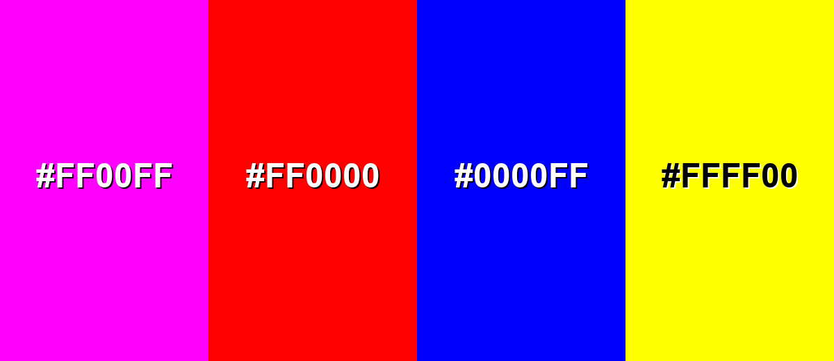
● Avoid pairing Fuchsia directly with Pure Red (#FF0000), Electric Blue (#0000FF), or Neon Yellow (#FFFF00) to prevent harsh edge vibration, compromised typography affordance, and severe readability reduction.
● When applying Fuchsia in photography or video grading, keep the hue away from mid-face portrait areas to prevent unnatural styling and monitor bright zones closely to avoid rapid highlight clipping.
Ask AI for a summary
 ChatGPT
 Perplexity
 Gemini
 Claude
 Grok
Grok
Fuchsia is a high-impact pink-purple hue that sits between vibrant hot pink and rich violet. Known for its bold, modern character, fuchsia instantly captures attention and adds energy to any composition. Its saturated intensity makes it especially popular in branding, fashion, digital design, and marketing materials where visibility and personality matter.
In this guide, you'll find a clear definition of the fuchsia color, accurate HEX, RGB, and CMYK color codes, detailed color conversions, and ready-to-use palettes. Whether you're designing for web, social media, packaging, or print, these resources will help you use fuchsia confidently and consistently across platforms.
Fuchsia Color: Codes & Values
If you need a reliable fuchsia color for web design, UI systems, branding guidelines, or print specifications, the values below represent the classic fully saturated reference version of fuchsia. These standardized HEX, RGB, CMYK, and HSL codes help ensure color accuracy and consistency across digital screens, design software, and physical print materials. Whether you're building a style guide, defining a brand accent, or preparing production-ready files, using precise fuchsia color codes keeps your visuals bold, vibrant, and consistent across every platform.
| Parameters | VALUE |
| HEX Code | #FF00FF |
| RGB DECIMAL | 255, 0, 255 |
| RGB PERCENTAGE | 100%, 0%, 100% |
| CMYK | 0%,100%,0%,0% |
| HSL | 300°, 100%, 50% |
| HSV (HSB) | 300°, 100%, 100% |
| Web Safe | #FF00FF |
Key Color Space Explanations:
- HEX - HEX is the most common digital notation for color, written as a # followed by six characters. It's widely used in web design, UI tools, and design handoffs.
- RGB - RGB describes how much red, green, and blue light make up a color on screens. It's the standard model for monitors, phones, and digital video.
- CMYK - CMYK represents the ink mix used in print: cyan, magenta, yellow, and black. It's helpful when you need predictable printing behavior across different materials.
- HSL - HSL organizes color into hue, saturation, and lightness, which feels intuitive when adjusting a palette. It's especially useful for creating tints, shades, and UI states.
- Web Safe - Web-safe colors come from a limited palette historically used for consistent display across older systems. Today it's mainly a compatibility reference, but still useful for quick standards.
Use HEX for UI handoffs and CSS, RGB for screen-based motion and edits, and CMYK when you're preparing anything that will be printed.
Want to generate fuchsia color photos or posters? Try Media.io's AI Image Generator now!
Fuchsia Color Conversions
Need to switch between design apps, developer specs, and print workflows? Use this conversion table to grab the exact format you need.
| Parameters | VALUE | CSS |
| HEX | #ff00ff | #ff00ff |
| RGB DECIMAL | 255, 0, 255 | rgb(255,0,255) |
| RGB PERCENTAGE | 100%, 0%, 100% | rgb(100%,0%,100%) |
| CMYK | 0%,100%,0%,0% | cmyk(0%,100%,0%,0%) |
| HSL | 300°, 100%, 50% | hsl(300°,100%,50%) |
| HSV (or HSB) | 300°, 100%, 100% | -- |
| Web Safe | ff00ff | #ff00ff |
| CIE-LAB | 60.2, 98.8, -61.0 | -- |
| XYZ | 59.3, 28.5, 97.0 | -- |
| xyY | 0.321, 0.154, 28.5 | -- |
| CIE-LCH | 60.2, 116.3, 328.2° | -- |
| CIE-LUV | 60.2, 83.9, -108.6 | -- |
| Hunter-Lab | 53.4, 111.1, -79.5 | -- |
| Binary | 11111111, 00000000, 11111111 | -- |
Fuchsia Color Meaning & Symbolism
The fuchsia color meaning comes from its unique position between vibrant pink and deep purple. By combining the warmth and emotion of pink with the depth and intrigue of violet, fuchsia often communicates confidence, bold self-expression, and contemporary style. Depending on how it’s styled in branding or design, fuchsia can feel playful and youthful—or dramatic and luxurious.
Psychological Effects
From a color psychology perspective, fuchsia is highly saturated and visually intense, which strongly influences first impressions. Because of its brightness and contrast, the psychological effects of fuchsia often determine how energetic, dynamic, or attention-grabbing a design feels at first glance.
- Instant Attention - The high saturation pulls the eye quickly, making it ideal for highlights and hero moments.
- Energy Boost - It can make layouts feel more upbeat and fast-paced, especially with clean typography.
- Expressive Mood - Fuchsia often signals personality and bold self-expression rather than subtlety.
- Modern, Digital Feel - It reads as pop-culture and screen-native, which can make visuals feel current.
- Visual Intensity - Overuse can create fatigue, so it works best with breathing room and balance.
Positive Associations
When applied strategically, the symbolism of fuchsia leans toward creativity, confidence, and standout personality. In branding and marketing design, it can inject sparkle and boldness without relying on complex graphics—making it a powerful accent color for modern visual identities.
- Creativity - It suggests bold ideas, experimentation, and standout design choices.
- Fun - The pink side brings playful, youthful energy to campaigns and UI moments.
- Glamour - Paired with dark neutrals, it can feel nightlife-inspired and fashion-forward.
- Individuality - It's often associated with confidence and doing things differently.
- Emphasis - Its visibility makes it great for clear hierarchy, spotlighting key actions or messages.
Cultural Significance Across the World
The cultural meaning of fuchsia is closely tied to visibility and self-expression. Globally, it appears in fashion, entertainment, digital media, and pop aesthetics—often signaling trend awareness, individuality, and high-impact visual communication.
- Pop Aesthetics - Frequently used in bold graphics and trend-driven visuals to signal "fresh" and expressive style.
- Fashion Statements - Common in runway and streetwear accents where impact and contrast matter.
- Nightlife Visuals - Often linked to neon-style lighting and energetic event branding.
- Digital-First Design - Widely used in app highlights, creator thumbnails, and modern UI systems for quick attention.
Design Applications
In practical use, the fuchsia color in design works best when given space to stand out. Because of its intensity, it performs like a visual spotlight—ideal for guiding attention, strengthening hierarchy, energizing user interfaces, and creating bold brand moments without overwhelming the entire layout.
Graphic Design Tips
- Use fuchsia for CTAs, highlights, tags, or key icons rather than full-page backgrounds.
- Balance it with neutrals or cooler tones to avoid visual fatigue.
- Use consistent saturation levels across your palette so fuchsia feels intentional, not accidental.
- For a fresh, high-contrast look, pair it with its complementary green.
- Test contrast carefully and avoid thin, small text on fuchsia backgrounds.
Pro tip: if you want fuchsia to feel premium, keep your layout simple—let one strong fuchsia element lead, and support it with clean whitespace and restrained type.
Fuchsia Color in Photography & Video
- Use fuchsia gels or accent LEDs to create a modern, nightlife-inspired mood without changing the whole scene.
- For portraits, keep fuchsia away from mid-face areas (like cheeks) unless you want a deliberate stylized look.
- In product shots, try fuchsia as a prop or background strip so the subject stays readable and "heroed."
- When color grading, watch for clipped highlights—fuchsia can blow out quickly in bright areas.
- Reserve fuchsia for motion graphics overlays, lower-thirds, or callouts when you want instant focus on-screen.
Recommended Tool for Image Enhancement: When incorporating fuchsia color into your photography projects, Media.io's AI Image tools can help you achieve more refined results. With AI-powered color enhancement, photo colorization, image upscaling, and old photo restoration, you can easily enrich fuchsia color tones, improve overall image quality, and highlight the color's elegant and sophisticated aesthetic.
Color Combinations
These palettes are designed to help fuchsia feel deliberate—either crisp and modern, smoothly blended, or bold and playful. Each scheme includes ready-to-use hex values.
Complementary Colors
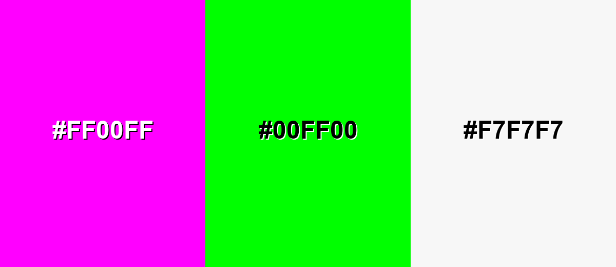
A complementary palette pairs fuchsia with a green opposite it on the color wheel, creating maximum contrast and a vibrant, energetic look.
Complementary Palette Example: Use fuchsia as the hero, electric green for contrast accents, and soft white to keep the overall layout readable.
Analogous Color Schemes
Analogous colors sit adjacent to each other on the color wheel, creating harmonious, cohesive palettes with subtle variation.
Hot Pink + Fuchsia + Blue Violet creates a smooth, neon-adjacent gradient that feels bold but cohesive.
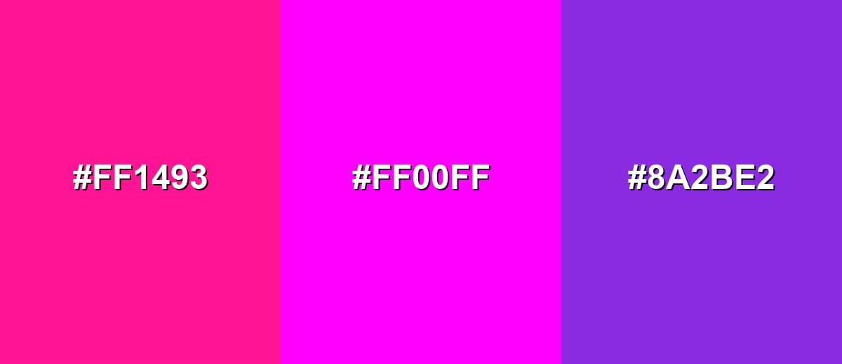
- Hot Pink: #FF1493
- Fuchsia: #FF00FF
- Blue Violet: #8A2BE2
Deep Magenta + Fuchsia + Indigo leans richer and moodier while keeping the same expressive energy.
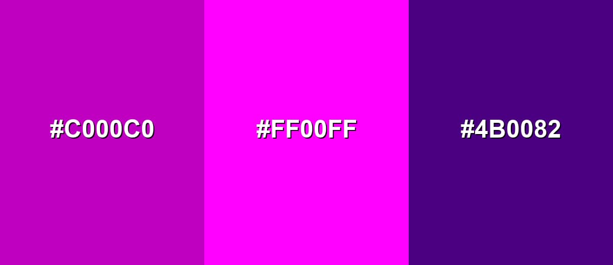
- Deep Magenta: #C000C0
- Fuchsia: #FF00FF
- Indigo: #4B0082
Triadic & Tetradic Combinations
Triadic schemes use three evenly spaced hues for a lively, balanced contrast.
Fuchsia + Amber Yellow + Bright Cyan is playful and attention-driven—great for youthful or creative visuals.
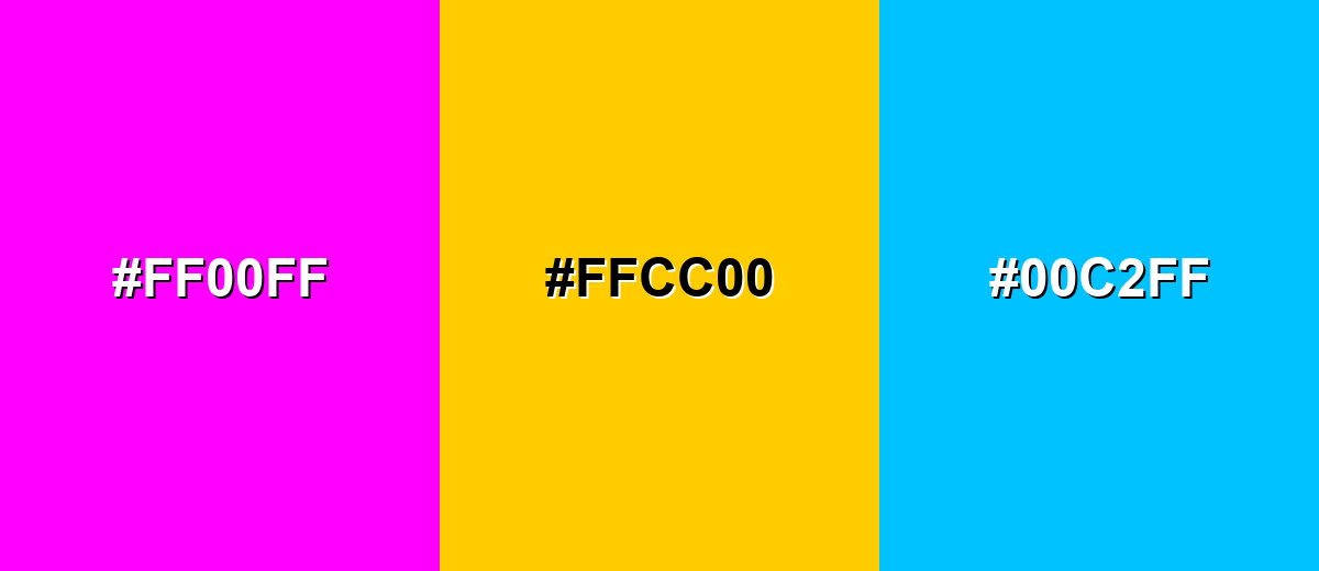
- Fuchsia: #FF00FF
- Amber Yellow: #FFCC00
- Bright Cyan: #00C2FF
Colors to Avoid
While fuchsia color is remarkably versatile, certain combinations can create problematic visual effects:
- Fuchsia (#FF00FF) - When combined with multiple equally saturated brights, fuchsia can lose hierarchy and make layouts feel noisy.
- Pure Red (#FF0000) - Red and fuchsia compete as dominant warm accents, often creating harsh vibration at edges and muddy emphasis.
- Electric Blue (#0000FF) - Fully saturated blue beside fuchsia can look overly synthetic and distract from typography and UI affordances.
- Neon Yellow (#FFFF00) - Neon yellow is extremely bright; paired with fuchsia at large scale, it can overwhelm and reduce readability.
Shades, Tints & Variations of Fuchsia Color
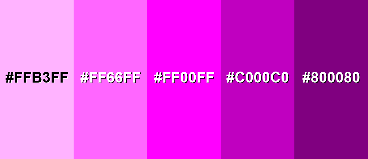
Fuchsia isn't just one "neon" note—its range runs from soft, airy tints to deeper, more dramatic purple-leaning shades. Having a few variations on hand makes it easier to build hierarchy, gradients, and brand systems without losing that signature fuchsia punch.
- Pale Fuchsia (#FFB3FF) - A soft, airy tint of fuchsia that keeps the pink-purple character without the intensity. It's best used for Background washes, subtle gradients, and gentle highlights..
- Light Fuchsia (#FF66FF) - A brighter tint that still feels energetic but is easier to use in larger areas than pure fuchsia. It's best used for Cards, banners, and secondary accents in UI..
- Classic Fuchsia (#FF00FF) - The fully saturated, high-visibility fuchsia most people recognize—electric and unmistakable. It's best used for CTAs, key highlights, brand accents, and short headline emphasis..
- Deep Fuchsia (#C000C0) - A darker, richer fuchsia that feels more grounded and slightly more premium. It's best used for Logos, headers, packaging accents, and high-contrast graphic shapes..
- Dark Fuchsia (#800080) - A shadowy, purple-leaning variation that keeps the fuchsia family vibe with a more dramatic tone. It's best used for Night-mode themes, editorial graphics, and depth in gradients..
Industry Applications
Fuchsia shows up anywhere attention and personality matter. It can read as playful, fashion-forward, or techy depending on palette and typography choices.
Fashion & Beauty
- Use fuchsia accents in packaging to create a bold, expressive shelf presence.
- Pair deep fuchsia moments with dark neutrals for a richer, more editorial feel.
- Lean on pale and light fuchsia tints for softer backgrounds in lookbooks and promos.
- Use classic fuchsia sparingly as a "hero" highlight to avoid overwhelming product photography.
Interior Design & Decor
- Try pale fuchsia as a gentle wash for playful rooms or creative studio spaces.
- Use classic fuchsia for small decor statements (art prints, cushions, accents) to energize neutral rooms.
- Deep fuchsia works well in graphic patterns for a more grounded, modern look.
- In moodier spaces, dark fuchsia can add depth in gradients, textiles, or feature details.
Branding & Marketing
- Use fuchsia in launch graphics, promotions, and hero sections that need instant focus.
- Apply it as an accent color in a broader identity system to signal energy or creativity.
- In UI-heavy campaigns, reserve fuchsia for buttons, badges, tags, and key icons to reinforce hierarchy.
- For creator-first content, fuchsia callouts can help thumbnails and overlays pop in crowded feeds.
Conclusion
Fuchsia (#FF00FF) is a vivid pink-purple that's made for emphasis—think CTAs, highlights, brand accents, and high-energy visuals. When you balance it with breathing room (neutrals), shape the vibe with nearby violets, or push contrast with complementary greens, fuchsia becomes easy to control: edgy, elegant, or playful on demand. Start with the exact codes above, test readability for real screens, and use fuchsia like a spotlight so it always points attention exactly where you want it.
Design Smarter with AI: Media.io is an online AI studio that empowers creators with advanced image generation and enhancement tools. From text-to-image and image-to-image creation to AI upscaling and color optimization, it enables fast, creative, and professional results—all in your browser.

Frequently Asked Questions About Fuchsia Color
Fuchsia is a vivid, saturated pink-purple color. It's commonly used as a high-energy accent in digital design, branding, fashion, and pop-style graphics.
A widely recognized digital fuchsia is represented by the hex value #ff00ff, which is a fully saturated pink-purple in the RGB color model.
They're closely related and often used interchangeably, but they can differ by definition and usage context. In many digital systems, #ff00ff is frequently labeled as magenta, while "fuchsia" is the common-name label for that same vivid pink-purple.
Fuchsia pairs well with complementary greens for punchy contrast, nearby pinks and violets for smooth blends, and balanced triads (like yellow and cyan) for playful palettes. Neutrals are also helpful for breathing room.
You can, but it's best used carefully because it's very intense. For large backgrounds, consider a lighter tint and keep text bold with strong contrast and ample spacing.
Common variations include pale fuchsia for soft backgrounds, light fuchsia for friendly accents, deep fuchsia for richer branding moments, and darker purple-leaning versions for dramatic themes and gradients.


