

Amaranth color is a vivid red-pink shade that reads like a rich berry red with a rosy magenta edge. Anchored by the HEX code #E52B50, it looks saturated and lively—bold without going full neon.
It's often seen as confident, passionate, and expressive, with a modern, fashion-forward energy. Named after the amaranth plant and its "unfading" symbolism, this guide covers meaning, color codes, pairings, shades, and practical design uses.
Amaranth Color: Codes & Values
If you want the "true" amaranth look across modern tools, start with its core HEX value and use the matching RGB/CMYK/HSL conversions for your workflow.
| Parameters | VALUE |
| HEX Code | #E52B50 |
| RGB DECIMAL | 229, 43, 80 |
| RGB PERCENTAGE | 90%, 17%, 31% |
| CMYK | 0%,81%,65%,10% |
| HSL | 348°, 78%, 53% |
| HSV (HSB) | 348°, 81%, 90% |
| Web Safe | #FF3366 |
Key Color Space Explanations:
- HEX - HEX is the most common way to specify amaranth for web design and digital tools. Use #e52b50 to get the standard amaranth look across modern browsers.
- RGB - RGB defines how much red, green, and blue light are mixed on screens. Amaranth's strong red value gives it intensity, while the lower green keeps it from reading as orange.
- CMYK - CMYK is used for print and describes ink percentages rather than light. Converting to CMYK helps keep amaranth consistent on paper, though print results can vary by stock and finish.
- HSL - HSL describes hue, saturation, and lightness, which is handy for building matching palettes. With a hue near 348°, amaranth sits close to red with a magenta lean.
- Web Safe - Web-safe colors are an older set of screen-safe values that reduce banding on legacy displays. The closest web-safe match to amaranth is #ff3366.
Use HEX/RGB for screens, switch to CMYK for print proofing, and lean on HSL when you're building tints, shades, and matching palettes around amaranth.
Amaranth Color Conversions
Need amaranth color values in a different format? Use this conversion table to copy the exact numbers into design tools, CSS, and print setups.
| Parameters | VALUE | CSS |
| HEX | #e52b50 | #e52b50 |
| RGB DECIMAL | 229, 43, 80 | rgb(229,43,80) |
| RGB PERCENTAGE | 90%, 17%, 31% | rgb(90%,17%,31%) |
| CMYK | 0%,81%,65%,10% | cmyk(0%,81%,65%,10%) |
| HSL | 348°, 78%, 53% | hsl(348°,78%,53%) |
| HSV (or HSB) | 348°, 81%, 90% | -- |
| Web Safe | ff3366 | #ff3366 |
| CIE-LAB | 51.0, 70.0, 26.2 | -- |
| XYZ | 34.6, 18.9, 9.4 | -- |
| xyY | 0.550, 0.301, 18.9 | -- |
| CIE-LCH | 51.0, 74.8, 20.6° | -- |
| CIE-LUV | 51.0, 132.3, 15.1 | -- |
| Hunter-Lab | 43.5, 66.0, 17.6 | -- |
| Binary | 11100101 00101011 01010000 | -- |
Want to generate Amaranth Color photos or posters? Try Media.io's AI Image Generator now!
Amaranth Color Meaning & Symbolism
Amaranth is often associated with confidence, intensity, and expressive warmth. Because it sits between red and pink, it can feel both passionate and stylish, making it a popular choice for accents that need energy without looking harsh. In everyday life, it tends to signal strong emotion, creativity, and a modern, standout personality.
Psychological Effects
Amaranth's red-pink intensity can shift a layout's mood fast, so small changes go a long way.
- Lively Energy - Amaranth can make designs feel more lively and assertive than softer pinks, while still keeping a human, approachable vibe.
- Fast Attention - It works well when you want attention quickly, such as call-to-action elements, highlight states, or hero details that need to pop.
- Vitality & Confidence - Used in moderation, it can communicate vitality and confidence in branding and packaging.
- Warmth & Depth - In interiors and visual communication, it can add warmth and depth, especially paired with calm neutrals to keep it from overwhelming the space.
- Intensity Overload - If overused, the same intensity can start to feel loud or emotionally heavy, particularly on large backgrounds or high-contrast screens.
Positive Associations
Because it blends red's strength with pink's style, amaranth often reads bold yet polished.
- Confidence - It's frequently tied to a confident, standout presence that feels intentional in modern design.
- Expressive Creativity - The red-magenta edge supports creative, fashion-forward visuals and expressive branding.
- Approachable Boldness - Compared with harsher reds, it can stay warm and human while still being attention-grabbing.
- Premium Energy - With simple supporting colors, it can feel vibrant and premium in packaging and campaigns.
- Enduring Beauty - The amaranth name is linked to the idea of unfading color, reinforcing a lasting, memorable impression.
Cultural Significance Across the World
Interpretations vary, but the name and red-pink family symbolism give amaranth a strong cultural backdrop.
- Unfading Blooms - The name is linked to the amaranth plant and has long been connected with ideas of enduring beauty and unfading blooms in art and literature.
- Love & Celebration - As a red-pink shade, it may inherit broader symbolism tied to love and celebration depending on the setting.
- Bold Self-Expression - Its vivid tone often aligns with confident self-expression in modern visual culture.
- Context Matters - Meanings can shift by audience and usage, so supporting colors and application make a difference.
Design Applications
Amaranth is usually best as a statement accent: strong enough to lead the eye, but easy to control when you balance it with calmer tones and clear hierarchy.
Graphic Design Tips
- Use amaranth as a focal accent to guide attention, rather than filling large background areas.
- Pair it with light neutrals for a clean look, or with deep darks for high-contrast drama.
- Keep the supporting palette simple so the saturation feels intentional, not chaotic.
- For print, start with CMYK values and confirm with proofs to protect the intended warmth.
- For accessibility, validate contrast for text, buttons, links, and labels across light and dark themes.
Pro tip: treat #E52B50 as your "hero" color and let neutrals or structured blues do the heavy lifting for layout—amaranth will still read bold even in small doses.
Amaranth Color in Photography & Video
- Use amaranth props, wardrobe, or graphic overlays as a controlled accent that instantly pulls focus.
- Balance its saturation with soft off-whites or calm neutrals so skin tones and key subjects stay natural.
- For product shots and packaging visuals, amaranth can add vibrant, premium energy—especially in beauty and lifestyle content.
- Avoid overusing it across full frames; the intensity can feel loud or emotionally heavy on high-contrast screens.
- If amaranth sits near alert reds in your edit, differentiate meaning with composition, icons, or supporting hues.
Recommended Tool for Image Enhancement: When incorporating amaranth color into your photography projects, Media.io's AI Image tools can help you achieve more refined results. With AI-powered color enhancement, photo colorization, image upscaling, and old photo restoration, you can easily enrich amaranth color tones, improve overall image quality, and highlight the color's elegant and sophisticated aesthetic.
Color Combinations
Amaranth pairs best with cool greens, calm neutrals, and structured blues that help it feel intentional. Use the palettes below as starting points for brand systems, UI themes, and decorative accents.
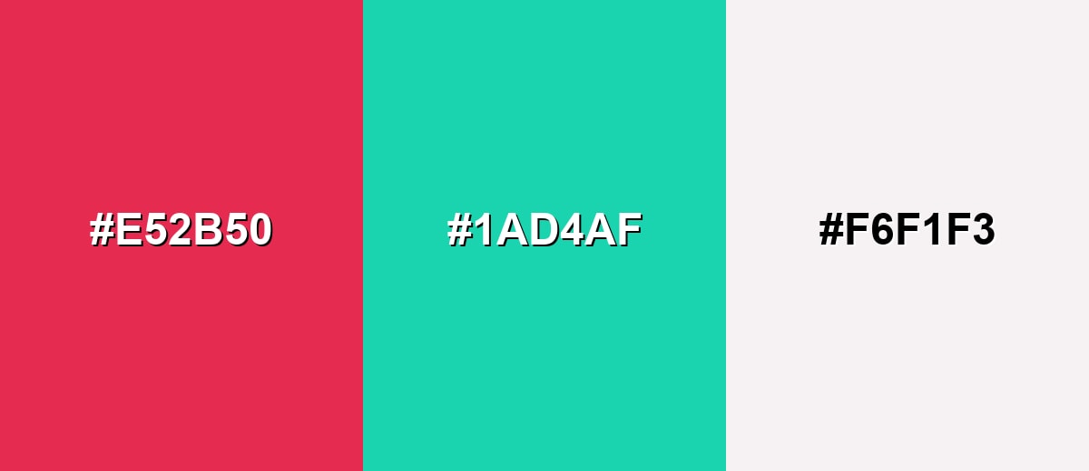
Complementary Colors
A complementary palette balances amaranth with a cool green-teal opposite, creating a crisp, high-energy contrast that feels modern and clean.
Complementary Palette Example: Pair Amaranth with a fresh teal and a soft off-white to keep the look bright but usable.
Analogous Color Schemes
Analogous colors sit adjacent to each other on the color wheel, creating harmonious, cohesive palettes with subtle variation.
A warm analogous set blends berry red into rosy and coral-leaning neighbors for a smooth, energetic gradient.
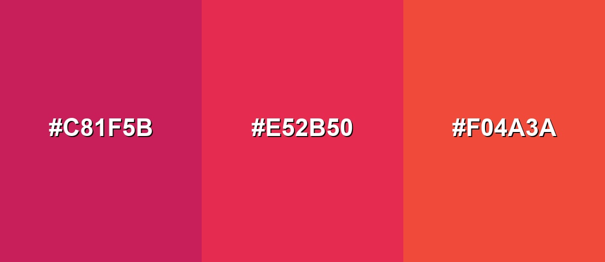
- Deep Rose: #C81F5B
- Amaranth: #E52B50
- Coral Ember: #F04A3A
A pink-forward analogous palette leans into magenta highlights for a bold, expressive, fashion-style feel.
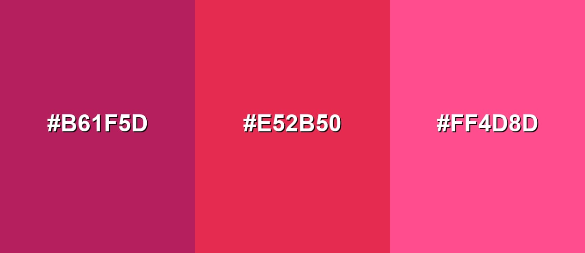
- Berry Plum: #B61F5D
- Amaranth: #E52B50
- Vivid Pink: #FF4D8D
Triadic & Tetradic Combinations
A triadic scheme uses three evenly spaced hues, giving you contrast without the sharpness of direct complements.
Combine amaranth with a bright yellow-green and a confident blue for a playful, balanced look.
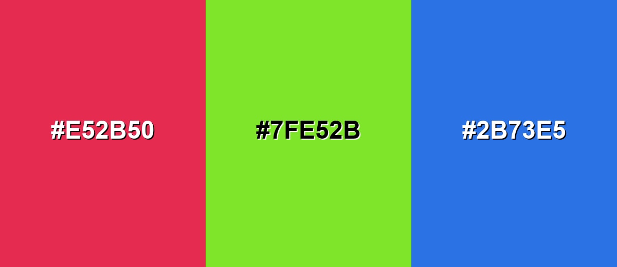
- Amaranth: #E52B50
- Citrus Leaf: #7FE52B
- Royal Blue: #2B73E5
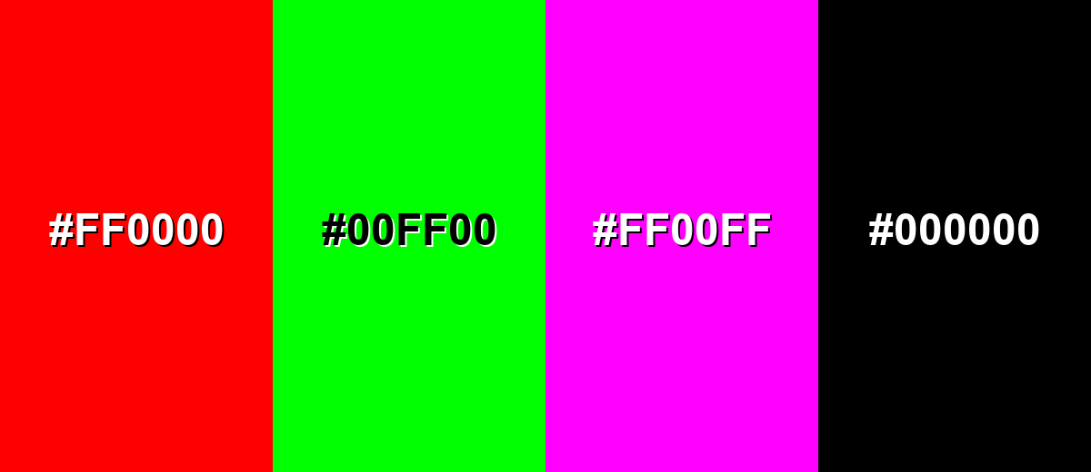
Colors to Avoid
While amaranth color is remarkably versatile, certain combinations can create problematic visual effects:
- Pure Red (#FF0000) - Too close in hue and intensity, so the pair can look aggressive and make amaranth feel less refined.
- Neon Green (#00FF00) - The extreme saturation creates visual vibration, which can feel harsh and reduce readability in UI.
- Electric Magenta (#FF00FF) - Both shades compete for attention, often reading as loud and unbalanced rather than stylish.
- Solid Black (#000000) - High contrast can work, but large areas of black can make amaranth look overly sharp and heavy if not softened with neutrals.
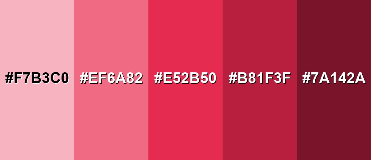
Shades, Tints & Variations of Amaranth Color
Amaranth has a surprisingly usable range—from airy, rosy tints to deep wine-like shades. Building with variations helps you keep the same personality while improving hierarchy, readability, and mood across different layouts.
- Pale Amaranth (#F7B3C0) - A light, airy tint that keeps the rosy character but feels softer and more delicate. It's best used for Backgrounds, large UI surfaces, and gentle branding accents.
- Soft Amaranth (#EF6A82) - A toned-down version that reads friendly and modern without the full intensity of the base shade. It's best used for Secondary buttons, illustrations, and lifestyle visuals.
- True Amaranth (#E52B50) - The classic vivid red-pink that stands out with confident, berry-like saturation. It's best used for Primary accents, highlights, and focal points in layouts.
- Deep Amaranth (#B81F3F) - A deeper, slightly moodier take that feels richer and more grounded. It's best used for Headings, premium branding, and dramatic contrast palettes.
- Dark Amaranth (#7A142A) - A dark, wine-leaning shade that keeps the red-pink undertone with a more serious tone. It's best used for Text accents, luxury packaging, and dark-theme UI details.
Industry Applications
Because it's bold but still refined, amaranth works best where you want emotional impact, modern style, and clear visual hierarchy—without drifting into harsh, warning-red territory.
Fashion & Beauty
- Packaging accents and product highlights that feel vibrant and premium.
- Social visuals where you want confident, expressive energy.
- Seasonal campaigns, drop announcements, and editorial layouts.
- Accessories, tags, and lookbook design that needs a strong focal point.
Interior Design & Decor
- Accent walls, textiles, or decor pieces that add warmth and depth.
- Neutral anchor surfaces that keep amaranth from overwhelming the space.
- Soft, matte finishes for a calmer feel (or glossy finishes for a fashion-forward look).
- Natural textures to balance the intensity and keep the room grounded.
Branding & Marketing
- CTA buttons, active states, and promotional modules that need quick attention.
- Brand accents that feel warmer than standard reds in tech and app UI.
- Berry, fruit, or botanical-inspired cues for food and beverage branding.
- Posters, tickets, and banners for events where bold contrast improves scanning.
Conclusion
Amaranth is a vivid red-pink that blends the confidence of red with a stylish, rosy edge—making it ideal for modern accents in branding, UI, print, and decor. Start with #E52B50, use it strategically (not everywhere), and balance it with calm neutrals or cool contrasts like teal for a look that stays energetic without getting overwhelming. With a few well-chosen shades—from Pale Amaranth to Dark Amaranth—you can keep the same personality while improving hierarchy, readability, and overall polish across any design system.
Design Smarter with AI: Media.io is an online AI studio that empowers creators with advanced image generation and enhancement tools. From text-to-image and image-to-image creation to AI upscaling and color optimization, it enables fast, creative, and professional results—all in your browser.

Frequently Asked Questions About Amaranth Color
Amaranth is a vivid red-pink shade with a berry-like look and a slight magenta edge. It's commonly represented by the HEX value #e52b50 in digital design.
It sits between both, but it's usually perceived as a strong red with a pink-magenta undertone. Compared with most pinks, it looks deeper and more intense.
It's often linked with confidence, passion, and expressive creativity. In many designs it communicates boldness while still feeling polished and modern.
Cool green-teals, soft off-whites, and structured blues tend to pair well because they balance its intensity. For a smoother look, neighboring rose and coral tones also work nicely.
Yes, it works well for CTAs because it grabs attention quickly. Just keep contrast high and avoid using it everywhere, so key actions remain clear and the interface doesn't feel loud.
The closest web-safe approximation is #ff3366. It's not identical, but it keeps a similar vivid red-pink character on legacy palettes.


