

 TL;DR:
The vivid emerald green #00A651 serves as a clean, energetic accent for digital UI and branding, signaling growth and success when properly contrasted against neutral tones.
● For digital accessibility and clear hierarchy, reserve #00A651 for positive actions like CTAs or success confirmations, always reinforcing the color with text labels or icons rather than relying on hue alone.
● Avoid combining this green with pure red (#FF0000) to prevent UI status confusion, or pure yellow (#FFFF00) which causes harsh visual vibration on backlit screens.
● Before moving digital designs to physical production, convert the palette to CMYK (100%,0%,51%,35%) early and run physical proofs, as green tones frequently dull or shift based on paper stock and ink absorption.
Ask AI for a summary
 ChatGPT
 Perplexity
 Gemini
 Claude
 Grok
Grok
Green is a fresh, balanced hue that sits between yellow and blue—think leaves, grass, and the calm you get from being outdoors.
On screens, a popular modern green is #00A651, a vivid emerald tone that feels clean, lively, and easy to build into palettes for UI, branding, and content design.
Green Color: Codes & Values
Use these standard green color values to keep your designs consistent across web, apps, print, and brand guidelines.
| Parameters | VALUE |
| HEX Code | #00A651 |
| RGB DECIMAL | 0, 166, 81 |
| RGB PERCENTAGE | 0%, 65.1%, 31.8% |
| CMYK | 100%,0%,51%,35% |
| HSL | 149°, 100%, 33% |
| HSV (HSB) | 149°, 100%, 65% |
| Web Safe | #009933 |
Key Color Space Explanations:
- HEX - HEX is the most common way to specify a screen-based hue in web and UI design. Use #00a651 in CSS, design tools, and brand guidelines for consistent output.
- RGB - RGB defines the red, green, and blue light values used by displays. It is ideal for digital work like websites, apps, video, and on-screen graphics.
- CMYK - CMYK is used for printing with cyan, magenta, yellow, and black inks. Converting to CMYK helps estimate how this tone will reproduce on paper and packaging.
- HSL - HSL describes hue, saturation, and lightness, which many designers find intuitive for building tints and tones. It is useful for creating systematic UI states and matching shades.
- Web Safe - Web Safe is the closest legacy palette match that older systems can render reliably. For this green, the nearest web-safe value is #009933.
For most digital work, stick to HEX or RGB; for print, convert early to CMYK and proof to confirm the final result on your chosen paper and finish.
Want to generate Green Color photos or posters? Try Media.io's AI Image Generator now!
Green Color Conversions
Need the same green in different formats? Here are quick conversions you can copy into design tools, CSS, and print workflows.
| Parameters | VALUE | CSS |
| HEX | #00a651 | #00a651 |
| RGB DECIMAL | 0, 166, 81 | rgb(0,166,81) |
| RGB PERCENTAGE | 0%, 65.1%, 31.8% | rgb(0%,65.1%,31.8%) |
| CMYK | 100%,0%,51%,35% | cmyk(100%,0%,51%,35%) |
| HSL | 149°, 100%, 33% | hsl(149°,100%,33%) |
| HSV (or HSB) | 149°, 100%, 65% | -- |
| Web Safe | 009933 | #009933 |
| CIE-LAB | 59.8, -56.0, 33.8 | -- |
| XYZ | 15.1, 28.0, 12.4 | -- |
| xyY | 0.273, 0.504, 28.0 | -- |
| CIE-LCH | 59.8, 65.4, 148.7 | -- |
| CIE-LUV | 59.8, -53.9, 50.7 | -- |
| Hunter-Lab | 52.9, -39.8, 22.0 | -- |
| Binary | 00000000 10100110 01010001 | -- |
Green Color Meaning & Symbolism
Green is widely associated with nature, balance, renewal, and steady progress. Because it is so common in everyday environments, it often feels familiar and restful in visual communication. In practice, Green Color meaning often shows up in messages about well-being, sustainability, safety, and positive momentum.
Psychological Effects
Depending on the shade, green can feel calming, stable, and quietly energizing.
- Calm Focus - Green tends to feel soothing without being sleepy, making it a solid choice for screens and spaces that should be easy to navigate.
- Visual Balance - Because it sits in the middle of the spectrum, many people find green less harsh than very warm or very cool hues.
- Trust & Clarity - In branding and product design, green can support a sense of steadiness and considered decision-making.
- Positive Feedback - It's frequently used to signal success states, confirmations, or availability in digital systems.
- Overuse Risk - Extremely bright greens can feel artificial or loud, while dull yellow-greens may read as stale if the tone isn't chosen carefully.
Positive Associations
Green commonly supports messages that feel healthy, optimistic, and forward-moving.
- Growth - Green is often tied to progress, momentum, and improvement over time.
- Renewal - It can suggest a reset, fresh start, or "clean" feeling in visuals and product narratives.
- Health - Many wellness and lifestyle designs lean on green to imply balance, recovery, and everyday well-being.
- Stability - Deeper greens can feel dependable and grounded, especially when paired with neutral typography.
- Sustainability - Green is a natural fit for eco, plant-based, and responsible positioning—best when backed by clear messaging.
Cultural Significance Across the World
Green symbolism shifts by region and context, so it's smart to check the shade and message with your audience.
- Nature & Life - Green is commonly connected to landscapes, fertility, and living systems.
- Permission & Correct Action - In signage and interfaces, green often communicates "go," "safe," or "approved."
- Luck & Status - In some settings, green can suggest luck, prosperity, or tradition depending on how it's used.
- Context Matters - The same green may feel organic and calm in one place, but overly synthetic in another if the saturation is too strong.
Design Applications
Green is versatile: it can be energetic and modern, or quiet and organic, depending on the shade and surrounding palette. The key is deciding whether you want a crisp, digital feel or a softer, natural impression, then building contrast and hierarchy around that choice.
Graphic Design Tips
- Use green as a "positive" accent (CTAs, highlights, badges) and let neutrals handle most surfaces for a clean layout.
- Pick the shade first: brighter greens feel youthful and tech-forward, while deeper greens read premium and stable.
- Balance saturation with whitespace—vivid green looks best when it has breathing room.
- Create hierarchy by pairing green with dark neutrals for text and UI chrome, not with similarly intense cool colors.
- For print, convert to CMYK early and compare test outputs—greens can dull or shift depending on paper and coating.
If green is a core brand color, build a small system around it (primary, hover, muted background tint, and deep shade) so your designs stay consistent across pages and campaigns.
Green Color in Photography & Video
- Use green backgrounds (plants, landscapes, textured walls) to add a natural, calming mood without distracting from the subject.
- Protect skin tones by keeping green saturation under control—heavy green casts can make faces look flat or sickly.
- For product shots, pair green props with simple neutrals so the hero item stays dominant.
- In video grading, use green as a subtle midtone push for "freshness," then anchor contrast with clean whites and controlled shadows.
- When green represents a status (like "success"), reinforce it with icons/text so meaning holds up on different displays.
Recommended Tool for Image Enhancement: When incorporating green color into your photography projects, Media.io's AI Image tools can help you achieve more refined results. With AI-powered color enhancement, photo colorization, image upscaling, and old photo restoration, you can easily enrich green color tones, improve overall image quality, and highlight the color's elegant and sophisticated aesthetic.
Color Combinations
Green pairs well with both warm and cool palettes, so you can steer it toward natural, sporty, luxurious, or tech-forward styles. Use the combinations below as starting points, then adjust lightness to match your layout and contrast needs.
Complementary Colors
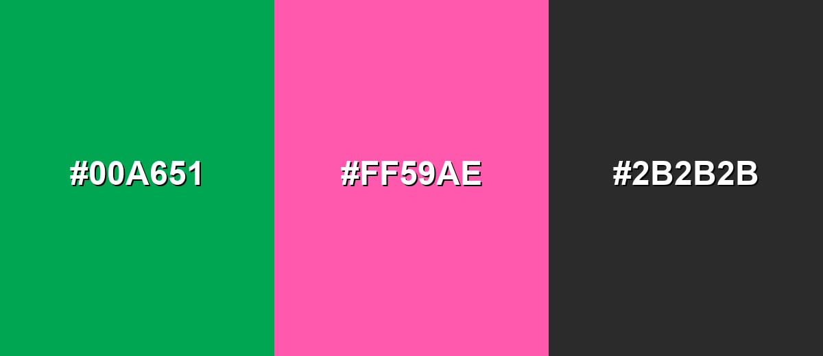
A complementary pairing adds high energy and clear separation. Green and a pink-magenta accent create a lively contrast that works well for campaigns, highlights, and modern UI accents when used in moderation.
Complementary Palette Example: Try emerald green as the anchor, magenta as the pop, and a dark neutral to keep the layout grounded.
Analogous Color Schemes
Analogous colors sit adjacent to each other on the color wheel, creating harmonious, cohesive palettes with subtle variation.
Teal to green to yellow-green creates a smooth, natural transition that feels fresh and outdoorsy.
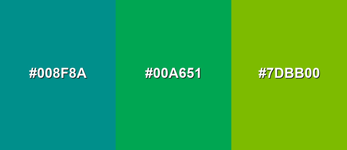
- Deep Teal: #008F8A
- Emerald Green: #00A651
- Yellow Green: #7DBB00
Mint with a core green and a darker forest tone gives a calm palette with built-in depth.
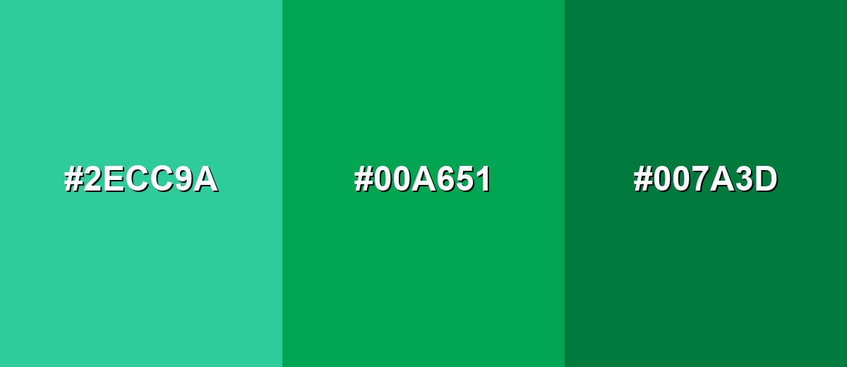
- Bright Mint: #2ECC9A
- Emerald Green: #00A651
- Forest Green: #007A3D
Triadic & Tetradic Combinations
A triadic palette keeps contrast strong while staying balanced across the spectrum.
Green with orange and purple is bold and playful, making it useful for creative branding, illustrations, and standout hero sections.
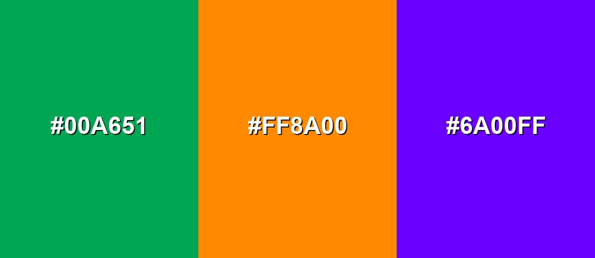
- Emerald Green: #00A651
- Vibrant Orange: #FF8A00
- Royal Purple: #6A00FF
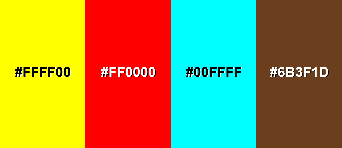
Colors to Avoid
While green color is remarkably versatile, certain combinations can create problematic visual effects:
- Pure Yellow (#FFFF00) - High brightness with green can feel vibrating and tiring to look at, especially in large blocks or on backlit screens.
- Pure Red (#FF0000) - This pairing can create harsh holiday-like contrast and may be confusing in UI where red typically signals errors.
- Electric Cyan (#00FFFF) - Both are intense cool accents, which can reduce hierarchy and make layouts feel noisy rather than clear.
- Mud Brown (#6B3F1D) - When both are mid-to-dark, the result can look dull or dirty unless you introduce a lighter neutral for separation.
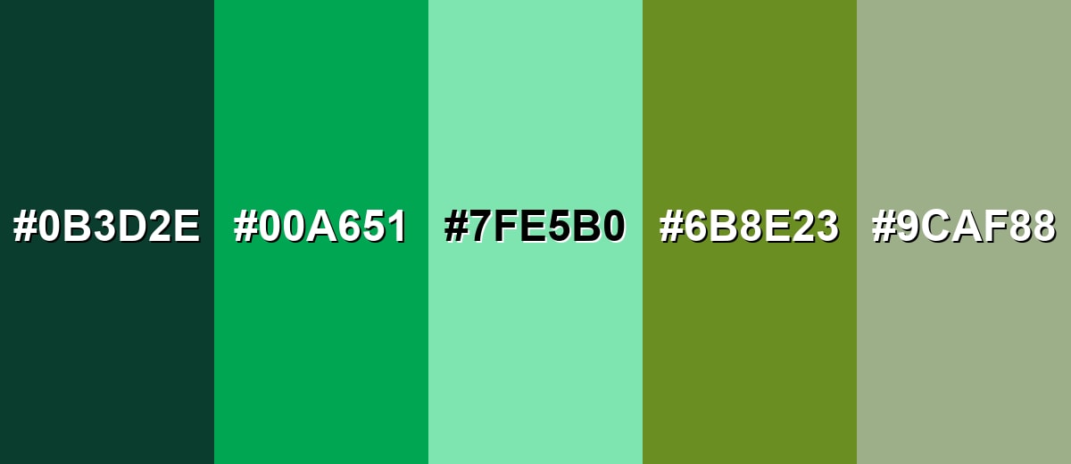
Shades, Tints & Variations of Green Color
Green isn't just one look—it runs from deep, structured forest tones to airy mint tints and earthy olive shades. Knowing the range helps you choose the right mood (premium, calm, organic, or high-energy) while keeping contrast and readability under control.
- Forest Green (#0B3D2E) - A deep, cool green that feels grounded and mature, with a subtle natural character. It's best used for Premium branding, headers, navigation bars, and backgrounds where you want stability and depth.
- Emerald Green (#00A651) - A vivid, modern green that reads clean and energetic without leaning too yellow. It's best used for Primary brand accents, success states, calls to action, and illustrations that need a fresh punch.
- Mint Green (#7FE5B0) - A light, airy green with a soft feel that stays friendly and approachable. It's best used for Background panels, wellness and lifestyle visuals, subtle UI fills, and calming interior accents.
- Olive Green (#6B8E23) - A muted yellow-green that feels earthy and practical, with a utilitarian edge. It's best used for Outdoor themes, editorial palettes, product packaging, and designs that need an organic, grounded tone.
- Sage Green (#9CAF88) - A gray-green that feels quiet, balanced, and easy to pair with neutrals. It's best used for Minimal layouts, soft brand systems, interior styling, and calm UI surfaces where readability matters.
Industry Applications
Because it can communicate nature, progress, and reassurance, green shows up across many industries. The most effective use depends on whether the goal is to feel energetic and modern or calm and established.
Fashion & Beauty
- Use vivid greens for sporty, fresh drops and seasonal collections that want an energetic feel.
- Choose sage and olive tones for minimalist styling, "clean" aesthetics, and everyday wear palettes.
- Deep greens can support premium positioning in packaging, labels, and product photography backdrops.
- Balance green with neutrals in layouts so product names, shades, and claims stay easy to read.
Interior Design & Decor
- Soft greens work well for calm rooms and workspaces where you want focus without visual tension.
- Use deeper greens on feature walls, cabinetry, or built-ins to create structure and depth.
- Pair green with natural materials and simple neutrals to keep the space cohesive and breathable.
- Consider lighting—greens can shift warmer or cooler depending on bulbs, daylight, and surface texture.
Branding & Marketing
- In tech and SaaS, green is a natural fit for success states, onboarding confirmations, and trust-building accents.
- In wellness, it supports messages around balance, recovery, freshness, and everyday health.
- In finance and business, green can reinforce steady growth cues in dashboards and performance visuals.
- For eco and food messaging, pair green with clean neutrals and clear copy so "natural" reads credible, not generic.
Conclusion
Green is one of the most adaptable colors in design because it feels familiar, calming, and confidently "alive" at the same time. Whether you're using #00A651 as a modern digital accent, building softer sage backgrounds for a minimal UI, or choosing deep forest tones for a premium look, the best results come from strong contrast, smart pairing, and consistent usage across your system. Treat green as part of a structured palette—not a random highlight—and it becomes a reliable tool for branding, interfaces, and print that stays readable, intentional, and on-message.
Design Smarter with AI: Media.io is an online AI studio that empowers creators with advanced image generation and enhancement tools. From text-to-image and image-to-image creation to AI upscaling and color optimization, it enables fast, creative, and professional results—all in your browser.

Frequently Asked Questions About Green Color
Green is the hue between yellow and blue that often looks like leaves and grass. It can range from bright and energetic to deep and muted depending on the shade.
A commonly used digital green for this page is #00a651. It is a vivid emerald-like tone that works well as a modern accent.
Green is often linked with growth, renewal, balance, health, and stability. In visual systems it also frequently signals a positive or successful outcome.
Green pairs well with neutrals for a clean look, with magenta for strong contrast, and with nearby tones like teal or yellow-green for smooth, natural palettes. The best pairing depends on whether you want calm harmony or bold separation.
Use strong contrast between text and green backgrounds, and avoid using green alone to communicate meaning. Add icons, labels, or patterns for status and test palettes for color vision deficiency in charts and states.
Print uses inks rather than light, so the same green can shift based on CMYK conversion, paper tone, and finishing. Proofing on the intended material is the most reliable way to confirm the final look.


